
Service: Visual Design Sprint • 2-weeks
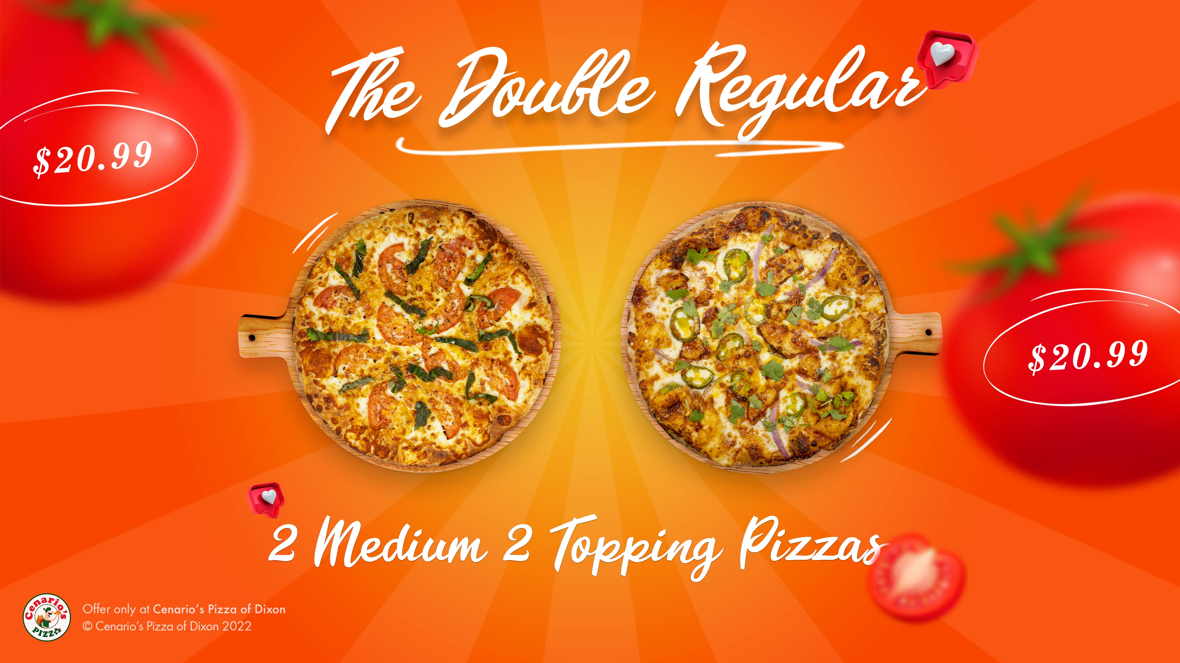
AFTER: Image of visually engaging "The Double Regular" coupon, created as part of a brand refresh visual design sprint
Project Snapshot
Following the remarkable success of Cenario's Pizza's Webflow transformation, President Kelvin Guevara approached me with another challenge: their physical menu and promotional materials were creating friction for in-store customers. And their dine-in experience, particularly the menu and coupons, hadn't kept pace with their new digital standards.
We mapped out focused solutions to solve this challenge:
Complete redesign of 7 promotional coupons
Comprehensive menu redesign optimized for readability
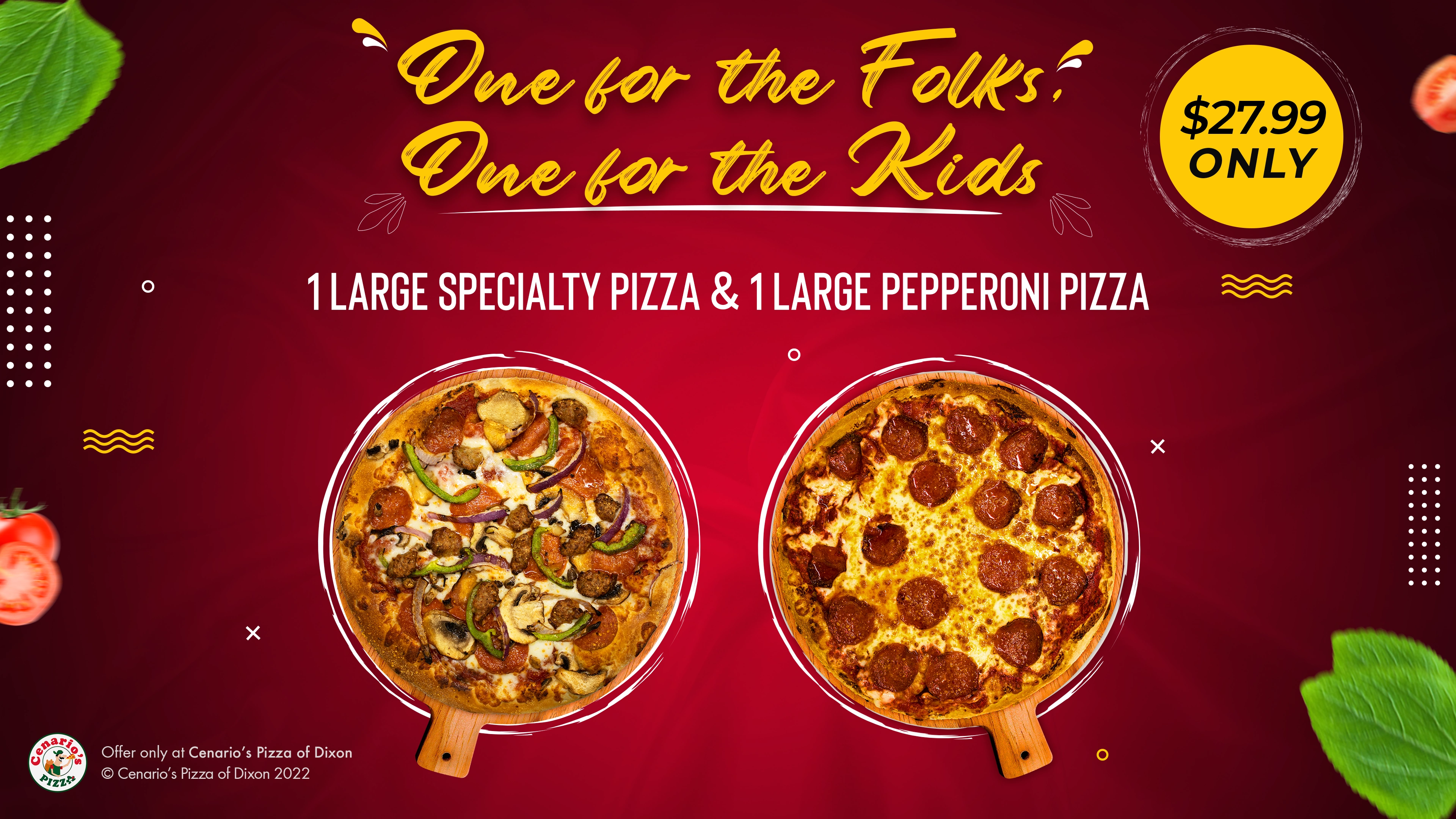
AFTER: Image of visually engaging "One for the Folks, One for the Folks" coupon, created as part of a brand refresh visual design sprint
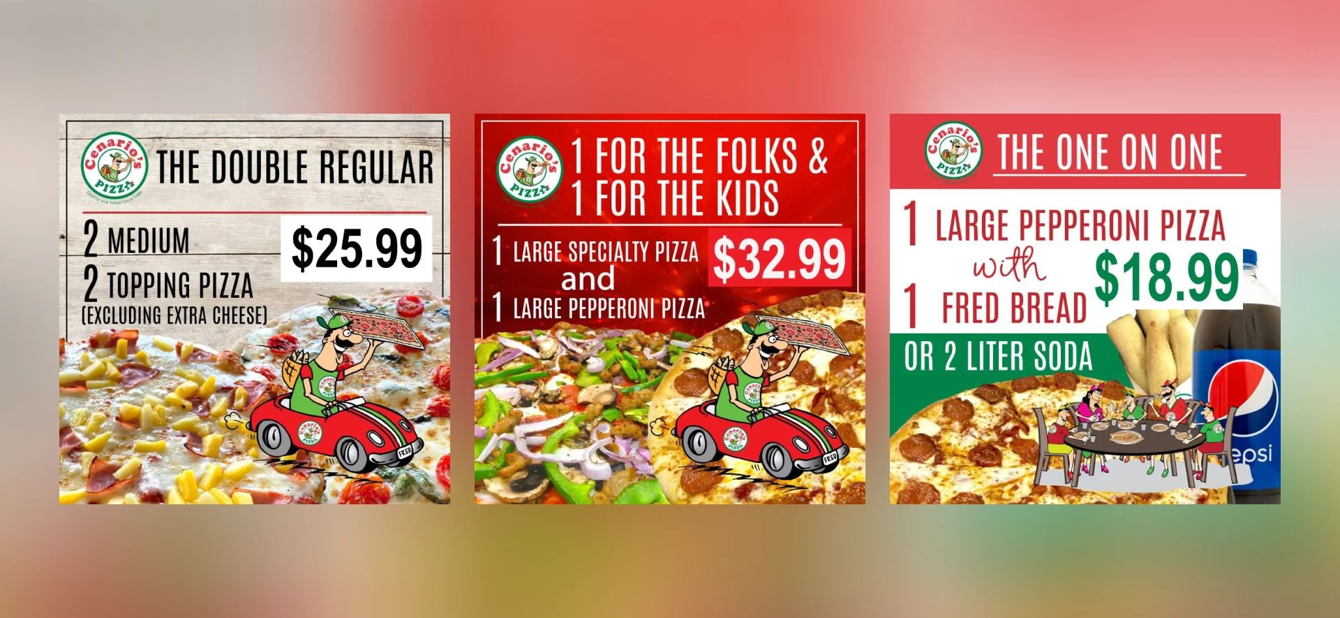
BEFORE: Compilation image of the old, less visually appealing pizza coupons
“Working with Open Omega has been a transformative experience for Cenario's Pizza and I highly recommend them. Saahil’s work has given us a premium feel and high-quality appearance. Our new website has set us apart in the market and we’re seeing excellent results in our revenues and customer feedback.” — Kelvin Guevara
Key Outcomes
This strategic visual design sprint delivered immediate operational and financial impact:
35% higher coupon redemption rates
Significant reduction in customer order times
Decreased staff time spent answering menu questions
Enhanced brand consistency across all touch points
Improved operational efficiency in-store
Reduced decision paralysis among customers
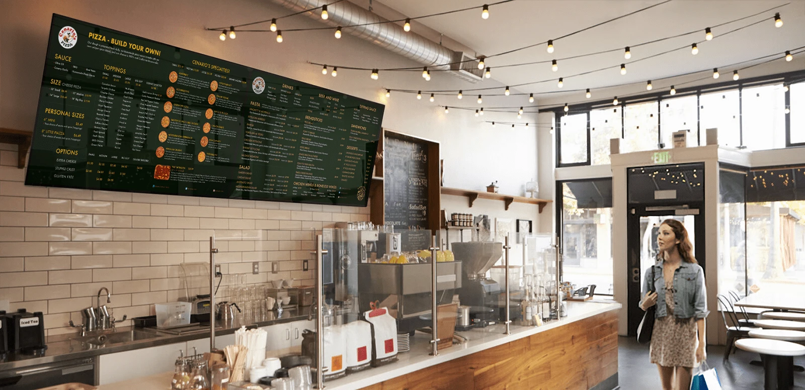
Mockup of a redesigned menu board displayed in-store, highlighting enhanced readability and visual appeal of the new menu design
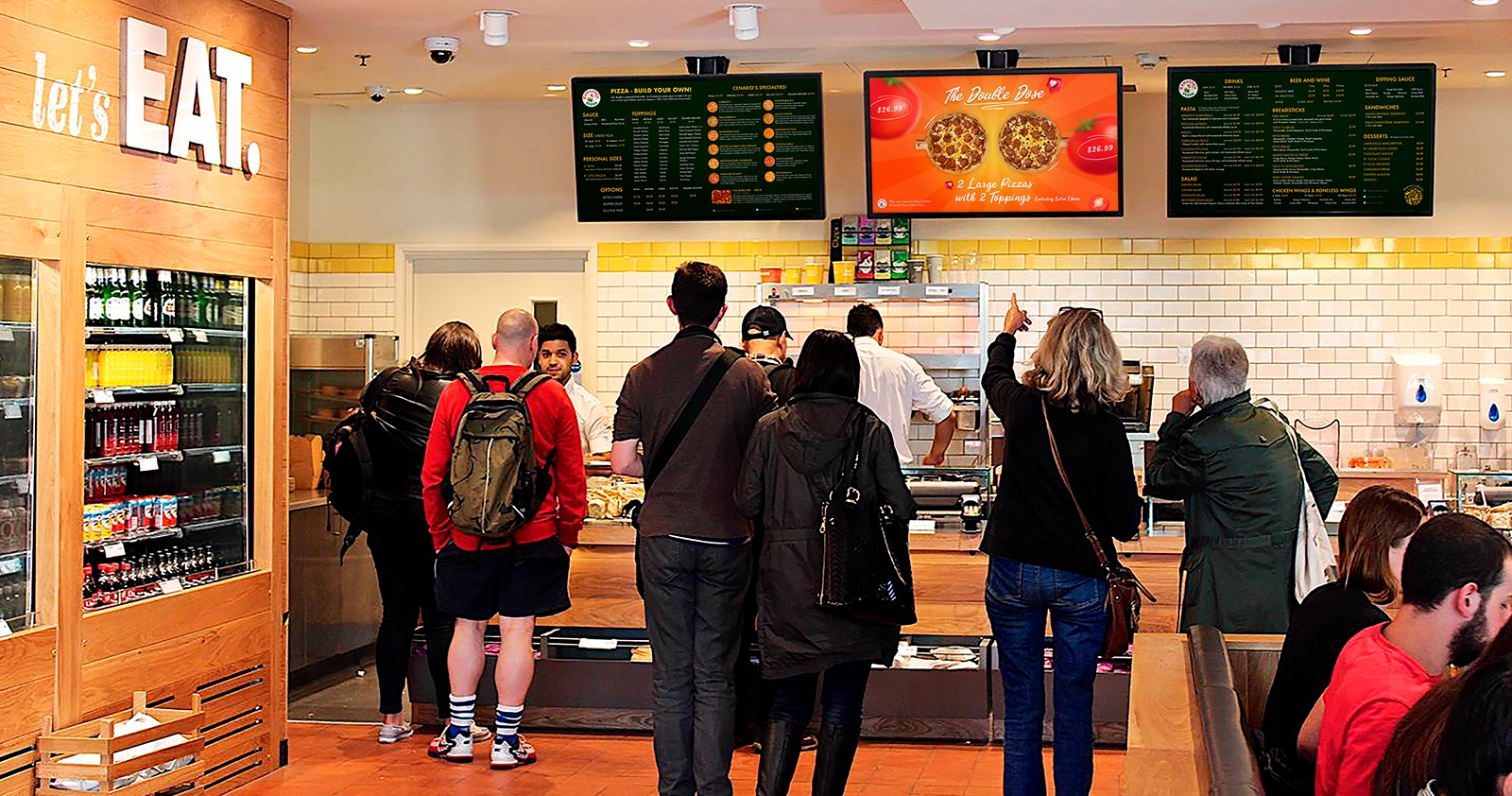
In-store mockup showcasing the cohesive visual branding achieved through the visual design sprint, highlighting both the redesigned menu and coupons
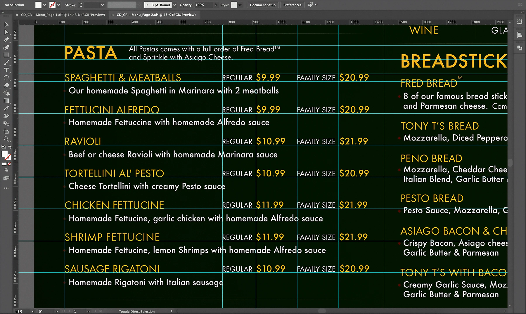
Work-in-progress image displaying the new menu's design, emphasizing the meticulous attention to detail during the visual design sprint
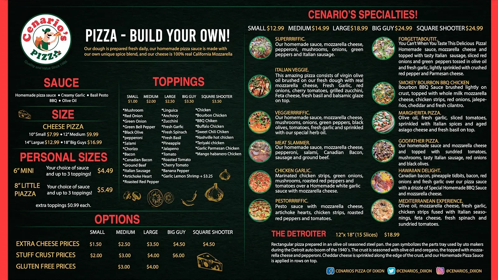
BEFORE: Image of the old menu, showcasing poor readability, visual hierarchy, appetizing images and cluttered design
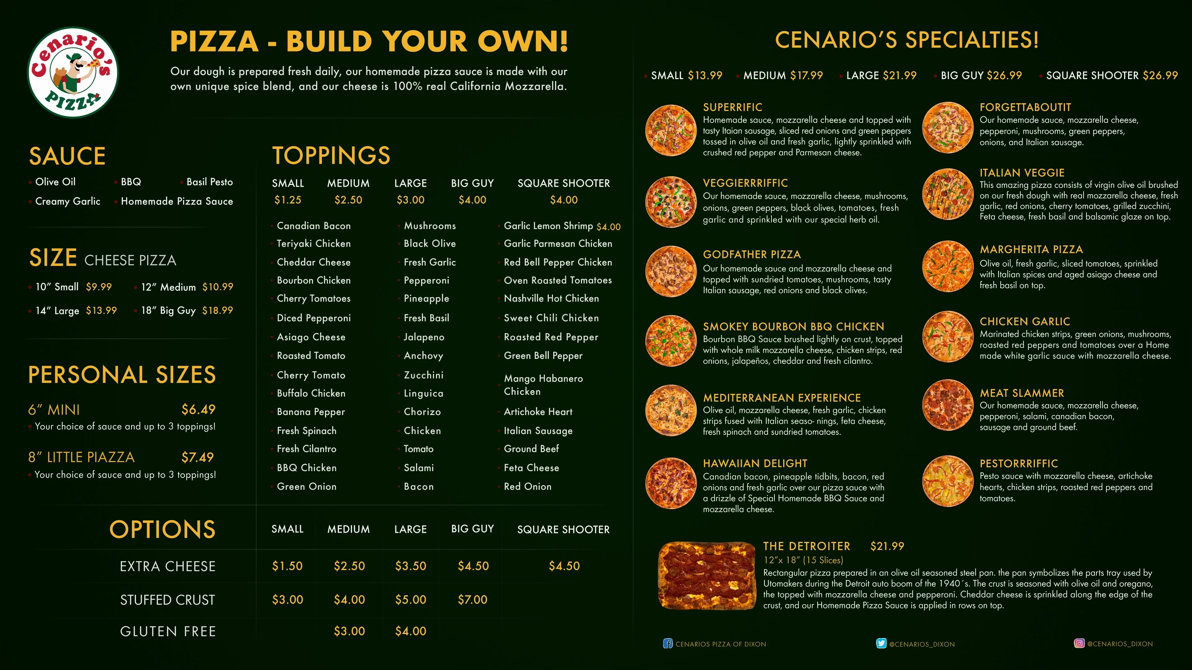
AFTER: Image of the redesigned menu with enhanced readability, clear visual hierarchy, appetizing images and a professional design aesthetic
You can read the full story here ↗
Let's Talk About You
I'd love to learn more about you and help you make your mark online. Click on “View Services” or "Get In Touch" to get started.
0 likes · 13 views · Jan 11, 2025
How my visual design sprint helped a beloved culinary institution boost revenue by 35% and transformed their in-store customer experience.

