
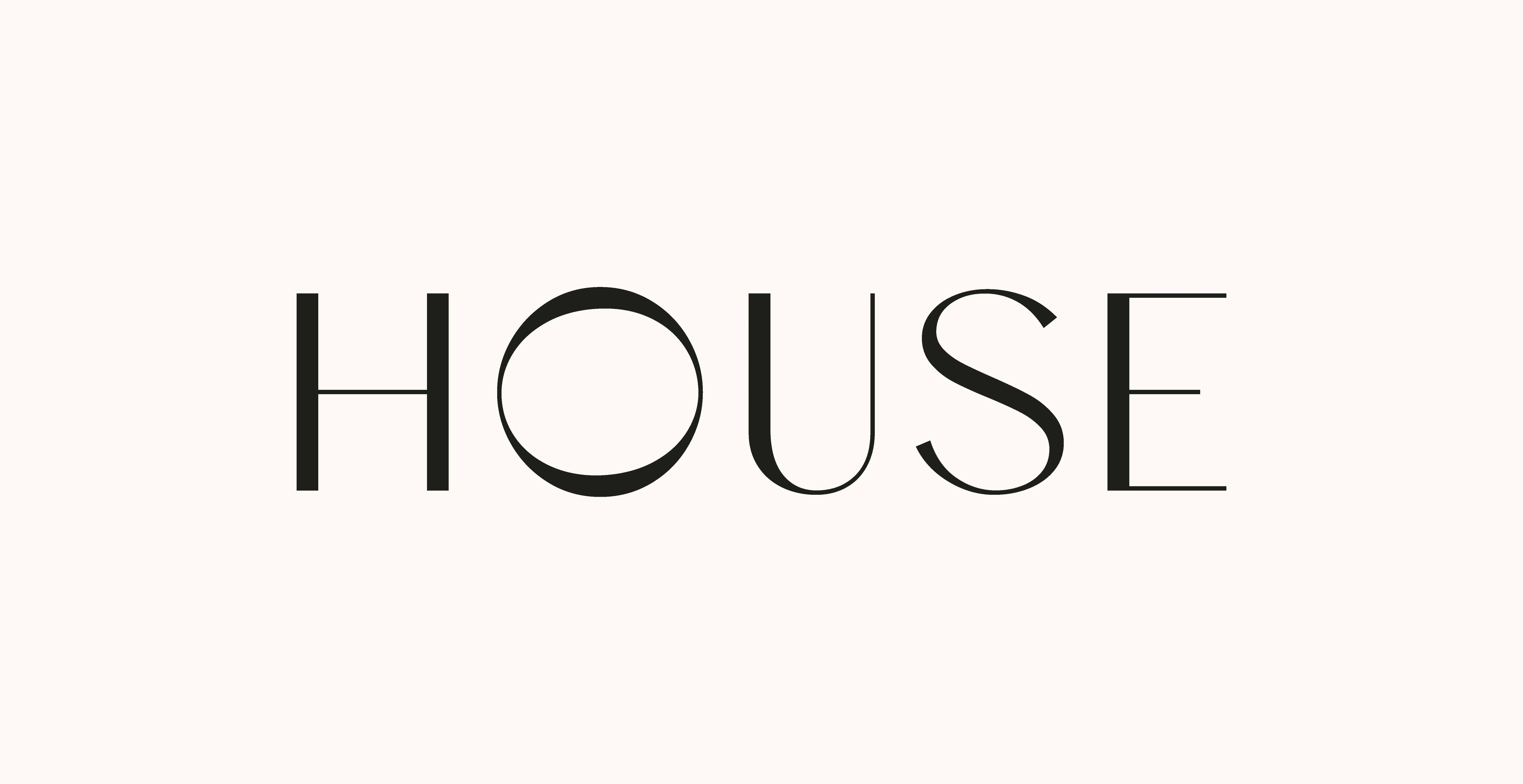
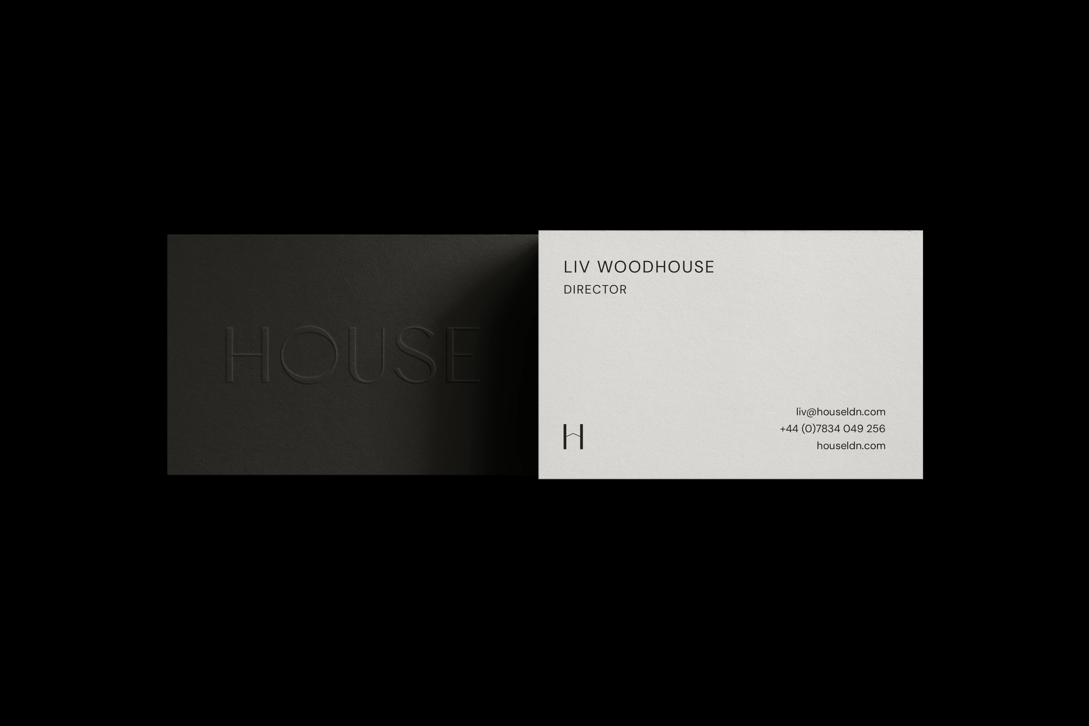
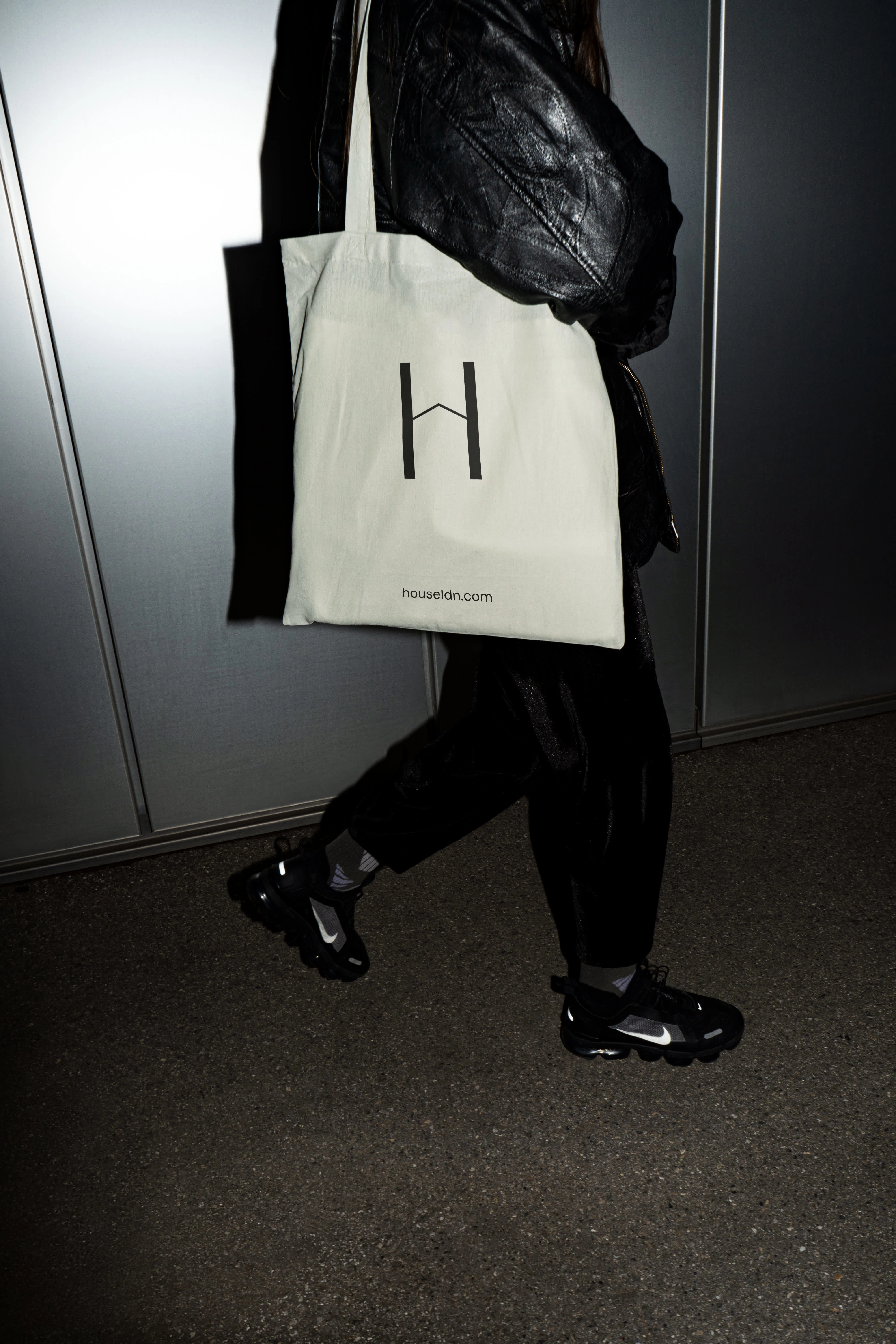
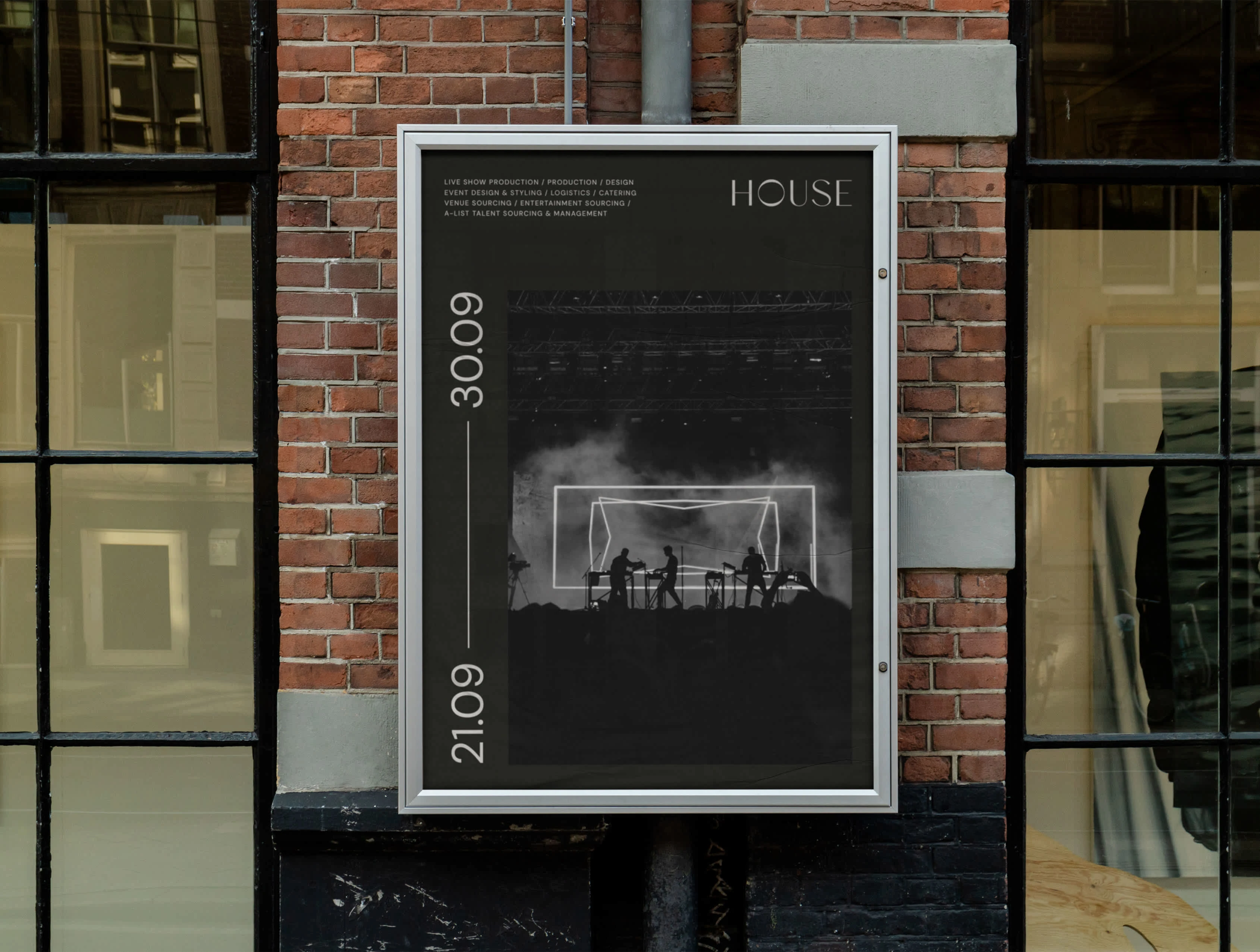
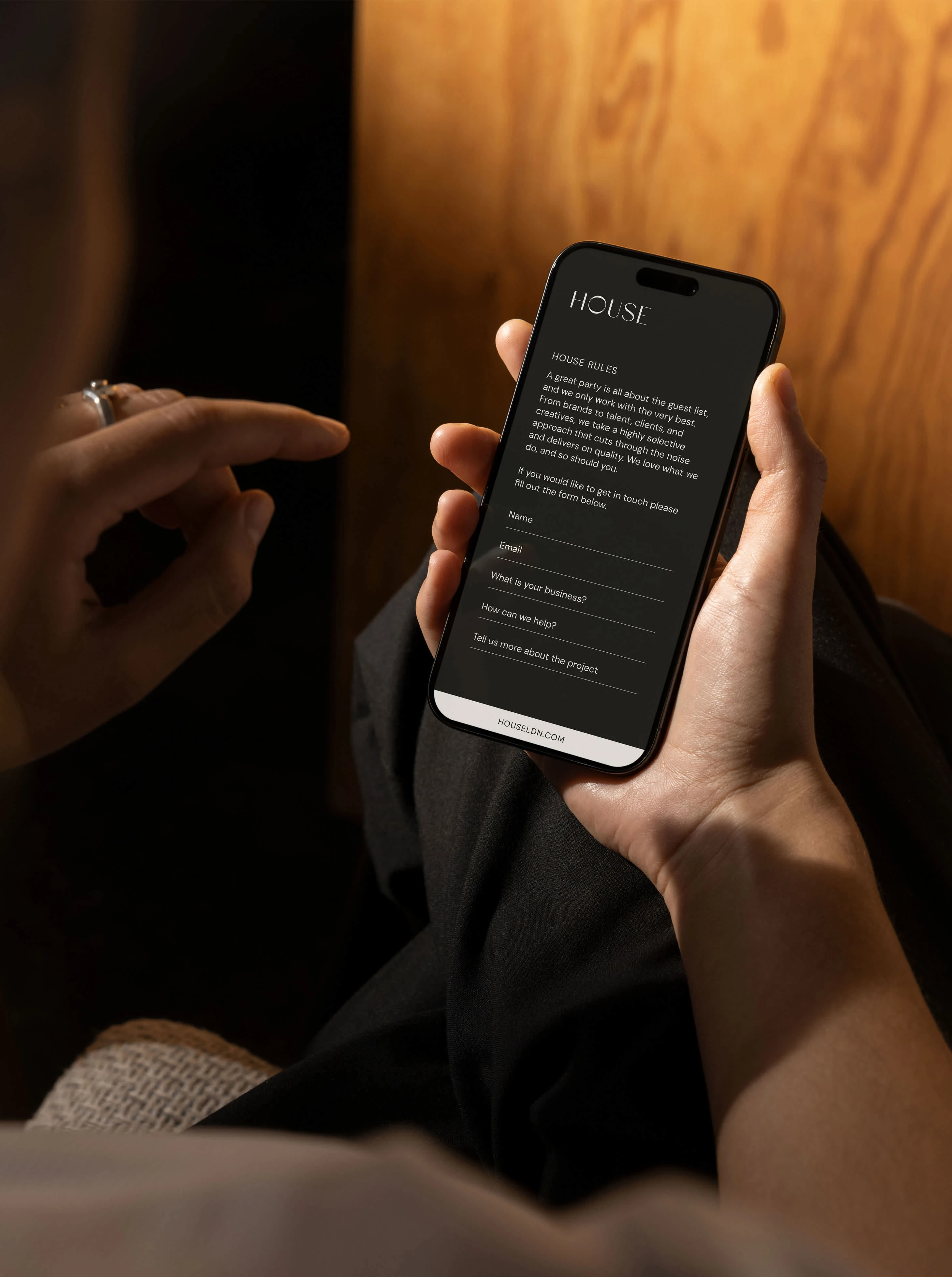
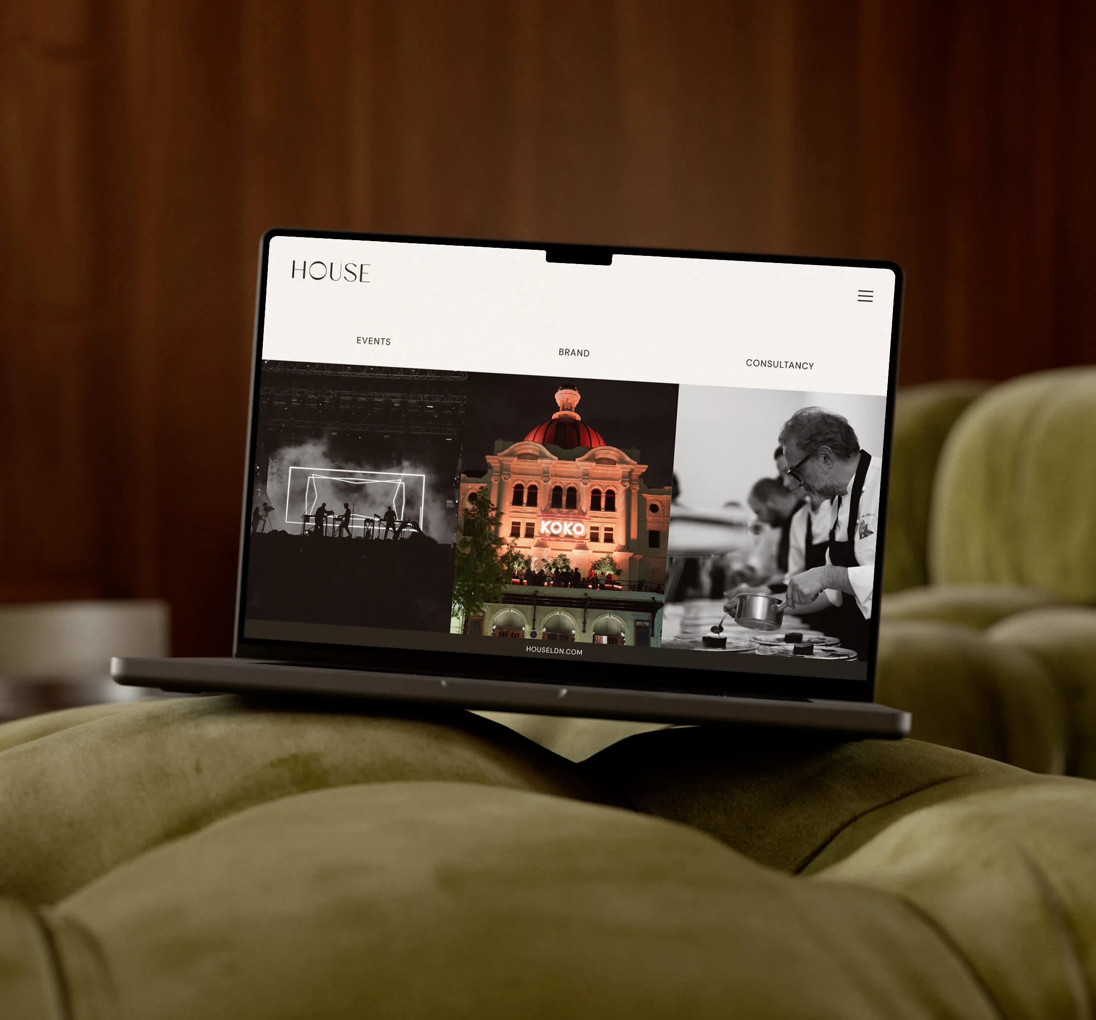
House goes beyond event planning—they create unforgettable experiences. For their rebrand it was important to reinforce their premier status in events. The refined logo mark features a twisted ‘o’ symbolising connection and flexibility. The brand icon abstracts the ‘H’ from the logo, with a subtle angle transforming it into a roof, alluding to the name “House” and their ability to provide comprehensive, all-encompassing event services. This paired with a monochrome colour palette and strong typefaces solidify House as the premium option for Events management.
0 likes · 11 views · Sep 16, 2024
House are a premium events and brand consultancy who were looking for a rebrand that helped solidify their position in the industry.


