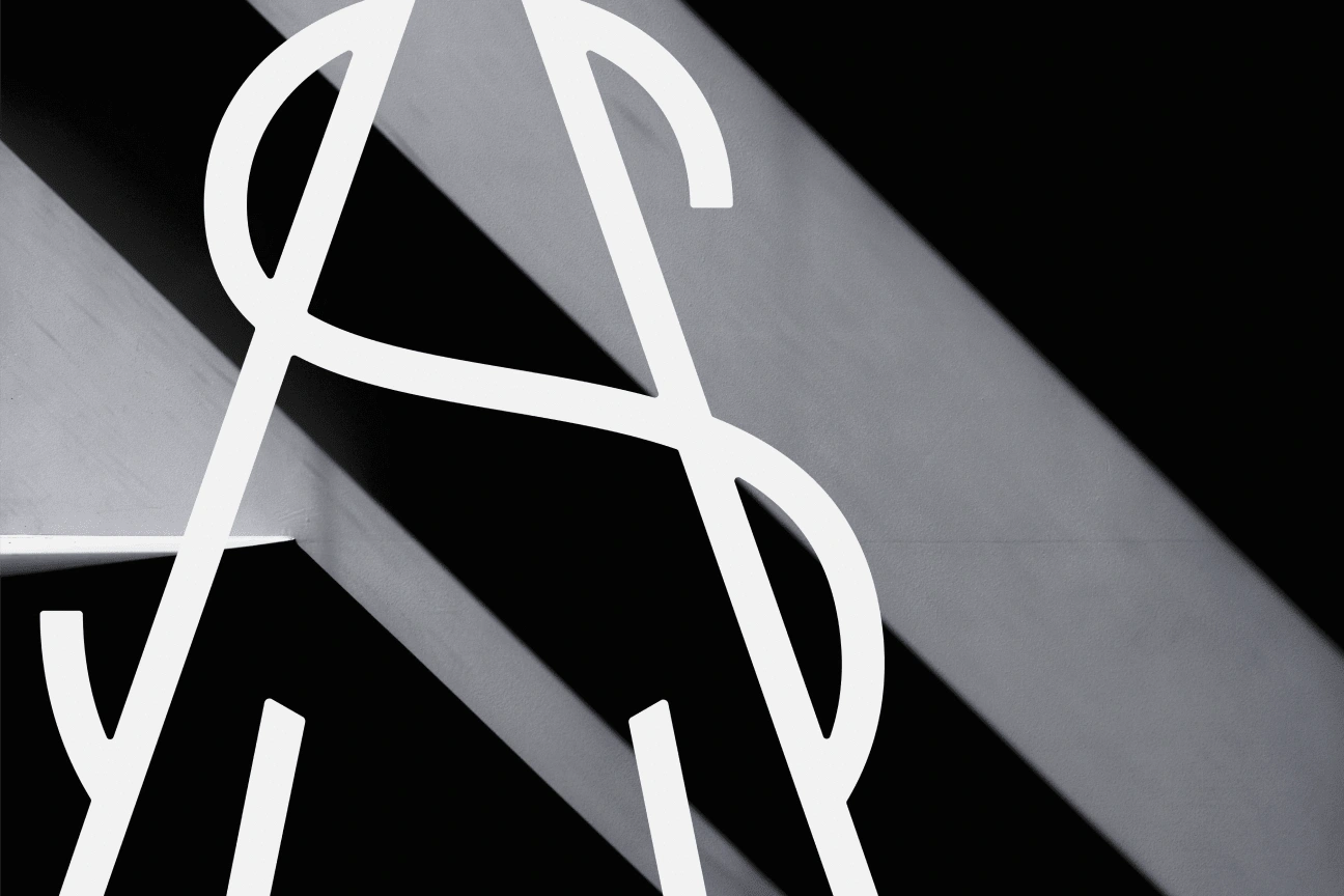
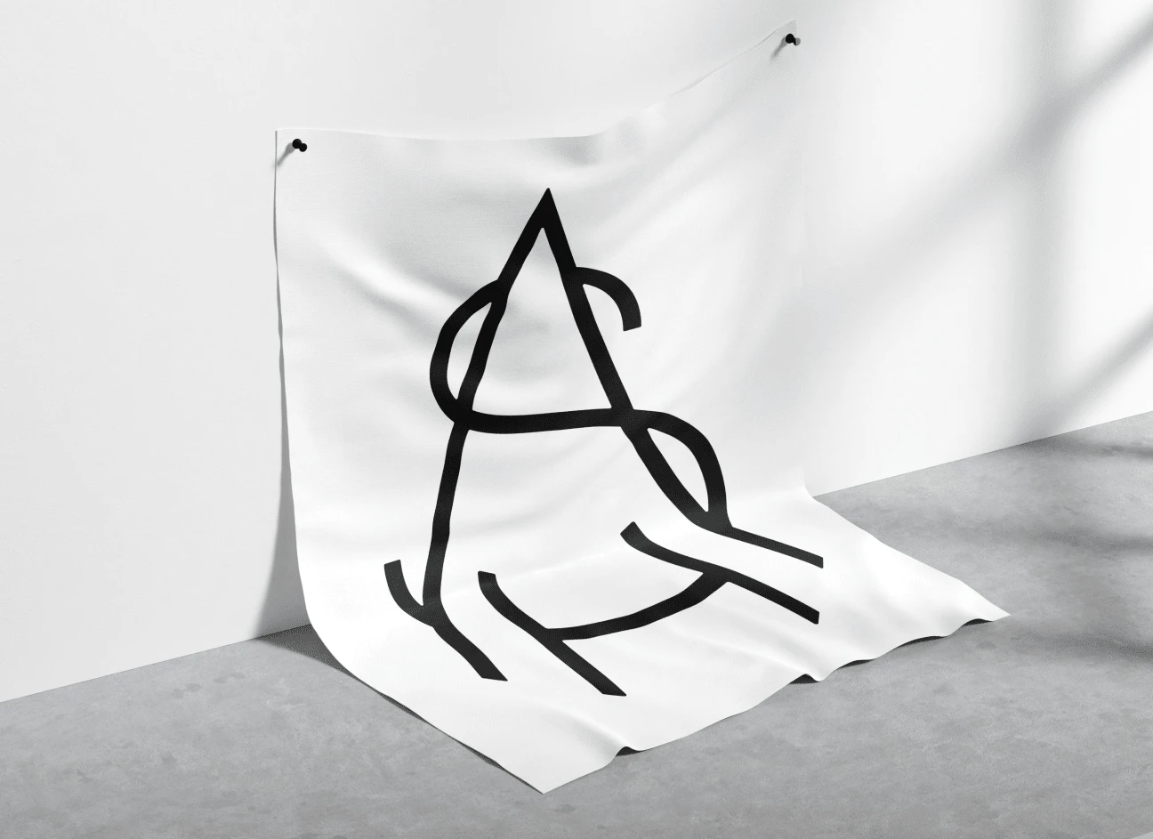
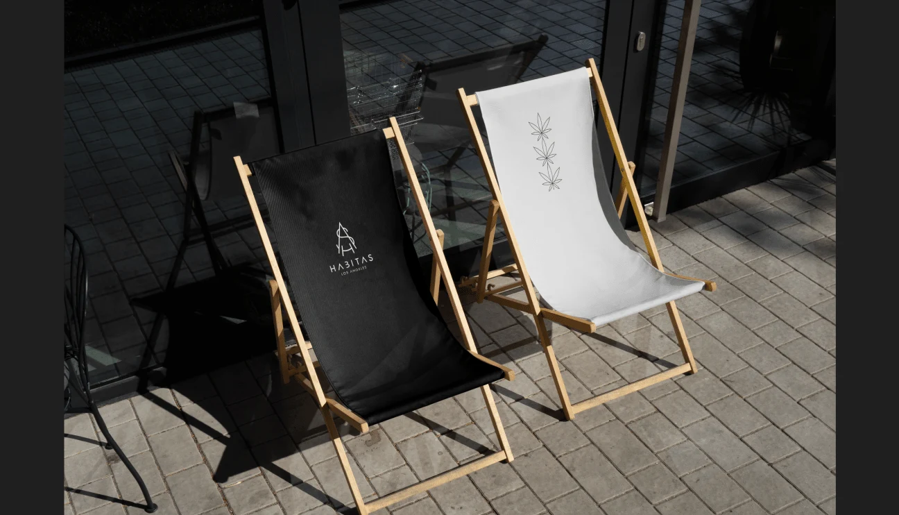
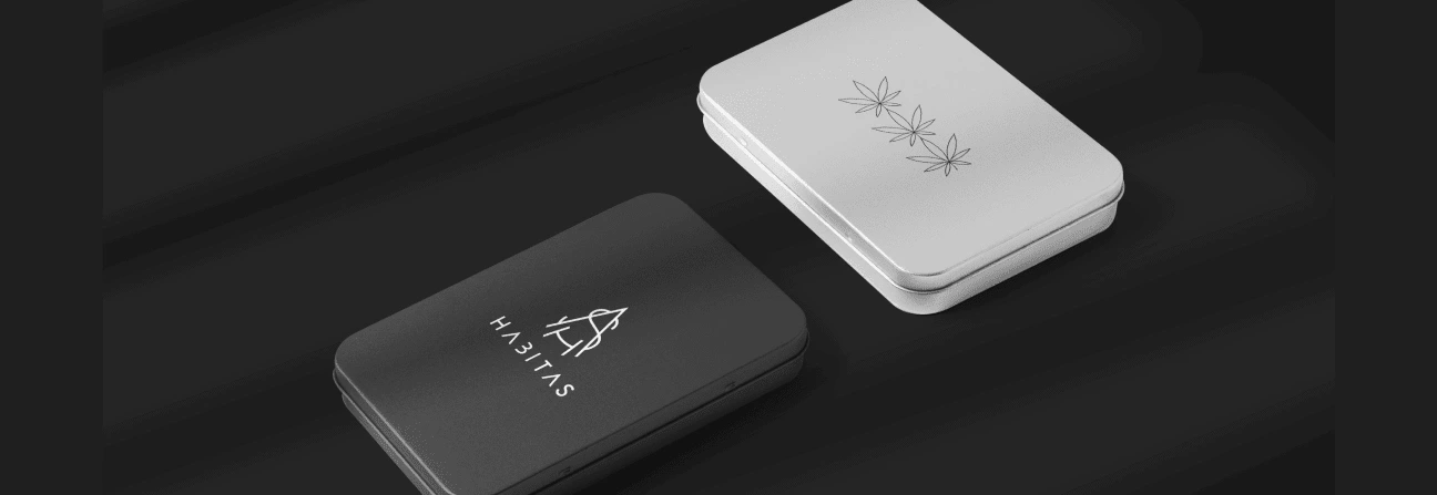
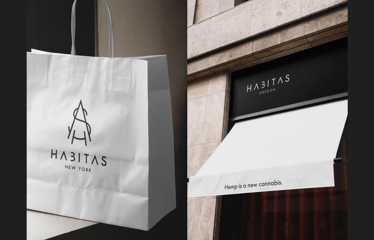
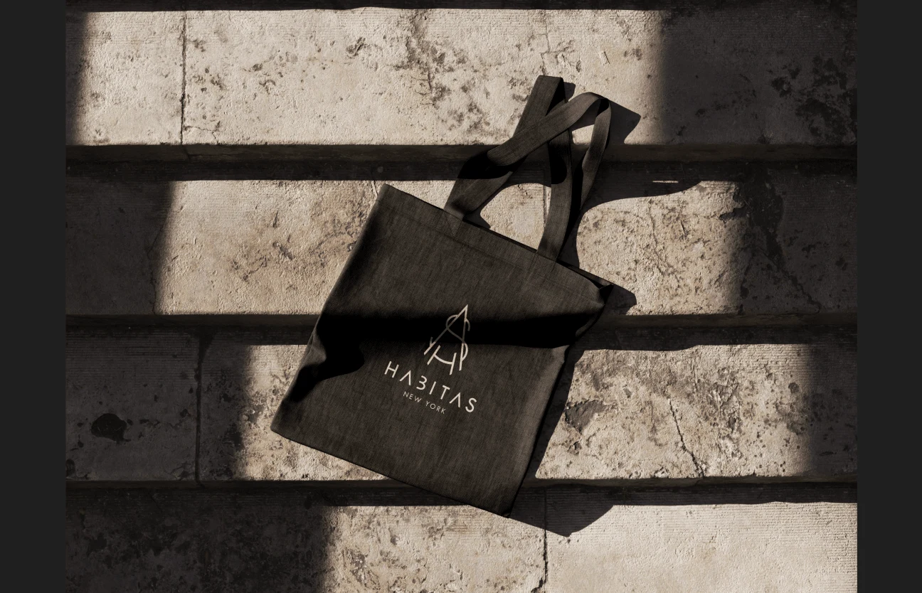
Logo design for coffeeshop chain Habitas
Daria Malovichko
The Client
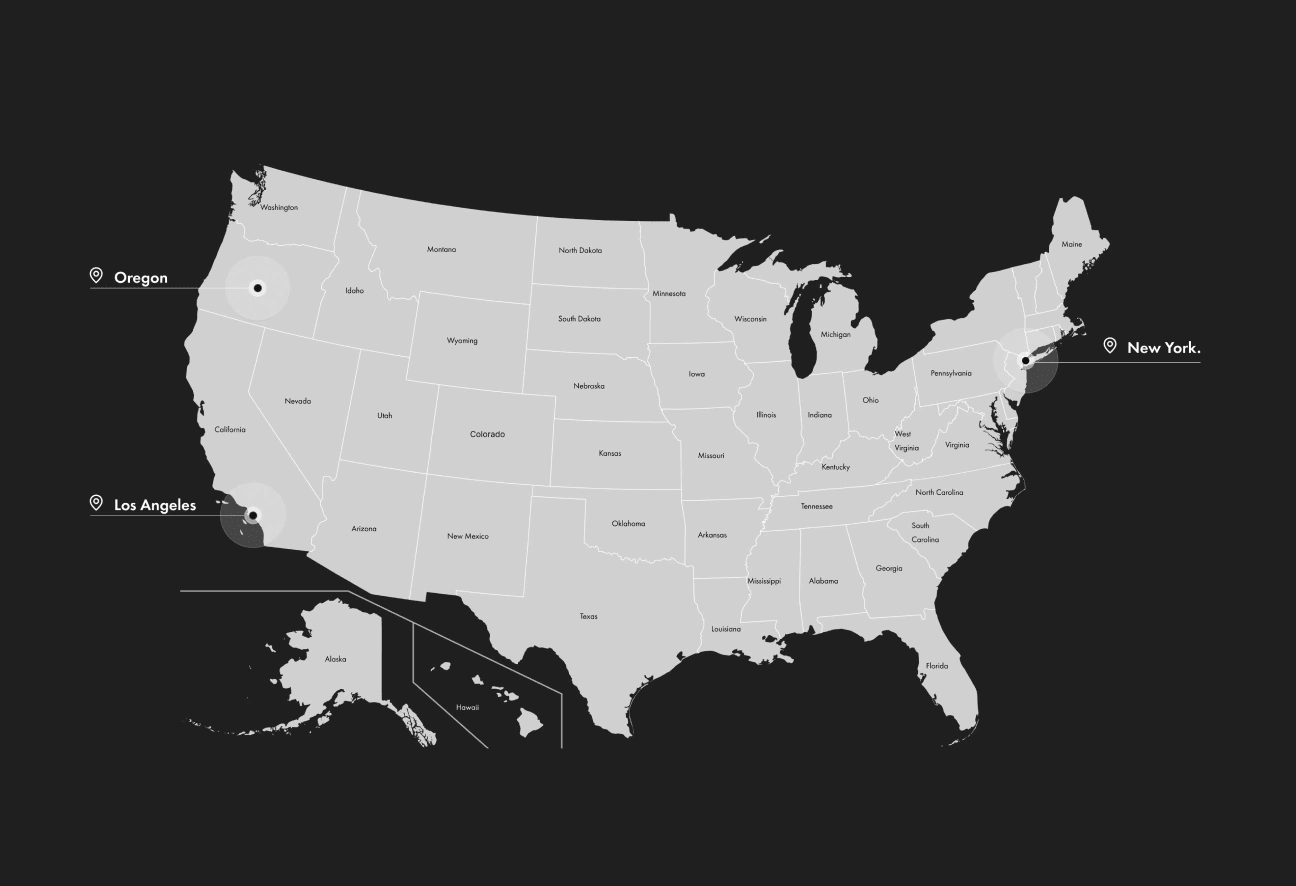
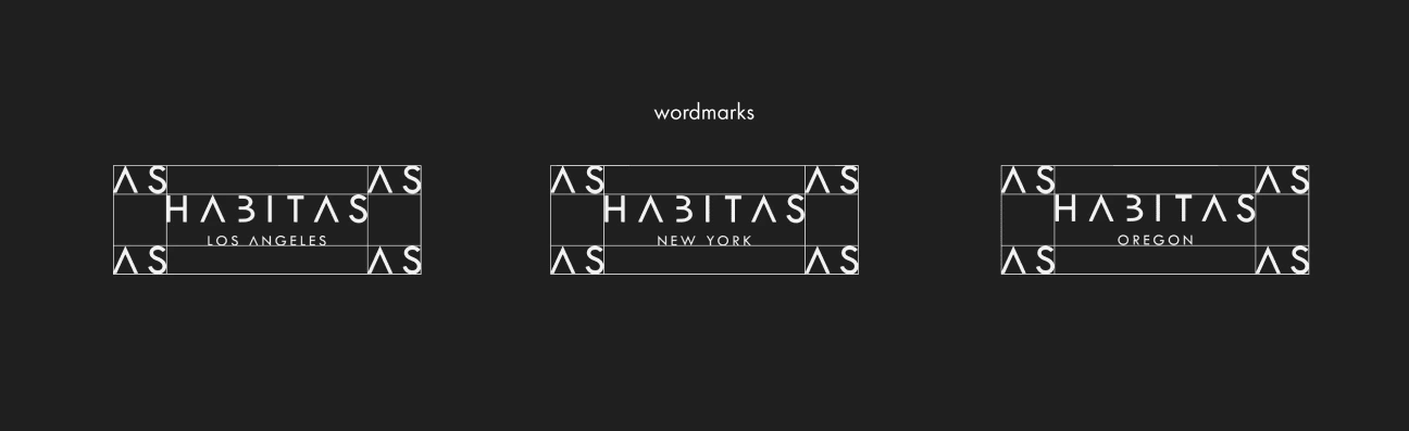
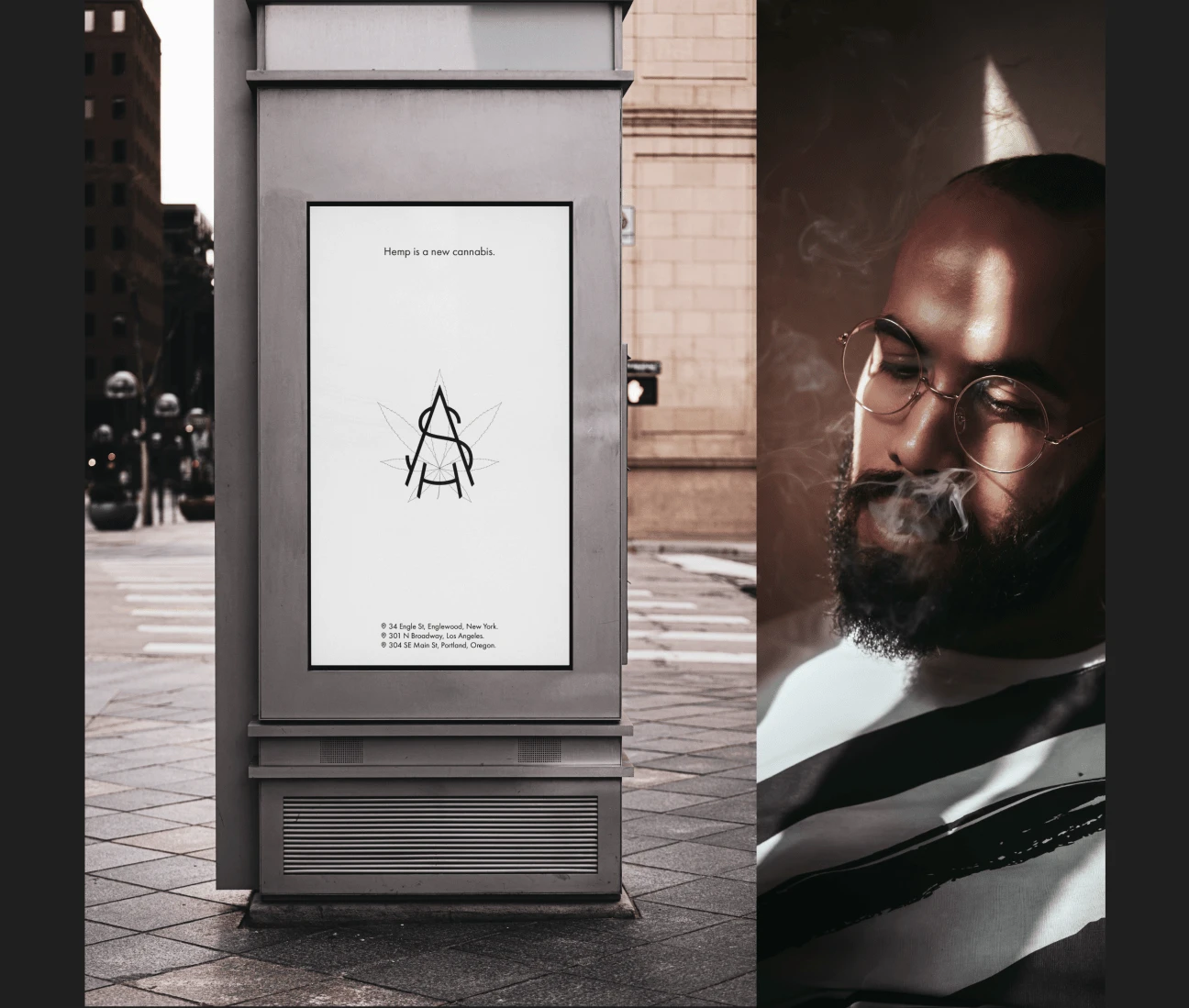
The project is an essential component of our work on the design system and brand identity for Inheal, a company that specializes in natural CBD products. During our collaboration with the brand creators, we decided to create Habitas, a sub brand that unifies several products under one philosophy. The creators of the brand also decided to open a chain of shops in Oregon, Los Angeles, and New York. Our task was to develop a logo and visual identity for the coffeeshops that would complement the overall style of the Inheal brand.
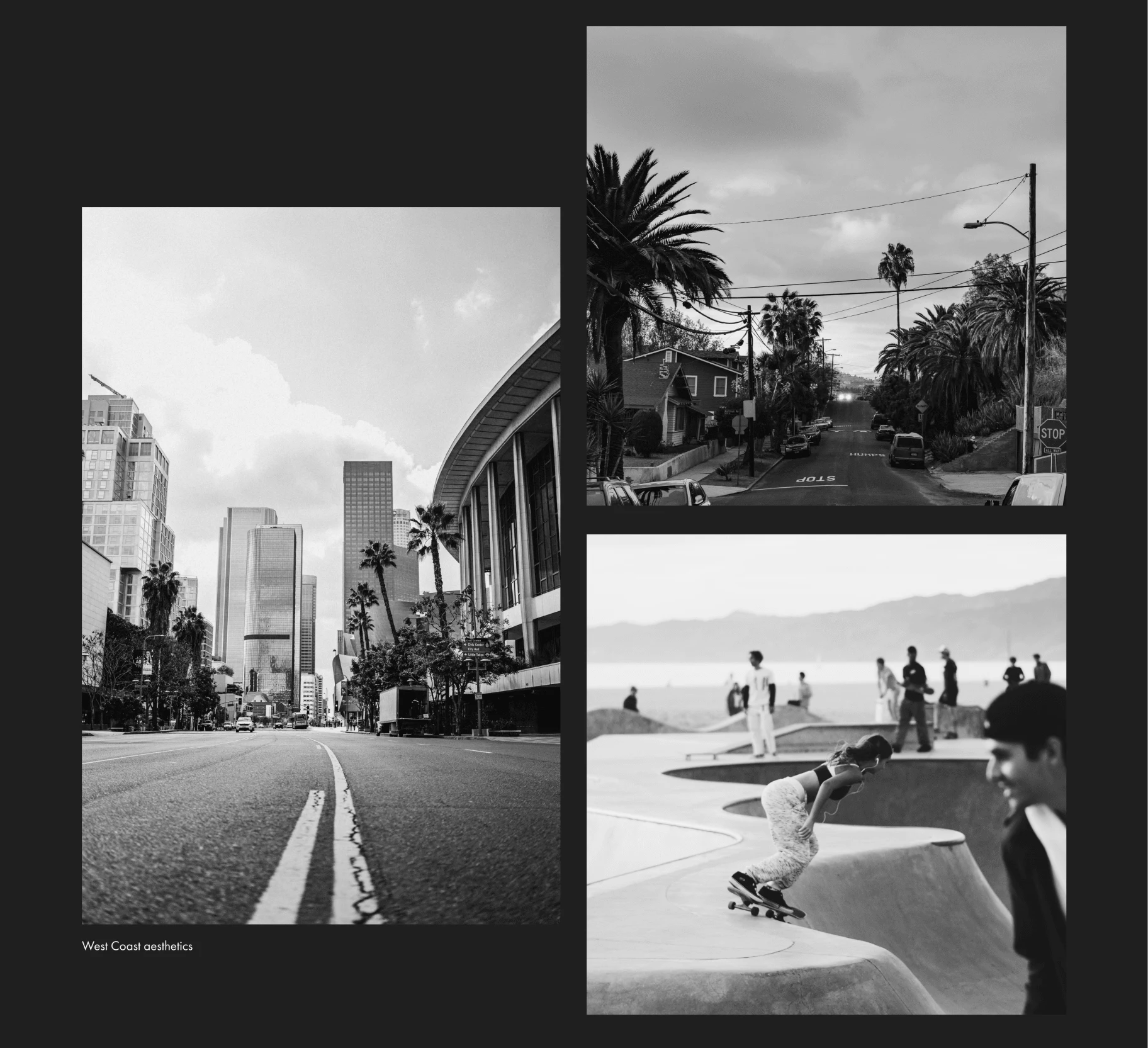
The Problem. A Tale of Two Coasts.
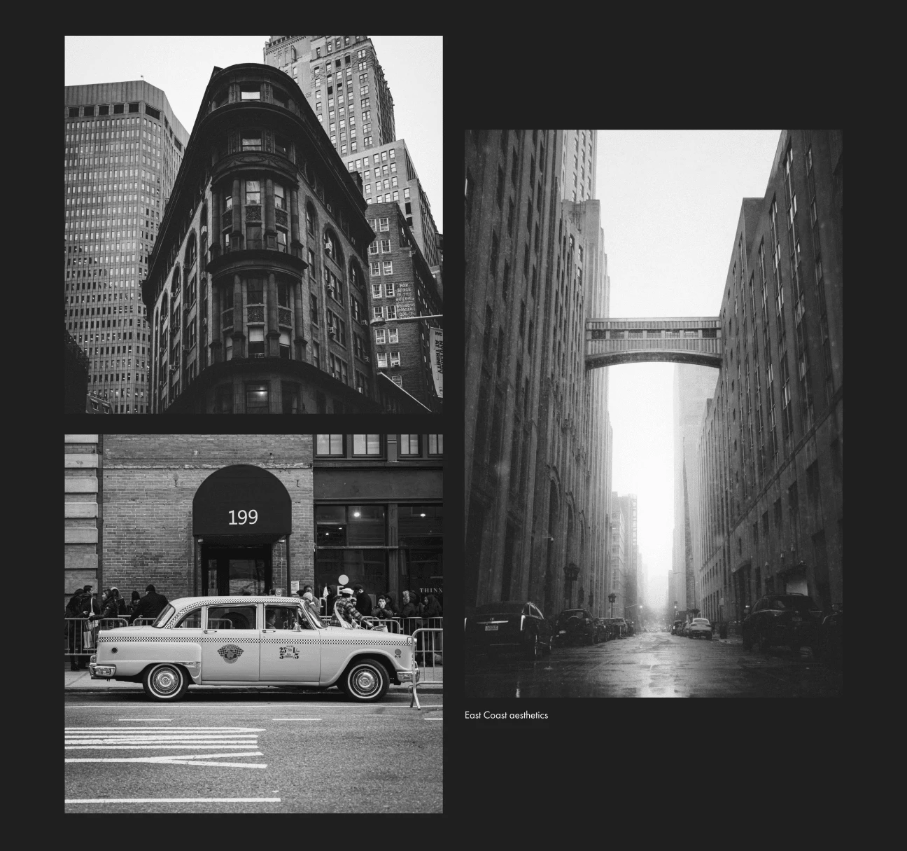
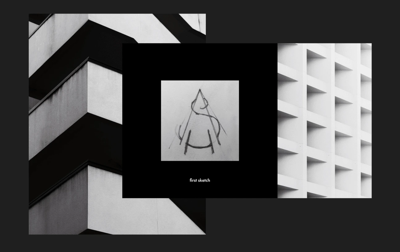
Habitas operates shops in three locations: one in New York, one in Los Angeles, and several in Oregon. Our goal was to create designs that would integrate with both East Coast and West Coast architecture, while also reflecting brand's unique identity. The East Coast is known for its rich color palettes and use of high-quality materials, while the West Coast tends to favor lighter, more neutral tones. The West Coast is often associated with a laid-back, easygoing culture, while the East Coast is seen as more uptight, rigid, and conservative. Our task was to design a logo and brand identity that would not only fit harmoniously into the landscape of each location, but also be appealing and recognizable to the target audience on both coasts.
The Solution. Common Ground
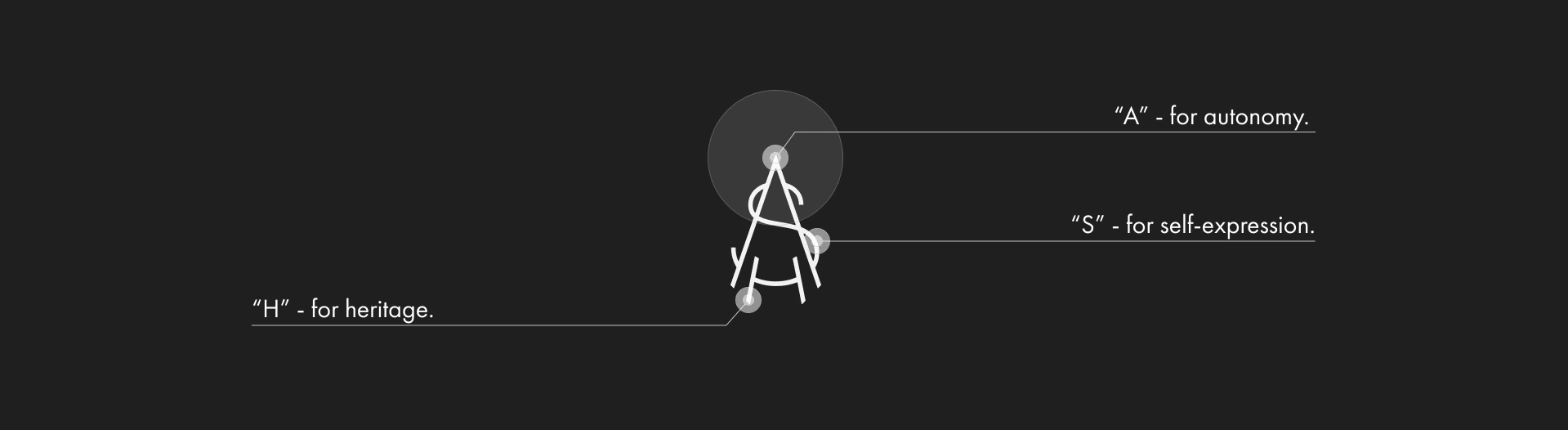
We focused on the values that are shared by both cultures. What do they in common? Actually West Coast and East Coast do have many fundamental similarities. Both coasts are home to many entrepreneurs and startup companies, and there is a strong culture of innovation and risk-taking in the context of both cultures. This may be partly due to the fact that both coasts are centers of the tech industry. East Coast and West Coast are known for their emphasis on personal expression and individualism. Both coasts are known for being more open to new and progressive ideas than other parts of the country. We decided to reflect in the logo those unifying qualities that help people from the West and East Coasts stay on the same page.
First of all, it is a concern for heritage. Both coasts have a rich history of cultural diversity, which has shaped the architecture and design of their cities. Both coasts have seen the influence of various immigrant groups over time. Both regions have been greatly affected by the colonial era.
Secondly, it is autonomy and an emphasis on personal development.
And finally, self-expression that penetrates through all epochs of the development of regions and was more of an obligation, not a privilege. The historically favorable conditions for innovation and starting business attracted adventurers from all over the world.


💡 Spatio is a full-service creative studio specialising in brand design, web design, marketing and creative direction! Have a challenging project? 🌞
🌟 Say Hi on Our Instagram
Thanks for watching and have a nice day :)
Like this project
Posted Apr 24, 2024
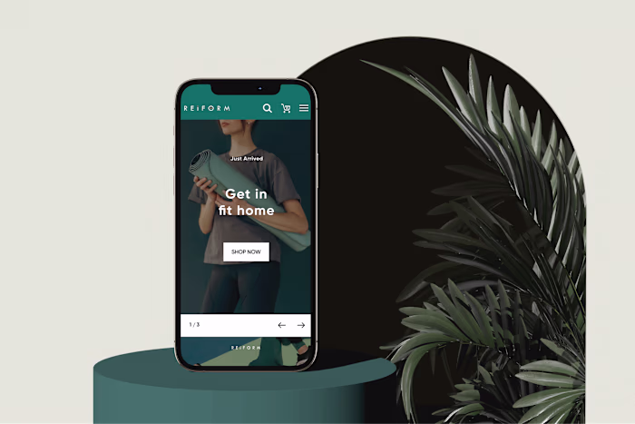
This project entailed creating a visual identity, brand strategy and personality for a chain of coffee shops operating in Oregon, Los Angeles, and New York.