Reiform Brand Identity
Daria Malovichko
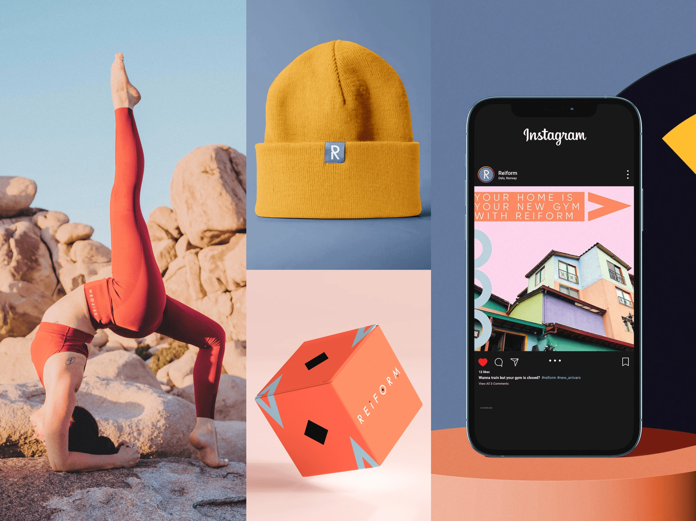
Reiform is a Norwegian company that provides fitness equipment for home workouts. The brand was launched to help people stay fit during the lockdown. It aims to offer a quick and easy solution through its intuitive website, dozens of filters, and fast delivery. The entire project is energetic and simple, much like orange juice.
Norway, Oslo, 2021
Stage 1.
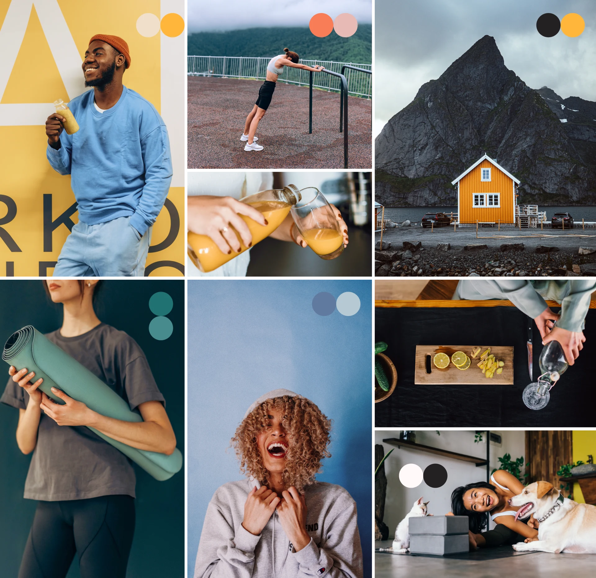
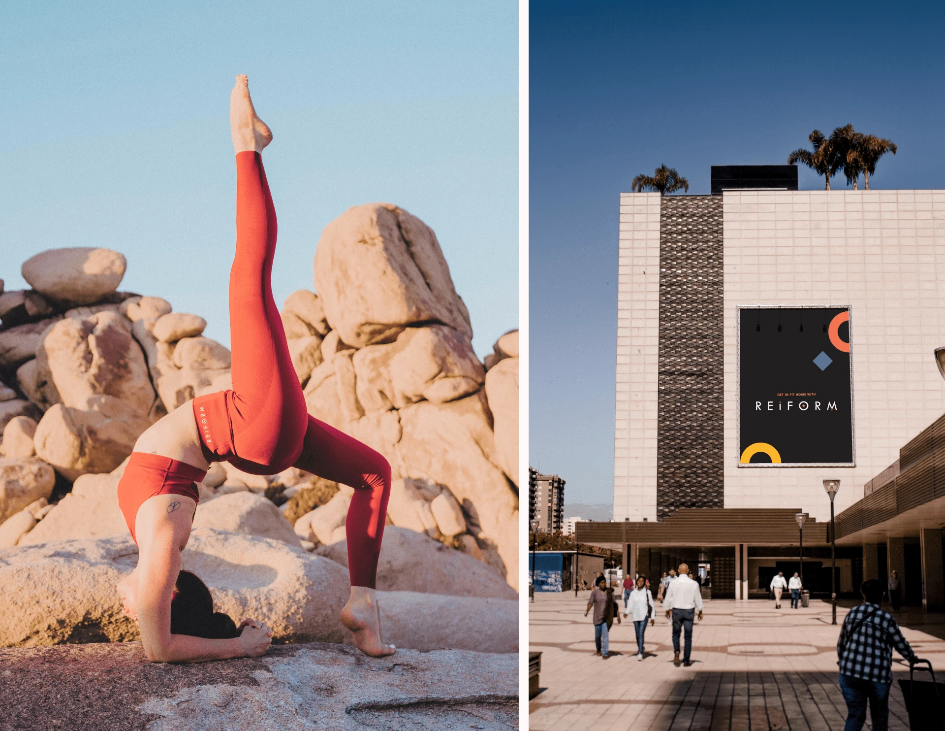
Imagery
We decided to start by looking for images that would not only convey the mood, but also be used for social networks, which are the main way to get traffic to the web site. Images should convey a sense of Scandinavian style, an active attitude and a healthy lifestyle.
Stage 2.
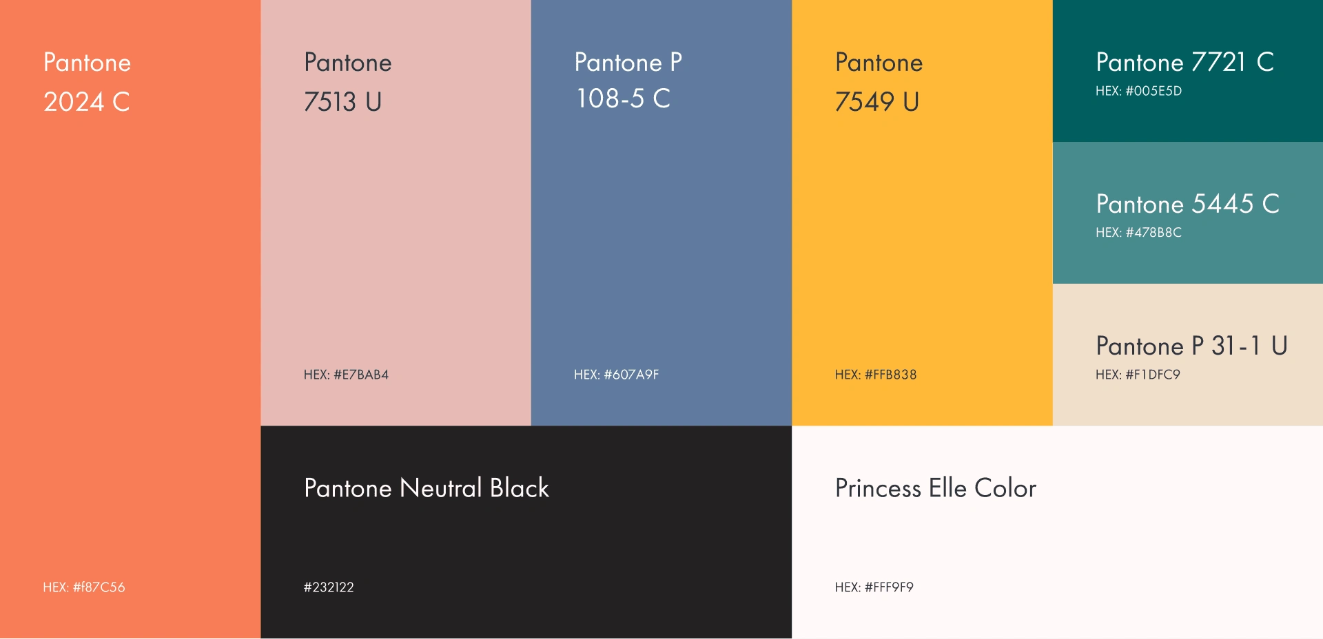
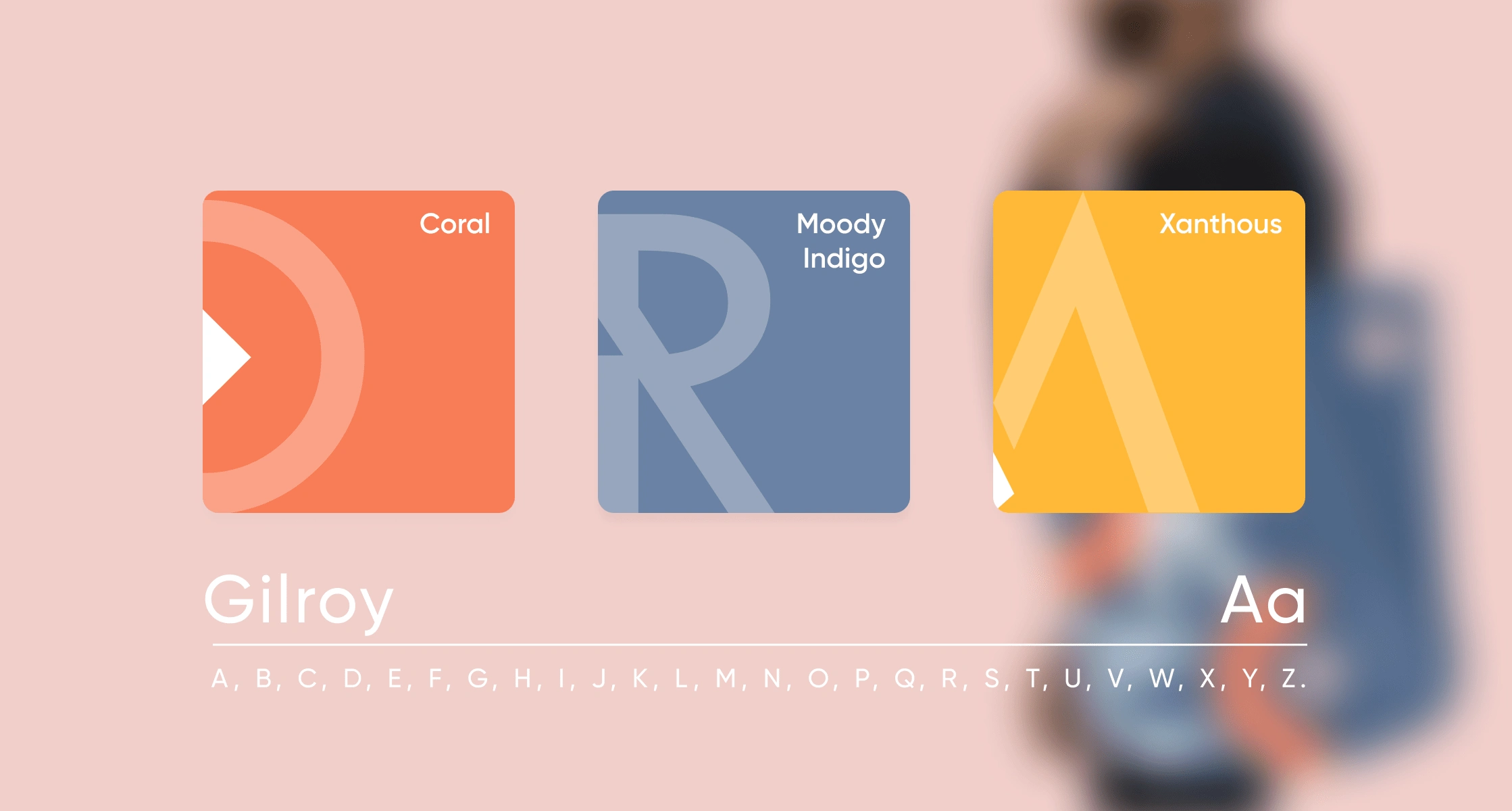
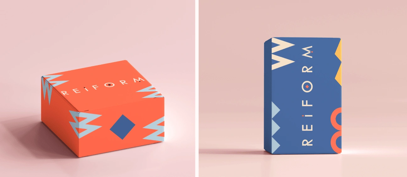
Color palette and brand pattern
While working on imagery, we determined which shades work best for our purposes. We identified the repeating colors in the photographs, unified them, and transferred them to the Pantone codes, thereby obtaining our new color palette.
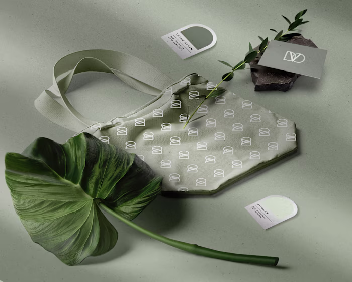
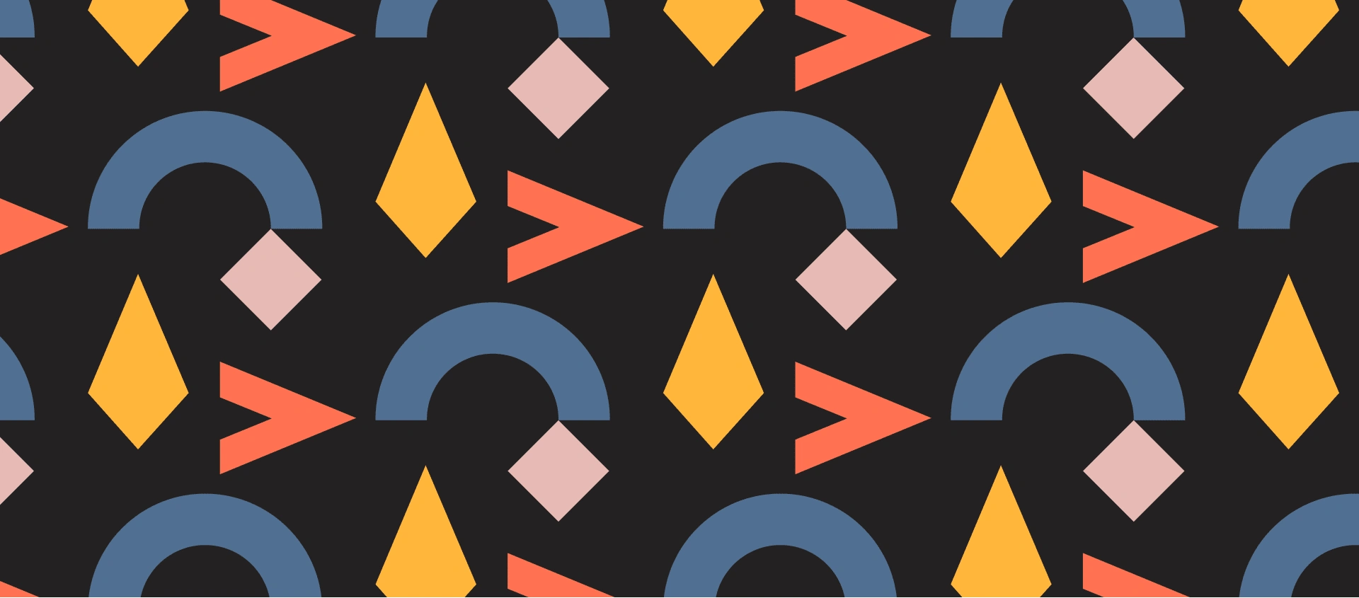
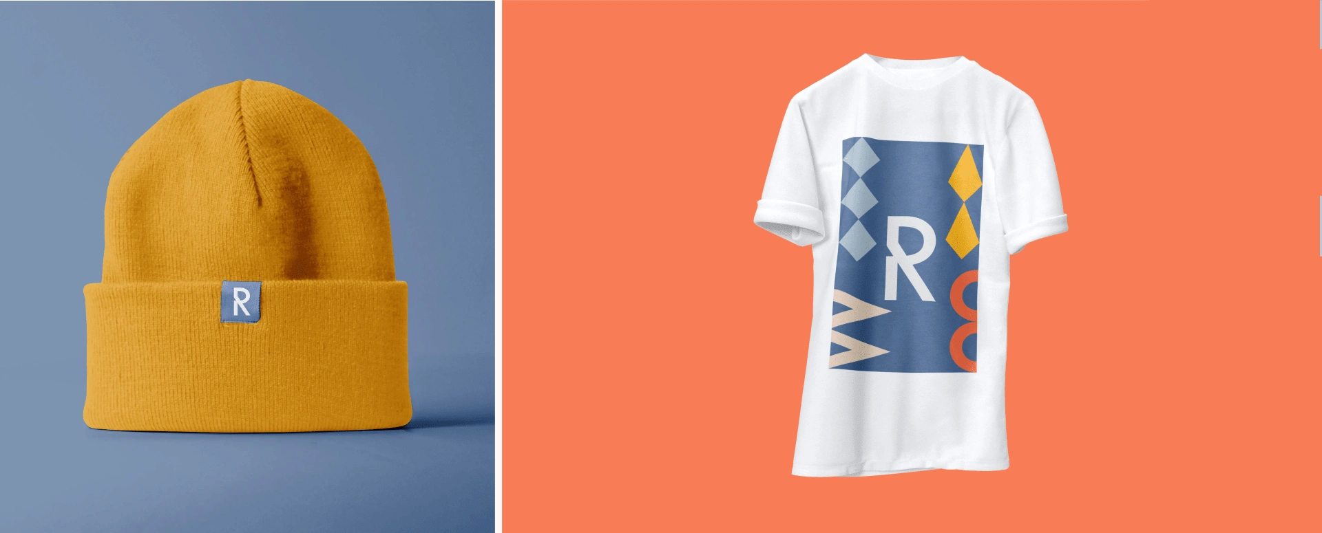
The logo's outline also served as the basis for highlighting the main graphic figures in the font. We have identified four repeating figures, which served as the basis for creating a pattern and will subsequently be used for packaging design.
Stage 3.
Typography
For the logo design, we decided to use a font called Tw Cen MT. 20th Century was designed and drawn by Sol Hess in the Lanston Monotype drawing office between1936 and 1947. This is a face based on geometric shapes which originated in Germany in the early 1920's and became an integral part of the Bauhaus movement of that time.
Form and function became the key words, unnecessary decoration was scorned. This clean cut, sans serif with geometric shapes is the most appropriatefor the Reiform logo design. We chose a font that could be well implemented in the Swiss layout and at the same time differed from popular fonts like Futura or Helvetica. 20th Century will be used for text that needs to be highlighted: headings, call to action text, slogans, etc.
However, we have chosen a different font for the body text, since the regability of the 20th Century is not very good in small sizes. Gilroy fits perfectly into theidentity. It is used more for practical needs, but it also fits well into the dynamics of the Swiss style.
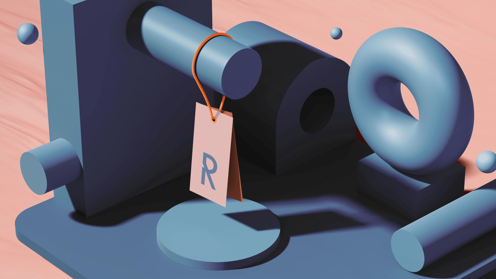
Stage 4.
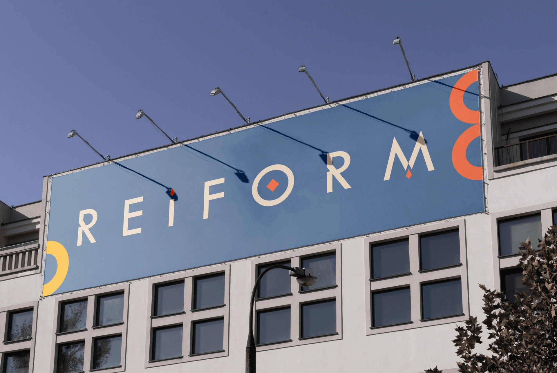
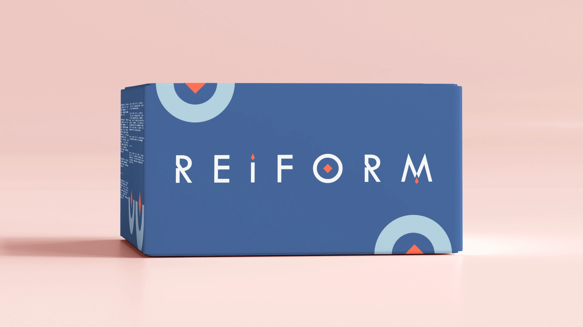
Logotype
The logo should be used carefully at low resolutions. Where it is necessary to preserve recognition, but it is allowed to neglect the full name, it is advisable to usea logomark. A set of brand figures and patterns based on them are created based on every second letter of the name. Thus, the pattern looks good along with the logo and adds uniqueness to the design.
Stage 5.
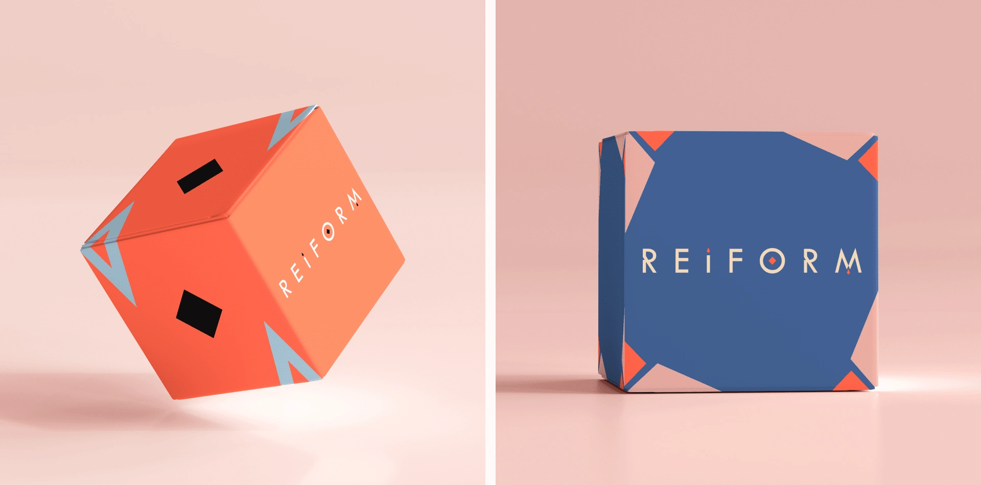
Packaging
💡 Spatio is a full-service creative studio specialising in brand design, web design, marketing and creative direction! Have a challenging project? 🌞
🌟 Say Hi on Our Instagram
Thanks for watching and have a nice day :)
Like this project
Posted Apr 22, 2024
Reiform is a Norwegian company that provides fitness equipment for home workouts. The entire brand identity is energetic and simple, much like orange juice.