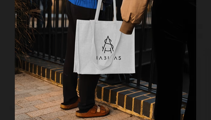
Habitas Brand Identity
About
Habitas is a Californian brand that produces CBD-containing products. It strives to make a warm impression as if you are having dinner with your closest ones at home. Habitas is a habitat; it encourages you to be here and now. The brand embodies family, traditions, and unity with yourself and others in our fast-paced world.
USA, Los Angeles, 2022
We aimed to move away from aggressive colours and overly eccentric typography in order to create a universal identity. Identity that can be aimed at a wide target audience.
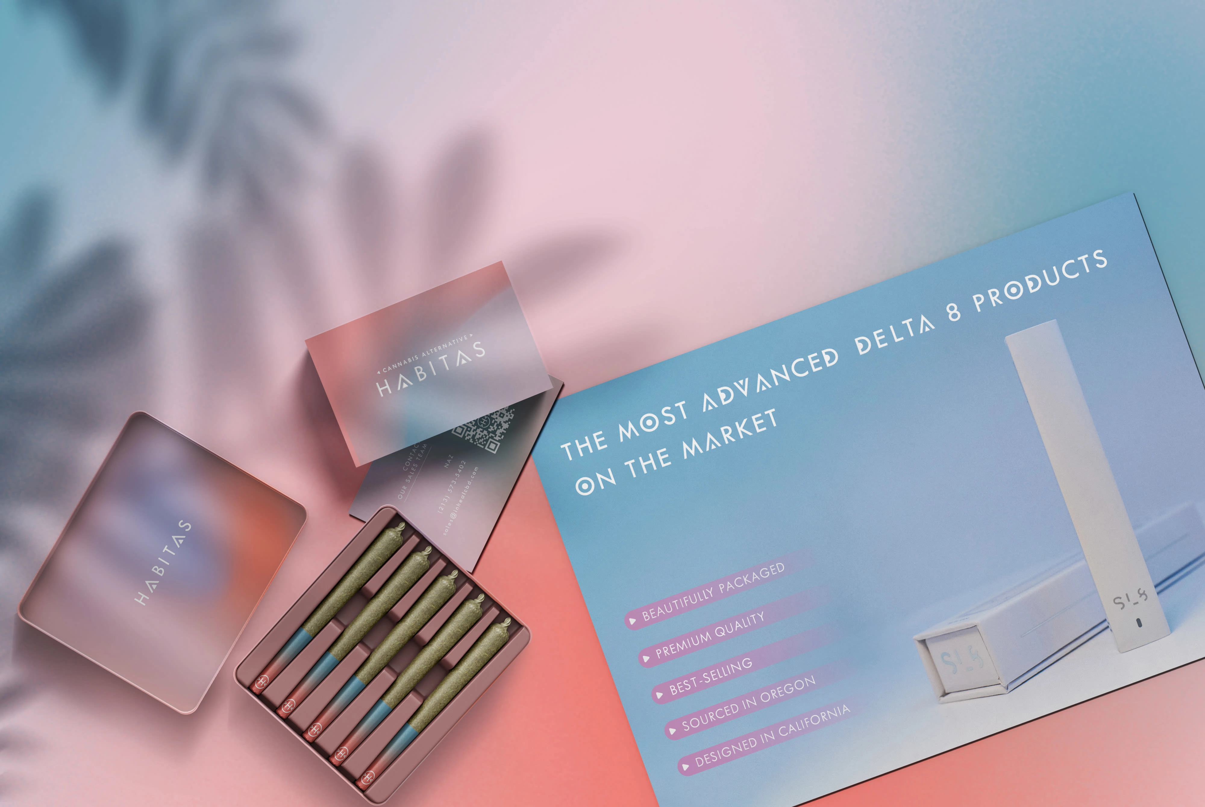
Deliverables:
Logo design;
Visual identity (color palette, typography, imagery, brand guidelines);
Printed matter and marketing matter (letterhead, e-mail signature, postcard, gift-card, business card, price-list);
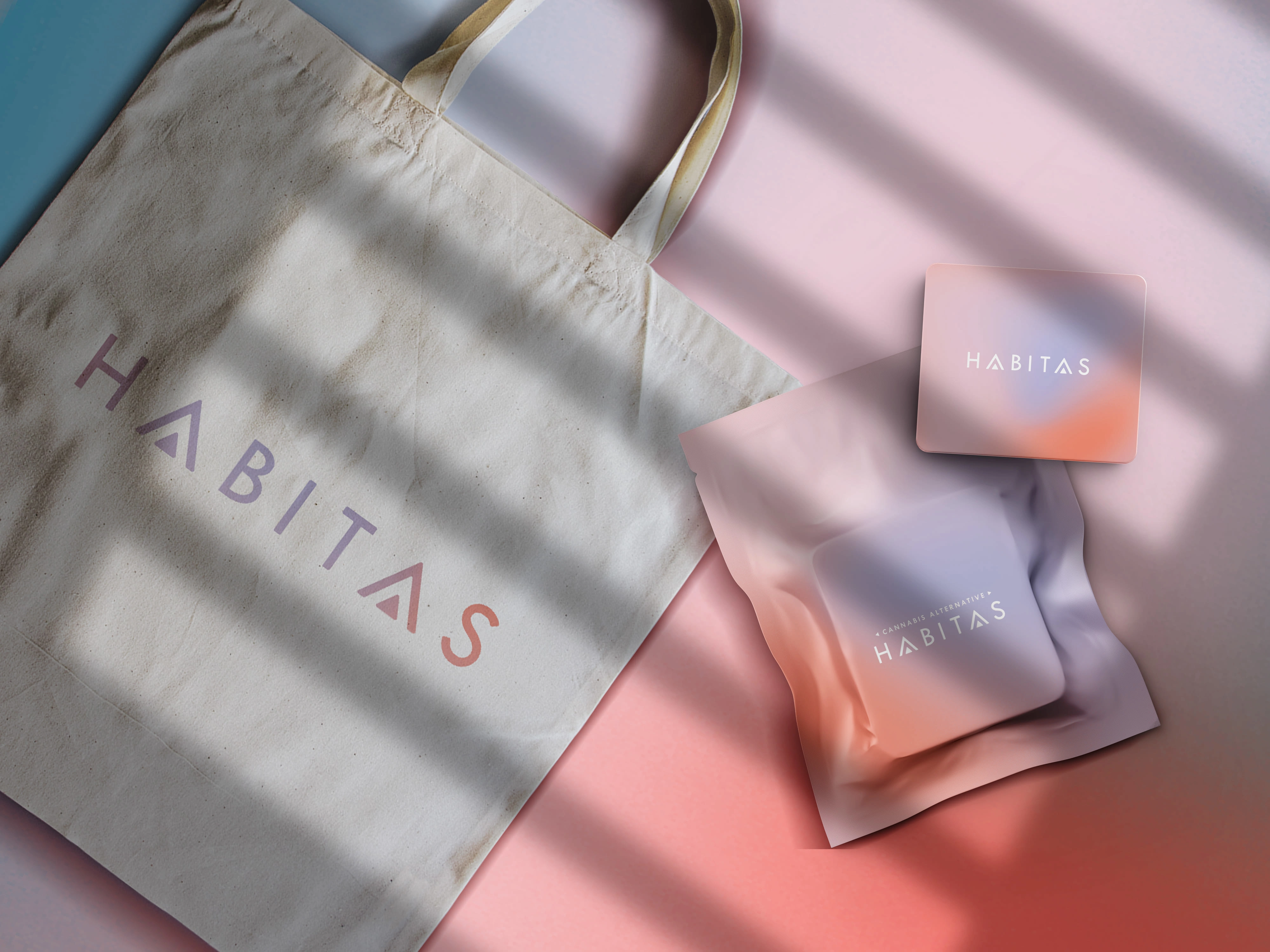
Merchandise (t-shirt design);
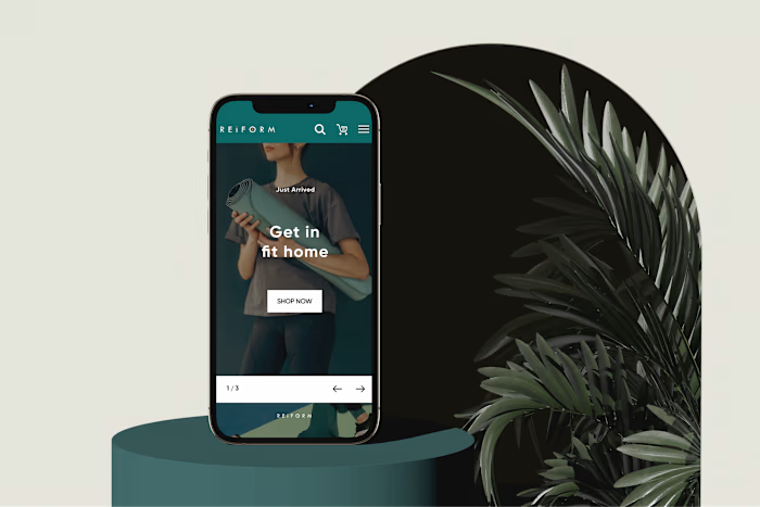
Web-design;
Packaging design (prerolls, flowers & moonrocks, disposables, gummies);
Photo retouch;
Social Media Strategy.
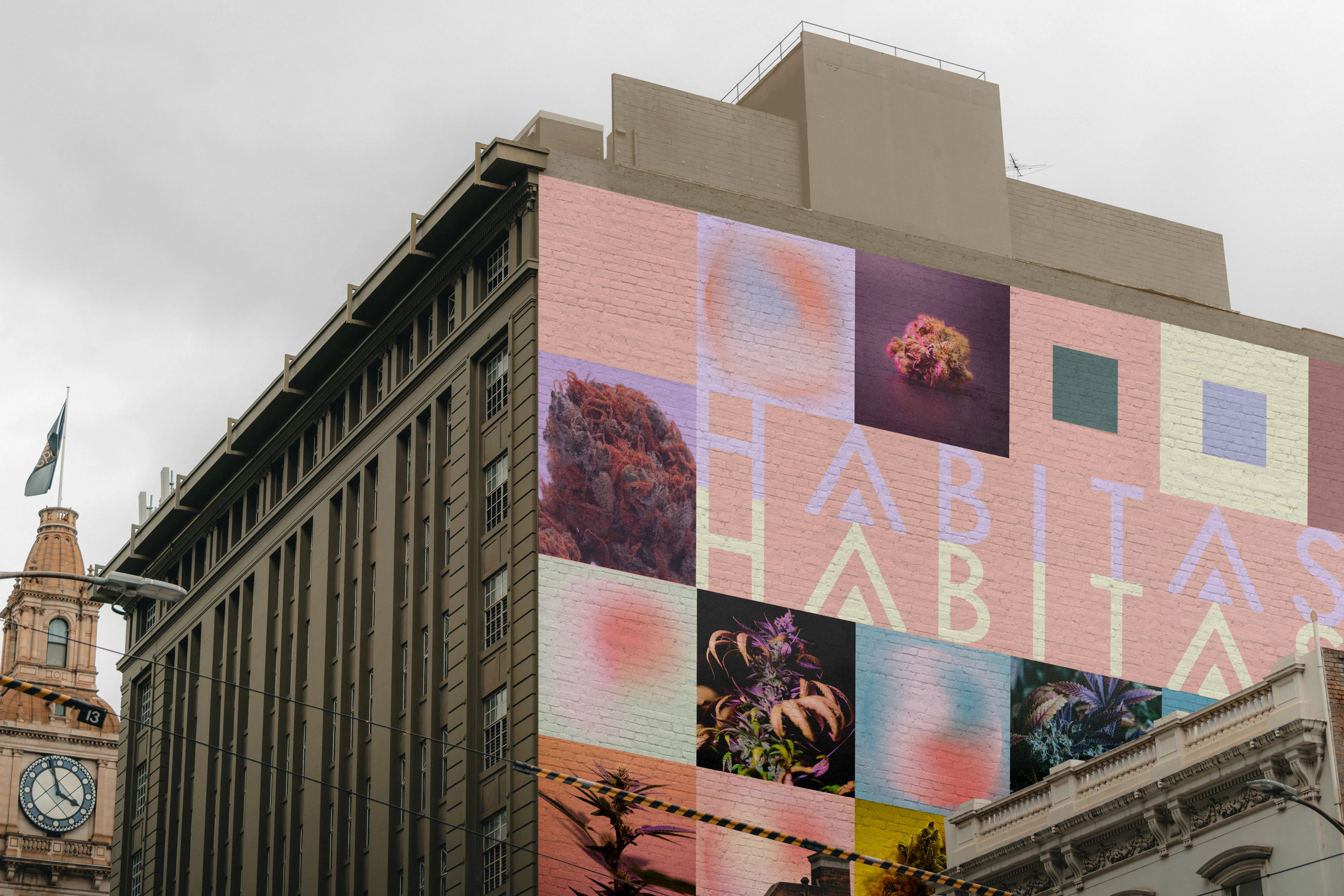


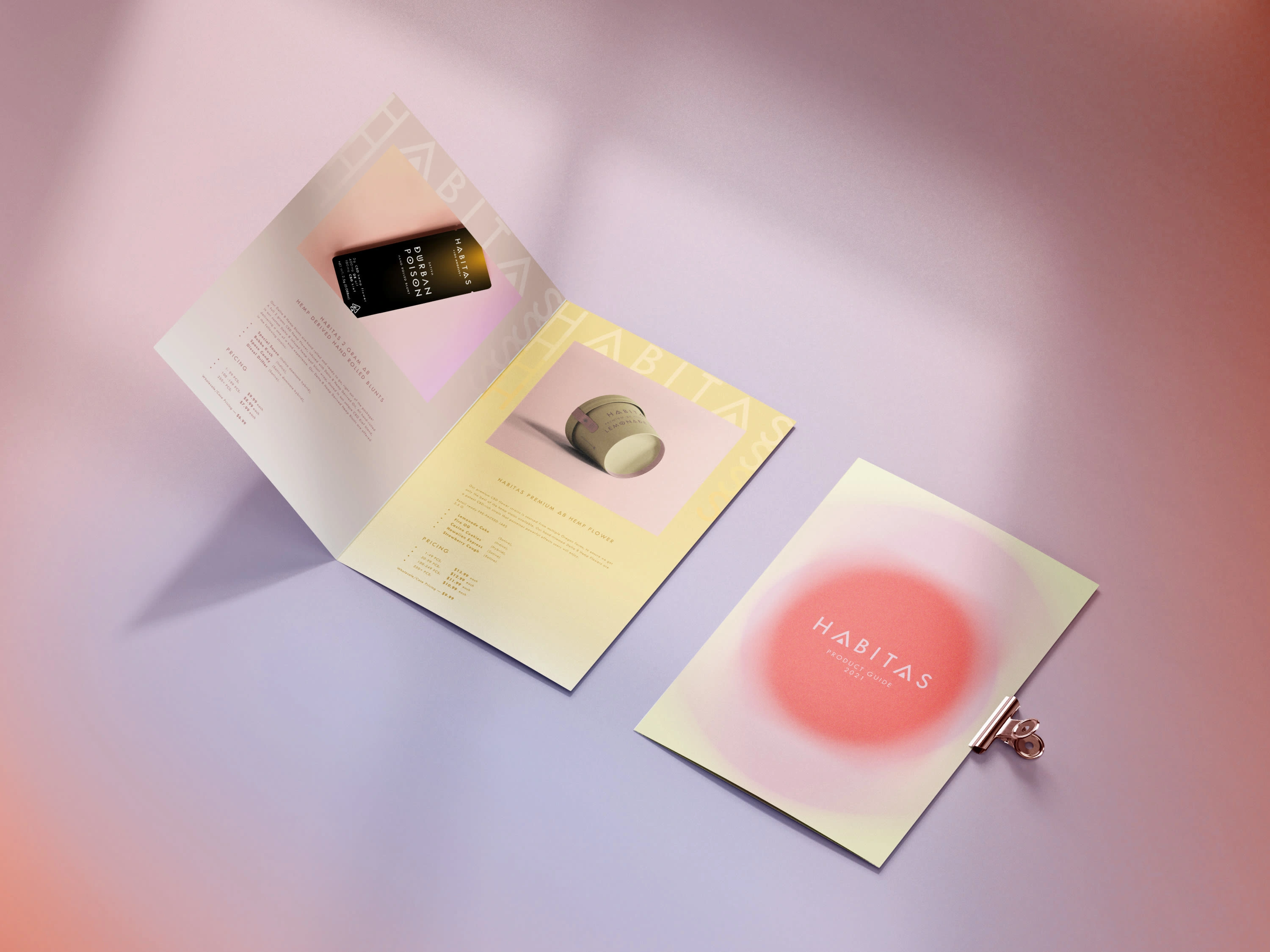
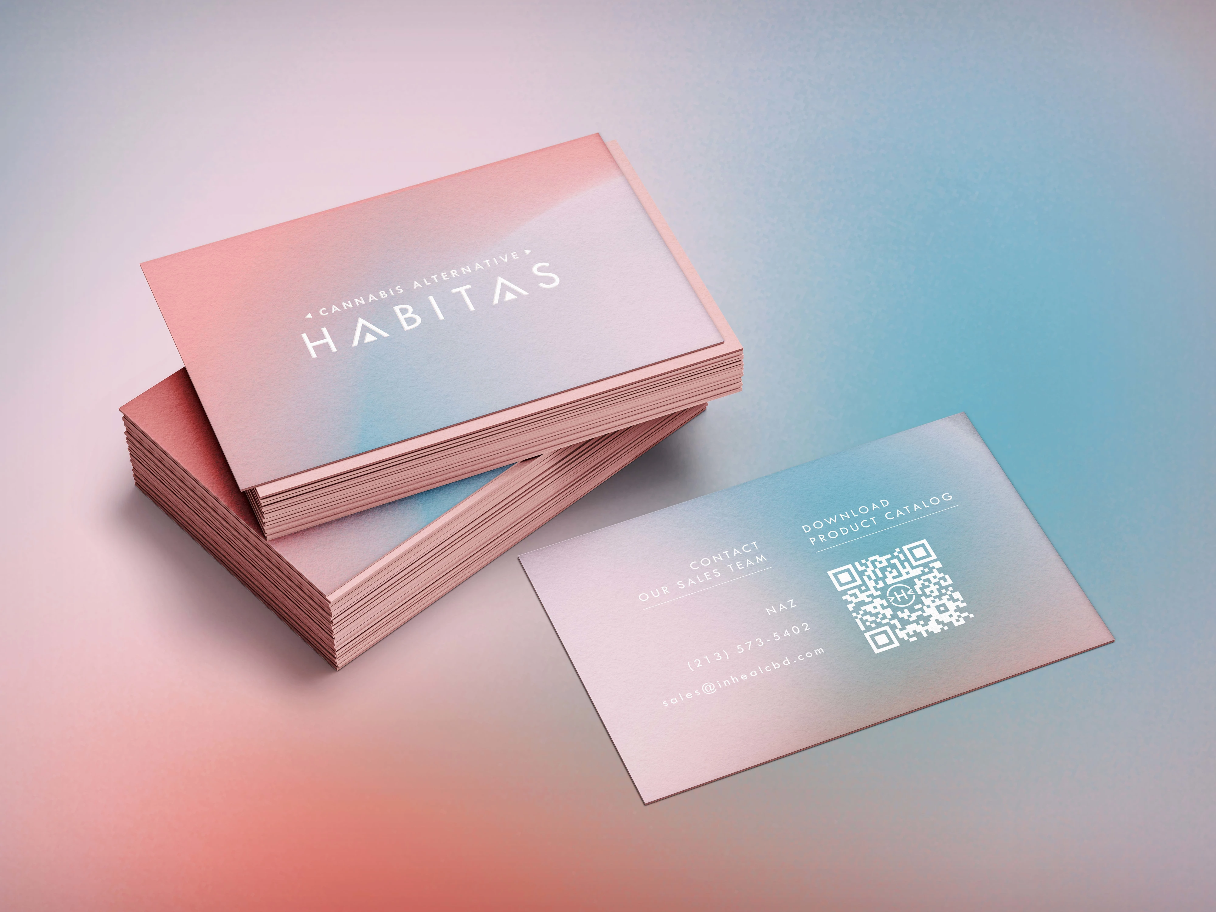
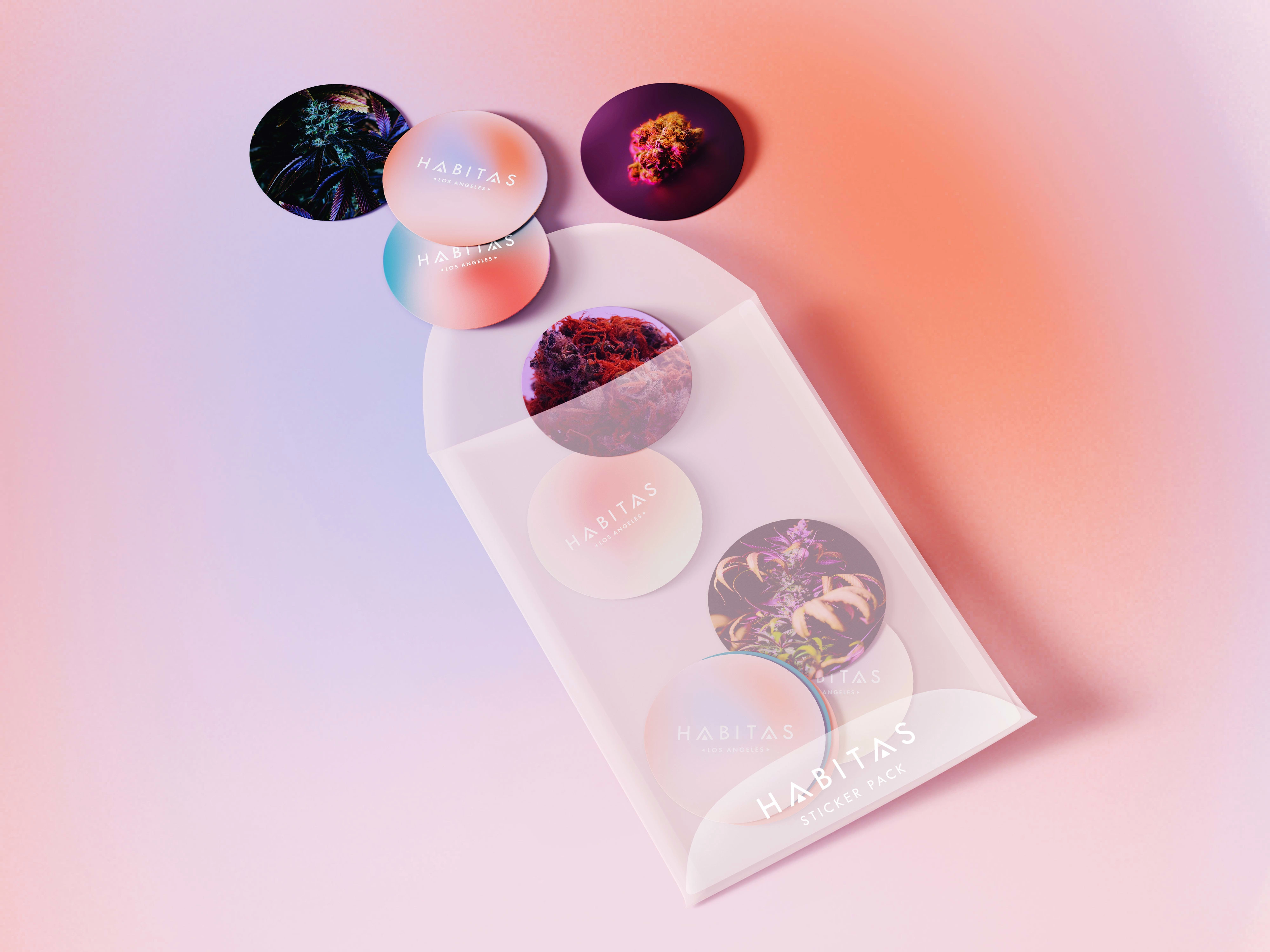
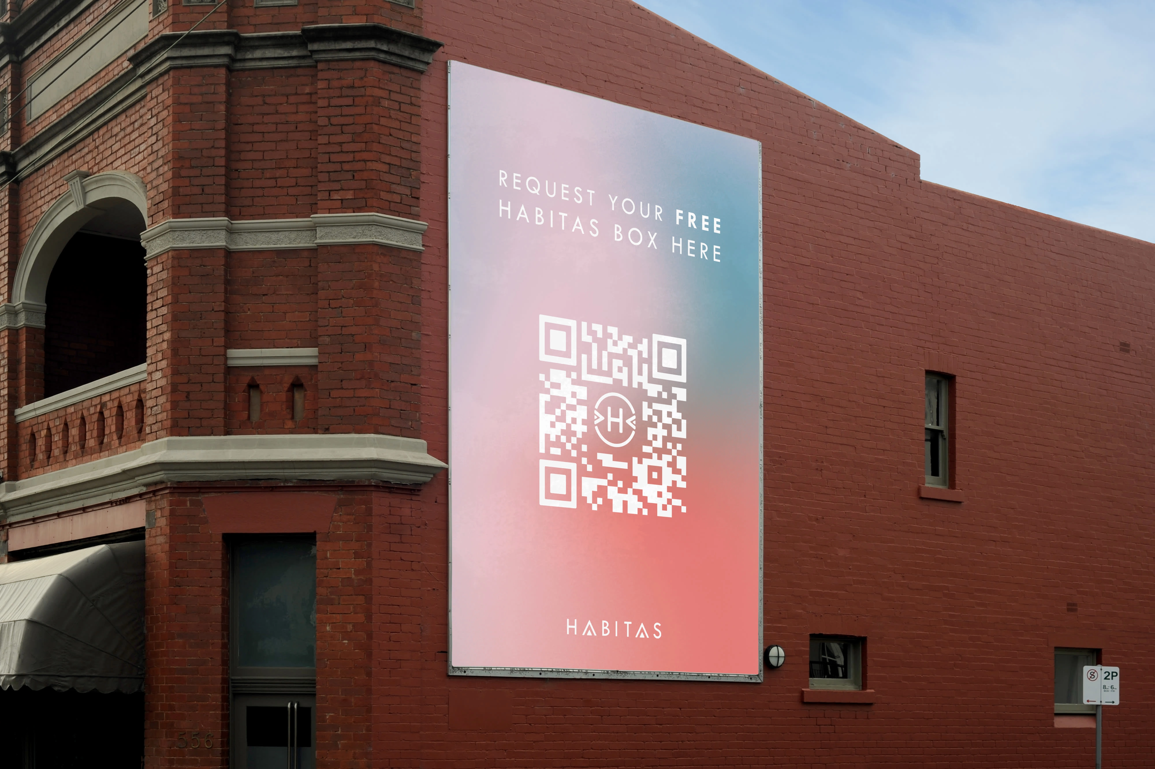
The main graphic element is a gradient. It is used to label different strains and flavors.

💡 Spatio is a full-service creative studio specialising in brand design, web design, marketing and creative direction! Have a challenging project? 🌞
🌟 Say Hi on Our Instagram
Thanks for watching and have a nice day :)
Like this project
Posted Apr 22, 2024
Habitas is a habitat; it encourages you to be here and now. The brand identity embodies family, traditions, and unity with yourself in our fast-paced world.


