Redefining Dashboards for Indian Fintech


🕹️ Overview
Euler, the merchant facing dashboard, is a sea full of modules used by different types of users. It is designed to empower merchants to do so with ease.
Euler consists of multiple modules, each crafted to facilitate self-service capabilities, allowing merchants to perform various tasks and configure product integrations independently.
Currently I am working on the Recommendations module, which plays a crucial role in guiding merchants towards optimizing their transaction scores and enhancing their business performance. This module provides tailored recommendations, which may include suggestions for new features, nudges to purchase additional functionalities, or valuable tips on configuration improvements.
By leveraging the Recommendations module, merchants receive actionable insights that help them stay ahead in the competitive landscape, ultimately driving growth and operational efficiency.
🏃♂️ What is Recommendations Module?
The Recommendations module provides merchants with tailored insights and suggestions to optimize their transaction performance and business growth.
🌀 Context
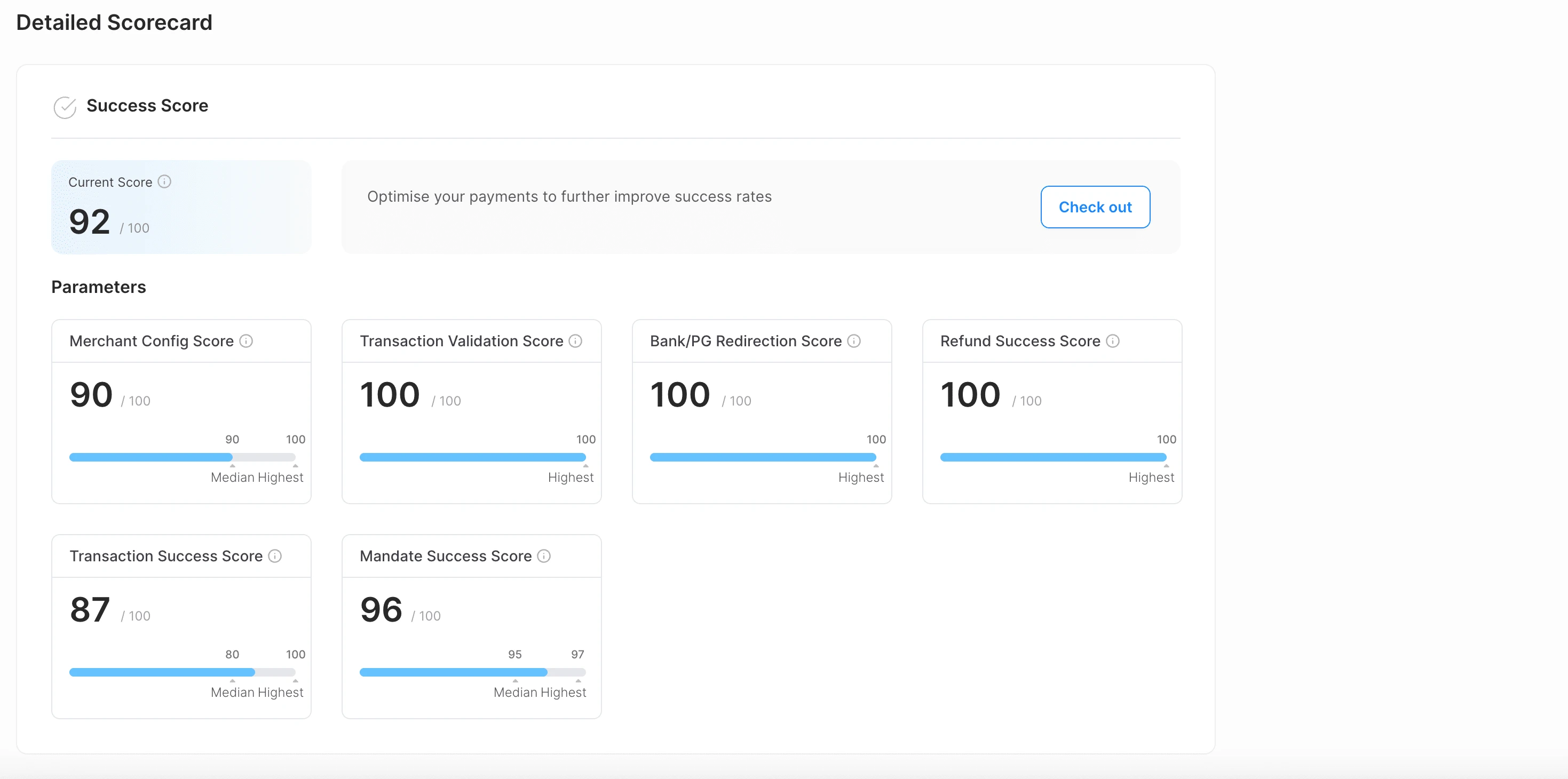
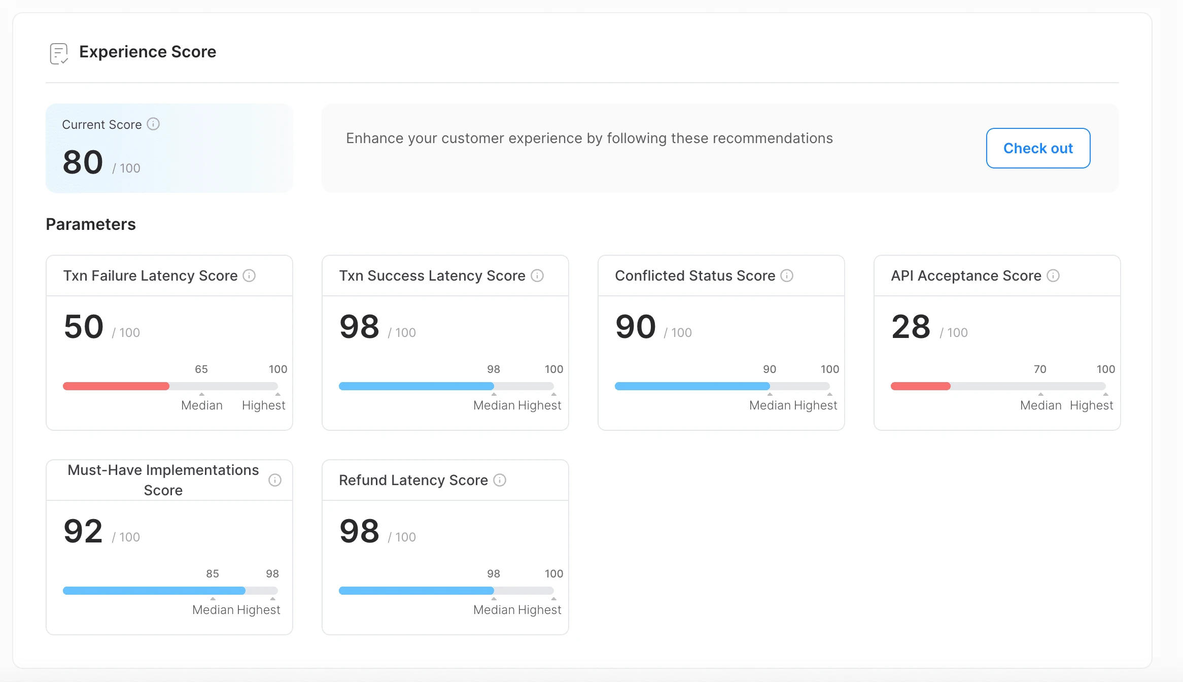
Currently the recommendations come as an exhaustive list for every merchant inside the Scorecard Module.
Scorecard tries to gamify the merchant’s experience on various parameters like Merchant Config Score, Transaction Validation Score, Transaction Success Latency Score, API Acceptance Score and so on.

🚨 Problems
The list of recommendations is currently hidden within a module, making it challenging for merchants to discover.
Merchants often struggle to find and understand the context of these recommendations and where they should be applied.
Consequently, merchants frequently raise support tickets, leading to an increased workload for the Juspay Merchant Support team.
🥅 Goals
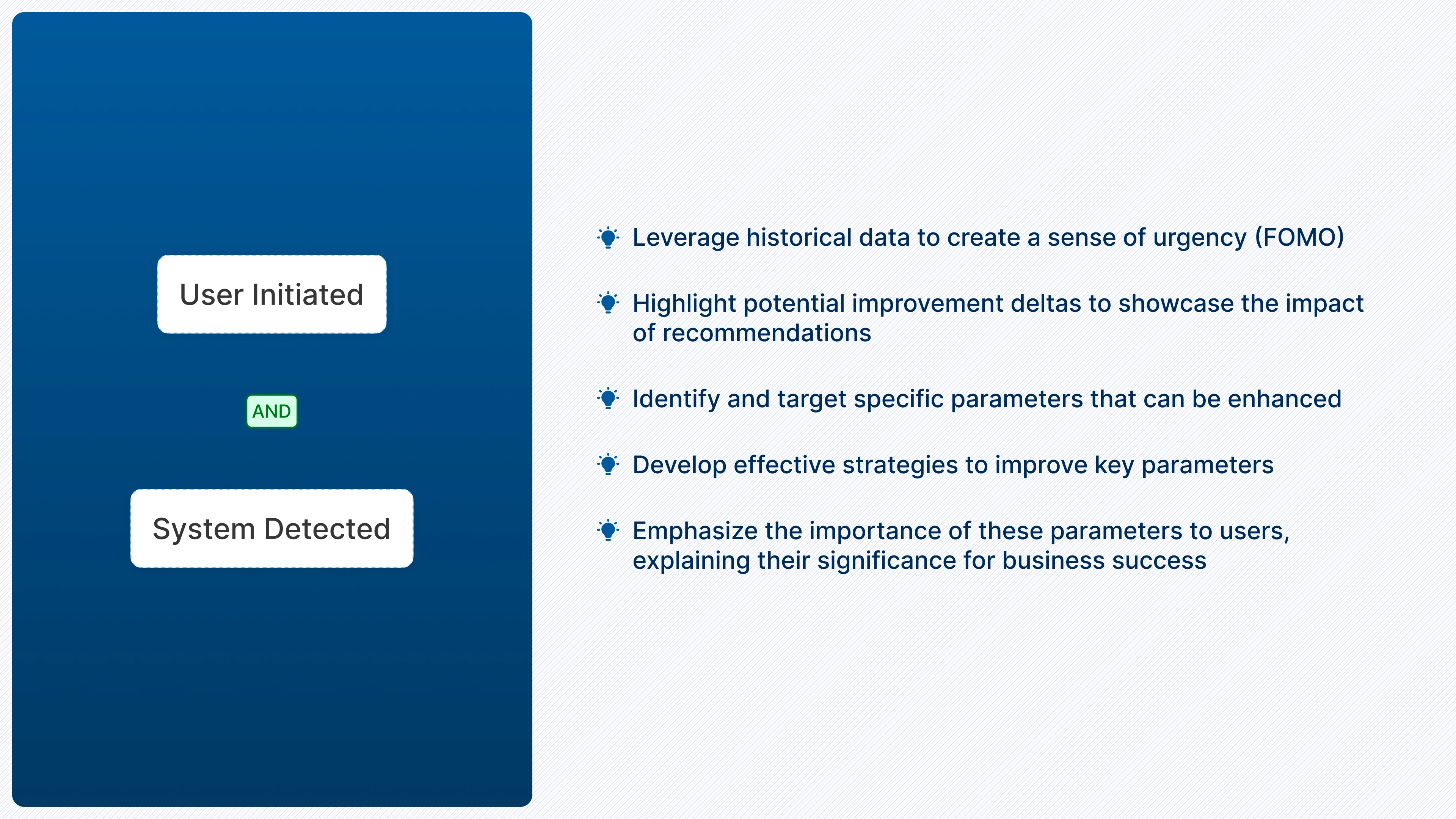
Increase the visibility of recommendations for merchants and personalize the nudges.
Strategically map each recommendation to the ideal location on the dashboard and integrate them efficiently to drive merchant action.
Craft nudges to be perceived as helpful tips for business improvement rather than mere advertisements.
Develop an algorithm to distinguish between critical, high-priority nudges and less urgent, optional suggestions.
⭐ How to initiate recommendations?
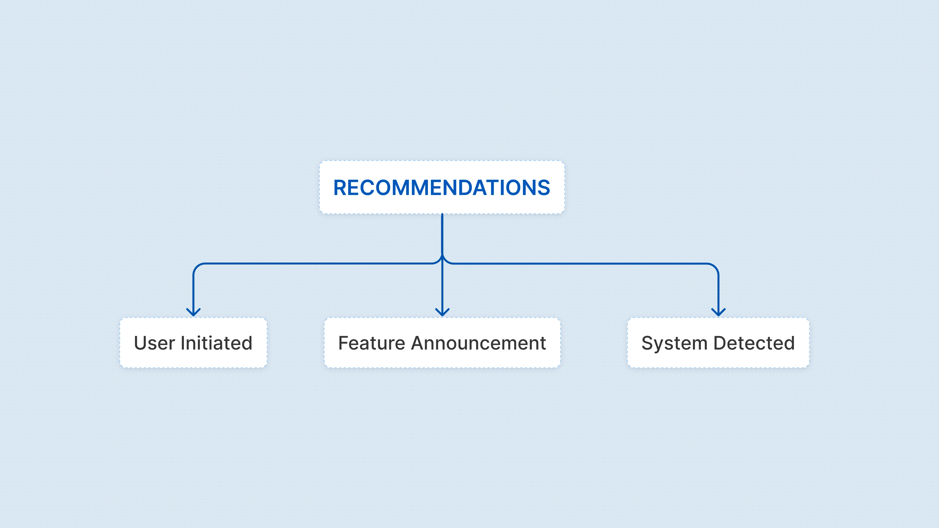
User-Initiated: These recommendations are triggered by actions taken by users, allowing us to subtly nudge them towards taking additional actions. This approach makes suggestions feel more natural and less intrusive since they follow the user's own activities.
Feature Announcements: These recommendations highlight new feature launches that need to be prominently promoted initially, and can later transition to other types of nudges.
System-Detected: These nudges are generated when the system detects opportunities for improvement or identifies issues (e.g., frequent drops in transaction success rates). They help users stay informed about their system's health and provide insights on potential enhancements.
Let’s take a deeper dive!
What could be the different entry points?
Soft Nudges
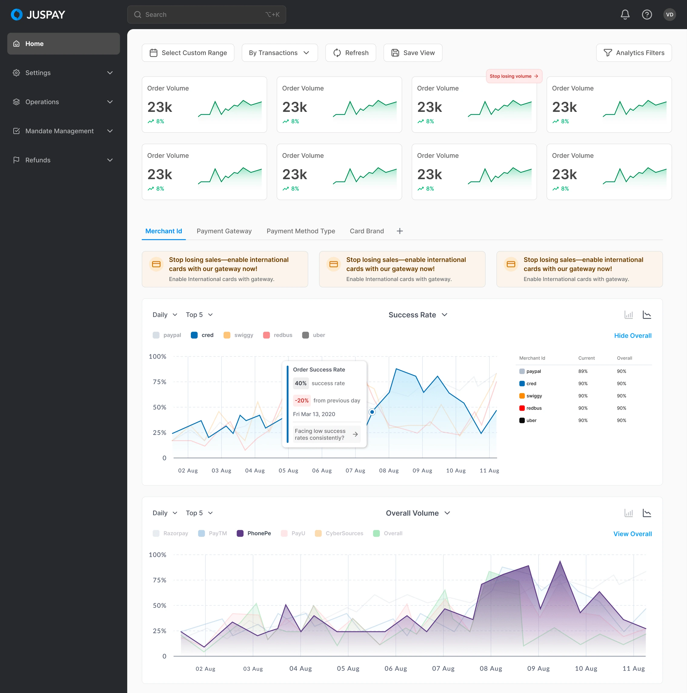
Here's how the initial and most basic version appeared. It featured a pill on the cards and prominent recommendation cards for the SR graph. However, this approach can be too intrusive, and over time, users might start ignoring them, much like how we tend to overlook Spotify ad pop-ups now :p
The Idea of a Bulb: Integrating small bulb icons at key locations (most appropriate places where they will see the impact) on the dashboard allows users to hover over them and discover special recommendations tailored to their business.
Educating the Users: Initially, users may be curious about the bulbs, but as they encounter them across various modules, they'll learn that these icons contain actionable "ideas" to help improve their transaction scores.
Form of the Recommendation Card
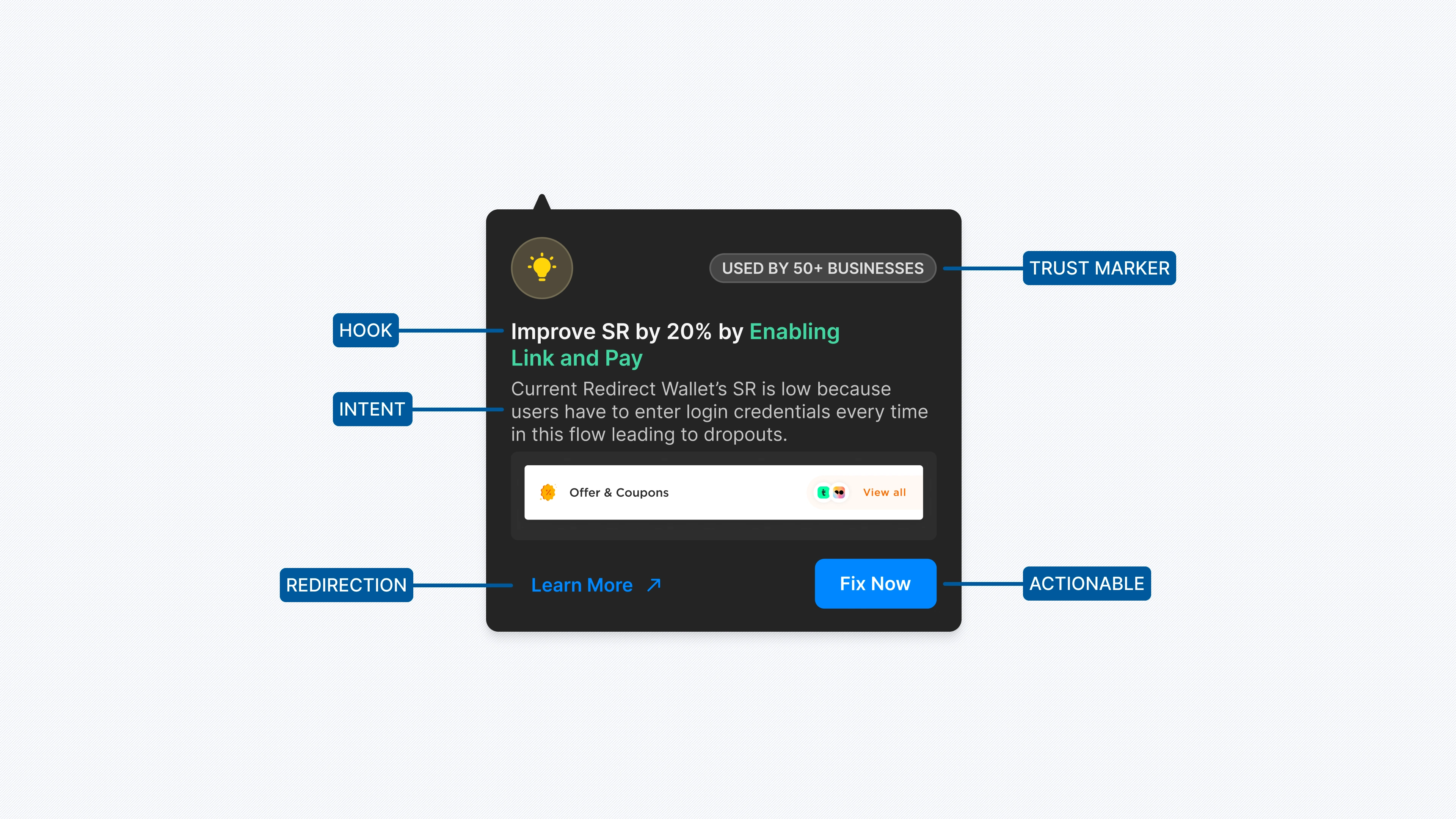
The primary goal in designing the recommendation card is to avoid making it seem like an advertisement, which can deter users. Instead, the card should subtly entice users to take action. The main components of the card include:
Engaging Hook: Capture the user's attention with compelling figures.
Clear Intent: Display the parameters that will improve after acting on the recommendation.
Actionable: Provide a clear and easy-to-follow call to action.
Trust Factor: Ensure the recommendation conveys credibility and reliability.

These are some of the iterations for the recommendations card that will appear on hovering over the bulb
The main issue with these cards was that they blended in with the base cards, causing them to get overlooked.

So post those, I shifted to a darker theme.
More Critical Nudges
Users may not hover over every bulb they see, so it's crucial to prominently display the more critical recommendations.
Therefore, there should be a dedicated area to showcase these recommendations, either within specific modules or in a universal space on the dashboard (still WIP).
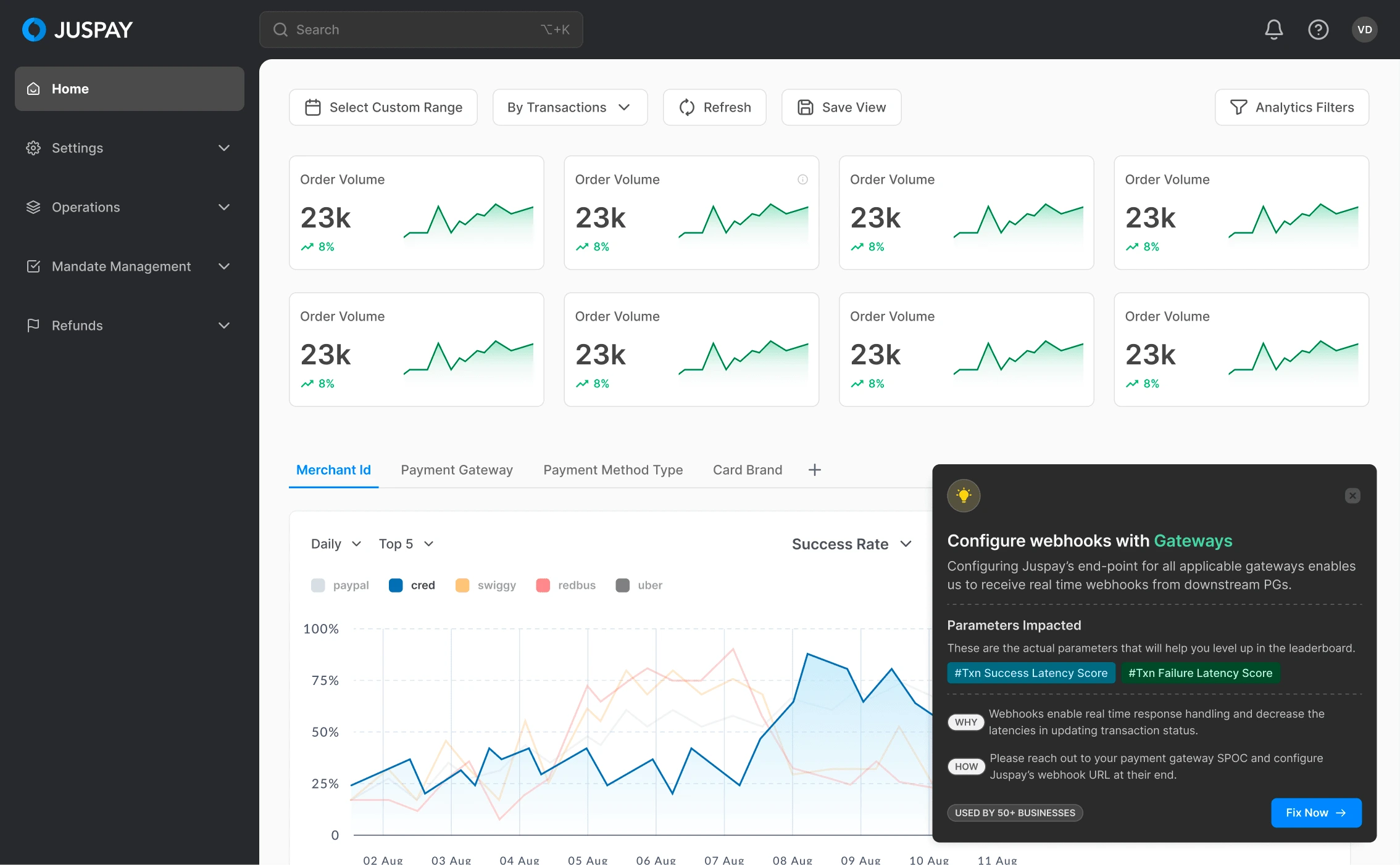
This is a version and idea of the implementation.
The next step :)
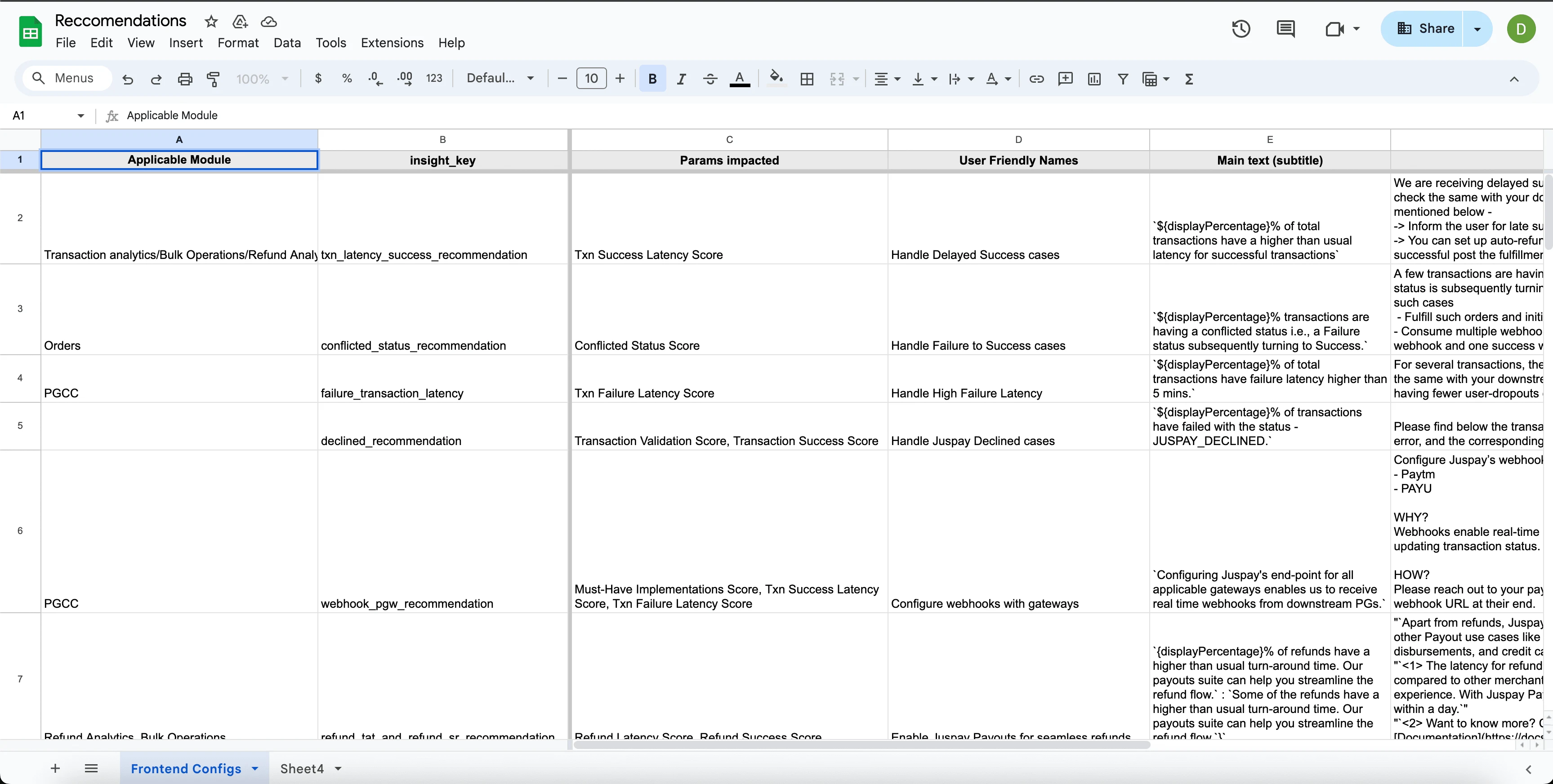
Given the numerous recommendations that can be integrated into various modules, it's crucial for us and the PM to determine the appropriate mapping for each recommendation. Additionally, we need to understand the impact of these recommendations on the merchant's business through relevant metrics.
To address this, we conducted an exercise where I received an Excel sheet from the PM listing all possible recommendations, which I then mapped to different modules.
Following this exercise, I am now in a position to work on identifying the optimal locations to place the bulbs.
Conclusion
This track is still WIP and more advancements are continuously made.
Like this project
Posted Jul 13, 2024
Euler, the merchant dashboard, empowers users to manage payment configurations easily and become self-sufficient with its modular design.
Likes
0
Views
109


