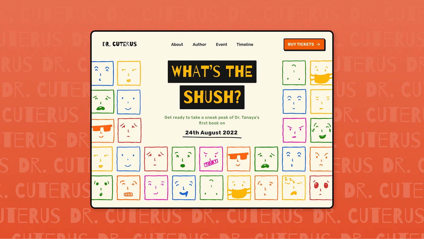
A landing page for a book launch event for teenagers
Dr. Tanaya Narendra (her Instagram avatar named Dr. Cuterus) offers quick videos and candid advice about every doubt you might have had but never thought to ask. She has committed to making public medical education her life goal. She runs her own Instagram and YouTube channel dedicated to public medical education. She has done multiple video podcats with RaiseTheBrow and SheThePeople.
😶🌫️ Talking about sex education is yet a taboo, isn’t it?
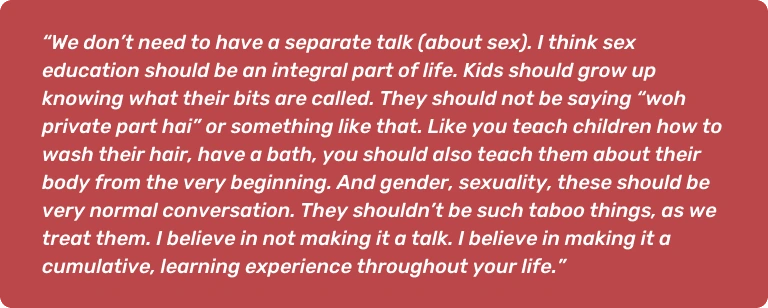
Here’s what Dr. Cuterus had to say:
She knows how to excellently put the fun in fundamental sex education and myth-busting, talk about “taboo” topics, learn in a fun way, and #ScrewTheShush!
In a country like ours, this is the need of the hour. Understanding and accepting every human is the most beautiful form of expression. Every person, without the fear of society, should be allowed to express his true self. Dr. Cuterus, even after receiving loads of negative responses on her content, did not give up and fearlessly talked about things people are most hesitant to talk about, that too on a public platform.
☑️ Checkpoints

🥅 Goals
To let the audience book a seat at the book launch event.
To give an option of pre-booking the newly launched book if they could not attend the event.
To promote the book and let more people know about the launch.
To give a gist to the audience about the perks of attending the event.
🧠 Information Architecture
Organizing the content of the website beforehand is essential as content is the reason why people visit websites. Therefore, the content besides being valuable should also be easy to find. Information Architecture is not visible to the end users but is a backbone for the design.

Information Architecture
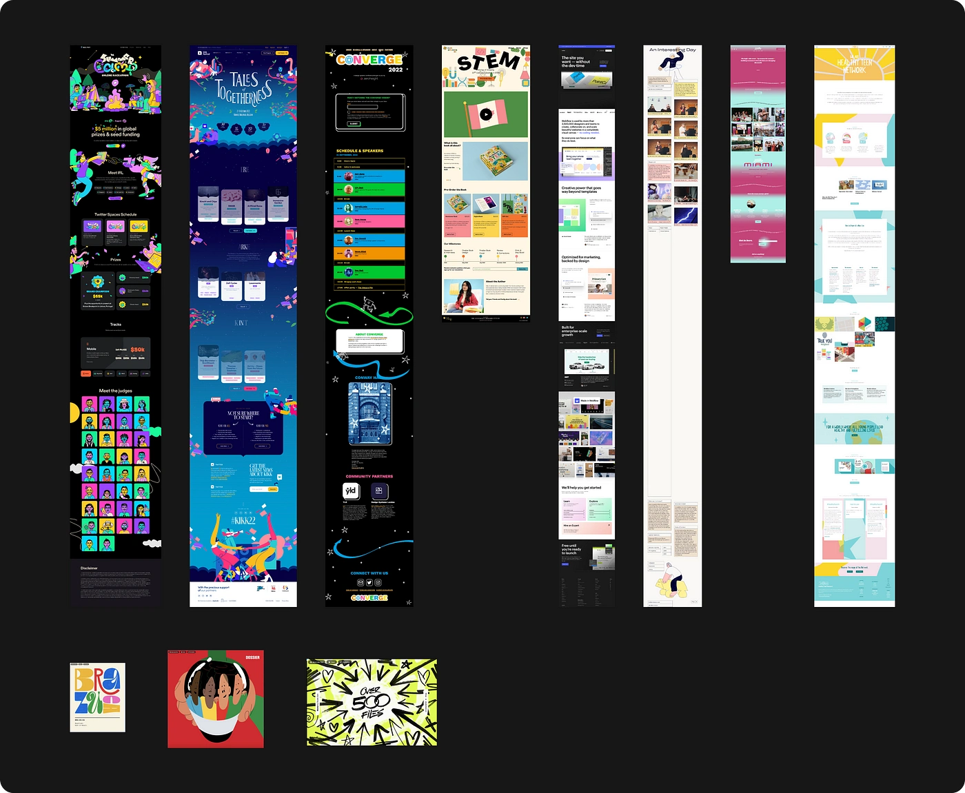
🌻 Moodboard
Moodboards helped in understanding how event websites are structured and what touchpoints are focused on the most. Going through other similar websites also helps us in understanding the design language.
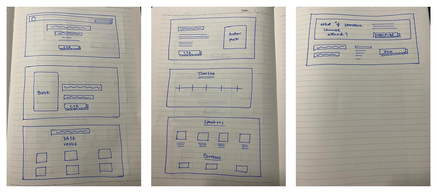
🖊 The power of pen-paper (Ideation)
Ideating using pen and paper is underrated! It helps me a lot before starting any design as it gives me a huge space to work and scribble around freely. A bit of time off-screen while ideating really helps us understand what our brain is visioning.

🪢 Wireframe
Wireframes are the step where the architecture has been converted into the layout. It gives a rough understanding of how the page structure would look, but is definitely subject to change.
🫀 Style Guide
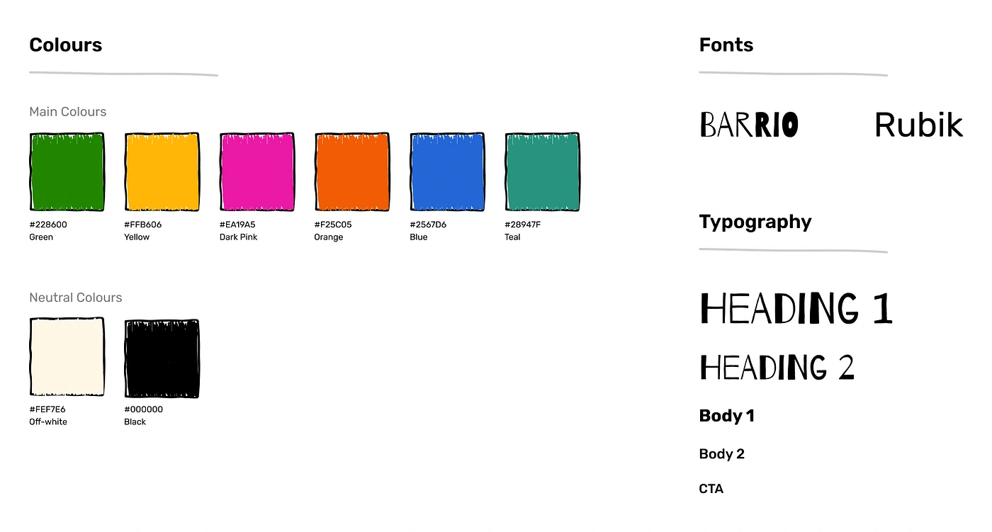
To decide on the colors and fonts, it was important for me to understand what kind of content Dr. Cuterus puts out, what is the vibe of the content and who exactly is the target audience. All her content is for sure educative but is also fun to listen to and the audience for the event is teenagers. Choosing a bunch of vibrant colors was mainly to show how every individual is different and beautiful in themselves. Moreover, a little doodling touch would make teenagers relate too!
🔮 Visuals and Iterations
I started designing one section at a time. Visuals are that part of the process which requires the most time and effort, so breaking it down into smaller chunks helps in making better iterations.
✨TL;DR✨
Check out the final design here: https://www.behance.net/gallery/157479649/Book-launch-Event-Website
🦸🏻♀️ Hero Section
The hero section of the website acts as the attire of the website. Over here it has to give the first impression of the event or would serve as the Attraction part of AIDA. Therefore, the hero section had to be a banger, something that people would remember us by and something that would make them scroll down further. It has to moreover gain the trust of the audience.
Here are some of my initial iterations for the hero section:

Problems identified:
There wasn’t enough space to add the event date and other details.
In some of these, the title of the book did not get much visibility.
The CTA wouldn’t have been discoverable enough.
🥁 Final Hero Section:

The different colored faces represent the different moods of people and how every individual is different, yet beautiful in themselves. Varied colors also show how fluid sexuality is.
Improvements:
Arranging the faces this way gave enough space to fit the book title and event details right in front which will grab the audience’s eyes.
The CTA is clearly visible along with other navbar links.
📚 Book Description
This is the section where the product is revealed and a brief description about it too. It has to be as crisp as possible because very few visitors read huge descriptions on the website.
Older version:

Problems identified:
The sharp edges of the main frame and CTA hurt the eye a little :(
The stroke distracted the eyes of the viewer from the actual product.
The copy was too huge and it increases the cognitive load.
🥁 Final Book Description section:

Improvements:
The edges of the frame and CTA both were made rounded which is much better for the eyes to look at whereas sharp corners throw your eyes off the path of the line so you end up experiencing abrupt pauses when the line changes direction (fun fact: our brain can process circles faster than rectangles!)
A slight gradient was added to the background and a bit of elevation to the CTA which makes it look clickable.
The copy was refined and the hierarchy was defined better.
The heading looked a little monotonous in the previous iteration and thus it was added in the background which gives it emphasis and creates breathing space in the frame too.
🤖 Event Details
After letting the audience know what the product is, and what the event is, we need to tell them how is the event planned, where is it, the date, and the perks of joining the event. It acts like cheese on a rat-trap 🤫.
Iteration:

Problems Identified:
The randomized order of arranging the cards baffles the viewer and increases the cognitive load. This way he might also skip on one of the cards without even realizing it!
The sharp edges needed to be fixed again.
The hierarchy of the date and venue can be refined further.
The center-aligned text inside the cards makes it very difficult for the viewers to skim through the text in a shorter amount of time.
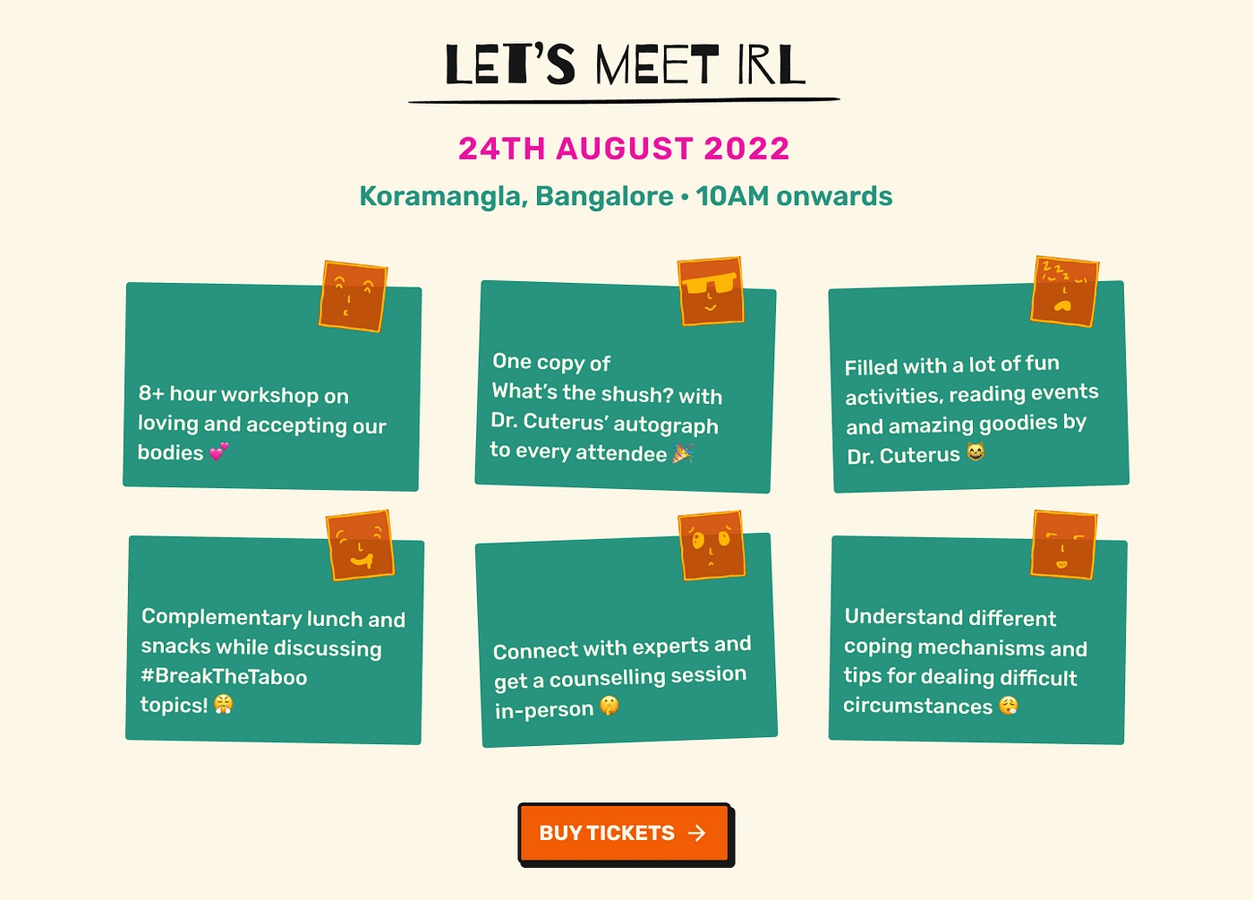
🥁 Final Event Description section:
Improvements:
The cards are not arranged in a conventional manner which makes it easier for the eyes to consume content. Moreover, according to the design language, I thought of going along with the theme of the sticky note.
The hierarchy of venues was fixed by increasing the font-weight. This makes it more readable.
The content of the cards is made left aligned.
CTA is added.
🐥 Other Details
To sell the book and event seats, it is equally important to let the audience know who the author is, how long the event will last, what is the timeline of the event, who are the credible speakers at the event and which are the popular brands partnering with them. This increases the trust and interest of the audience and gives the audience social proof.
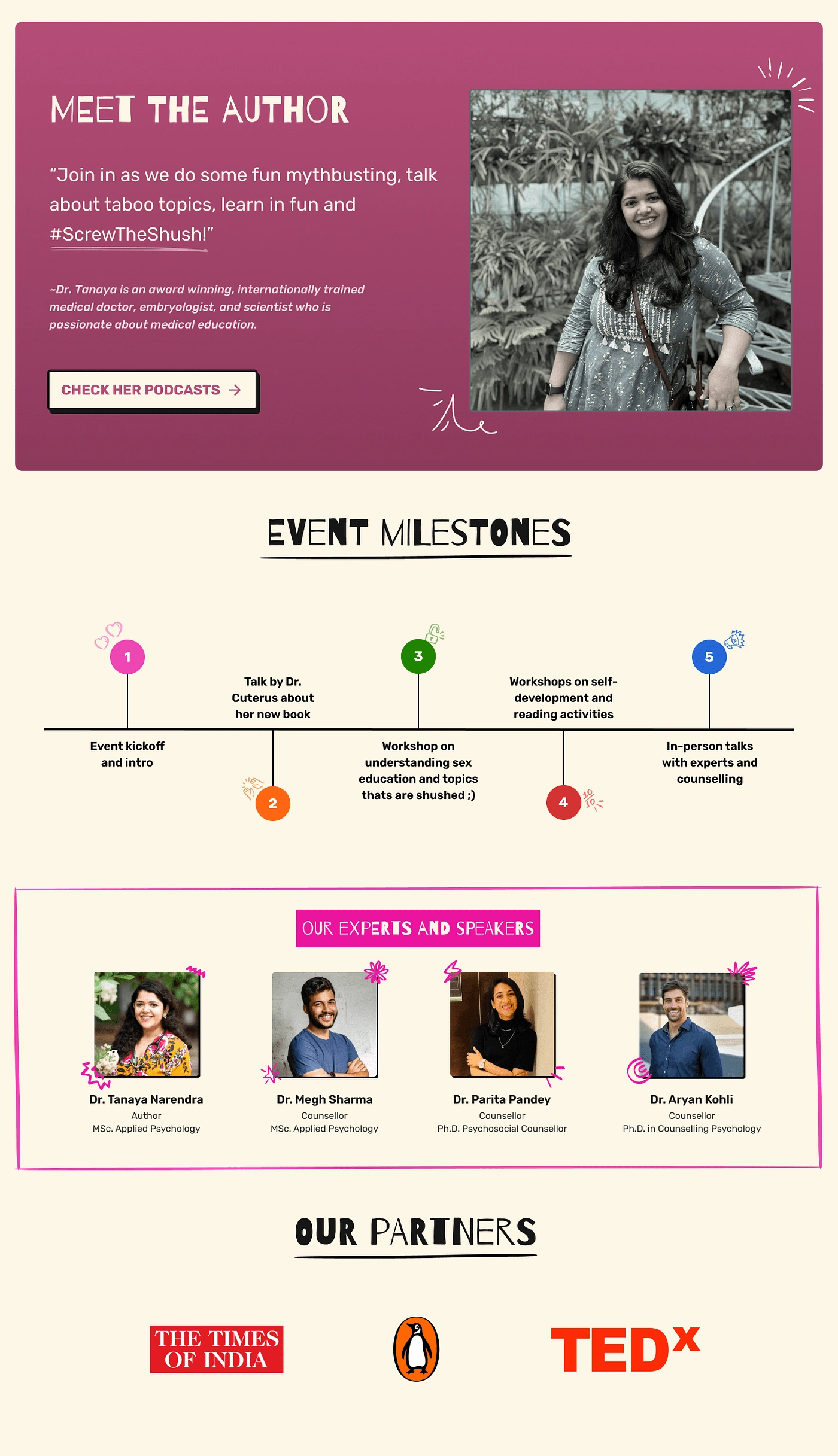
The author's description involves a quote from here about her ideology and a CTA which will take the users to know more about her by watching her podcasts.
The event timeline breaks the entire event into smaller sessions which lets the audience know what activities will take place at what time.
The speaker's names along with their professions and background help the audience to trust the people at the event.
The popular brands who are partners at the event attract the audience as people generally follow such brands from the beginning.
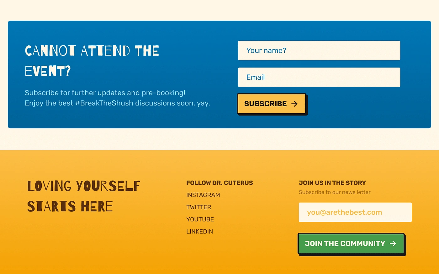
🦶🏻 Footer
The footer here consists of all the social media links of the content creator or author, and a CTA to subscribe to her newsletter. Moreover, to promote the pre-sales of the book, the audience can pre-book it if they cannot make it up to the event.
Like this project
Posted Mar 25, 2024
This landing page focusses on higher conversions and how to attract the right set of audience.
Likes
0
Views
37

