Esprichoo Publishing Limited - Branding & UI designer
Hosna Kachooee
www.esprichoo.net
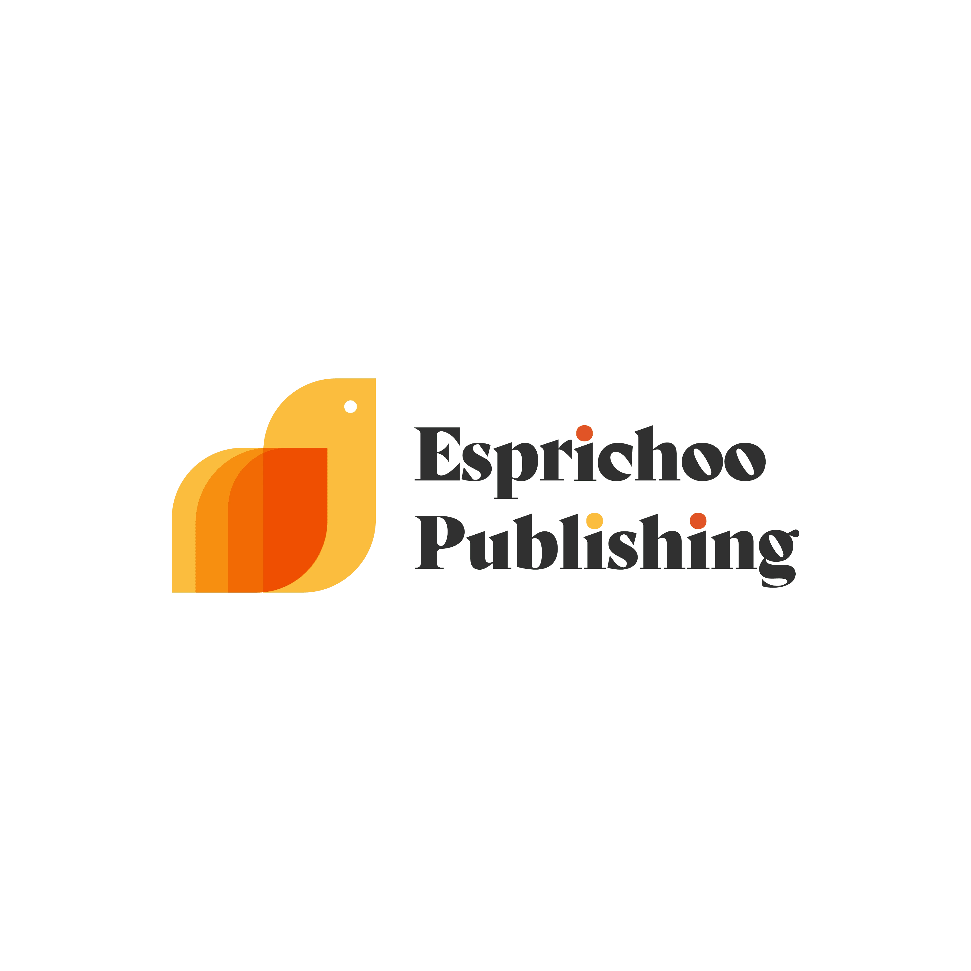
Esprichoo Publishing Limited
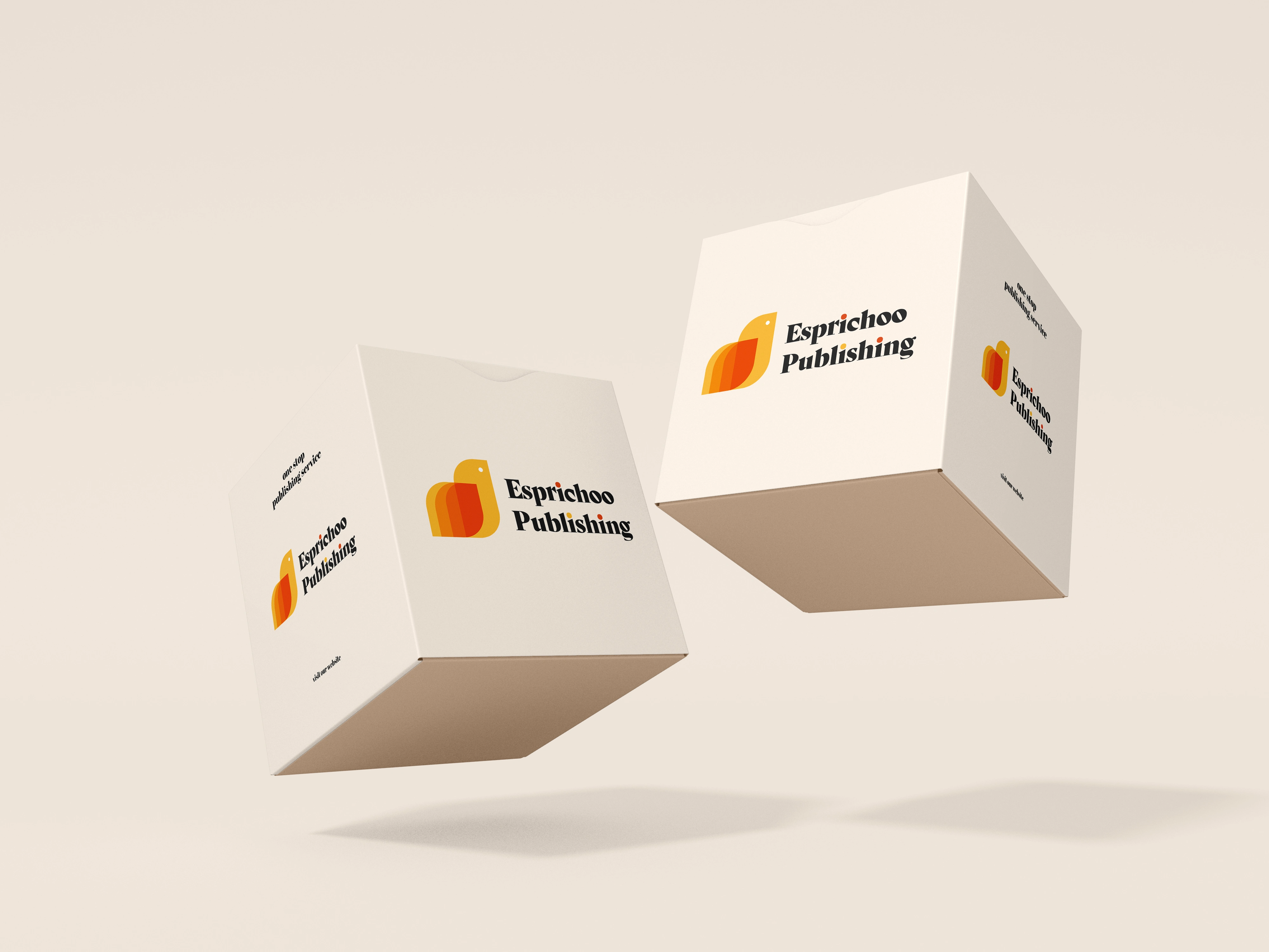
This company provides publishing services to new authors by connecting them to publishing sponsors. I have worked for this company before as a content producer, but I was then asked to rebrand their company and make it more modern and appealing. The website is still ongoing, but the brand's identity looks a lot better.
logo design
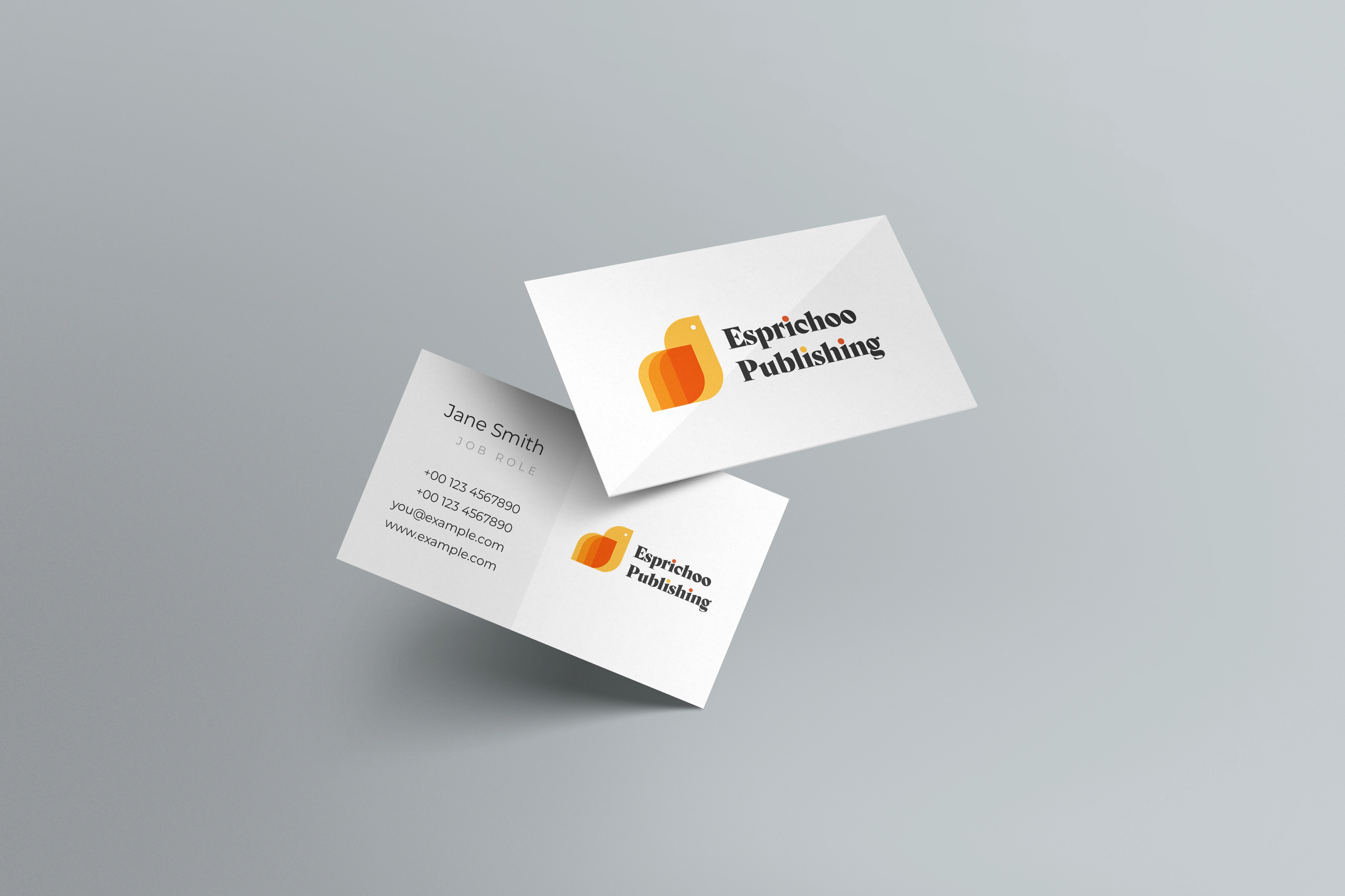
The logo was made using a combination of the brand's name. "Esprichoo" refers to a sparrow in Kurdish and the books refer to "Publishing".
I combined the shapes using blend modes and curved edges. It's paired with a funky font to make it look fun and approachable, especially since the brand is looking to attract new authors.
Like this project
Posted Feb 27, 2023
The previous identity followed a corporate style, with bold fonts and monochrome colors, I wanted to change that completely and make the brand look more alive.