Fitness Mobile App – UX/UI Design for Health & Training Goals
Valentina Guerrero
Verified
The Challenge
Design a fitness mobile app from scratch for iOS and Android that helps users track workouts, set personal goals, and stay motivated over time. The app needed to feel clean and energizing without overwhelming users with data.
Research & Discovery
Started with competitive analysis of 6 fitness apps (Nike Training Club, Strong, Hevy, FitBod, Strava, and Freeletics) to identify patterns in onboarding, workout tracking, and goal-setting flows. Key findings:
Most apps overload the home screen with metrics that intimidate beginners
Goal-setting is usually buried 3+ taps deep
Progress visualization rarely connects effort to outcomes in a motivating way
Defined two primary personas: a beginner looking for guided structure, and an intermediate user who wants flexible tracking without friction.
The Hard Problem: Real-Time Workout Tracking UX
The biggest design challenge was the active workout screen. Users need to log sets, reps, and weight while physically exercising, often with sweaty hands, limited attention, and no patience for small tap targets.
What made it difficult:
The screen needs to show current exercise, next exercise, rest timer, and rep counter simultaneously without feeling cramped on smaller devices
Users switch between logging (precise input) and resting (passive viewing) every 30-90 seconds, so the interface has to serve two opposite mental states
Mistyping a weight or rep count mid-set is frustrating and breaks flow
How I solved it:
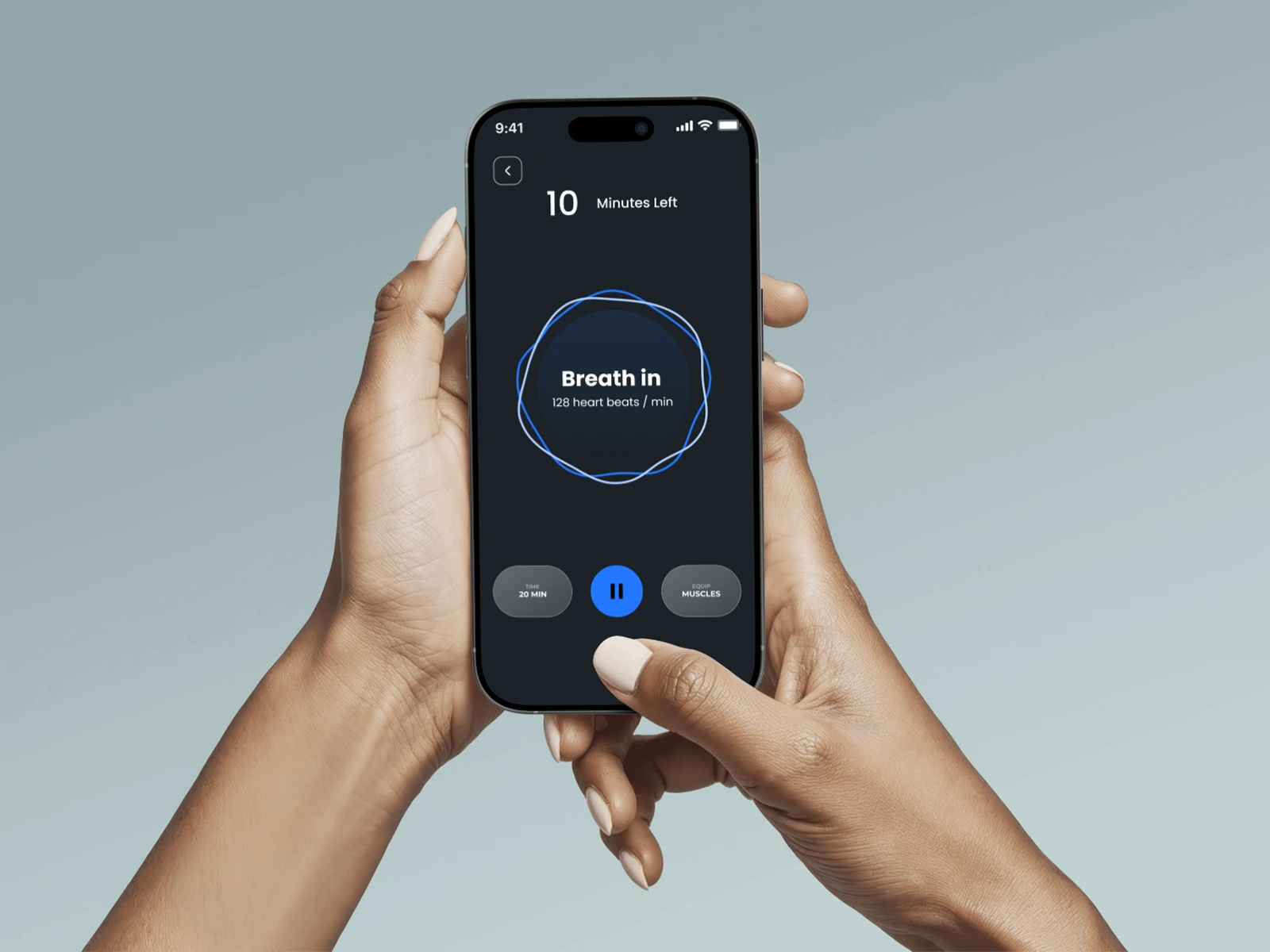
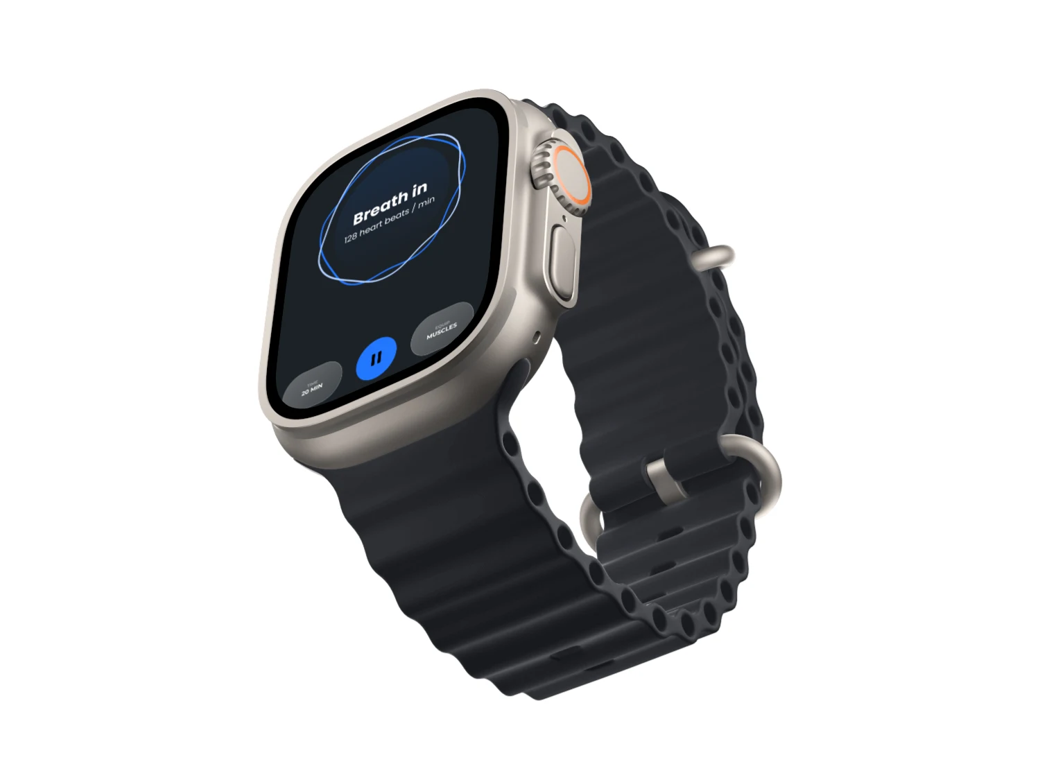
State-based UI: The screen shifts layout depending on whether the user is actively lifting or resting. During a set, the rep counter dominates with oversized touch targets (minimum 56px). During rest, the timer expands and upcoming exercises become visible.
Gesture-first input: Instead of a number keyboard, users swipe up/down to adjust reps and left/right to adjust weight in preset increments. This works with one thumb and tolerates imprecise touches.
Smart defaults: The app pre-fills weight and reps based on the user's last session for that exercise. Most of the time, users just confirm rather than type.
Error forgiveness: A floating "undo" button persists for 5 seconds after logging a set, so mistakes don't require navigating back.
Tested the flow with 3 paper prototypes before moving to high-fidelity. The gesture input reduced logging time from ~8 seconds (keyboard) to ~2 seconds (swipe confirm).
UX Decisions
Progressive disclosure: The home screen shows only today's plan and one key metric. Deeper stats live one tap away for users who want them.
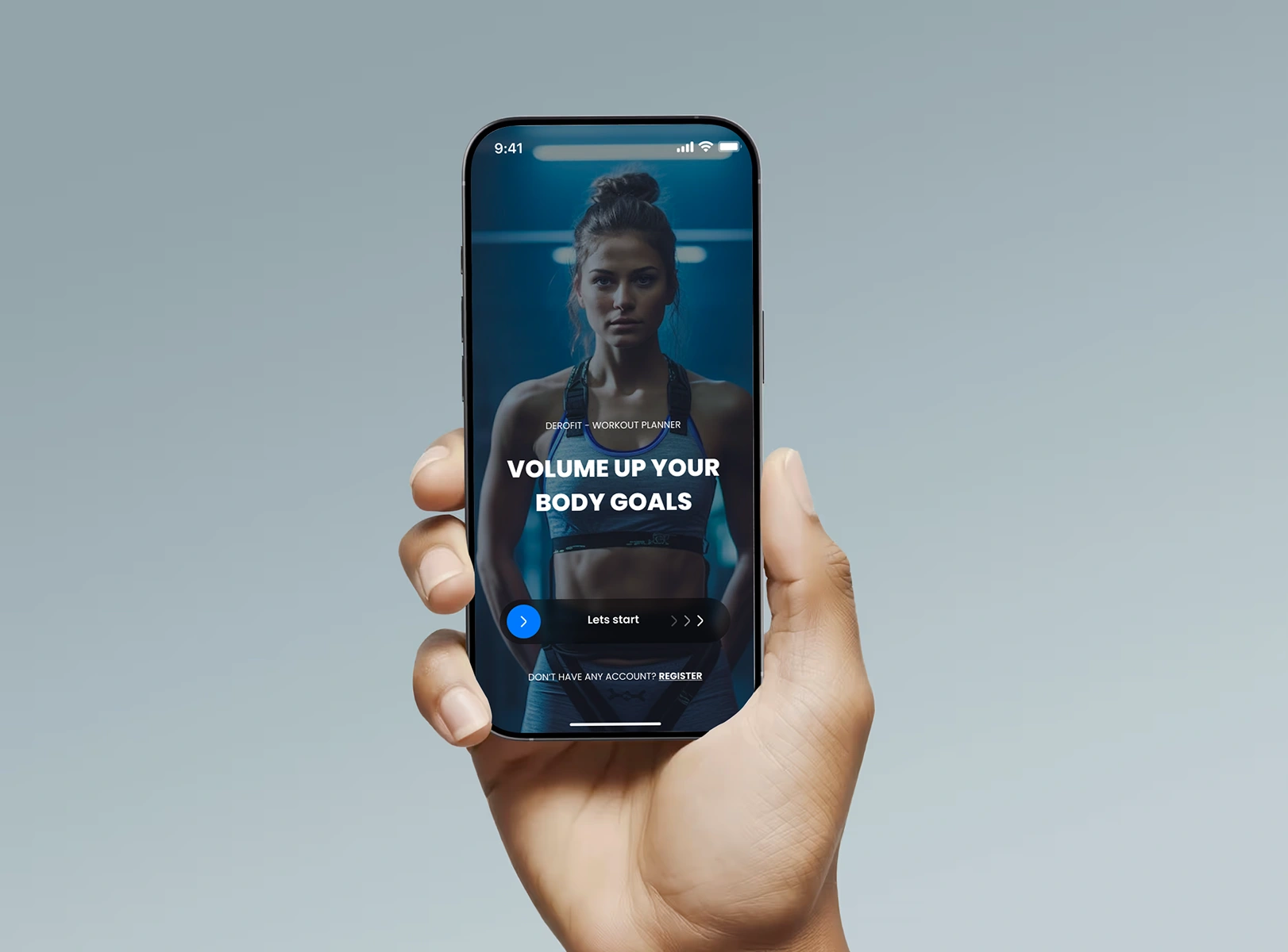
Goal-first architecture: Onboarding starts with goal selection (lose weight, build muscle, stay active) and the entire UI adapts based on that choice.
Micro-feedback loops: Every completed set triggers a subtle animation and progress bar update, reinforcing consistency without being distracting.
Visual Design
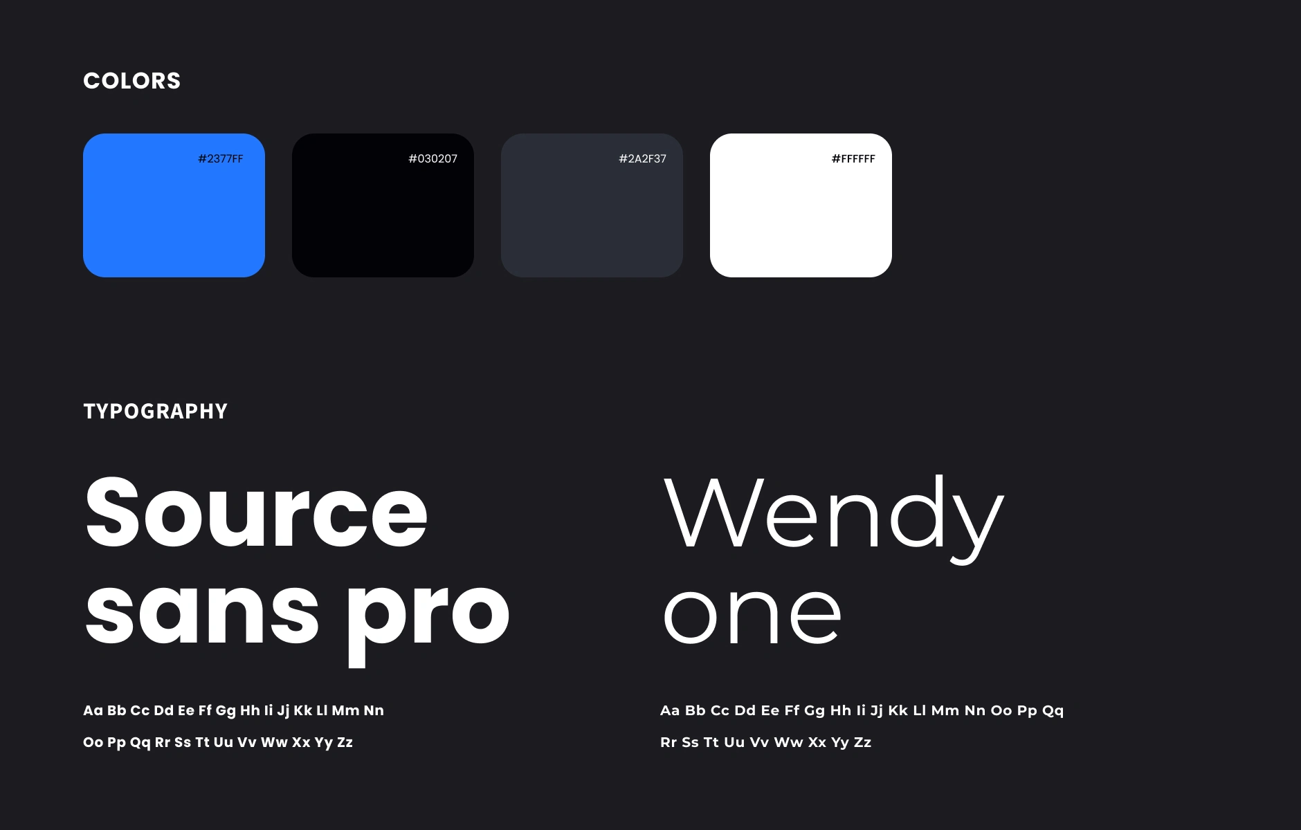
Clean, high-contrast palette with dark mode as default (most users train in gyms with dim lighting)
Typography hierarchy designed for glanceability during workouts (large numbers, minimal labels)
Card-based layout for workout modules, making it easy to scan and tap between exercises
Consistent 8px grid system across all screens for pixel-perfect alignment
Outcome
Delivered a complete design system with 40+ screens, reusable components, and interactive prototypes for both iOS and Android. The Figma file is structured for developer handoff with auto-layout, variants, and clear naming conventions.
Like this project
Posted Jul 4, 2025
UX/UI design for a fitness mobile app. Clean, motivating interface for tracking workouts and setting goals. Built in Figma for iOS & Android
Likes
4
Views
53
Timeline
Apr 28, 2025 - Aug 23, 2025