Landing page - UX/UI Design for a Responsive Roofing Website
Valentina Guerrero
Verified
The Challenge
Design a high-converting landing page for a roofing company focused on lead generation. The page needed to build trust fast (homeowners are skeptical of contractors online), communicate services clearly, and drive quote requests without feeling pushy or generic.
Research & Discovery
Analyzed 8 roofing and home services landing pages across the US market to identify conversion patterns. Key findings:
Most roofing sites look outdated, use stock photos, and bury the CTA below the fold
Trust signals (licenses, insurance, reviews) are often present but poorly positioned
Mobile experience is usually an afterthought, despite 65%+ of local service searches happening on phones
Identified the primary user: a homeowner who just noticed a leak or storm damage and needs a quote within 24 hours. They're comparing 3-4 companies simultaneously and deciding in under 60 seconds.
The Hard Problem: Trust at First Scroll
Roofing is a high-ticket, low-trust industry online. Homeowners have heard horror stories about contractors disappearing mid-job. The landing page had to overcome that skepticism in the first viewport, before the user even scrolls.
What made it difficult:
The company was relatively new and didn't have hundreds of reviews to lean on
Stock photography of roofs looks generic and actually decreases trust (users can tell)
Too many trust signals at once (badges, certifications, guarantees) creates visual noise and paradoxically feels less trustworthy
How I solved it:
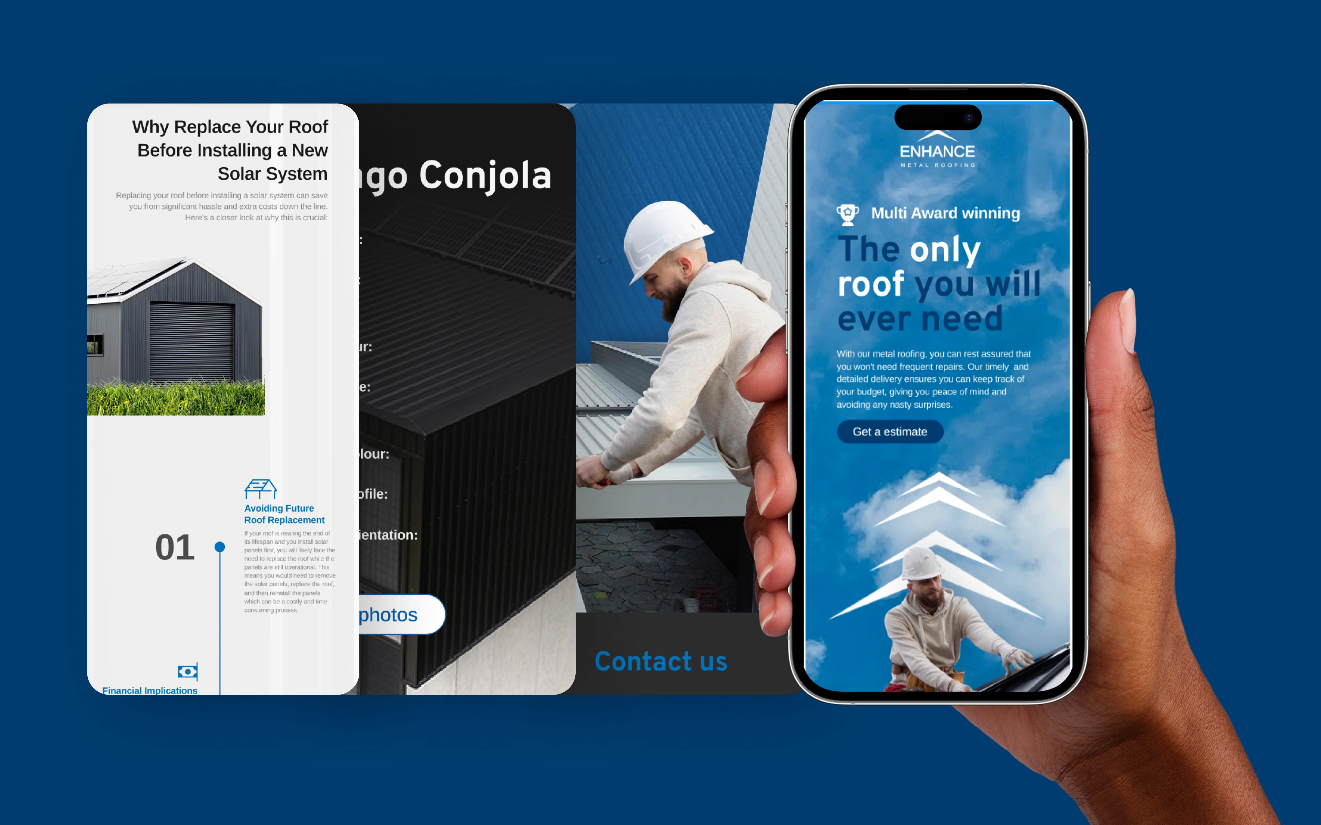
Hero section with real project photography: Worked with the client to source actual before/after images from completed jobs. Edited and color-corrected in Photoshop to look professional without feeling staged.
Single dominant CTA above the fold: "Get Your Free Inspection" with a phone number visible. No competing actions, no menu distractions. The entire first viewport funnels toward one decision.
Tiered trust architecture: Instead of dumping all credibility signals in one section, distributed them strategically: license number in the header (subtle, always visible), one client testimonial mid-page (social proof at the decision point), and guarantee badge near the CTA (risk reversal at the moment of action).
Speed-first content hierarchy: Assumed the user will spend 10 seconds scanning. Structured content so the value proposition, service area, and CTA are all visible without scrolling on mobile.
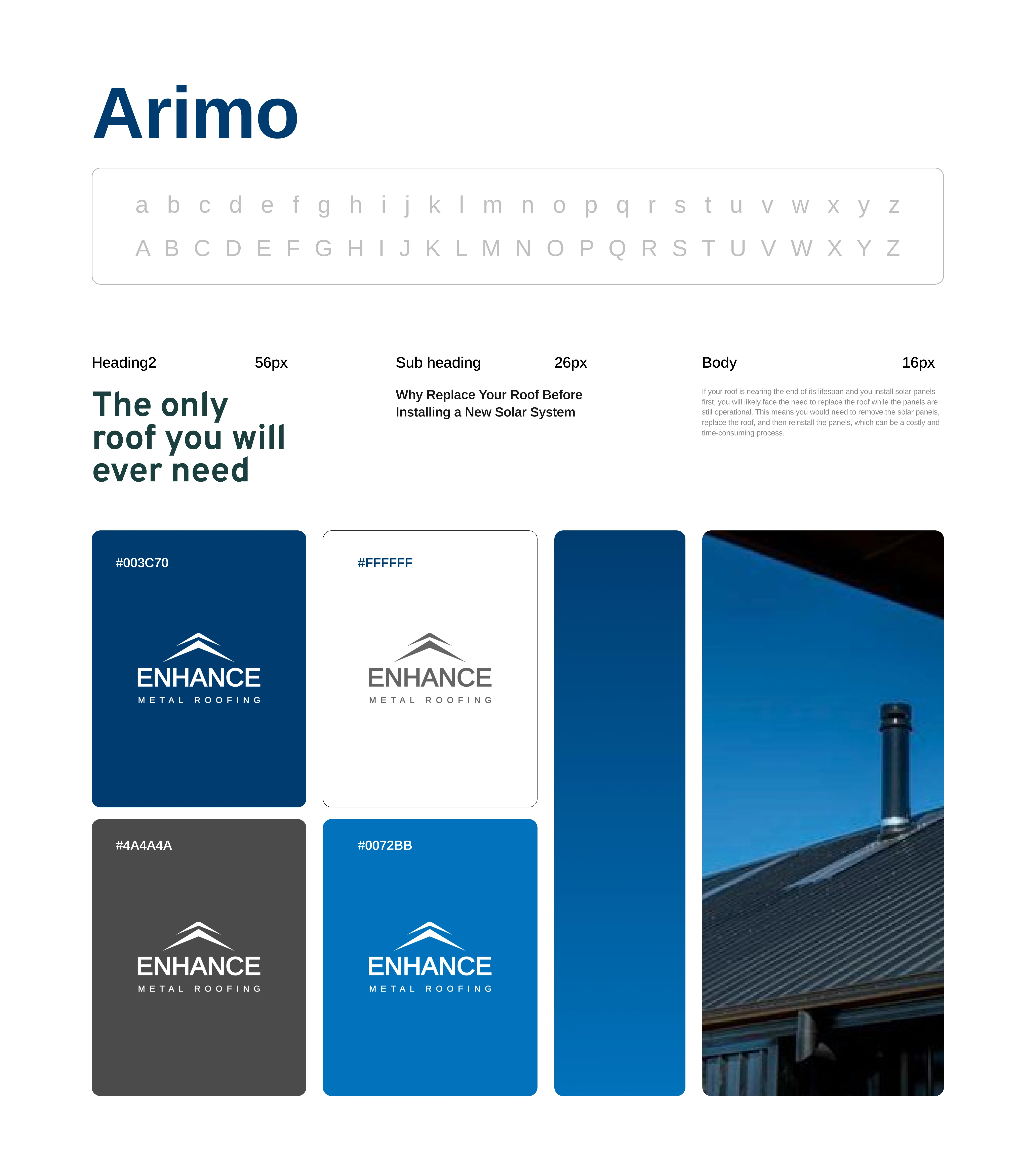
Visual Design
Bold, high-contrast color palette (dark navy + safety orange) that stands out from the typical blue/white roofing site
Large photography with overlay text for impact without sacrificing load speed
Mobile-first responsive layout with thumb-friendly tap targets on all CTAs
Clean section breaks with clear visual hierarchy guiding the eye downward
Outcome
Delivered a complete responsive landing page design in Figma with desktop, tablet, and mobile breakpoints. Included a component set for testimonial cards, service blocks, and CTA variations for A/B testing. The design was structured for easy handoff to any development platform.
Like this project
Posted Jun 11, 2025
Responsive UX/UI landing page design for a roofing company. Built in Figma with a clear lead-generation focus and modern layout.
Likes
1
Views
30
Timeline
Nov 24, 2024 - Ongoing
Clients
koollab