E-learning SaaS Platform for Online Courses
Valentina Guerrero
Verified
The Challenge
Design a scalable SaaS platform for online course management from the ground up. The platform needed to serve two very different user types: instructors creating and managing courses, and students consuming content and tracking progress. Both experiences had to feel intuitive without requiring onboarding tutorials.
Research & Discovery
Analyzed 6 competing platforms (Udemy, Teachable, Thinkific, Kajabi, Podia, and LearnDash) to map common UX patterns and pain points. Udemy was the primary reference the client provided as a benchmark. Key insights:
Course creation flows are often linear and rigid, forcing instructors into a fixed structure that doesn't match how they think about content
Student dashboards tend to prioritize metrics over motivation (completion percentages without context)
Navigation between admin and student views is usually disjointed, creating confusion for instructors who also want to preview the student experience
Mapped user journeys for both personas: an instructor publishing their first course, and a student enrolled in 3+ courses simultaneously.
The Hard Problem: Dual-Interface Architecture
The core challenge was designing one coherent platform that serves two fundamentally different mental models. Instructors think in terms of modules, lessons, and assets. Students think in terms of progress, deadlines, and "what's next."
What made it difficult:
Shared components (like a lesson card) need to show different information and actions depending on who's viewing them
The instructor needs a content management mindset (drag, reorder, edit), while the student needs a consumption mindset (play, mark complete, continue)
Both users access the same URL structure, so the system has to contextually adapt without feeling like two separate products stitched together
How I solved it:
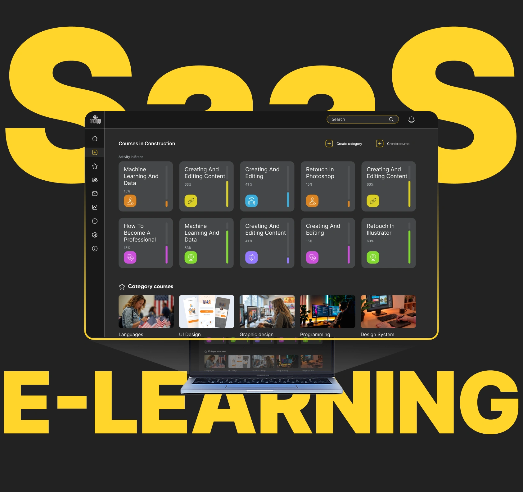
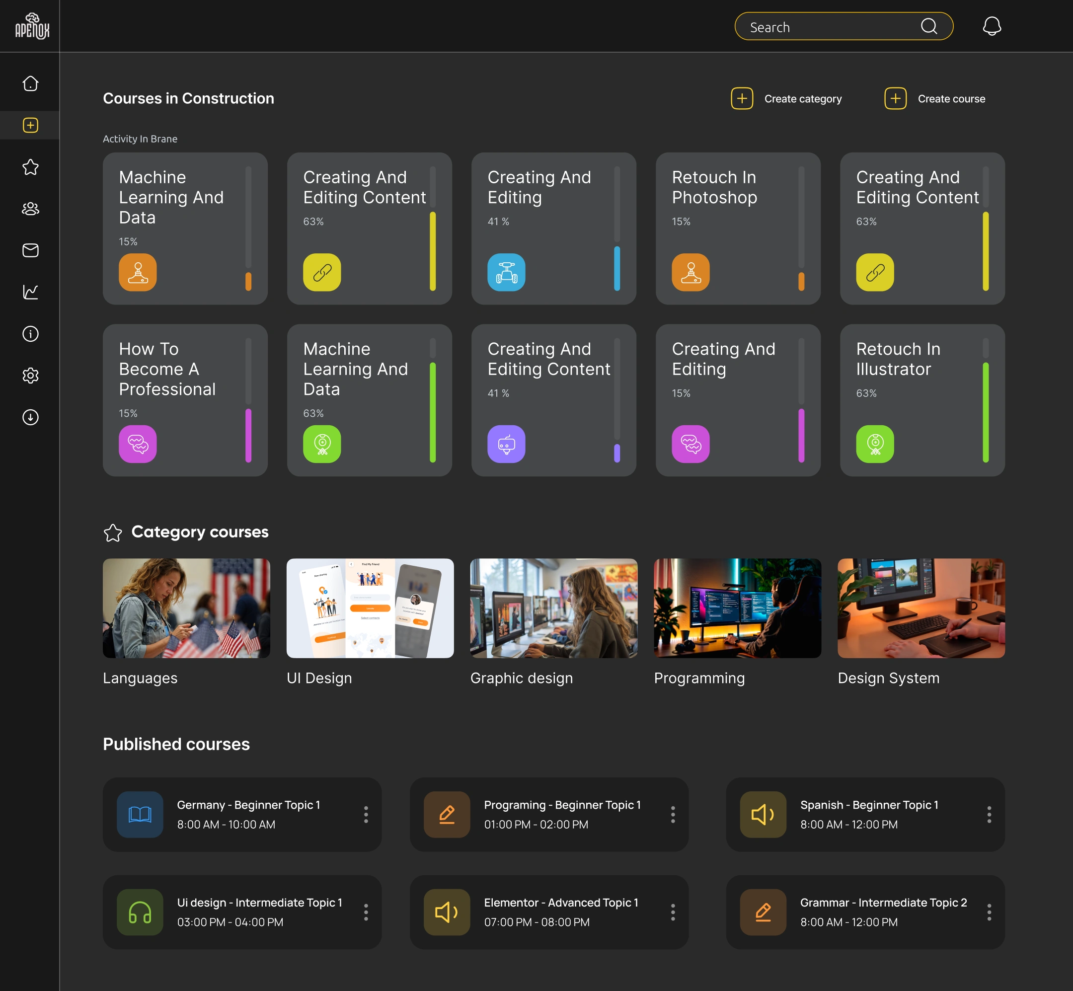
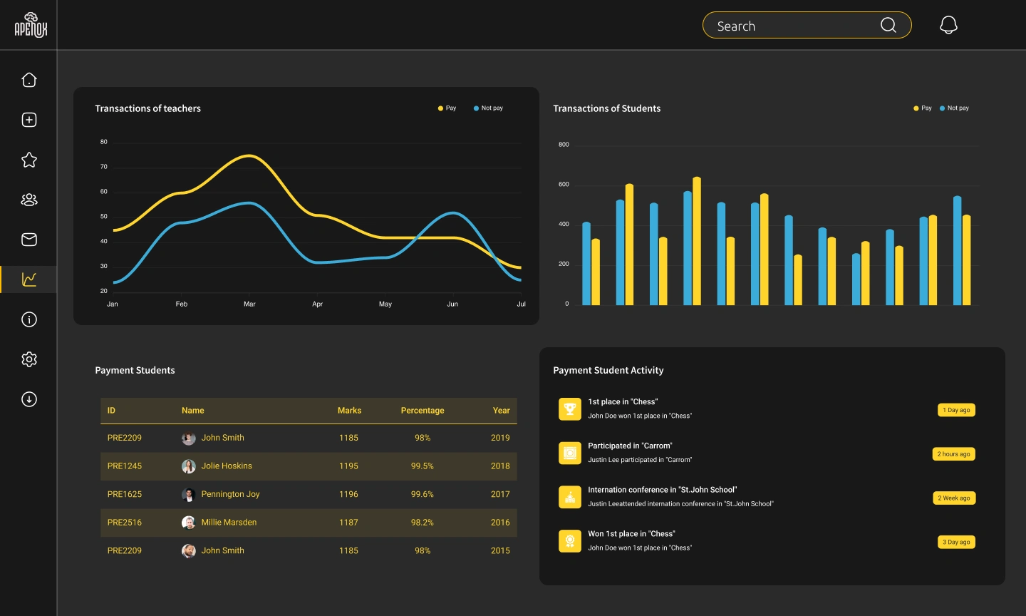
Role-aware component system: Designed a single component library where each element has instructor and student variants. Same visual language, different content density and action sets. This kept the platform feeling unified while serving both needs.
Contextual action bars: Instead of cluttering the interface with every possible action, the top bar adapts based on the user's current task. Instructors editing a lesson see publish/preview/settings. Students viewing the same lesson see progress/notes/next.
Progressive complexity for instructors: The course builder starts with a simple outline view (just titles and order). Advanced options (drip scheduling, prerequisites, certificates) reveal only when the instructor explicitly expands them. This prevents the "blank cockpit" feeling that kills first-time setup.
Unified preview mode: Instructors can toggle into "student view" at any point during editing without leaving their workflow. This eliminated the need to publish drafts just to check how things look.
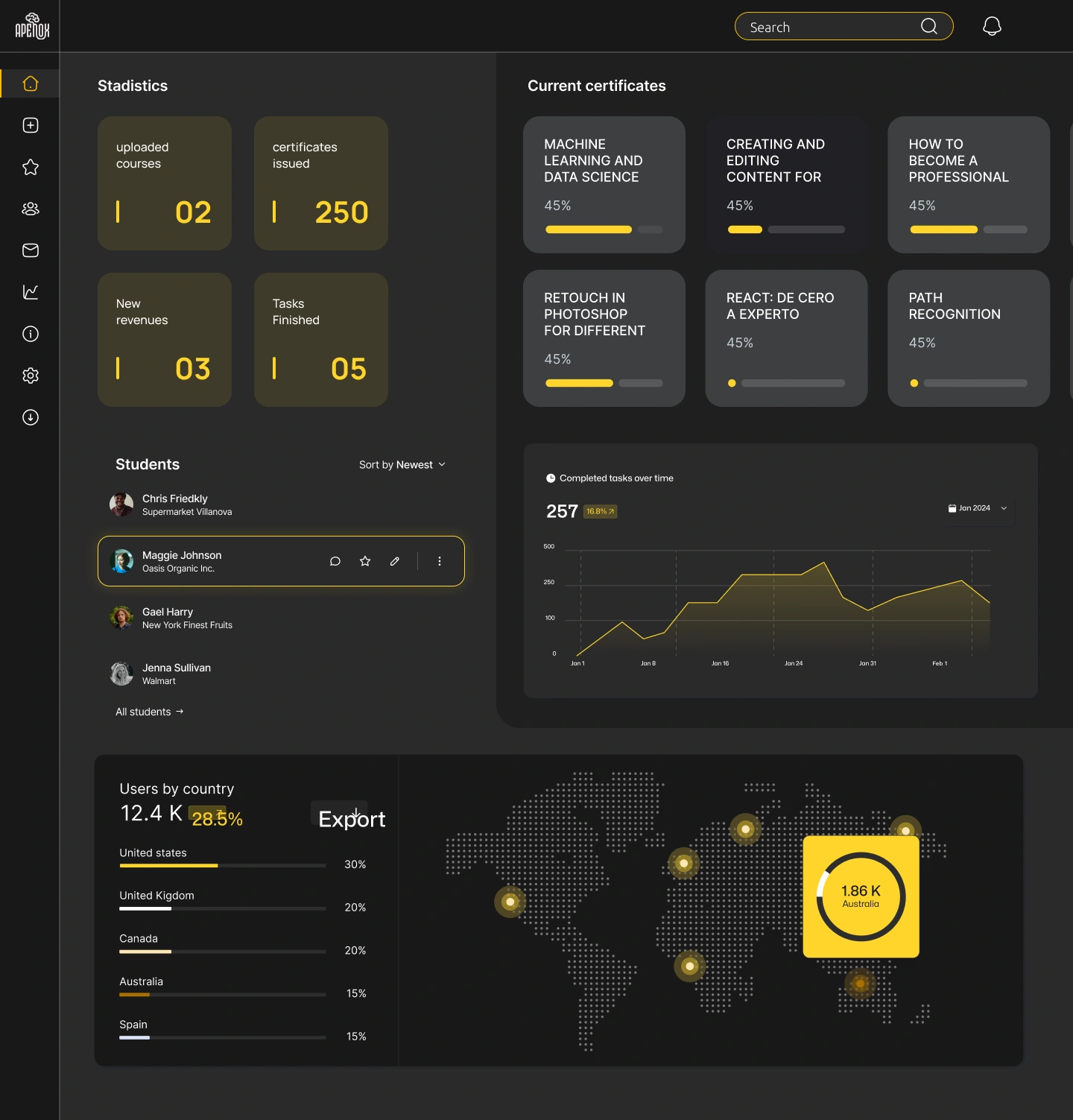
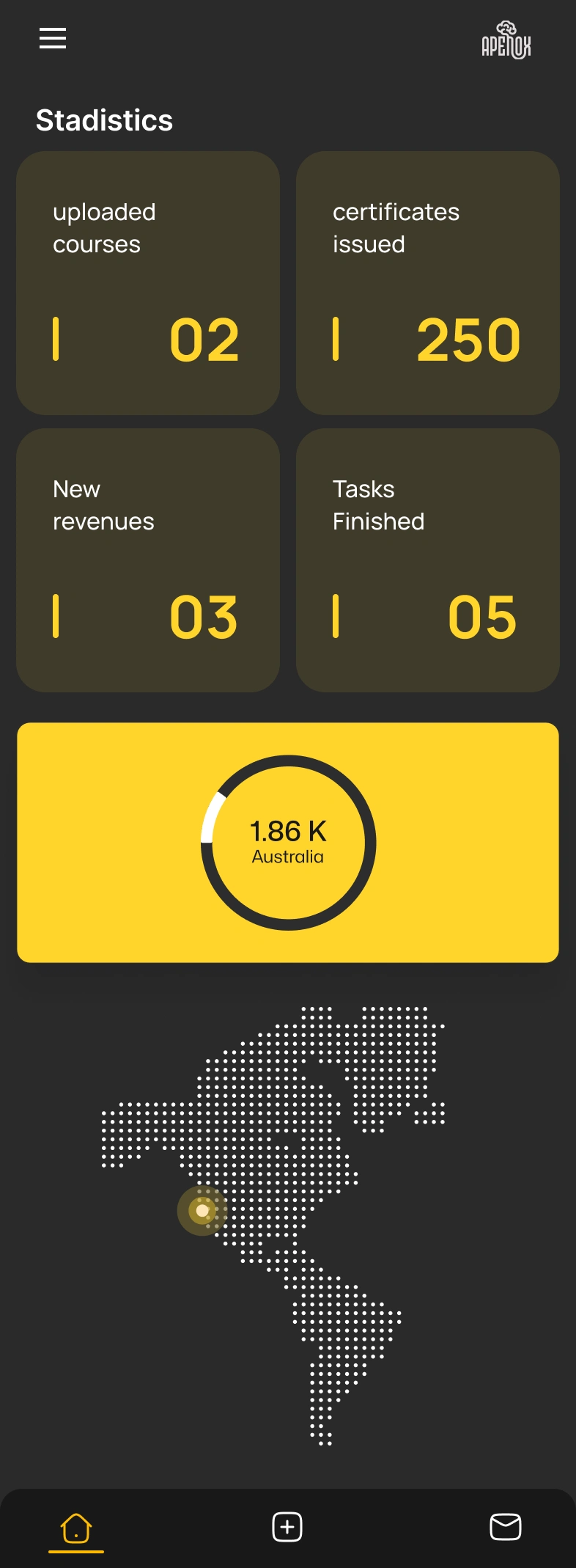
Visual Design
Light, airy palette with generous whitespace to reduce cognitive load during long study sessions
Consistent card system across courses, lessons, and modules for scanability
Clear typographic hierarchy separating content titles, metadata, and action labels
Responsive grid that adapts from desktop (instructor primary) to tablet/mobile (student primary)
Outcome
Delivered a complete design system with 60+ screens covering both instructor and student flows, a reusable component library with role-based variants, and interactive prototypes for usability validation. The Figma file was structured with auto-layout and clear developer handoff documentation.
Like this project
Posted Jun 24, 2025
Scalable UI/UX design for an e-learning SaaS platform with user flows, wireframes, and high-fidelity components for online course management.
Likes
1
Views
45
Timeline
Dec 20, 2024 - Jan 23, 2025
Clients
Apenox