Fitness & Activity Tracking App - Mobile Redesign
M M Azaz
Overview
I redesigned a fitness and activity-tracking mobile app to deliver a more intuitive, motivating, and data-driven user experience. The goal was to simplify navigation, increase user engagement, and present health metrics in a way that feels friendly, clear, and instantly digestible.
🎯 The Challenge
The original experience suffered from:
Scattered information across screens
Poor hierarchy and overwhelming data blocks
No clear structure for workouts, progress, or recommendations
Limited guidance for new users
A chatbot feature that felt disconnected from the overall flow
Users needed an interface that felt personal, lightweight, and supportive — not clinical or complicated.
🧠 My Approach
I focused on creating a holistic daily fitness companion built on clarity, structure, and personalization.
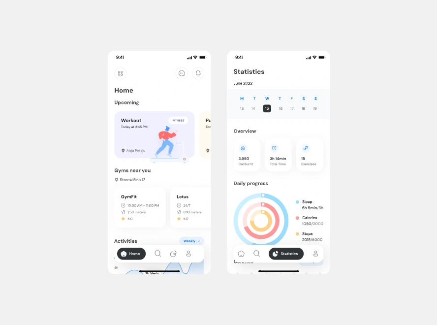
1. Rebuilt the Home Experience
Clear “Upcoming Workout” card to anchor daily intention
Nearby gym recommendations with distance + rating
Weekly activity snapshot for quick motivation
Clean visual hierarchy with soft spacing and friendly illustrations
The home screen now feels like a guided fitness dashboard rather than a static list.
2. Designed a Modern Statistics Dashboard
Health metrics can easily feel overwhelming — so I reframed the data to be visual, human, and quick to interpret.
I introduced:
A calendar for navigating daily/weekly stats
Easily scannable metric cards for calories, total time, and exercise count
A circular progress ring that visualizes sleep, calories, and steps in one unified view
This created a more engaging way for users to understand their habits at a glance.
3. Integrated a Smarter Fitness Chatbot
The chatbot was redesigned to feel like a real assistant — conversational, contextual, and useful.
Key improvements:
Clean message bubbles with lightweight icons
Pre-built action buttons (Book a gym visit, Explore facilities, More options)
Location-based suggestions for gyms and activities
Smooth bottom input bar for quick interactions
This transformed the bot from a novelty into an actionable fitness concierge.
✨ Visual Direction
I focused on:
A light, breathable interface
Rounded components for approachability
Soft gradients and subtle shadows
Minimal but expressive icons
High accessibility contrast where needed
The result is a UI that feels friendly, modern, and motivating — perfect for a wellness-focused mobile app.
🚀 Outcome
The redesign helped:
Reduce cognitive load
Increase clarity of daily tasks and goals
Improve consistency across the entire product
Make fitness data more engaging and rewarding
Turn the chatbot into a meaningful feature in the user journey
This updated structure forms a solid base for scaling future features like habit loops, challenges, personalized plans, and subscription logic.
🔍 Tools Used
Figma
Auto-layout, component set building
Prototyping for interactions
Light UX writing for clarity
Like this project
Posted Dec 5, 2025
A fitness and activity-tracking mobile app to deliver a more intuitive, motivating, and data-driven user experience. The goal was to simplify navigation.