Real Estate Property Discovery App
M M Azaz
Real Estate Property Discovery App — Mobile Redesign
Overview
I redesigned a real-estate discovery app to help users find homes faster with a more intuitive search flow, a stronger visual hierarchy, and a clear focus on property details that matter. The goal was to create a simple, elegant, and highly visual browsing experience built for modern home-seekers.
🎯 The Challenge
Real-estate apps often overload users with options and text-heavy cards. This project required:
A smoother way to explore nearby listings
A cleaner, high-impact property presentation
Quick access to key details (price, rooms, location)
A more emotional, lifestyle-driven visual tone
A search experience that feels effortless on mobile
🧠 My Approach
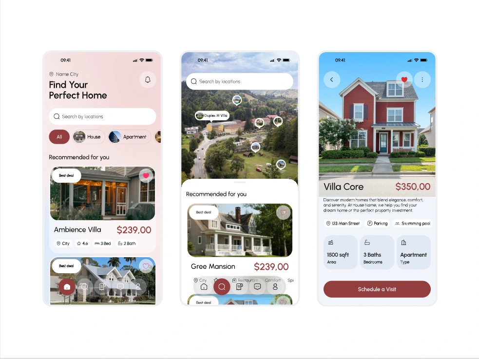
1. A Warm, Guided Home Screen
I designed a welcoming hero section with:
A soft gradient background
A clean location search bar
Category filters for House / Apartment
Smart recommendation cards with price, bed count, and amenities
The screen sets the right tone — friendly, simple, and aspirational.
2. Immersive Map-Based Exploration
The map screen makes browsing far more visual. I introduced:
Property pins with price tags
A full-width search bar for quick filtering
Scrollable recommendations anchored to the bottom
A light, airy UI for browsing multiple areas at once
This creates a hybrid browsing flow: map-first + card-first depending on user preference.
3. A High-Impact Property Details Screen
To help users make decisions faster, I restructured the detail view:
Full-bleed hero image showcasing the home
Large, clear price
Short lifestyle description
Essential details grouped into cards (area, beds, type, amenities)
A bold primary CTA: “Schedule a Visit”
This design supports both emotional appeal and practical decision-making.
✨ Visual Direction
The aesthetic blends modern minimalism with warm tones:
Soft gradients and pastel backgrounds
Rounded components for a friendly feel
Clean typography
Strong photo-centric layout
Light iconography to reduce clutter
The UI feels premium and approachable — ideal for real-estate browsing.
🚀 Outcome
The redesign elevated:
User confidence while browsing
Visual clarity of listings
Engagement on detail pages
Time spent exploring properties
Conversion opportunities via the visit scheduling CTA
The final UI creates a strong foundation for scaling more features like comparisons, favorites, and smart recommendations.
🔍 Tools Used
Figma
Auto-layout + component variants
Micro-interactions and flow prototypes
Like this project
Posted Dec 5, 2025
Redesigned a real-estate discovery app to help users find homes faster with a more intuitive search flow, a stronger visual hierarchy.
Likes
0
Views
7