Built with Framer
Robi WiFi Website Experience Design
M M Azaz
Case Study — Robi WiFi Landing Page (Desktop & Mobile)
Role: Lead UI Designer
Platform: Web
Duration: 1.5 weeks
Tools: Figma, Framer
Overview
Robi WiFi needed a sleek, conversion-focused landing page to promote their home internet devices and simplify the buying journey for customers across Bangladesh. My responsibility was to redesign the entire experience for both desktop and mobile, ensuring clarity, speed, and trust-building visual communication.
Objectives
Present Robi’s internet product as modern, fast, and reliable
Reduce friction in the device selection and purchase journey
Highlight key benefits with strong visual storytelling
Organize technical details in a clean, easy-to-read layout
Create consistent responsive versions (desktop + mobile)
Process & Design Thinking
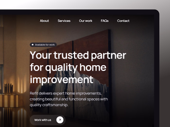
1. Hero Section Built for Conversion
Clean, minimal layout with strong headline
Product device visual as a primary attention anchor
Clear CTA: Buy Product
Supporting details (speed, device compatibility, warranty)
This instantly sets expectations and communicates reliability.
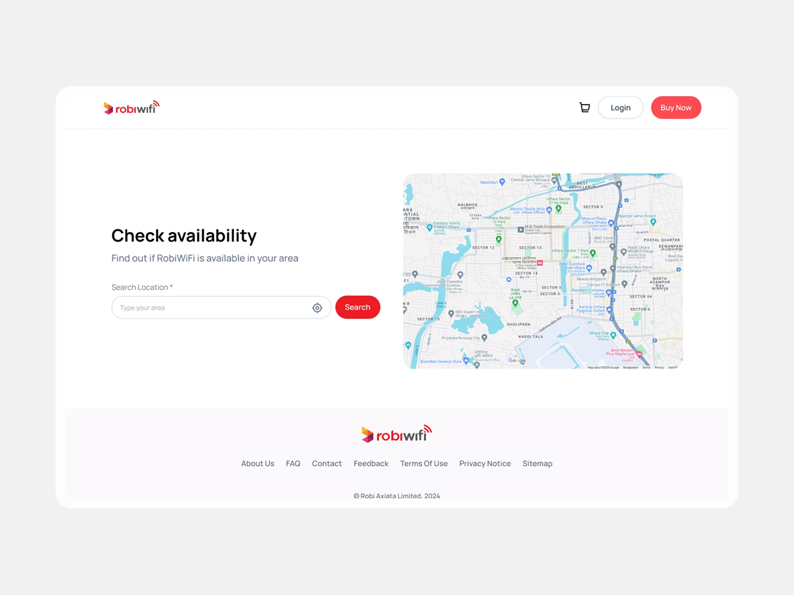
2. Availability Checker — A Key Funnel Step
Customers must confirm network availability before purchasing, so I:
Added a clean location search bar
Designed a map preview for transparency
Included a bold "Check Availability" CTA
This step improves trust and reduces user drop-off later.
3. Feature Highlight Using Modern "Accordion × Visual" Layout
I created a dual-panel layout:
Left: Feature list in an interactive accordion
Right: Corresponding image/visual cue
This structure helps explain benefits without overwhelming the user.
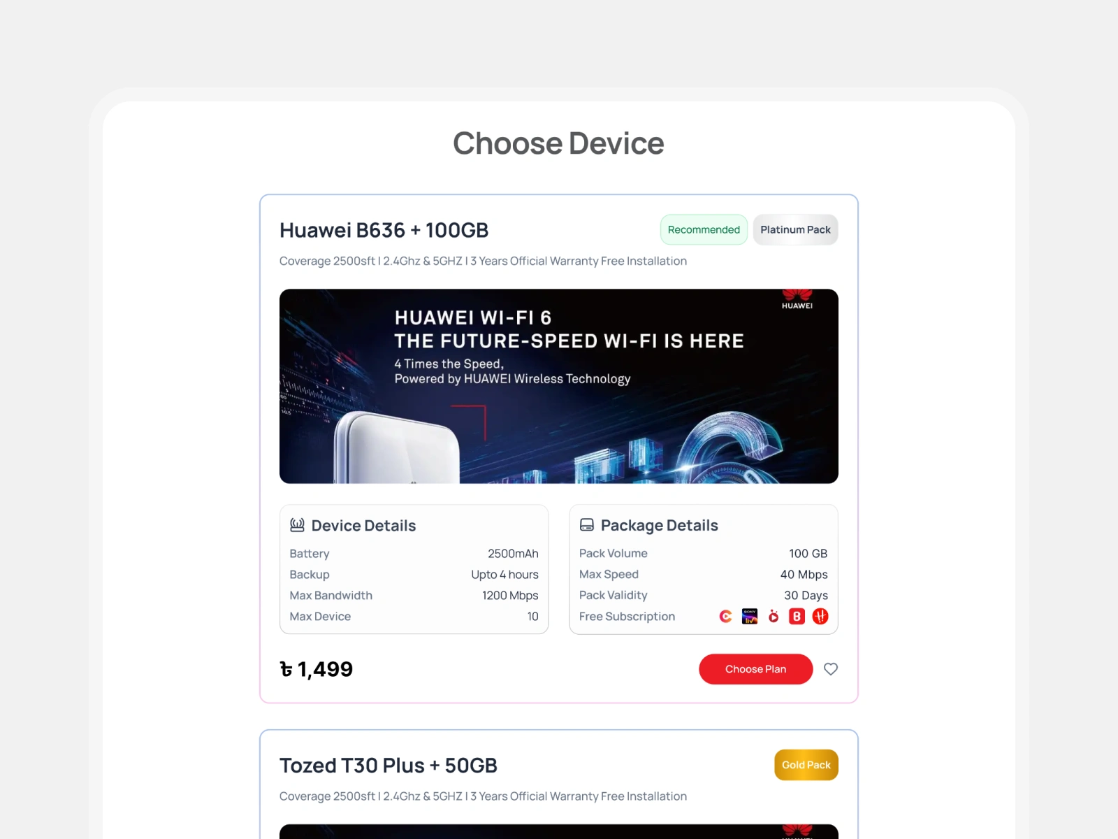
4. Devices Section — Focus on Clarity & Comparison
Each device card includes:
High-quality product render
Key device specs
Package details
Icons for quick scanning
Pricing & CTA
The cards follow a modular structure so the team can easily add more devices later.
5. Strong Mobile Experience
The mobile version is not just reduced — it’s reflowed for natural thumb navigation:
Vertical stacking
Full-width CTAs
Optimized readability
Touch-friendly interaction zones
The entire experience feels purposeful and lightweight on mobile.
Outcome
The redesigned landing page delivers:
A clean, modern, premium look aligned with Robi branding
Dramatically improved content hierarchy
Higher clarity in device selection
A smoother, more intuitive browsing experience
This structured approach helps users move confidently from interest → availability check → device selection → purchase.
Final Deliverables
Desktop landing page design
Fully responsive mobile version
Component library for reuse
Export-ready assets
Clean Figma file prepared for developer handoff
Like this project
Posted Nov 25, 2025
I Redesigned Robi WiFi's website for better user experience on desktop and mobile. The previous version lacked hierarchy, had scattered information.