TabTally — Bill-Splitting App Design

Hibye Studio


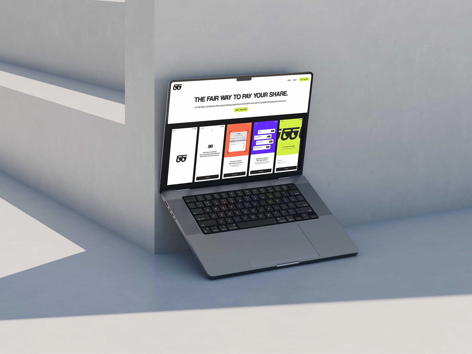
A concept for a bill-splitting app that makes dining out with friends less awkward. The design challenge was turning a transactional moment into something that actually feels good to use.
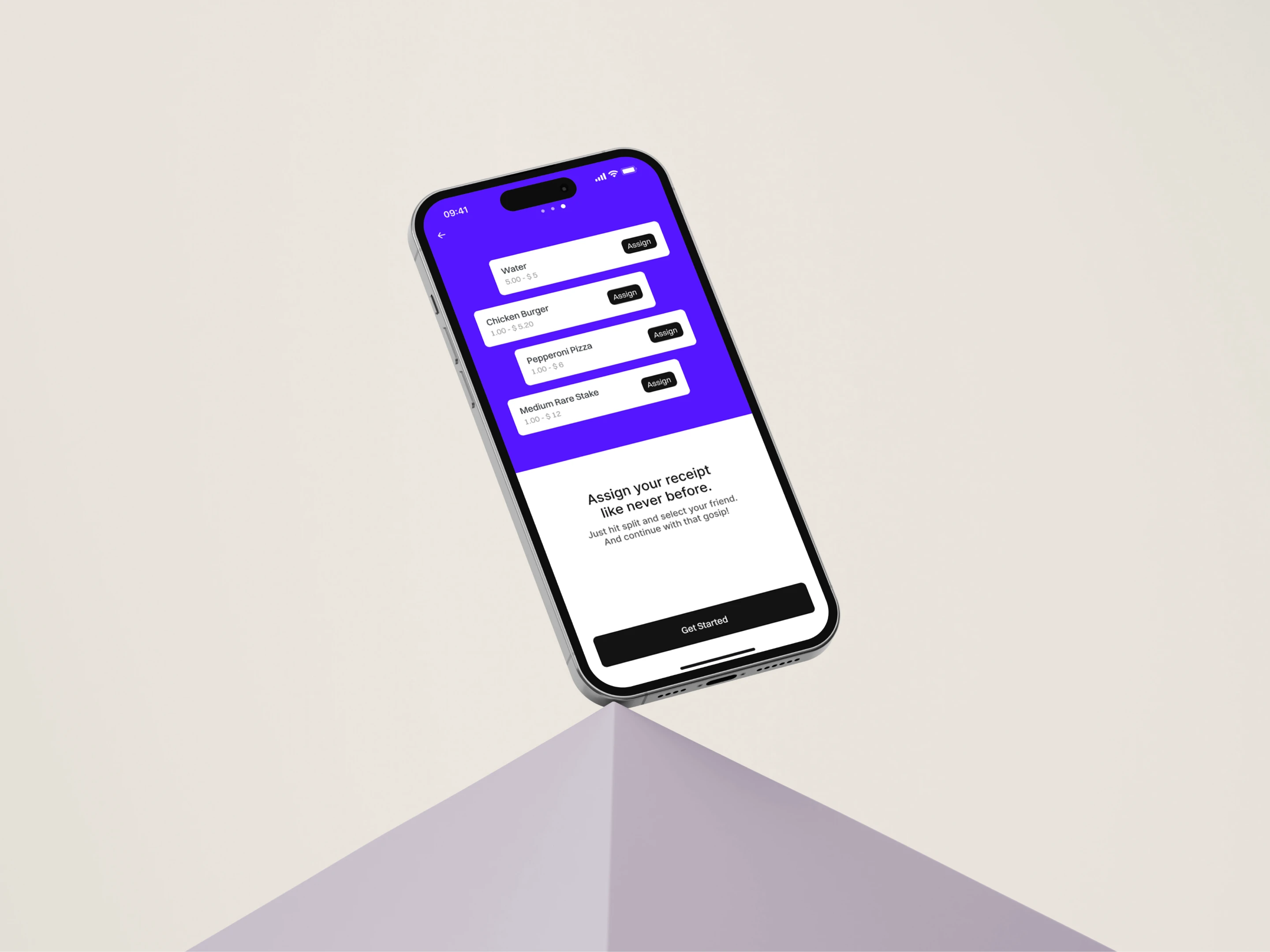
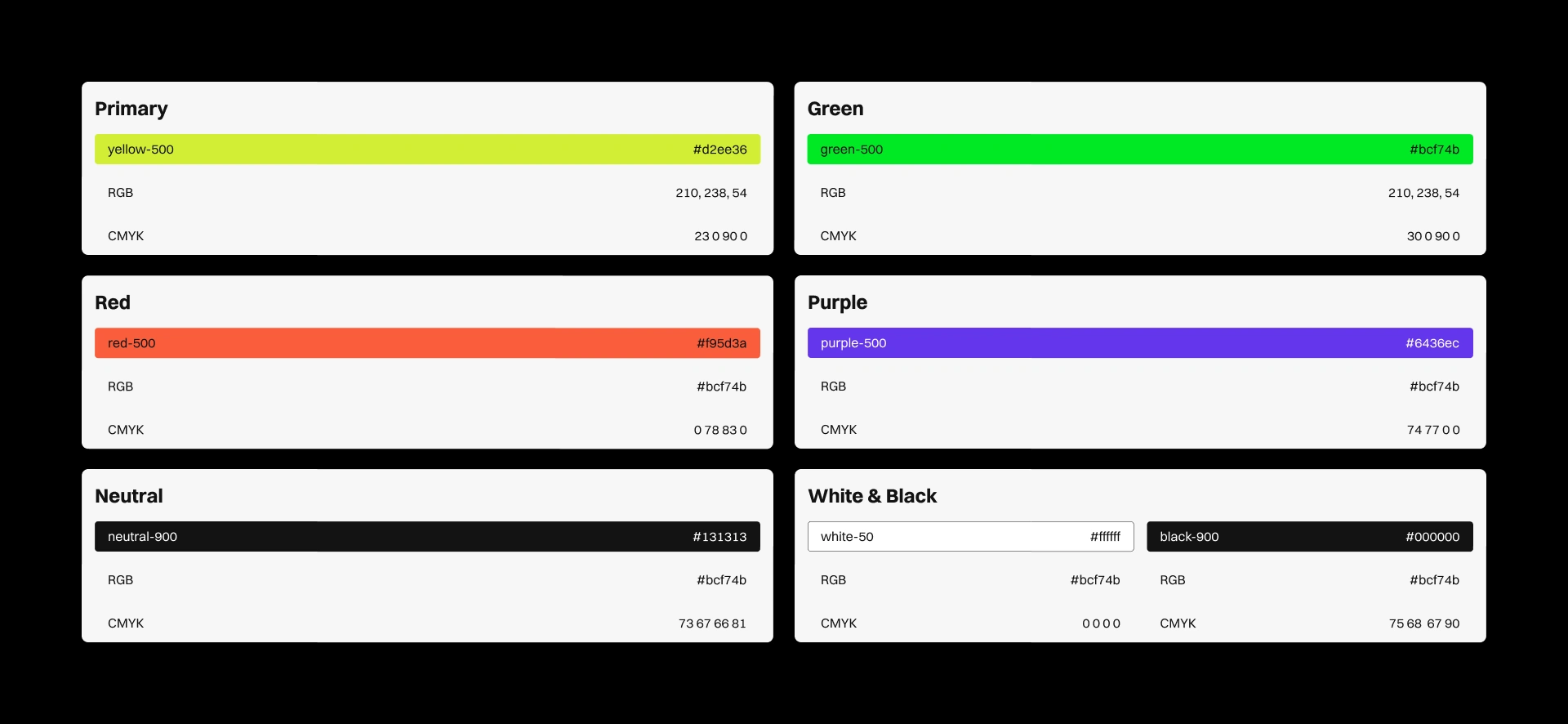
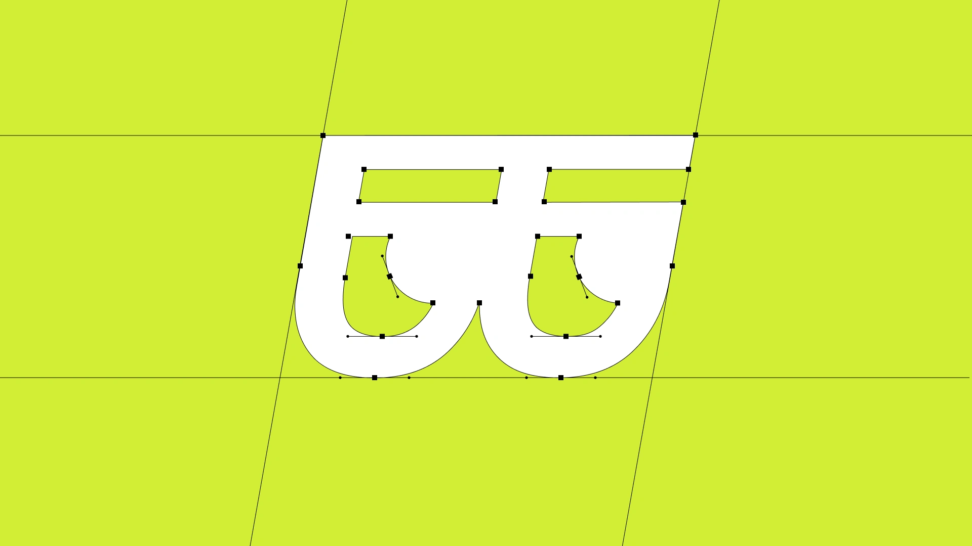
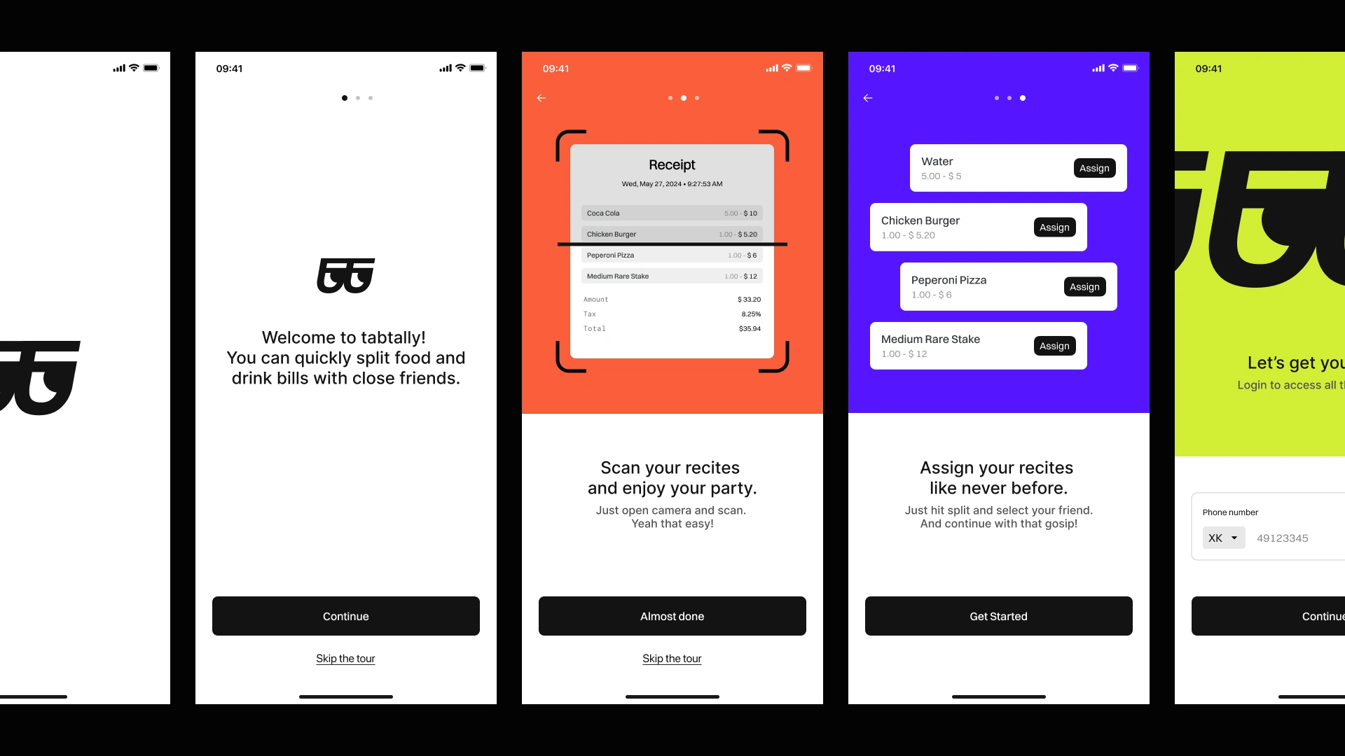
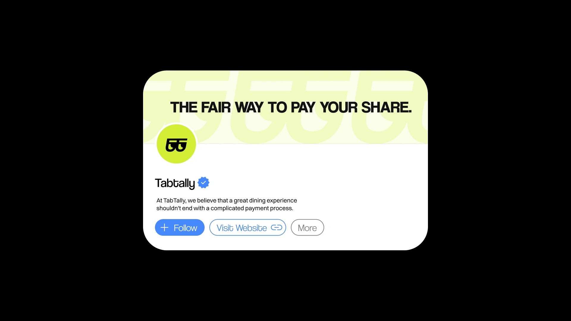
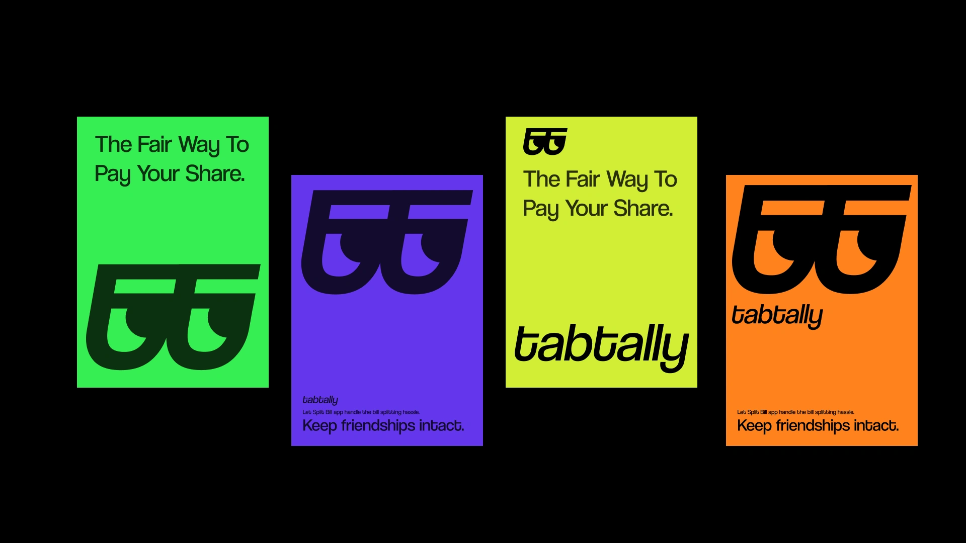
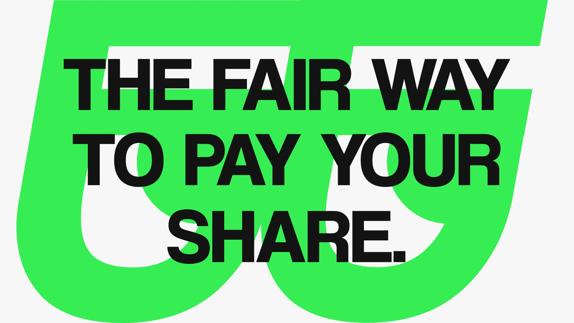
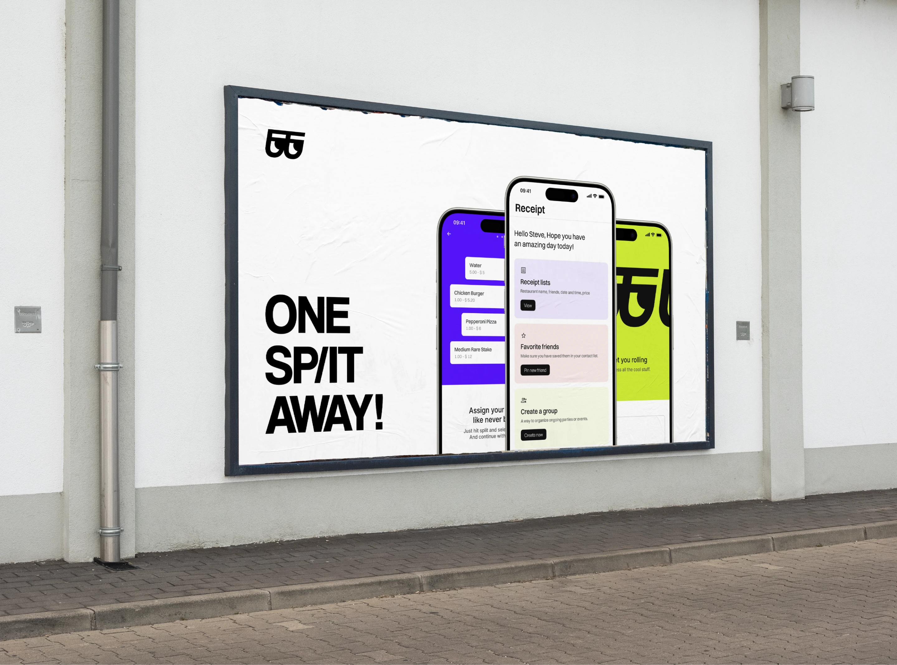
The brand identity pairs bold color with clean UI. The tone is confident and casual, matching the social context where the app lives.
Every screen was designed to minimize taps. Splitting a bill should take seconds, not minutes. The flow moves from scan to split to pay with as little friction as possible.
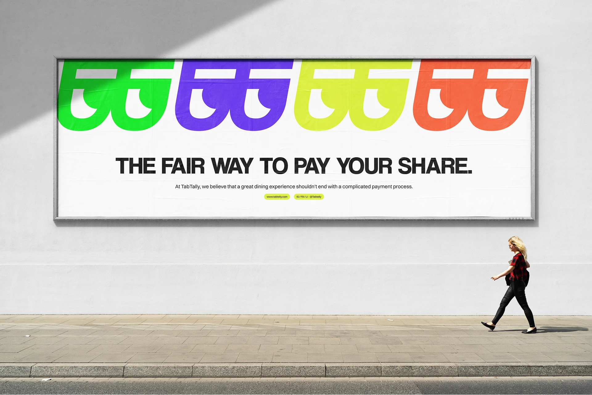
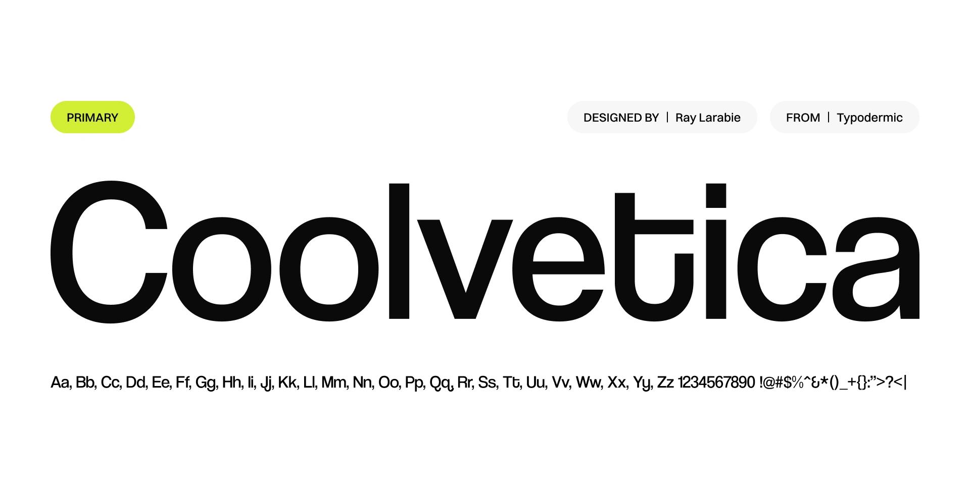
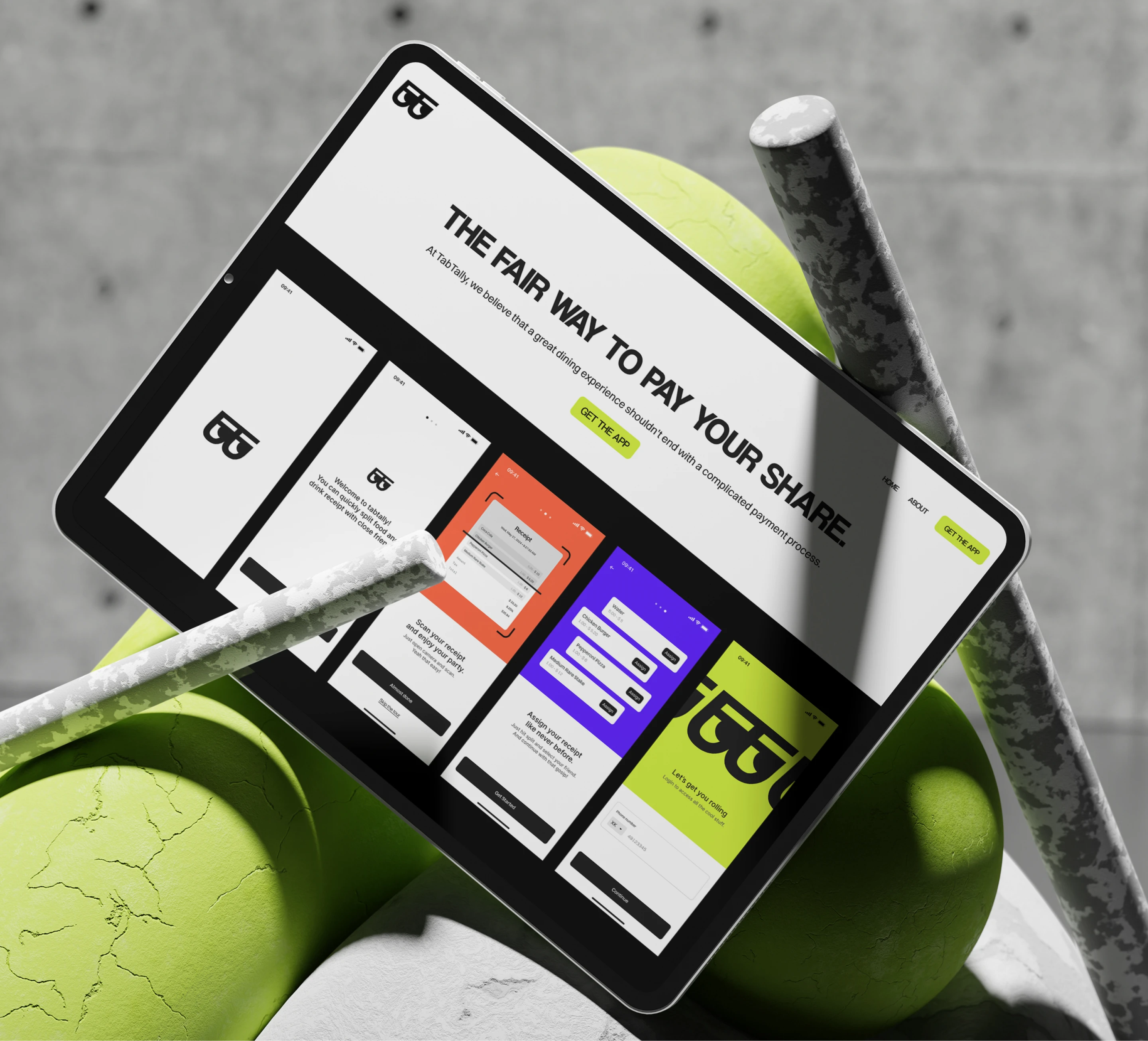
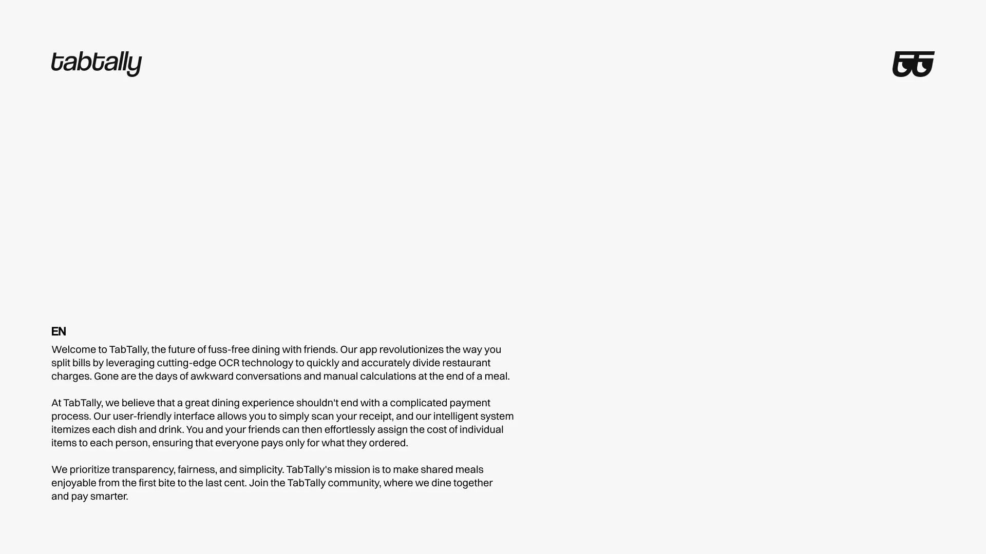
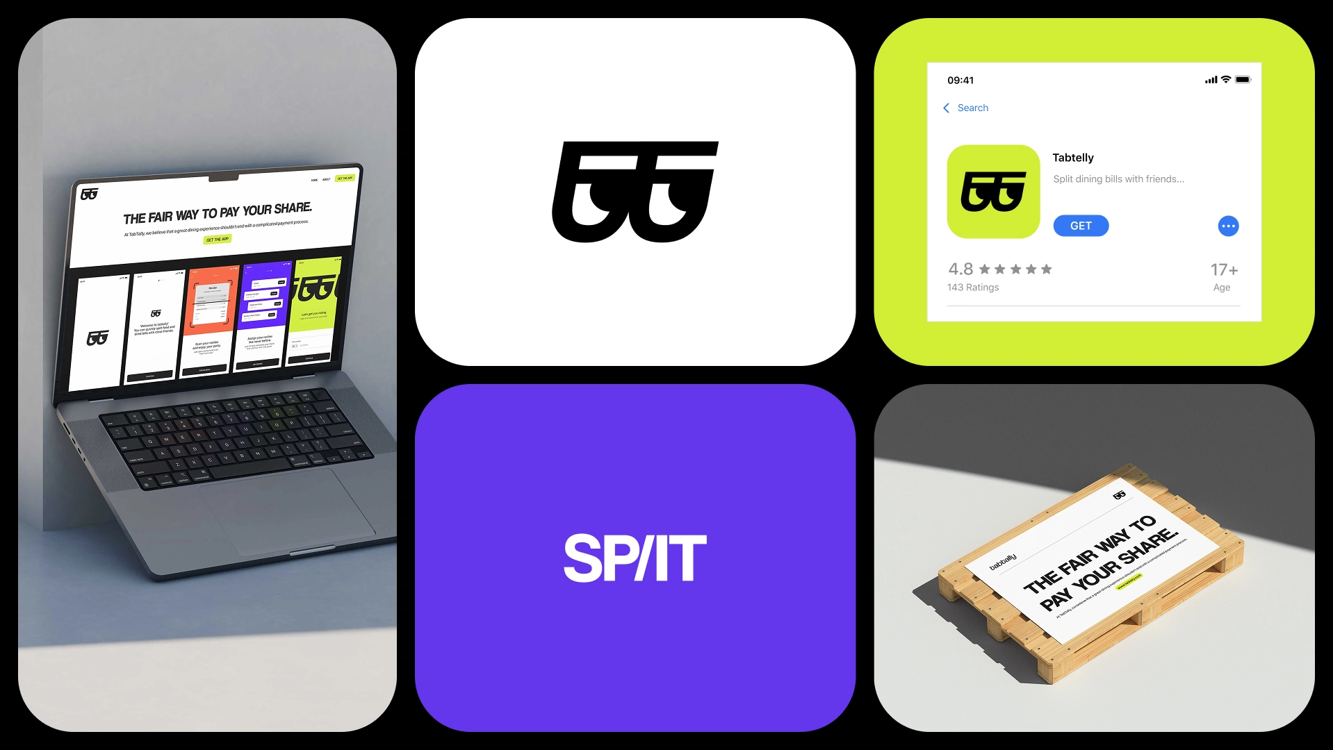
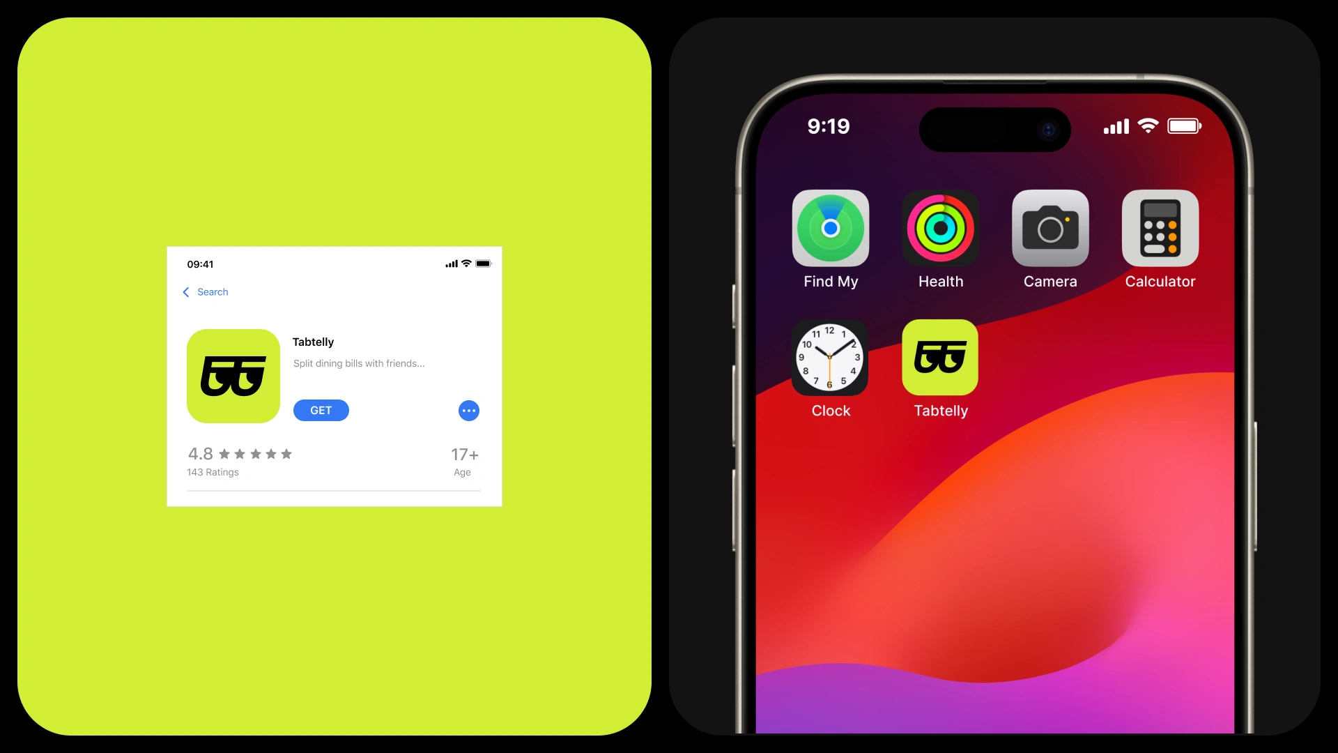
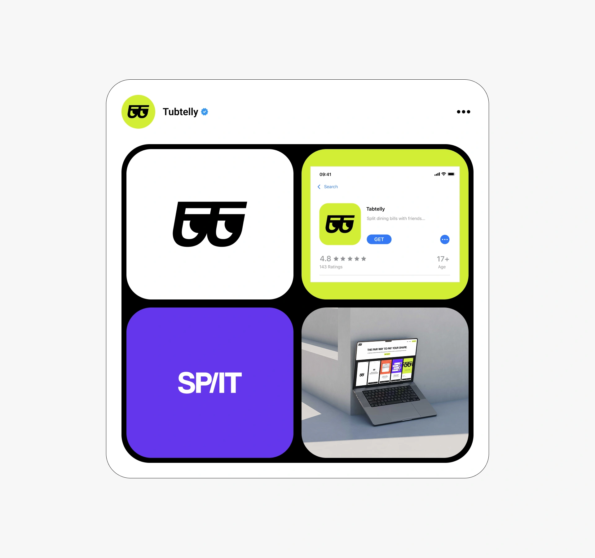
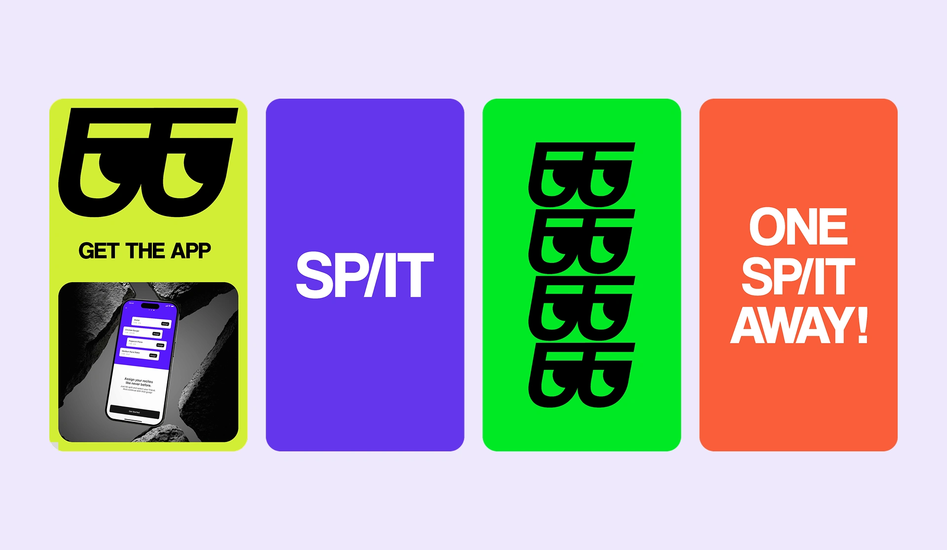
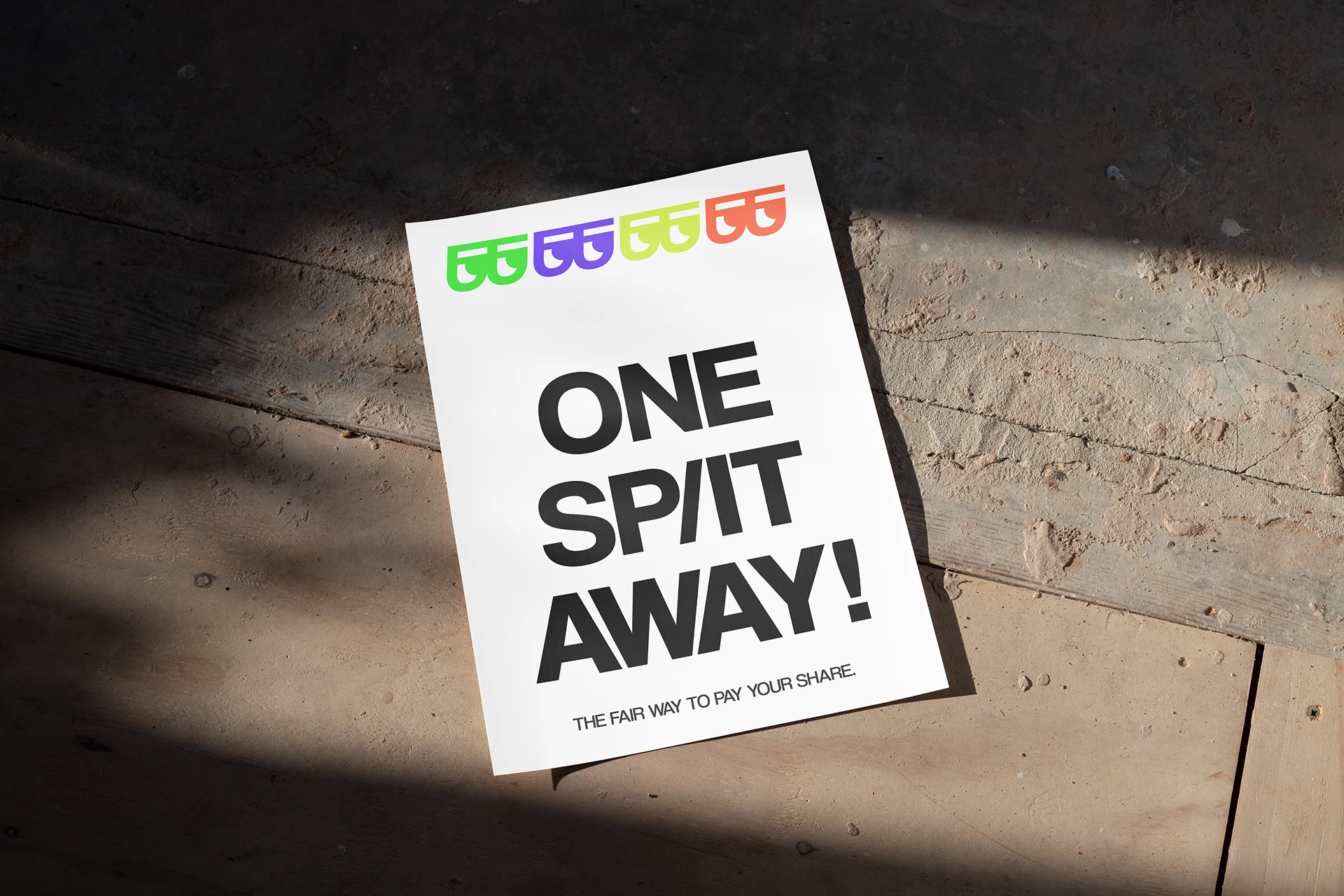
The visual system extends beyond the app into marketing materials, social content, and presentation decks. Everything shares the same energetic, approachable feel.
Like this project
Posted Jun 19, 2026
Designed a mobile app identity and UI for splitting dining bills, with clean flows, bold branding, and a simple payment experience.