Rebranding for MAF
Chiara Pucci

Category
Brand Strategy and Design
Scope
Market Research & Customer flow
Brand Strategy (Voice, Values, Positioning)
Visual Identity Design
Editorial and Packaging Design
Brand Book with Identity Guidelines
Type
Personal project
Tools
Adobe InDesign, Illustrator, Photoshop, After Effects, Miro, Notion
Year of completion
2025
MAF stands for Museo Archeologico Nazionale di Firenze (National Archaeological Museum of Florence) and currently presents an incoherent and weak verbal and visual identity.
The museum holds a substantial permanent collection comprising of Egyptian, Etruscan, Roman artefacts as well as items belonging to the De' Medici family, who ruled Florence and, later, the rest of Tuscany during most of the period from 1434 to 1737, provided the Roman Catholic Church with four popes – Leo X, Clement VII, Pius IV, Leon XI – and married into the royal families of Europe. The museum also hosts temporary exhibitions and events.
Despite the museum's broad exhibition and activity, each section speaks its own language and in its own graphics. Temporary notices may look different from one another and from permanent ones. The current museum thus called for a coherent identity, both verbal and visual.
After an in-depth research to understand all aspects of the museum and to define the customers' nature and flow, which was also possible thanks to the staff of the institution, a new coherent brand identity was established.
The personality of the new brand reminds one of the wise yet witty character of a powerful, knowledgeable person. To reflect this, rules around adopted lexicon, style and tone of voice were established.
To reflect the personality and to improve legibility of information, Neulis Neue was chosen as the primary Typeface, a sans-serif 'with a flair', accompanied by Ten Oldstyle, which works as the secondary typeface.
At the same time, the many artefacts' materials the museum holds were used to generate the brand's versatile colour palette: the Iron Red palette for the permanent main collection – Egyptian, Etruscan and Roman –, the Pottery Orange palette for kids-related activities, the Malachite Green palette for temporary exhibitions and events, and the Copper Blue palette for anything related to the De' Medici.
The visual identity called for impactful elements representing the history the museum holds but, on the other hand, linked to modern times.
Starting from a visual map, history stands for a collection of tangible things like materials and intangible elements like memories and languages. The museum, being the place where history is held, becomes the setting, in the present day, where people can hear and see echoes of the past to inform their future.
The logomark comes from a symbol present in most of the artefacts present in the museum, while also representing the concept behind the entire visual identity.
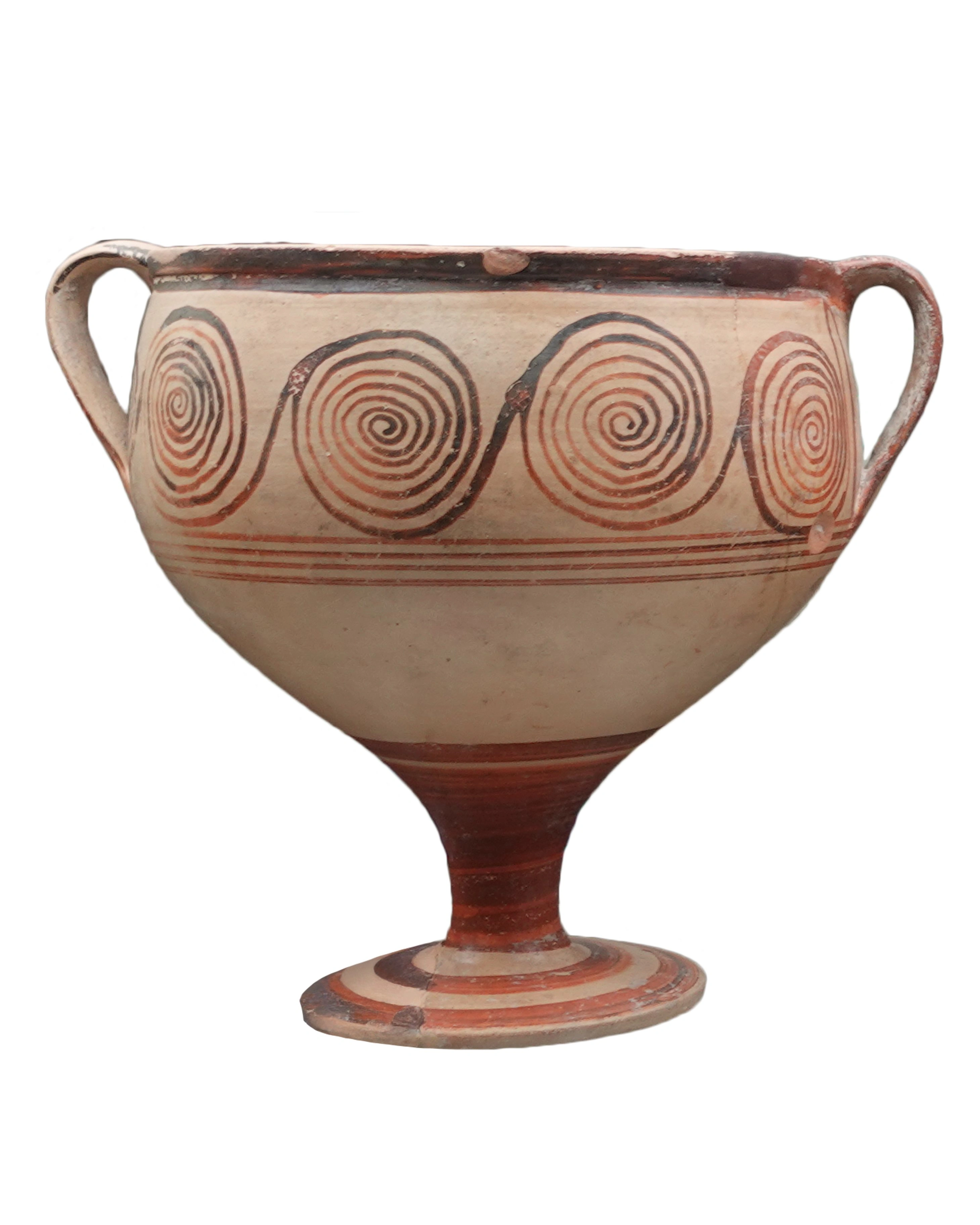
One of the many artefacts that inspired the logomark
The Echo Symbol is another useful visual element to let the Key Visual (artefact photograph) speak in the design.
Following, we can see the comparison between the new logo system and the old singular logo.
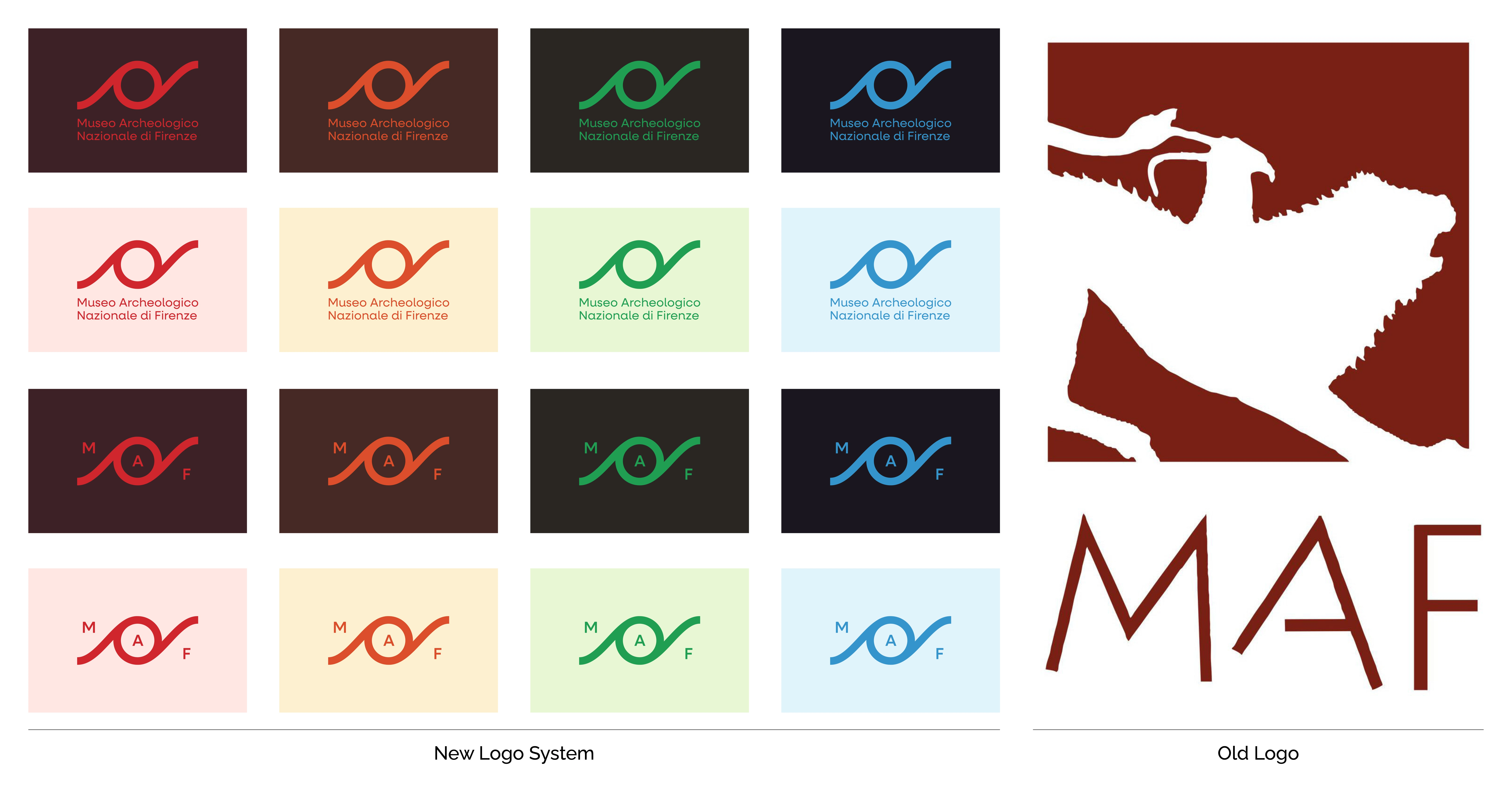
Comparison between new and old logo system
Given that the museum's building belonged to the De' Medici family, it is clear why the current (old) logo chose to represent the hero artefact of the family's collection: the Chimera.
However, the old logo did not serve the full variety and spectrum of artefacts and activities the museum breathes.
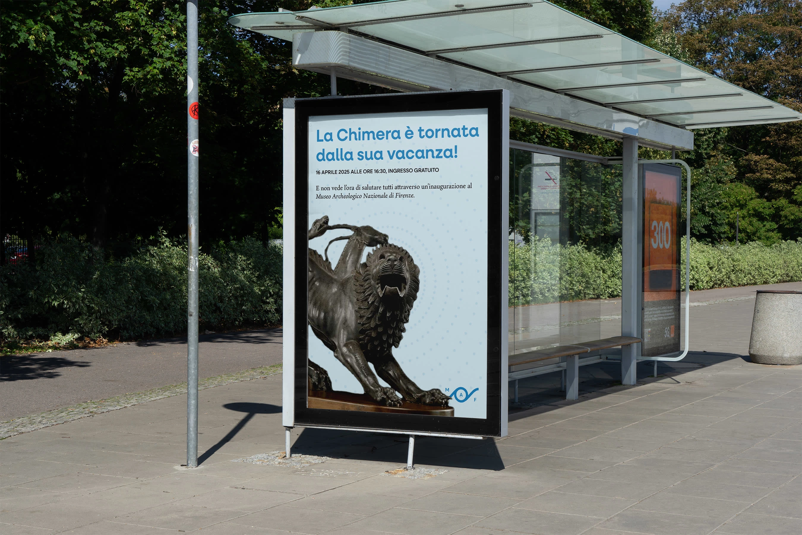
OOH visual and verbal application example
Posters, for each museum section, with lockup variation
As examples of applied guidelines, posters (both for the shop and OOH ads), postcards, social media posts & stories – the current museum is quite active on Instagram – were developed, as well as a brochure usable as both a ticket and a map to get around the building, and staff cards, especially useful for events.
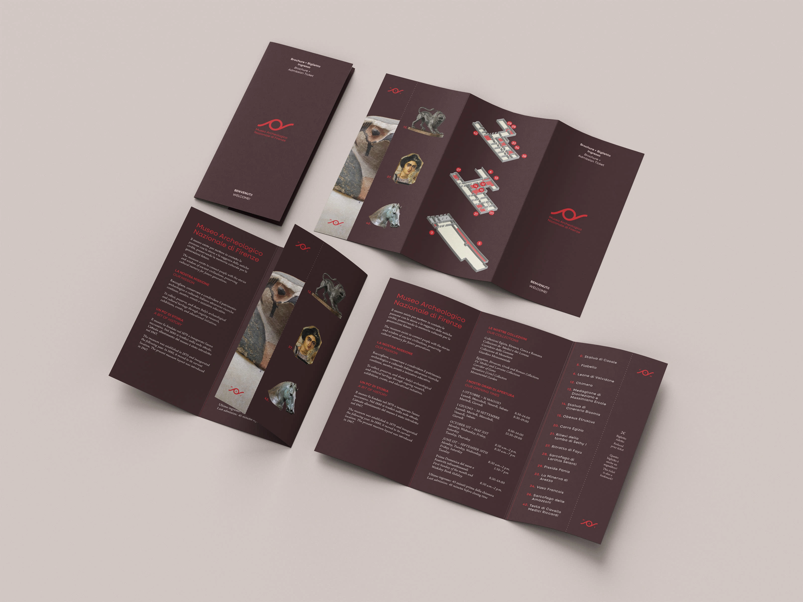
Brochure that includes a tearable ticket
At the same time, the museum has a small but interesting gift shop. Some articles and their packaging were thus developed to showcase the range of the verbal and visual identity application.
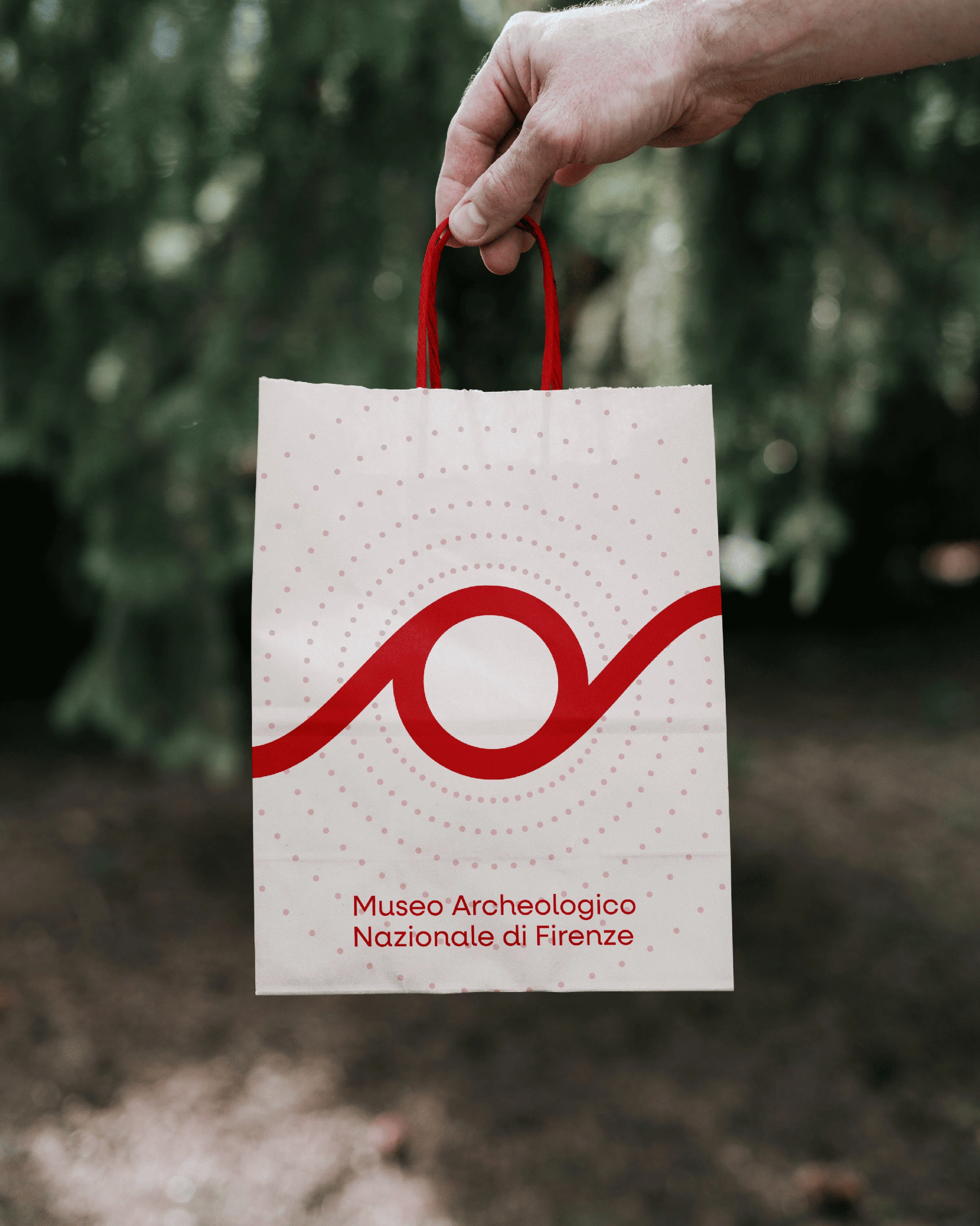
Small paper bag
Small paper bag dielines
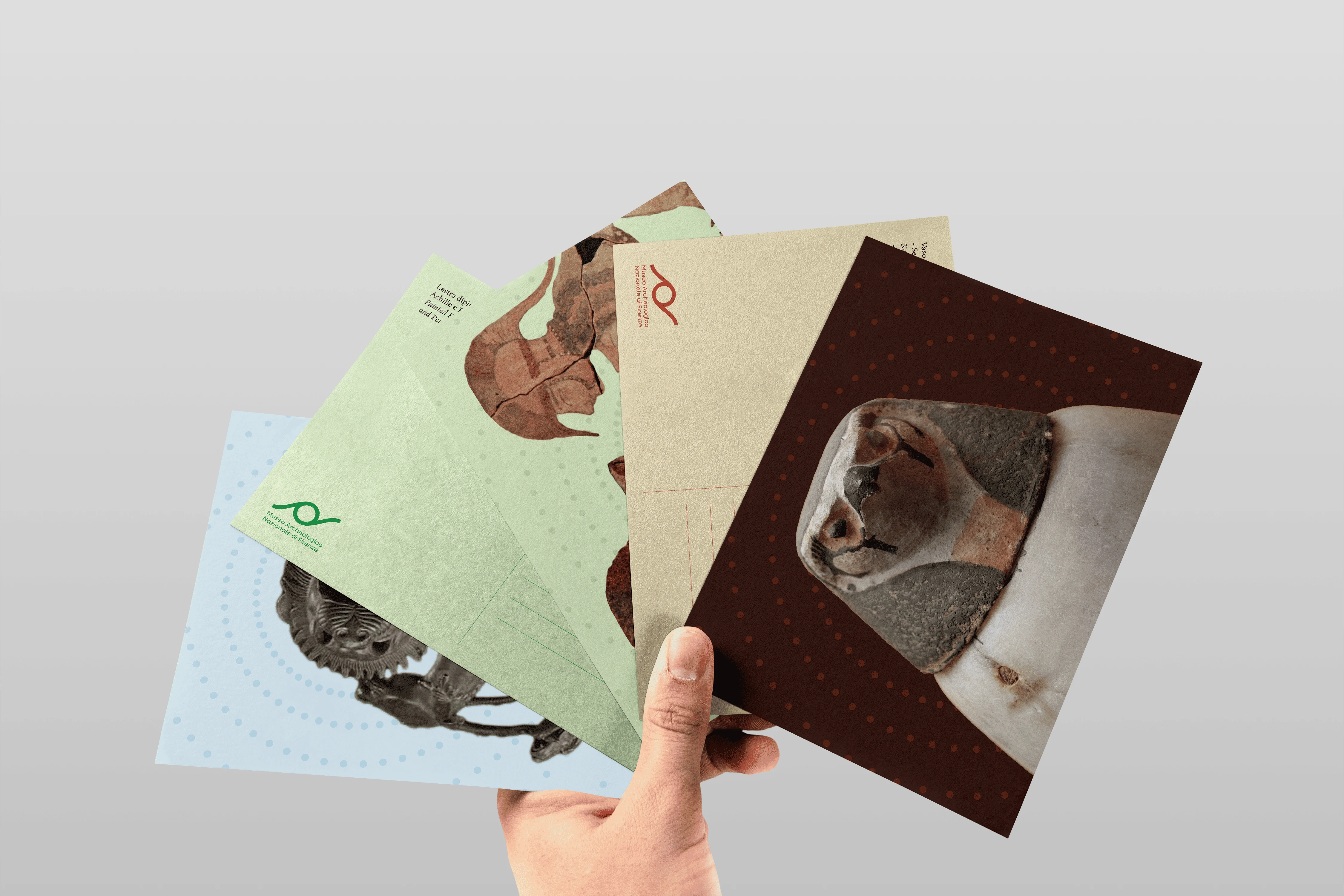
Postcards for each section of the museum
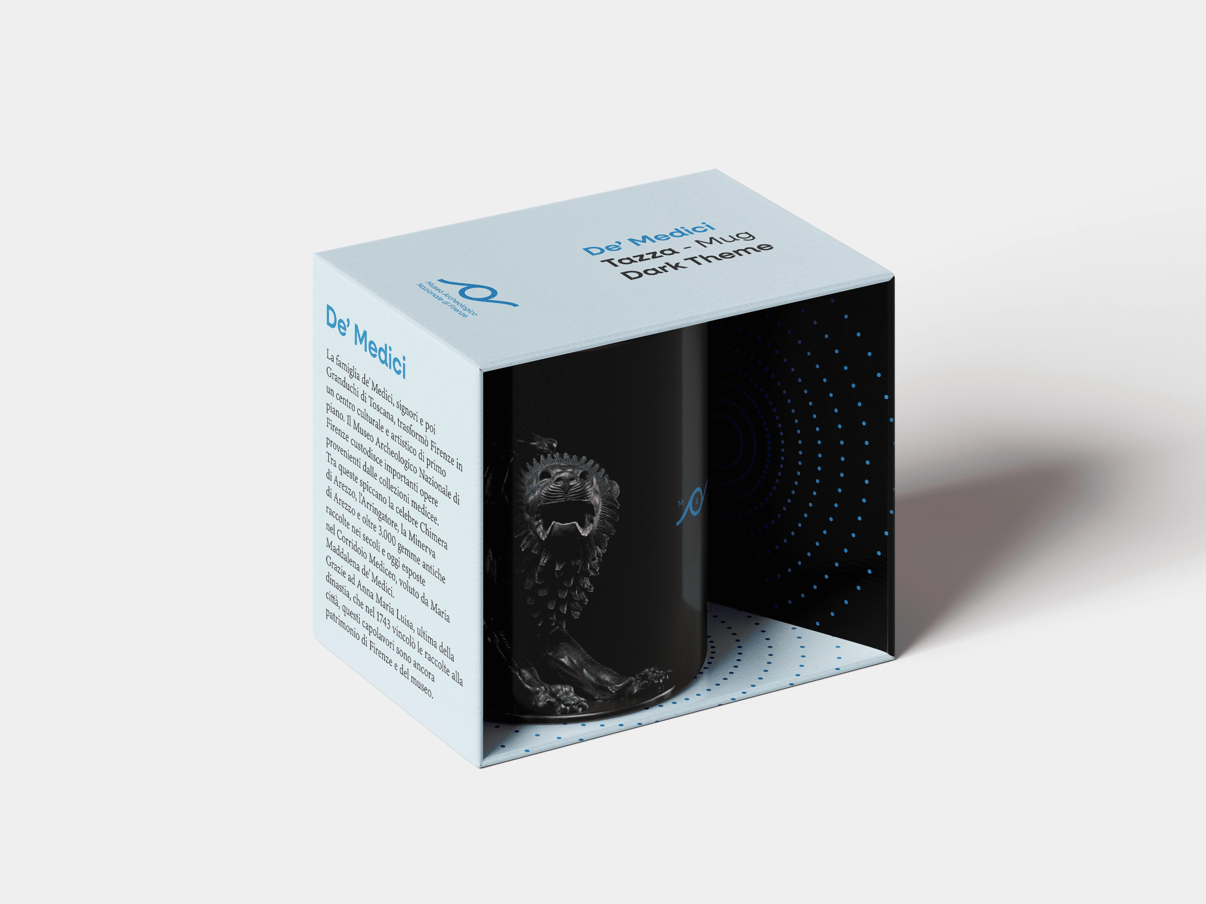
Mug + packaging for the De' Medici section
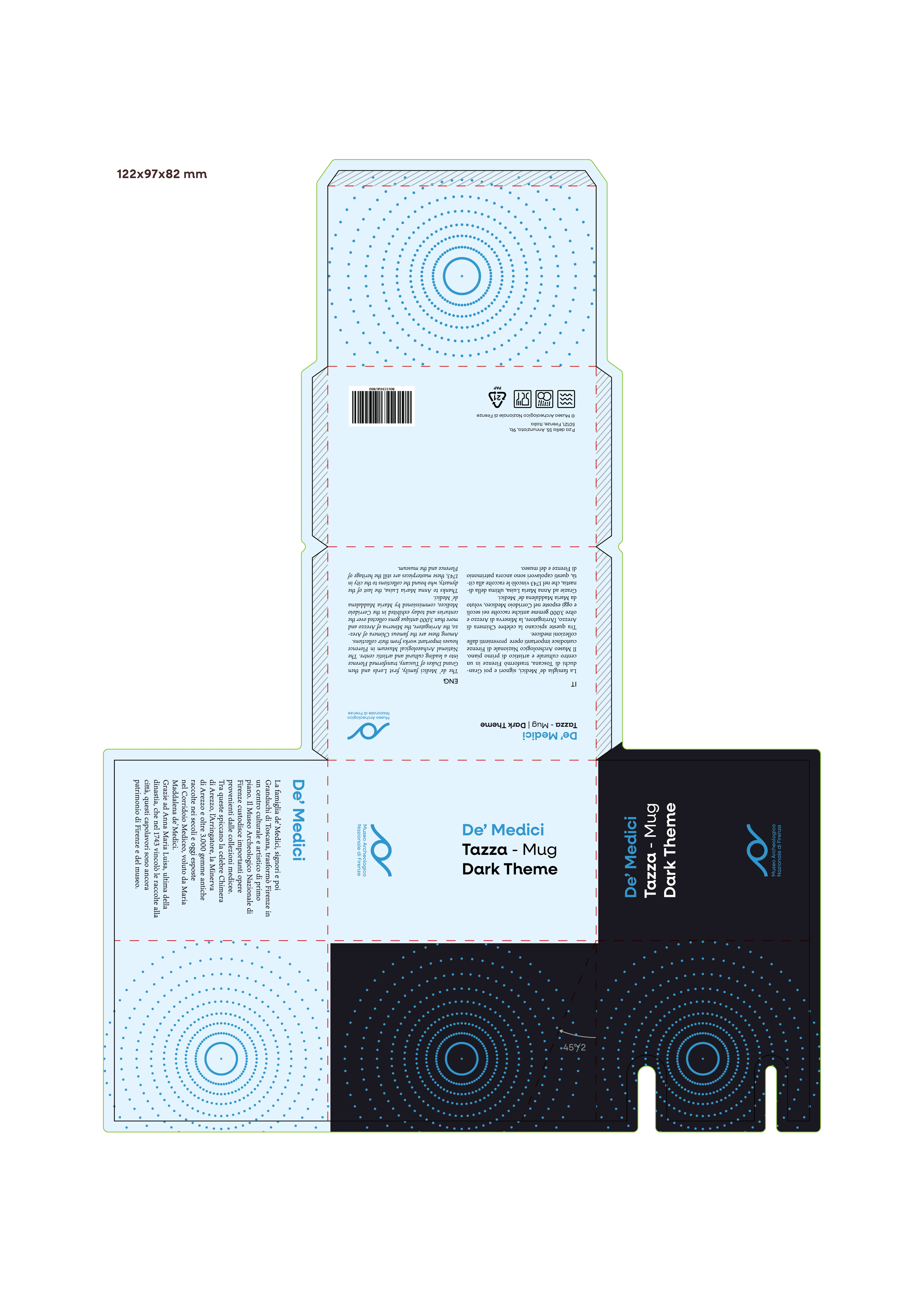
Mug + packaging for the De' Medici section dielines
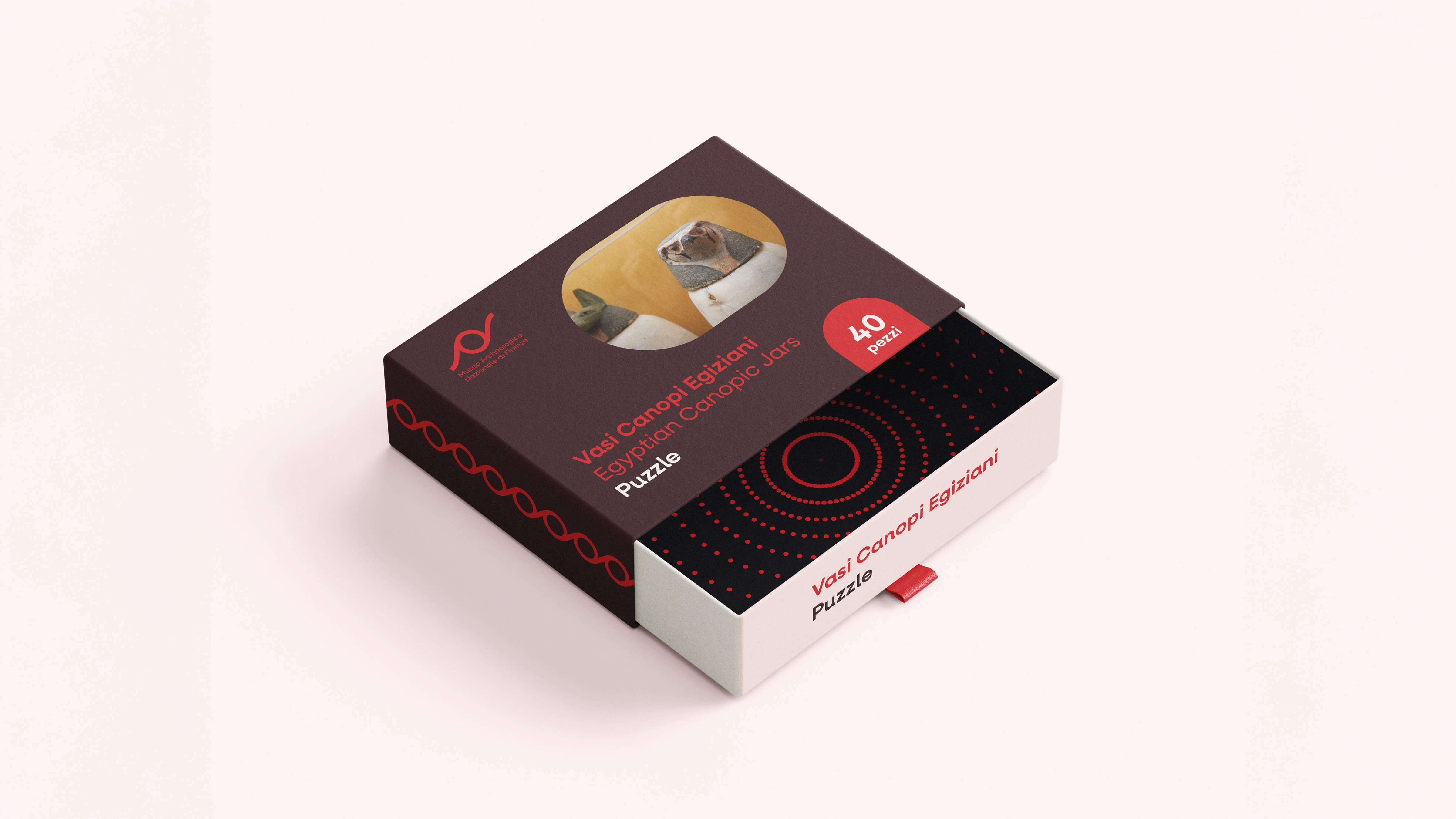
Puzzle Packaging for the Main collection
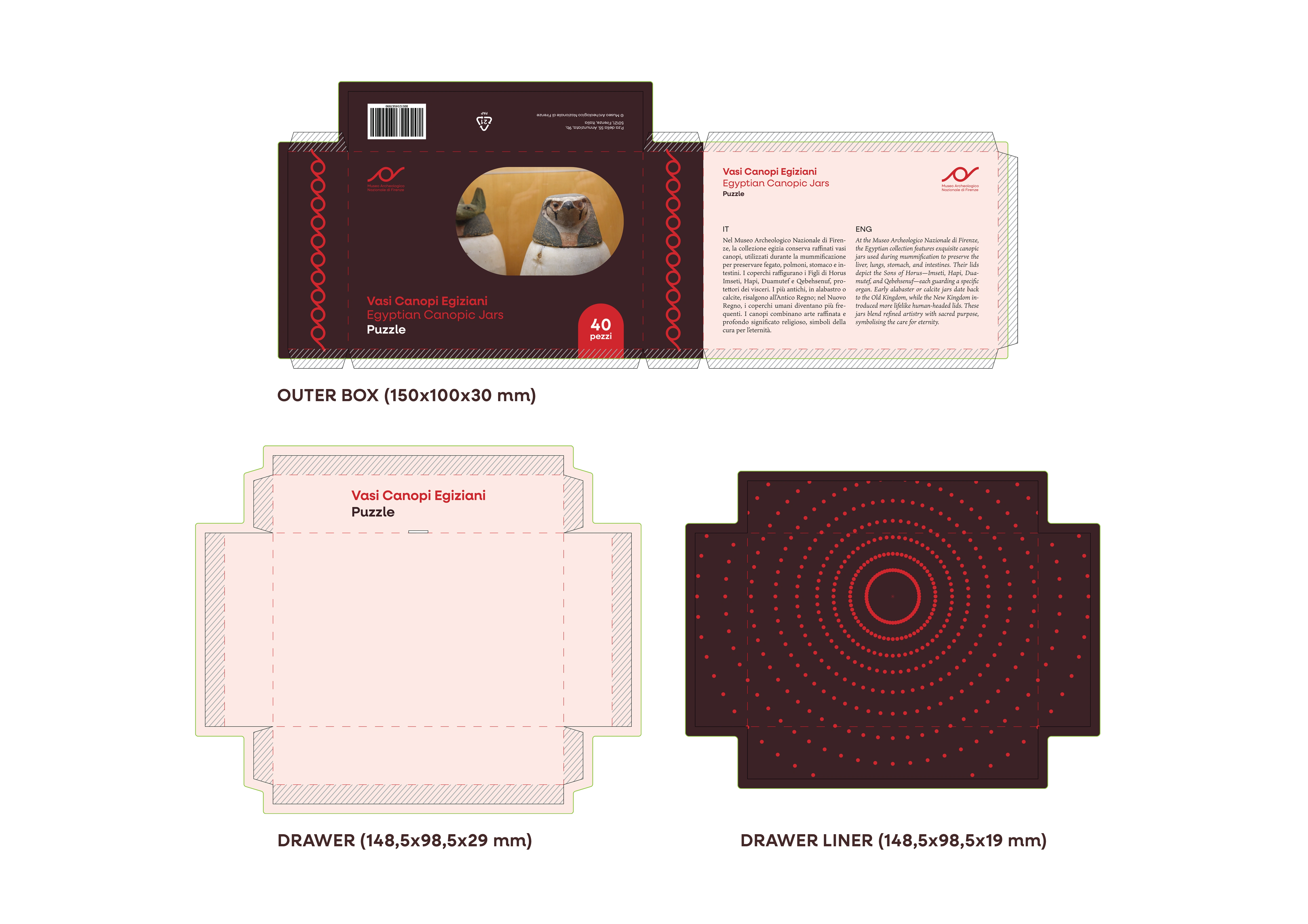
Puzzle Packaging for the Main collection dielines
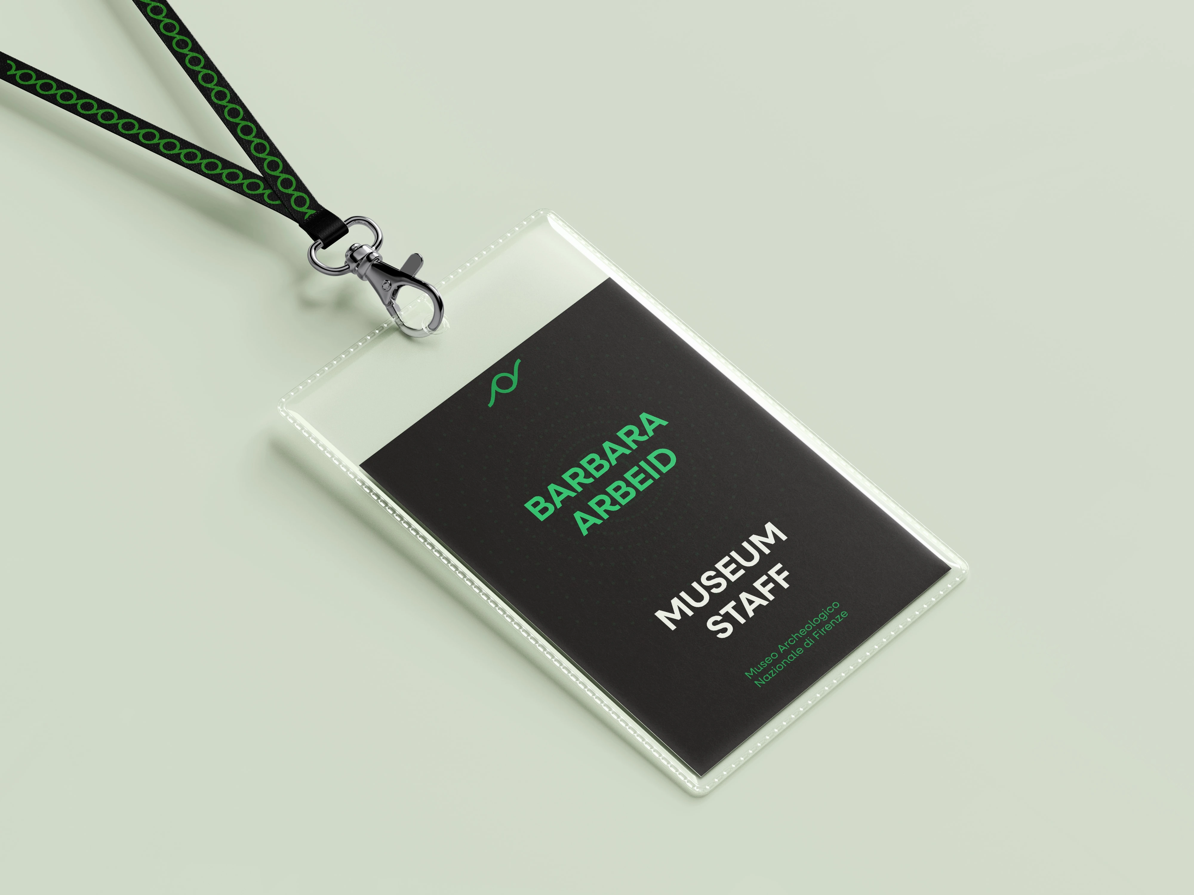
Staff Badge for a temporary event
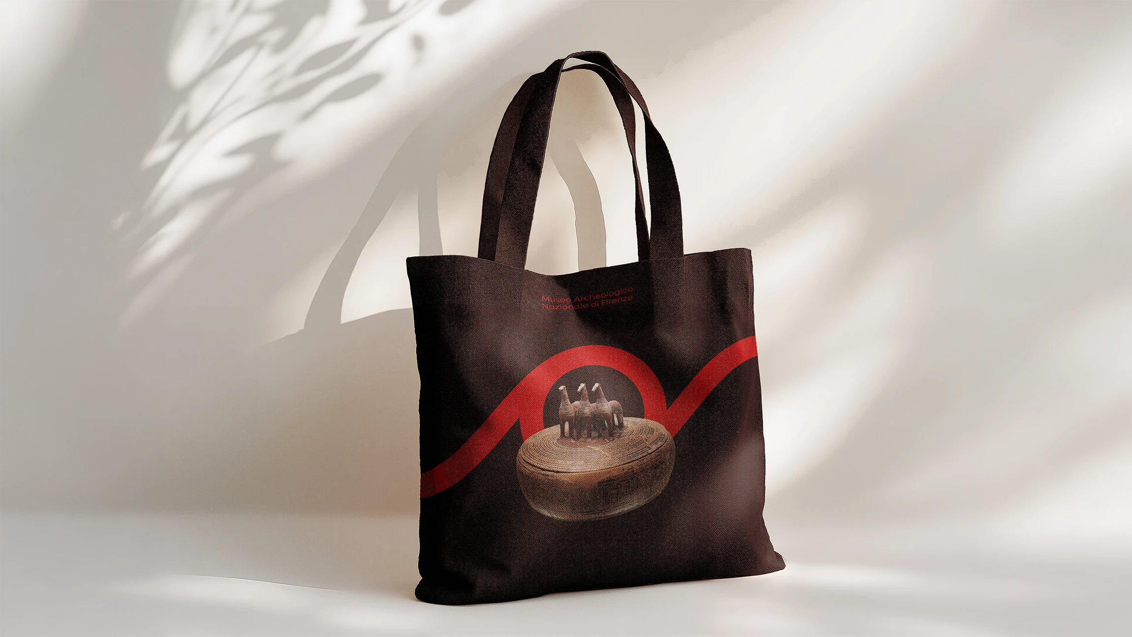
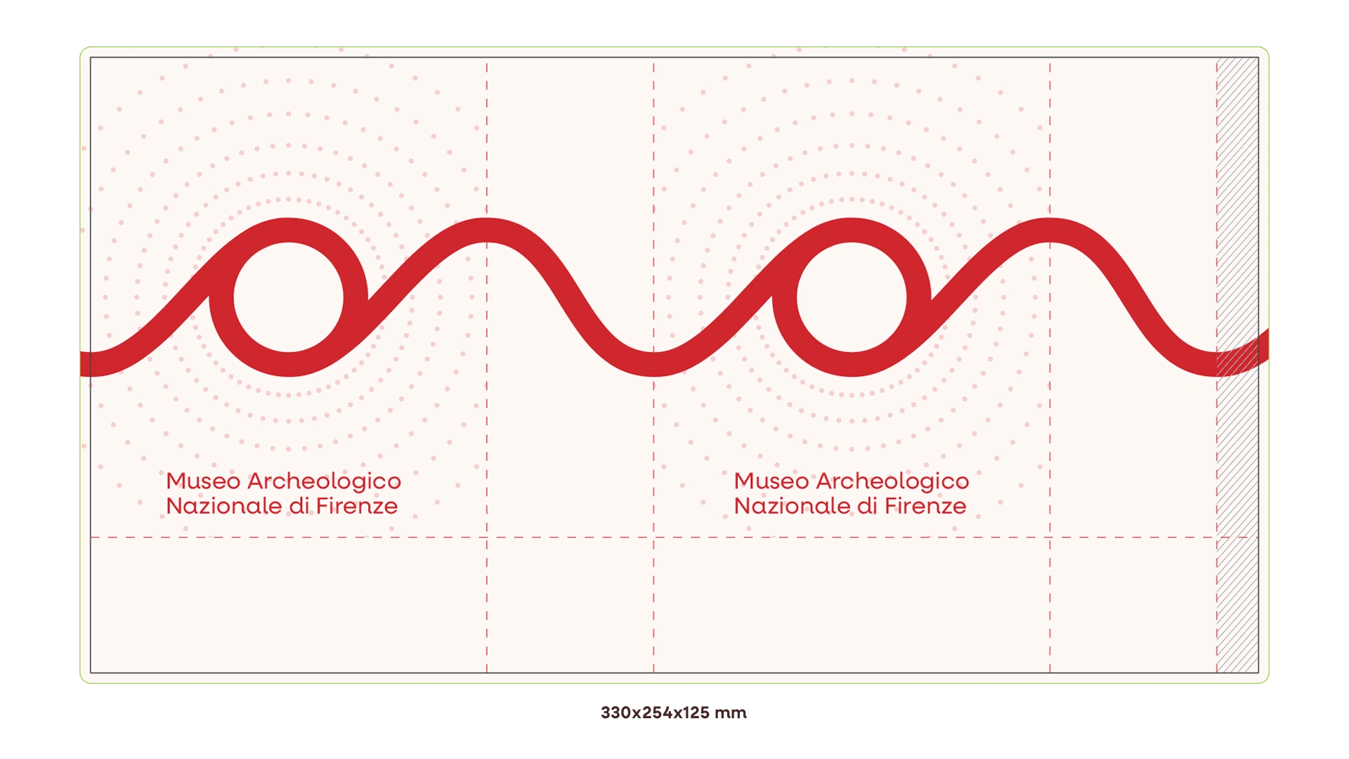
Shop totebag for the Main collection
The wayfinding and signage used by the museum follow, instead, their own rules, laid out in the Brand Book with Identity Guidelines.
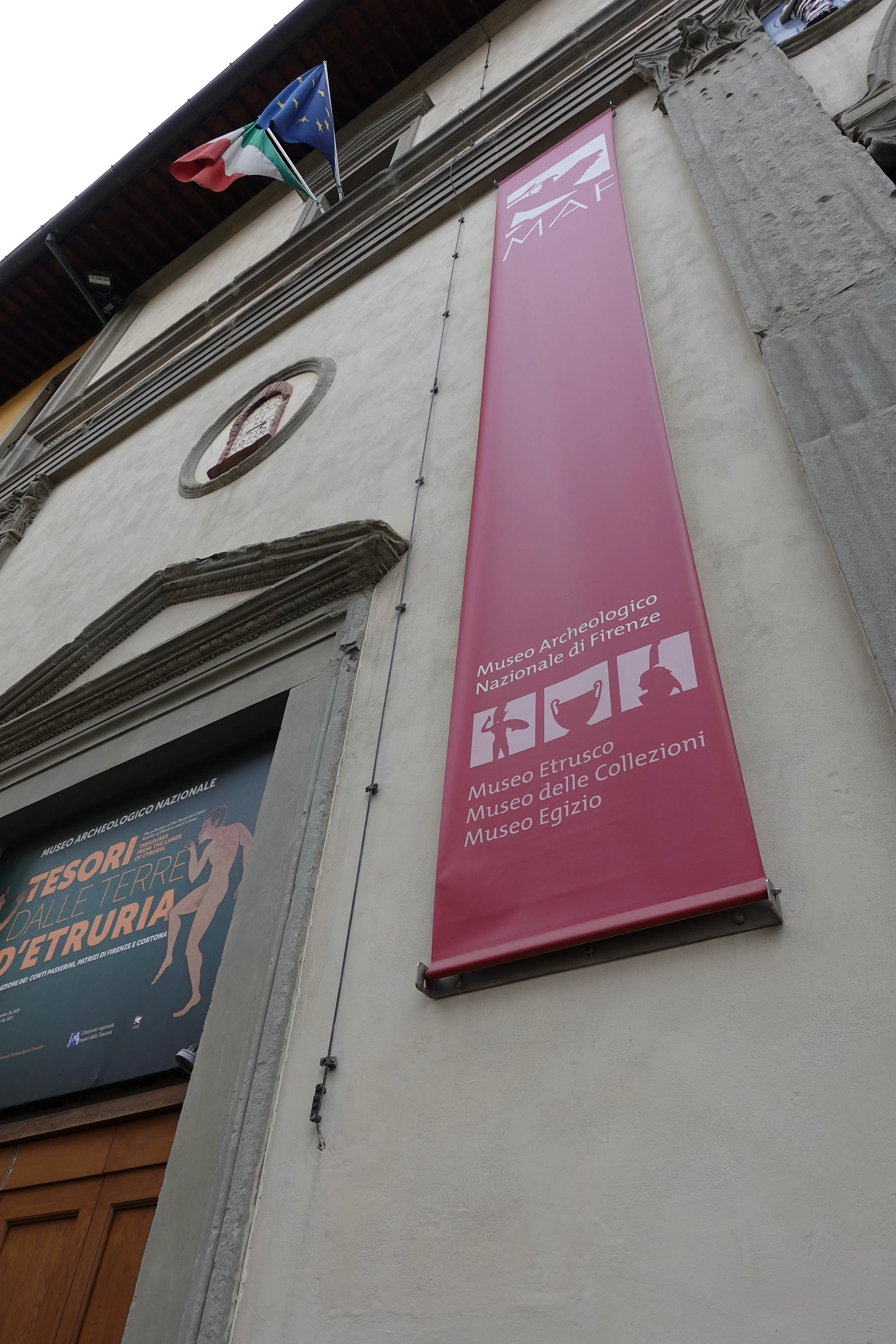
Current museum front banner
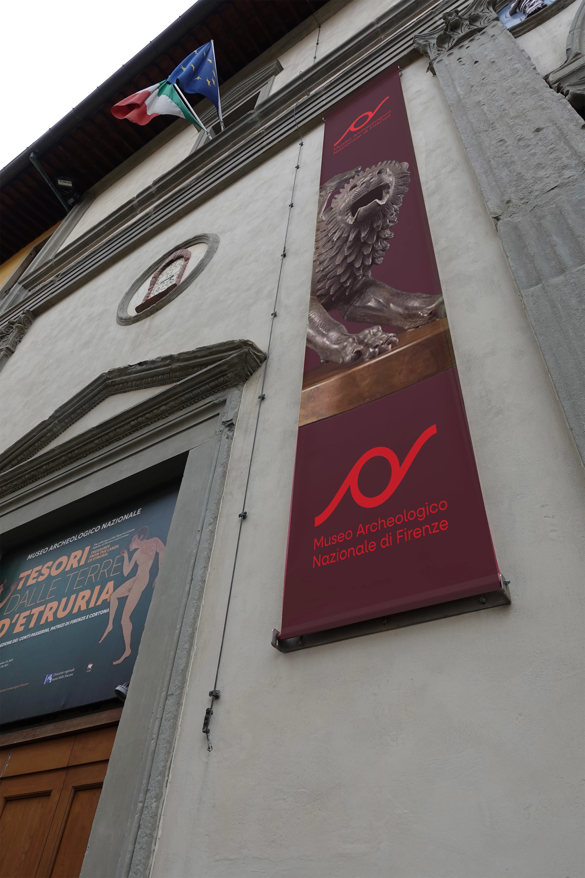
New museum front banner
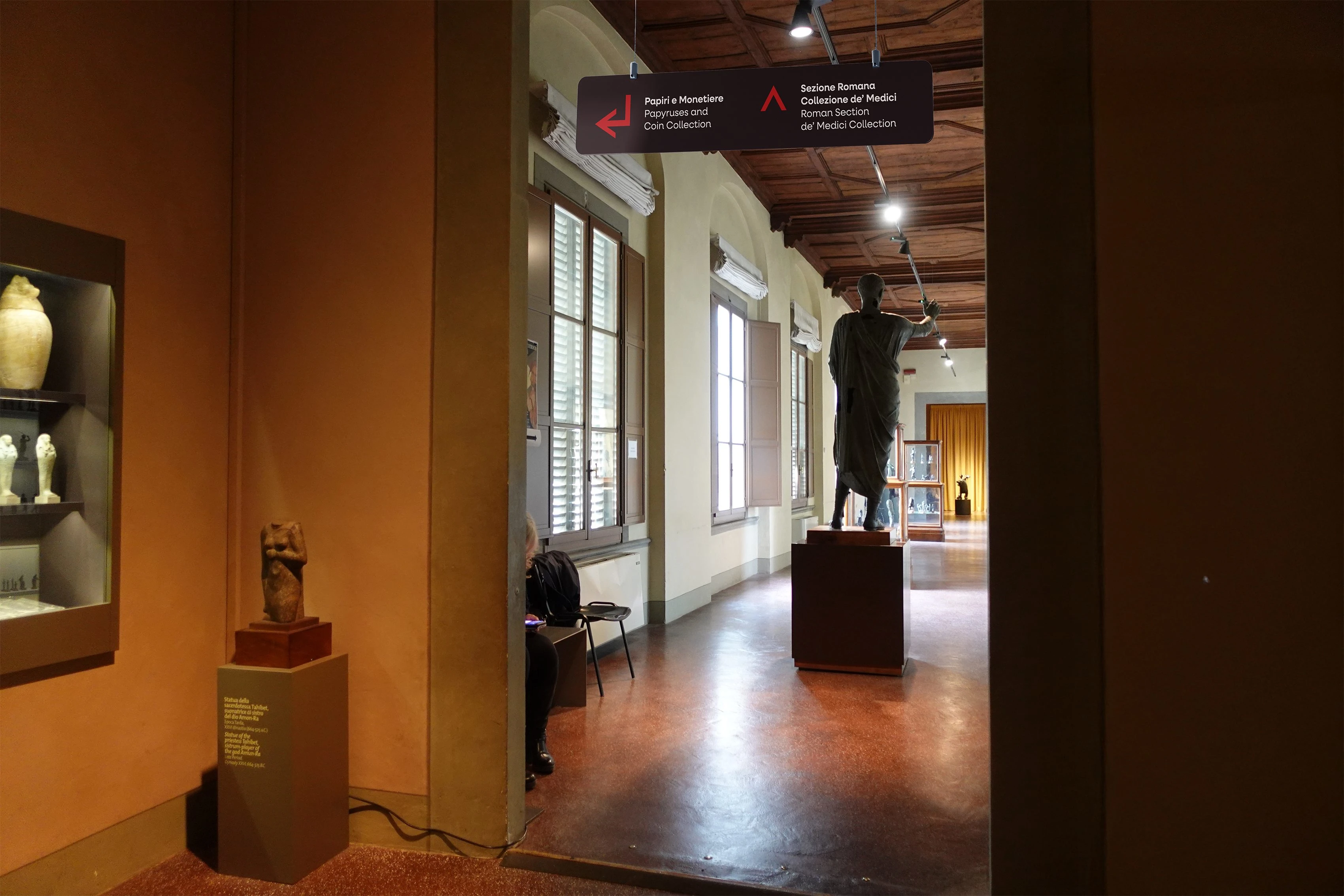
Signage mockuped in real museum setting
Like this project
Posted Dec 20, 2025
Developed a cohesive brand strategy and identity for MAF (Museo Archeologico Nazionale di Firenze), and its applications, including packaging for shop items.
Likes
0
Views
2
Timeline
Apr 1, 2025 - Jul 27, 2025