Brand Blast: Yessnatched!
Naming, brand positioning and brand image for Yessnatched.
Yessnatched is a brand that empowers women, embracing the beauty of diversity through self-awareness and self-love. It aims to boost women's confidence by promoting their unique beauty and individuality.
Regardless of age, women can take control of their time and elevate their self-esteem with easy-to-use DIY beauty products and tools. By adopting a simple and safe beauty routine, they can enhance their natural beauty without the need for surgery or time-consuming procedures.
About the brand
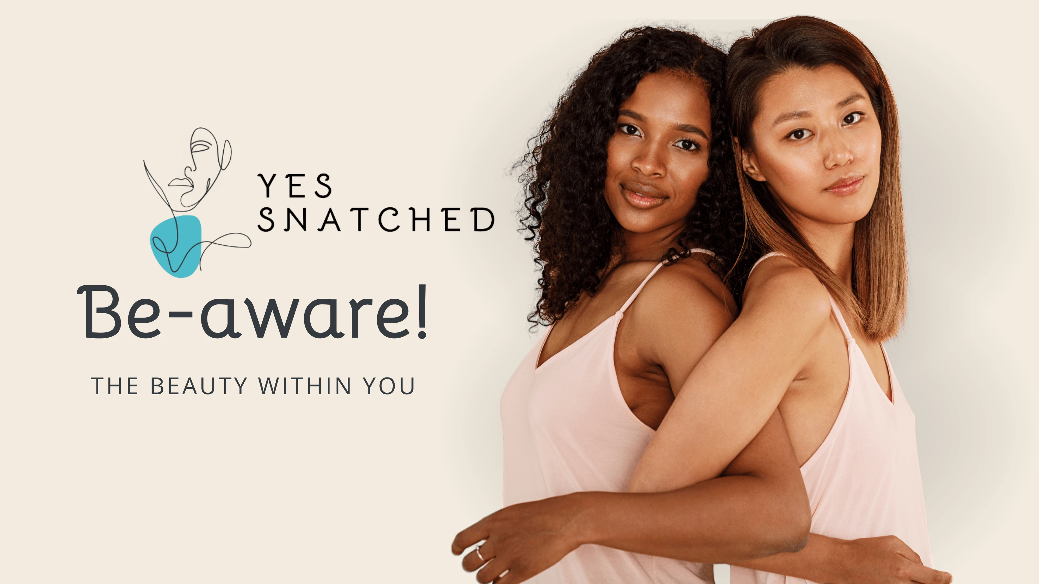
The brand is all about empowering women to embrace their inner beauty. It's not just a brand, but a vibrant community uniting women worldwide through art, culture, beauty, music, and more. Yessnatched strives to provide a platform for women to connect, share their experiences, and celebrate their passions.
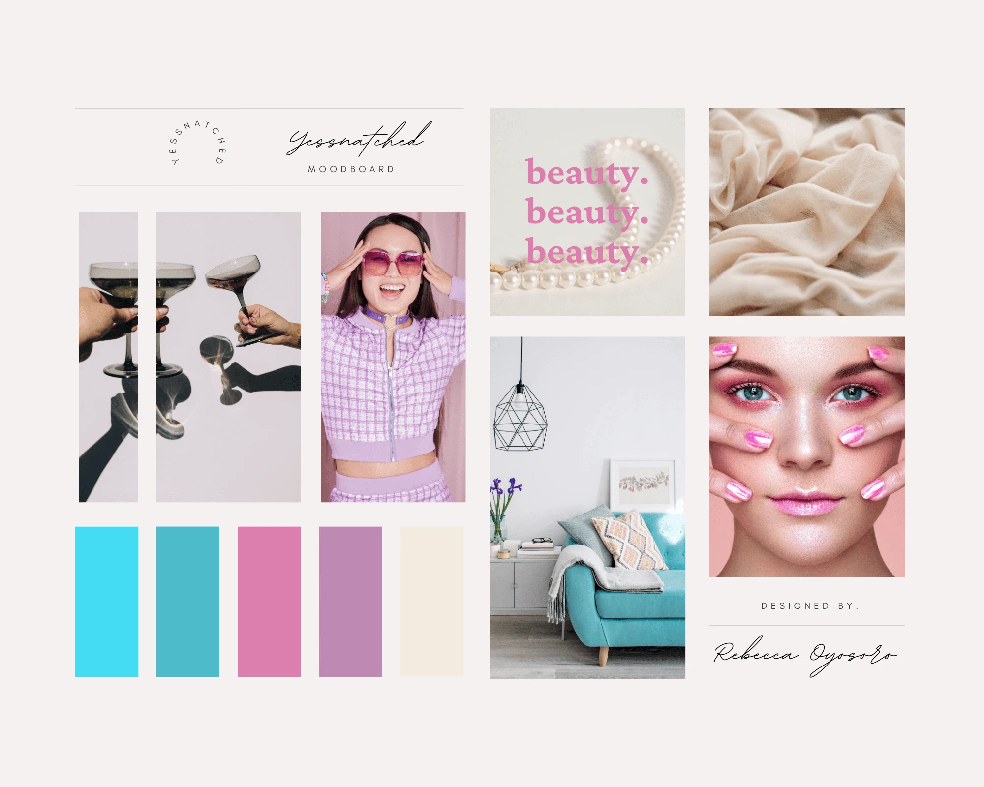
Yessnatched - Mood-board
Being a woman, I love empowering other women to feel and look beautiful. My goal is for this platform to guide women on their path to self-discovery, unity, and unwavering confidence no matter what challenges they may face.
- Peace - Co-owner Yessnatched
Brand concept
This creative concept perfectly captures the essence of femininity and elegance, while maintaining a fun tone. It is the perfect representation of women across all generations, from baby boomers, and Gen-Z, to millennials and beyond.
The brand tone exudes; warmth, fun, elegance, and an irresistible feminine energy.
This fair mix of tones differentiates Yessnatched from its competitors
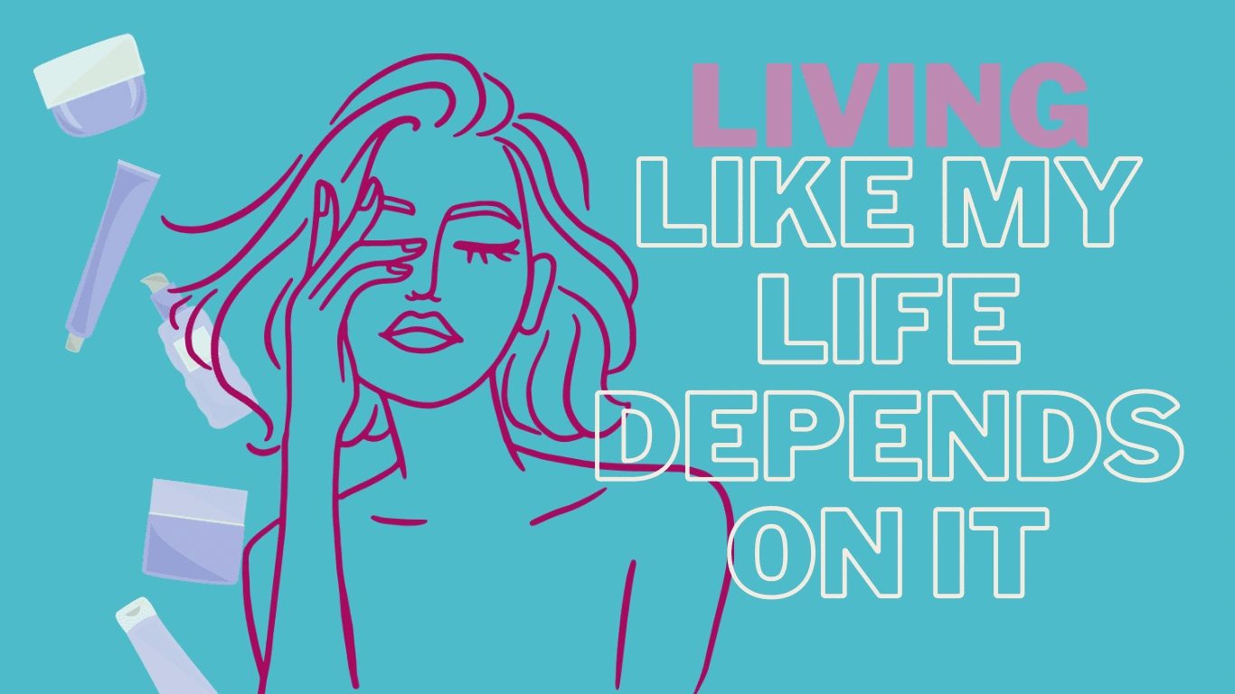
Yessnatched Pro-life campaign slogan
Logo design concept
Beauty is a diverse concept that transcends age, race, and certain features. The illustrative logo design captures the essence of being a woman with a soft yet confident appeal. It features a stand-alone logo, a logo with the brand name written around in a clockwise manner, and a logo with the brand name written across the right-hand side, all with a slightly heavy but soft bold font.
The main brand logo consists of mainly pastel colors and a darker shade colour which represents the illustration of the feminine entity on the logo.
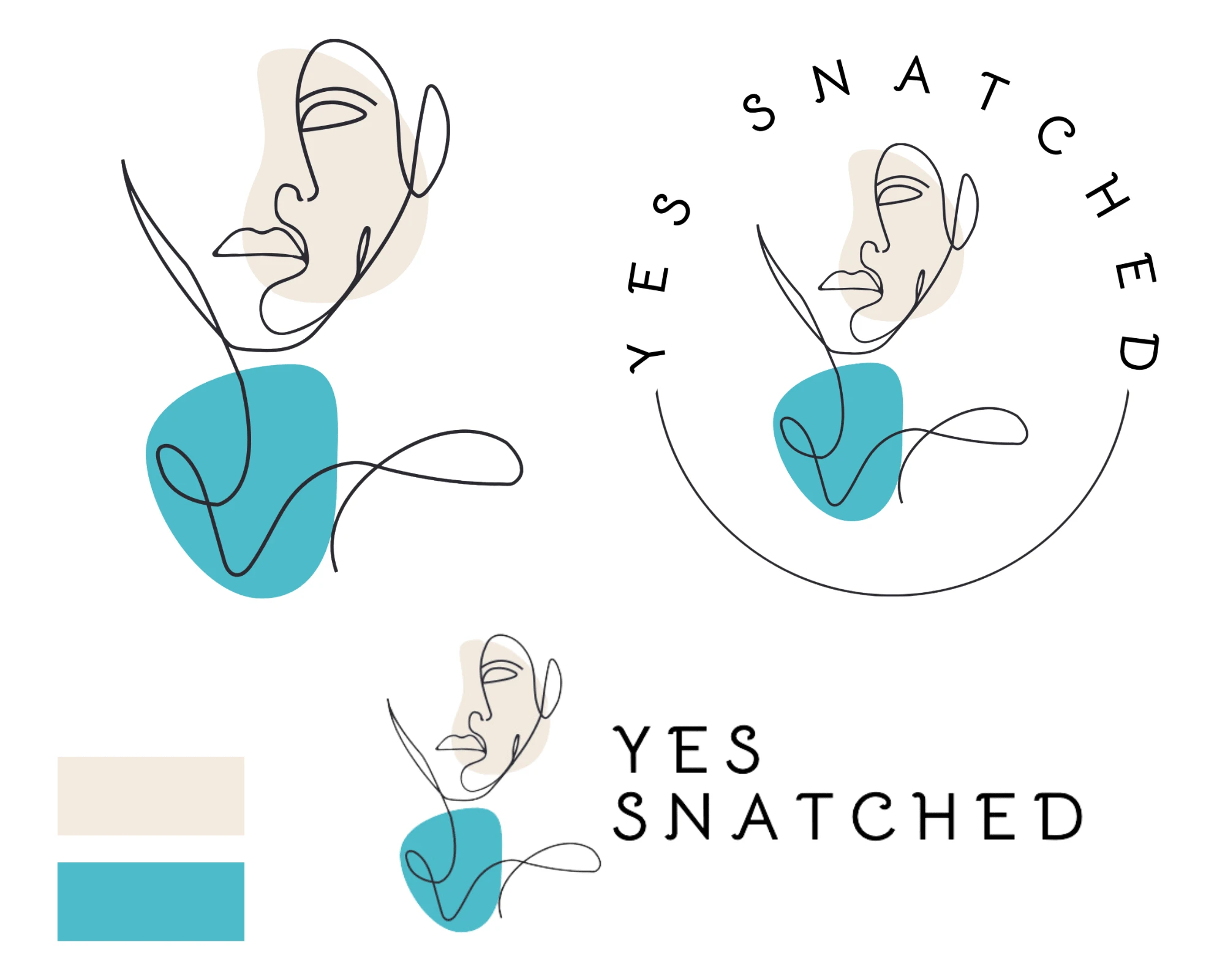
Yessnatched Logo - Main concept
A second Logo concept is an alteration of the pastel turquoise shade to a brighter shade (secondary color), in situations where the main background color is the pastel turquoise shade, to enable the visibility of the entire logo structure.
And the use of #FFFFFF for the feminine illustration on color backgrounds.
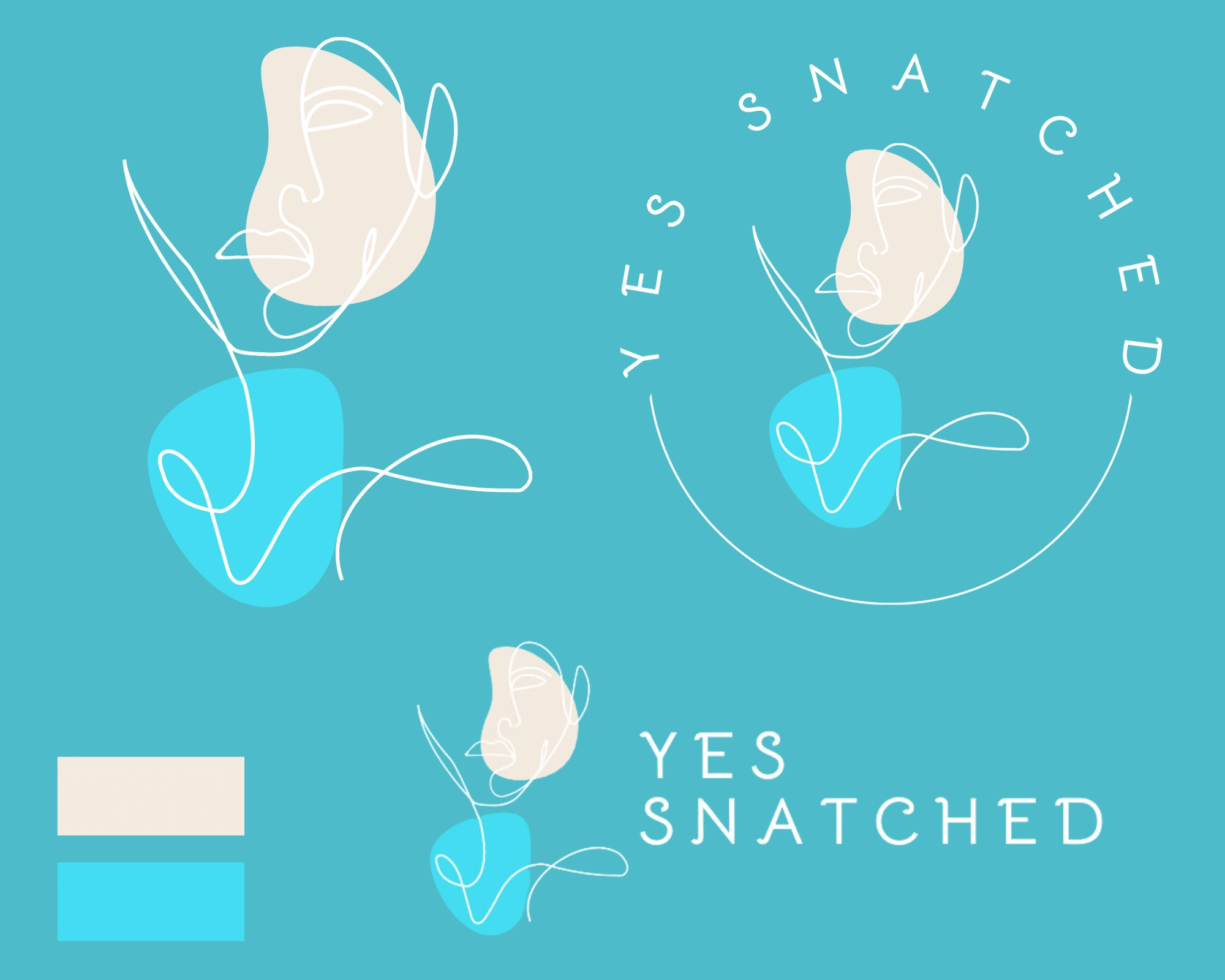
Yessnatched Logo - concept 2
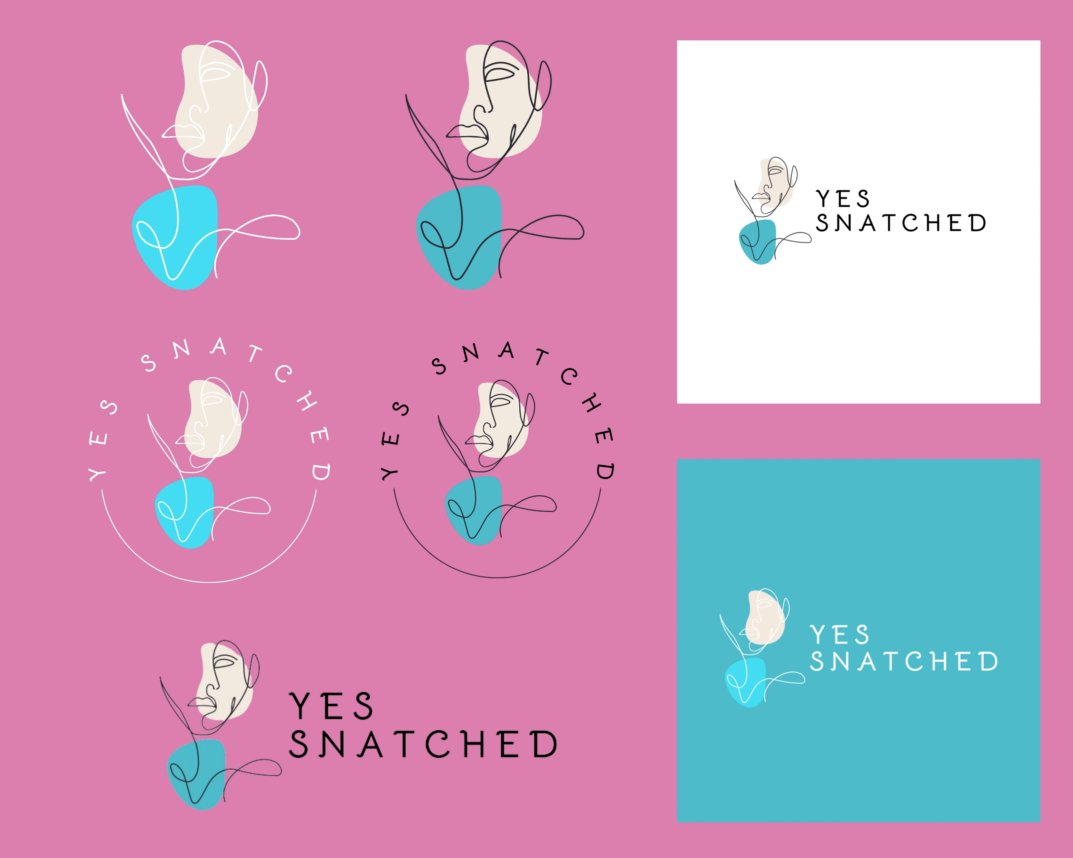
Color palette system
The colors for Yessnatched are mostly pastels, highlighting the inner essence of women.
With three main colors visible on the main logo design and secondary colors included in other brand elements, the color system conveys an overall sense of beauty that is inspiring, bubbly, and empowering.

Initial color palette

Final color palette
Yessnatched will cover a variety of subjects like culture, femininity, art, music, places, self-improvement, food, and more. To make it easier to distinguish between these topics and sub-topics, I designed a vibrant color-coding system.
Examples:
Medium turquoise: Self-development
Bright turquoise: Food
Egret white: Music
Charade: Culture
Wild orchid pink: Fun facts
Mountbatten Pink: Fashion
Women coming together regardless of differences to share a soda or a bowl of salad chatting away, doing a beauty regimen, or whatever makes them tick, becoming more aware and encouraging each other is a sight I love to behold.
- Angel - Senior Manager Yessnatched
Typography
The power of typography is in its ability to convey a message with clarity and impact. The logo suite of this brand achieves just that with a careful selection of a befitting typeface. I suggested the power of Bellota in Bold and Regular, which evokes a sense of sophistication and elegance, combined with the versatility Open Sans and Open Sans Light offer to the brand's packaging and web copy.
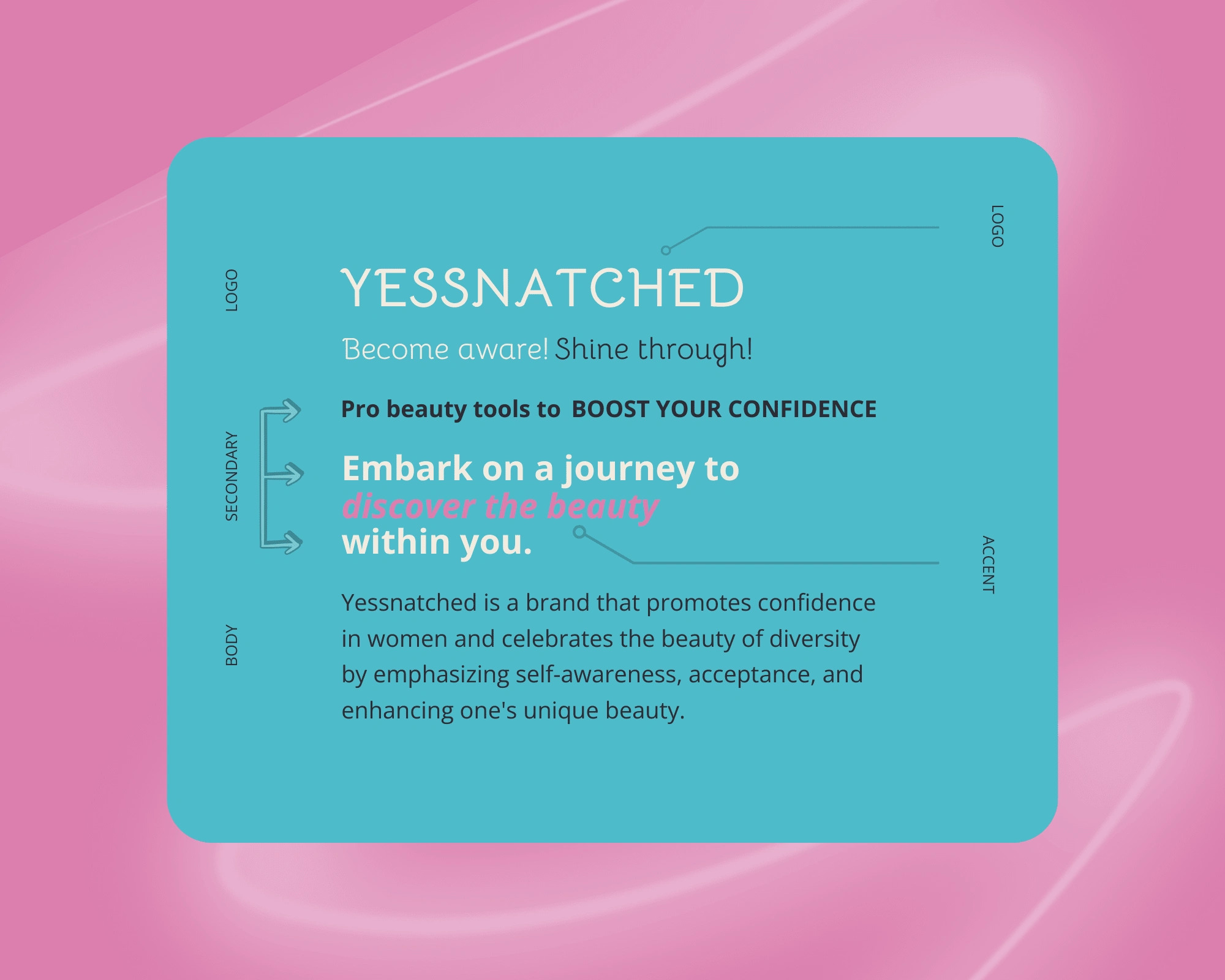
Yessnatched - Typeface system.
Using Open Sans Bold or Extra Bold for headlines adds a daring and affirming touch, delivering a confident tone that resonates with the brand's vision.
When it comes to emphasizing specific words or creating focus, using Open Sans Light Bold in italics does wonders. It can also serve as the perfect secondary font to complement the brand's personality.
Tagline and slogan
The brand's focus on empowering women triggers a sense of reassurance which enabled me to give birth to some of these affirmation-based taglines and slogans.
After drafting several taglines the Founder found this to fit into the brand’s overall vision; ‘The beauty within you’, which will serve as a memorable and permanent expression of its greater purpose and mission.
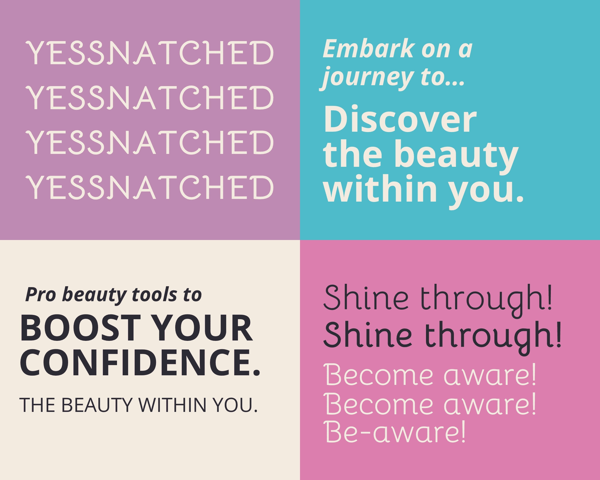
Yessnatched slogan and tagline variations
As for the slogans, I came up with a variety that will be used to represent specific product lines or individual marketing campaigns of the brand. Slogans are designed to be less long-lasting than a brand’s tagline, as they can adapt over time, but still serve the purpose of keeping the brand in the mind of its consumers.
Slogans:
Pro-beauty tools to boost your confidence.
Shine through! Be-aware!
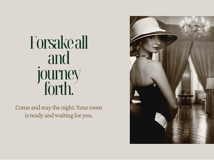
Embark on a journey to discover the beauty within you.
Living like my life depends on it.
Your Vision To Life
Are you feeling inspired by my work? Explore a world of creativity just waiting for you to uncover! Check out my other projects to see the wide range of my creative abilities. Excited to share my work? Click the button below to help spread the word about this artistic masterpiece! *Thanks :)
If you have a vision ready to come to life, I'm here to turn it into reality. Let's connect and embark on creating something truly magnificent together.
Disclaimer
DisclaimerMost clients prioritize privacy before the launch of their project or design. As a result, complete details may not always be disclosed, and information like location, links, or contact details might be modified to safeguard their privacy. It is important to note that many clients prefer not to have their projects displayed.
Like this project
Posted Apr 18, 2024
Crafted with utmost precision, a captivating brand identity to elevate the sense of unity and amplify the brand recognition of 'Yessnatched Wellness'.
Likes
0
Views
28
