Gal & Jane Fitness

Introduction
Gal and Jane Fitness is a thriving community led by two siblings who are passionate about promoting a healthy lifestyle. Originally, it began as a small community offering free advice on fitness matters, but it has recently evolved into a vibrant gym community that motivates individuals to prioritize their well-being and embrace a fit and fulfilling life!
Concept & Drafts
My creative journey always commences with traditional sketches and drafts, allowing me to soulfully connect with the vision and breathe life into my designs.
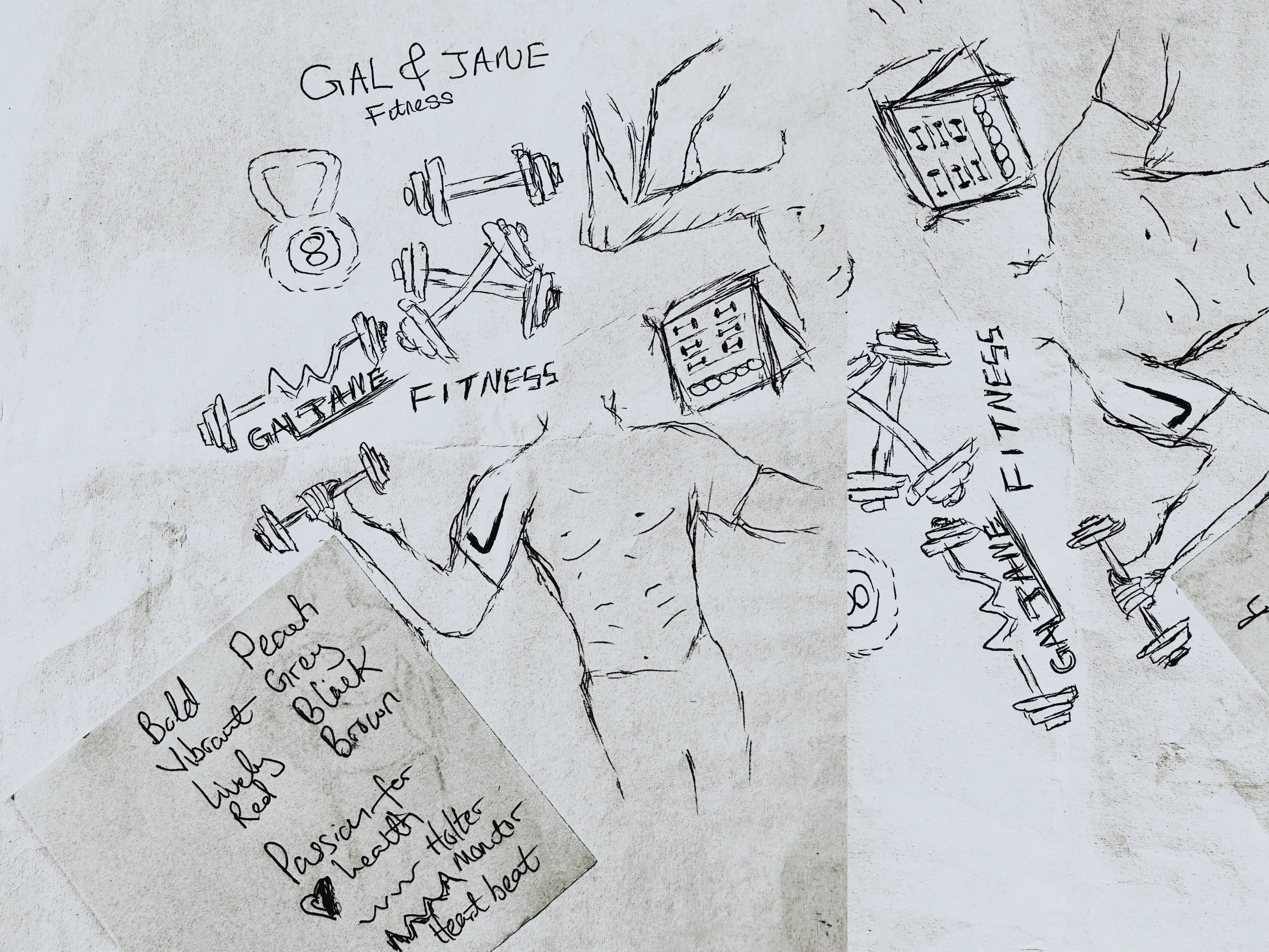
Initial rough sketches were randomly penned on paper.
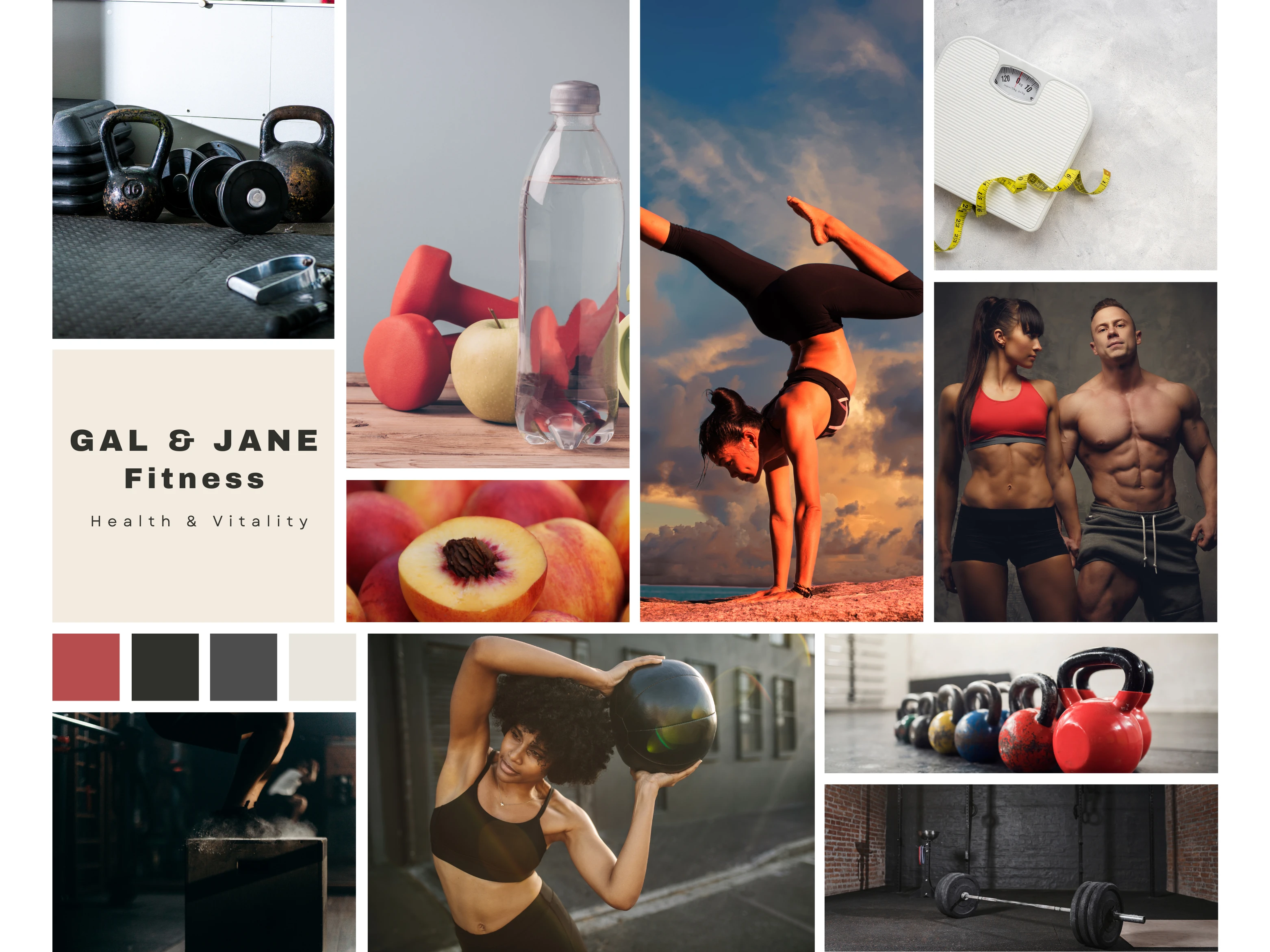
The cordial palette inspired by peach and grey hues with an energetic outlook connects all the visual elements.
With a burning desire to embrace a healthier lifestyle, the designs was crafted to exude a captivating blend of passion and refreshing simplicity.
Creating a design that emphasises boldness without appearing too loud or overwhelming was quite a challenge. To achieve this, I carefully selected a primary capitalized clean typeface for the word mark and the pictorial mark itself is a dumbbell with a subtle heartbeat in the center, that adds a twist to the image and signifies the importance of good health. The vibrant peach color on the dumbbell adds a lively tone to the logo, contrasting beautifully against a clean white canvas. After a back and forth session to coin an official tagline I came up with ‘Vitality at its peak’, which speaks volumes for the brand.

Typography format for the brand to be used across all marketing materials.
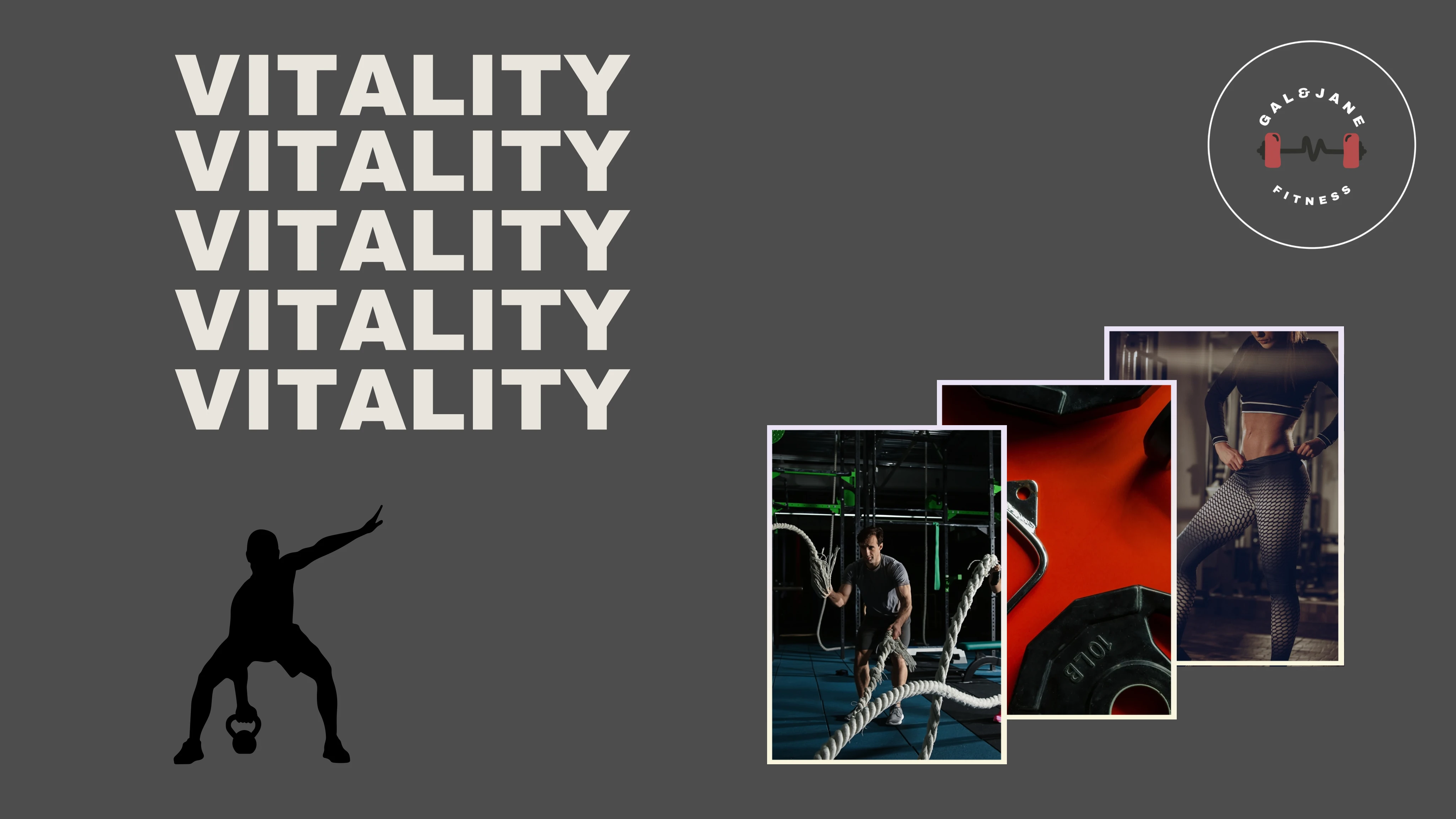
Final Design
Gal & Jane Fitness brand image radiates an invigorating representation of the modern fitness lifestyle.

With its simple-bold color palette and striking graphics, the brand represents a sense of strength and determination that resonates with its target audience.
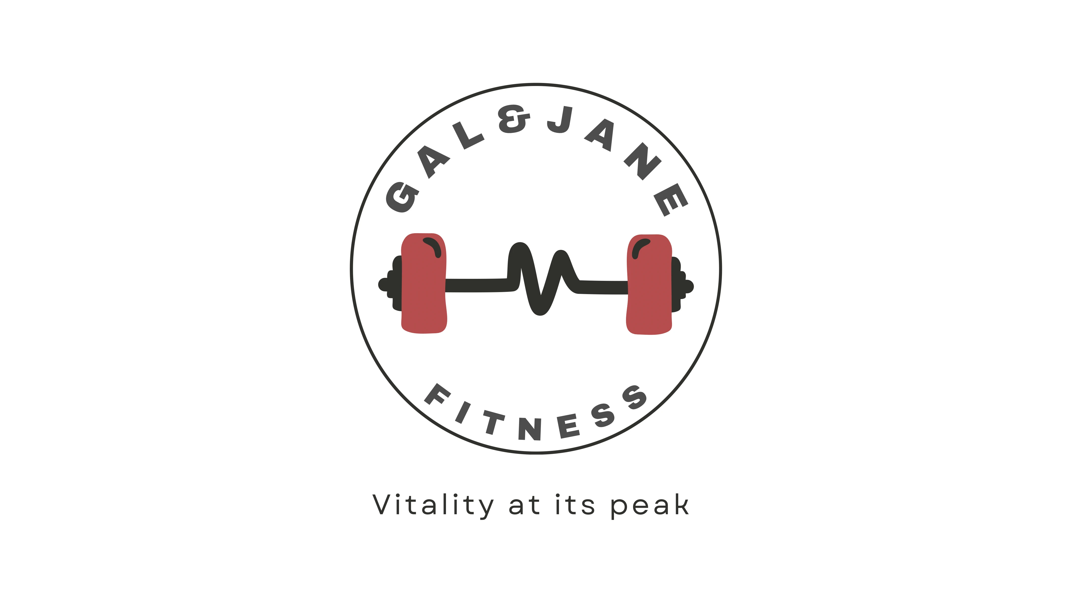
Tagline and brand logo on a white background.
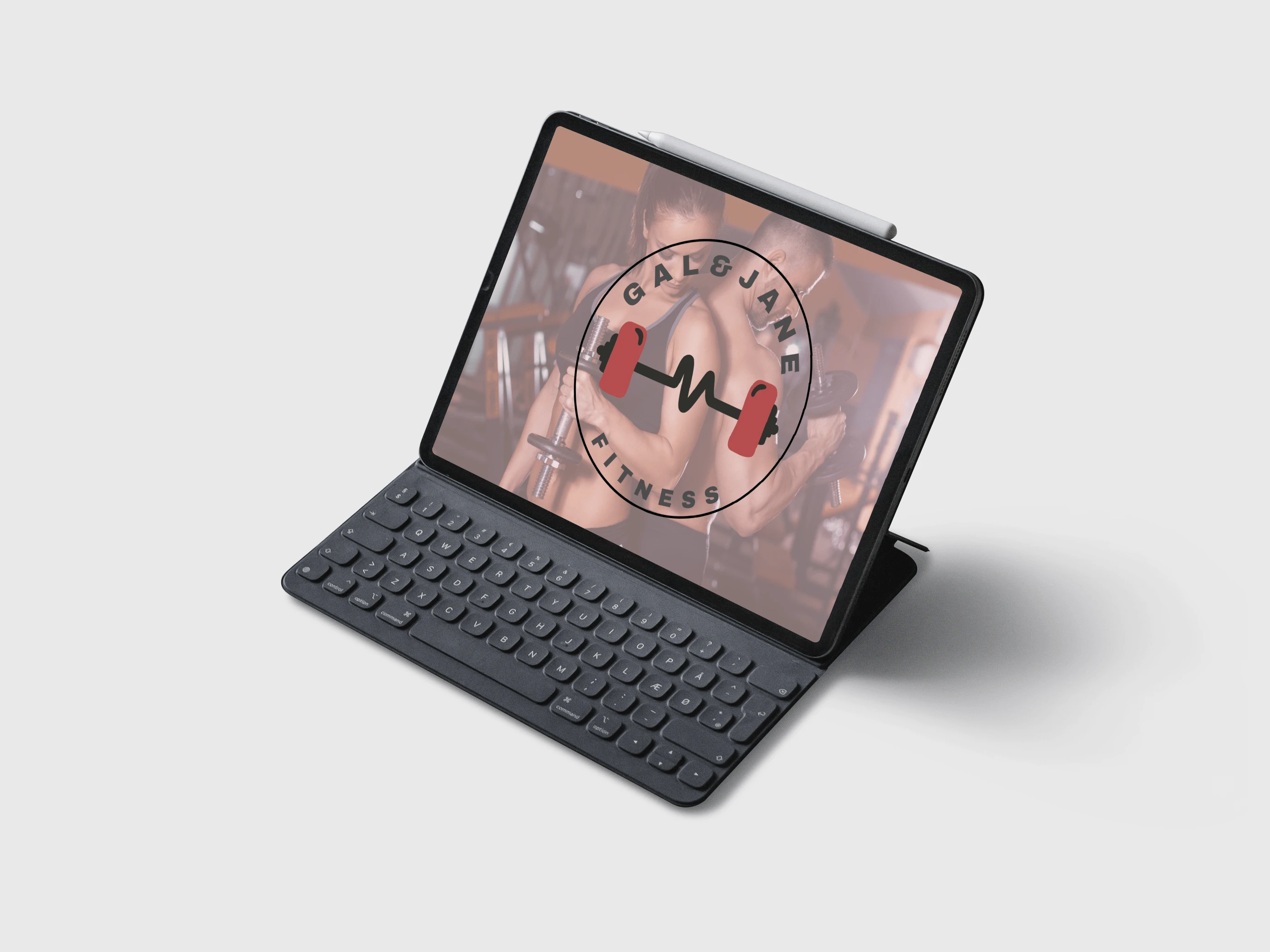
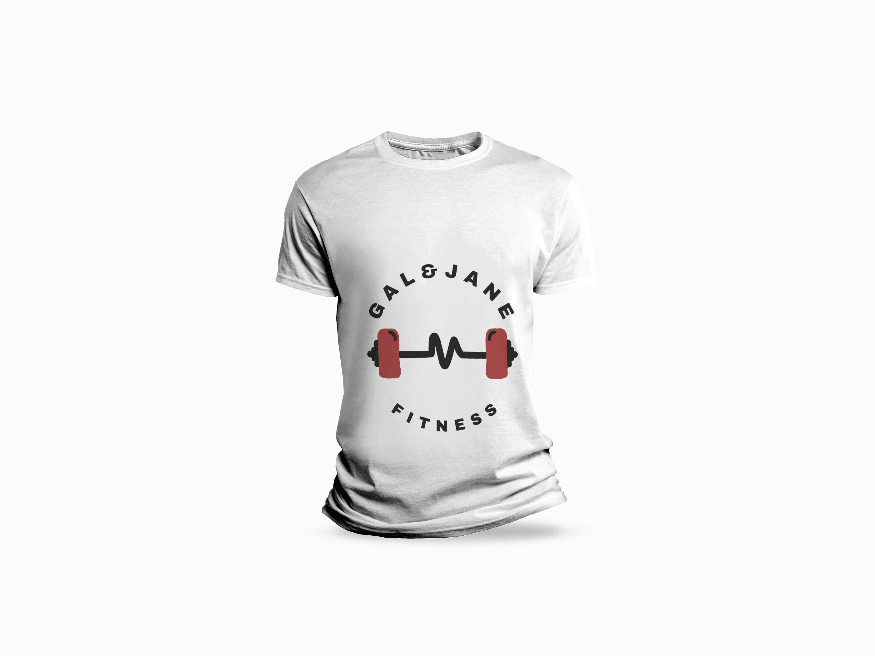
The Brand logo on a white t-shirt.
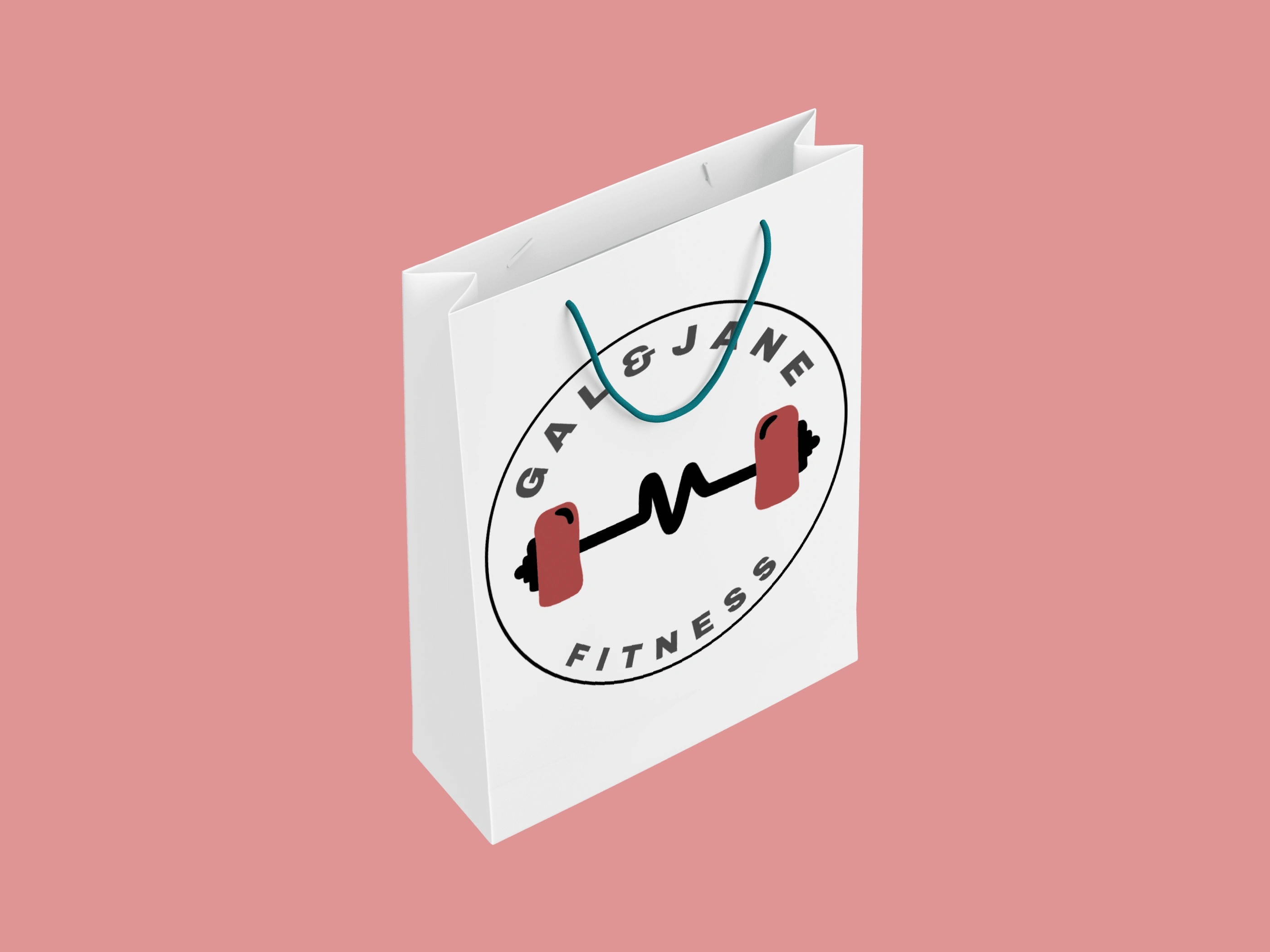
Paper bag design.
Each element of the brand's visual identity, from its logo to its marketing materials, beautifully captures the essence of the brand's core values of health and vitality. They ultimately collide to convey a message of empowerment and motivation. In a crowded market, the Gal & Jane Fitness brand stands out as a beacon of inspiration and vitality.
Are you feeling inspired by my work? Explore a world of creativity just waiting for you to uncover! Check out my other projects to see the wide range of my creative abilities. Excited to share my work? Click the button below to help spread the word about this artistic masterpiece! *Thanks :)
If you have a vision ready to come to life, I'm here to turn it into reality. Let's connect and embark on creating something truly magnificent together.
Disclaimer: Most clients prioritize privacy before the launch of their project or design. As a result, complete details may not always be disclosed, and information like location, links, or contact details might be modified to safeguard their privacy. It is important to note that many clients prefer not to have their projects displayed.Like this project
Posted Apr 19, 2024
Showcasing an audacious contemporary aesthetic that embodies 'Peak vitality!'

