Carbon Footwear | Ecommerce Website Design

Vincent Olusola


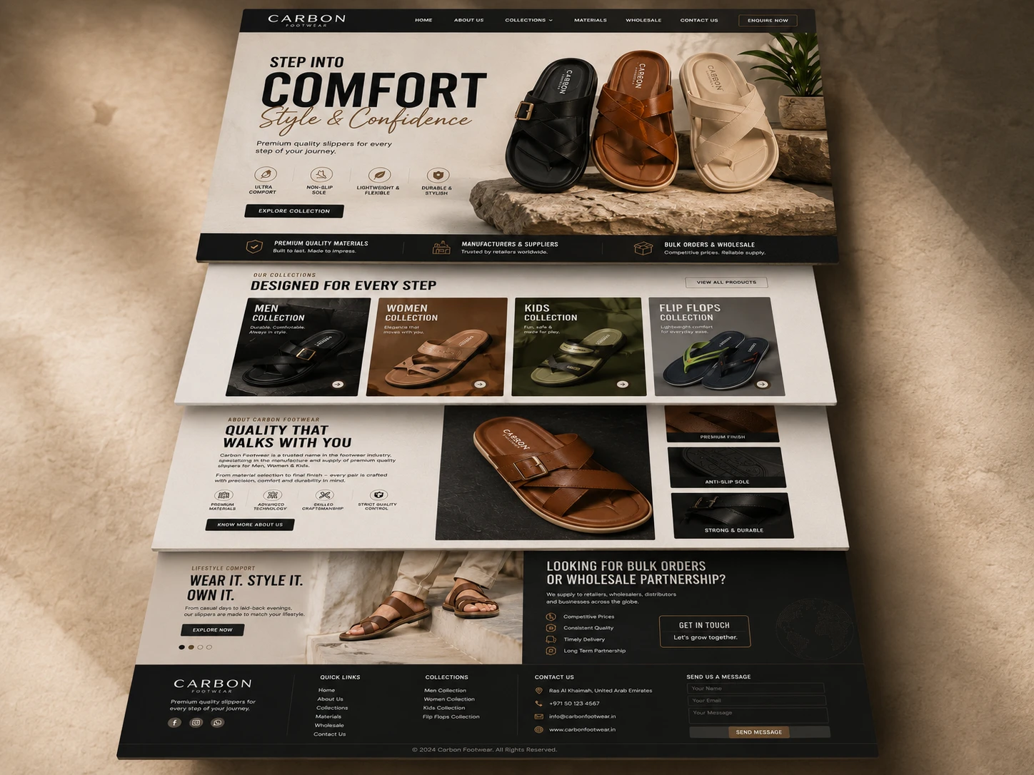
A footwear website built for shoppers and wholesale buyers
Carbon Footwear is a footwear brand offering premium slippers for men, women, and children. This concept explored how the brand could create a stronger digital presence while serving two important audiences: customers discovering products and wholesale buyers looking for a dependable supply partner.
The goal was to create more than a product catalogue. The website needed to introduce the brand confidently, help visitors find the right collection quickly, communicate the comfort and quality behind each product, and make wholesale enquiries feel like a serious part of the business.
The challenge
Retail shoppers and wholesale buyers visit a footwear website with different expectations.
Retail customers want attractive product presentation, simple collection choices, visible benefits, and enough confidence to continue exploring. Wholesale buyers care about consistent quality, competitive pricing, dependable delivery, supply capability, and a clear way to begin a conversation.
The design challenge was to support both journeys without making the homepage feel divided or overcrowded. The website also needed to present several footwear categories without reducing the experience to a generic product grid.
UX and conversion decisions
The website supports two related conversion journeys.
For retail visitors, conversion begins with collection discovery. Large category cards, product-led imagery, clear benefits, and consistent calls to action reduce the distance between the brand introduction and product exploration.
For wholesale visitors, conversion depends on credibility. Supplier messaging appears within the wider brand story, while the dedicated partnership section provides the practical benefits and enquiry path required to continue the conversation.
Calls to action use clear language according to the purpose of each section, including “Explore Collection,” “View All Products,” “Know More About Us,” “Explore Now,” and “Get in Touch.”
The outcome
The final concept gives Carbon Footwear a polished digital presence that reflects the comfort, finish, and dependable quality of its products.
The homepage creates a clear hierarchy, gives each collection a recognizable entry point, makes craftsmanship visible, and connects product storytelling with practical navigation.
It also presents the brand as commercially capable. Retail customers receive an attractive route into the collections, while wholesale buyers receive a direct explanation of the partnership value and an obvious enquiry path.
The result is a unified ecommerce and wholesale experience built around comfort, craftsmanship, and confident product discovery.
Project scope
Ecommerce homepage design
Content hierarchy and UX structure
Product and collection presentation system
Retail customer journey
Wholesale enquiry journey
Brand-led visual direction
Product benefit and craftsmanship sections
Conversion-focused calls to action
Responsive design direction
Portfolio and case-study mockups
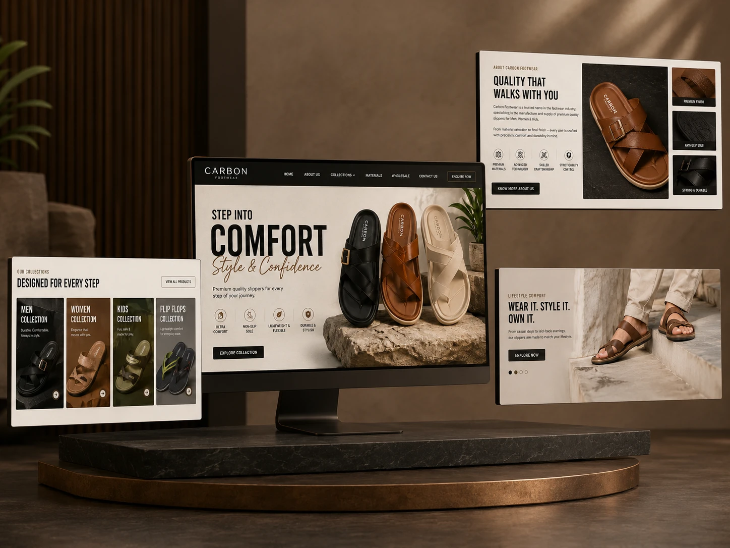
Different website sections displayed across multiple screens to present the design system, product storytelling, and page continuity.
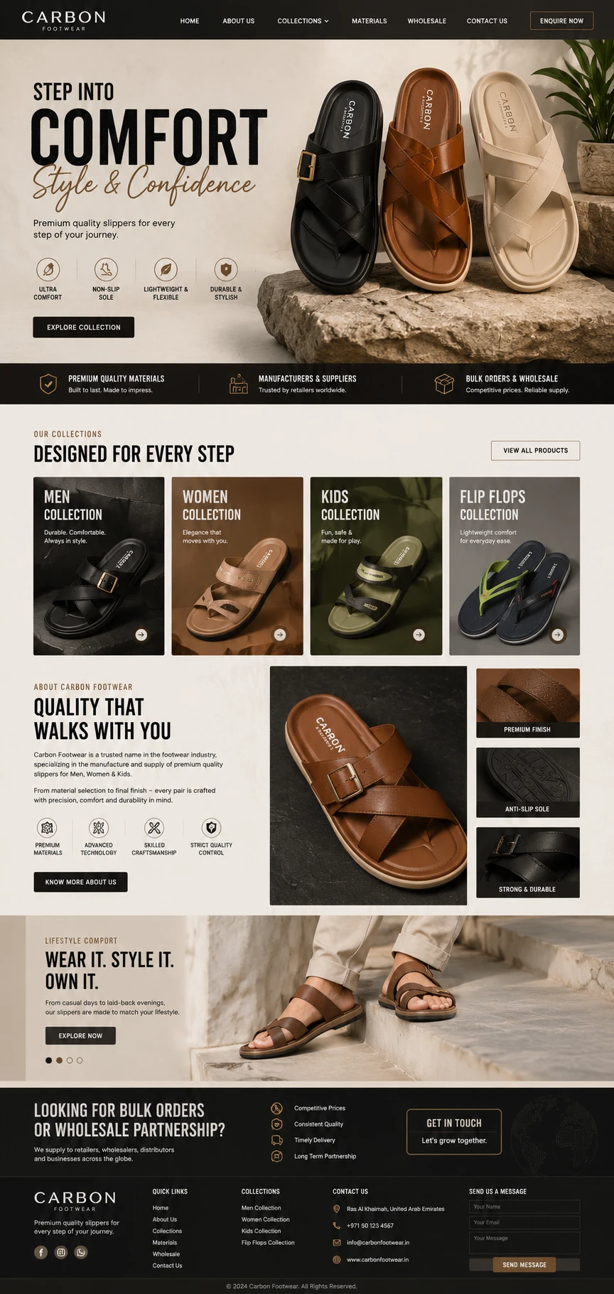
The full homepage journey moves from the comfort-led hero and collection discovery into craftsmanship, lifestyle storytelling, and wholesale enquiries.
Project objectives
The concept focused on six objectives:
Establish a premium and recognizable first impression.
Make footwear collections easy to discover.
Communicate comfort, quality, flexibility, and durability visually.
Give individual products enough space to feel desirable.
Support retail exploration and wholesale enquiries.
Create one consistent journey across the full homepage.
Strategy and content flow
I structured the homepage as a progressive brand story:
Introduce the comfort-led brand promise.
Present the most important product benefits.
Help visitors choose a relevant collection.
Explain the quality and craftsmanship behind the footwear.
Show the products in an everyday lifestyle setting.
Finish with a focused wholesale partnership invitation.
This sequence answers the visitor's main questions in a natural order: What does the brand offer? Which collection is for me? Why should I trust the quality? How does the footwear look in real life? What should I do next?
Brand and visual direction
The visual direction is warm, grounded, and premium.
Black creates confidence and gives the identity a strong foundation. Cream and sandstone tones soften the experience and connect it to comfort and natural materials. Cognac brown complements the leather footwear, while restrained bronze details add a refined finish to buttons, icons, and supporting elements.
Bold condensed headings give the website energy and make the main messages easy to scan. Elegant supporting typography balances the heavier headlines and keeps product information readable.
Stone surfaces, leather textures, warm lighting, close product details, and lifestyle photography make the experience feel tactile. These choices help visitors understand the finish and construction of the slippers before physically interacting with them.
Hero and first impression
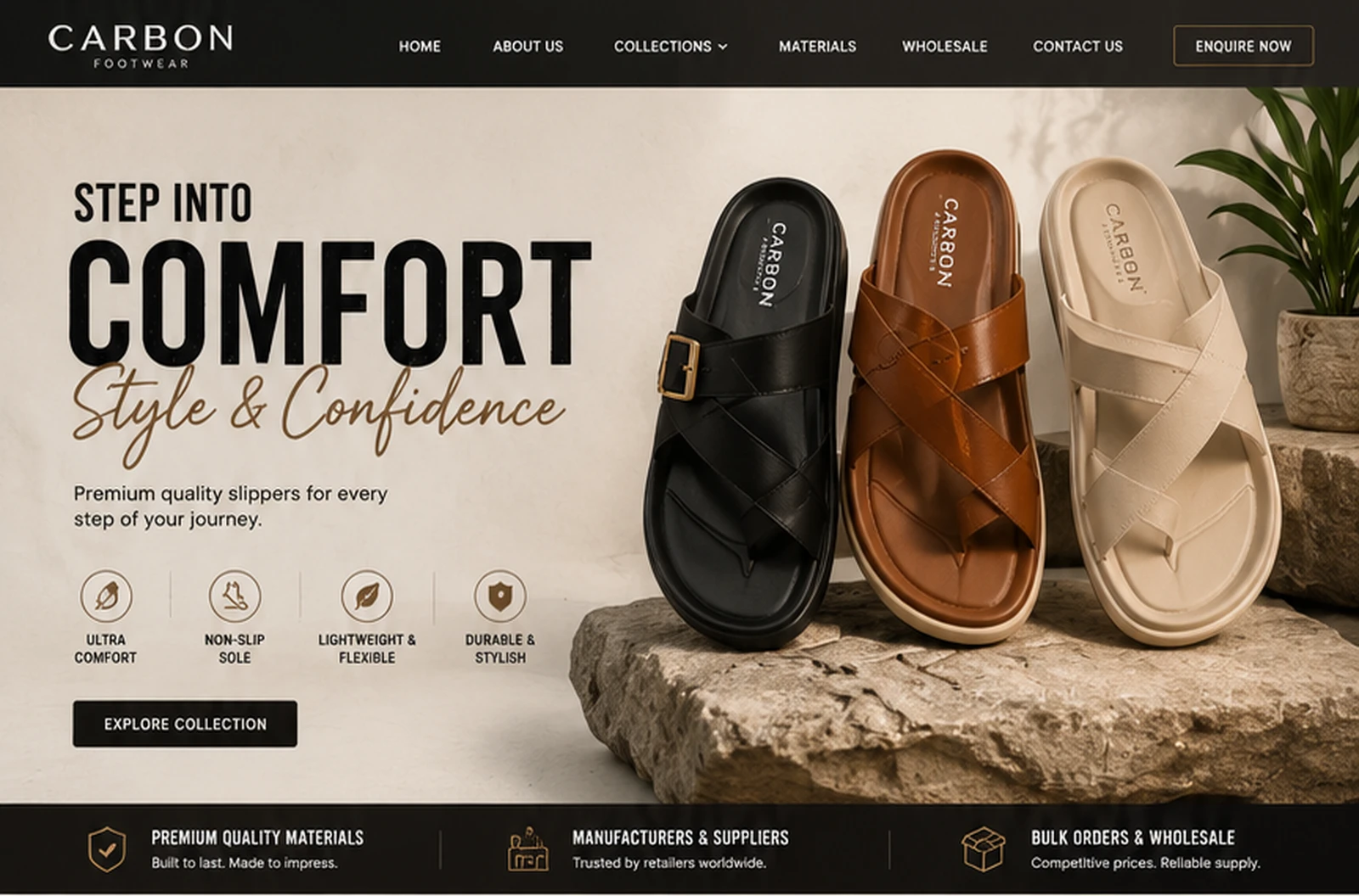
The hero introduces Carbon Footwear through the promise, “Step Into Comfort, Style & Confidence.”
Three prominent slippers immediately establish the product category and demonstrate the available finishes. Supporting benefit icons communicate ultra comfort, non-slip soles, lightweight flexibility, and durable construction.
The primary action, “Explore Collection,” gives retail visitors a clear next step without placing too many competing options in the opening section.
Collection discovery
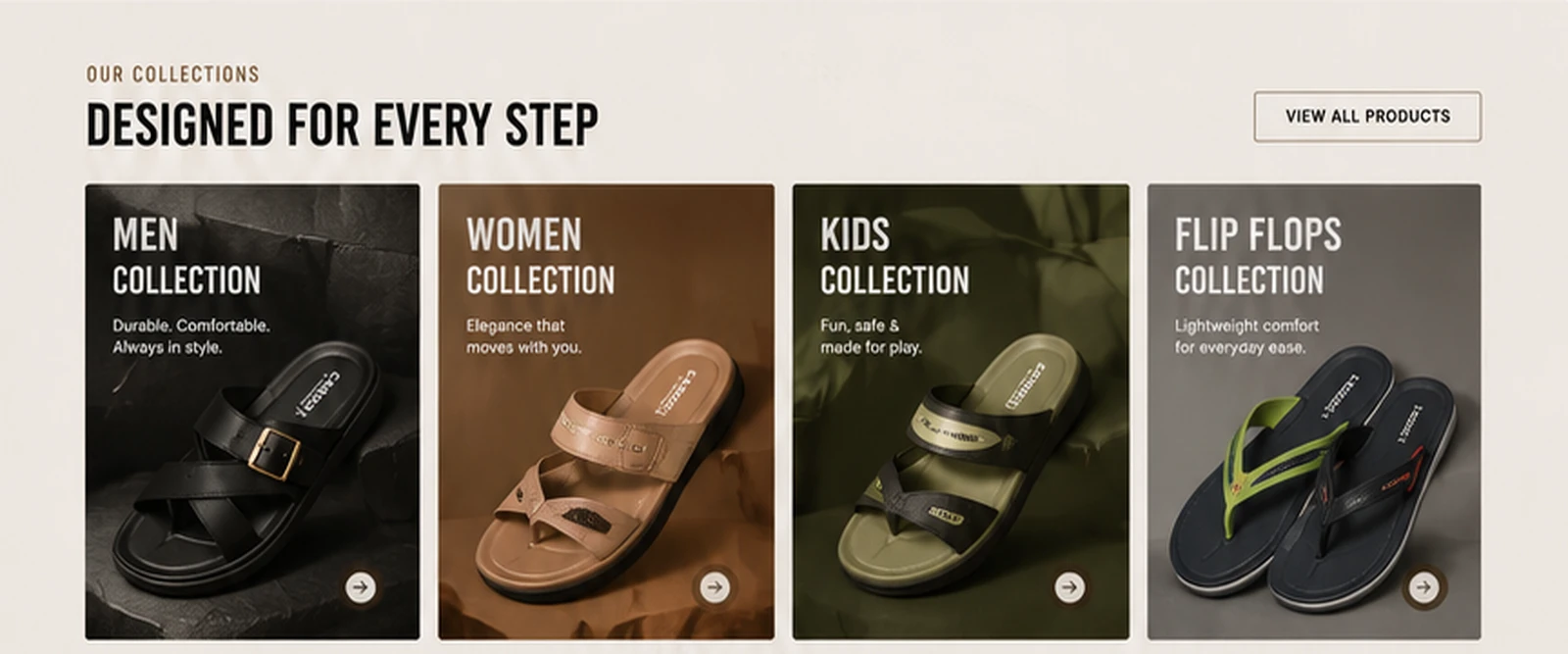
The product range is divided into four clear paths: men, women, kids, and flip flops.
Each collection has its own product image, short description, visual atmosphere, and directional action. This makes the range easy to scan while allowing every collection to feel distinct.
Visitors can identify the right category without searching through long menus or reading unnecessary paragraphs.
Quality and craftsmanship
The quality section moves the story from what Carbon Footwear sells to why the products deserve attention.
A large buckle sandal becomes the focal point, supported by close views of the finish, sole, and construction. The surrounding content highlights premium materials, advanced technology, skilled craftsmanship, and strict quality control.
This turns broad quality claims into visible product proof.
Lifestyle storytelling
The lifestyle section places the footwear in use and connects the product to everyday movement.
“Wear It. Style It. Own It.” positions the slippers as more than functional footwear. They become a comfortable style choice for casual days and relaxed social settings.
Showing the product on a person helps customers imagine its fit, appearance, and real-world use.
Wholesale as a real conversion path
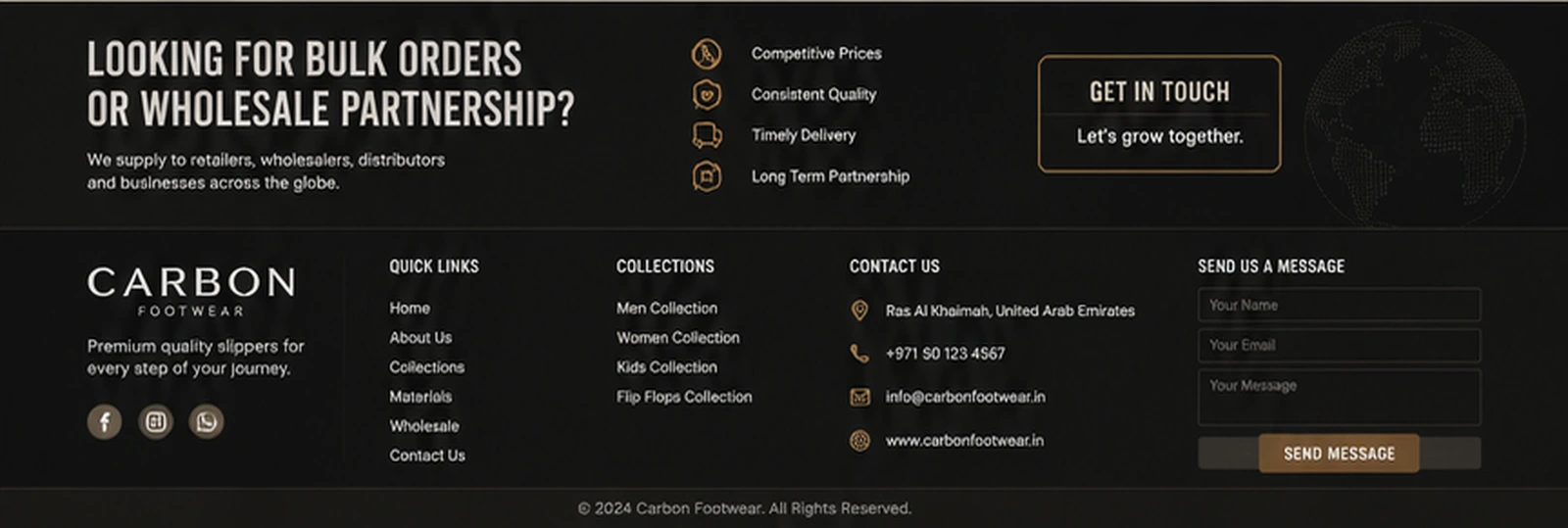
Instead of burying wholesale information inside the footer, the homepage ends with a dedicated partnership section for retailers, wholesalers, distributors, and business buyers.
Competitive pricing, consistent quality, timely delivery, and long-term partnership are presented as the main commercial benefits. A focused “Get in Touch” action gives business buyers an obvious next step.
Placing wholesale at the end of the homepage signals that it is a real revenue channel rather than a secondary contact option.
CARBON FOOTWEAR HERO SECTION
COLLECTIONS SECTION
CARBON FOOTWEAR FOOTER
Need an ecommerce website that makes your products feel desirable and your brand easy to trust? I design product-focused digital experiences that combine strong visual identity, clear customer journeys, and meaningful calls to action.
Like this project
Posted Aug 29, 2026
A premium footwear ecommerce concept combining product storytelling, collection discovery, and a dedicated wholesale enquiry journey.
Likes
1
Views
8