Neo's HVAC Website Redesign

Vincent Olusola


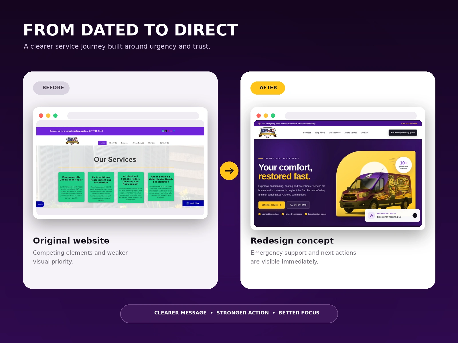
Neo's HVAC provides air conditioning, heating, and water heater services across the San Fernando Valley and surrounding Los Angeles communities. This redesign concept explored how the website could feel more current, trustworthy, and action-focused while preserving the company's recognizable purple and yellow identity.
The goal was not simply to give the page a newer appearance. The redesign needed to help people understand the service immediately, find the phone number without searching, recognize that emergency help is available, and move confidently toward scheduling a service or requesting a quote.
The challenge
HVAC customers often visit a website while dealing with an urgent comfort problem. They do not want to navigate through a slow or confusing experience before they can call for help.
The original design contained useful service information, but the page hierarchy felt dated and visually fragmented. The navigation, service content, social links, chat prompt, and contact details competed for attention. The strongest actions were not presented as one clear journey.
The redesign needed to organize that information around the visitor's priorities: what the company does, where it operates, why it can be trusted, how quickly help is available, and what action to take next.
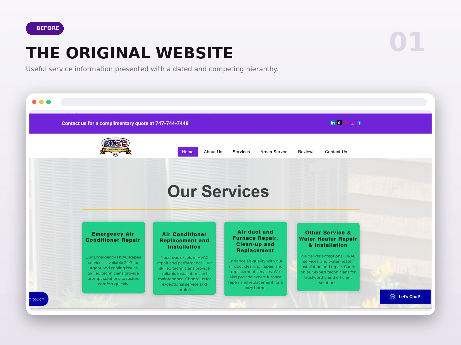
The earlier experience contained the necessary service information, but competing elements and a dated hierarchy made the customer journey less direct.
The redesign focused on six objectives:
Create a strong and recognizable first impression.
Make emergency availability and the phone number immediately visible.
Present the core HVAC services in clear, customer-friendly language.
Build trust through local experience, licensing, service coverage, and complimentary quotes.
Reduce visual competition between navigation, content, and calls to action.
Create a layout that can adapt clearly across desktop, tablet, and mobile screens.
Strategy and page structure
I reorganized the opening experience around a simple decision path:
Confirm that emergency service is available.
Introduce the local HVAC company and its service promise.
Explain the main services and coverage area.
Reinforce trust with practical customer assurances.
Offer two direct actions: schedule service or call immediately.
This structure respects the urgency of the visitor while still giving the brand enough room to communicate expertise and personality.
Visual direction
The redesign keeps the company's existing purple and yellow brand colors, then uses them with more control and contrast.
Deep purple creates a confident foundation for the hero, while bright yellow highlights the promise, primary call to action, trust markers, and branded service vehicle. White and soft neutral surfaces keep supporting information readable and prevent the identity from becoming visually overwhelming.
Large, direct typography makes the main message easy to understand at a glance. Rounded shapes soften the interface, while the strong content blocks and high-contrast buttons keep the experience practical and professional.
Hero and first impression
The new hero leads with the message, "Your comfort, restored fast."
The headline speaks directly to the customer's problem and the speed of the solution. Supporting copy identifies the main services and service area without forcing the visitor to search through another page.
The branded service van becomes the main visual, reinforcing local recognition and making the company's real-world presence part of the digital experience. A visible experience badge adds another trust signal without distracting from the primary message.
Emergency service and direct actions
Emergency availability appears in the top bar and again beside the main hero visual. This repetition is intentional because urgent visitors may enter the page, scan it quickly, and act without reading every section.
"Schedule service" is the primary action for visitors ready to begin a request. The phone number sits beside it as an immediate alternative. The complimentary quote button remains visible in the navigation for visitors who are still comparing options.
Together, these actions support different levels of urgency without overcrowding the page.
Trust and local credibility
Trust is especially important for a company entering homes and businesses. The redesign introduces concise trust markers for licensed technicians, residential and commercial service, complimentary quotes, local experience, and 24/7 emergency support.
Instead of hiding these points inside long paragraphs, the interface places them close to the main call to action. This helps visitors see the practical reasons to contact the company before they leave the opening section.
Navigation and content hierarchy
The navigation was simplified around the questions a local customer is most likely to have: services, why Neo's, the service process, areas served, and contact.
The phone number and quote action are separated from the standard navigation links, giving them greater visual priority. The layout creates a more deliberate path from information to action and reduces the competition visible in the earlier experience.
UX and conversion decisions
The redesign treats clarity as the main conversion tool.
The service promise appears first, the service area is stated early, urgent help is always visible, and calls to action use direct language. Small trust points answer common customer concerns before they become reasons to leave the page.
The interface also distinguishes between visitors who want to schedule, visitors who need to call now, and visitors who want a complimentary quote. Each action is clearly labeled and positioned according to its importance.
The outcome
The final concept gives Neo's HVAC a more focused and contemporary digital presence while keeping the company's recognizable character intact.
The redesigned opening experience communicates the service, location, urgency, and next action within one clear view. The stronger hierarchy makes the phone number easier to find, gives the branded service vehicle a meaningful role, and turns emergency availability into a visible part of the customer journey.
The result is a local service website concept designed to feel fast, dependable, and easy to act on when comfort cannot wait.
Project scope
Website redesign concept
Homepage hero design
Information architecture and content hierarchy
Local service positioning
Emergency service messaging
Call and quote conversion paths
Brand color refinement
Trust and credibility system
Responsive design direction
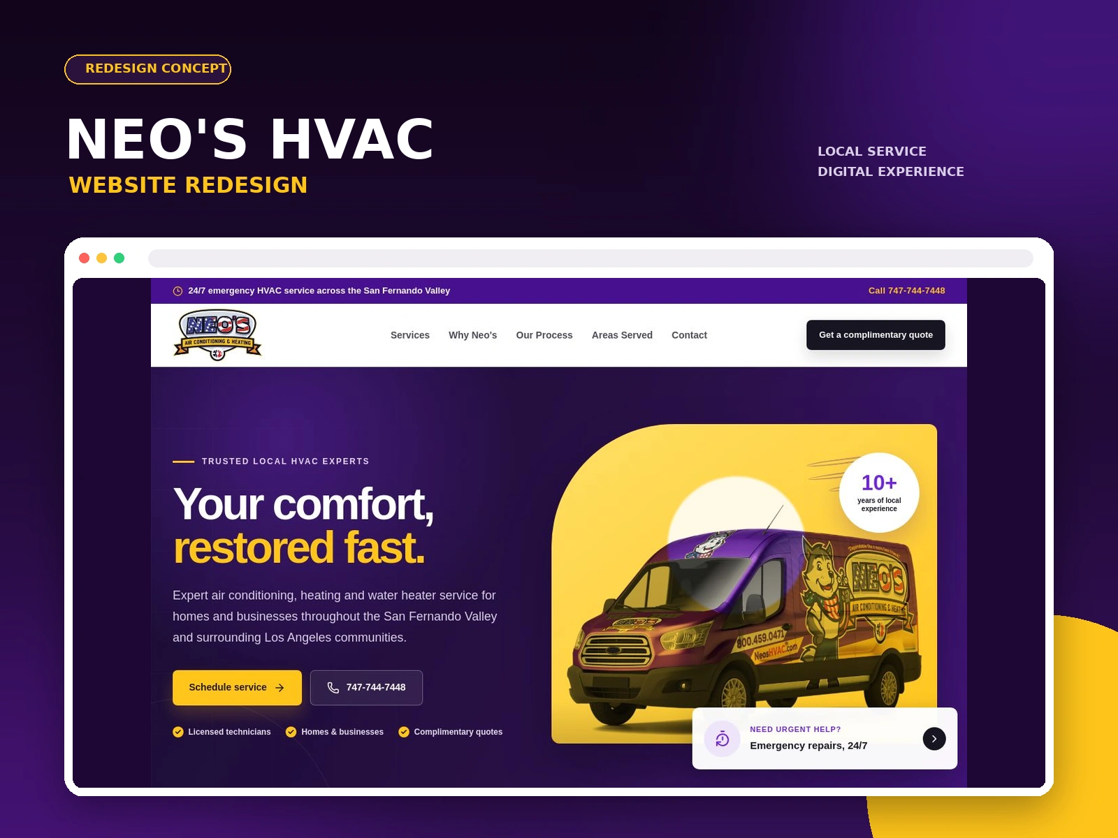
The redesigned hero brings the service promise, phone number, service area, trust points, and primary actions into one focused experience.

ORIGINAL AND CURENT HOME PAGE

WEBSITE REDESIGN CONCEPT FOR NEOS HVAC
Like this project
Posted Aug 30, 2026
A modern HVAC website redesign concept built to communicate urgency, local trust, and clear service actions for homeowners and businesses.
Likes
1
Views
8
Timeline
Mar 2, 2026 - Mar 15, 2026