
Overview
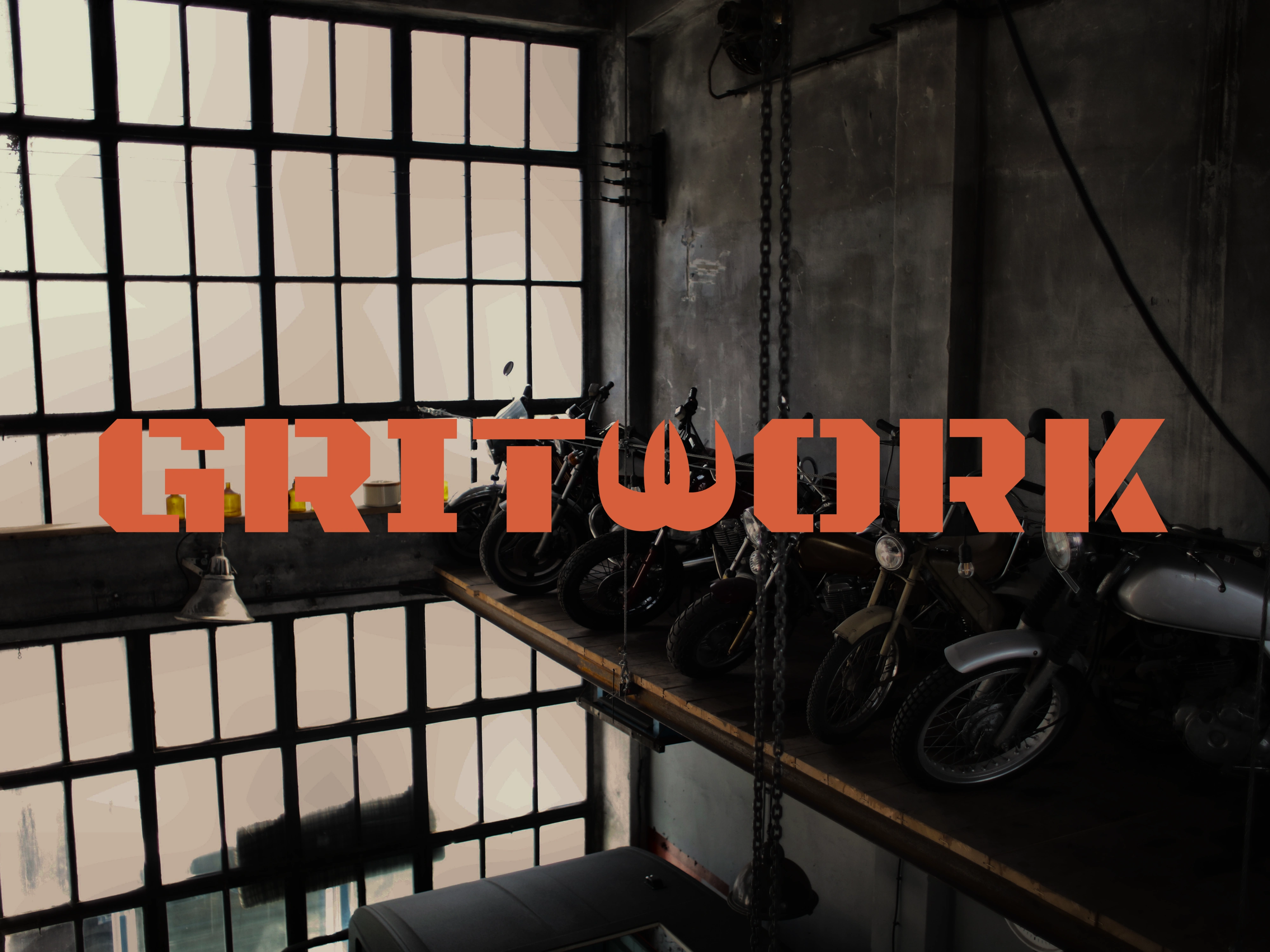
Gritwork is a co-op motorcycle garage and community hub built around a single philosophy: Built, Not Bought. Designed for city riders, weekend wrenchers, and vintage customizers, the space offers rentable work bays, shared heavy machinery, and hands-on guidance from veteran mechanics. Rather than functioning as a sterile dealership or an exclusive club, Gritwork celebrates the raw, unfiltered reality of analog mechanics: grease stains, chipped paint, and shared knowledge.
The Challenge
Most modern automotive and motorcycle lifestyle brands fall into two predictable traps: they either look hyper-corporate and clinical, or they rely on tired, generic "hipster garage" clichés.
The goal was to create an intentional anti-design identity system: one that feels loud, utilitarian, and rough around the edges, yet operates as a highly functional, professional system behind the scenes.
Logos
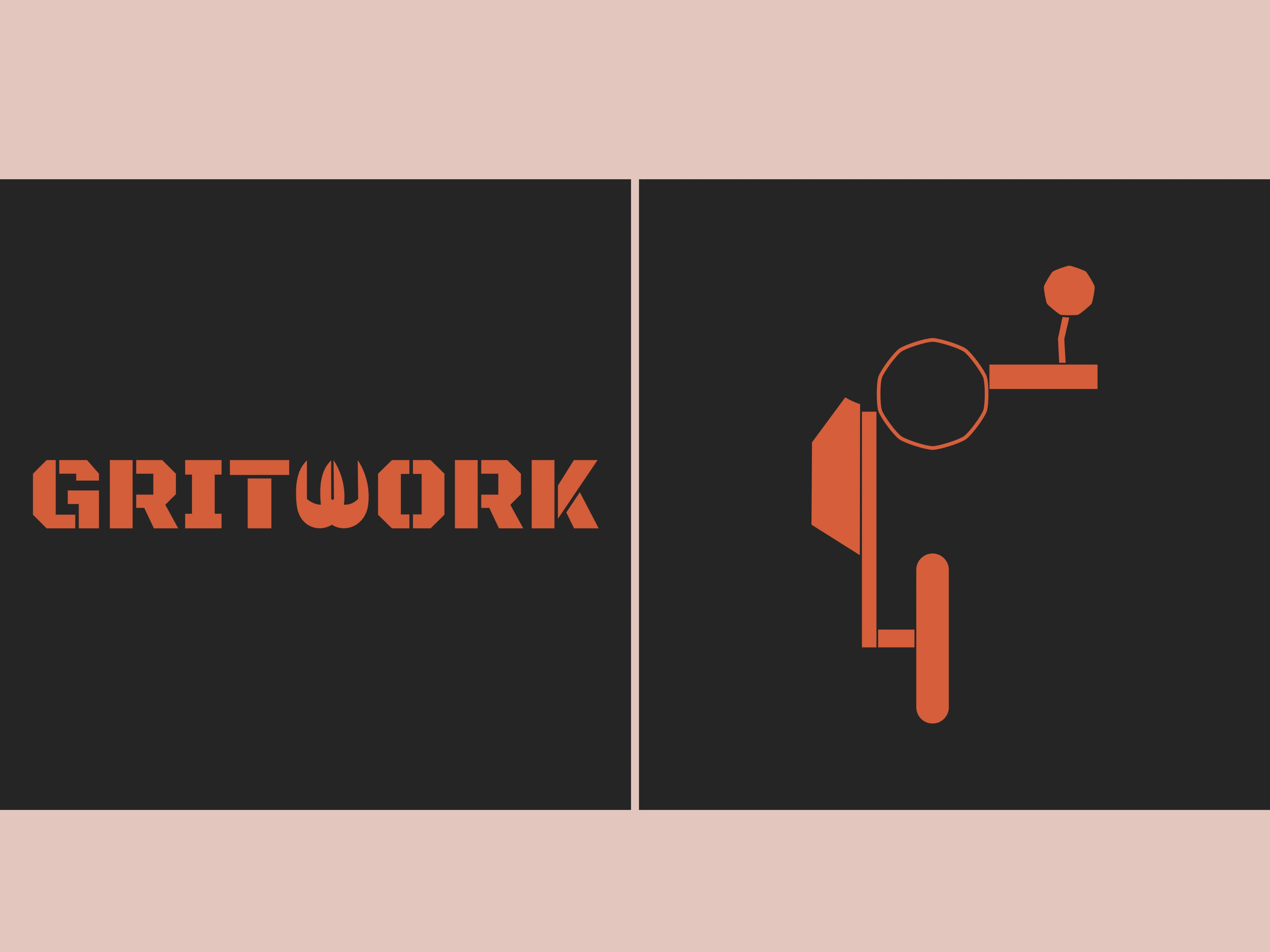
The Primary Wordmark: The Interlocking Wrench
To establish a structural, industrial foundation, Black Ops One was selected for its rigid, stencil-cut architecture reminiscent of heavy manufacturing blueprints and crate markings.
To elevate the wordmark beyond a standard typeface and make it uniquely ownable, the letter "W" was custom-engineered from two interlocking wrench heads. This modification serves a dual purpose:
Utility: It immediately anchors the brand in physical tools and mechanical craft.
Community: The interlocking jaws symbolize riders coming together, sharing gear, and helping one another build.
The Submark: Geometric "G" Silhouette
The secondary mark distills the brand's initial "G" and core subject matter into a single geometric icon. Constructed from hard, architectural lines that trace the profile of a custom motorcycle frame, handlebars, and engine block, the mark maintains a circular wheel to preserve a sense of forward motion.
Brand Pattern
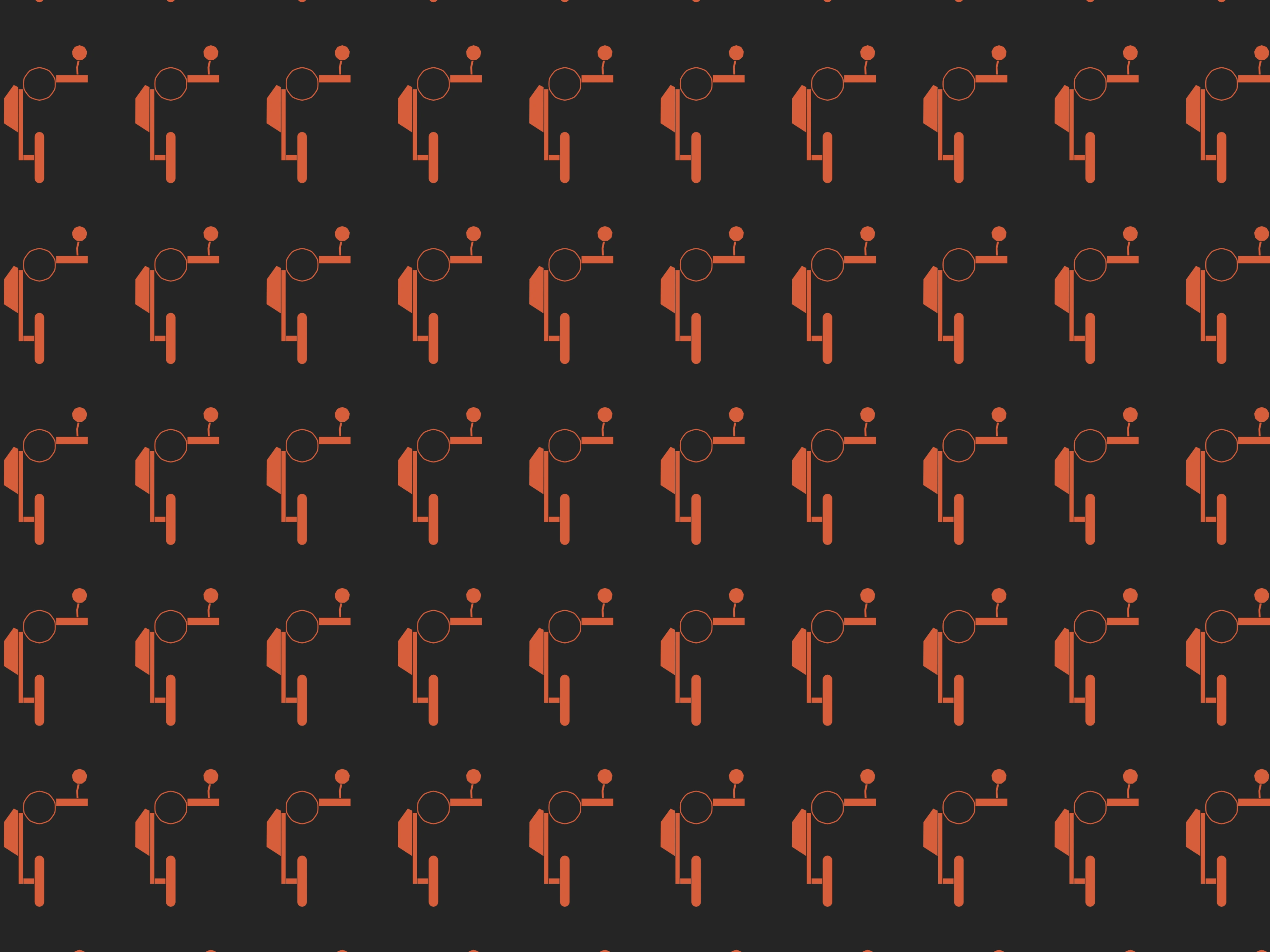
Modular Industrial Brand Pattern
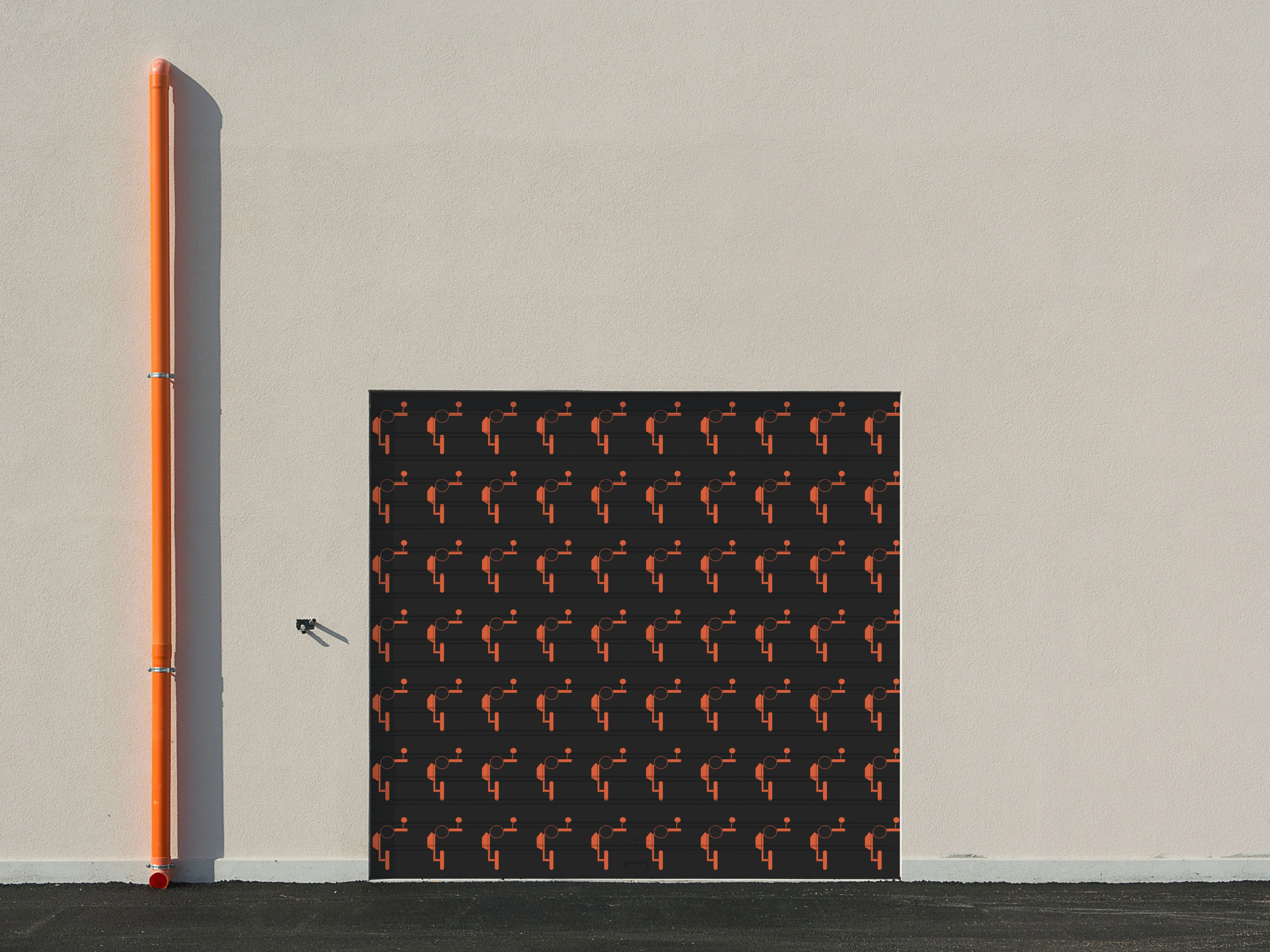
Beyond functioning as an isolated badge, the geometric "G" silhouette was mathematically tessellated into a continuous, modular brand pattern. Engineered with deliberate grid alignment and equalized negative space, the pattern transforms technical machinery lines into an architectural asset.
Typography
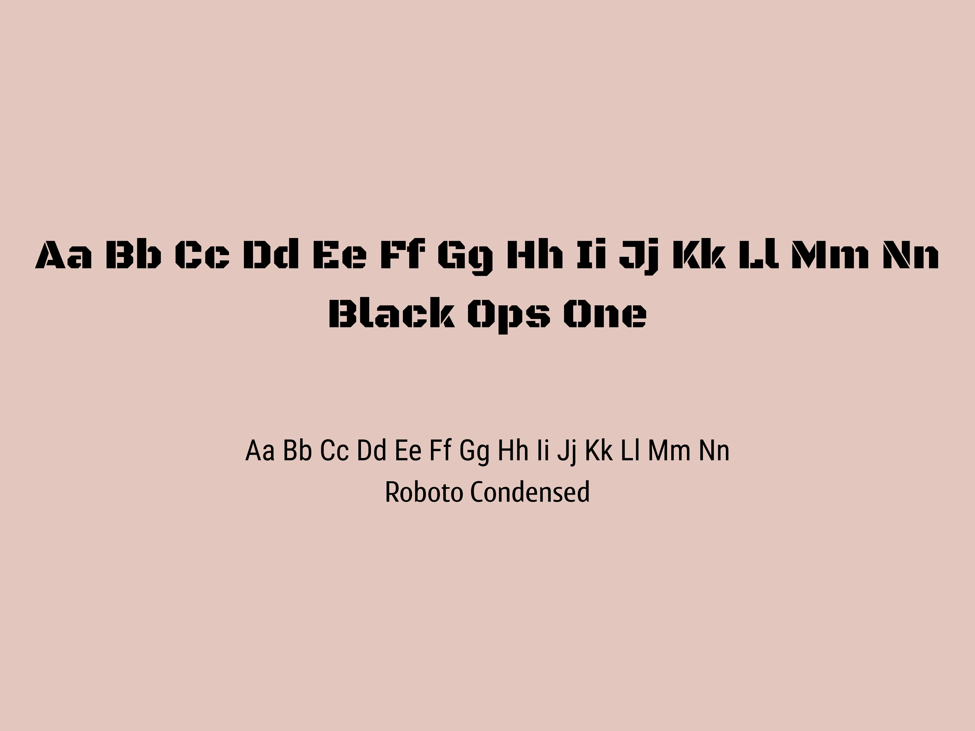
Typography System
Primary Display (Black Ops One): Selected for its unapologetic visual mass and rigid stencil architecture. The geometric cuts and heavy industrial proportions evoke mechanical manufacturing blueprints and structural machinery markings. Its angular, unpolished weight establishes an immediate tone of durability, analog engineering, and the "Built, Not Bought" ethos.
Body & Technical Data (Roboto Condensed): Chosen for its narrow horizontal footprint and tall, utilitarian structure. The condensed letterforms mirror the dense data layouts of technical repair manuals, engine schematics, and mechanical specification charts. It delivers clean, high-density legibility while maintaining a rugged, functional posture alongside the heavy display type.
Color Palette
Color Palette: Sourced from the Shop Floor
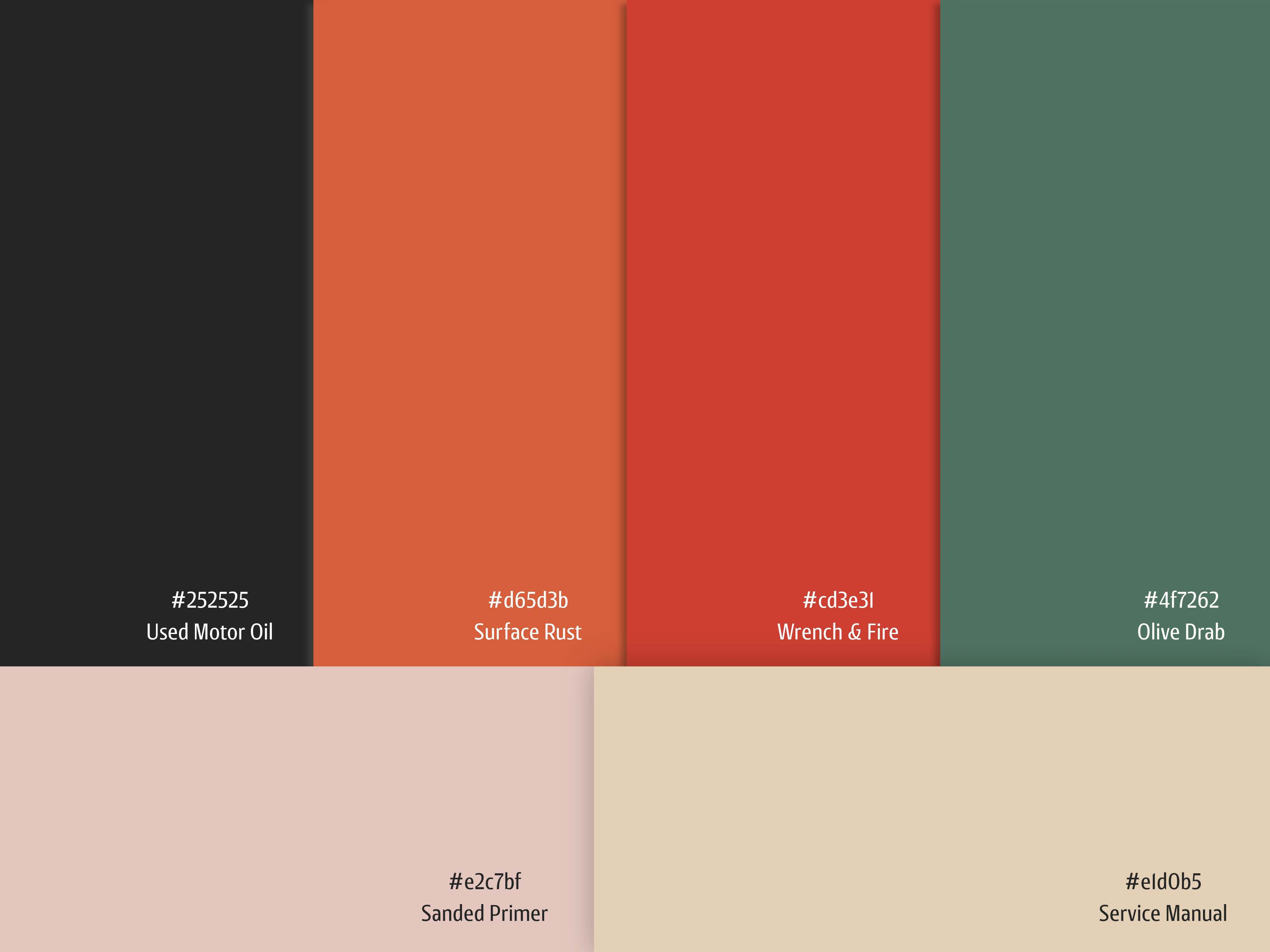
Moving completely away from muted luxury palettes, Gritwork uses high-contrast, utilitarian tones named directly after real garage materials:
Used Motor Oil (#252525): A deep, grease-tinged charcoal that serves as the identity's foundational dark tone. It replaces cold, sterile digital blacks with the organic, carbon-rich residue of working engines.
Surface Rust (#d65d3b) & Wrench & Fire (#cd3e31): High-energy oxidized tones inspired by weathered steel, heated exhaust pipes, and industrial workshop safety pigments. These colors deliver raw visual heat and sharp contrast against darker grounds.
Olive Drab (#4f7262): A muted, utilitarian green drawn from vintage machinery enamel and military-surplus hardware. It introduces a calculated, functional heritage that balances the aggressive warm tones.
Sanded Primer (#e2c7bf) & Service Manual (#e1d0b5): Dry, tactile neutrals that evoke dog-eared paper manuals, bare metal preparation filler, and sun-baked workshop surfaces. They provide natural, non-reflective contrast without the sterile glare of bleached whites.
Signboard
Rolling Bay Doors
Floorplan System
Shop Apron
Newsprint Bulletin
Riding T Shirt
Riding T Shirt
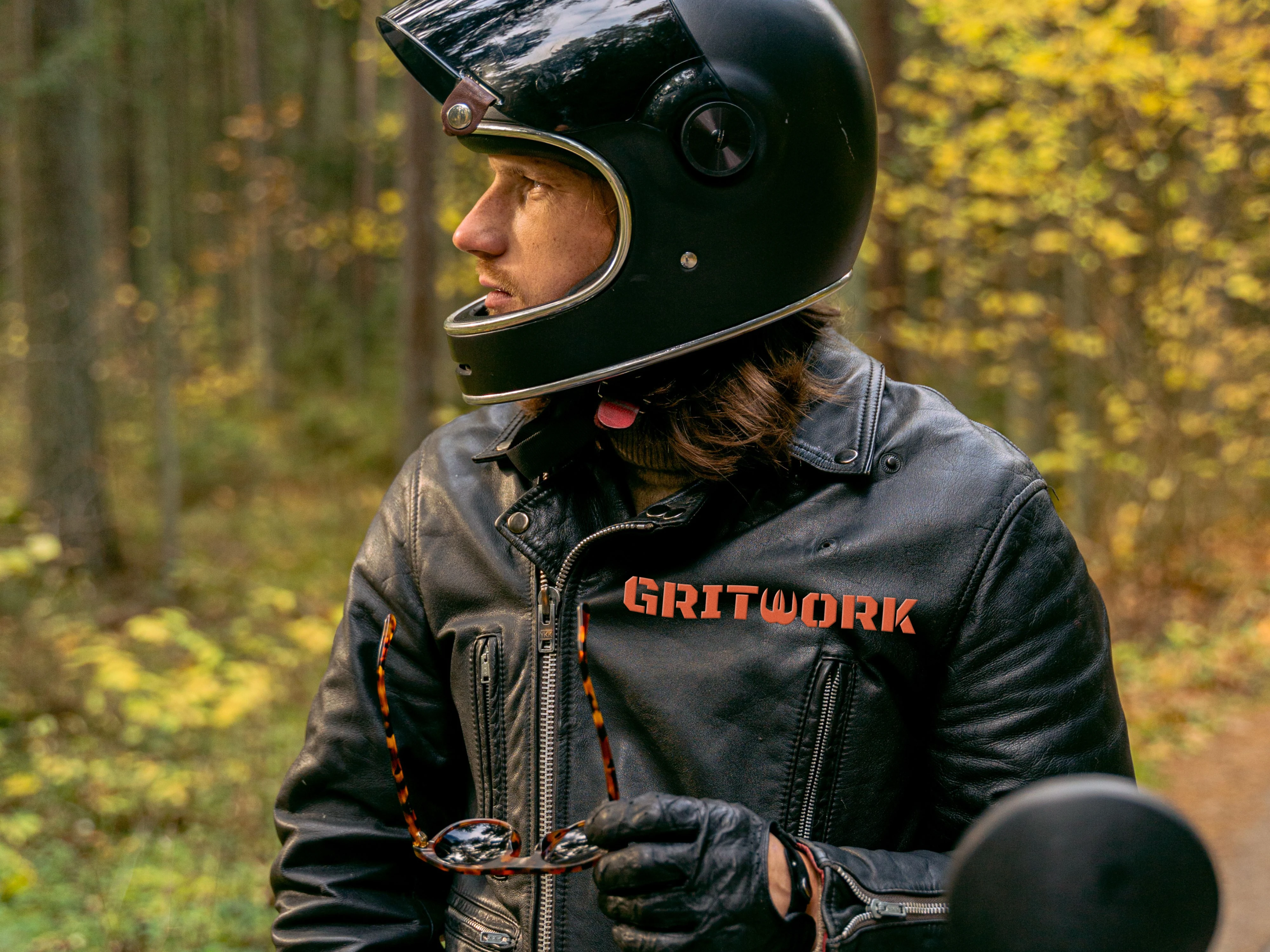
Riding Jacket
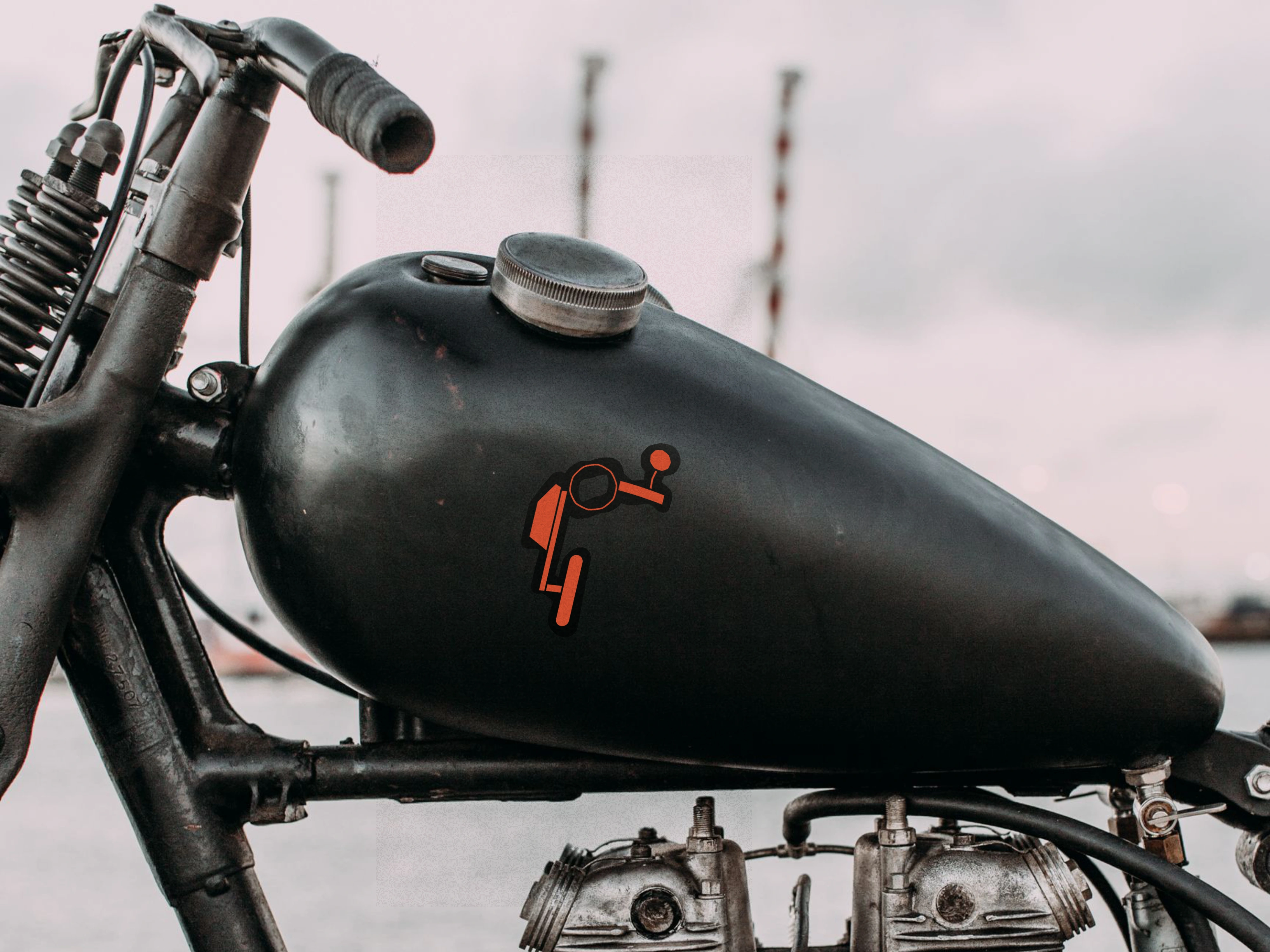
Fuel Tank Decal
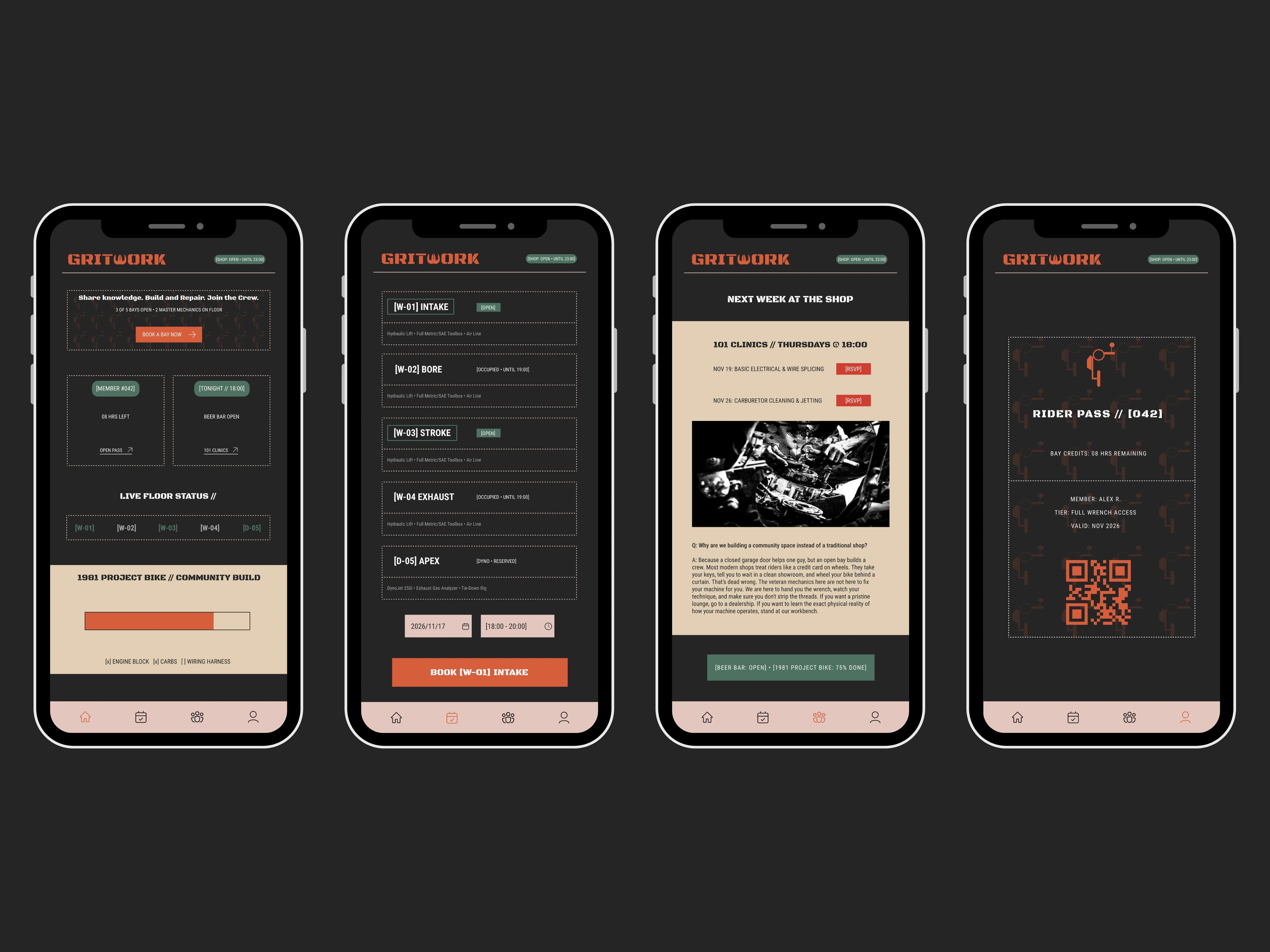
Mobile App UI
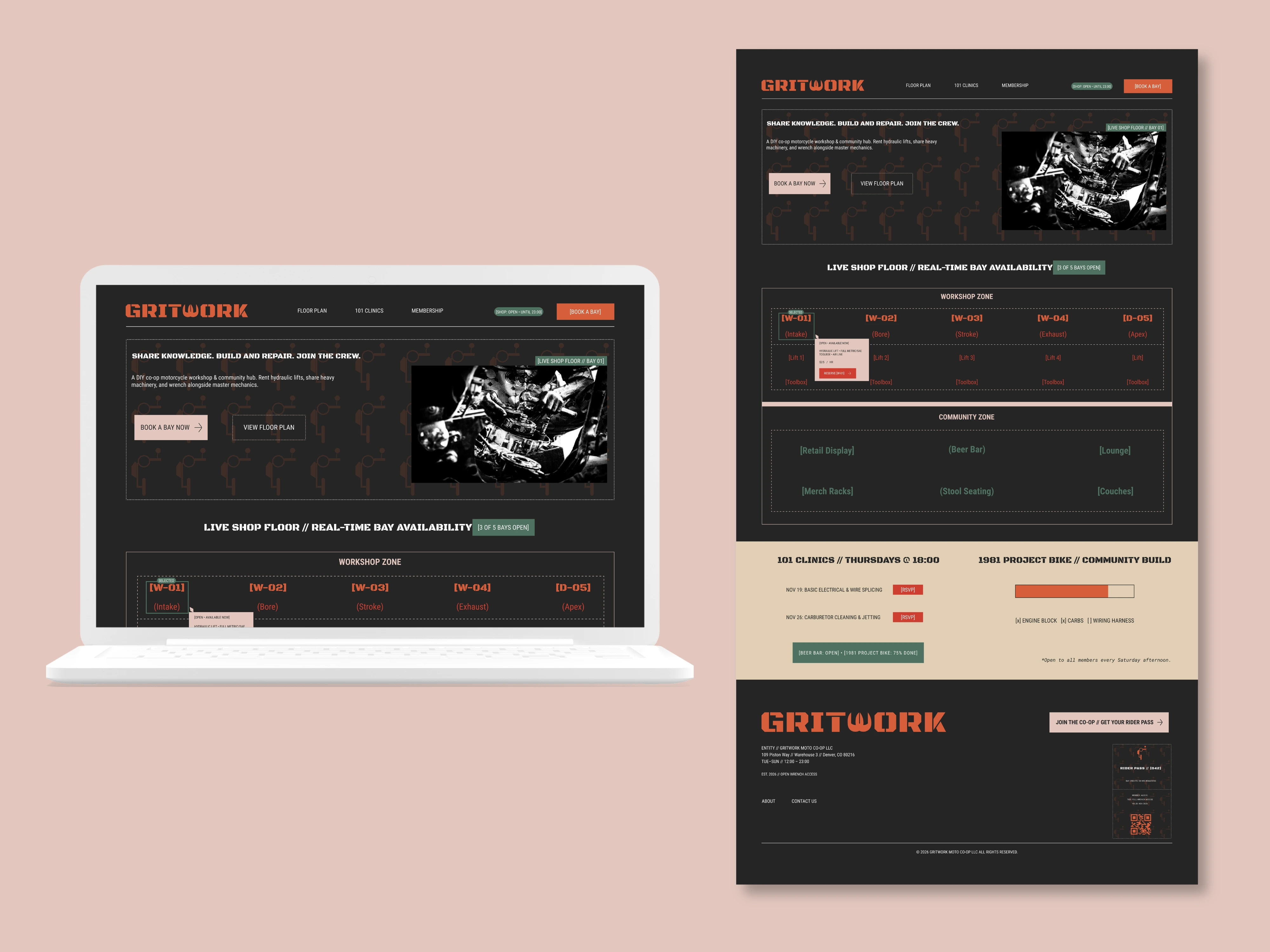
Website Landing Page UI
Business Card
Physical, Environmental & Digital Ecosystem
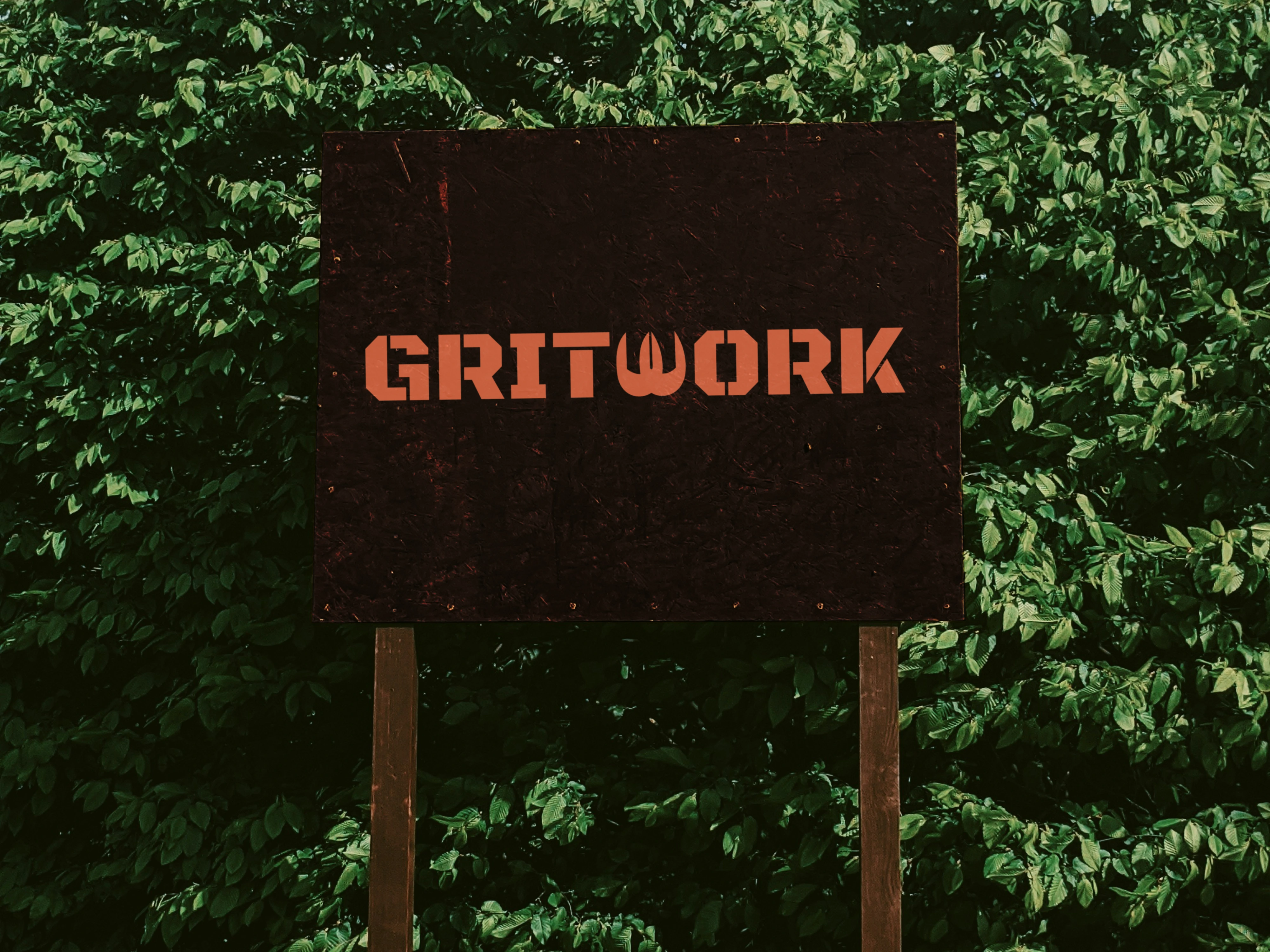
Environmental Graphics & Signage: Designed for maximum visibility across raw industrial materials. Includes large-scale stencil typography applied across interior steel mezzanines, weathered exterior timber signboards, and full-bleed submark pattern wraps on rolling warehouse bay doors.
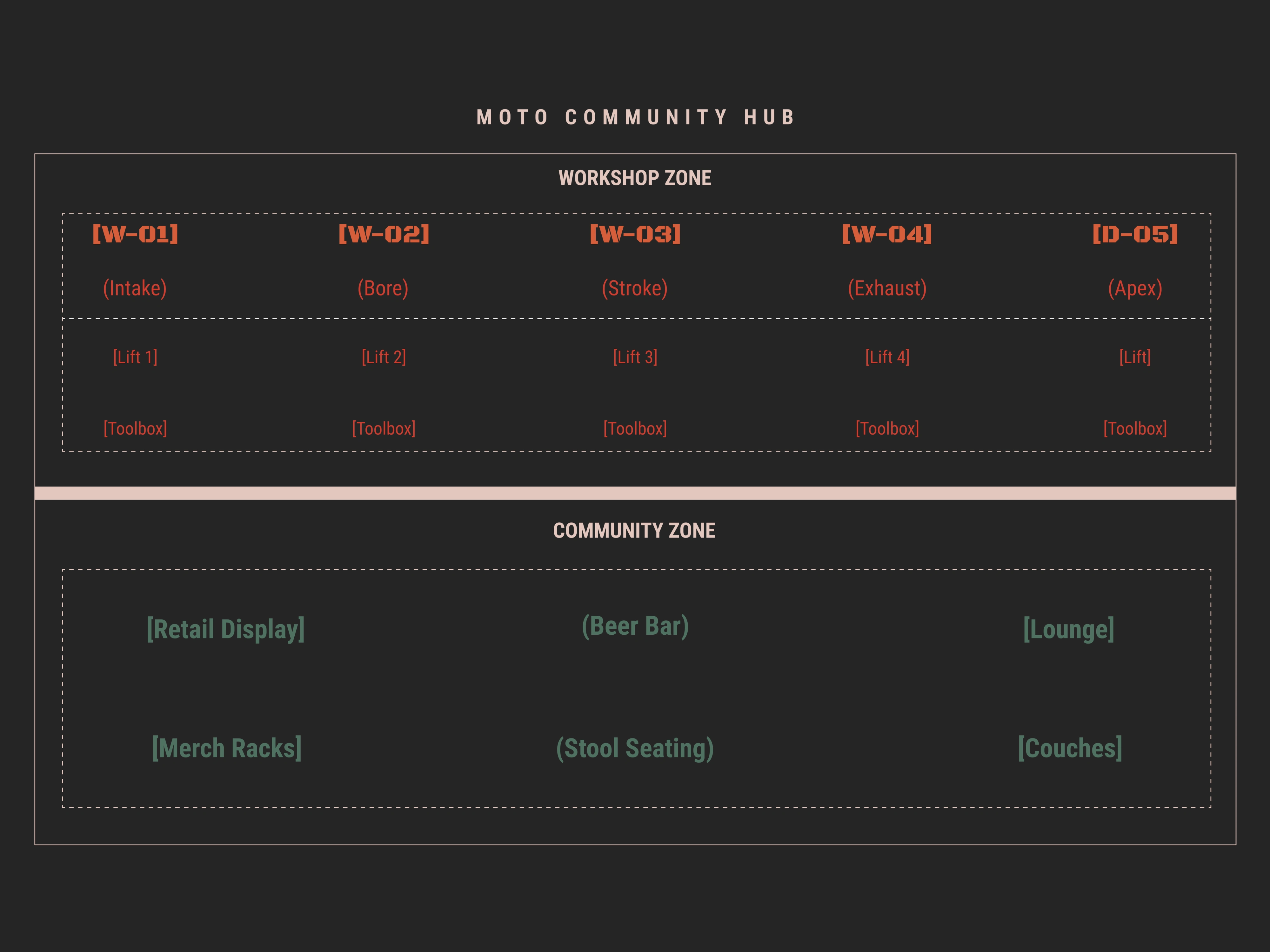
Operational Floorplan System: Organizes the physical workshop into clear mechanical zones, utilizing engine-stroke designations for work bays ([W-01] Intake through [D-05] Apex) alongside designated retail and community lounge areas.
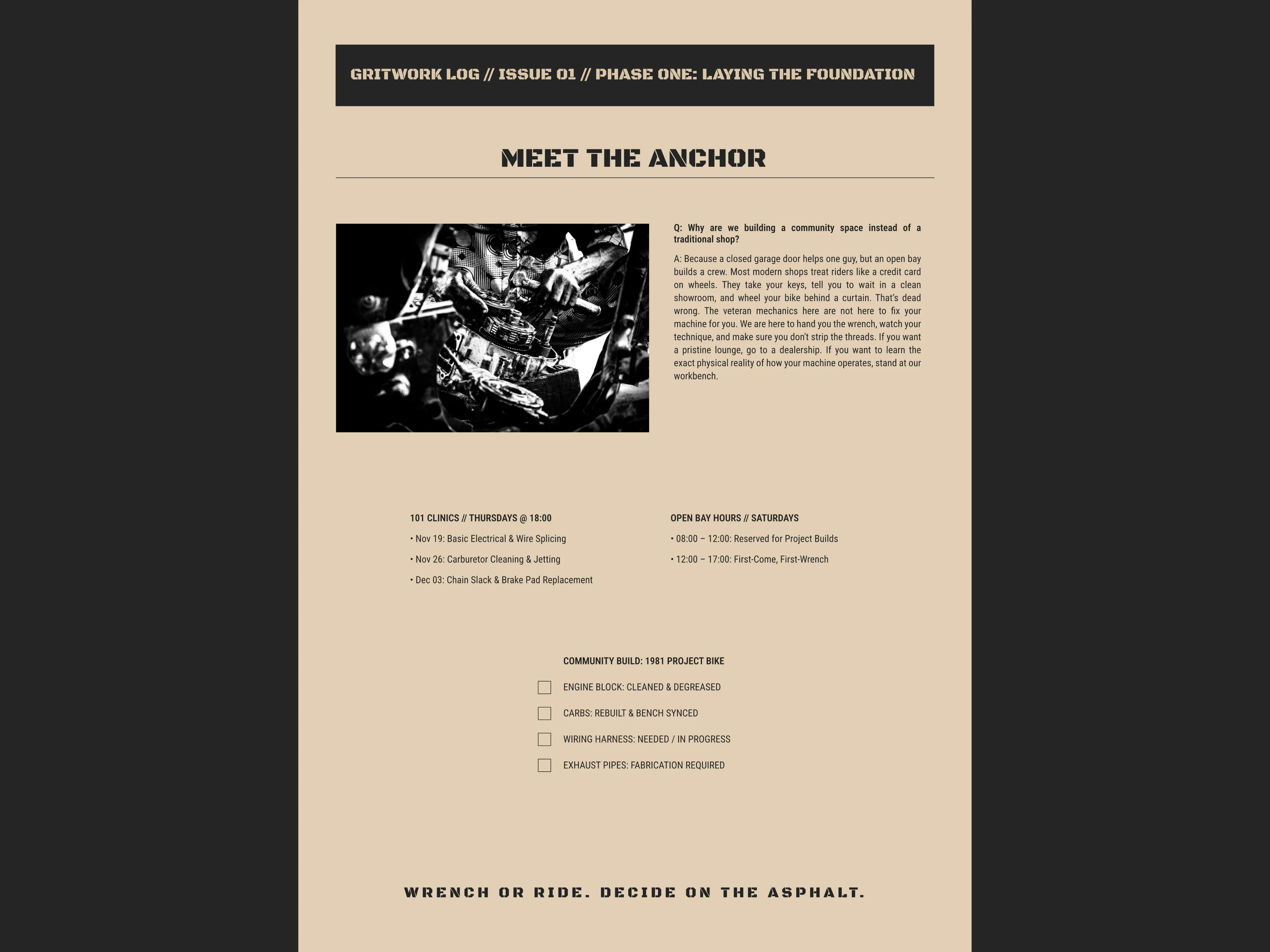
Print Collateral (Gritwork Log): A physical, single-sheet newsprint bulletin featuring technical Q&As with resident mechanics, clinic schedules, and a live build checklist for the communal 1981 project motorcycle.
Digital Ecosystem (Web & Mobile App): Translates the physical workshop floor into an interactive reservation platform where members can track real-time bay availability, RSVP to technical workshops, and check in using their digital Rider Pass ([042]).
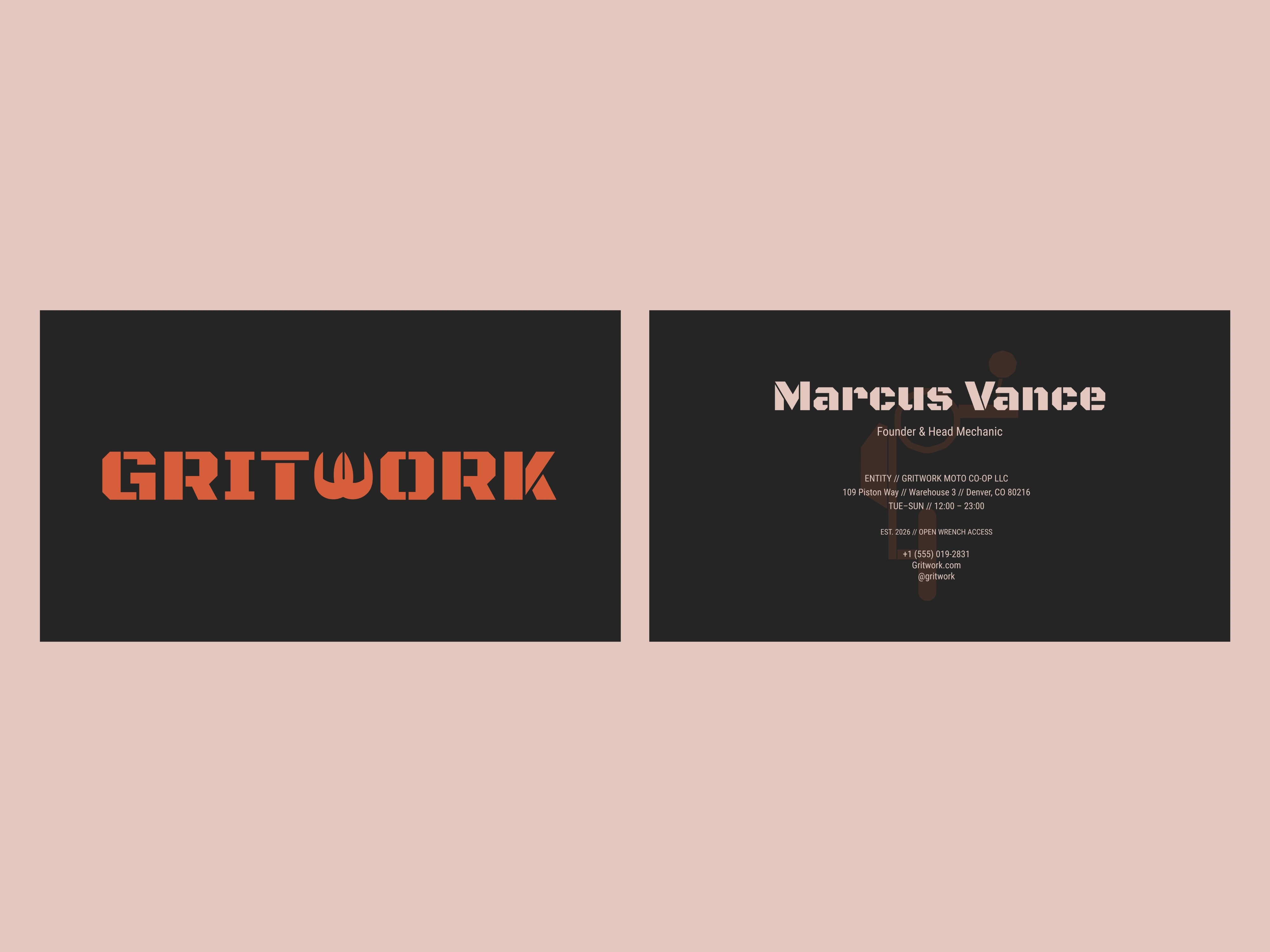
Tactile Brand Stationery (Business Cards): Built with high-contrast utility. The front features the Surface Rust stencil on Used Motor Oil charcoal, while the reverse side uses the Service Manual tone to house official Denver workshop coordinates and credentials for Founder Marcus Vance.
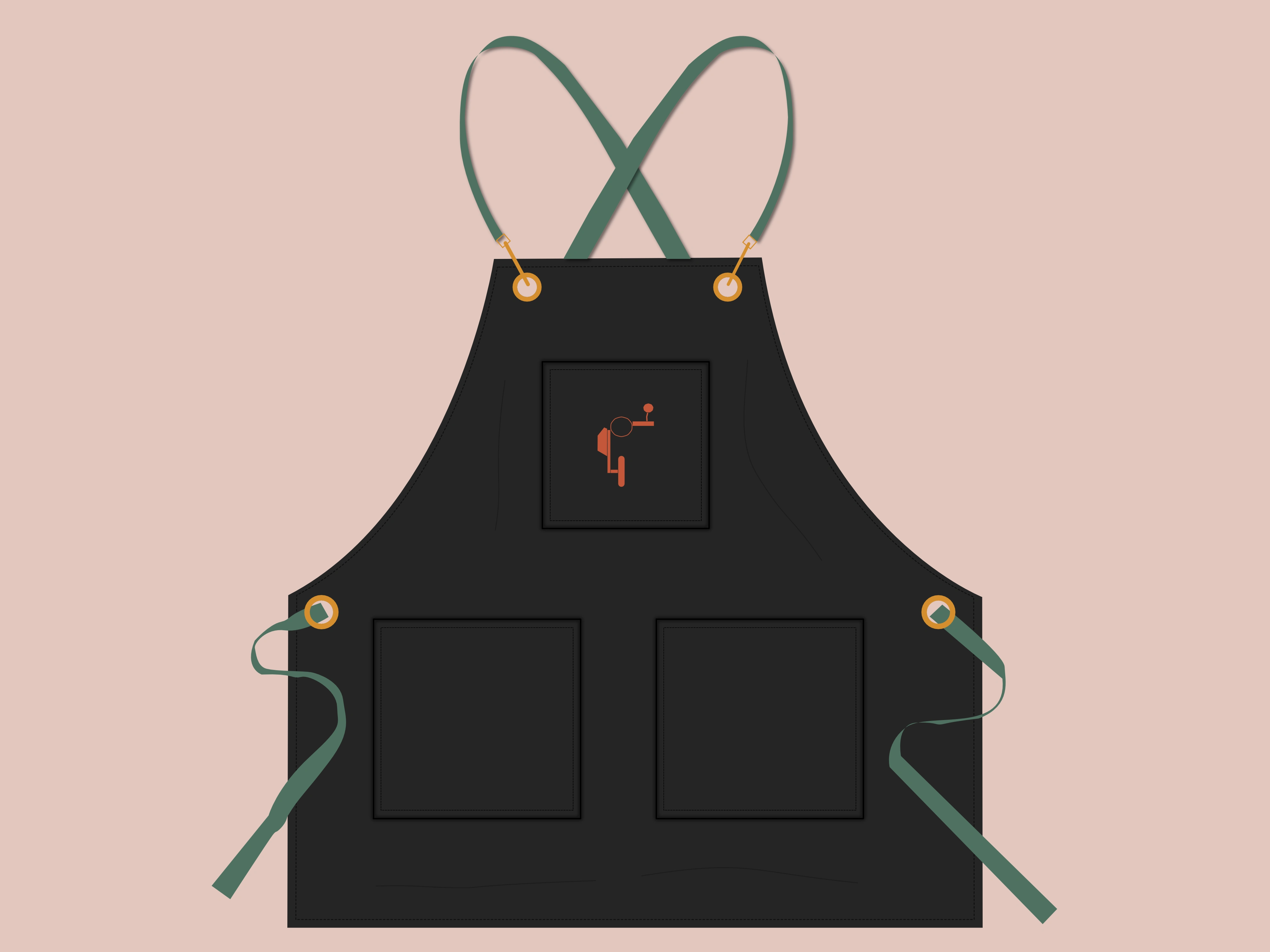
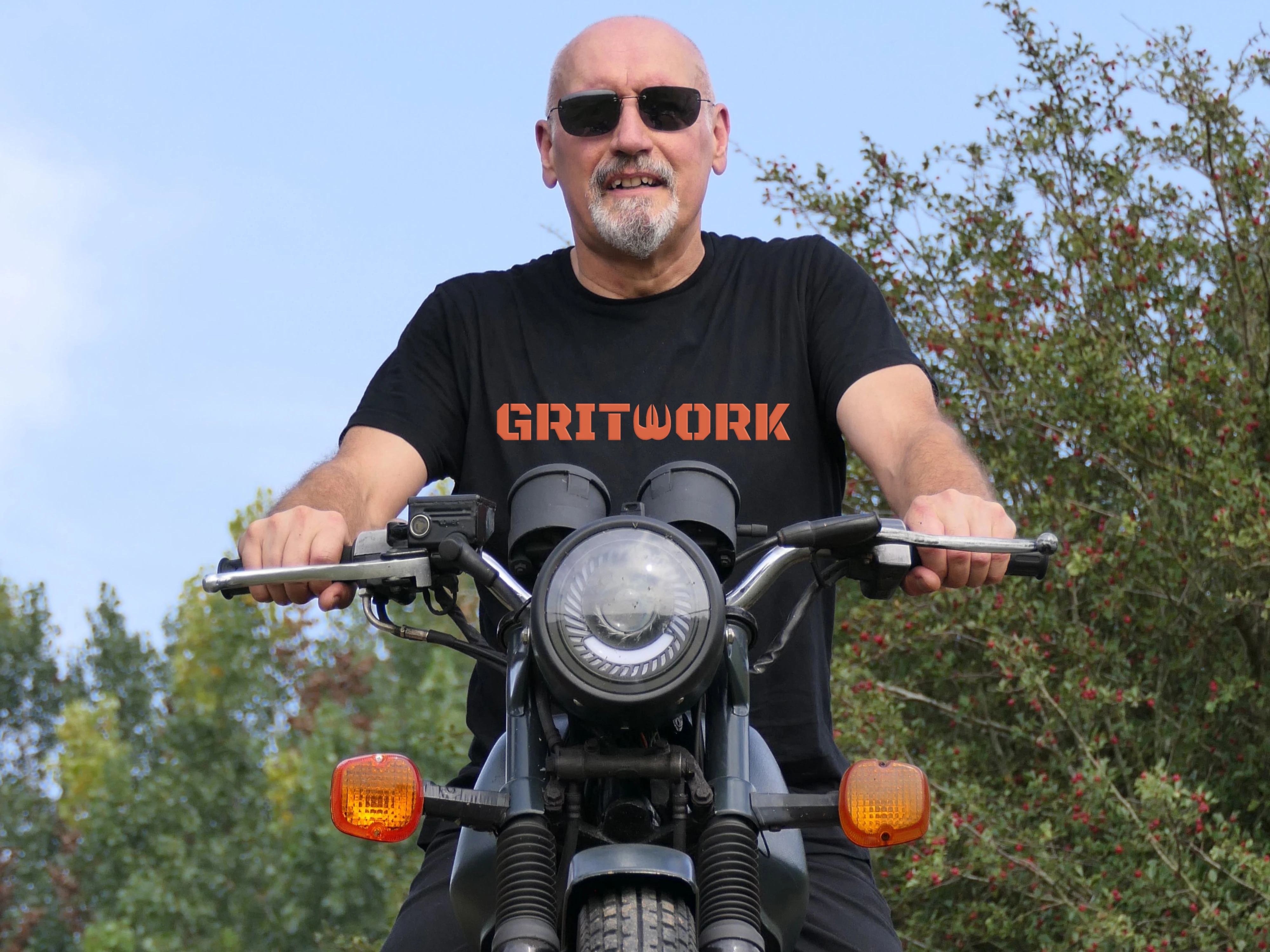
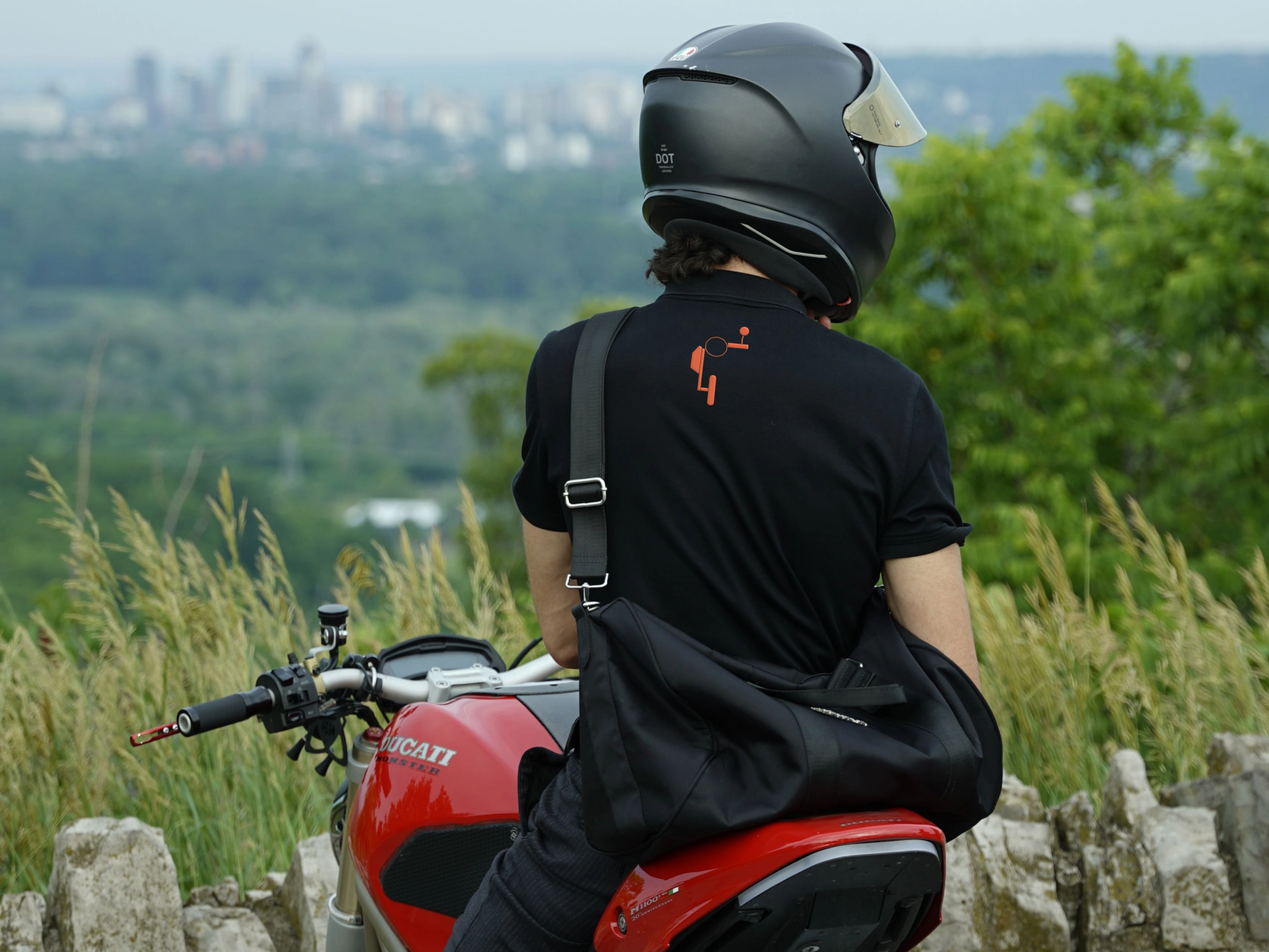
Workwear & Motorcycle Gear: Engineered to withstand daily garage wear, extending the brand onto heavy canvas shop aprons with brass grommets, embroidered leather riding jackets and tees, and matte fuel tank decals.
Building a co-op workshop, automotive brand, or community space?
Let’s build an authentic, hard-hitting visual identity for your business.
Message me directly to discuss more.
Thanks for watching!
0 likes · 0 views · Nov 14, 2026
Designed a brand identity that feels rough around the edges yet highly professional system for Gritwork — Co-op Motorcycle Workshop & Community Brand.


