E-commerce web platform UI components
Bart Szabaciuk
About
* It's still work in progress...*
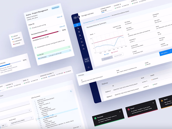
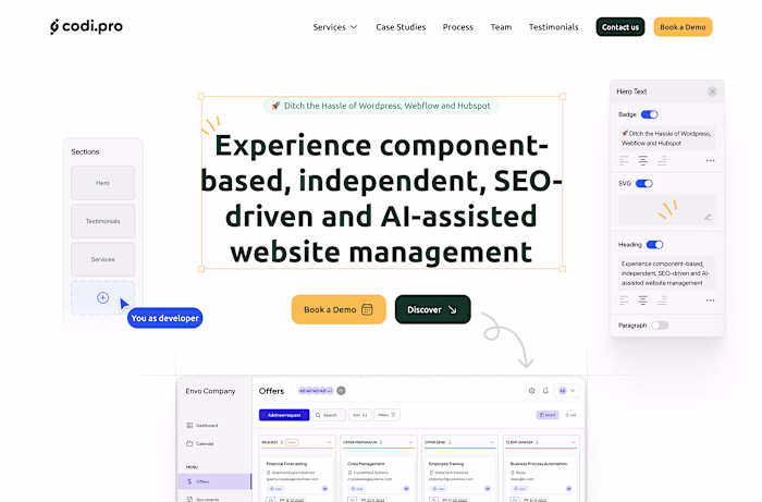
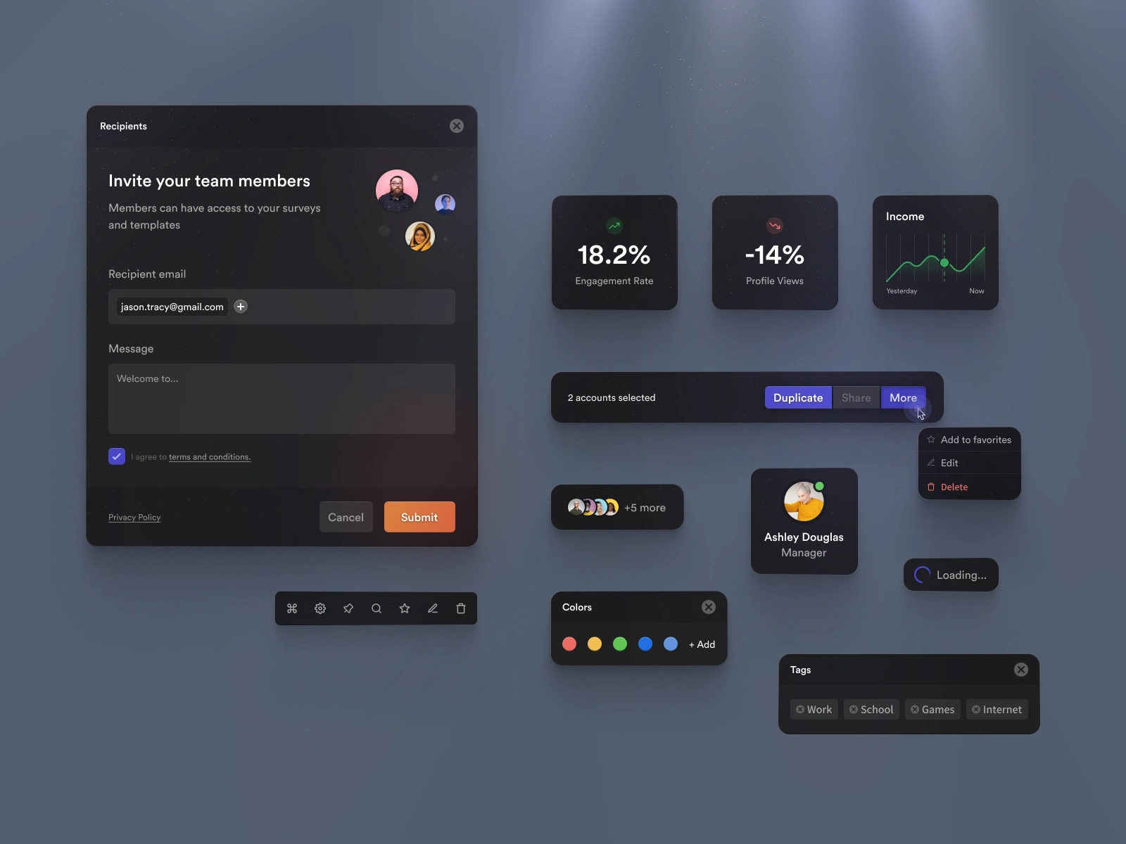
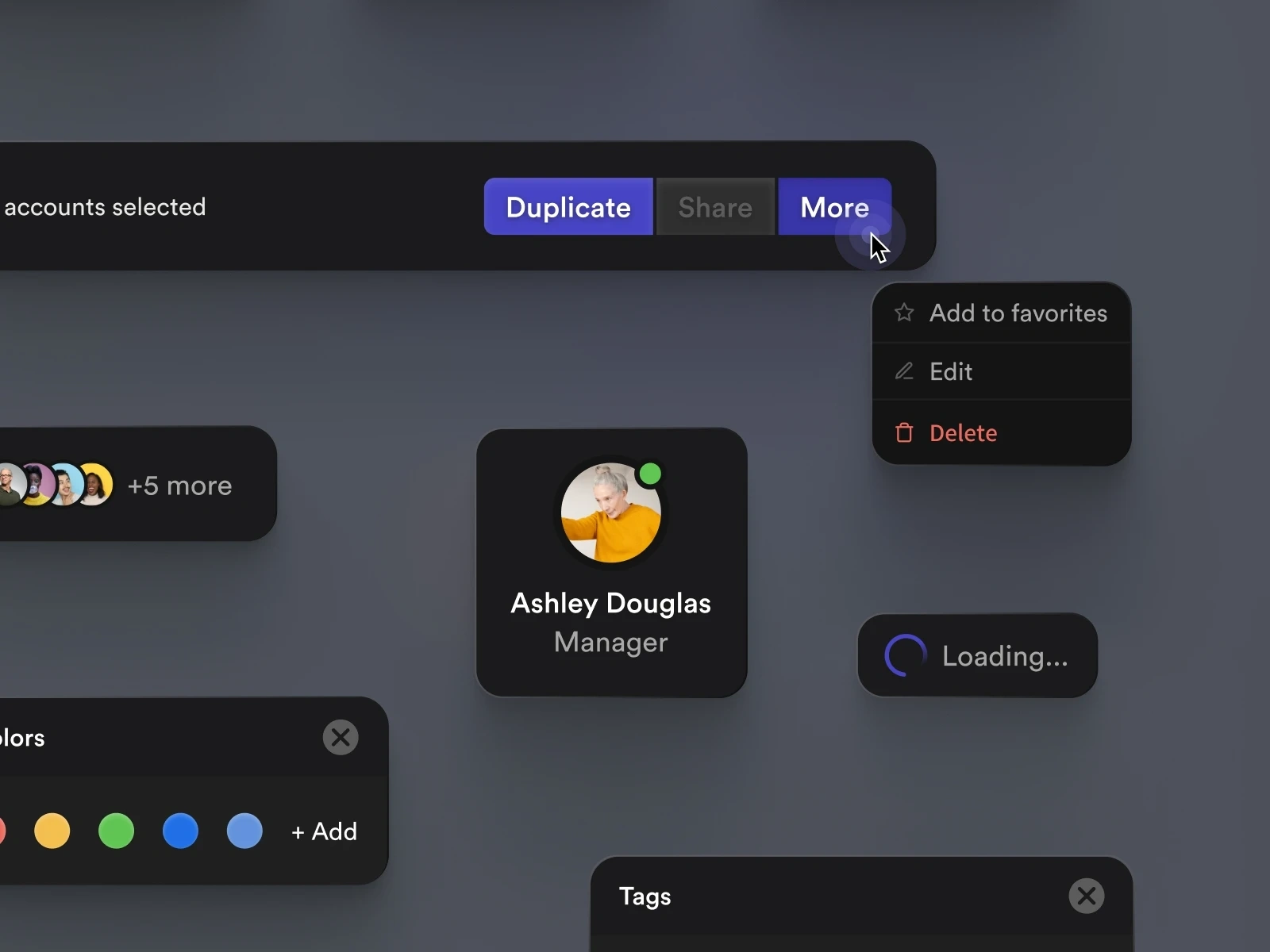
This components project is a self‑initiated exploration of building a robust UI library rather than a traditional client engagement. It was created to push visual craft, interaction detail and system thinking within a safe “sandbox” environment, free from business constraints.
The goal of the project was to design a modern, production‑ready component library that could support various SaaS dashboards and marketing sites. The work covers core foundations such as typography, color, spacing and grids, and then builds up a wide range of reusable components on top of them.
The visual language leans into clean, neutral styling and clear hierarchy so the system can adapt to different brands while still feeling polished and coherent. This makes the library a strong base for future client work, rapid prototypes and internal tools.
Challenge
Without a real client brief, the main challenge was to define realistic constraints: what types of products this system should serve, what content patterns are most common, and how developers would actually integrate it. The system also needed to stay compact enough for everyday use while covering enough edge cases to feel credible.
Another key problem was designing components that look great in isolation but also scale across dense layouts, from marketing hero sections to complex app views with filters, tables and forms. Balancing aesthetics with flexibility and practicality was central to the exercise.
Like this project
Posted Sep 17, 2025
A modern dark-themed UI kit designed for collaboration platforms, showcasing clean components, analytics cards, and interactive elements for a seamless UX.
Likes
1
Views
18
Timeline
Mar 2, 2024 - Ongoing