Netcomm Brand Identity
Bart Szabaciuk
About
Netcomm builds tailored data, AI and business intelligence solutions that connect disparate systems, automate reporting and surface insights for decision‑makers. The company focuses on private AI, analytics and integration for organizations that need secure, scalable and future‑proof software foundations.
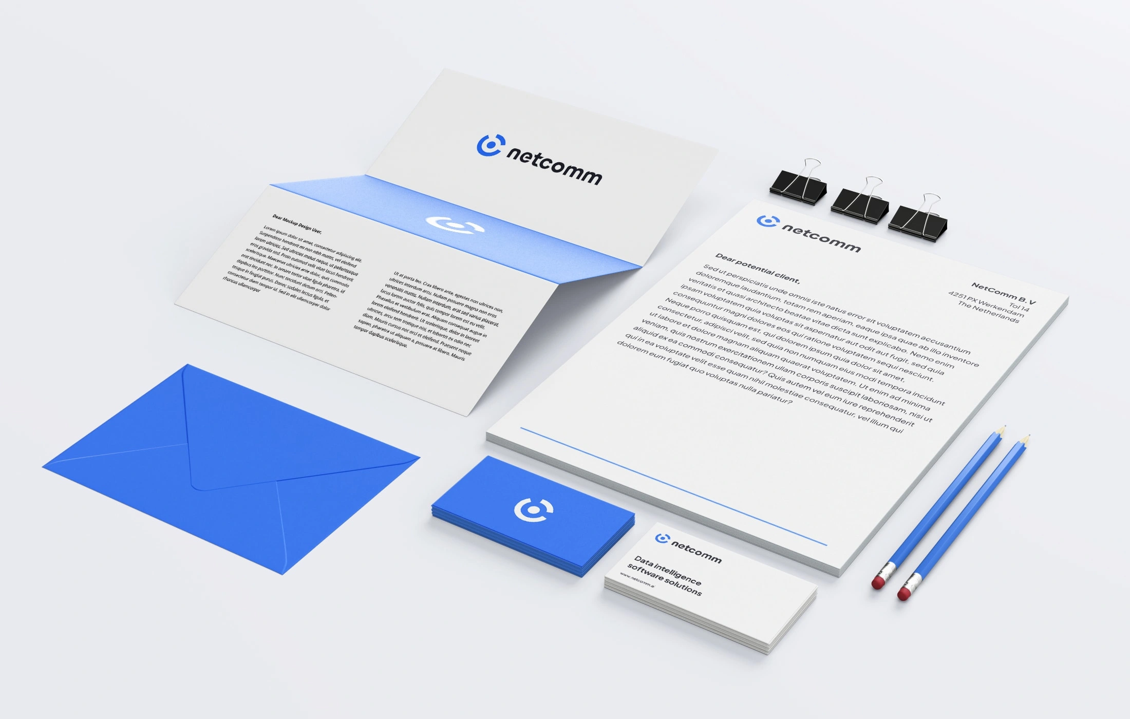
The visual identity positions Netcomm as a calm, precise and trustworthy technology partner rather than a loud “startup” brand. A soft blue, white and navy palette, rounded geometry and generous whitespace convey technical depth, stability and human‑centric design.
My responsibility: Brand / Visual Design
Challenge
Netcomm needed a cohesive brand that could bridge two worlds: deep technical expertise in data/AI and an accessible, non‑intimidating story for business stakeholders. Existing references in the category leaned either too corporate or too experimental, making it hard to communicate innovation, reliability and clarity at the same time.
The team also required a flexible identity system that would work across product UI, website, decks and future marketing without becoming visually noisy, inconsistent or hard to use. With a growing portfolio of data‑driven services, the brand needed a clear hierarchy and a visual language that could scale to new offerings over time.
Solution
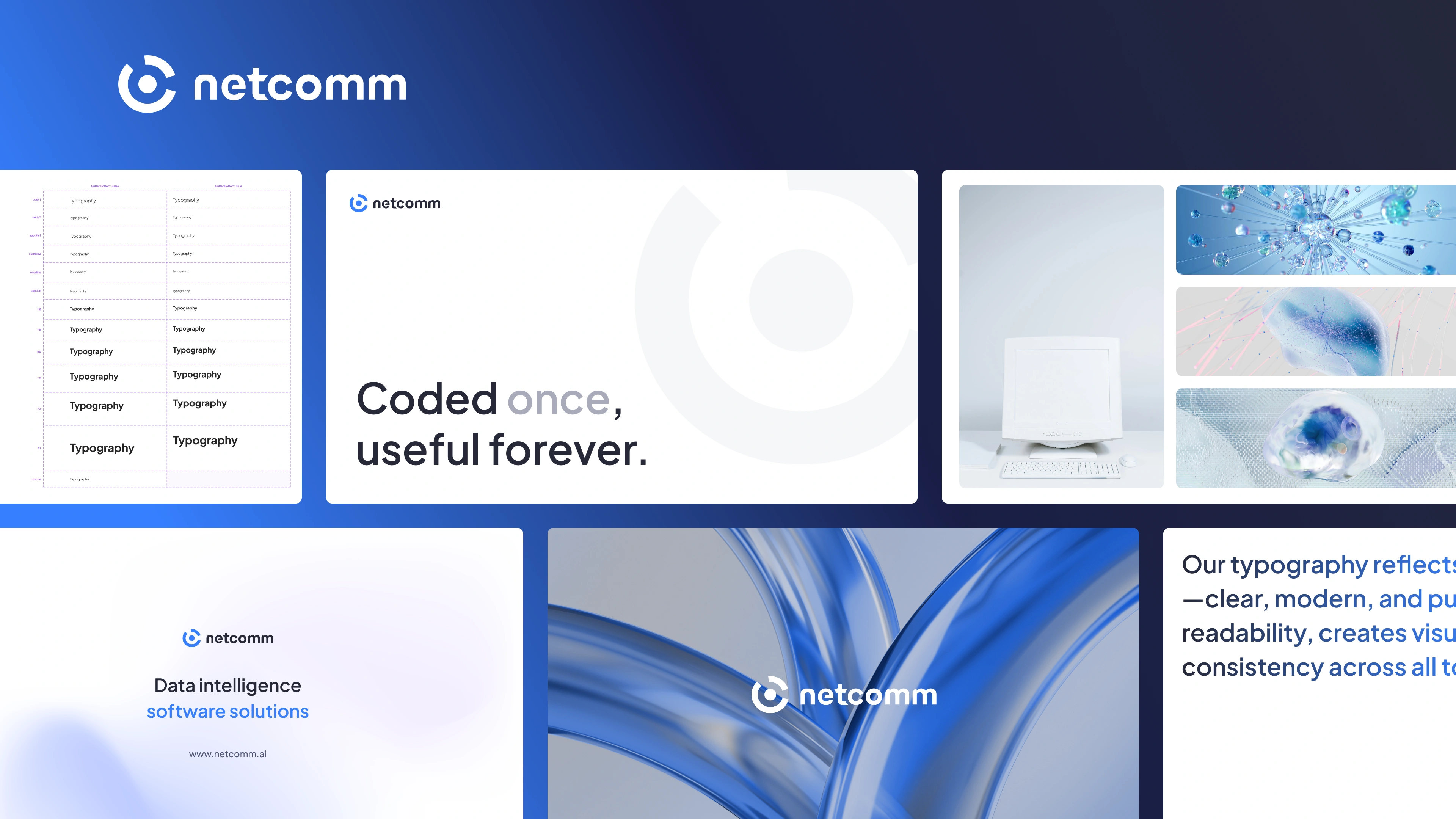
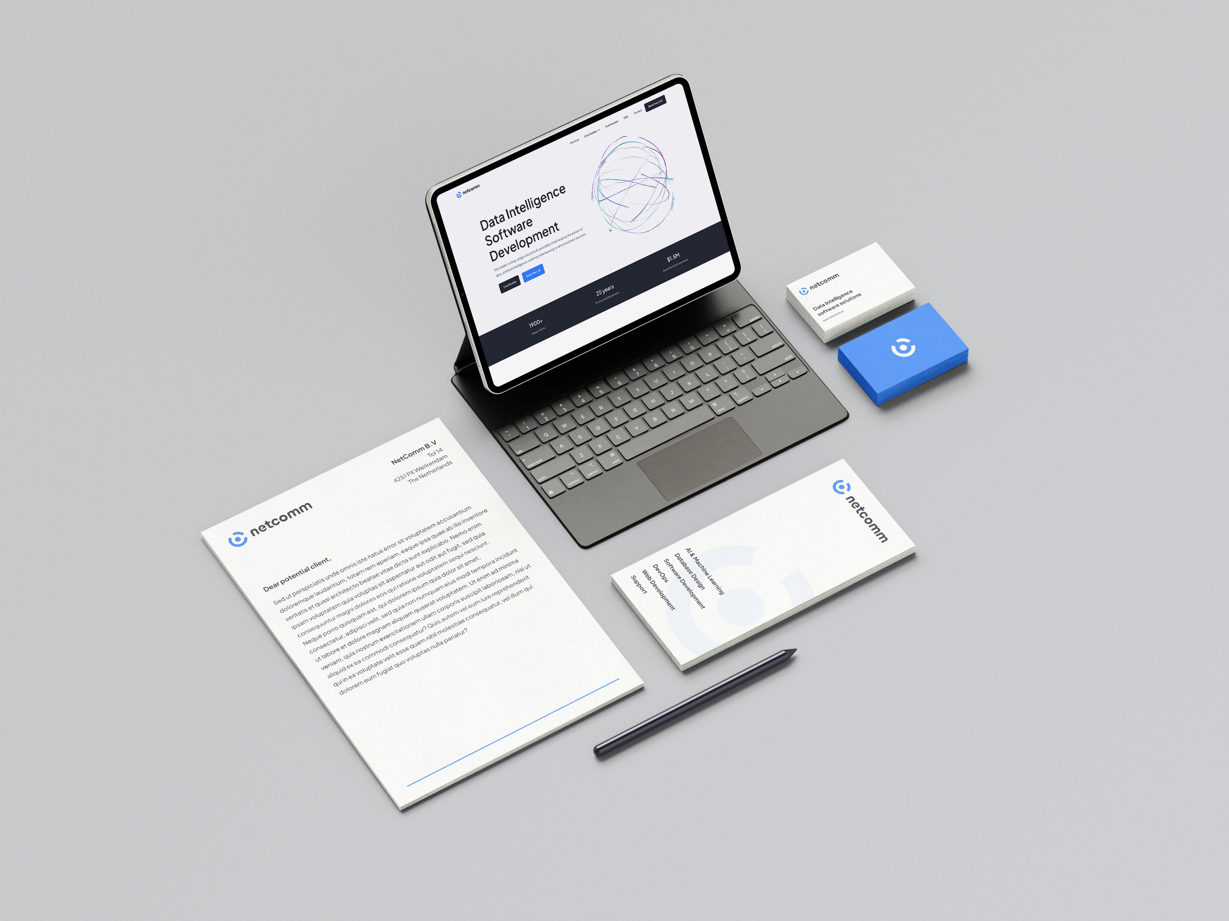
The branding centers around a circular symbol that suggests signals, connection and continuous data flow, paired with a clean wordmark for maximum legibility in digital environments. The mark was designed to remain instantly recognizable across tiny UI avatars, presentation covers and large hero sections, creating a consistent anchor throughout the ecosystem.
Typography uses a modern, rounded sans‑serif system optimized for interfaces and dense technical content, ensuring excellent readability across screen sizes. The copy tone is concise and confident, with phrases like “Coded once, useful forever” reinforcing the promise of durable, maintainable software rather than disposable projects.
A modular layout system was created for web and collateral, combining bold hero statements with data‑inspired imagery, soft gradients and glass‑like 3D forms. This visual language reflects abstract concepts like AI, automation and intelligence without relying on clichés, while still feeling premium and contemporary.
Results
The new identity gives Netcomm a distinctive, ownable position among data and AI consultancies, clearly communicating its focus on turning data into strategic value. Stakeholders can immediately understand that Netcomm combines robust engineering with thoughtful product design, reducing the gap between technical and business audiences.
The scalable design system accelerates future touchpoints: new pages, decks and product visuals can be composed quickly from the same visual toolkit, maintaining strong brand recognition. The combination of clear messaging, calm visuals and flexible components creates a brand that feels “coded once, useful forever” in practice—supporting Netcomm’s growth as its solutions and markets expand.
Like this project
Posted Mar 28, 2025
Full brand materials including logo, typography, colors, usage, imagery, printable materials and brand key visuals.
Likes
1
Views
6
Timeline
Jun 28, 2024 - Jul 28, 2024
Clients
Netcomm