Nexus Labs – Futuristic Software Agency Website

Zaid Ali


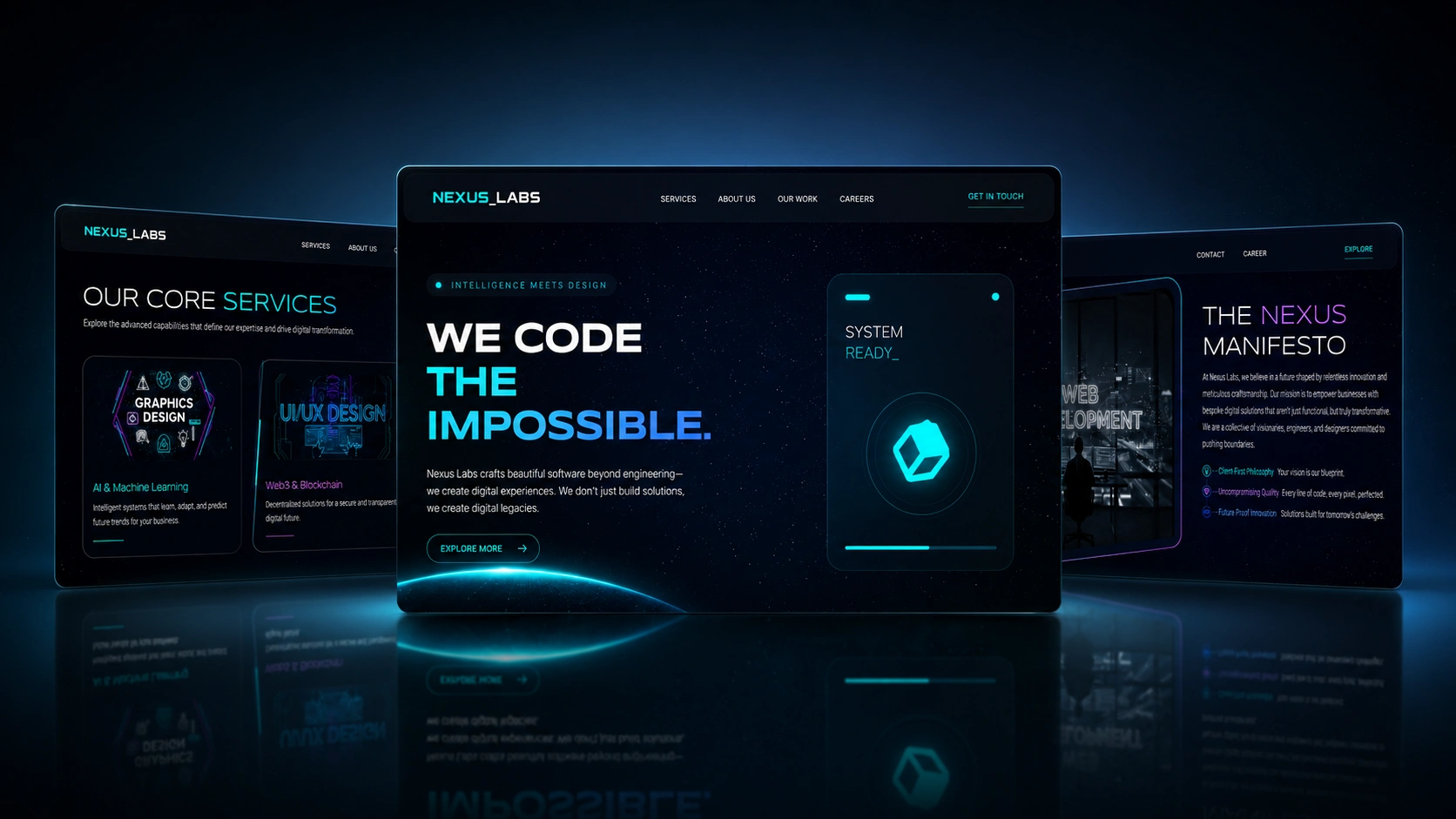
Nexus Labs
The Challenge
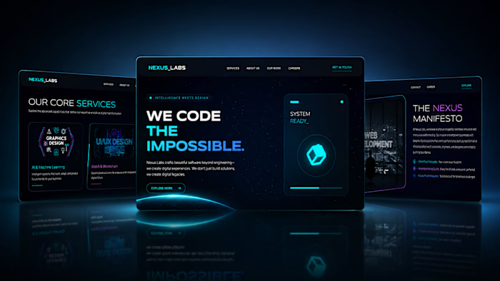
Nexus Labs builds cutting-edge software, but their website looked like it was from 2018. They wanted something that matched the ambition of their work: futuristic, visually bold, and interactive enough to make potential clients spend time exploring rather than bouncing after 5 seconds.
This wasn't a content-heavy corporate site. It was a statement piece. The website itself needed to demonstrate the kind of quality Nexus Labs delivers to their own clients.
My Approach
This project was more design-intensive than my typical builds. I spent extra time in the research phase studying agency sites that nail the balance between visual spectacle and actual usability. A lot of "futuristic" sites look impressive but are painful to navigate. The goal was to avoid that trap.
I developed 3 concepts ranging from clean and corporate to bold and experimental. The client went with the most ambitious direction: dark theme, layered visual effects, and scroll-triggered animations. It was the riskiest option from a development standpoint, but the one that would make the biggest impression.
The Site, Page by Page
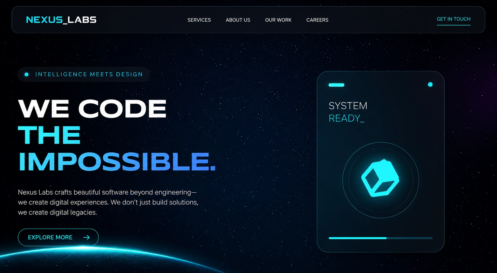
Hero Section
The hero section hits hard. A full-viewport dark canvas with animated elements that respond to scroll. The headline is bold and direct. No generic stock imagery. The animation draws the eye downward, pulling visitors into the rest of the site naturally.
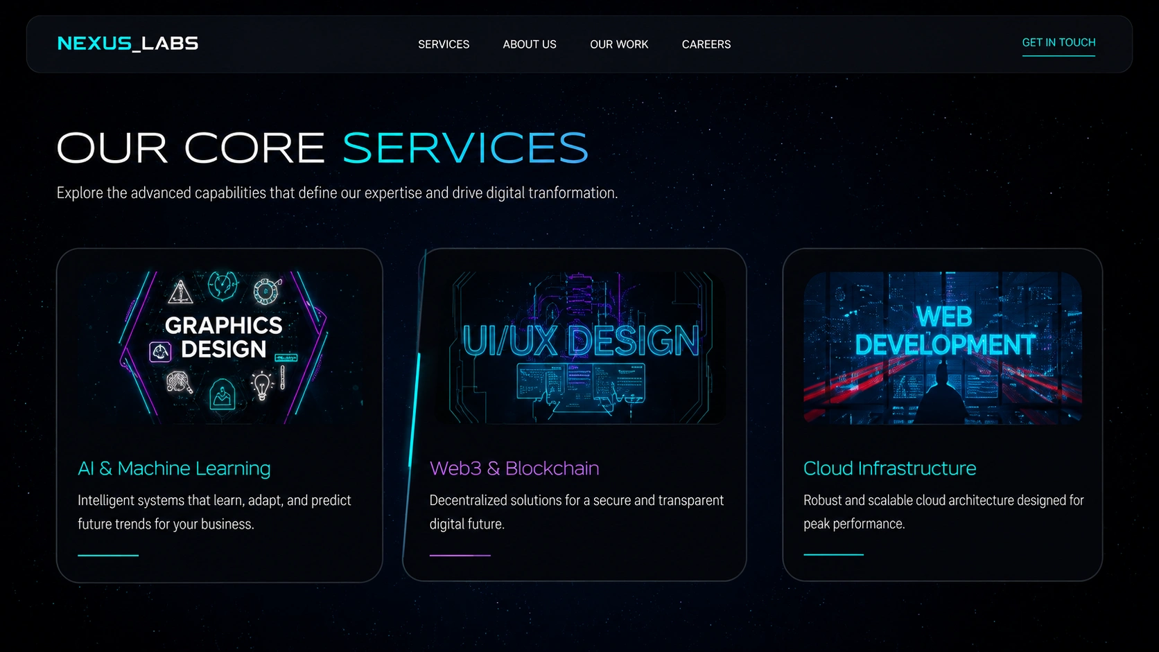
Services Page
The services page breaks down what Nexus Labs offers without walls of text. Each service gets its own card with an icon, a short description, and a hover state that reveals more detail. The layout makes it easy to scan and compare offerings at a glance.
Portfolio Section
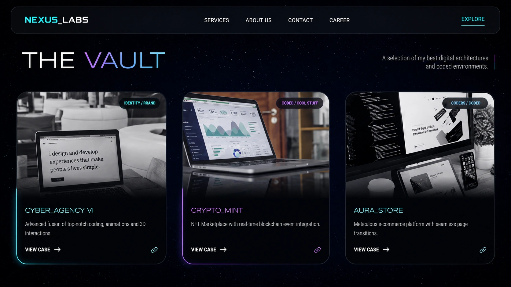
The portfolio section is where the site really flexes. Past projects are displayed as visual case study cards with large thumbnails, project titles, and tech tags. Clicking through reveals the full story. This section does the heavy lifting for lead conversion.
About Page
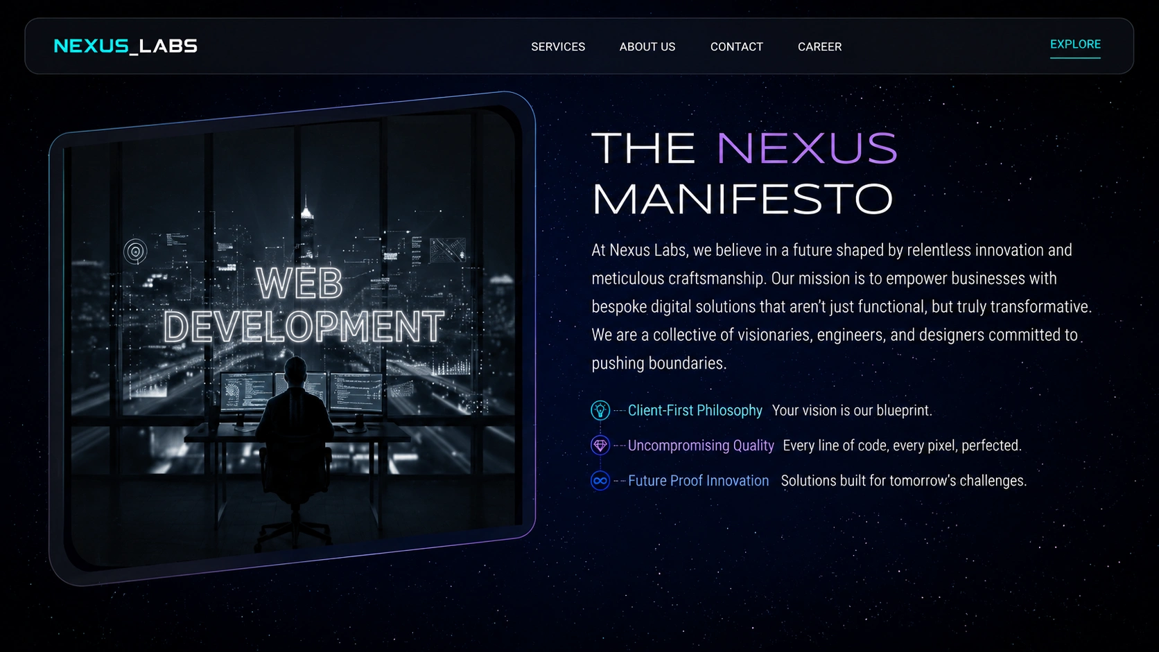
The about page humanizes the brand. Company story, mission, and values are presented with the same visual treatment as the rest of the site. No boring corporate bio. The dark theme and custom typography carry through, keeping the futuristic feel consistent.
Team Section
The team section puts faces to the work. Each team member gets a card with their photo, role, and a short bio. Hover effects add a layer of interactivity. It's a small touch, but it builds trust with potential clients who want to know who they'll be working with.
Contact Page
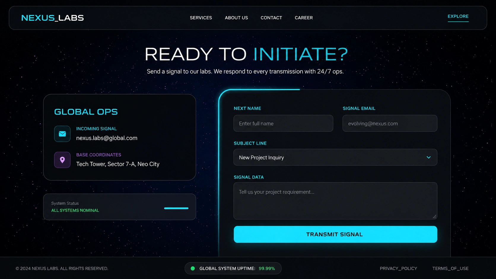
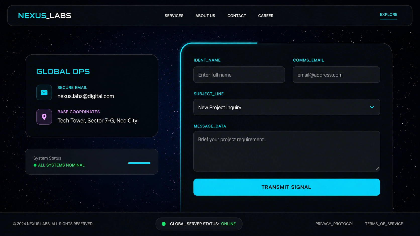
The contact page is designed for conversion. A clean form with minimal fields, paired with direct contact info and a map. No friction. The CTA is clear: "Let's build something together." The dark background keeps the form visually prominent.
Footer and CTA
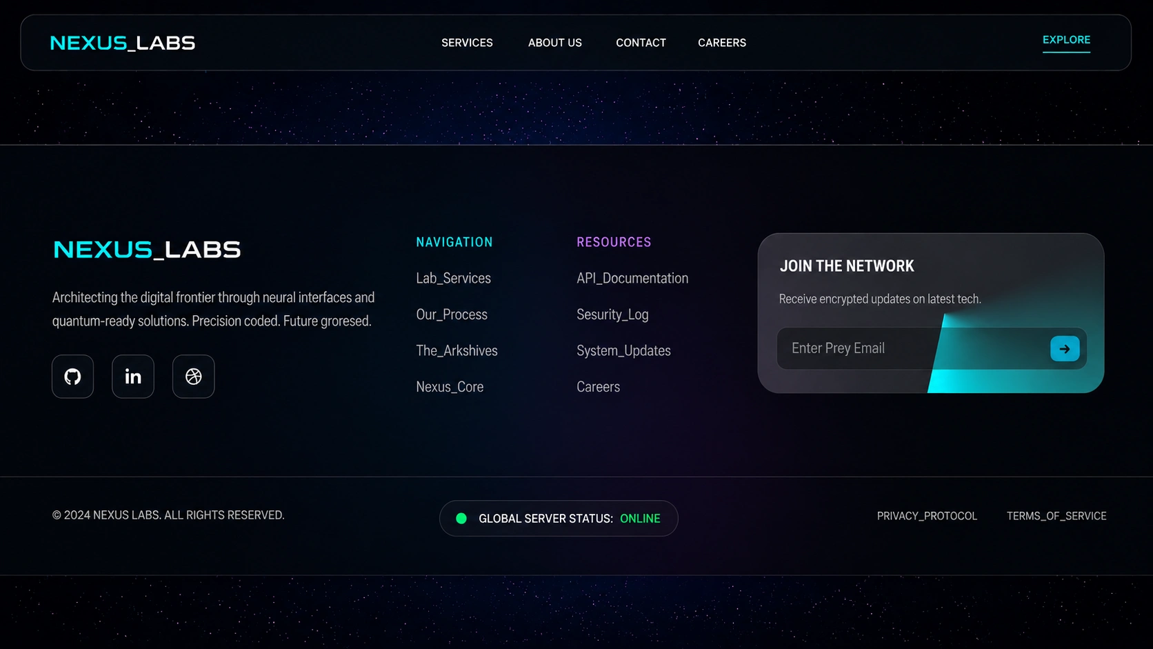
The footer doubles as a final CTA. A bold call-to-action banner sits above the footer links, giving visitors one last push to get in touch. Social links, quick navigation, and legal info are all organized cleanly below.
Built With
CMS: WordPress
Page Builder: Elementor
Timeline: ~2 months from research to launch
Like this project
Posted Jul 16, 2026
Designed and built a futuristic agency website on WordPress: custom dark-theme UI, interactive animations, service pages, portfolio, and contact forms. Currently live.