Ana.so Brand Identity Design
Ana.so: Esperanto Platform with Duck Mascot
The Project
Ana.so is a Reddit-style platform centered around the Esperanto language. I was tasked with creating a mascot and logo that would make the platform feel friendly and approachable while maintaining a clear connection to Esperanto culture.
The Brief
Ana.so tasked me with creating a complete brand identity for a Reddit-style platform centered around the Esperanto language. The platform needed to feel welcoming and community-oriented, with a clear connection to Esperanto culture and values.
What They Wanted
The platform needed to feel welcoming and community-oriented, with a clear connection to Esperanto culture. The design requirements were simple but important: a friendly and approachable feel, a green color scheme to reflect growth and community, a clear Esperanto connection, and a mascot that represents the platform's identity.
The Mascot Choice: Duck (Anaso)
The choice of a duck as the mascot was both meaningful and strategic. In Esperanto, "Anaso" means "duck," making it a direct linguistic nod to the language at the heart of the platform. Ducks are universally seen as friendly and approachable animals, which aligns perfectly with the welcoming atmosphere Ana.so aims to foster. They also symbolize community and togetherness, qualities essential to a language-learning community. Additionally, a duck is easy to recognize and remember, and its positive associations translate well across different cultures and languages, ensuring the mascot would resonate with a global audience.

Ana.so Duck
The Design Approach
In the early stages of the project, the creator of Ana.so and I discovered a shared admiration for the art style of the Hilda cartoon series. We agreed that this friendly, warm aesthetic would be ideal for the platform’s brand identity. This inspiration guided my approach to designing the mascot: I focused on creating a character that felt friendly and welcoming in its expression, was simple and easily recognizable at any size, and featured a green color theme to match the platform’s overall aesthetic. Most importantly, the design needed to embody the values of the Esperanto community, ensuring the mascot would feel authentic and representative of the platform’s mission.
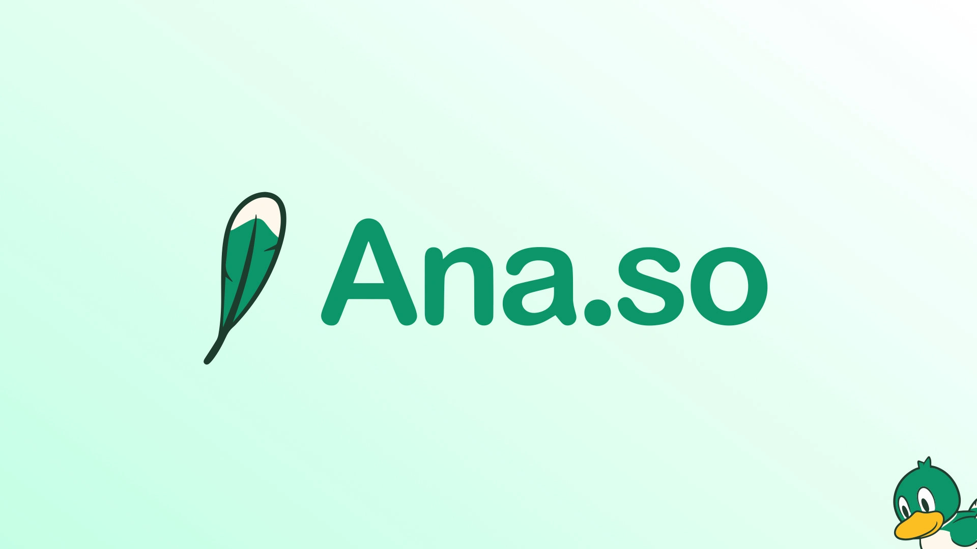
The logo seamlessly integrated the mascot with the platform name, using typography that complemented the friendly aesthetic while maintaining the green color scheme throughout. A key design element was the feather icon, which serves as a subtle but meaningful symbol connecting to the duck mascot while maintaining the platform's clean aesthetic.
Brand Elements
The color palette centered around various shades of green, representing growth, learning, and community. I chose clean, readable typography that complemented the mascot while ensuring good legibility across different screen sizes.
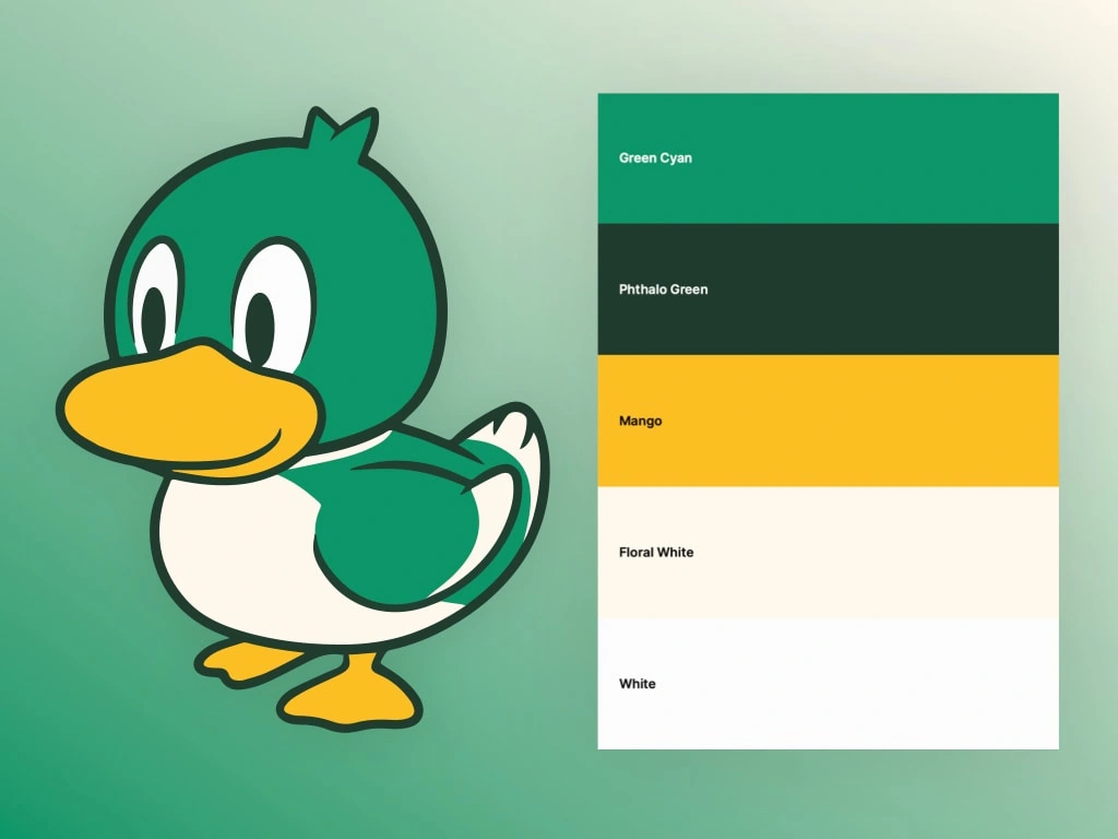
Color Palette
Where It Works
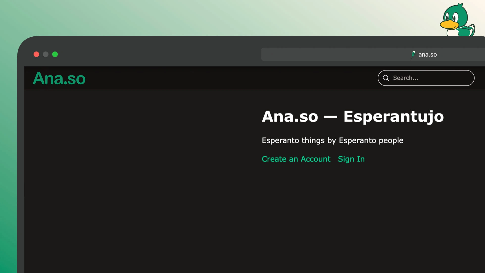
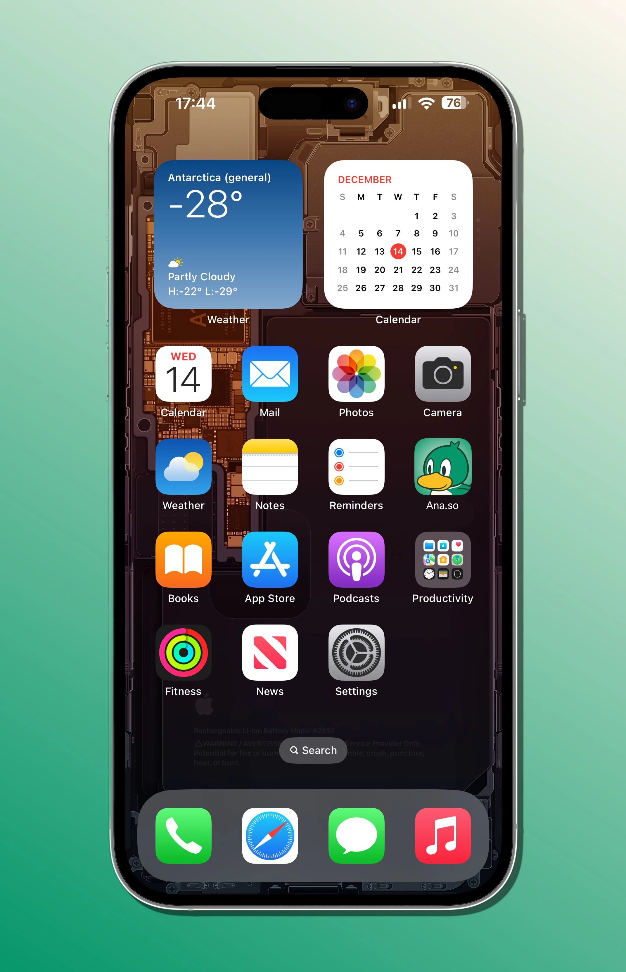
The mascot and logo design work seamlessly across the website header, mobile app, social media, and all community features, maintaining consistent visual identity while reinforcing the friendly, welcoming atmosphere. The mascot serves as a personality element throughout the platform, appearing on various pages to add warmth and character to the user experience.
Beyond digital applications, I also created concept art for merchandise items including shirts, bags, and plushies, expanding the brand's reach into physical products that fans could wear and collect.
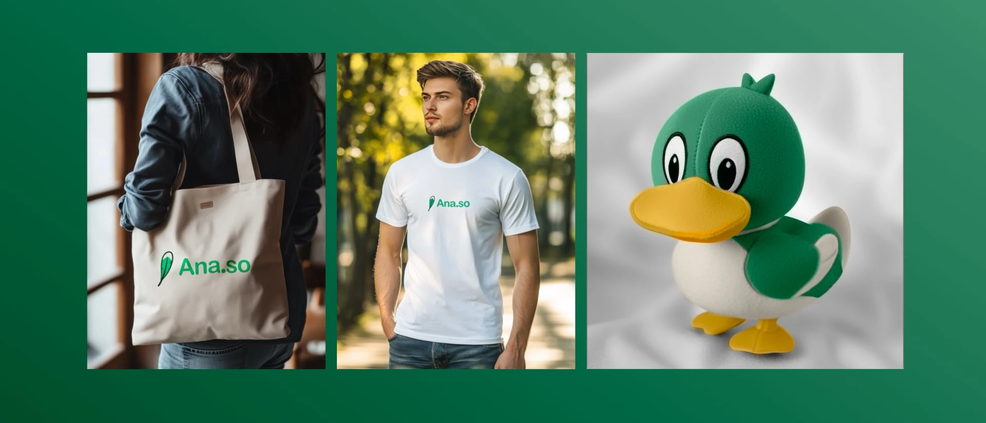
concept apparel
Why a Duck?
The choice of a duck mascot was perfect for several reasons. Anaso directly translates to "Duck" in Esperanto, and ducks are universally friendly and approachable across all cultures. They represent community and togetherness, transcend cultural barriers to work worldwide, and embody the welcoming, inclusive nature of language learning communities.
What Made It Work
The design succeeded for several key reasons. The duck mascot works across different cultures without negative connotations, scales effectively from app icons to large headers, and is easy to remember. Additionally, the green color scheme creates a cohesive brand experience that ties everything together.
The Result
The Ana.so platform now has a distinctive, friendly brand identity that perfectly captures the welcoming nature of the Esperanto community. The duck mascot (Anaso) serves as a friendly face for the platform, while the green color scheme reinforces the community and growth aspects of language learning.
Key Points
When designing for platforms like this, it's important to choose mascots that reflect community values, consider cultural implications across regions, maintain consistency, and design for scalability. For Esperanto projects specifically, embracing the international nature of the language and using cultural elements that translate well globally is crucial.
Final Thoughts
The Ana.so project shows how thoughtful mascot and logo design can create a strong brand identity that resonates with a specific community while remaining universally appealing. The duck mascot perfectly embodies the friendly, inclusive nature of the Esperanto community while providing a memorable and scalable brand presence for the platform.
Like this project
Posted Aug 23, 2025
Designed a duck mascot and logo for Ana.so, an Esperanto platform.
Likes
1
Views
11

