Employee App (UI/UX Design for mobile app)
Sergio Verdeguer
Introduction
Australian Smart Group is a technology company specializing in electrical contracting and smart building technologies based in Canberra (Australia).
User feedback led me to identify a significant user experience issue: While the Employee Portal (ASG’s Intranet Platform) was an essential tool for over 30 employees across various departments, it was not mobile-optimized. This lack of mobile compatibility posed a considerable problem, especially for on-site employees frequently accessing the portal via mobile devices.
Please note: To maintain privacy and confidentiality due to the internal nature of the ASG application, this case study will not detail all screens or specific features. Instead, the focus will be on outlining the overall design process and key implemented elements.
My Role
As the Product Manager at ASG, I was responsible for the overall product strategy, planning, and execution throughout the product lifecycle. I served as a bridge between different teams and stakeholders, coordinating and aligning the efforts of everyone involved.
In my role as a UI/UX Designer, I was involved in every step of the design process. My primary focus was to create a seamless, intuitive, and efficient user experience for the Employee Portal’s mobile version.
This case study describes the UI/UX Design process.
The Challenge
The Employee Portal (web-based intranet) was a vital tool for over 30 employees across various departments. User feedback highlighted a clear need for better mobile compatibility, especially for on-site workers. We needed to maintain all web version functionalities while optimizing the user interface for a range of screen sizes, network conditions, and real-world use cases.
HMW statement:
How might we transform ASG’s Employee Portal into a mobile-friendly application that retains all its key functionalities while improving the user experience for on-site workers?
Product Vision
The primary goal was to make the Employee Portal a mobile-friendly experience, preserving all functionalities offered in the web version while optimizing the interface for mobile users.
The design approach had to consider various factors including the wide range of screen sizes, varying network conditions on sites, and the practicality of usage given the nature of ASG’s on-site work.
Research and Define
In our previous work on the web application, we conducted extensive UX research. With this strong foundation, our focus now shifted towards UI and interaction design. The first phase involved translating the existing web functionalities into mobile-friendly features.
Based on this research, we defined the challenge:
How might we transform the ASG’s Employee Portal into a mobile-friendly application that retains all its key functionalities while improving the user experience for on-site workers?
Ideate and Prototype
With a clear problem defined, we began to ideate, translating the existing web functionalities into mobile-friendly features.
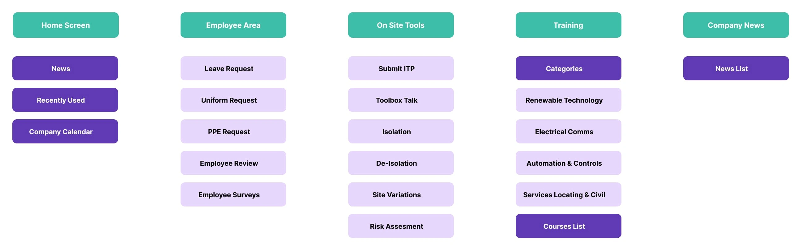
Information Architecture
We created information architecture for the mobile app to ensure all functionalities from the web app were accounted for.
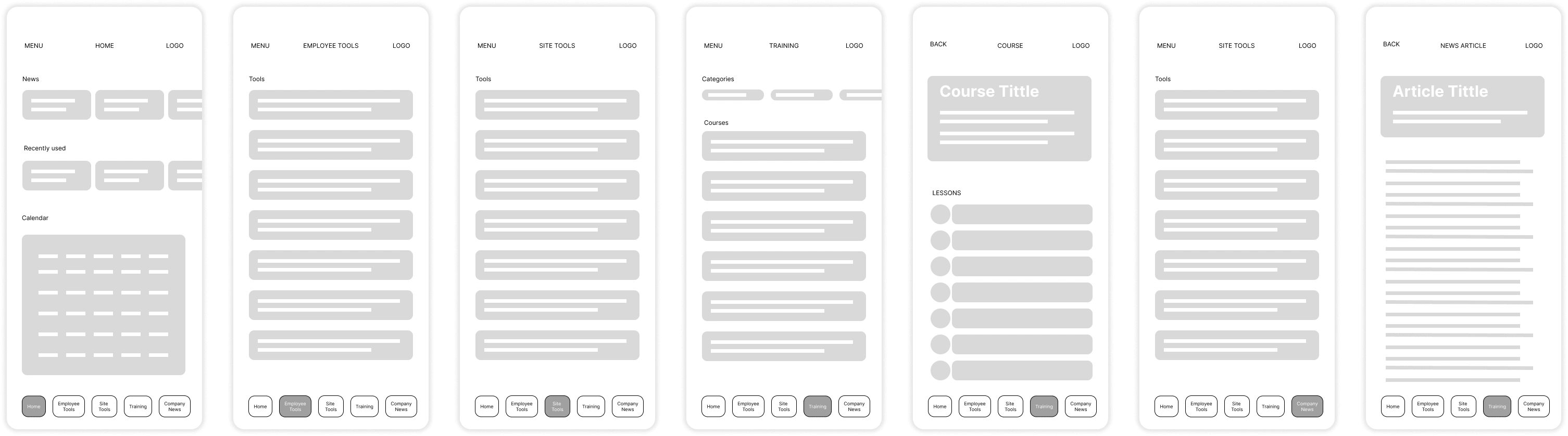
Low-Fidelity Wireframes
After ideating, we moved on to the prototype stage of the design thinking process. This began with creating low-fidelity wireframes. The advantage of low-fidelity wireframes is that they are quick to produce and modify, allowing us to rapidly iterate and experiment with different layouts and features
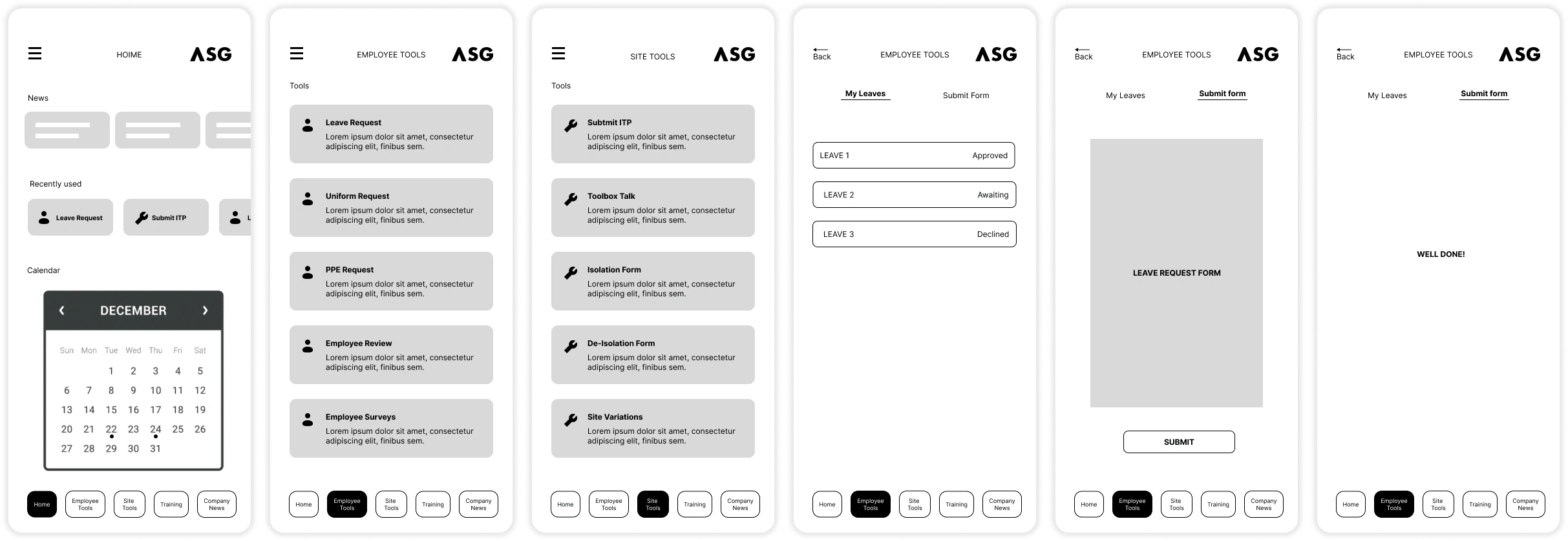
Mid-Fidelity Wireframes
Next, we created mid-fidelity wireframes. These wireframes offered a more detailed view of the app, including more precise placement and sizing of elements, and provided a clearer sense of the look and feel of the final product.
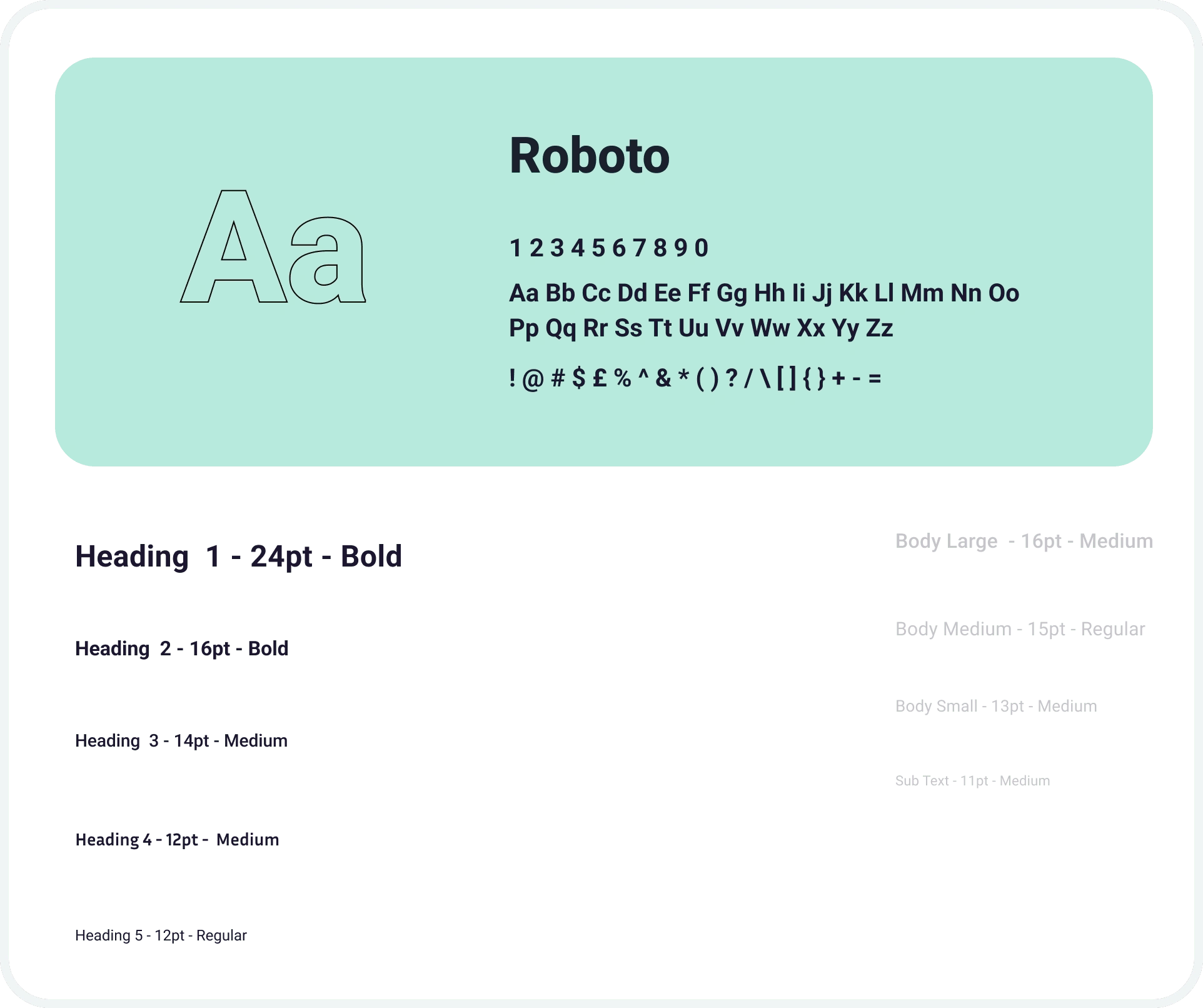
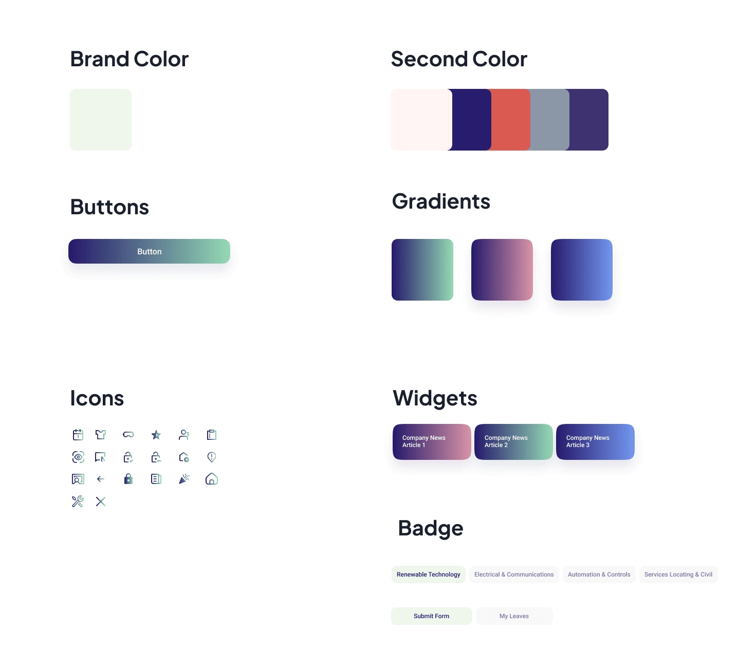
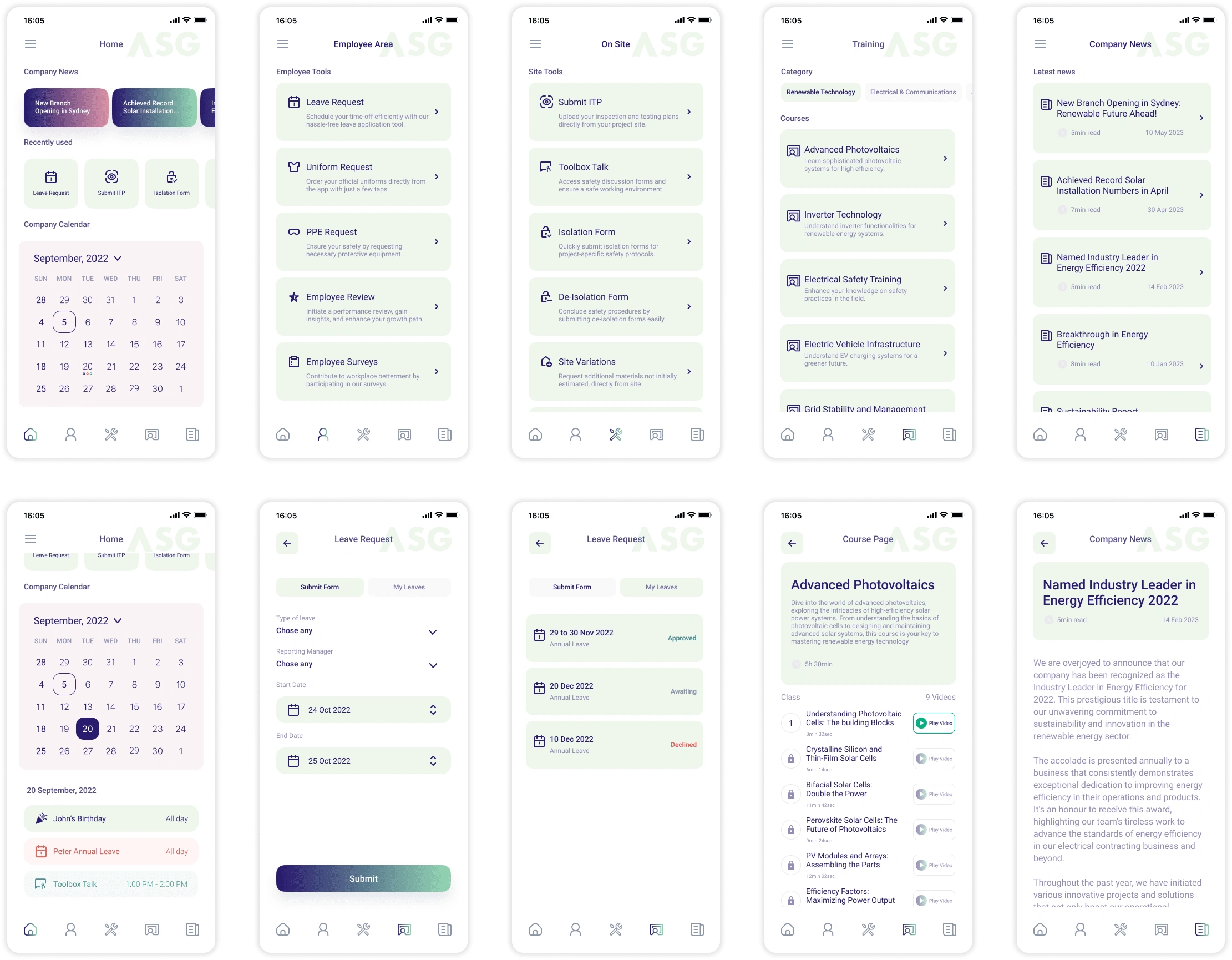
UI Design
The UI design phase also involved careful attention to the aesthetics of the application, ensuring it was not just functional, but also visually pleasing.
The design had to be consistent with the brand, clean, and intuitive. Moreover, the use of conventions like bottom navigation bars, collapsible menus, and touch-friendly buttons were considered.
Interactions were designed to be user-friendly. Buttons had to be large enough for fingers, swipe gestures were used for navigation between screens, and feedback was provided for user actions (like successful form submissions).
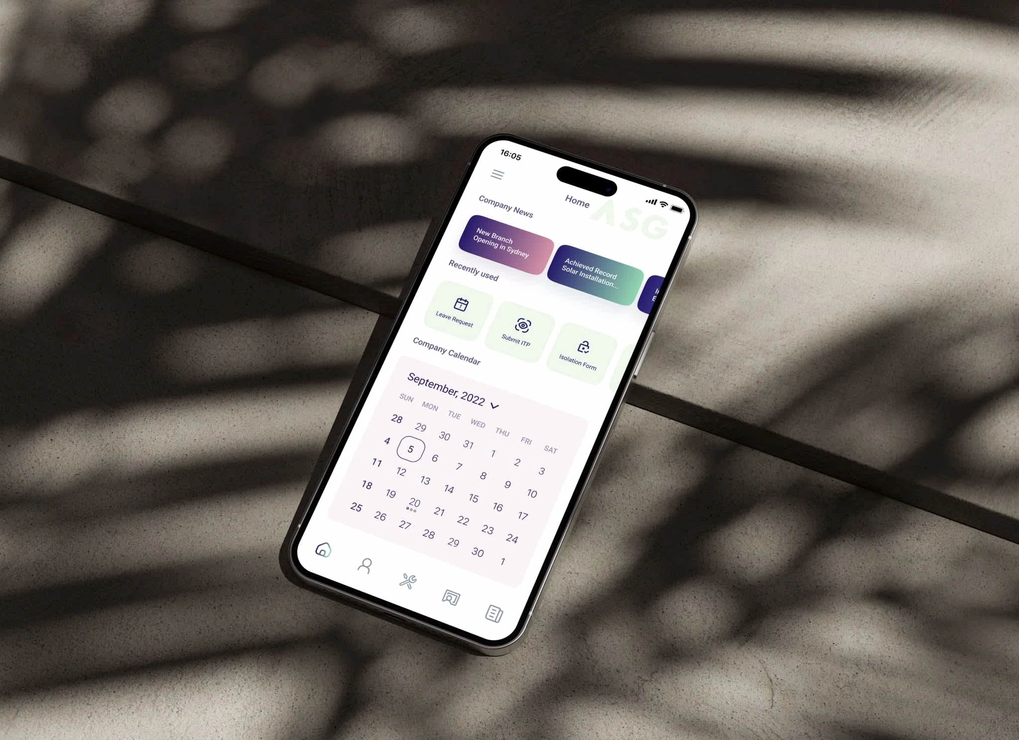
High-Fidelity Wireframes
The final phase of the ideate and prototype phase was the creation of high-fidelity wireframes, bringing the app’s visual and interactive design to a near-final state.
Validate and Design Hand-Off
The next step was to bring these designs to life with an interactive prototype using Figma. This helped the team to test the app’s functionalities and gather more feedback. Several rounds of usability tests were performed with a diverse group of employees to ensure a wide range of experiences and use cases were considered.
Please note, as a reminder, the prototype that you’re about to experience does not include all screens or specific features of the app due to privacy and confidentiality reasons. The focus is to provide an overall feel of the user experience and the implemented general design elements.
Test and Launch
We conducted usability tests to gather feedback on the app’s functionalities and gather more feedback. Several rounds of usability tests were performed with a diverse group of employees to ensure a wide range of experiences and use cases were considered.After all necessary refinements were made based on the feedback from the Test phase, the Employee Portal mobile app was launched. It was made available for iOS and Android platforms, ensuring broad accessibility. Post-launch, the team continued to gather feedback to improve the app’s UI and UX further.
Final Product and Results
The final product, the transformed Employee Portal mobile app, was launched on both iOS and Android platforms, ensuring broad accessibility. It maintained all web version functionalities while providing an enhanced mobile user experience.The new mobile application has been positively received by employees who now can use the Employee Portal more efficiently. This successful transition into a mobile-friendly platform improved employee productivity and satisfaction, serving as a testament to the importance of mobile optimization in today’s increasingly mobile-first world.
Conclusion
Designing the mobile version of the Employee Portal was a challenge that required careful translation of the existing features from a desktop-centric design to a mobile-friendly design. By focusing on the UI design and user interactions, the team was able to deliver a solution that met the needs of the on-site workers and improved the overall user experience for the entire workforce.
This project serves as a testament to the importance of mobile optimization in today’s increasingly mobile-first world. It emphasizes the need for UI/UX designers to pay careful attention to user feedback and to be willing to adapt and modify designs as technology and user needs evolve.
Like this project
Posted Jun 9, 2023
Led the mobile optimization of Australian Smart Group's Employee Portal, maintaining web features while enhancing UX for on-site staff.
Likes
0
Views
265