Apptics MAX Case Study

Prem Pandey


Like this project
Posted Dec 14, 2025
Designed a conversion-first landing page for Apptics MAX targeting e-commerce founders.
Likes
0
Views
9
Timeline
Sep 16, 2025 - Sep 30, 2025


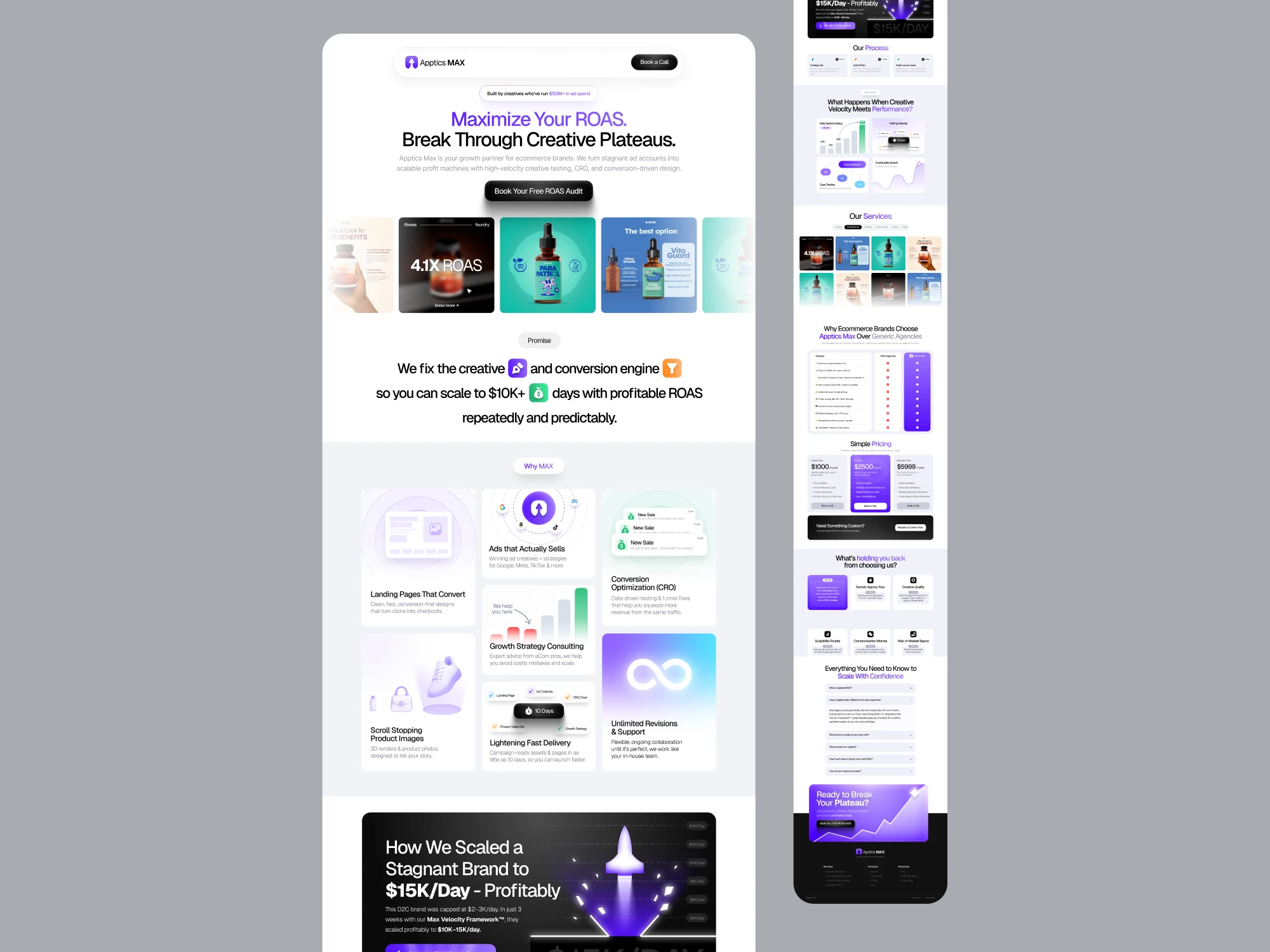
Apptics MAX Landing Page Case Study
Designing a Conversion-First Landing Page for Ecommerce Founders
Overview
Apptics MAX is an e-commerce growth partner that helps brands break through paid ads plateaus and scale profitably. This project focused on designing a new landing page to clearly communicate Apptics MAX’s value, differentiate it from generic agencies, and convert high-intent traffic into booked strategy calls.
I led this project solo, owning UX strategy, information architecture, visual design, and copywriting. Development and post-launch optimization were handled by the client’s internal team.
This case study focuses on why specific design and copy decisions were made, not just what the final page looks like.
The Problem
E-commerce founders don’t lack options. They lack confidence.
Most of the founders Apptics MAX works with:
Are already spending heavily on paid ads
Have worked with agencies before
Have seen “pretty creatives” that didn’t convert
Are skeptical of bold promises without proof
The problem wasn’t awareness or aesthetics.
It was trust, differentiation, and clarity.
The landing page needed to answer one core question quickly and convincingly:
“Why should I trust you with my ad spend?”
Users: Who We’re Designing For
Primary audience
Ecommerce founders and growth leads
Already running Meta, Google, or TikTok ads
Experiencing diminishing returns at $2–3K/day
Highly ROI-driven and risk-averse
These users don’t want:
Trendy visuals
Marketing jargon
Generic “full-service” claims
They want:
Proof
Process
Predictability
Business Goals
From a business perspective, the landing page needed to:
Increase qualified “Free ROAS Audit” bookings
Pre-educate prospects before sales conversations
Position Apptics MAX as a system, not a service
Filter out low-fit clients early
This was a conversion-first project, not a branding exercise.
Discovery: Starting With Understanding, Not UI
Before designing anything, I focused on understanding the story behind the product.
I started with conversations centered on why:
Why founders hesitate to hire agencies
Why previous efforts failed
Why Apptics MAX believes its approach works
I intentionally asked even simple or “obvious” questions and encouraged stakeholders to explain the product as if they were the user. Letting people talk - and taking meticulous notes - surfaced the strongest insights and language.
A clear pattern emerged:
Founders weren’t afraid of spending money. They were afraid of wasting it.
Writing a Design Spec (Before Designing)
Before moving into layouts or visuals, I wrote a personal design spec to externalize my thinking.
This spec captured:
The user’s emotional journey
Primary objections and fears
Business priorities
Narrative order of the page
What the page should not try to do
I shared this spec with the client to align on intent before execution.
This step reduced ambiguity and prevented rework later.
Framing the Core Design Challenge
This wasn’t a UI problem.
It was a communication problem.
The landing page needed to:
Acknowledge skepticism instead of ignoring it
Demonstrate ecommerce-specific expertise
Show a repeatable system, not one-off wins
Reduce perceived risk before asking for commitment
Everything that followed was evaluated against this framing.
Structuring the User Journey
Instead of starting with sections, I mapped the emotional flow:
“I’m stuck.”
“They understand ecommerce.”
“They’ve done this before.”
“They have a clear system.”
“This feels lower risk than alternatives.”
“I’m ready to book a call.”
If a section didn’t clearly move the user forward in this journey, it didn’t belong.
Key Design & Copy Decisions
Leading with the problem, not the product
Instead of listing services upfront, the page opens by addressing creative plateaus and scaling frustration. This mirrors the user’s internal state and creates immediate relevance.
Explicitly surfacing objections
Rather than hiding common fears, the page names them directly: wasted spend, poor communication, lack of scalability. Addressing these head-on builds trust.
Using numbers and systems language
Metrics, timelines, and frameworks were emphasized over abstract claims. Founders care about repeatability, not hype.
Choosing a long-form layout
This is a considered, high-stakes decision for users. Long-form content supports education, credibility, and confidence before conversion.
Clear, low-friction CTA
“Book a Free ROAS Audit” positions the next step as consultative, not sales-driven.
Transition to High-Fidelity Design
I moved into wireframing and visual design only after:
The narrative was clear
The order of information was validated
Copy intent was locked
Visual design was treated as execution - not exploration.
The final layout supports scannability, hierarchy, and momentum without distracting from the message.
Final Outcome
The final landing page:
Clearly differentiates Apptics MAX from generic agencies
Communicates a repeatable growth system
Builds trust before asking for action
Uses copy and layout as persuasion tools
Every section exists to answer a single question:
“Why should I trust you with my business?”
Collaboration & Handoff
I owned all UX, visual, and copy decisions.
Development was handled by the client team.
Handoff focused on:
Content hierarchy
Spacing and emphasis
CTA priority
Preserving design intent rather than pixel perfection
Impact
I didn’t own implementation or analytics, so I don’t claim specific performance results.
However, the design was intentionally structured to:
Increase qualified audit bookings
Reduce skepticism through transparency
Pre-educate leads before sales conversations
Learnings
Writing a design spec early saves time and prevents rework
Copy is often the highest-impact design tool on a landing page
Objection-led layouts outperform feature-led ones
Clear documentation is more reliable than memory
Why This Matters
As a freelance designer, my role isn’t just to make things look good - it’s to help businesses communicate clearly, build trust, and convert with confidence.
This project reinforced a core belief:
Strong design is not decoration. It’s decision-making made visible.
Let’s Work Together
If you’re a founder looking to clearly communicate your product, build trust with your audience, and convert without gimmicks, I’d love to help.
I work end-to-end across UX strategy, copy, and visual design to solve real business problems - not just make things look good.