Redesigning Zeno AI for Conversion & Clarity
Prem Pandey
Redesigning Zeno AI for Conversion & Clarity
From Cluttered Utility to a Clear, Powerful AI Brand for Creators
🧠Overview
Zeno AI is a no-code tool that transforms long-form YouTube videos into actionable insights using 8 smart content cards.
While the product was powerful, the previous landing page failed to convert. Users weren’t fully understanding the value, the layout was flat, and the message wasn’t sticky enough.
We redesigned the Zeno landing page to be:
✨ Visually appealing
🧭 Clear in communication
🎯 Conversion-optimized
🔍 Structured around user goals
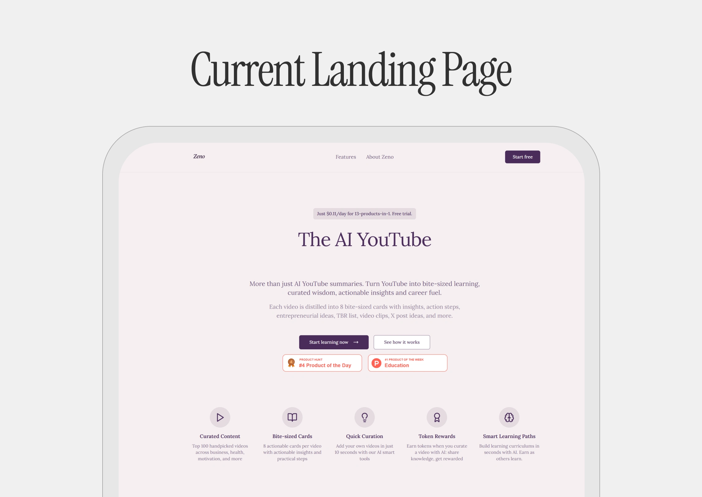
🔍 The Problem
Zeno’s original design had:
❌ Generic landing layout (looked like any AI tool)
❌ Poor above-the-fold messaging (What is Zeno? For whom?)
❌ No emotional resonance or modern branding
❌ Weak visual hierarchy & scattered CTAs
❌ Underused demo potential
❌ Missing trust signals (real people, testimonials, logos)
Despite the powerful product, the site lacked narrative, identity, and flow.
🎯 Goals
We wanted to:
✅ Clarify what Zeno does — in 5 seconds
✅ Build a strong, lovable brand identity
✅ Increase trial → paid conversions
✅ Highlight visual value (card system) early
✅ Make users feel Zeno is for them
✅ Remove friction & show results, not just features
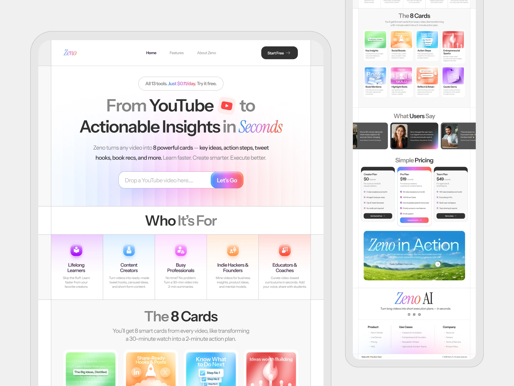
🔧 What We Changed
✍️ Brand & Messaging Refresh
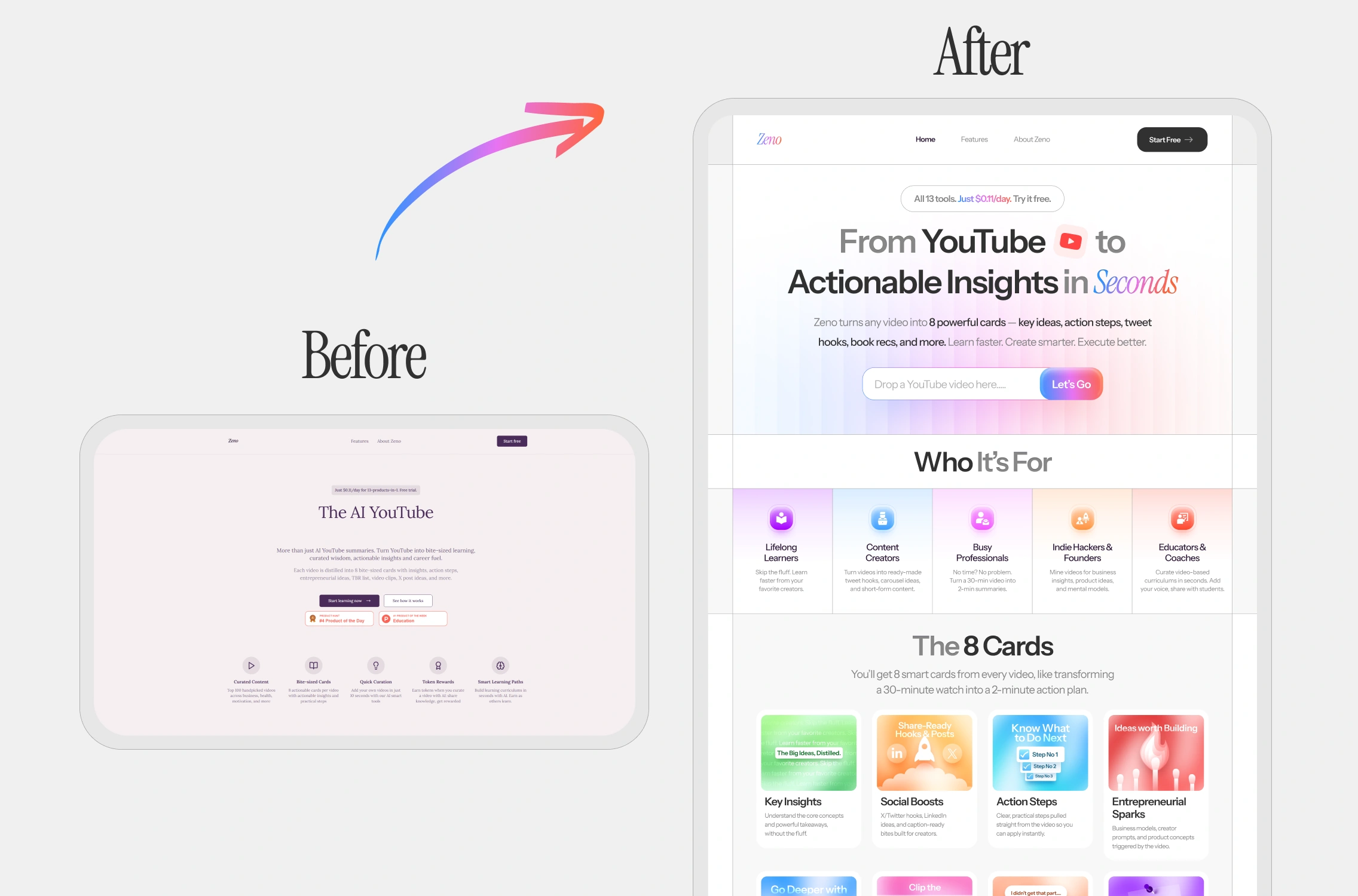
Before:
“The AI YouTube — Bite-sized learning. Actionable insights. Smart content.”
After:
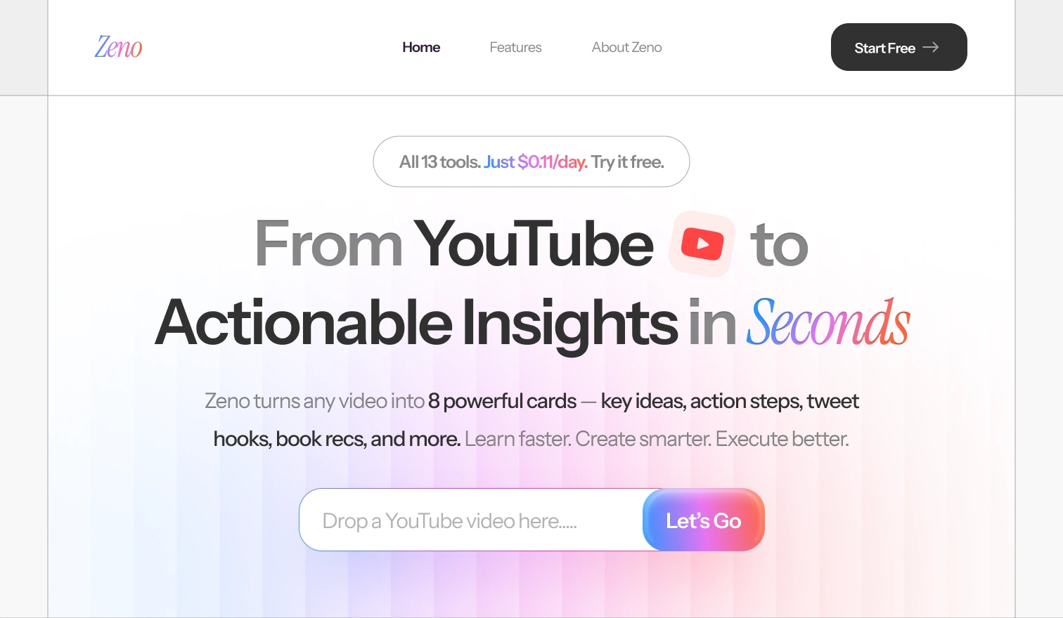
From YouTube 🎥 to Actionable Insights in Seconds
Zeno turns any video into 8 powerful cards — key ideas, action steps, tweet hooks, and more.
🔁 Clear benefit. Immediate value. Specificity. Simpler language.
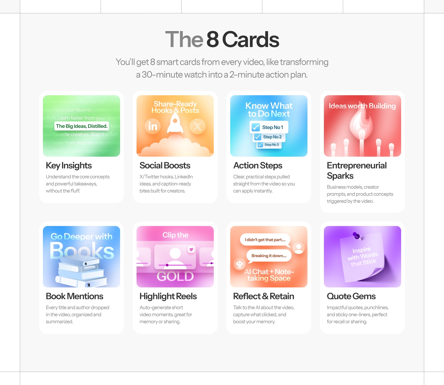
🧠 Introduced the 8-Card Framework
We turned abstract features into 8 named cards — each with its own utility, icon, and identity.
Key Insights
Social Boosts
Action Steps
Entrepreneurial Sparks
Book Mentions
Highlight Reels
Reflect & Retain
Quote Gems
🔁 Transformed vague AI output into a clear product structure.
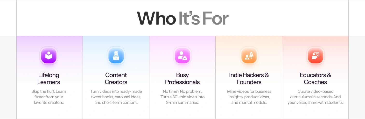
👥 Targeted Personas with the “Who It’s For” Section
We added a vibrant row of avatars and use cases:
Lifelong Learners
Content Creators
Busy Professionals
Indie Hackers
Coaches & Educators
🔁 Spoke directly to the user, making them feel seen.
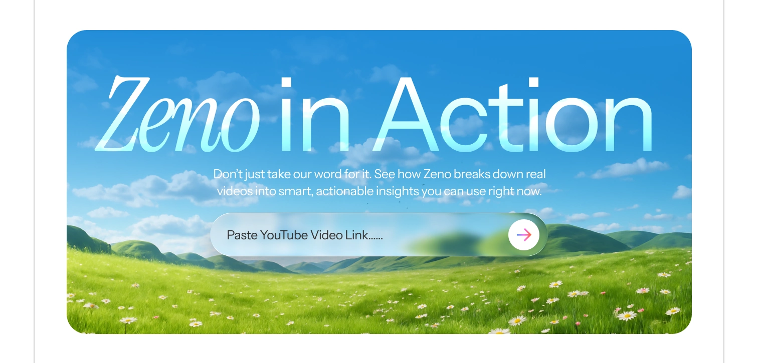
🧪 Added Live Demo Input & Actionable CTAs
We turned the CTA from a generic “Start Free” to a real YouTube input field.
[Paste any YouTube link...] [Let’s Go →]
This gave users a taste of the product instantly — boosting signups and stickiness.
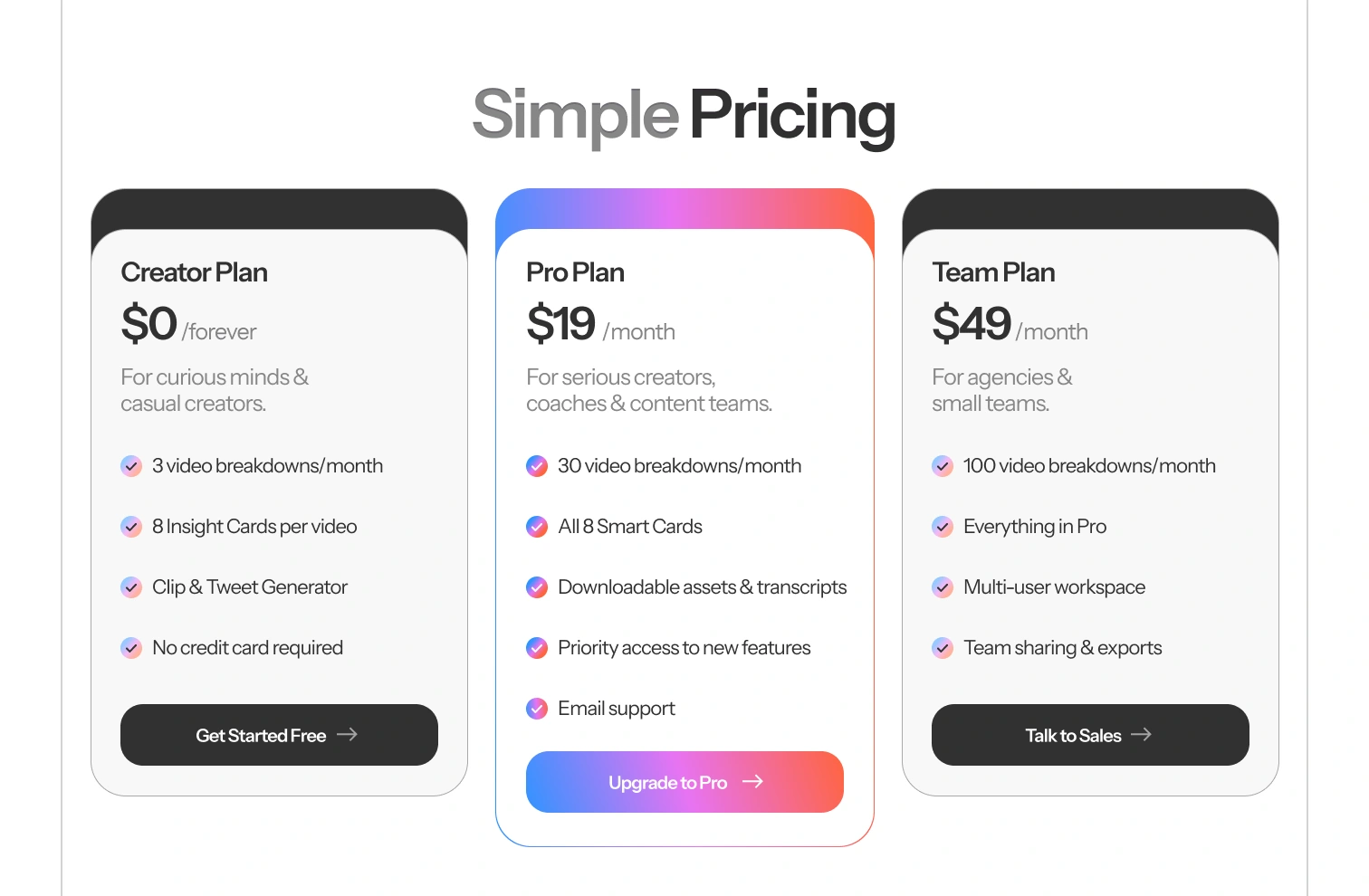
💰 Simplified & Tiered Pricing
New plans:
Creator – $0/month (free forever)
Pro – $19/month
Team – $49/month
Each has bulleted benefits, clean layout, and a strong CTA.
🔁 Removed friction. Drove clear upgrade paths.
🎨 Brand Refresh
New gradient palette (pink → blue glow)
Rounded buttons + glassmorphism elements
Google Fonts with contrast between elegance (logo) and clarity (body)
🔁 Modern, delightful, trustworthy.
🧠 UX Takeaways
What made this redesign work?
✅ Jobs-to-be-done thinking:
We centered messaging around outcomes, not features.
✅ Instant clarity:
The new headline communicates product + value in 5 seconds.
✅ Emotional UX:
Gradients, micro-interactions, quotes — these elements add trust and warmth.
✅ Fewer decisions, faster action:
One input, one CTA. Simple beats clever.
✅ Onboarding starts on the landing page.
The redesigned CTA lets users experience the tool before asking them to commit.
Like this project
Posted Aug 5, 2025
Redesigned Zeno AI's landing page for better conversion and clarity.
Likes
2
Views
16
Timeline
Jul 15, 2025 - Jul 30, 2025