AI Sales Forecasting Platform Design | UX/UI Design
Yuliia Ishchenko
AI-Powered Forecasting Platform
A fintech forecasting platform designed to help businesses predict sales, analyze trends, compare forecast models, and turn complex datasets into actionable business insights.
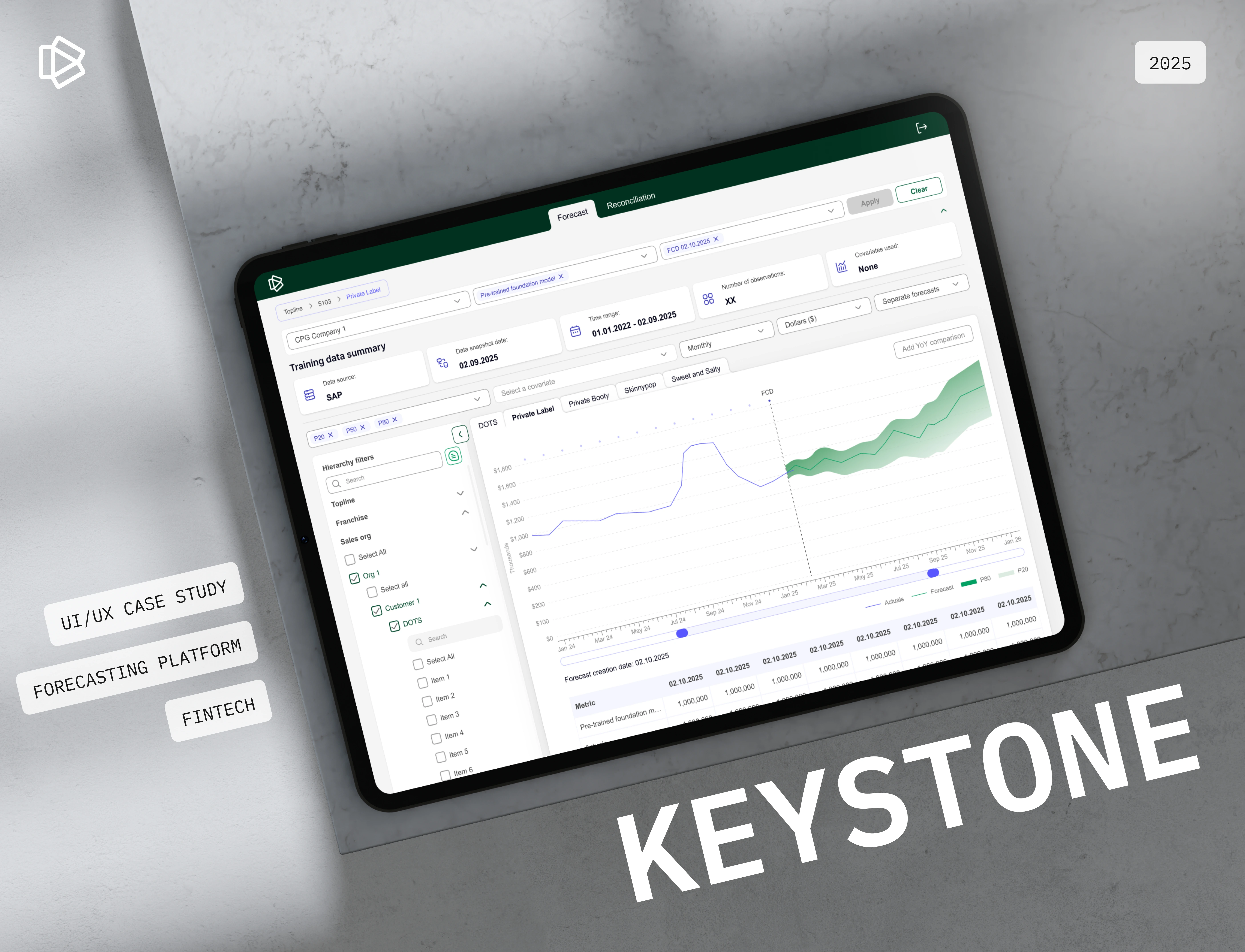
Keystone is an AI-powered sales forecasting platform that helps companies forecast demand, uncover hidden trends, reduce risk, and make data-driven decisions with confidence. The platform combines automated analytics, prediction models, trend visualization, forecast reconciliation, and business insight generation in one structured interface.
Year: 2025
Industry: FinTech, Forecasting, AI Analytics, Business Intelligence
Project Type: UX/UI Design, Forecasting Platform, Web App
Scope: User Flow, Forecasting Dashboard, Reconciliation Flow, Data Visualization, Filters, Forecast Parameters, Design System
Contribution: UX/UI Design, User Flow, Data Visualization, Interface Design, Design System
Project Overview
Keystone was designed as a forecasting platform for businesses that work with large volumes of sales and financial data.
The goal was to create an interface that helps users select datasets, choose forecasting models, apply parameters, generate predictions, compare results, and review forecast accuracy in a clear and structured way.
The platform supports AI-powered sales forecasting with automated analytics, accurate predictions, trend visualization, and seamless business insights.
The final result is a clean forecasting workspace where users can manage complex data flows without losing clarity or control.
Problems
Forecasting workflows can be complex
Users need to work with datasets, models, filters, covariates, time ranges, quantiles, and chart settings. Without a clear structure, this process can quickly become overwhelming.
Large-scale data requires strong organization
The platform needed to support hierarchy filters, multiple companies, sales organizations, customers, items, and data sources while keeping the interface readable.
Forecast accuracy needed to be easy to evaluate
Users needed a visual way to compare actual performance with forecasted values and understand possible future scenarios.
AI adoption can create uncertainty
Since users rely on AI-generated forecasts for business decisions, the interface had to communicate trust, transparency, and control.
Forecast parameters needed to be adjustable
Users needed to change forecast models, dates, quantiles, time grain, time horizon, chart display, and covariates without breaking the flow.
Data security and compliance were key concerns
Because the product works with business and financial data, the design had to feel professional, structured, and secure.
Goals
Create a clear forecasting interface for complex business data.
Help users generate sales forecasts with minimal friction.
Improve forecast readability through strong data visualization.
Make filters and parameters easy to access and adjust.
Support forecast comparison, reconciliation, and override management.
Build a clean visual system suitable for fintech and enterprise users.
Reduce cognitive load when working with large datasets.
Create a scalable foundation for future AI forecasting features.
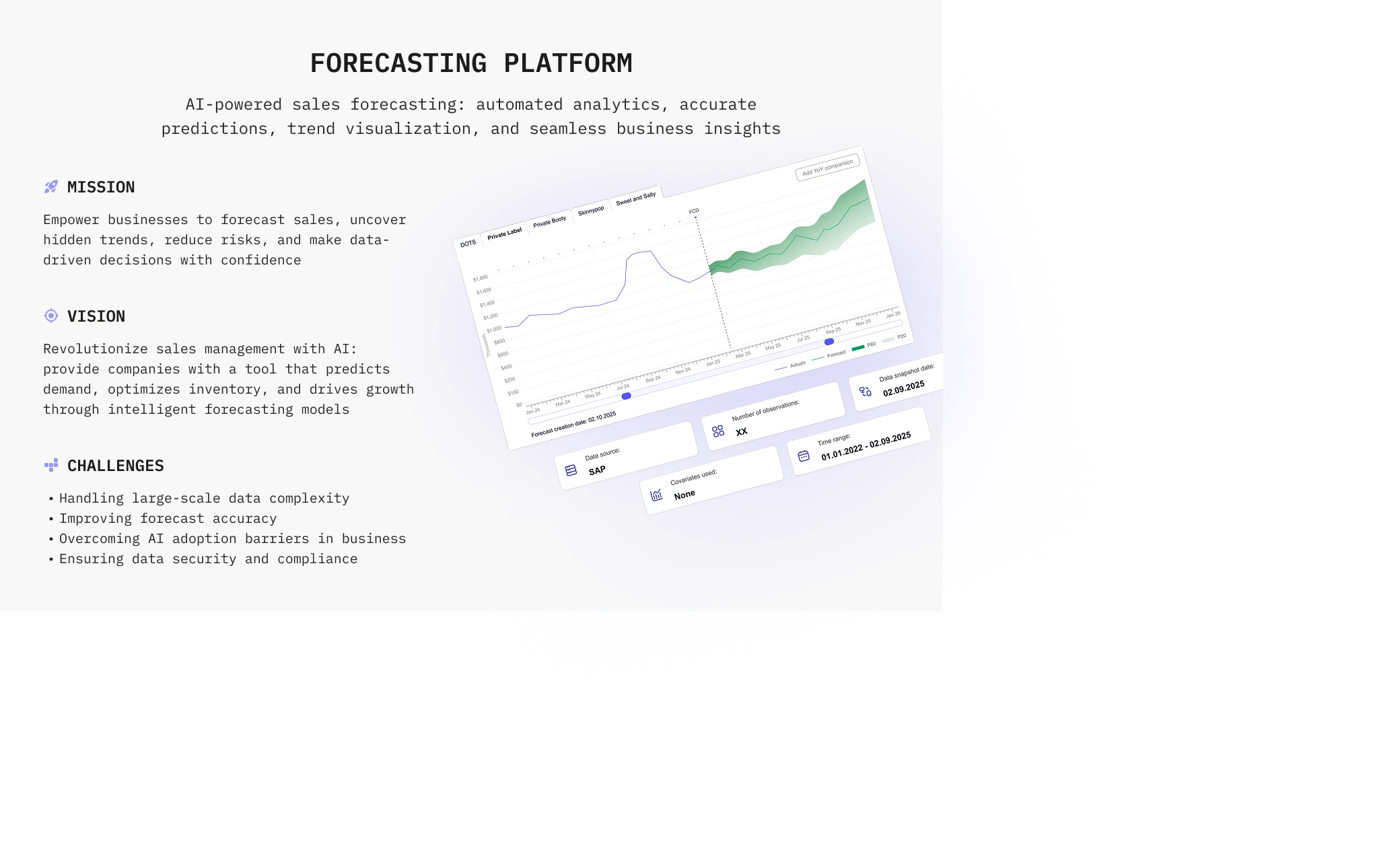
Mission
Keystone’s mission is to empower businesses to forecast sales, uncover hidden trends, reduce risks, and make data-driven decisions with confidence.
Vision
The product vision is to revolutionize sales management with AI by giving companies a tool that predicts demand, optimizes inventory, and drives growth through intelligent forecasting models.
Challenges
The main challenges included:
Handling large-scale data complexity
Improving forecast accuracy
Overcoming AI adoption barriers in business
Ensuring data security and compliance
Making advanced forecasting tools understandable for everyday users
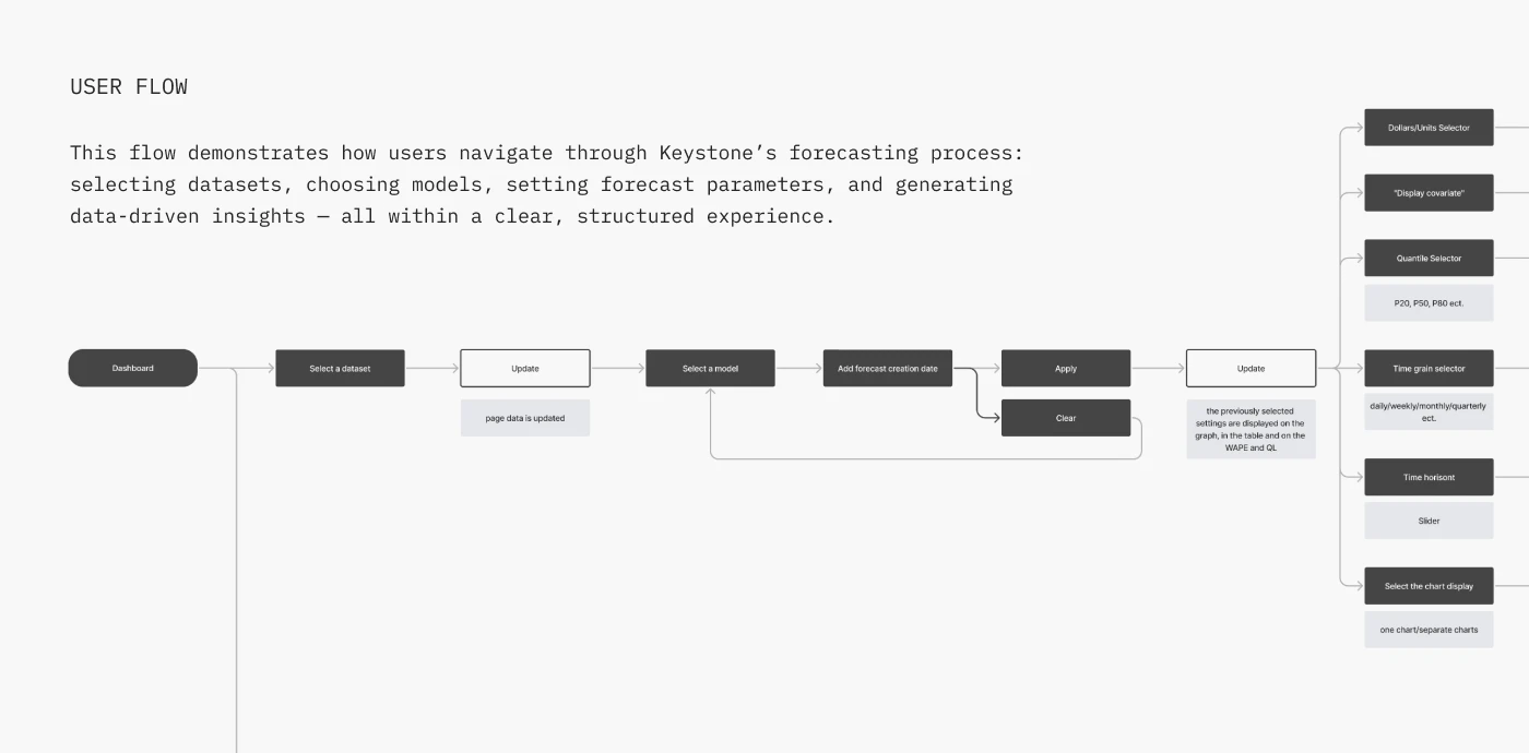
User Flow
The user flow was structured around the forecasting process:
Dashboard
Select a dataset
Update data
Select a forecasting model
Add forecast creation date
Apply or clear settings
Review updated forecast
Adjust parameters
Compare charts
Generate data-driven insights
The flow also includes additional controls such as: Dollars / units selector, Covariate display, Quantile selector: P20, P50, P80, Time grain selector, Time horizon slider, Chart display selector, One chart or separate charts view.
This structure helps users move through the forecasting process step by step while keeping advanced settings available.
Visual Identity
The visual system was designed to feel clean, analytical, and enterprise-ready.
The interface uses a white workspace, deep green accents, light green supporting colors, blue-violet highlights, and neutral gray UI states. This creates a balance between trust, data clarity, and modern AI-product aesthetics.
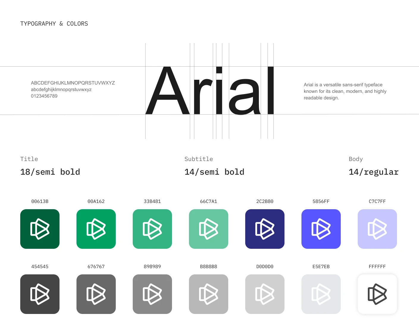
Typography
Arial was used as the main typeface.
It supports high readability across charts, tables, filters, dashboard labels, and dense data screens.
Typography system:
Title — 18 / Semibold
Subtitle — 14 / Semibold
Body — 14 / Regular
Color Palette
The color palette includes:
#00613B — deep green for primary brand and navigation
#00A162 — main green accent
#33B481 — supporting green
#66C7A1 — soft green support color
#2C2B80 — deep violet-blue accent
#5856FF — bright blue-violet highlight
#C7C7FF — soft lavender-blue support color
#454545, #676767, #898989, #B8B8B8, #D0D0D0, #E5E7EB, #FFFFFF — neutral UI system
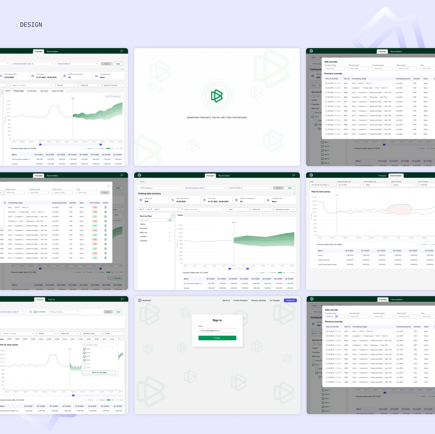
Forecasting Dashboard
The main forecasting screen is the core workspace of the platform.
It includes:
Dataset selection
Company selection
Training data summary
Data source
Data snapshot date
Time range
Number of observations
Covariates used
Hierarchy filters
Forecast chart
Actuals line
Forecast line
Quantile ranges
Forecast table
Forecast creation date
Model selector
Apply and clear actions
The goal was to make advanced forecasting functionality feel structured and manageable.
Data Visualization
The forecasting chart was designed to show historical values and predicted results in one clear view.
Users can review:
Actual performance
Forecasted values
Prediction ranges
Quantile lines
Time-based trends
Forecast creation date
Comparison points
The chart layout helps users understand where past data ends and where the forecast begins.
Filters and Parameters
A detailed filtering system was created to help users control the forecast output.
Users can adjust: Hierarchy filters, Topline, Franchise, Sales organization, Customer, Items, Covariates, Currency or unit display, Time range, Time grain, Forecast model, Forecast creation date, Quantile view, Chart mode.
The filters are organized to support complex data selection without overwhelming the user.
Forecast Generation
A loading state was created for the forecast generation process.
When the user applies settings, the platform shows a focused generation screen, helping users understand that the system is processing the forecast and that results will appear shortly.
This adds clarity and reduces uncertainty during AI-driven processing.
Reconciliation Flow
The platform also includes a reconciliation section, allowing users to review and adjust forecasted values.
This flow supports:
Forecast reconciliation
Add override
Previous override table
Forecasting target
Forecasting period
Quantile selection
Value entry
Override history
Error impact indicators
This is important for business users who need to adjust AI-generated forecasts based on internal knowledge, business context, or updated expectations.
Sign-In Screen
A simple sign-in screen was designed to provide secure platform access.
The screen uses the same visual system and brand pattern as the main interface, keeping the experience consistent from entry point to dashboard.
Design System
A lightweight design system was created to keep the forecasting interface consistent.
The system supports both simple UI elements and dense data-management screens.
Results
The final design created a structured and scalable forecasting platform for AI-powered sales and business prediction.
Key Results
A clear forecasting dashboard for reviewing sales predictions and historical performance.
A structured user flow for selecting datasets, models, forecast dates, and parameters.
Advanced data visualization with actuals, forecasts, quantiles, and trend lines.
Flexible filters for hierarchy, companies, customers, items, covariates, and time settings.
Forecast reconciliation tools for adding overrides and reviewing previous changes.
A clean enterprise visual system based on green, violet, and neutral UI colors.
Improved usability for complex data workflows through organized controls and clear hierarchy.
A scalable design foundation for future AI forecasting, analytics, and business intelligence features.
Project Scope
This case study covers the UX/UI design of Keystone’s AI-powered forecasting platform, including the forecasting dashboard, user flow, filters, forecast settings, chart visualization, reconciliation flow, override tables, sign-in screen, and design system.
The product was designed as a scalable fintech and business intelligence tool for companies that need clearer forecasting, better trend visibility, and more confident decision-making.
Conclusion
Keystone transforms complex sales forecasting into a clear and structured digital experience.
The platform helps users manage datasets, apply forecasting models, visualize trends, reconcile predictions, and turn large-scale business data into actionable insights.
The final design creates a professional, scalable, and data-focused interface that supports confident AI-powered decision-making.
✍️ Contact me and I will provide you with an estimate for your project!
Like this project
Posted Apr 21, 2026
UX/UI design for an AI-powered sales forecasting platform for predictions, trend visualization, reconciliation, and business insights.
Likes
0
Views
7
Timeline
Feb 1, 2025 - Apr 1, 2025