Automotive Marketplace Redesign
Koonj Imdad
Automotive Marketplace Redesign
Role: Lead UI/UX Designer (end-to-end)
Industry: Automotive eCommerce / Global Marketplace
Duration: 3 Months
Deliverables: UX audit, user flows, wireframes, high-fidelity UI, responsive web
& mobile app designs
The Problem
After auditing the existing platform, I identified a set of interconnected UX failures that were actively damaging the user experience and suppressing conversion. The
product had grown organically without a design system or UX strategy, every
new category or feature was bolted on without consideration for the overall
experience.
Homepage Overload
The homepage attempted to surface everything simultaneously, country selectors, currency pickers, category mega-menus, search, featured listings, promotions, and more, all competing for attention above the fold. A first-time visitor had no clear starting point. The opening experience required users to self-orient through an overwhelming volume of competing elements.
Broken Product Discovery
Browsing a catalog of this scale requires a smart navigation architecture. The existing category system was a deeply nested mega-menu with hundreds of subcategories listed in plain text, no visual grouping, no iconography, no logical hierarchy visible to the user. Finding parts for a specific make and model required
knowing exactly where to look; browsing was not a realistic option.
Outdated Visual Language
The UI was built with an early-generation eCommerce template aesthetic, small text, tight spacing, GIF flag images for country selection, inconsistent button styles, and product cards that buried key information. In a market where users increasingly compare with Alibaba, Amazon, and global automotive platforms, the dated visual design undermined credibility and trust.
No Mobile Strategy
Automotive parts buyers frequently search on mobile, in a workshop, at a scrapyard, or while inspecting a vehicle. The existing platform had no mobile-first thinking: touch targets were too small, navigation was unusable on a phone screen, and the information density that was already problematic on a desktop became completely unworkable on a 390px viewport.
Weak Product Cards
Product listings, the core unit of any marketplace, were hard to scan. Images were
small, pricing was not visually prominent, category and compatibility data were
buried in text, and there was no consistent card structure that allowed users
to compare listings at a glance.
No Scalability
With hundreds of brands across 10+ vehicle categories and machinery types, the platform needed a design architecture that could accommodate future growth. The existing layout had no modular logic; adding a new category meant adding more visual noise, not extending a system.
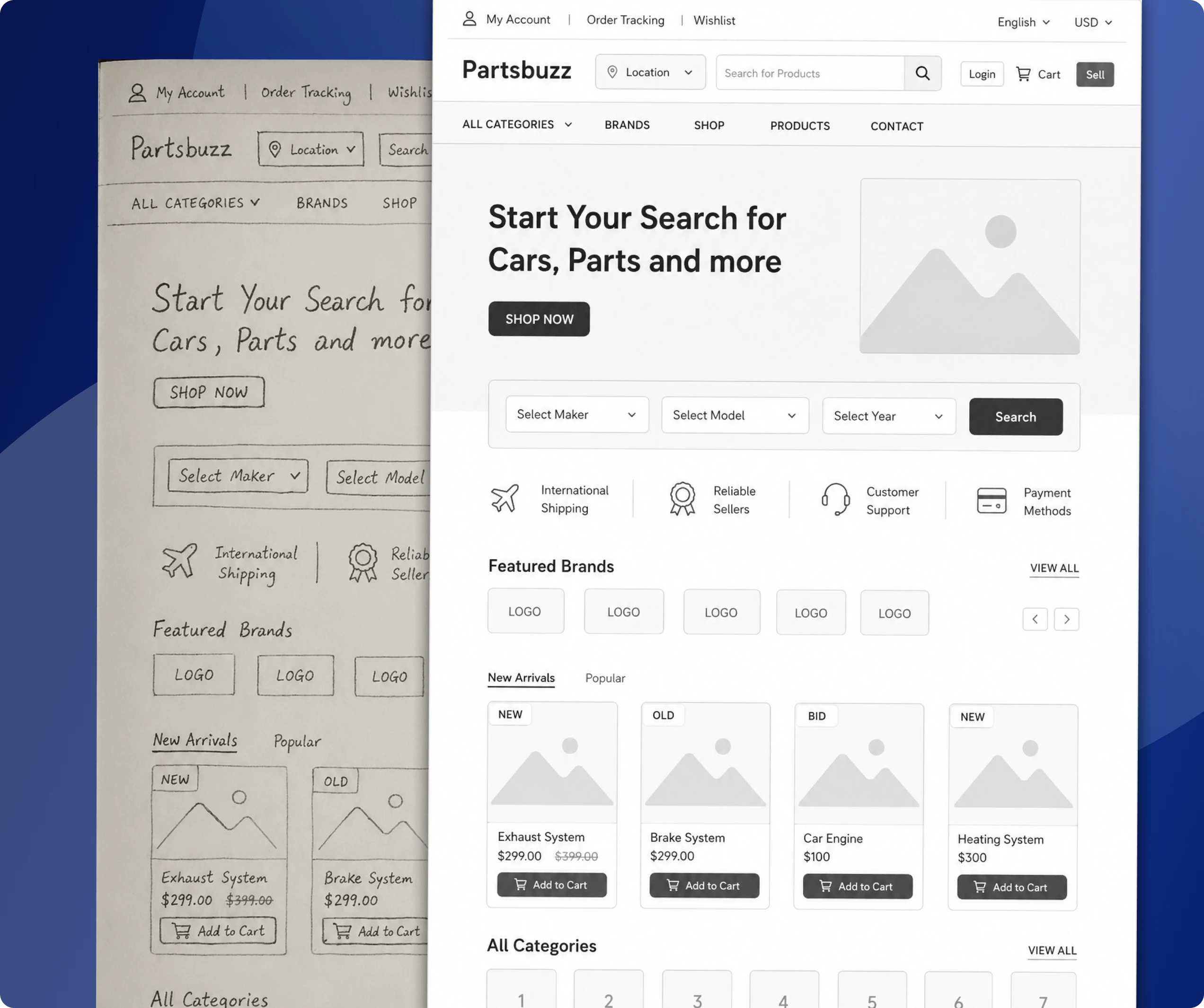
Rough sketches - Low Fidelity Ideas
My Role
I was the sole UX/UI designer on this project, responsible for every stage from initial audit through to final, developer-ready designs. This was not a team effort with dedicated researchers and product managers, I owned the full design process independently across three months.
Specifically, I was responsible for:
UX audit of the existing partsbuzz.com experience
Competitive analysis of automotive eCommerce platforms globally
User flow mapping for the core buyer and seller journeys
Information architecture redesign for homepage, categories, product listing, and product detail
Wireframing all key screens before moving to high-fidelity
High-fidelity UI design for the website (desktop and mobile responsive)
Mobile app UI design — a new channel that did not previously exist as a dedicated app experience
Component and layout system across all screens
Design documentation for developer handoff
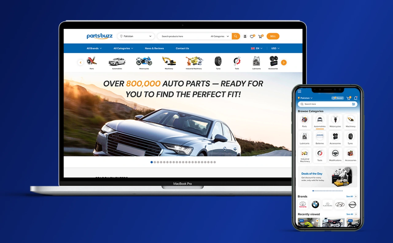
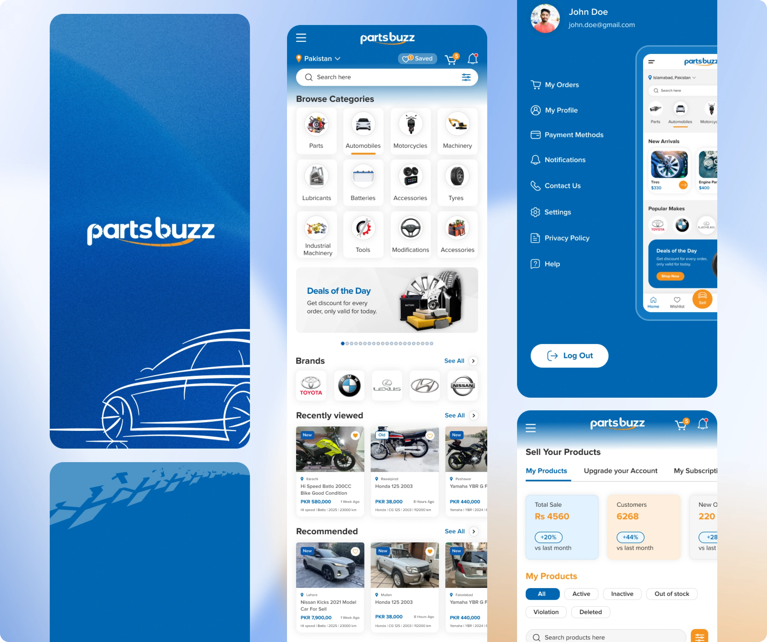
Website Home page Design
Design Strategy
Before moving to any visual work, I established three design principles that would govern every decision across the redesign:
Principle 1 — Clarity over Completeness
The old platform tried to show everything. The redesign would show what matters first and give users progressive paths to depth. The homepage is not a catalog, it
is an entry point. I would ruthlessly reduce what appears at first glance and
trust users to drill down.
Principle 2 — Scan, Then Decide
Automotive buying involves comparison, comparing part compatibility, price, seller
reputation, and condition. Every product surface needed to be designed for
rapid scanning, not reading. This meant larger images, prominent pricing, clear
category labels, and visual consistency across all cards so the eye can move
quickly.
Principle 3 — Mobile as Primary
The redesign would be designed mobile-first, then adapted to desktop, reversing the approach that had produced the existing platform. Every component would work on a 390px screen before being expanded for larger viewports. Navigation, filters, cards, and detail pages all started from the mobile constraint.
The Solution
The redesign touched every major surface of the PartsBuzz experience. Here is a breakdown of the key design decisions and what changed.
Homepage — Modular, Focused, Conversion-Led
I restructured the homepage into clearly separated modular sections, each with a single purpose:
Hero section: dominant search bar as the primary action, vehicle make, model, or part name. One clear entry point.
Category browse: a visual grid of the top 8-10 categories with iconography, Parts, Automobiles, Motorcycles, Machinery, Tyres, Tools, Lubricants, Batteries, Accessories — scannable in under 3 seconds.
Featured listings: a horizontal card row for promoted products with a consistent card layout.
Seller trust strip: key credibility markers (global shipping, secure payment, verified sellers) in a compact band.
Recently viewed and trending sections: personalisation hooks to increase return visit engagement.
The country and currency selectors were moved out of the hero and into a persistent header utility, present but not competing with the primary search action.
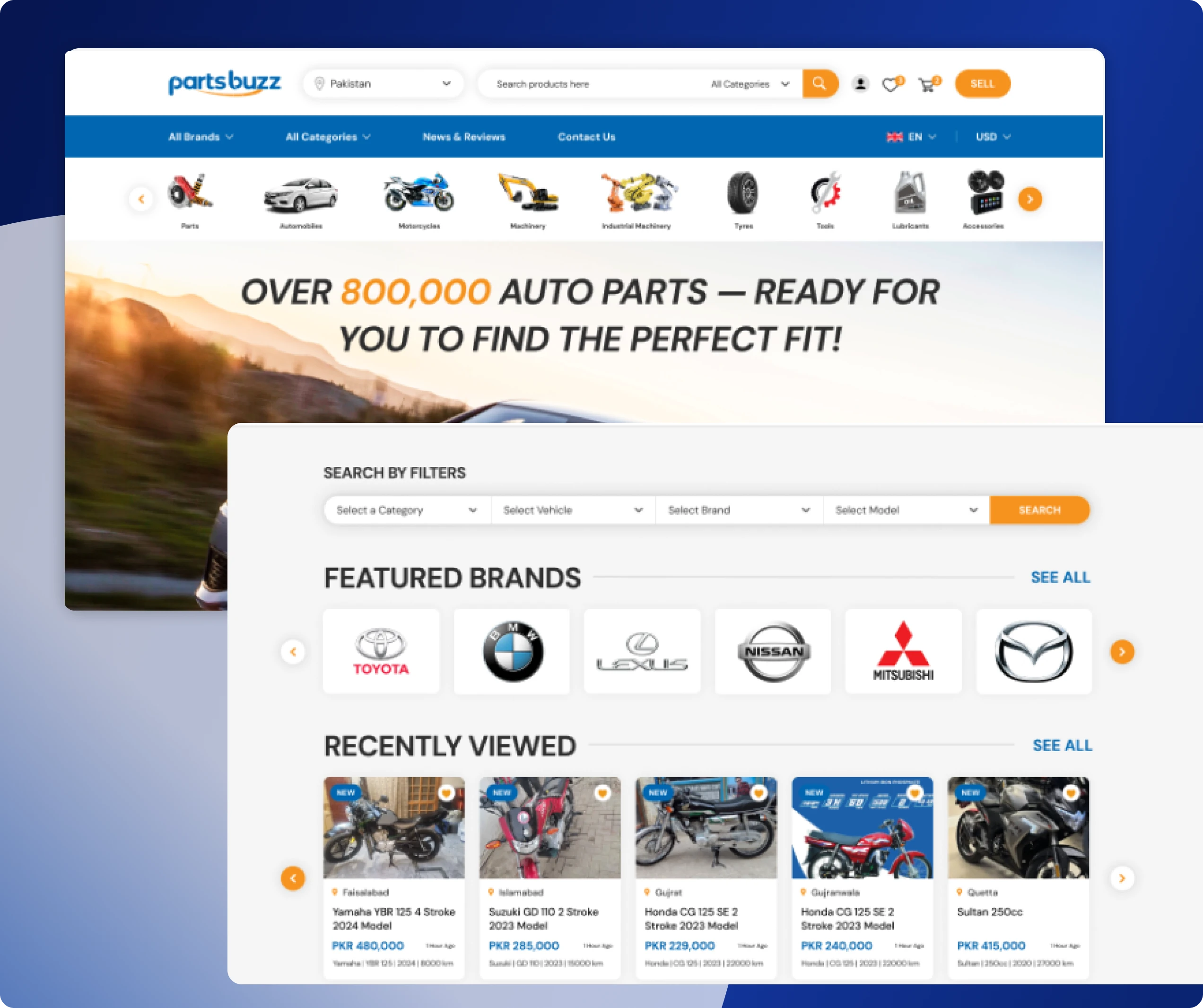
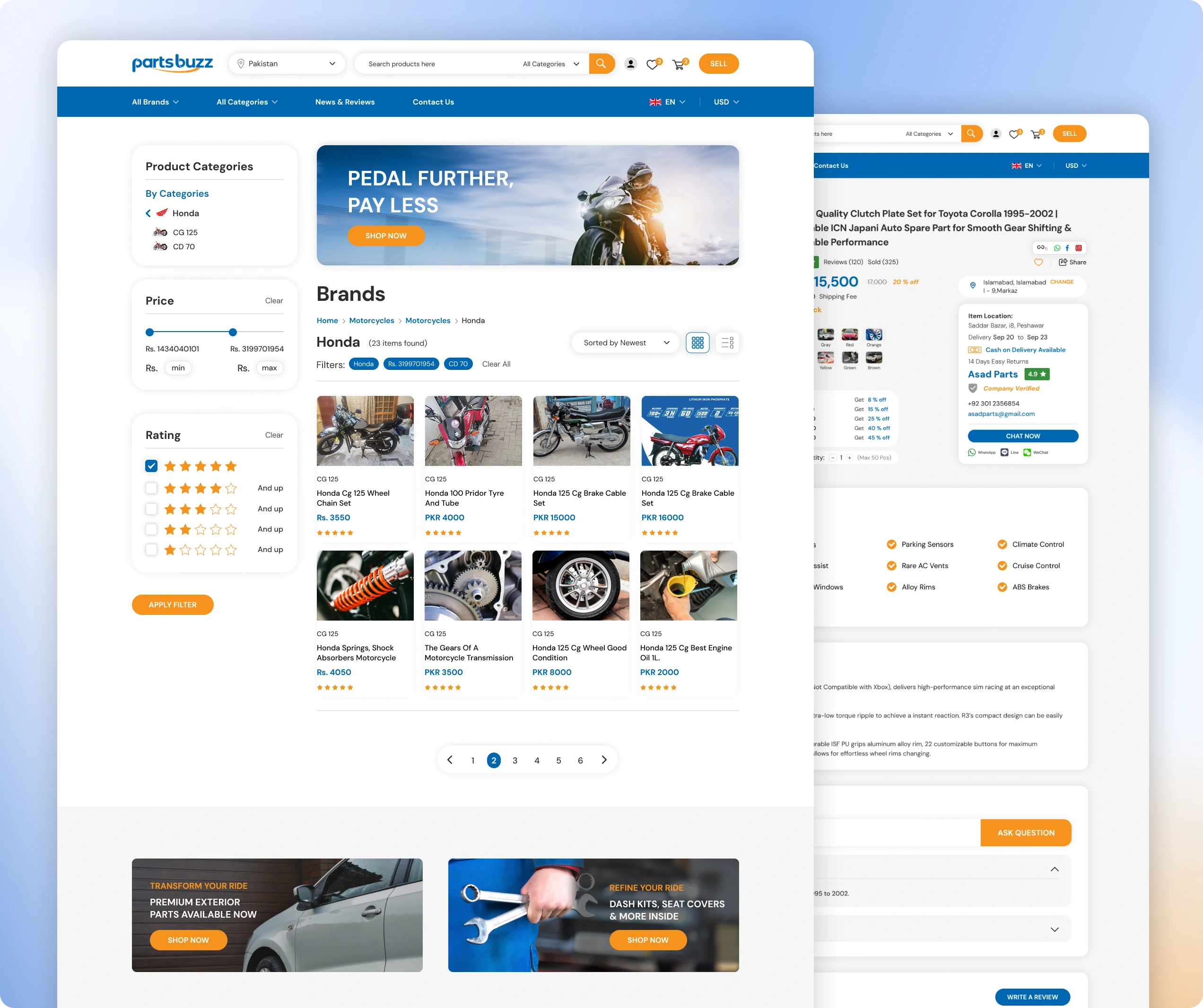
Navigation Architecture
The mega-menu was replaced with a two-level structure: top-level categories visible at all times, with a clean sub-category panel triggered on interaction. Vehicle make/model was introduced as a primary filter dimension; users can select their vehicle first and browse compatible parts, dramatically reducing the
Irrelevant results problem.
Product Cards — Redesigned for Scanning
The product card is the most repeated UI element across the platform, so I gave it the most attention. The new card design features:
Larger, squared product image with consistent aspect ratio
Product name in 2-line truncated display — enough context, no overflow
Price prominent and bold, the most decision-relevant data, treated accordingly
Seller rating and location in smaller secondary text
Quick-action area: Add to Wishlist icon, visible on hover/tap
Condition badge (New / Used / Refurbished) as a coloured label on the image
The card works identically on desktop (grid of 4), tablet (grid of 3), and mobile (grid of 2 or stacked single column for detail-heavy contexts).
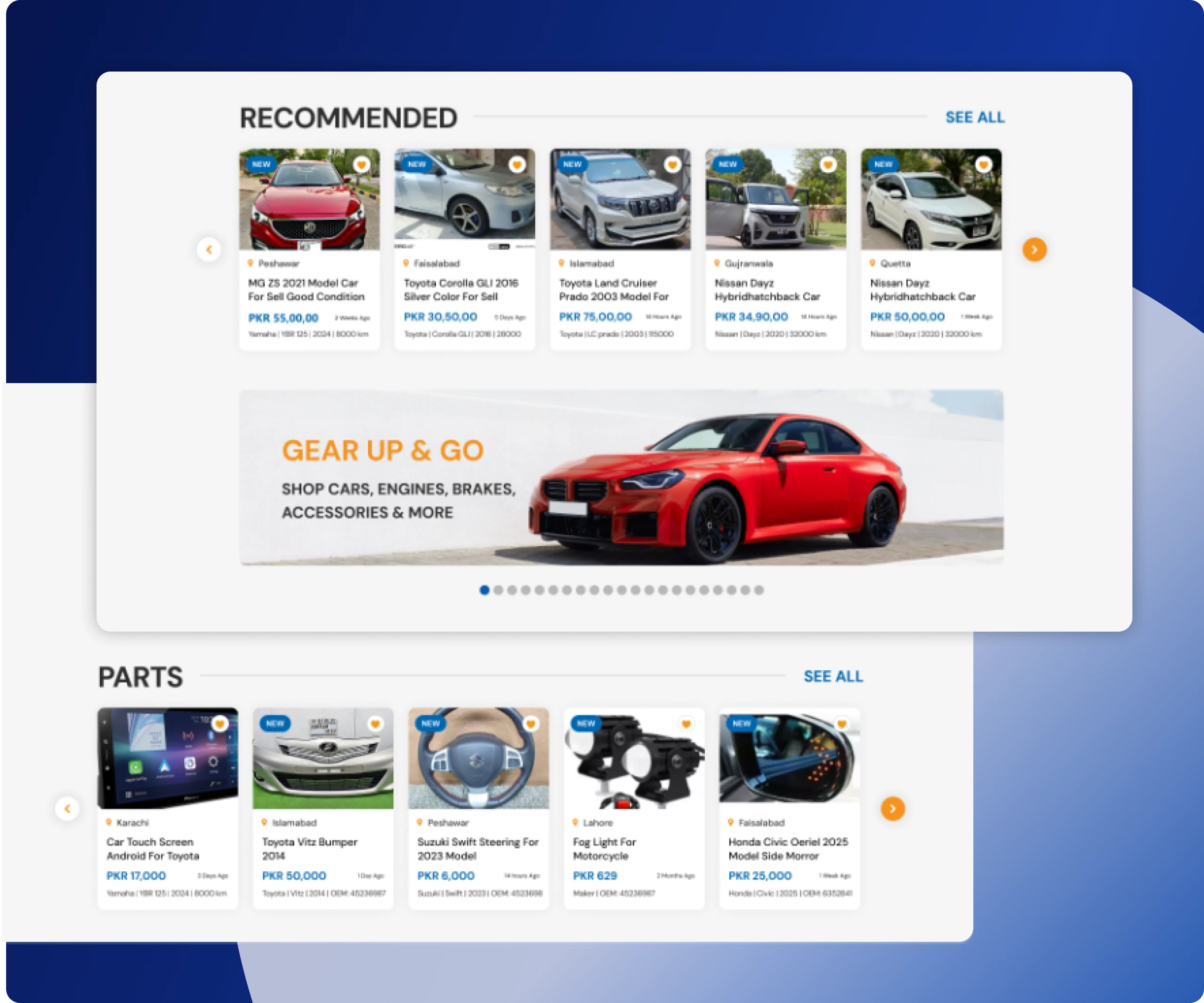
Category & Listing Pages
Category pages were redesigned with a persistent left-side filter panel on desktop (bottom sheet on mobile) covering: vehicle make/model, price range, condition,
location, and seller type. Sort options are always visible at the top of the
results. The listing grid respects the card system established above, providing
visual consistency throughout the browse experience.
Product Detail Page
The product detail page was restructured with a clear priority order: image gallery → price + CTA (Add to Cart / Contact Seller) → compatibility information → product
description → seller details and trust signals → related products. On mobile,
the CTA is fixed to the bottom of the viewport so it is never out of reach as
users scroll through details.
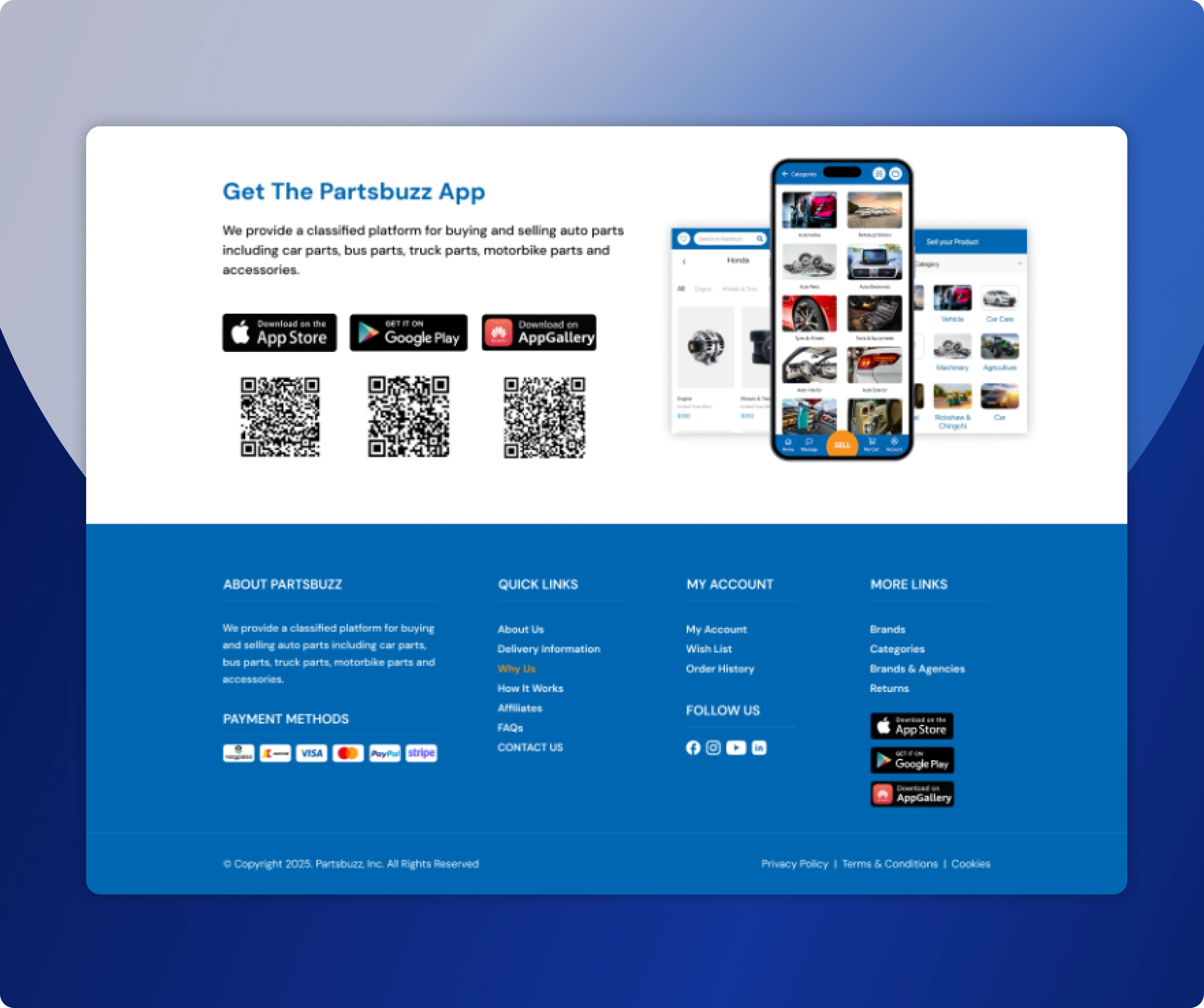
Mobile App — A New Channel
In addition to the responsive web redesign, I designed the PartsBuzz mobile app experience from scratch. The app introduced native mobile patterns that the web could not replicate:
Bottom tab navigation: Home, Search, Categories, Wishlist, Account, always accessible
Native-feel search with recent searches, suggested queries, and category shortcuts
Swipeable product image galleries replacing static single images
Tap-to-call and WhatsApp integration on the seller contact — critical for the target market
Pull-to-refresh on listing pages
Push notification hooks for price drops and saved search alerts
Simplified checkout flow optimised for mobile input
My Impact
This is what I personally contributed to the PartsBuzz product, not just what changed, but what my design decisions specifically created.
I untangled a genuinely complex information architecture
PartsBuzz's catalog is one of the most category-dense automotive platforms I have
encountered, 200+ car brands across 15+ national origins, plus motorcycles, rickshaws, buses, trucks, three types of machinery, and nine product types. I
built a browsing structure that makes this scale navigable without reducing the
catalog, by introducing vehicle-first filtering and visual category groupings
that did not previously exist.
I made the mobile experience viable for the first time
Before this redesign, there was no functional mobile strategy. I designed the mobile app from scratch, establishing the navigation model, interaction patterns, and screen architecture for a channel that now gives PartsBuzz a native-feel presence on the device their users are most likely using when they actually need a part.
I built a scalable product system, not a one-off redesign
The component library and layout grid I established means that when PartsBuzz adds a new vehicle brand, a new category, or a new geography, the design system already handles it. Growth no longer means adding visual clutter; it means extending a system that was built for scale from the start.
I changed what "trust" means on the platform
Redesigning the product cards, seller badges, compatibility labels, and detail page hierarchy transformed how users experience PartsBuzz's credibility. A platform that looked like a 2009 classifieds site now looks like a modern, vetted
marketplace. In automotive eCommerce, where buyers are spending significant
money on parts compatibility-critical purchases, the difference between
Looking credible and looking dated are the differences between a purchase and a
bounce.
I demonstrated that complexity and clarity are not opposites
The temptation with a catalog this large is to reduce it. I didn't reduce PartsBuzz's
inventory or capabilities; I redesigned how they are surfaced and structured.
The result is a platform that is significantly more usable without being less
comprehensive. That balance is the hardest design problem in marketplace UX,
and it is the one I spent the most time solving.
Hire Me
I am available for new projects. I specialise in:
eCommerce UX/UI Design: Marketplaces, product listings, checkout flows, mobile apps — from audit to final UI
Mobile App Design: Native iOS and Android patterns, component systems, interaction design from scratch
Complex Platform Design: SaaS products, multi-category marketplaces, admin panels, dashboards, I am at home with information density
Design System Creation: Figma component libraries with tokens, variants, auto-layout, and developer-ready documentation
UX Audit & Redesign: Structured review of existing products, identifying friction, drop-off points, and redesign priorities
End-to-End Product Design: Full process from discovery and wireframing through high-fidelity UI and handoff
Industries I have worked in:
Automotive eCommerce · PropTech · Travel & Hospitality · Clinic / Health Tech · Food Tech · CRM & SaaS · Finance
Contact
Koonj Imdad — UX/UI Designer
Portfolio: koonjportfolio.framer.website
Email: koonjimdad@gmail.com
LinkedIn: www.linkedin.com/in/koonjali/
Like this project
Posted Jun 12, 2026
Complete UI/UX redesign for PartsBuzz, enhancing functionality and scalability.