Ka-Lā Organics Brand Development

Kari Livingston


Ka-La Organics
Brand Strategy · Visual Identity · Packaging Concepts
The Brief
Ka-Lā Organics is a Swiss premium supplement brand built for modern women who want to nourish their bodies without compromise. Founded by an experienced product manager, the brand launched with a clear conviction: 100% organic, sustainably sourced formulations — backed by science, rooted in nature.
The founder came to me with a name ("Ka-Lā" — meaning sun, life, love), a philosophy, and an urgency to be first to market. What she needed was everything else: a brand that could hold the weight of a higher price point, communicate trust and warmth simultaneously, and perform across both retail and digital touch points.
The Challenge
The organic women's supplement space is crowded with two dominant aesthetics: clinical-white science brands that feel cold, and earthy-maximalist wellness brands that feel dated. Ka-Lā needed to live in a third space — premium enough to justify a higher price point, warm enough to feel like a friend, and distinctive enough to own a shelf.
Brand Strategy
My first task was to pressure-test the positioning and give it structure. Through a discovery session and competitive landscape analysis, I identified the clear white space Ka-Lā could own.
The strategic territory: Soft Strength. Where competitors chose between natural-soft or scientific-hard, Ka-Lā could be both — warmly confident, grounded in nature but never naive, feminine without being fragile. We further defined the brand personality pillars, voice direction, and market positioning.
Visual Identity
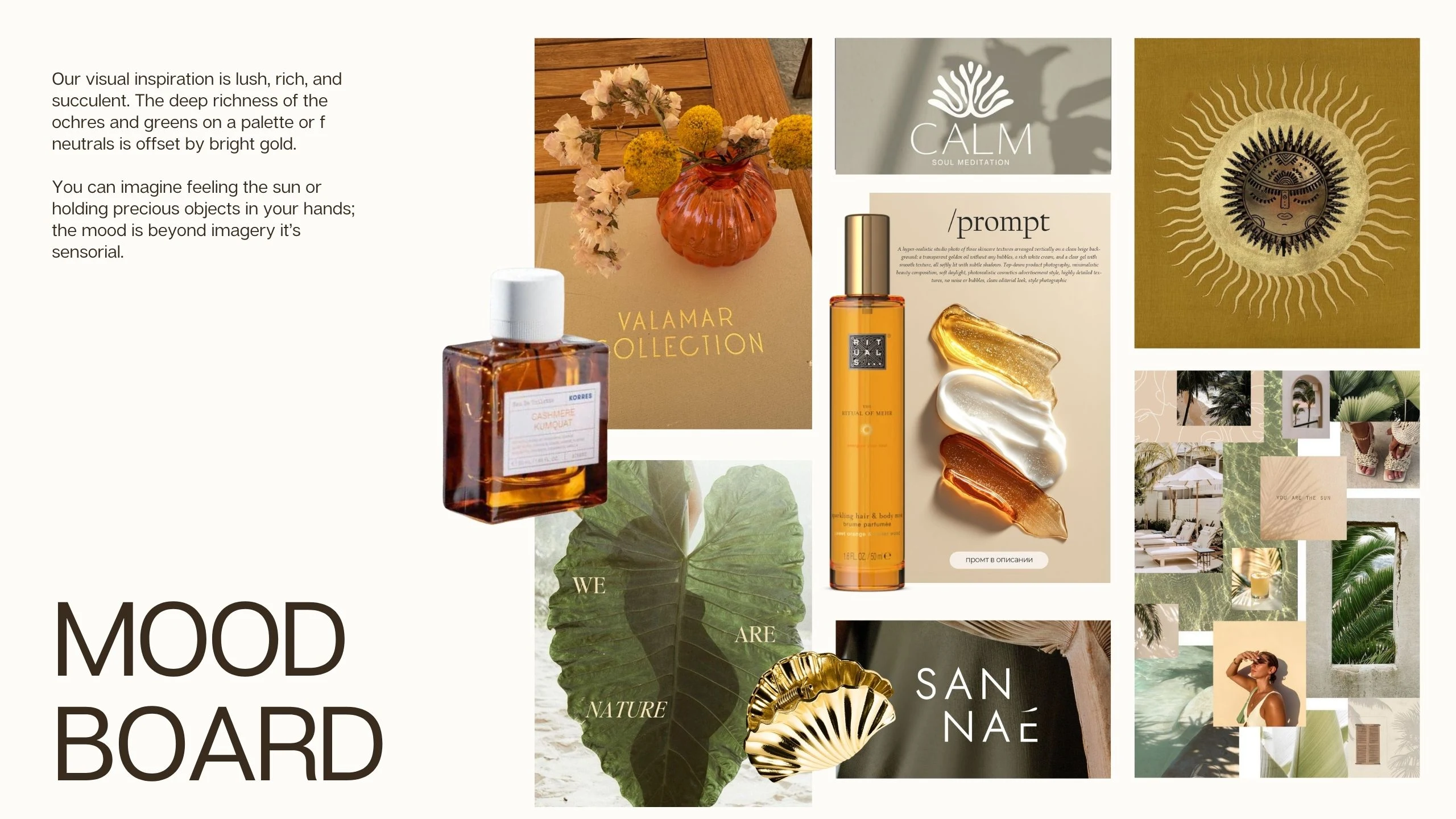
With strategy as the foundation, I developed the full visual identity system. We created a mood board to explore the natural influences and precious objects that would define our visual identity.
Color Palette
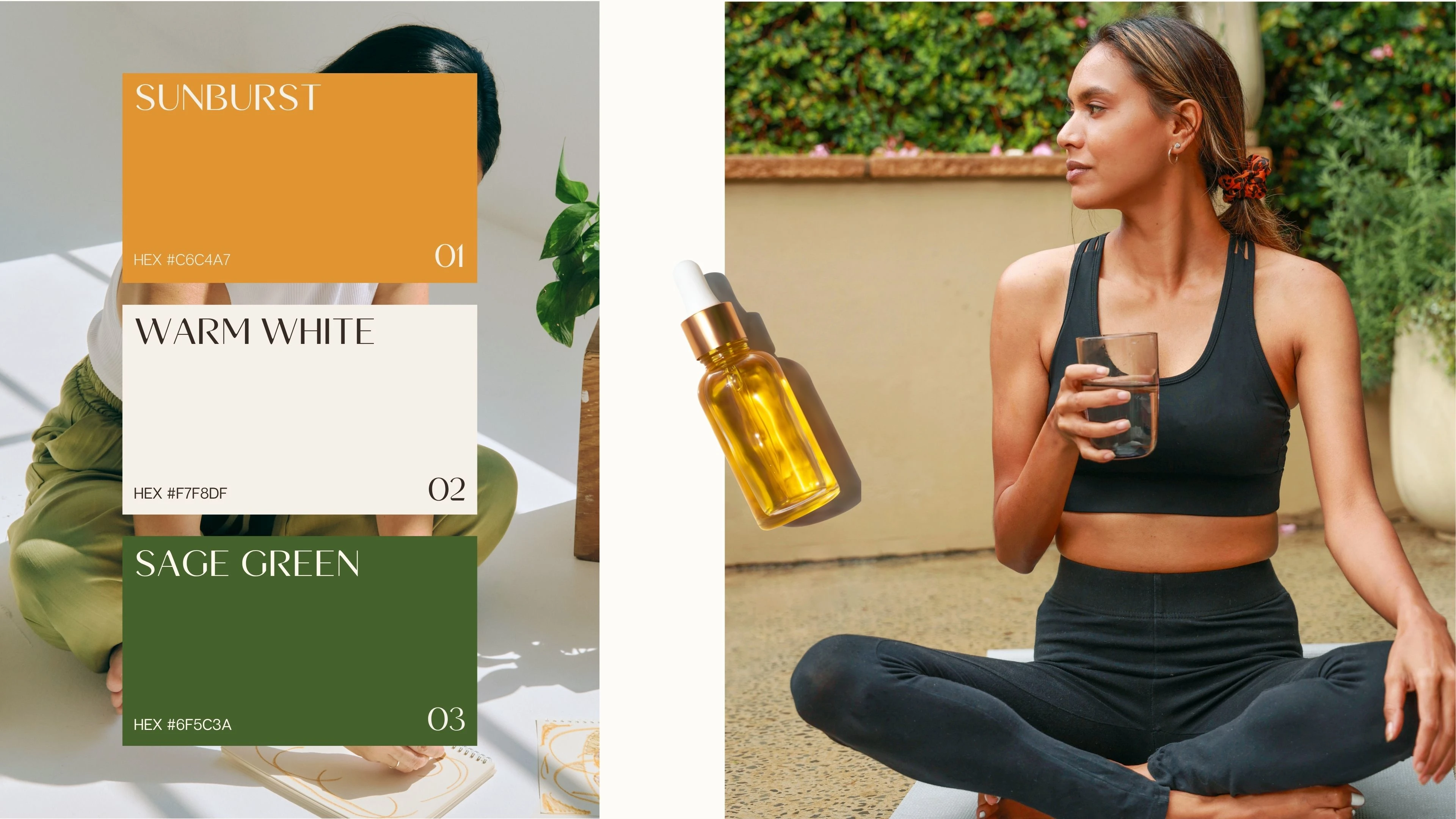
Built around the feeling of golden hour — warm without being garish, grounded without being dull:
Buttery vanilla (primary warm neutral)
Sage green (freshness, nature)
Apricot (energy, sun)
Salmon (femininity without pink cliché)
Gold (premium finish)
Typography
A pairing of a luxurious thin serif with a flowing script. The system communicates premium quality at first glance while remaining approachable in body copy.
Logo Design
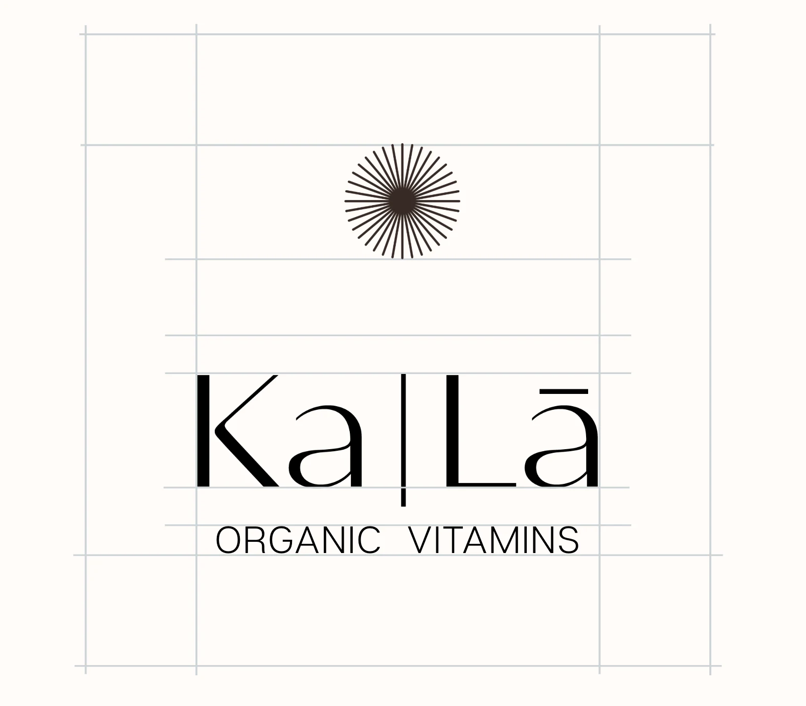
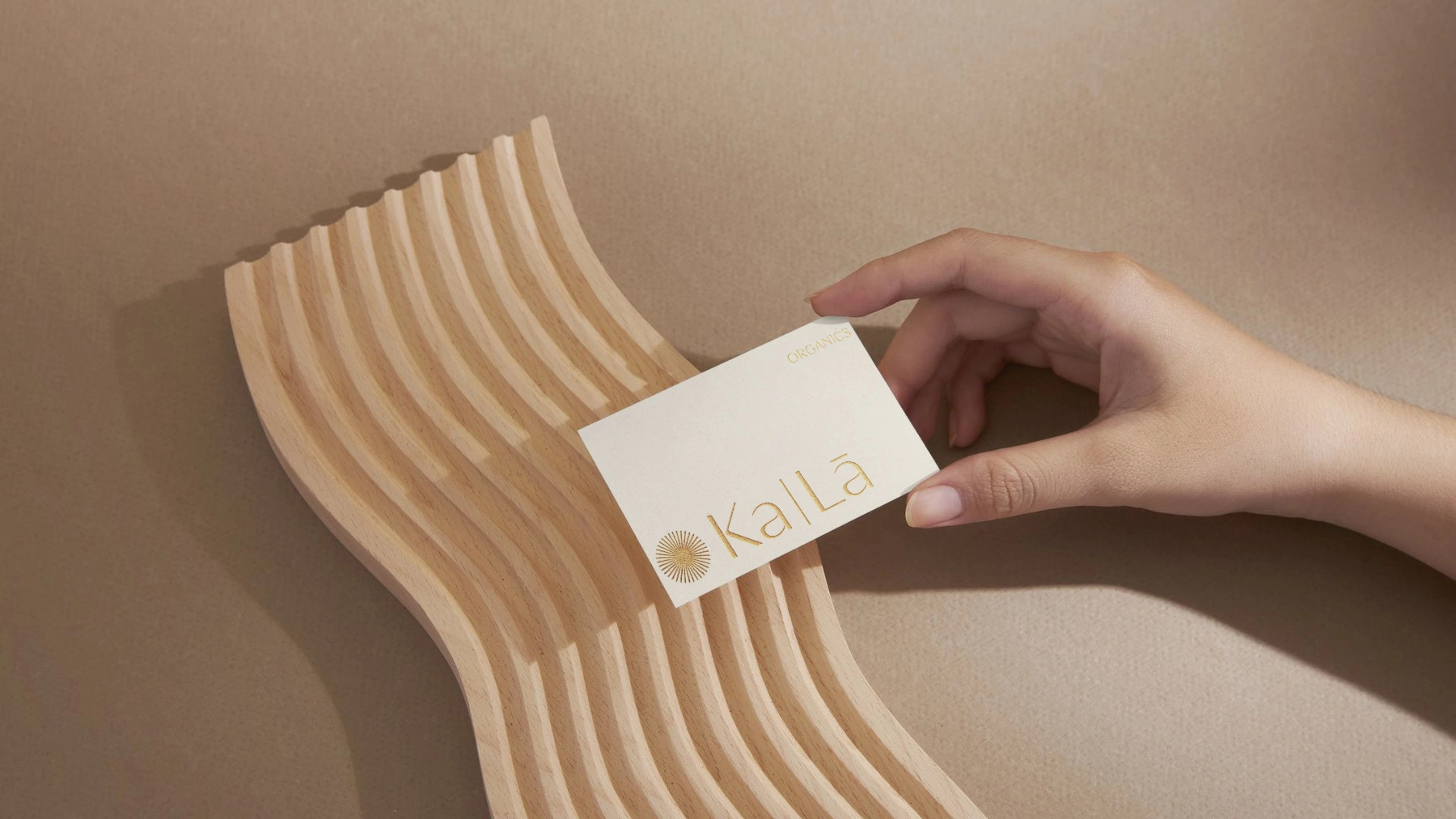
The logo centers on the Ka-Lā wordmark with a minimalist sun emblem — a nod to the brand's name and its roots. I explored multiple directions before landing on a system of primary, secondary, and tertiary lockups that give the brand flexibility across digital and physical applications. The final mark balances fine-line elegance with organic warmth: luxurious thin letterforms, a discreet sun element, and "Organics" as a clean supporting descriptor.
Packaging Concepts
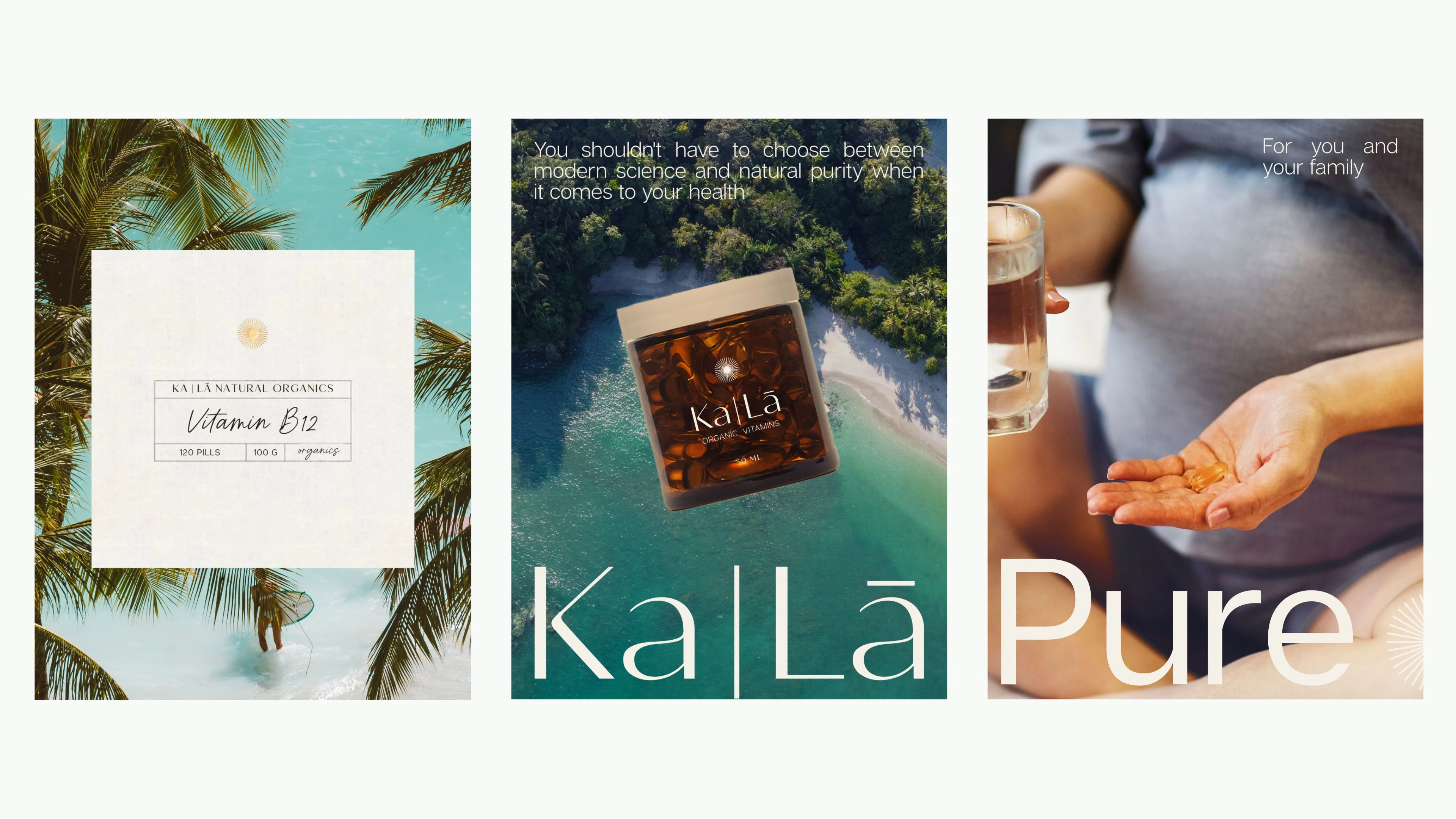
Packaging was designed around tactile luxury over color volume. Rather than bold color-coding between SKUs, the differentiation strategy leaned into texture and finish — embossed logo, tactile label stock, high-end bottle forms with refined closures.
The system was built to scale across multiple SKUs while maintaining cohesion on shelf. (Packing shots coming soon.)
Results
Ka-Lā launched in the European market with the brand identity developed through this project. The visual system is live across the brand's product line and web presence.
Like this project
Posted May 25, 2026
Developed brand strategy, visual identity, and packaging for Ka-Lā Organics.