Peek.money Website Redesign
Anders Bragee
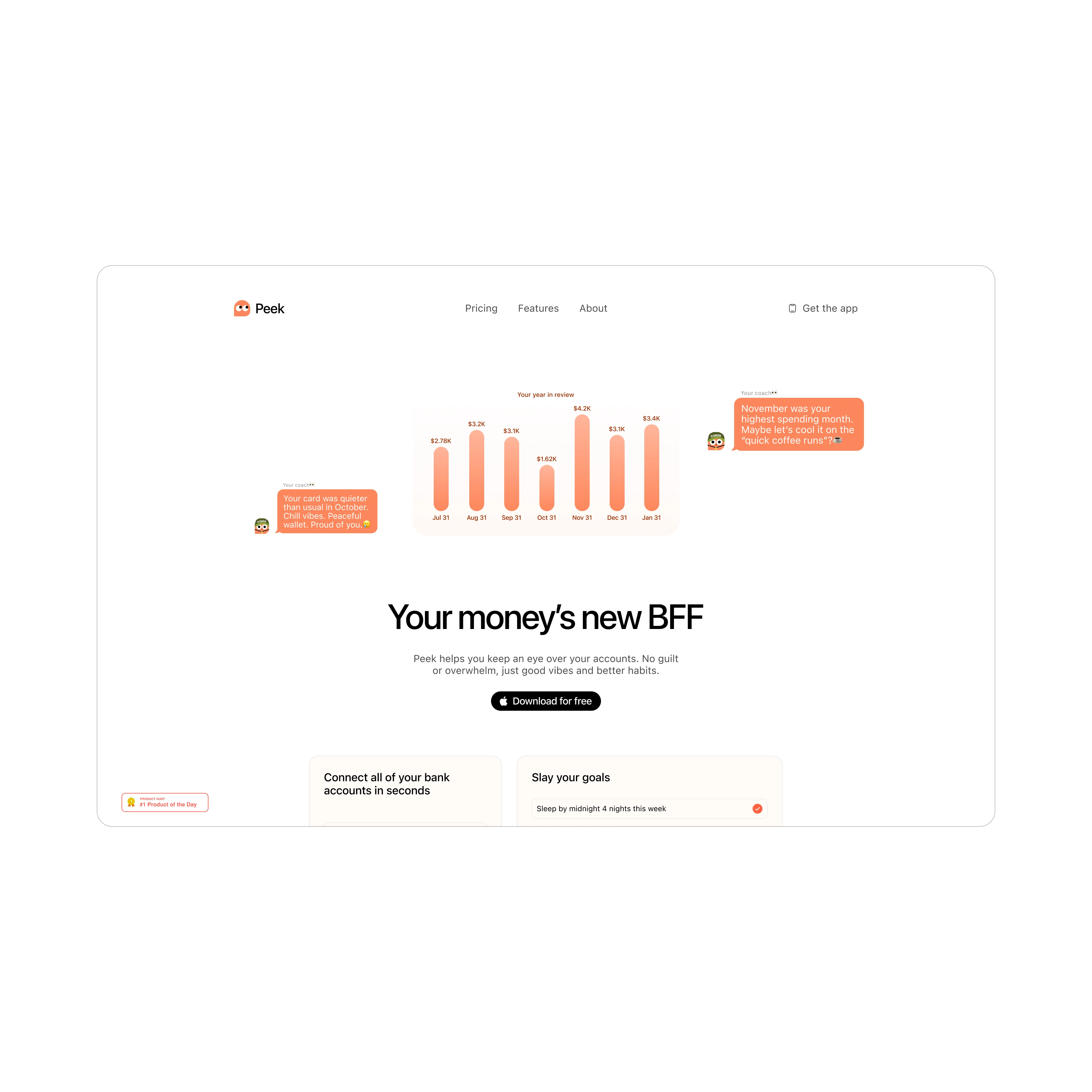
Peek is a personal finance platform built for people who want more control and less confusion around their money. The goal of the web design was to make budgeting and financial tracking feel approachable, clean, and even a little bit fun — without sacrificing clarity.
I leaned into soft color contrasts, simple graphs, and clear CTAs. Financial tools can often feel cold or overly technical, so this design aimed to strike a balance between credibility and warmth. The kind of site that makes you want to sit down and finally look at your numbers, and actually feel good doing it.
Like this project
Posted Jul 29, 2025
Clean, approachable web design for a personal finance tool. The goal? Making managing money feel less stressful and more intuitive.
Likes
0
Views
51