Solhaus Brand Identity Design
Anders Bragee
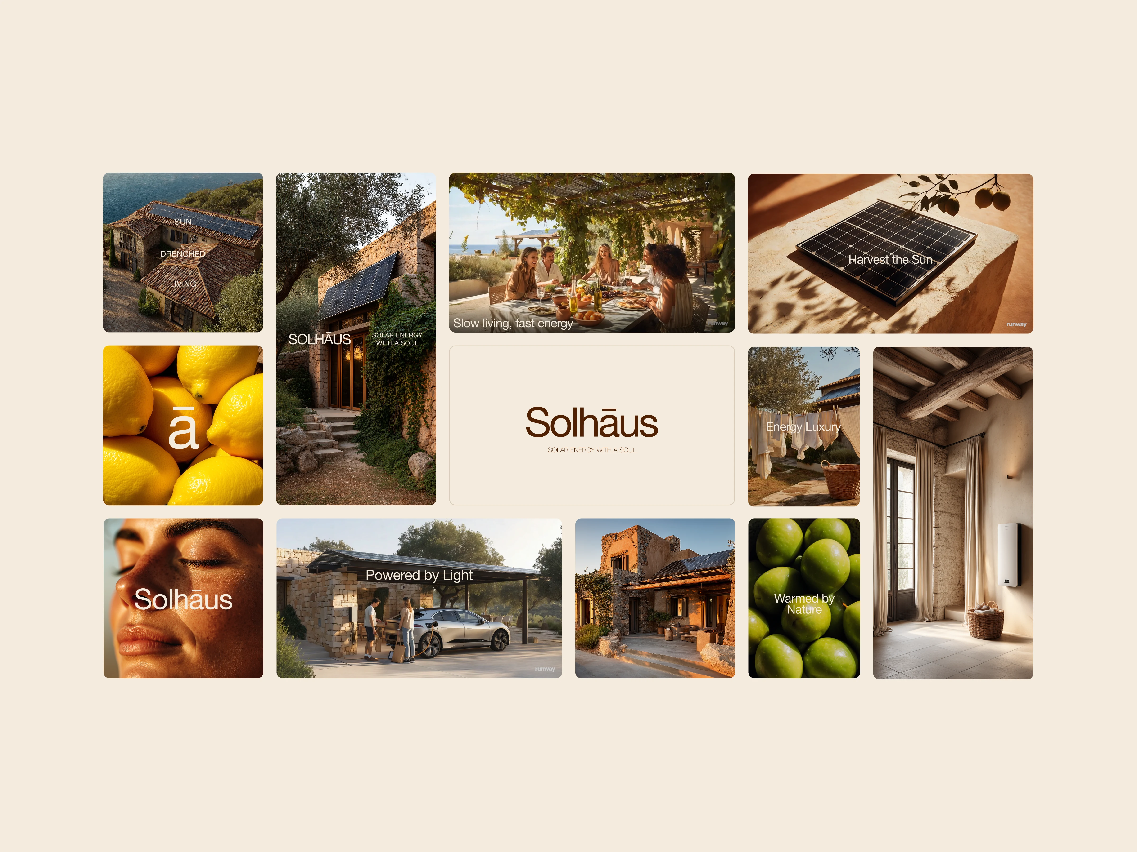
Solhaus started with a simple question: what if solar energy didn’t feel so… sterile? Most solar brands are all about tech specs and savings charts. But I wanted to reframe it, not as just a utility, but as a lifestyle. Something aspirational. Something beautiful.
The brand direction I explored for Solhaus leans into warmth, both visually and emotionally. Think sun-soaked Mediterranean scenes, slow family lunches outside, modern homes glowing in golden light. The goal was to create a feeling, that solar can be more than functional, it can be part of a life well lived.
I designed the identity to feel premium but grounded. Earthy tones, soft type, and airy layouts make the visuals feel calm and effortless. It’s not shouting at you about kilowatt hours, it’s inviting you into a slower, cleaner, more beautiful way to live.
Solhaus is a solar brand that doesn’t just power your house, it powers a lifestyle.
Like this project
Posted May 13, 2025
Explored a lifestyle-first solar brand that feels like a Mediterranean summer, sunny visuals, soft typography, and an identity that makes solar feel stylish.
Likes
0
Views
49