Lead Designer at Alpaca Notify
Collaborators: Gray Lewis, Kyle Woodward, Nate Detling
Project Description
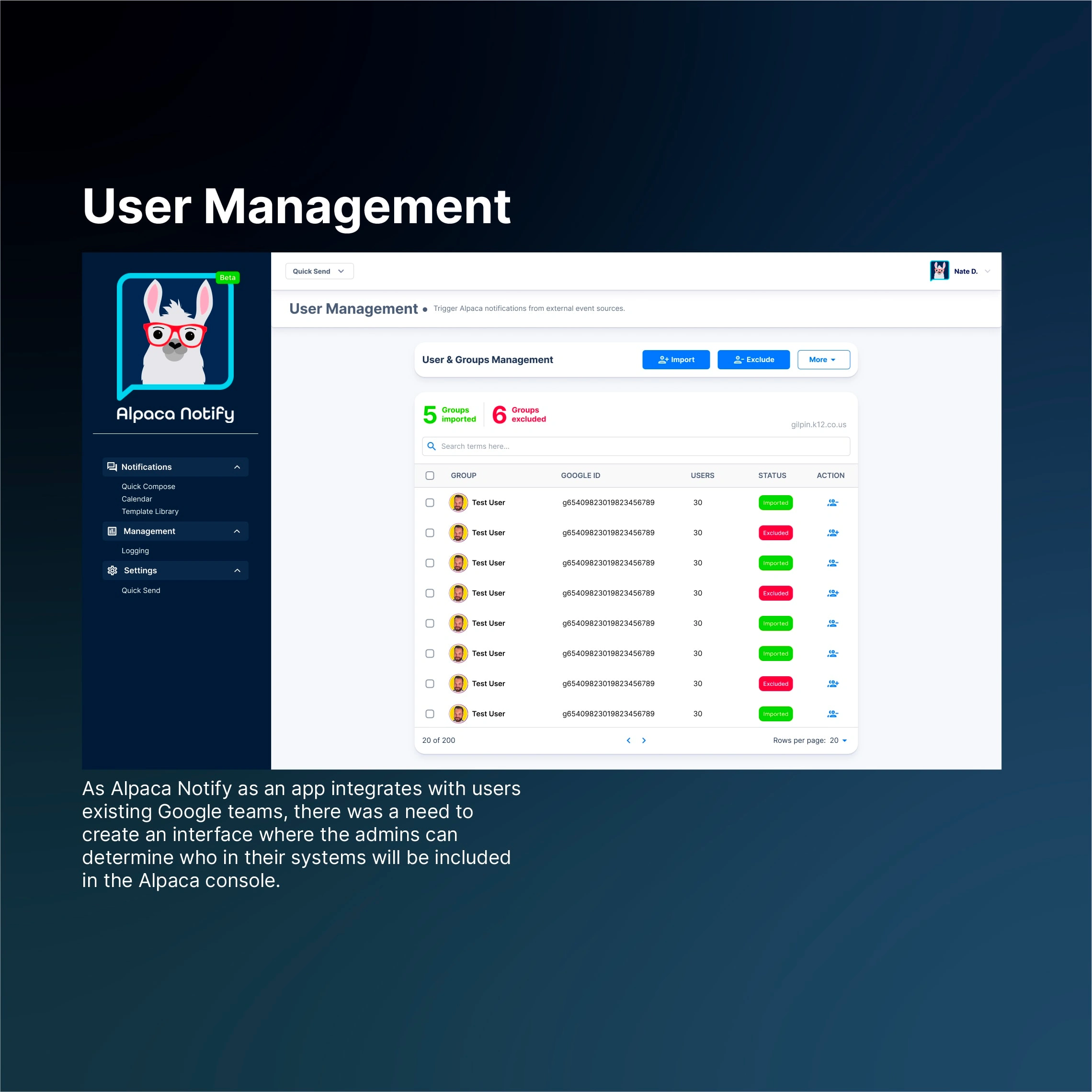
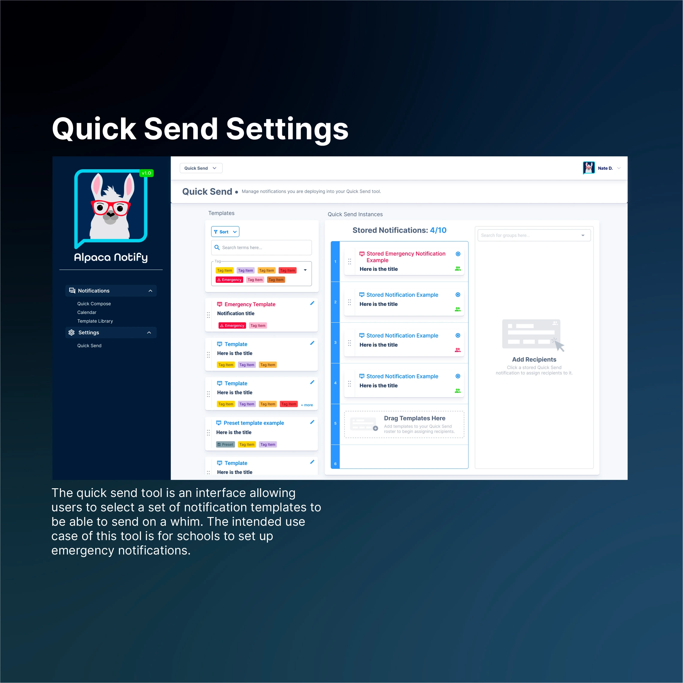
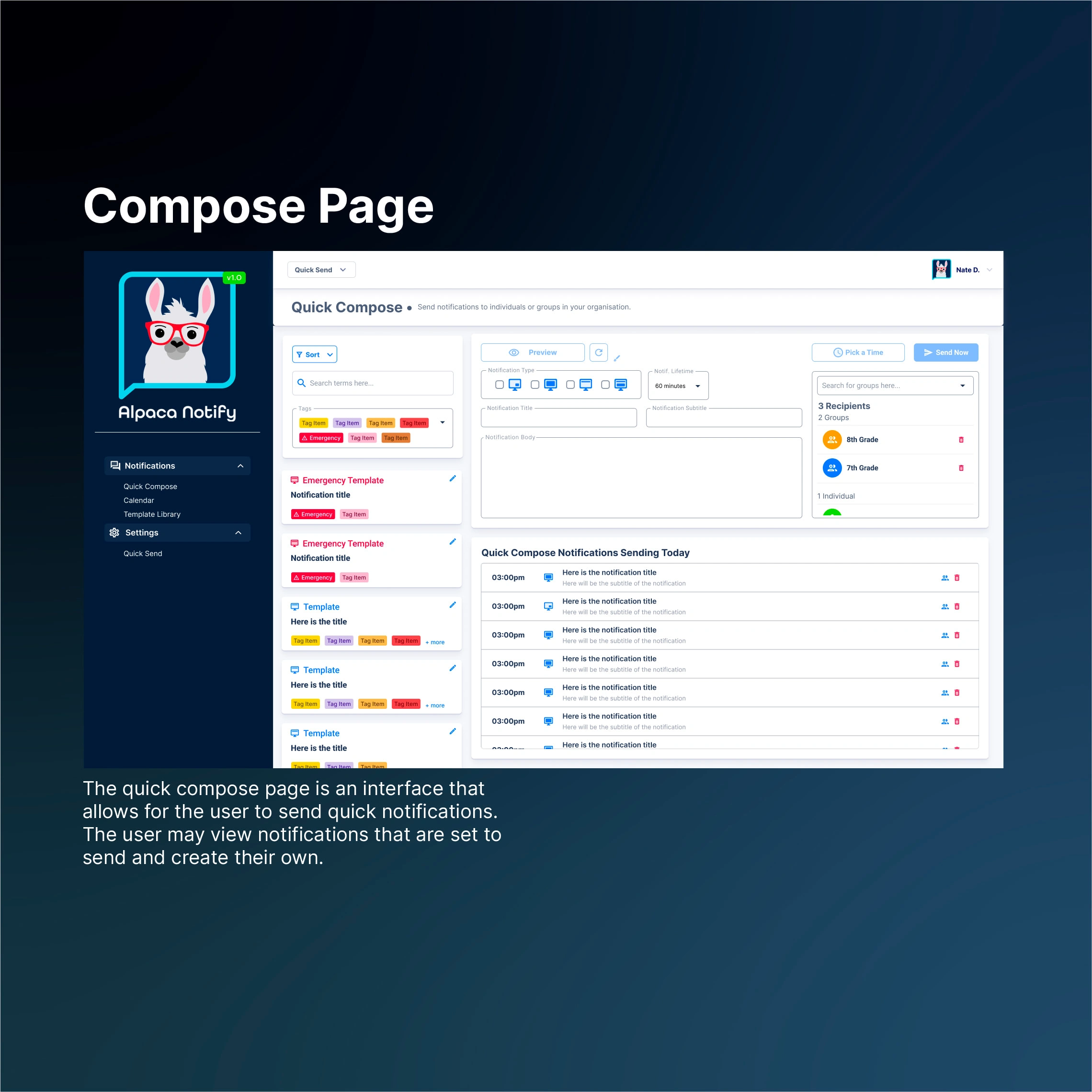
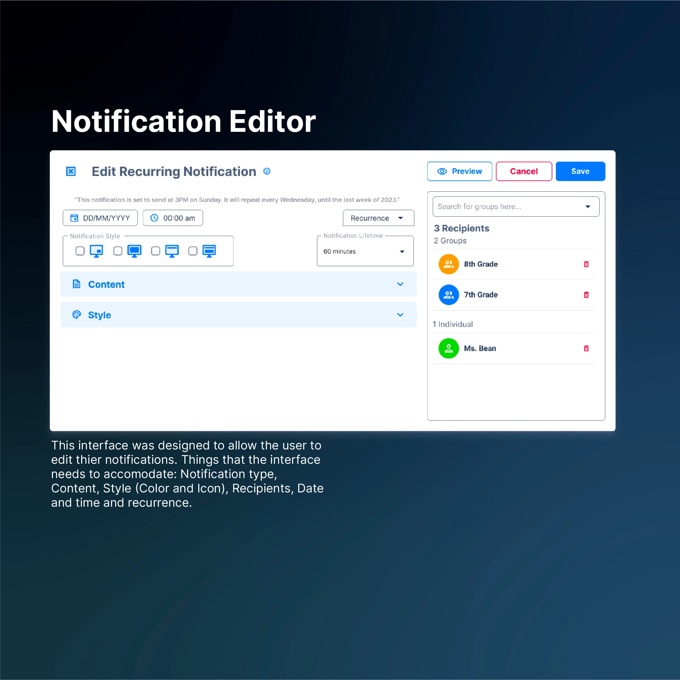
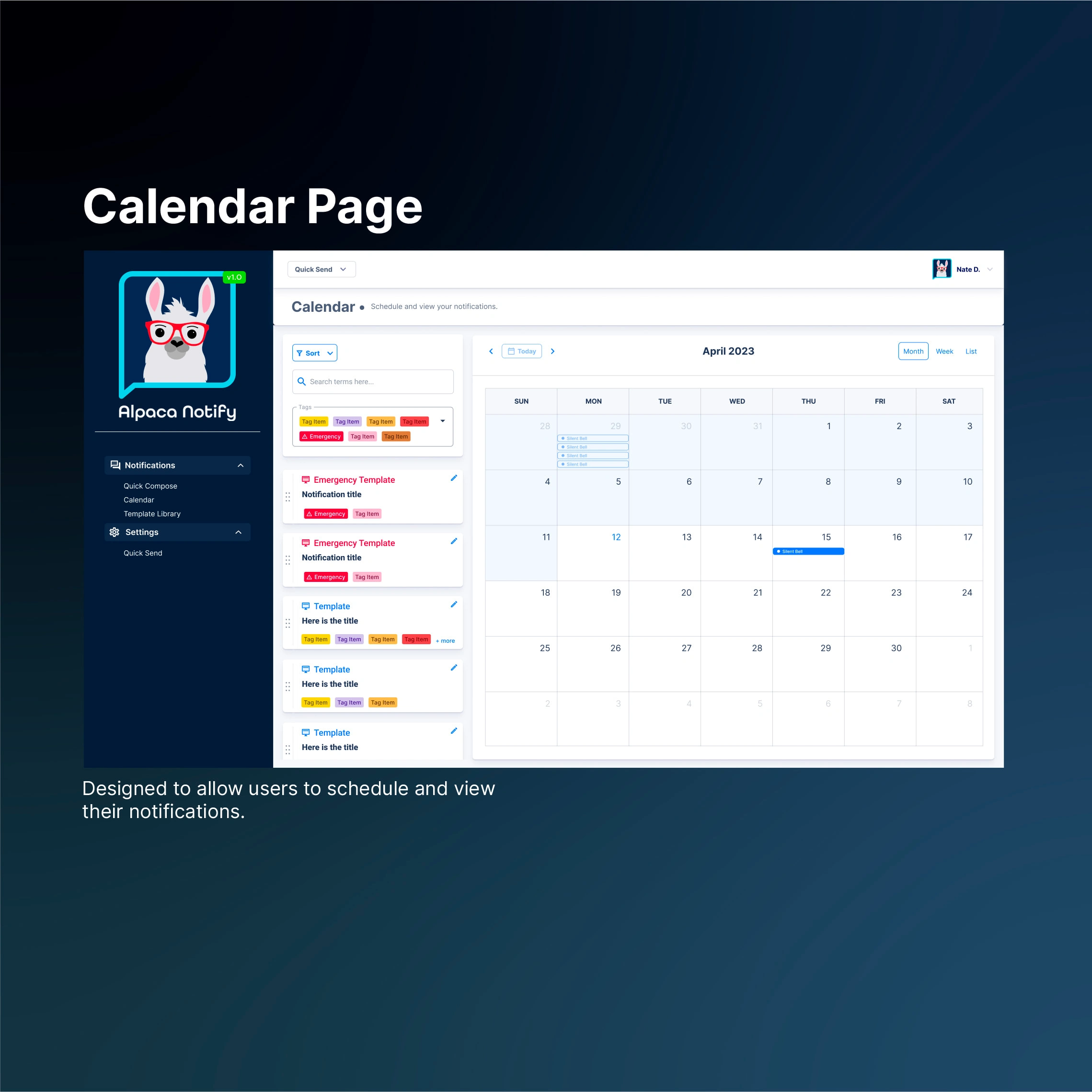
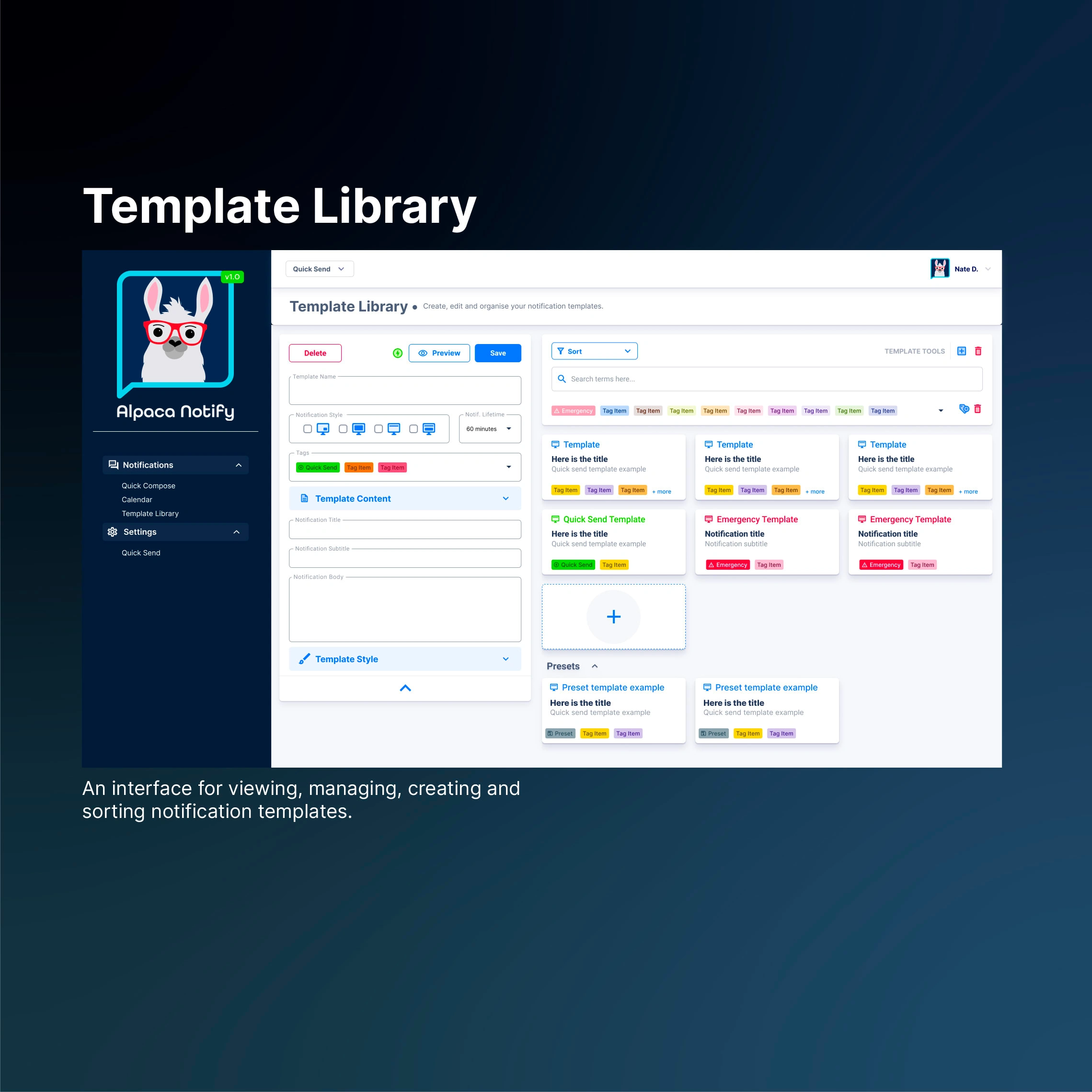
The Alpaca Notify platform delivers alerts and notifications directly to student and staff Chromebook and ChromeOS devices. Our simple, straightforward, and convenient web portal makes it easy to send notifications on-demand, at a scheduled date and time, or on a recurring basis. Notifications are fully customizable — choose your preferred style, colors, and even logos. Users also have the ability to relay a notification from any Webhook capable service.
Bringing in my wealth of knowledge from a traditional graphic design education, I became the creative force behind the product and user experience at Alpaca Notify. With a keen eye for detail and a passion for user-centric design, I ensure that every interaction with our product is both intuitive and visually appealing. Positioning as a multidisciplinary graphic designer, I am poised to tackle a diverse range of creative challenges.
Product Photos

Solution
Alpaca Notify's market positioning within the Google ecosystem, specifically Chromebooks, informed our choice in design language greatly. Using Google's own Material Design was a clear and easy decision for the project. With extensive documentation and style guides for design, it set the stage for us to focus solely on the user.
The console was primarily built with the use of a React component library called Tokyo. First and foremost, this design consideration made it possible to have seamless collaboration with Gray allowing us to iterate with code quickly and efficiently. However, due to the uniquely custom nature of Alpaca Notify's interfaces, new components had to be designed outside of the React library. As a result, we took great care to ensure that the new components fit in with the original design language and did not feel out of place.
The design process for Alpaca underwent a systematic and necessary process that helped shape it into the product we have today. It can be broken down into three distinct practices:
📝 Initial Product design pass:
During the first and most important step in the application design process, Gray and I sat down and looked at the product from a holistic, top down perspective. What was the product and its goal? How would the user go about doing what they needed to in the most efficient way possible? We answered the questions of Who, What, When and Why? For Alpaca, the product informed the design greatly, making this step pivotal to the look and feel of the product. Building a launchpad for the rest of the design process.
📐 Wire framing and user experience:
During this step, the bare bones of the app were put together: Screens, modals and basic user journeys were assembled. Alongside that, a general user experience methodology was implemented such as creating user personas that informed my UX choices around the app. Overall, the goal of this step was to materialize the theory that was leading up to it. This was also important as a tool to communicate our ideas with the major stakeholders of the project. Allowing us to comfortably transition into high fidelity interface designs that breathed life into the application.
🎯 High Fidelity Mockups:
The third and final design pass that Alpaca went through was the creation of high fidelity mockups. These were incredibly valuable for early marketing material as well as guides for the developer. Once the user journeys were mapped, components and panels were sketched out, it was time to visualize the app as it would look in the hands of the users. This made it easier for Gray to understand the animations, spacing, typographic hierarchy and colors of the interfaces. A comprehensive component set was created using Figma, allowing us to freely prototype and iterate during meetings. In addition to that it also allowed us to be flexible with our designs, being able to pivot to other layouts or rethink previous concepts without trouble.
Key words: User flow, design thinking, Web design, Web application, UX research, UI/UX prototyping, UX & UI, Product design, Graphic design, Figma, Adobe illustration
Like this project
Posted Oct 15, 2023
Product design services including UX, UI and Graphic design for the edtech startup, Alpaca Notify.
Likes
0
Views
52
