KICKASS Recipes | Brand Identity & Website Design

MUHAMMAD HUNAIN


Good food and serious training do not have to live in separate worlds.
That is the idea behind KICKASS Recipes, a fitness-focused recipe brand built around real ingredients, high-protein meals, and food that supports an active lifestyle.
Created by athlete and content creator Kate, KICKASS had a personality that was already recognizable through its recipes, fitness content, and growing community. The opportunity was to give that personality a consistent visual identity and a website where people could do more than discover their next meal.
Our work brought together the brand identity, visual guidelines, website design, recipe discovery, membership presentation, and responsive experience.
The challenge was to make all of it feel like KICKASS.
Finding the balance between fitness and food
Fitness brands often rely on aggressive visuals and performance messaging. Recipe websites usually go in the opposite direction, using softer colors, restrained typography, and familiar food layouts.
KICKASS sits somewhere between the two.
Its audience cares about protein, nutrition, recovery, and training, but the food still needs to look delicious. A website that felt too much like a sports supplement brand would take attention away from the recipes. A traditional recipe-blog aesthetic would lose the energy behind KICKASS.
That balance became the foundation of the design.
We brought the confidence of fitness branding into a food-focused experience, using strong typography, expressive photography, and a distinctive blue, black, and white identity. The visual language feels energetic without making the food compete for attention.
Building an identity that works everywhere
The KICKASS identity needed to work beyond a single logo or website header.
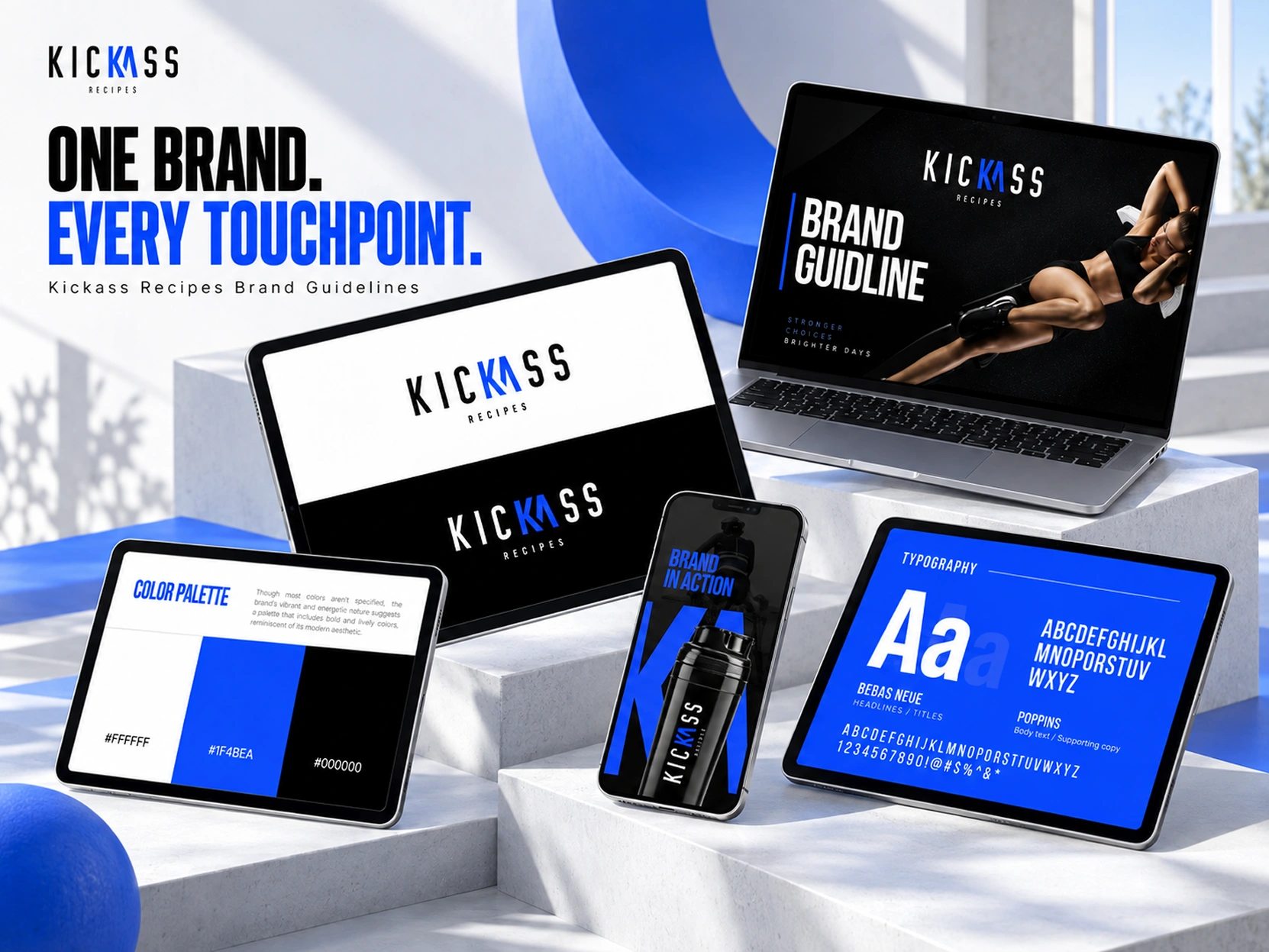
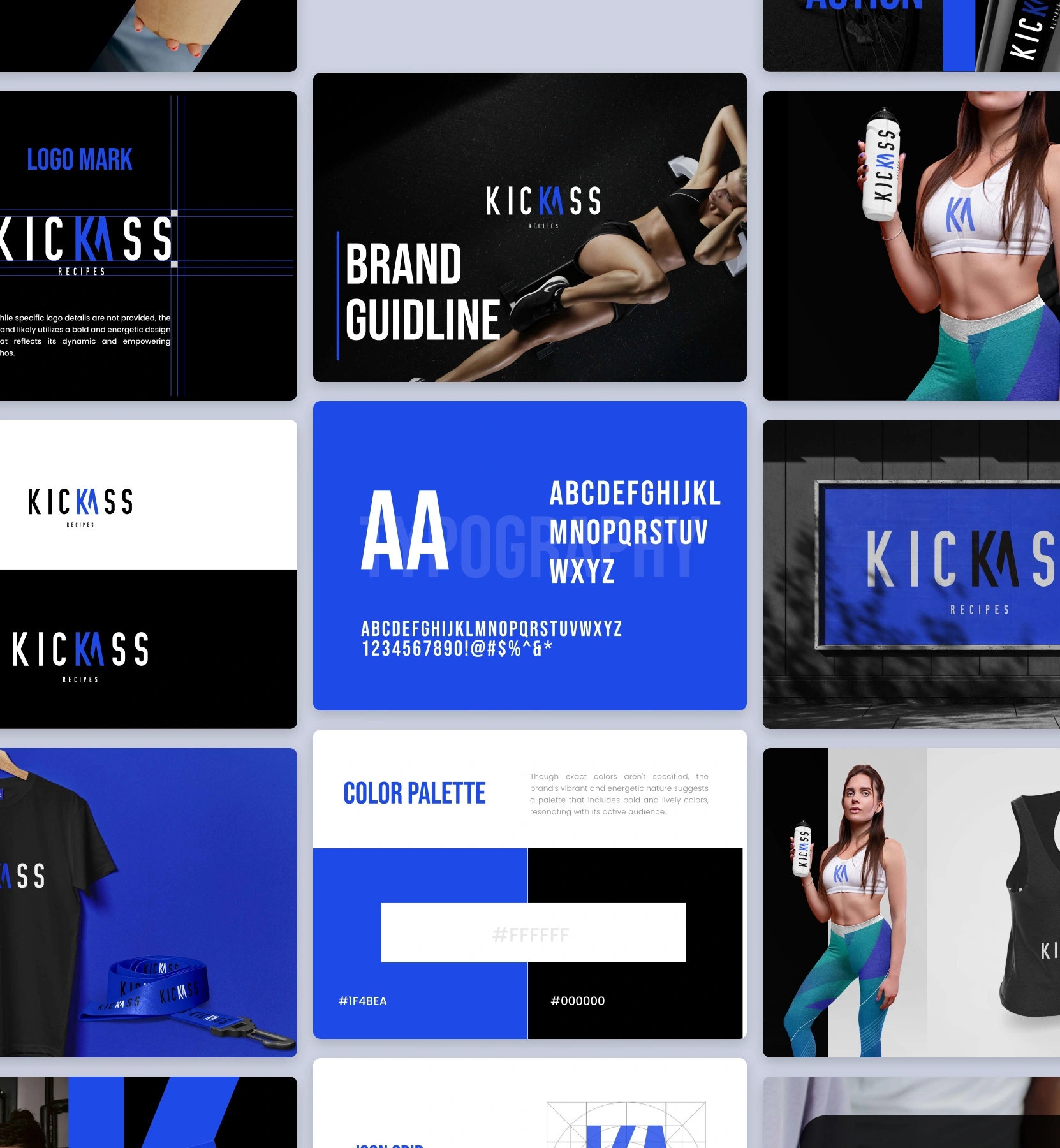
The wordmark uses tall, condensed lettering, with the blue-highlighted letters creating a recognizable detail within the name. Its narrow proportions give it a strong presence on everything from a website navigation bar to a small social graphic.
The typography follows the same thinking. Bebas Neue gives headlines their bold, athletic character, while Poppins keeps supporting text practical and readable.
The color system is deliberately simple. Electric blue (#1F4BEA) brings energy and recognition, while black and white provide the contrast needed for both photography and information-heavy layouts.
Rather than introducing more colors for variety, the identity uses scale, contrast, and imagery to create different moods.
The brand guidelines establish how these elements work together across digital content, merchandise applications, social graphics, and the website itself.
Giving KICKASS its own digital home
A social post can introduce someone to a recipe, but it is not always the best place to return when they want to cook it, compare options, or understand how it fits into their training.
The website needed to make that next step easier.
We structured the homepage around a clear introduction to the brand, followed by the recipes and the ways visitors could access them.
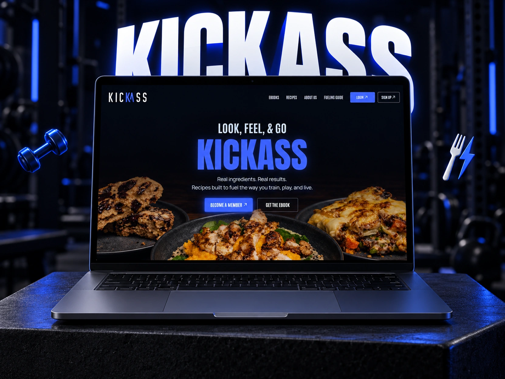
The opening message, "Look, Feel, & Go KICKASS," gives the brand a confident introduction without a lengthy explanation. Food photography immediately supports that message, making the experience feel as much about eating well as performing well.
The navigation gives visitors direct access to recipes, eBooks, the fueling guide, and account options. Membership and eBook calls to action are introduced early, but the site also gives people enough information to understand what they are signing up for.
The aim was to make the website feel like a natural extension of the creator's content, while giving the growing recipe collection a more organized home.
Making the recipes useful, not just beautiful
The recipe experience is where the purpose of KICKASS becomes clearest.
This is not simply a gallery of attractive meals. The collection is built around how people actually eat when they train.
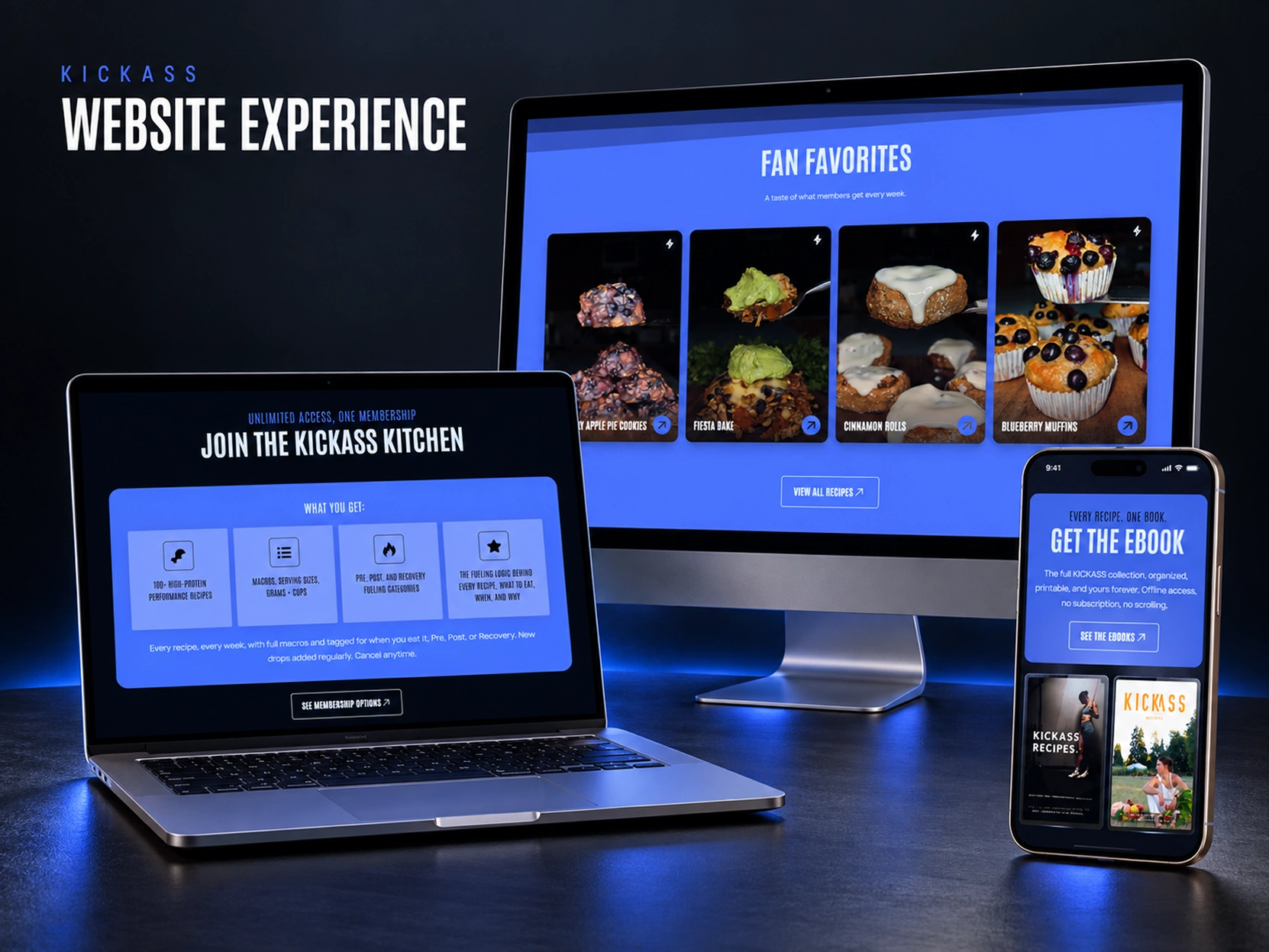
Recipes include nutritional information such as protein, carbohydrates, fats, calories, and serving measurements. They are also organized around Pre-Workout, Post-Workout, and Recovery needs.
That distinction matters.
Someone looking for a breakfast before training has a different need from someone planning dinner after a long workout. Organizing recipes by meal type and nutritional purpose helps visitors find something appropriate without searching through unrelated content.
The visual design supports that structure. Large food photography makes the meals appealing, while clear labels, consistent recipe cards, and recognizable actions make the collection easier to explore.
One collection, two ways to access it
The website also needed to explain the difference between the membership and the eBooks.
The KICKASS Kitchen membership provides access to the growing recipe collection, including 100+ recipes, detailed macros, measurements, and ongoing additions.
The eBooks offer a different experience: organized, printable collections that customers can keep and use offline.
Rather than treating both options as interchangeable products, the website presents their benefits separately. Visitors can understand whether they want continued access to the full recipe library or a downloadable collection.
This distinction gives each offer a clear place in the experience.
Keeping the experience consistent on mobile
The mobile version was an important part of the design.
KICKASS reaches people through social content, and the website needed to feel natural when someone moves from that content to a phone-sized screen.
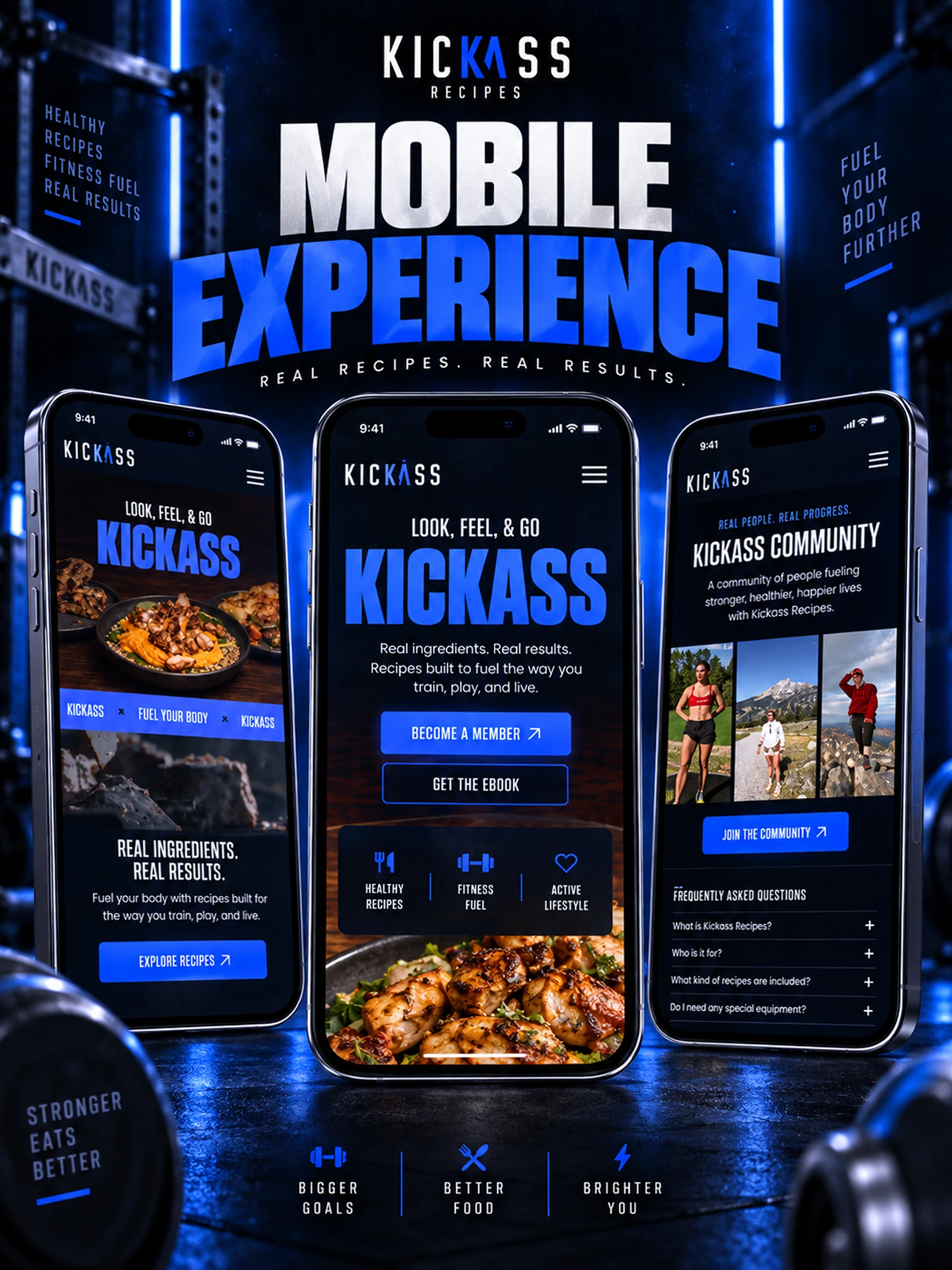
The mobile layouts retain the brand's strong headings, food photography, and recognizable blue actions while adapting the information to the available space.
The homepage makes the recipe offering immediately visible. Membership and eBook options remain easy to reach, while the community section introduces the people and lifestyle behind the recipes.
We kept the visual identity consistent without trying to squeeze the desktop layout onto a smaller screen.
The result is a website that keeps its character across devices, whether someone is browsing recipes at a desk or checking meal ideas from their phone.
A brand that still feels like its creator
An important part of KICKASS is Kate herself.
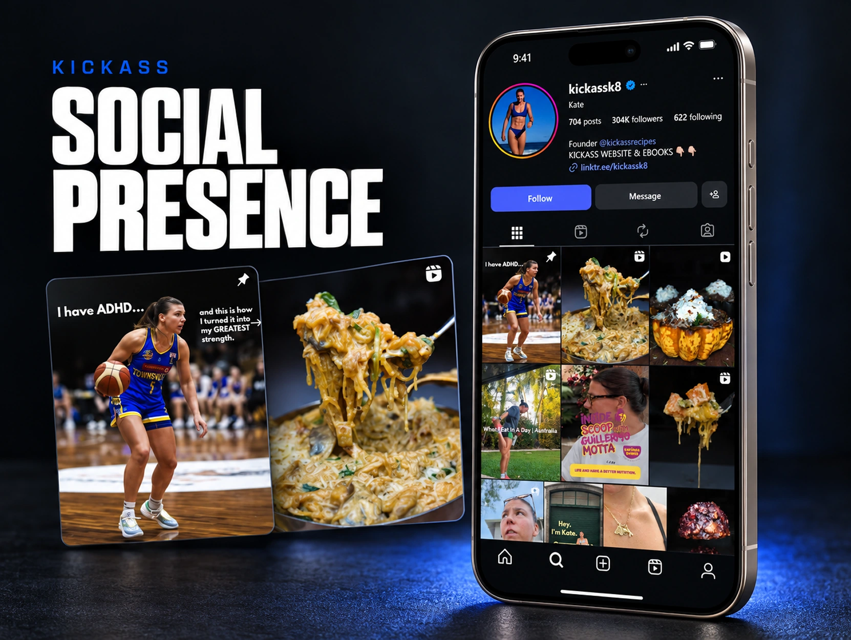
Her content brings together fitness, food, sport, and everyday life. The brand identity needed to sit comfortably alongside that variety rather than forcing everything into one rigid visual format.
The social presentation shows why this matters.
Training content, recipe photography, and personal moments can all belong to the same brand without looking identical. The recognizable wordmark, color palette, and bold visual language provide continuity while allowing the content itself to remain varied and personal.
That flexibility is what makes the identity useful beyond the website.
It gives KICKASS a recognizable presence while leaving room for the real people, meals, and experiences that make the brand interesting.
The finished experience
KICKASS Recipes now has a consistent identity and a dedicated website that brings its recipes, nutritional guidance, membership, and eBooks together.
The brand system gives the business a recognizable visual direction. The website makes the collection easier to explore. The membership and eBook sections give visitors clear ways to access the content, while the responsive layouts carry the same experience across screens.
What makes this project distinctive is the relationship between the two sides of KICKASS: the energy of an athletic brand and the practical usefulness of a recipe collection.
Neither needs to overpower the other.
The finished work gives the recipes a stronger home and the brand room to grow, while staying connected to the creator and community behind it.
Like this project
Posted Oct 8, 2026
Designed KICKASS Recipes' brand identity and responsive website, bringing performance recipes, nutrition guides, memberships, and eBooks together.