HYBRÉ Performance — Brand Identity & Art Direction

MUHAMMAD HUNAIN


A living botanical editorial, introducing HYBRÉ through oversized typography, natural textures, a matte-black product, and motion.
A morning workout. A full calendar. Somewhere to be after hours.
HYBRÉ Performance is haircare built for the spaces between. An athlete-inspired, beauty-forward brand designed around people who move through life without slowing down.
The challenge was to give that idea a visual identity of its own. Something with the strength of a performance brand, the sophistication of contemporary beauty, and enough personality to move comfortably between the two.
Strength, with a softer side.
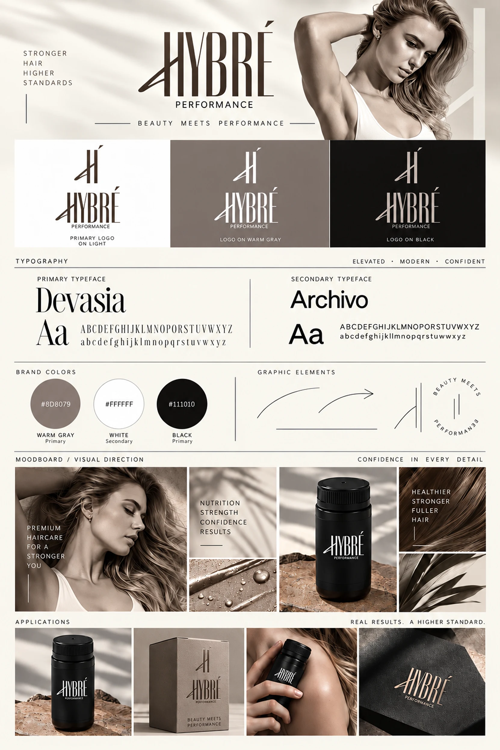
The identity finds its character in contrast.
Tall, expressive lettering meets sharp, angular details. Warm gray softens the confidence of black and white. Devasia brings distinction to the headlines, while Archivo keeps everything else grounded and clear.
The custom brandmark and symbol establish the foundation, supported by a deliberately restrained visual system that leaves room for the photography, products, and messaging to do their part.
Nothing needs to shout to feel strong.
More than a product on a shelf.
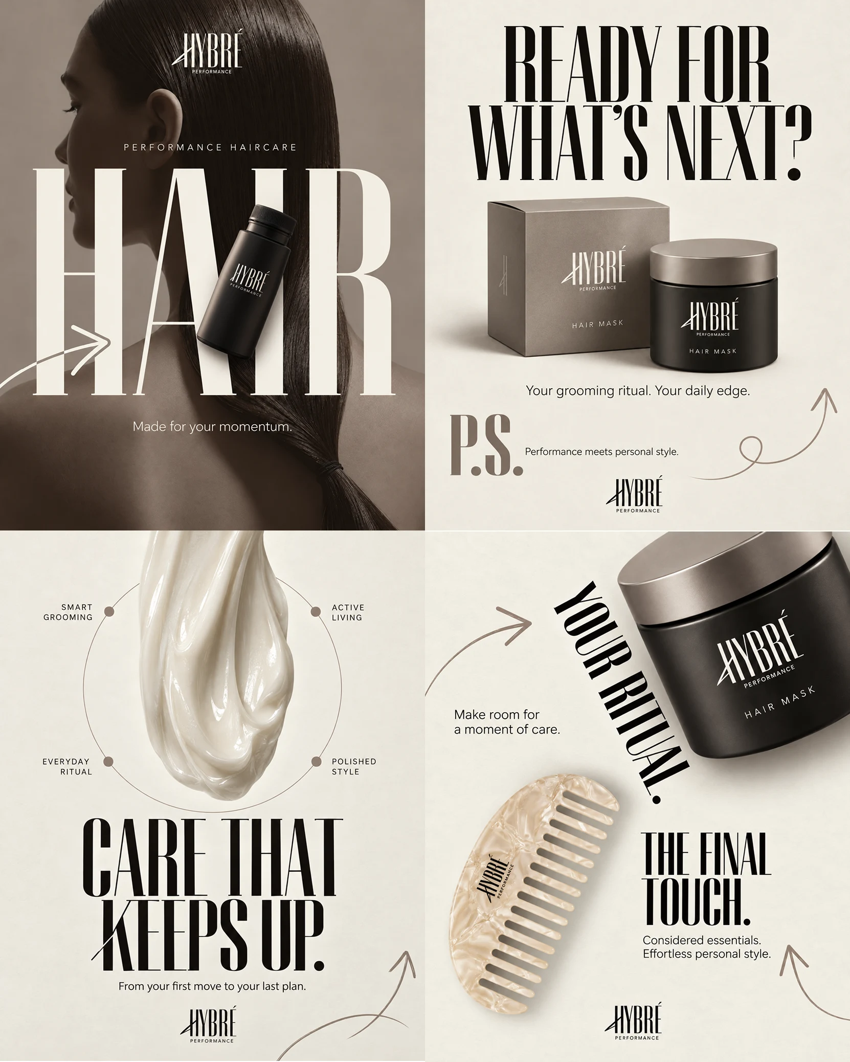
The identity extends into packaging explorations, product-focused compositions, and editorial campaign concepts.
Oversized typography becomes part of the photography. Matte-black containers sit against warm neutral backgrounds. Organic textures, sculptural details, and considered negative space create a visual language that feels tactile rather than overly polished.
The intention was to make the products feel as considered in a quiet everyday ritual as they do in a bold campaign image.
A little personality goes a long way.
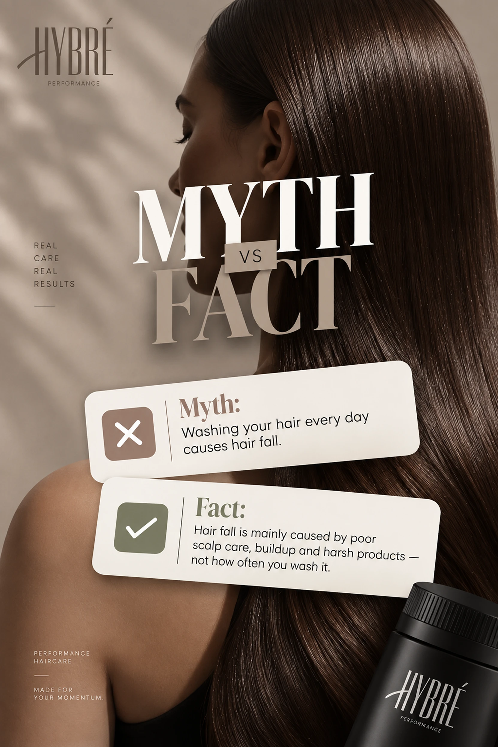
A brand also needs to know how to have a conversation.
The Myth vs Fact concept explores a more accessible side of HYBRÉ, pairing close-up hair photography with confident typography and simple editorial information cards.
It's a different pace from the product campaigns, but unmistakably part of the same family.
The visual system stays consistent without making every piece of communication look the same.
Bringing the identity online.
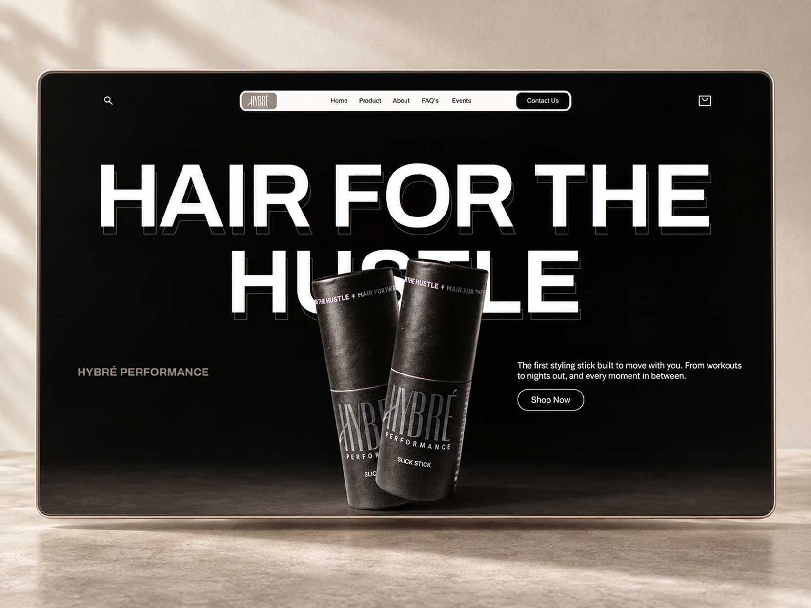
The digital direction takes the brand's strongest elements and gives them room to make an impression.
A near-black canvas. Monumental typography. Direct, confident messaging. Product imagery that takes center stage.
The Hair for the Hustle hero is designed to establish the brand's personality immediately, before moving into the details of what it offers.
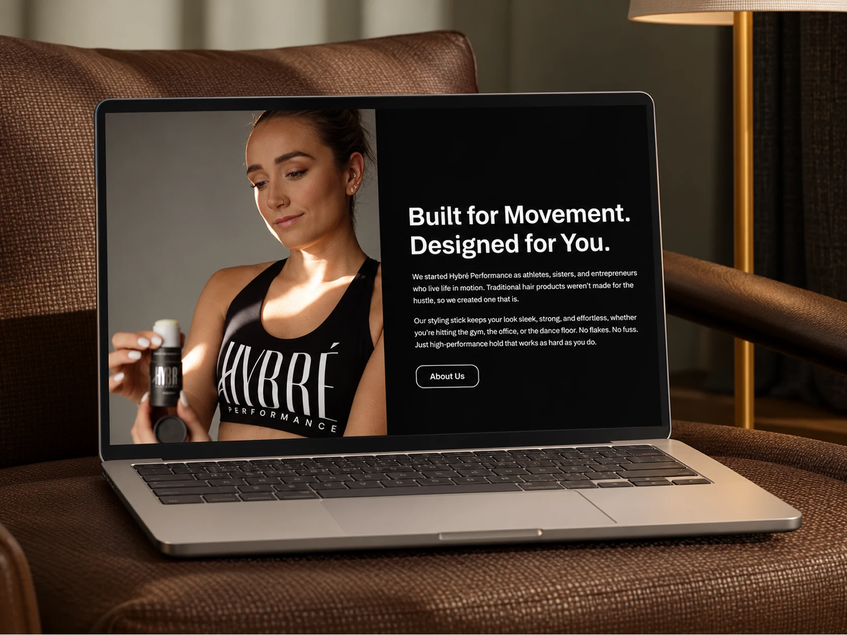
Beyond the opening impression, the experience becomes more personal.
Lifestyle photography and a simpler editorial layout introduce the people and thinking behind the brand. A warmer, more human counterpoint to the bold product-led hero.
Together, the screens explore how HYBRÉ's identity can shift between expressive campaigns and straightforward storytelling without losing its character.
An identity made to keep moving.
HYBRÉ brings together the confidence of athletic performance and the everyday intimacy of personal care.
From the brandmark to packaging, from editorial storytelling to the animated cover and digital concepts, each application adds another expression of the same idea.
Made for your momentum.
Like this project
Posted Oct 10, 2026
A bold, editorial identity for HYBRÉ Performance, bringing athletic energy and modern beauty together through branding, packaging, digital design, and motion.