HOFLORE Digital Storefront Design

MUHAMMAD HUNAIN


The curve of a handle. Light moving across leather. A silhouette that holds your attention before you know its name. HOFLORE’s digital experience begins with these details, giving the pieces enough space to make their own impression.
HOFLORE is a New York leather house creating distinctive handbags in small batches. The project brought that character into a storefront designed in Figma and developed on Shopify, with an emphasis on expressive imagery, considered typography, and a clear journey from discovery to purchase.
The central design question was how to give an online store the intimacy and presence of a fashion house. Visitors needed to feel the character of the collection while finding their way naturally through the products, the story, and the practical details of shopping.
That balance shaped the experience.
The opening composition pairs close views of the leather with photography that shows the bags being worn. Together, they communicate texture, proportion, and personality. The wordmark sits quietly above the imagery, while fine navigation and a restrained collection link leave the photographs room to breathe. The first impression feels composed and unhurried.
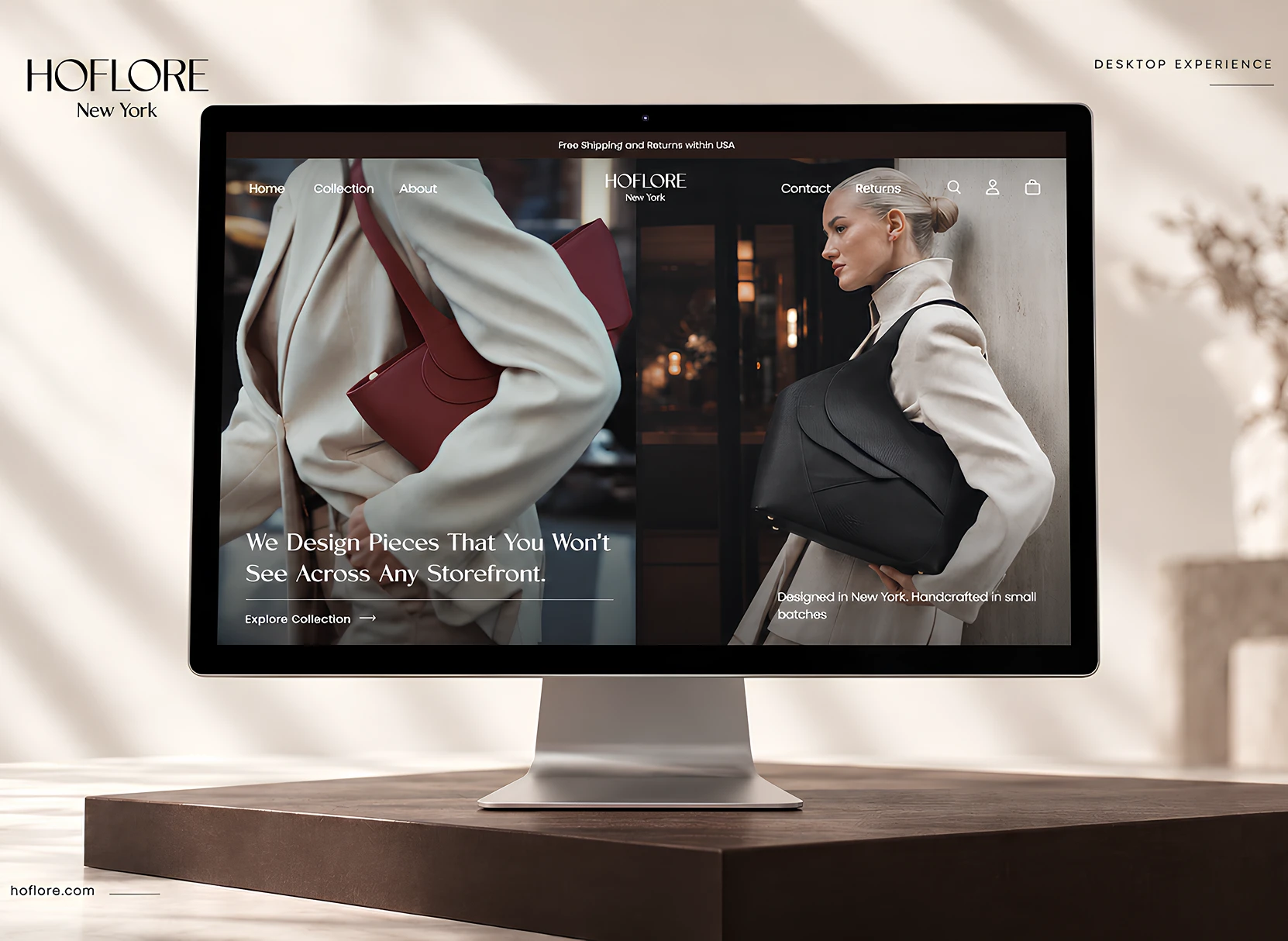
The desktop homepage mockup in the sunlit room.
Colour carries that atmosphere throughout the design. Warm ivory and soft sand bring lightness to the layouts; deep espresso gives the collection and footer a rich, grounding presence. Cognac tones connect the surrounding visual language to the leather itself. Moving between these surfaces creates a gentle rhythm, with brighter moments for looking closely and darker sections that draw attention to the silhouettes.
Typography adds another layer of character. Vonca gives the headlines an elegant, distinctive voice, paired with Regulator Nova for supporting text and interface details. The relationship between expressive titles and quieter information keeps the experience readable while giving it a recognisable personality. Fine rules, generous margins, and deliberate changes in scale complete the composition.
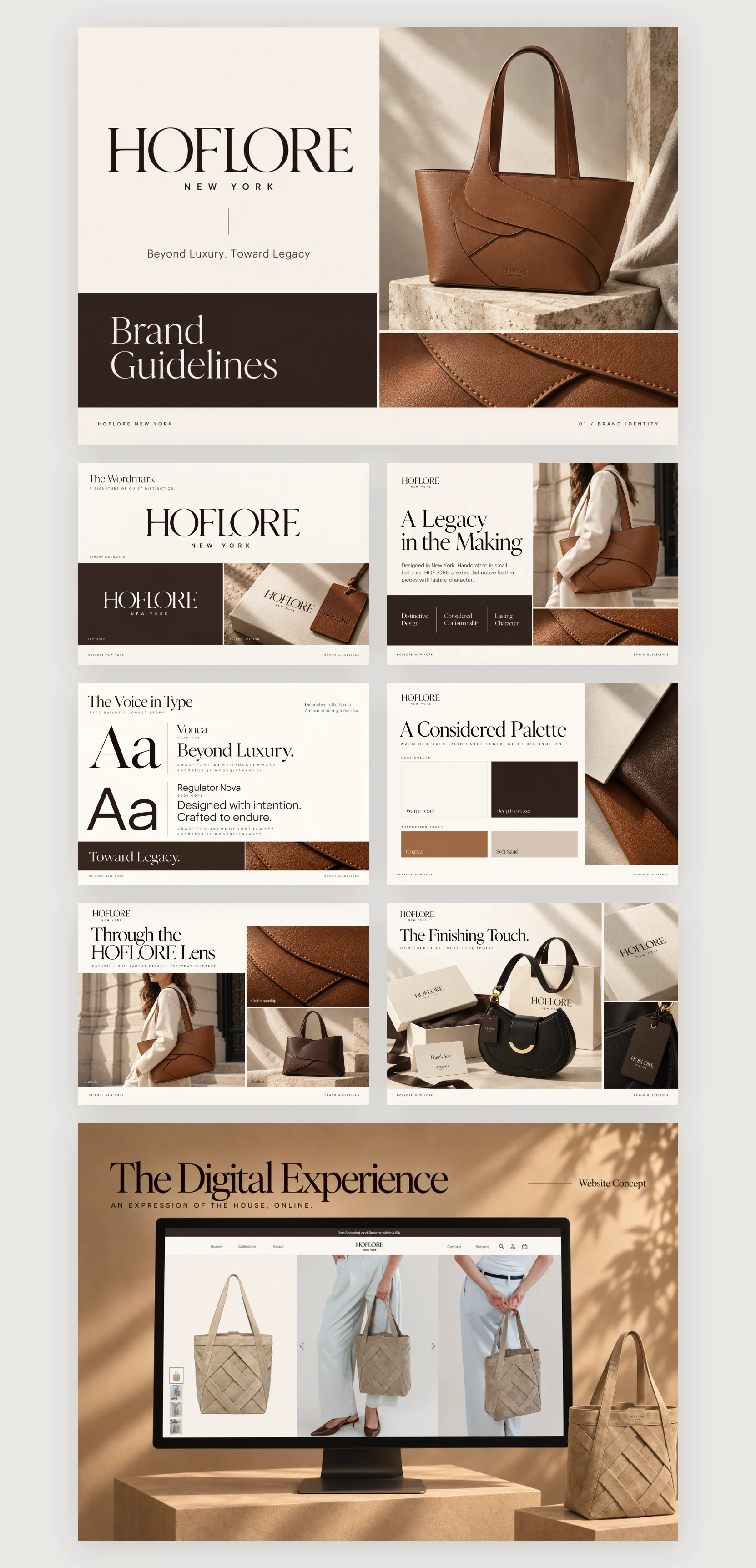
The brand guidelines composition showing typography, colours, imagery, and packaging.
The First Light collection brings that visual language into the shopping experience. Light product backgrounds define each bag’s shape, while a consistent grid makes the pieces easy to compare. Names and prices sit close to the imagery, allowing the photography to remain prominent without obscuring the information a customer needs.
There is also room to understand the house behind the objects. The HOFLORE story introduces the thinking behind the collection, giving the products a context beyond their appearance. New York imagery, material details, and editorial photography connect the storefront to a wider sense of place and craft.
The accompanying brand presentation extends the same aesthetic into packaging, printed applications, and campaign compositions. The wordmark, warm palette, and tactile imagery remain consistent across these settings, showing how the identity can hold together from a shopping bag to a mobile screen.
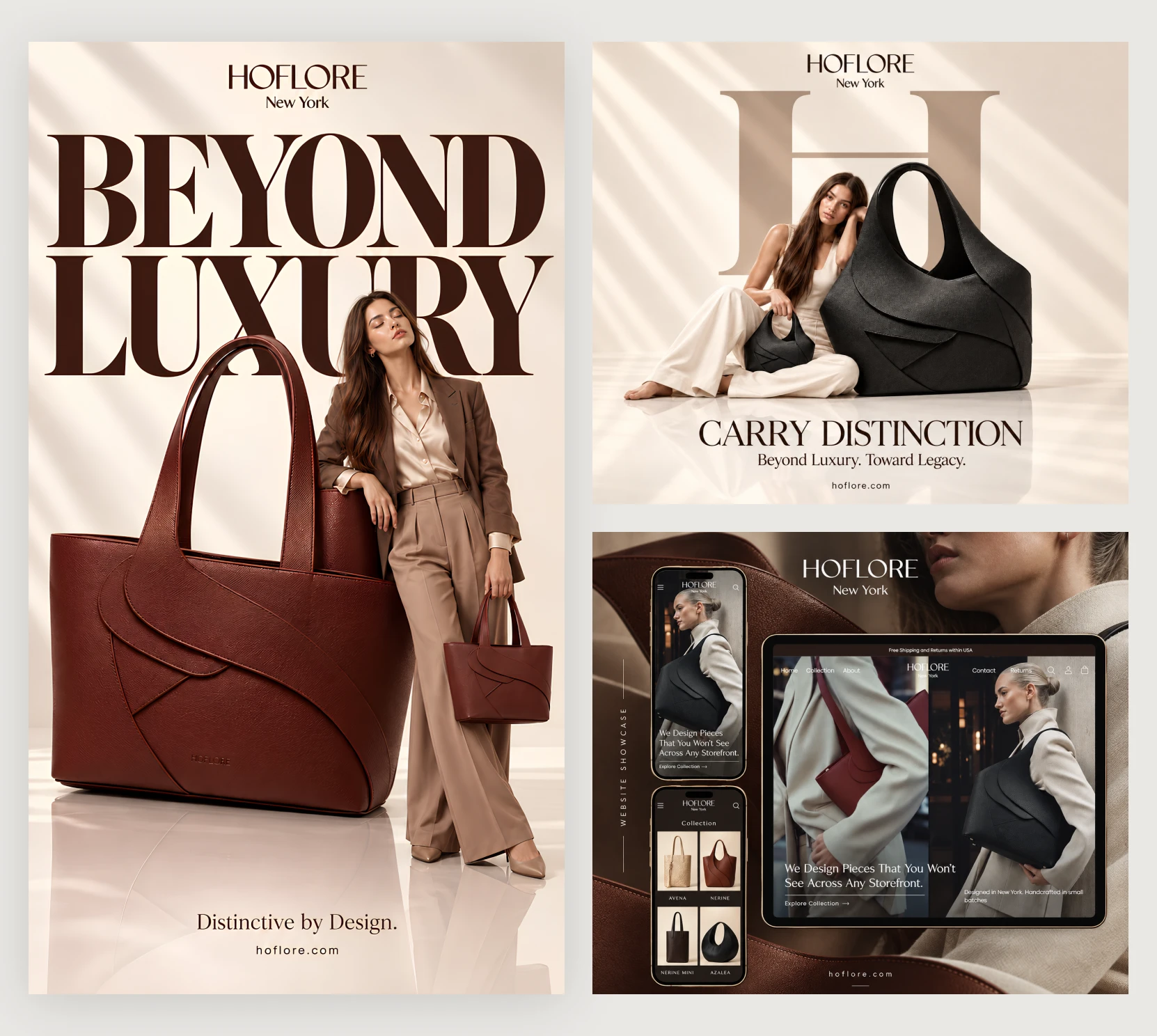
The campaign collage featuring “Beyond Luxury,” “Carry Distinction,” and the website mockups.
Taking the design from Figma into Shopify brought the visual direction into a working retail experience. The mobile layouts carry the same character through narrower compositions: expressive photography, prominent product imagery, compact navigation, and clearly grouped information. The sense of space remains central, even when the screen becomes smaller.
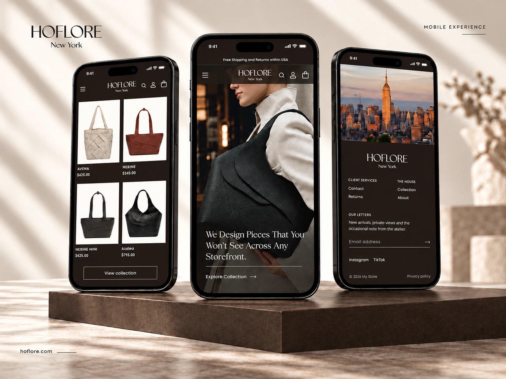
The three mobile screens showing the collection, homepage, and footer.
The finished storefront gives HOFLORE a digital presence with warmth, clarity, and a distinct point of view. Its beauty comes from the relationship between the details: the weight of a headline, the colour behind a product, the crop of a photograph, and the space left around it.
Every part of the experience brings the eye back to the pieces.
Like this project
Posted Sep 14, 2026
Designed and built HOFLORE’s Shopify storefront, using expressive imagery and a clean shopping experience to let the leather goods lead.
Likes
0
Views
3
Timeline
Jun 13, 2026 - Sep 11, 2026