The Potter’s House — An identity built for every expression

MUHAMMAD HUNAIN


The Potter’s House reaches people through more than one room.
Worship, community, ministries, events, digital experiences and everyday moments all become different expressions of the same organization. Its mission centers on helping people discover purpose, experience God’s love and create impact, with both in-person and online ways to connect and belong.
The identity needed that same range.
Instead of designing a collection of isolated assets, we created a visual system that could move between those environments while still feeling unmistakably The Potter’s House.

A foundation strong enough to flex
The system starts with its most recognizable pieces.
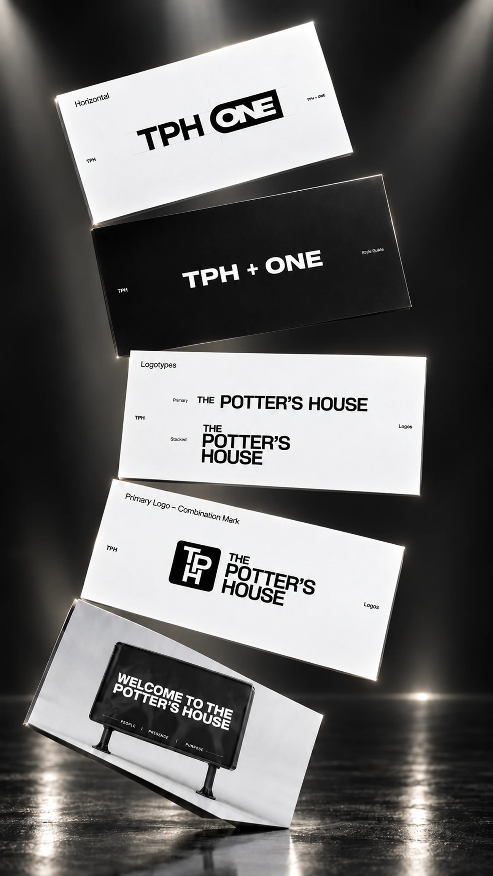
A bold wordmark, the TPH monogram, supporting stamps and clearly defined lockups create a compact family of marks instead of asking one logo to solve every situation.
Each has a job.
The full mark can carry the name when context matters. The monogram can become the shorthand. The stamp introduces another layer of personality without moving away from the core identity.
Clear-space, scale and usage rules make those marks repeatable rather than dependent on whoever happens to be designing the next piece.
One identity. More than one voice.
A living organization rarely stays inside a single lockup.
The visual language was built to extend into initiatives such as TPH ONE while keeping the relationship to the parent identity visible. Typography, spacing, proportion and contrast provide the connective tissue.
The result is a system that can introduce something new without making it look unrelated.
That distinction mattered throughout the project:
Consistency shouldn’t mean sameness.
Typography became part of the personality
The type system carries much of the brand’s confidence.
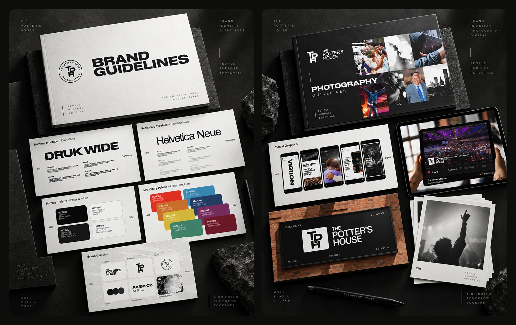
Druk Wide gives major statements scale and presence. Helvetica Neue handles the quieter work around it — information, supporting copy and the moments where clarity matters more than impact.
Together, they create a useful contrast:
bold enough for a stage, disciplined enough for a system.
Hierarchy rules take that further, making it possible to move from oversized campaign messaging to detailed communication without having to invent a new visual language every time.

Black and white anchors it. Color changes the energy.
The core palette stays deliberately restrained.
Black, white and neutral tones give the identity a reliable base across signage, typography, photography and digital applications. A broader secondary spectrum introduces color when the communication needs more energy.
That makes color contextual rather than compulsory.
Some moments need restraint.
Others need celebration, movement or immediacy.
The system can do both without losing recognition.
People were never meant to become background imagery
The Potter’s House describes community as central to how people connect, grow and belong, while its ministries serve different stages and needs across that community.
So photography couldn't behave like filler.
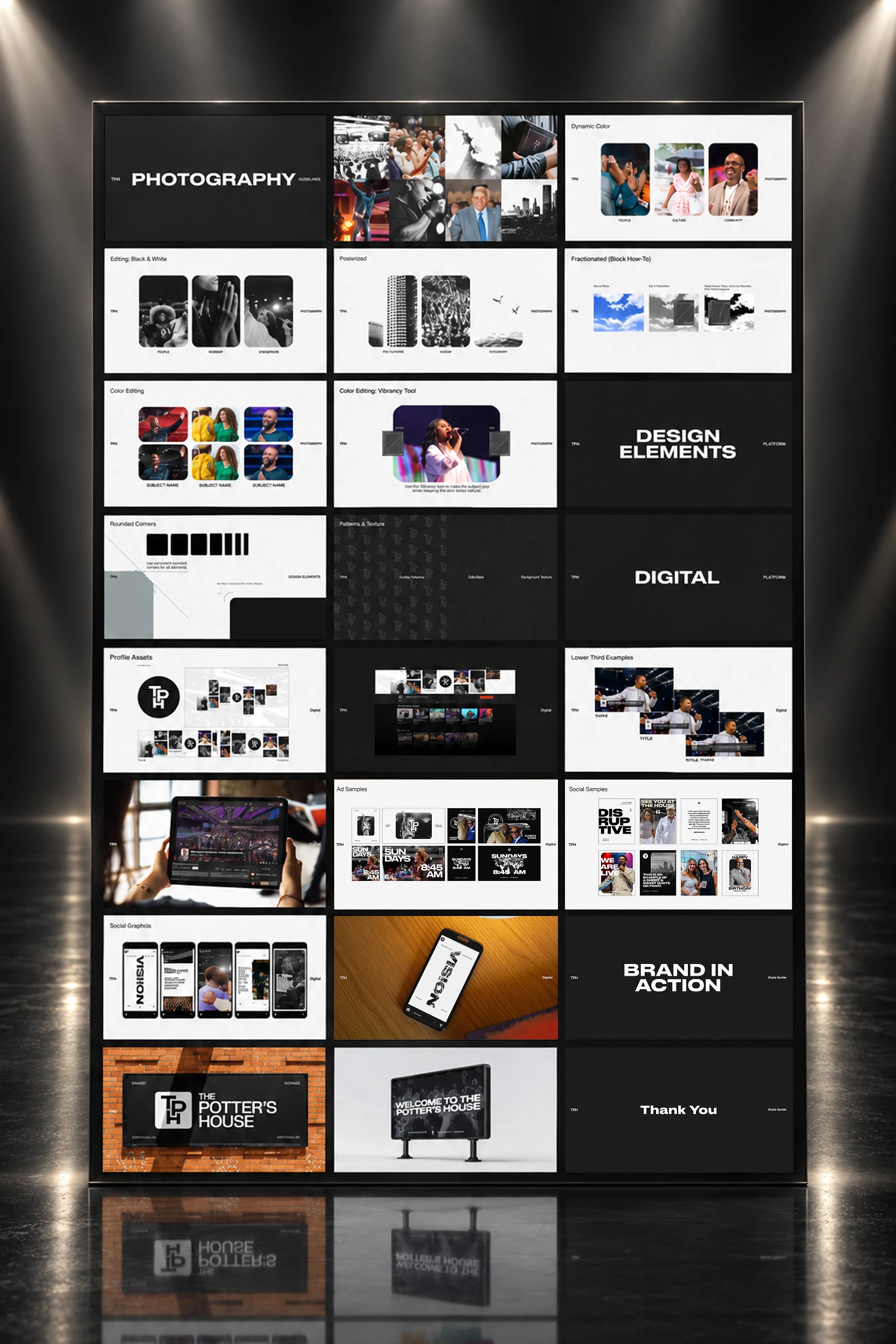
The image system was developed around real human moments — worship, people, speakers, community, movement and place.
Black-and-white treatments create focus and intensity. Dynamic color preserves the atmosphere when color itself is part of the moment. Cropping, contrast and image treatment give photography enough structure to sit alongside the graphic system rather than underneath it.
The people remain the subject.
The identity frames them.
The real test happens outside the guidelines
A brand system can look perfect in a presentation and still fall apart the moment people start using it.
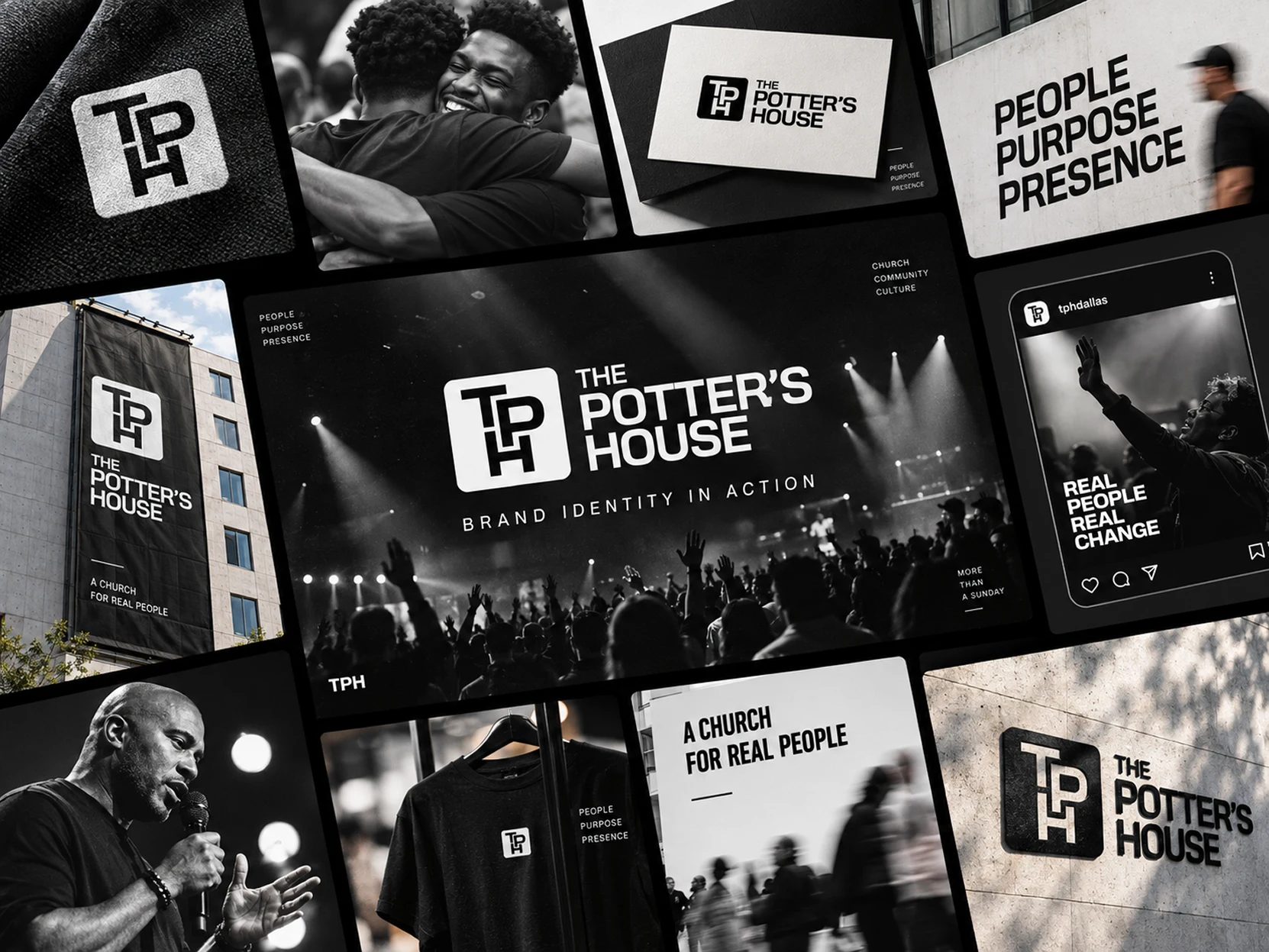
So the identity was pushed onto the places where The Potter’s House actually has to communicate:
social feeds, livestreams, campaign graphics, screens, apparel, signage and physical environments.
Across those applications, the layouts change.
The underlying decisions don't.
Strong typography. Deliberate contrast. Human photography. Recognizable marks. Enough restraint to let the message lead.
That makes the system recognizable without forcing every execution into the same template.
Built to be used, not admired from a distance
The final guidelines bring the system together: logo behavior, typography, hierarchy, color, photography, digital treatments and real-world applications.
But the purpose of that document isn't to freeze the brand.
It's to make the next decision easier.
A useful system gives future designers and teams enough structure to create confidently without needing to recreate the original project every time.
That is where guidelines stop being documentation and start becoming infrastructure.
One system, many expressions
The Potter’s House operates across worship, events, ministries, community experiences and digital channels; its own website reflects that breadth through in-person and online engagement, community programs and content.
The identity was built with that reality in mind.
Not so every expression would look identical.
So every expression could still feel like it came from The Potter’s House.
A strong identity isn’t recognized because everything looks the same. It’s recognized because everything feels like it belongs together.
Like this project
Posted Sep 17, 2026
A visual identity system for The Potter’s House, bringing logos, typography, color, photography and digital applications together in one flexible brand system.
Likes
0
Views
6
Clients
The Potter’s House