YONU Earbud Distinctive Design Project

MUHAMMAD HUNAIN


An audio product makes its first impression before anyone hears it. The finish, the packaging, the way light catches the charging case: each detail shapes what someone expects when they pick it up.
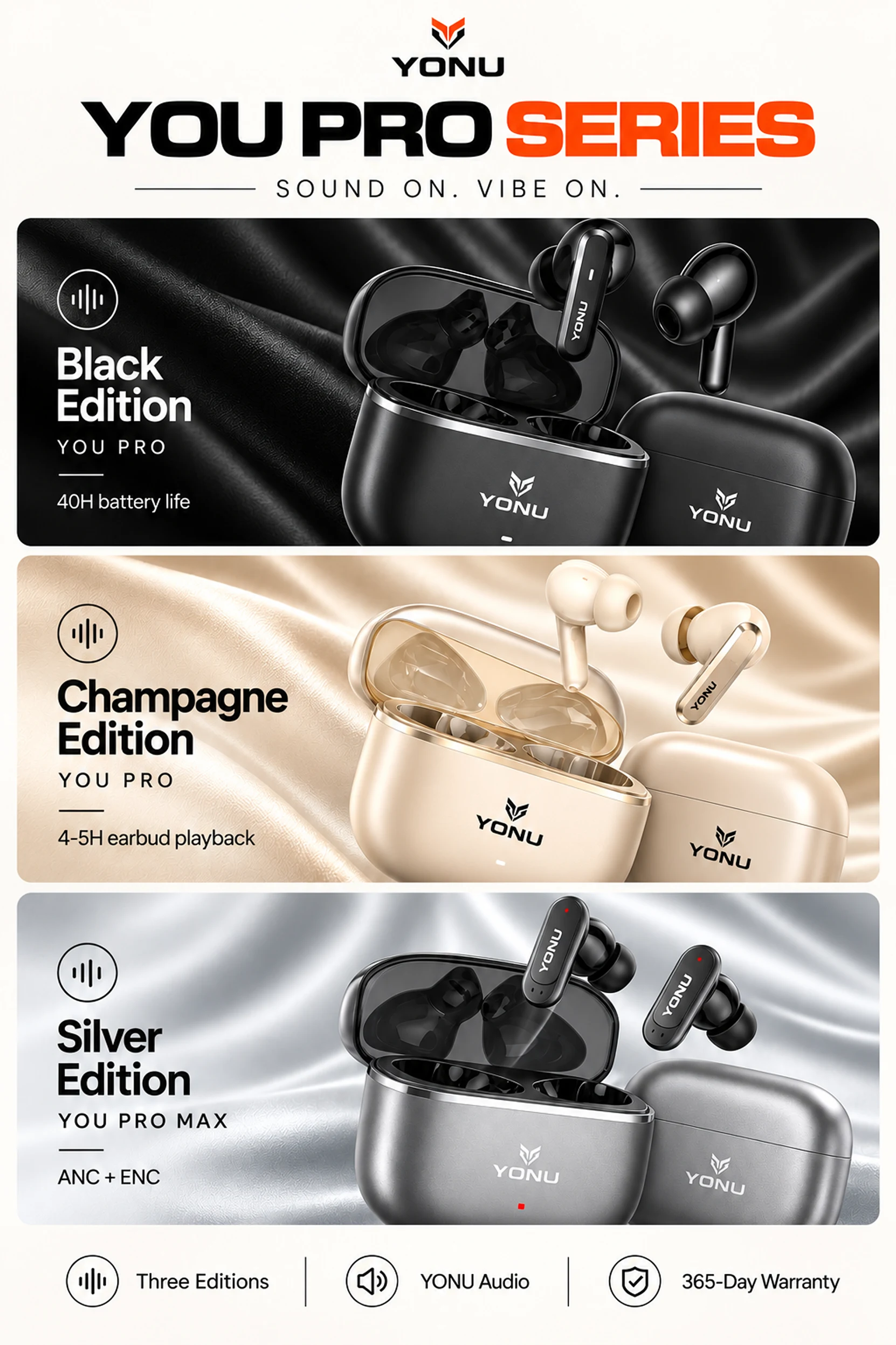
For YONU, the design focus was bringing that first impression together across the YOU PRO Black and Champagne editions and the YOU PRO MAX Silver edition.
Each needed a distinct presence. Together, they needed to feel like a considered product family.
Let the Finish Set the Mood
The product colours became the starting point for the visual direction.
Black sits against dark, tactile surfaces, with controlled highlights defining the earbuds and case. The composition feels concentrated and graphic, giving the polished edges room to stand out.
Champagne introduces warmth. Cream backgrounds, soft reflections, and fabric textures extend the colour of the product into its surroundings. The presentation feels lighter while retaining the same attention to detail.
Silver brings a cooler, more technical expression. Metallic surfaces and close crops draw attention to the shape of the earbuds and their construction.
Across all three, the YONU emblem, strong typography, and consistent product naming provide continuity. The surrounding atmosphere changes; the brand remains recognisable.
Make the Detail Worth a Closer Look
The product imagery works at two distances.
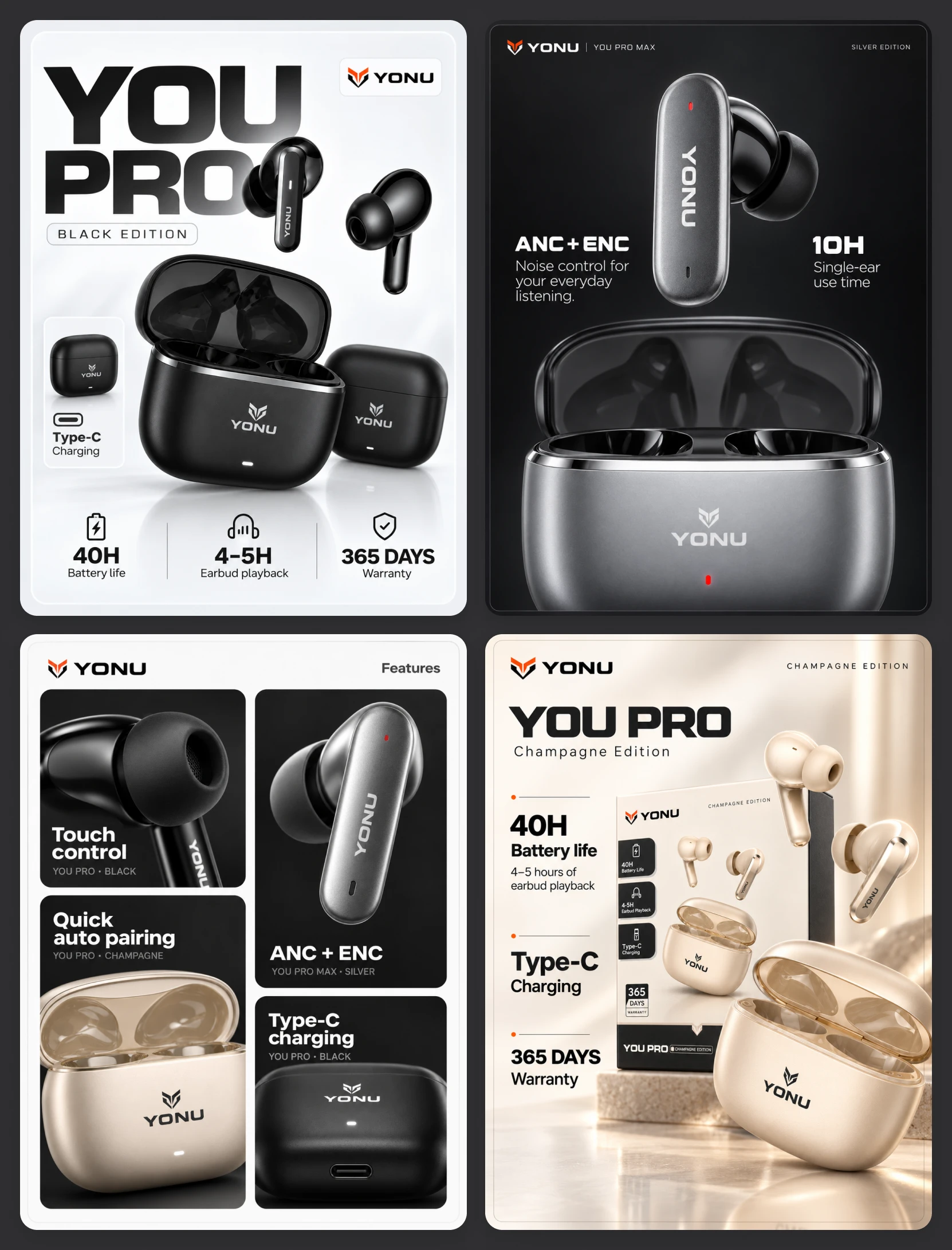
From further away, large silhouettes and clear model names establish recognition. Up close, the open cases, ear tips, charging ports, and reflective surfaces give the viewer more to explore.
Packaging and feature compositions bring practical information into that same visual language. Short labels, simple icons, and grouped specifications establish an order around the product. The information has a defined place, allowing the imagery to remain prominent.
The Champagne presentation shows this relationship directly: packaging and product sit together, with matching colours and typography connecting the object to the box it arrives in.
Bring the Product Into Someone’s World
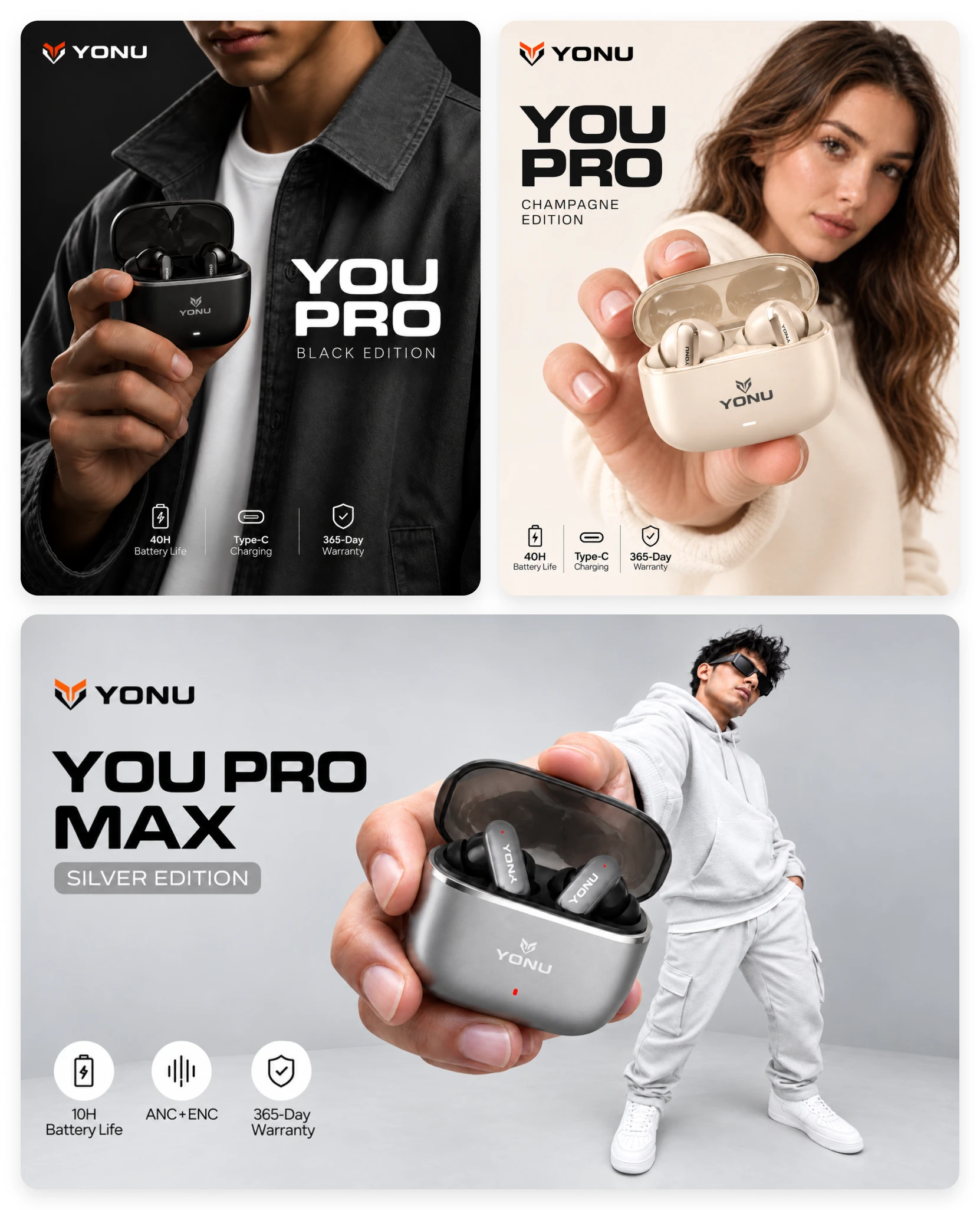
The lifestyle compositions take the same three colour directions into a more personal setting.
Dark denim supports the Black edition. Soft cream clothing echoes Champagne. Pale grey styling gives Silver a clean, contemporary setting.
In each composition, the charging case is held towards the viewer. That repeated gesture gives the campaign a consistent point of view and makes the product feel immediate. The person adds expression and context, while the earbuds remain the visual focus.
Large model names and restrained feature callouts connect these portraits to the packaging and product compositions.
The resulting presentation gives YONU room to express different tastes without losing its identity. Each edition has a recognisable mood, supported by a shared approach to typography, product detail, and composition.
The work makes the range feel connected from the first campaign image to the packaging held in someone’s hands.
Like this project
Posted Sep 16, 2026
Branding, Packaging and campaign visuals that give YONU’s Black, Champagne, and Silver audio editions distinct personalities within one coherent brand.
Likes
0
Views
8