Fusion · Making the Right Phone Easier to Find

MUHAMMAD HUNAIN


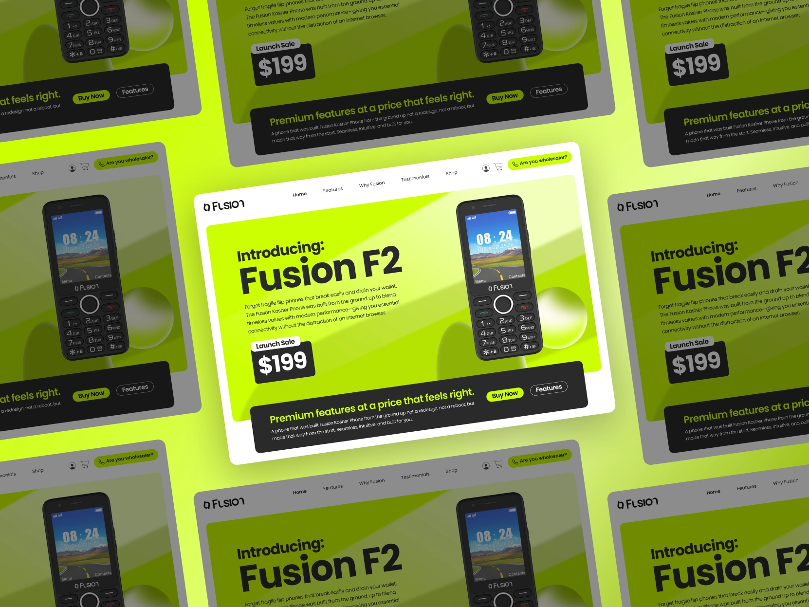
Choosing a kosher phone involves more than choosing a device. Customers also need to decide which features belong in their everyday lives: calls, messaging, selected apps, or a more restricted configuration.
Fusion’s store brings these choices together across Fusion and Bliss phones, alongside their accessories. The design task was to make that range understandable while giving the brand a confident, recognisable presence.
That meant solving two connected problems: helping people understand what they could buy, and giving them a reason to pay attention.
Start With the Choice the Customer Is Making
A product name alone cannot explain whether a phone suits someone’s needs. Two devices that look similar may offer different levels of access.
The current phone catalogue makes those distinctions explicit through options such as talk only, talk and text, and configurations with selected apps. These differences are central to the purchase decision.
The supplied homepage design gives this information a broader structure. Fusion, Bliss, and accessories have distinct entry points, followed by product cards and dedicated feature sections. Visitors can identify the relevant range before exploring the details.
The page moves from introduction to selection, then into explanation. Contact information and frequently asked questions provide a place for the questions that remain.
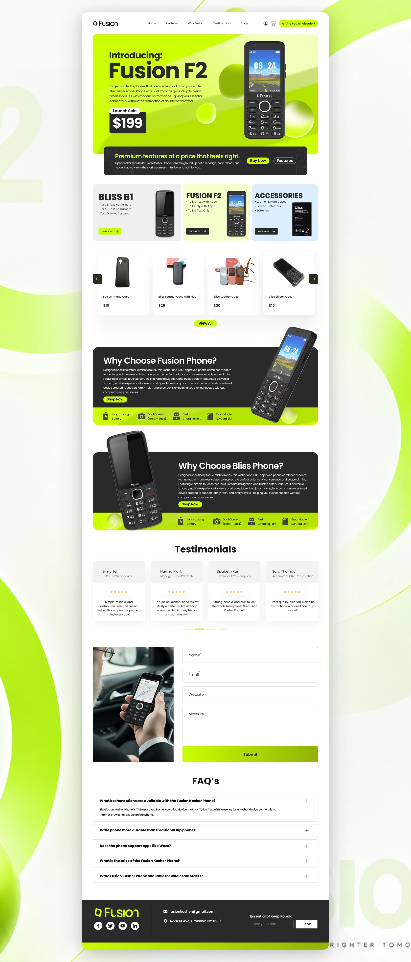
The full homepage shows how product discovery, feature explanations, and support fit together.
Make a Practical Product Worth Looking At
Clarity gives the store its structure. The visual identity gives it character.
The Fusion F2 takes a prominent position in the hero, with its physical keypad, screen, and silhouette clearly visible. Large typography establishes the model name immediately. A contrasting action panel groups the next steps beneath it.
Lime gives the composition its energy. Against the dark device, it creates a strong separation between product and background. Rounded shapes and soft gradients add depth, while white margins keep the surrounding interface orderly.
This is where the design’s personality serves a practical purpose: the product is easy to notice, recognise, and return to throughout the page.
Keep the Next Step Visible on Mobile
On a smaller screen, the product introduction, supporting explanation, and shopping actions need to remain connected.
The mobile layout retains the prominent model name and device imagery, then places the purchase and feature buttons together in a dark panel. Account, cart, and navigation controls sit in a compact header.
The desktop and mobile compositions share the same priorities, with their proportions adjusted to the available space. The product attracts attention; the controls show where to go next.
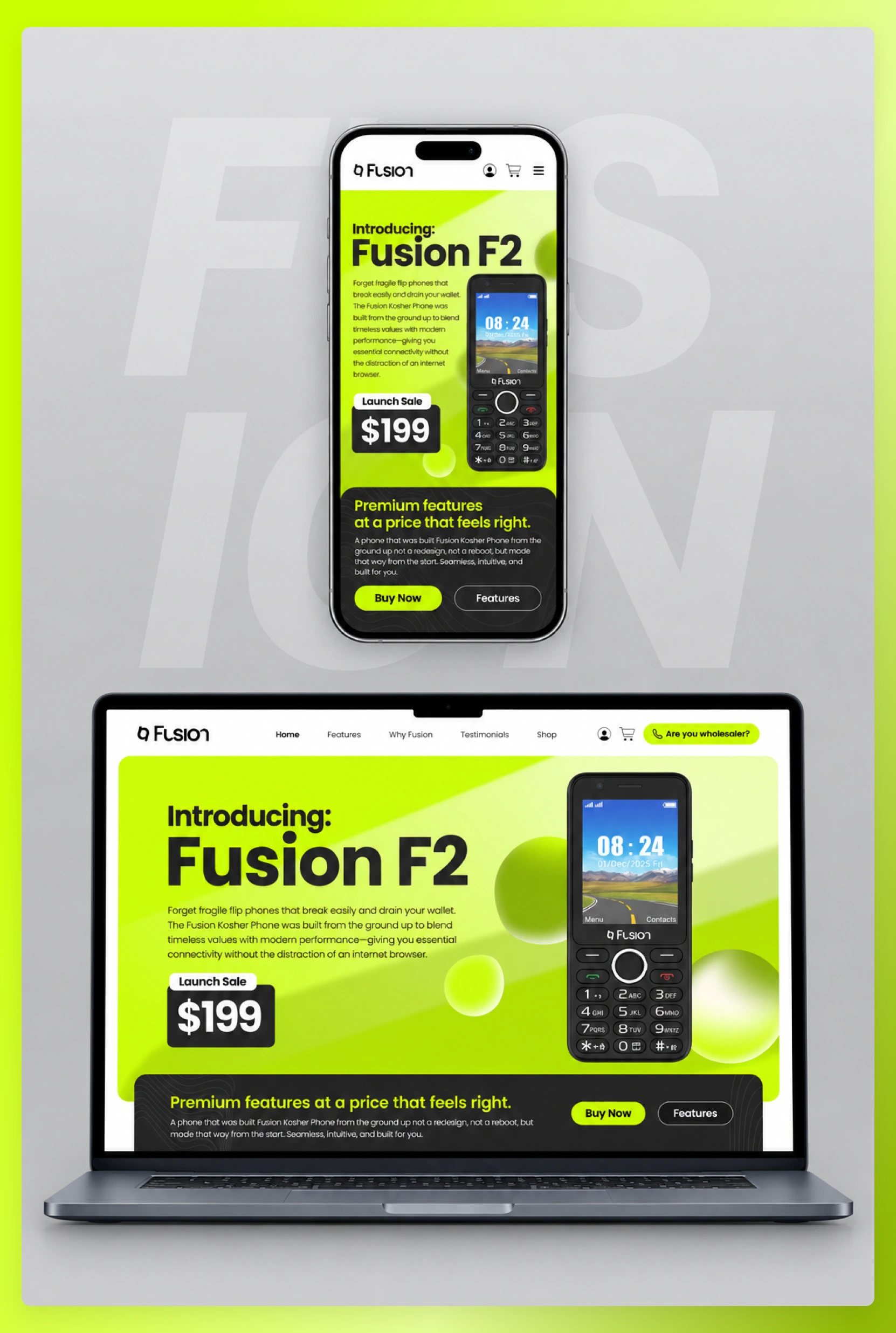
The mobile and laptop pairing shows the two layouts together.
Give the Store a Visual Language It Can Keep Using
The identity extends beyond a single homepage.
The brand guidelines define the relationship between lime, dark neutrals, white, and olive. Poppins provides a consistent type family, with changes in weight and scale separating product names, explanations, and interface labels.
Logo treatments, imagery guidance, and reusable visual elements give future product and accessory presentations a shared foundation.
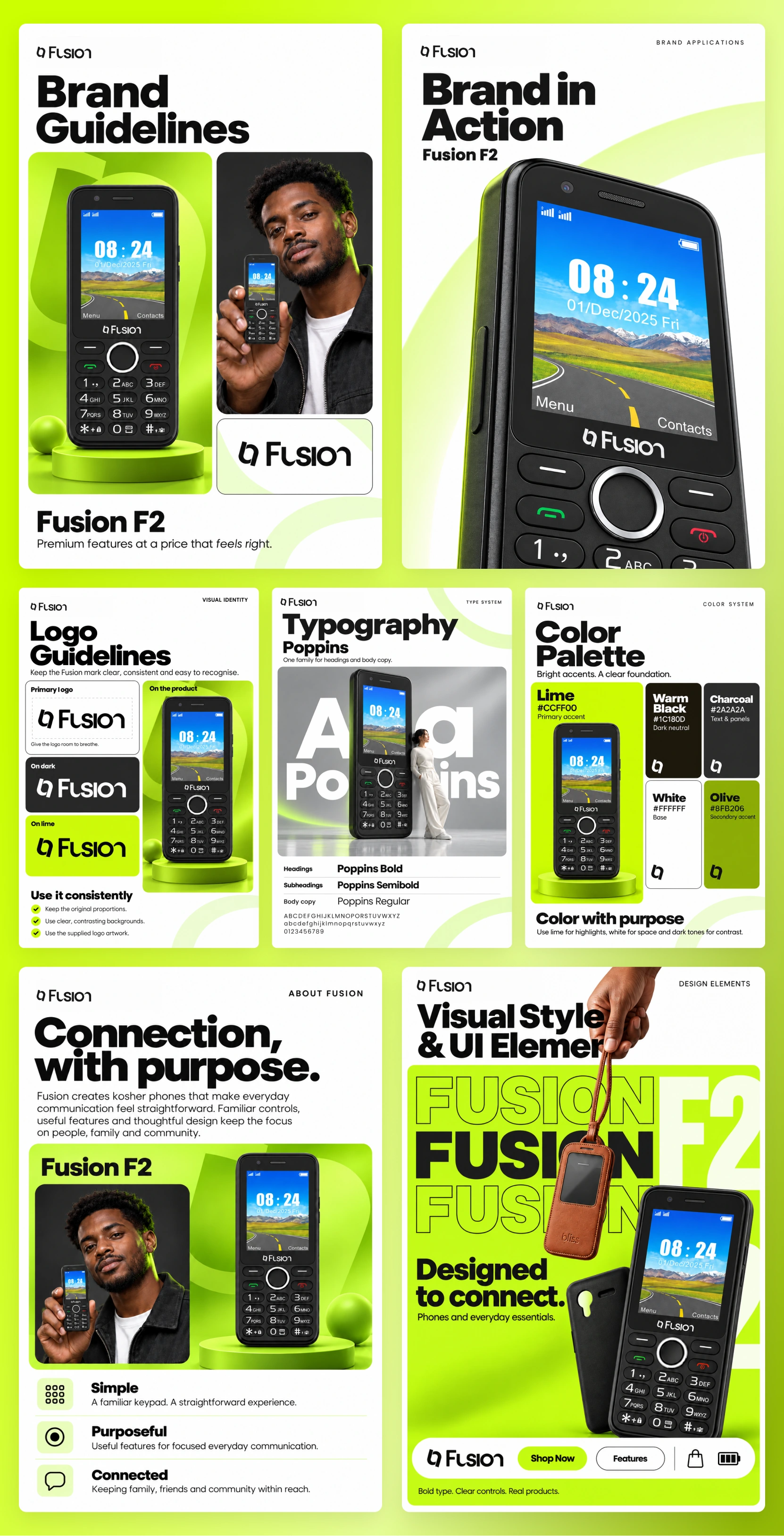
The guidelines board documents the system behind the storefront.
Campaign applications then give that system more freedom. Oversized lettering, people holding the phone, and close product views bring everyday use into the imagery. The device remains recognisable even as the setting and composition change.
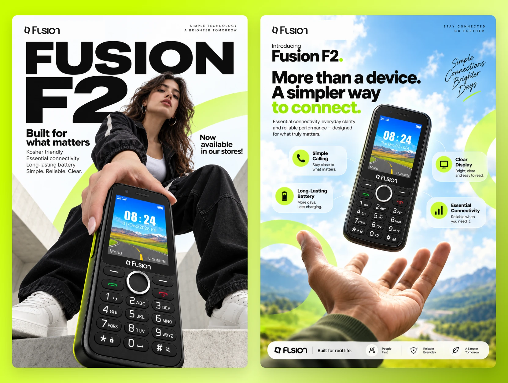
The campaign pair demonstrates how the identity extends into promotional material.
The work connects product explanation with brand recognition. Customers have a clearer structure for exploring their options, and Fusion has a consistent way to present the phones and essentials around them.
Like this project
Posted Sep 15, 2026
A bold brand identity and Shopify storefront that help customers explore kosher phones, compare connectivity options, and find everyday essentials.