ZipTie: Simplified SEO SaaS Management and Results Presentation
ZipTie offers valuable insights to optimize website indexing and enhance search rankings. Our application enables you to effortlessly track the number of indexed pages in search results and keeps you informed about your website's status on Google. We've designed a comprehensive SaaS solution that streamlines management processes and simplifies the presentation of user results and recommended actions
Overview:
ZipTie empowers users with valuable insights to enhance their website's indexing and search engine ranking. The application provides a means to track the number of indexed pages and monitor Google's performance. Our project aimed to create an intuitive SaaS application that streamlines management processes and presents users with clear action steps.
Disclaimer:
Please note that the following outlines our initial process. The product design is an ongoing and dynamic effort, so while some components discussed here may have evolved, this reflects the product's continued growth and our commitment to its success.
Initial Kick-off:
We initiated our project with a kick-off meeting, during which we addressed the following topics:
Project Objective: Develop an MVP using UI components from a previous project to save development time and resources.
Leveraging Bubble.io: Acknowledge and work within the limitations of Bubble.io, the primary development tool.
Addressing Product Design Challenges: Assist customers in overcoming general product design obstacles.
Seamless Onboarding: Implement effective onboarding processes for user convenience.
Pricing and Subscription Flow: Define the structure for pricing and subscription management.
Credits System: Incorporate a credits system within the app.
Project Management: Include project management functionalities within the application.
Aesthetic Modernization: Ultimately, revamp the app's appearance to achieve a modern look and feel.
User Flow & Architecture:
Our approach to the project involved the following steps:
Stakeholder Interviews: We conducted interviews with stakeholders to gain a deep understanding of the project. These interviews informed the creation of user stories, guiding our research.
Inspirational Research: We sought inspiration for our product to gain a comprehensive project overview.
Initial Design: Based on the insights gathered, we organized the project into five primary flows.
Subscription Management: We implemented subscription options for both new and existing users.
Please note that the project continues to evolve as we refine and enhance its features to meet the needs of our users.
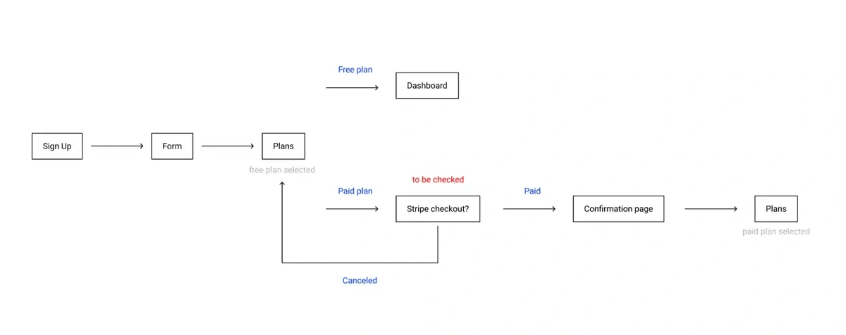
Maintaining a project
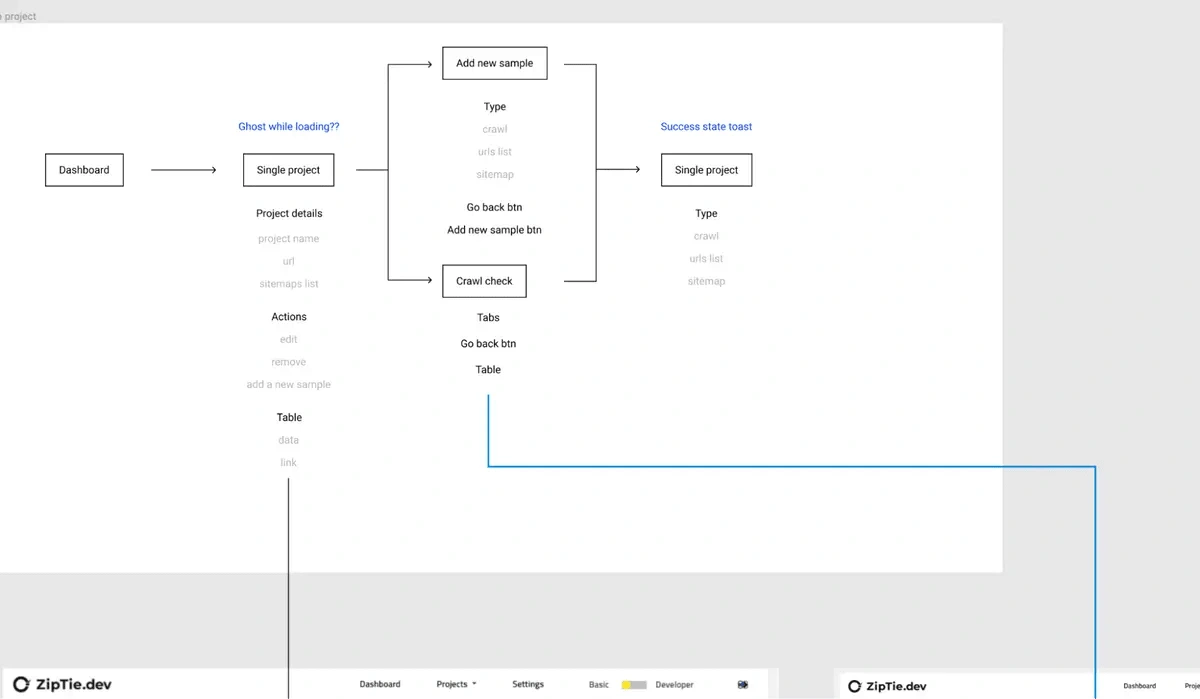
Creating a new project
Sign up/ sign in
Main Dashboard & Settings
Product Design Process
In our approach to developing digital products, we typically adhere to the principles of the Lean UX process.
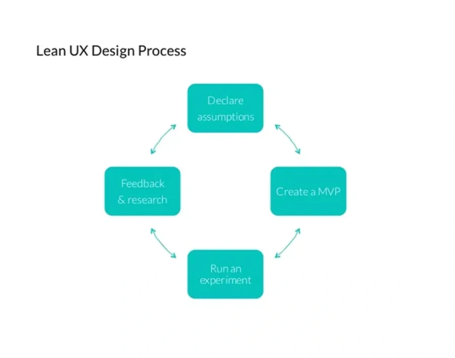
To outline the process, we can follow these steps:
Determine the desired workflow.
Document all possible use cases and edge cases, aiming to develop a preliminary Minimum Viable Product (MVP).
Collect a wide range of insights and explore alternative approaches.
Create the initial version and undergo iterative refinement.
Conduct Guerrilla Tests with stakeholders and users to ensure the clarity and effectiveness of the workflow.
Incorporate feedback-driven improvements. Only once the entire workflow is finalized do we proceed to the next feature.
Design Approach
It's important to highlight that for this project, we were provided with specific guidelines to adhere to Bootstrap recommendations. The design needed to strike a balance between a contemporary and clean aesthetic without becoming overly complex, and the application was built using Bubble.io.
Before delving into the user interface (UI) design, we took the time to gather inspiration to establish the desired look and feel for the final UI. Our initial design assumptions included:
Incorporating a prominent color scheme within the app.
Achieving a modern, fresh, and clean appearance.
Cultivating a friendly ambiance, which initially led us to consider incorporating rounded design elements.
Utilizing the quirky illustrations featured on the client's primary website, ensuring their seamless integration into the app.
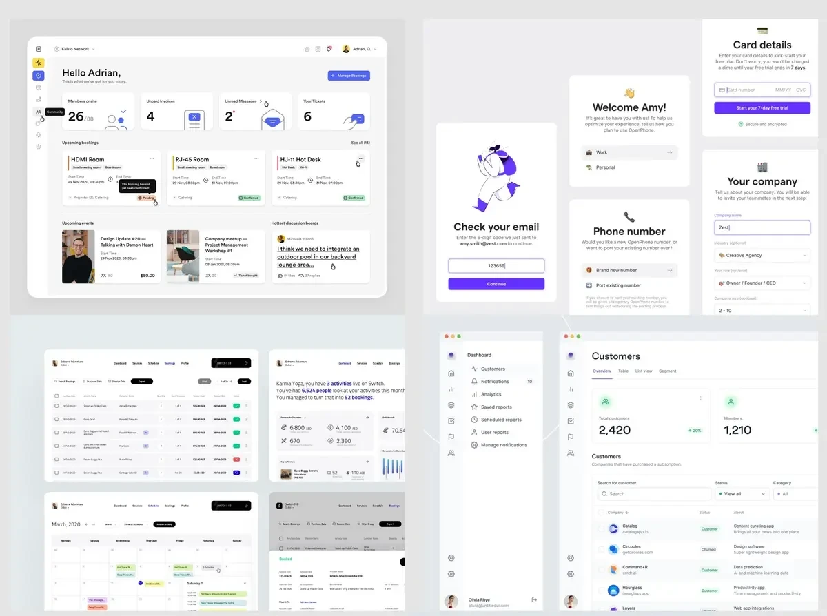
Layout & Project Management Screen
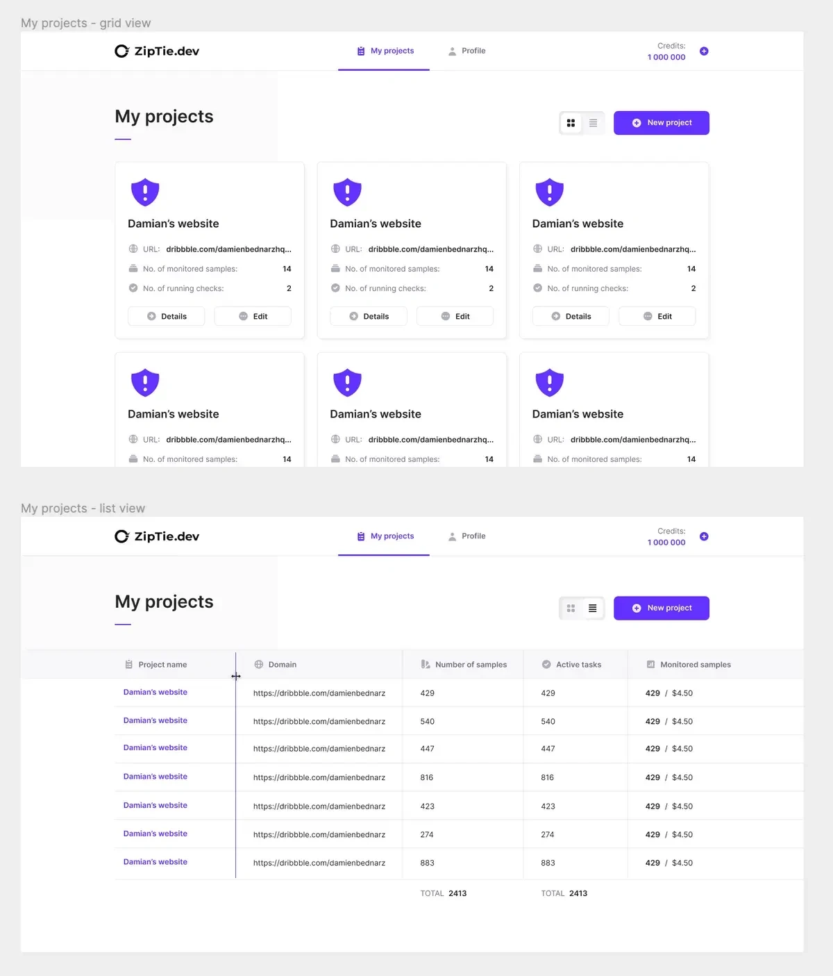
Our initial step involved the creation of overarching layouts and grids for the application. To accomplish this, we focused on one of the most intricate and pivotal pages within the app: the project list. This page serves as a comprehensive catalog of all the websites integrated into the application. We refer to them as projects rather than websites, as a single website can have multiple methods for generating a list of indexed pages, such as web crawling or manual sitemap uploads.
As outlined in our design process, we sought inspiration for the project view. Our objective was to identify existing solutions in the market that align with our vision. One particular scenario we considered was that users might have just one or two projects, rendering a simple list format impractical. Consequently, we opted for a tile-based layout when the number of projects falls below eight.

Once the layout was established, we directed our attention toward the UI design. Incorporating the feedback received during the mood board phase, we developed the following style
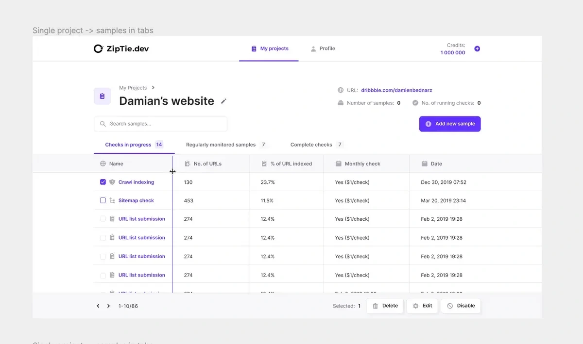
We employed a similar approach in crafting the project details page. Given the abundance of data that needed to be presented, we anticipated a wealth of information on a single project page. Consequently, we embarked on a comprehensive search for inspirations, particularly from SaaS products that excel in displaying intricate details through tables.
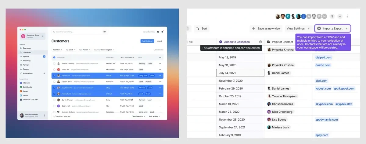
It is a good practice to reuse patterns in the app, so we adopted the table from the project’s list view. It makes interfaces more friendly because users are already familiar with the layout. The difference is the header, where we put all project details. We also added a sticky bottom bar. The table might be extremely long, so having the sticky element makes it easier to navigate.
Introducing a New Project
One of the most intricate processes we encountered was the "adding a new project" workflow. The primary challenge lay in effectively conveying the various methods for importing website pages in a clear and understandable manner. We needed to articulate to users the distinctions between importing a project via a sitemap file, a list of URLs, or utilizing the crawling system.
Initially, we considered using a video as the optimal solution, but we discovered that it wasn't the most efficient way to present the solutions, as only a limited number of users actually clicked the play button.

In lieu of the video, we opted for a three-step clarification approach. We designed a streamlined version of the user interface (UI) and emphasized the key distinctions. To ensure that users remained focused on the critical UI elements, we strategically blurred out less relevant components of the interface, minimizing distractions.
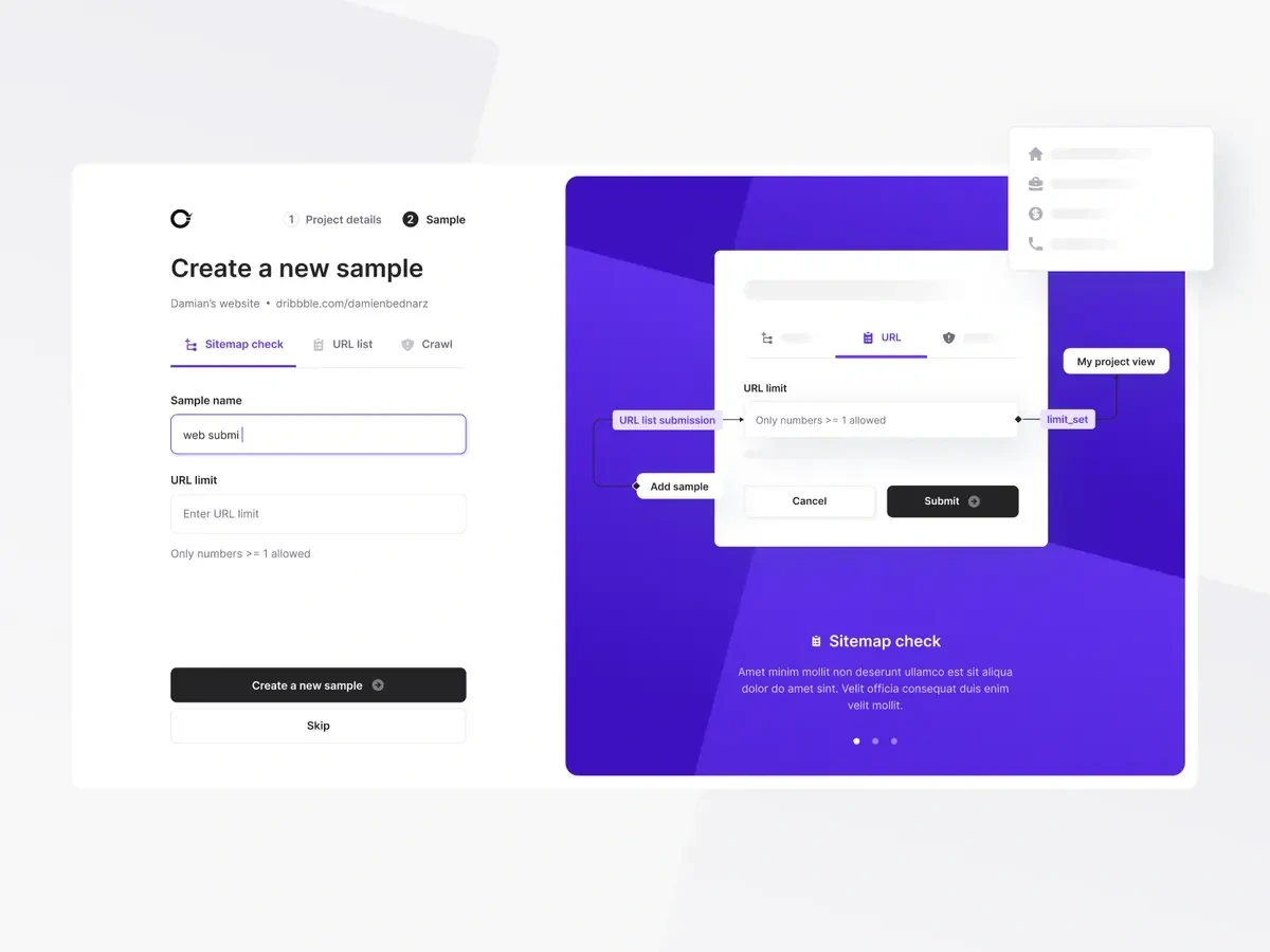
Each import method came with its own set of requirements and inputs, yet we employed a consistent single-page layout for all of them.
Registration Process and Trial Period
Following the onboarding phase, our next step was to tackle the login page. We began with the initial page where users were prompted to provide standard information like their email and password. In the first iteration, we attempted to adapt the layout from the onboarding page, as seen in the illustration on the right. However, as we aimed to prioritize user focus and avoid unnecessary distractions, we ultimately crafted an alternative version featuring centered login details. This approach ensured a cleaner and more efficient user experience without the added aesthetic but non-essential large illustration.

Even though all apps have similar flows, we still had many questions:
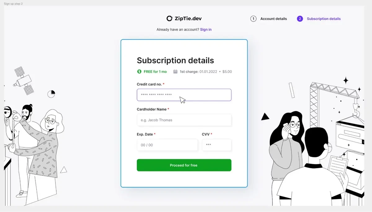
When is the right time to ask for credit card details? After the free trial period or right in the sign-up flow? Because it was a business consideration, we decided with the client to ask for it on the second screen during the registration process. We were aware it would drive down the number of trial accounts, but the goal was to monetize the app as soon as possible.
Based on that decision, we needed to work a bit on the sign-up page to maximize conversions. We did research and used best practices. We communicated the free trial period duration and the date when we would start charging the user.
Payment Process
The card details page played a pivotal role within both the sign-up process and the subsequent payment and subscription workflow.
The primary challenge stemmed from the fact that users could have anywhere from 3 to 4 projects with a small number of pages, to a single project with thousands of pages. The application conducts multiple website scans (with user-configurable frequency), monitors page conditions, and issues alerts whenever a page is not crawled by robots.
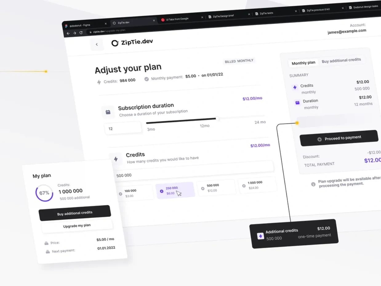
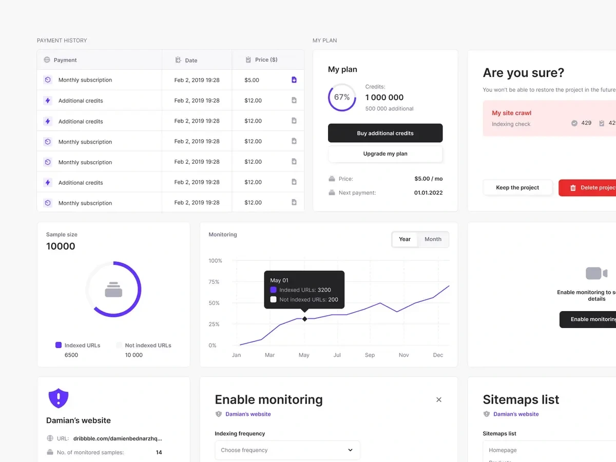
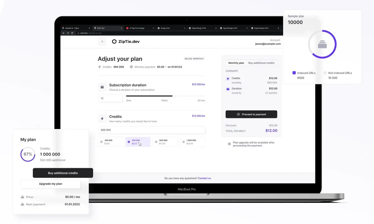
To address this, we introduced a credit points system as per customer proposals. Under this system, each monitoring instance, or "monit," consumes one credit. Users have the option to purchase a subscription for a specified number of points, which automatically renews on a monthly basis. In the event a user depletes their credit balance, they can easily acquire additional credits.
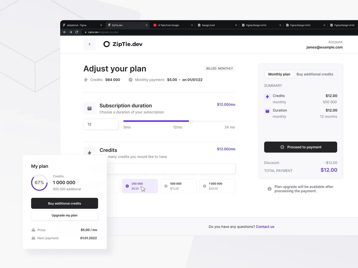
Upon project creation, the system is designed to provide users with suggestions regarding the number of credits required. To reinforce this system and enhance user awareness, we strategically incorporated numerous notifications throughout the app. Furthermore, we made a "Buy Additional Credits" button prominently visible within the main navigation for easy access and convenience.

Style Guide
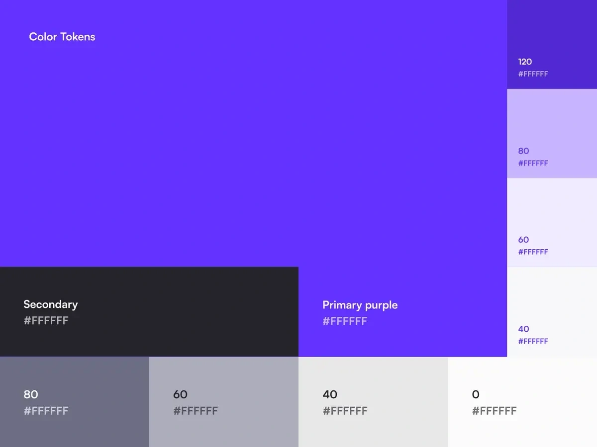
The final step involved the creation of a comprehensive style guide, which was instrumental in facilitating a seamless handoff process to the developers. The development of a component library played a pivotal role in maintaining consistency across all deliverables and significantly eased the workflow for our developers.

In summary, ZipTie serves as a compelling example of how the creation of a well-structured Minimum Viable Product (MVP) can efficiently validate market demand. Presently, the application is experiencing growth, and the stakeholders are actively working on the development of new features, all of which are built upon the foundation we meticulously laid out.
Like this project
Posted Nov 28, 2023
Streamline SEO management and reporting with ZipTie: Your go-to solution for efficient SaaS SEO tasks.
Likes
0
Views
33


