How Revamping the LMS Design Rescued a 64% Mobile Learner Base
Abrita W
Context
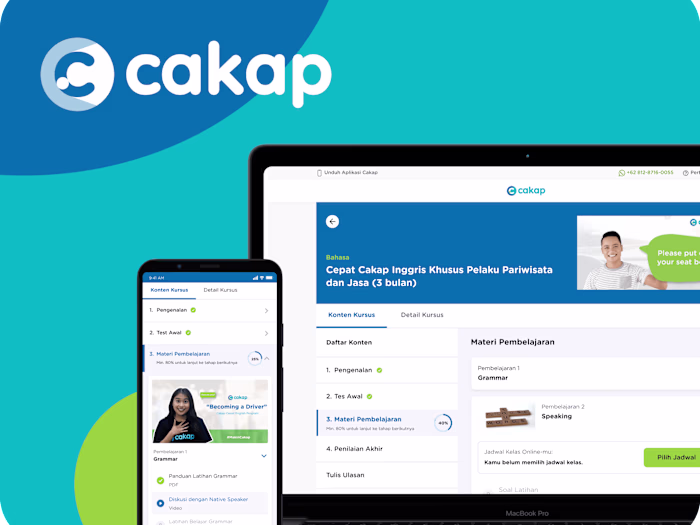
Cakap's LMS had a structural problem that analytics made hard to ignore. Despite being a mobile-first market, the platform was built around interaction patterns that assumed a desktop modal pop-ups for content delivery, navigation that required precise taps on small targets, and progress tracking buried behind multiple layers. The result: an average material completion rate of 37.04% (July 2025) across active users, with drop-off concentrated in the first few interactions with a course.
My mandate was a full redesign. Not a reskin a structural overhaul of how learners move through content on mobile, with a secondary constraint: the new architecture had to accommodate upcoming AI feature integrations without requiring another rebuild.
The Problem
The platform's existing persona research had already identified a segment we internally called "The Quitter" learners who were motivated enough to enroll but abandoned courses early. The pattern wasn't motivational. It was mechanical. Three friction points kept surfacing:
Navigation required too much deliberate effort.
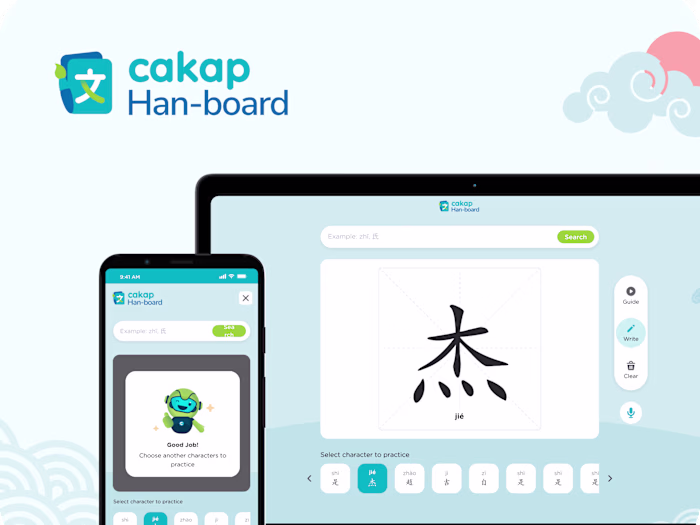
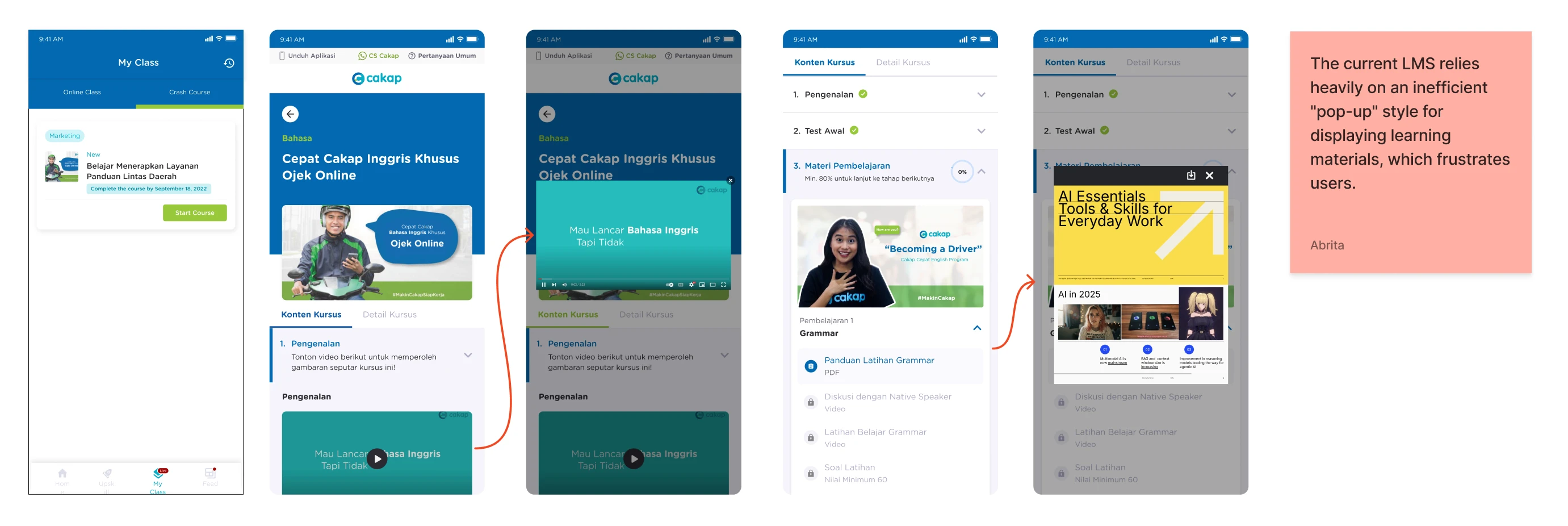
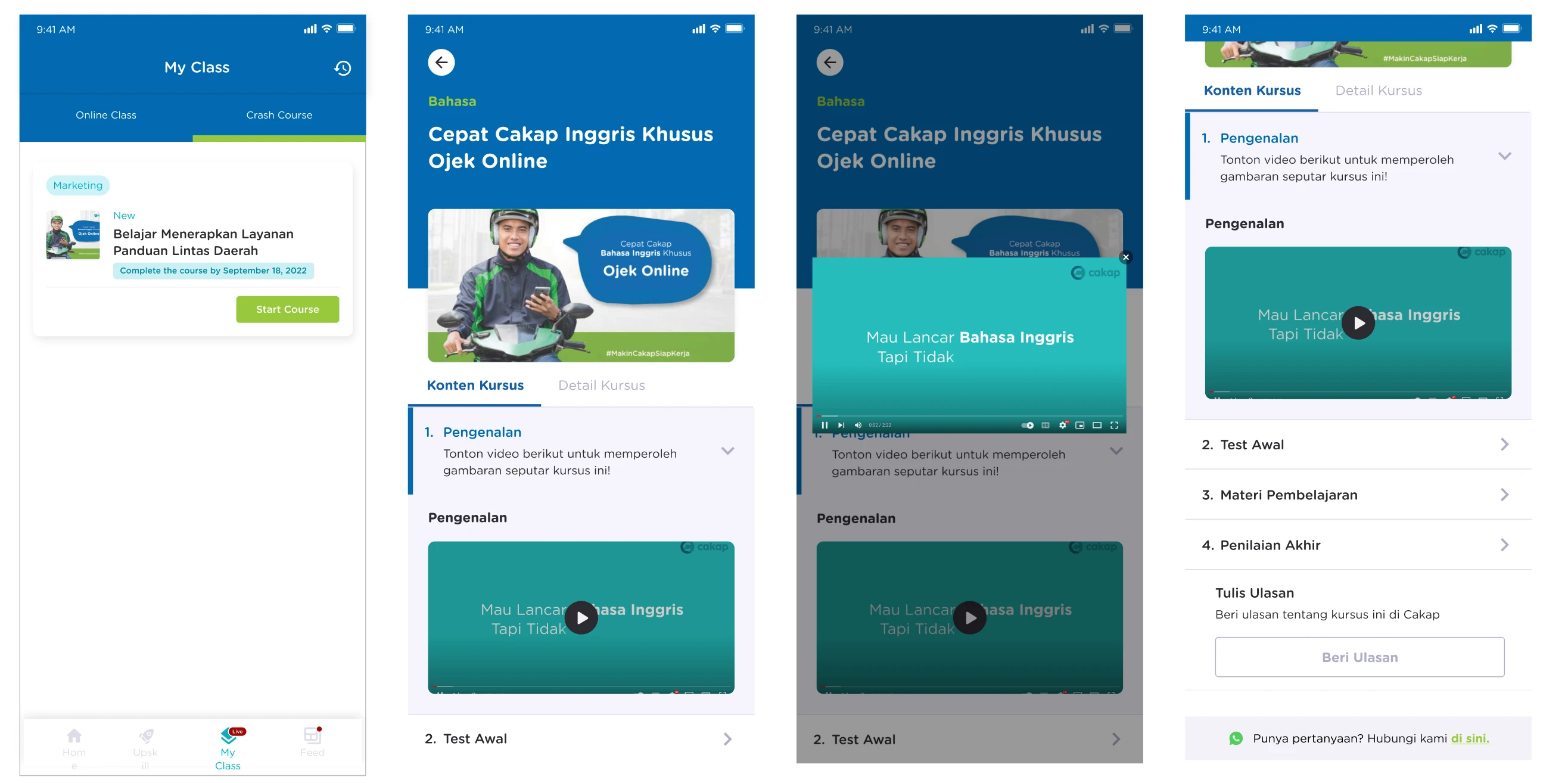
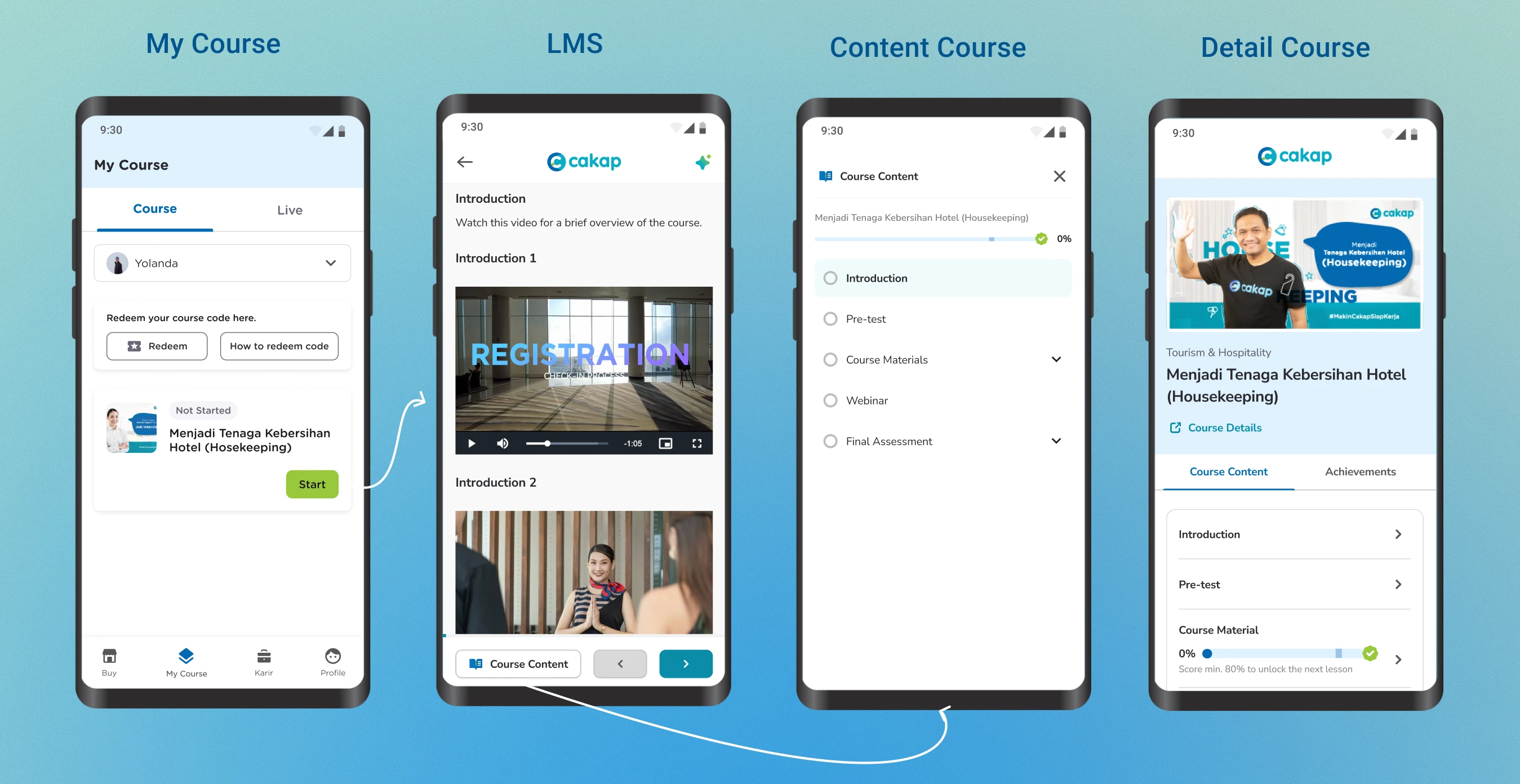
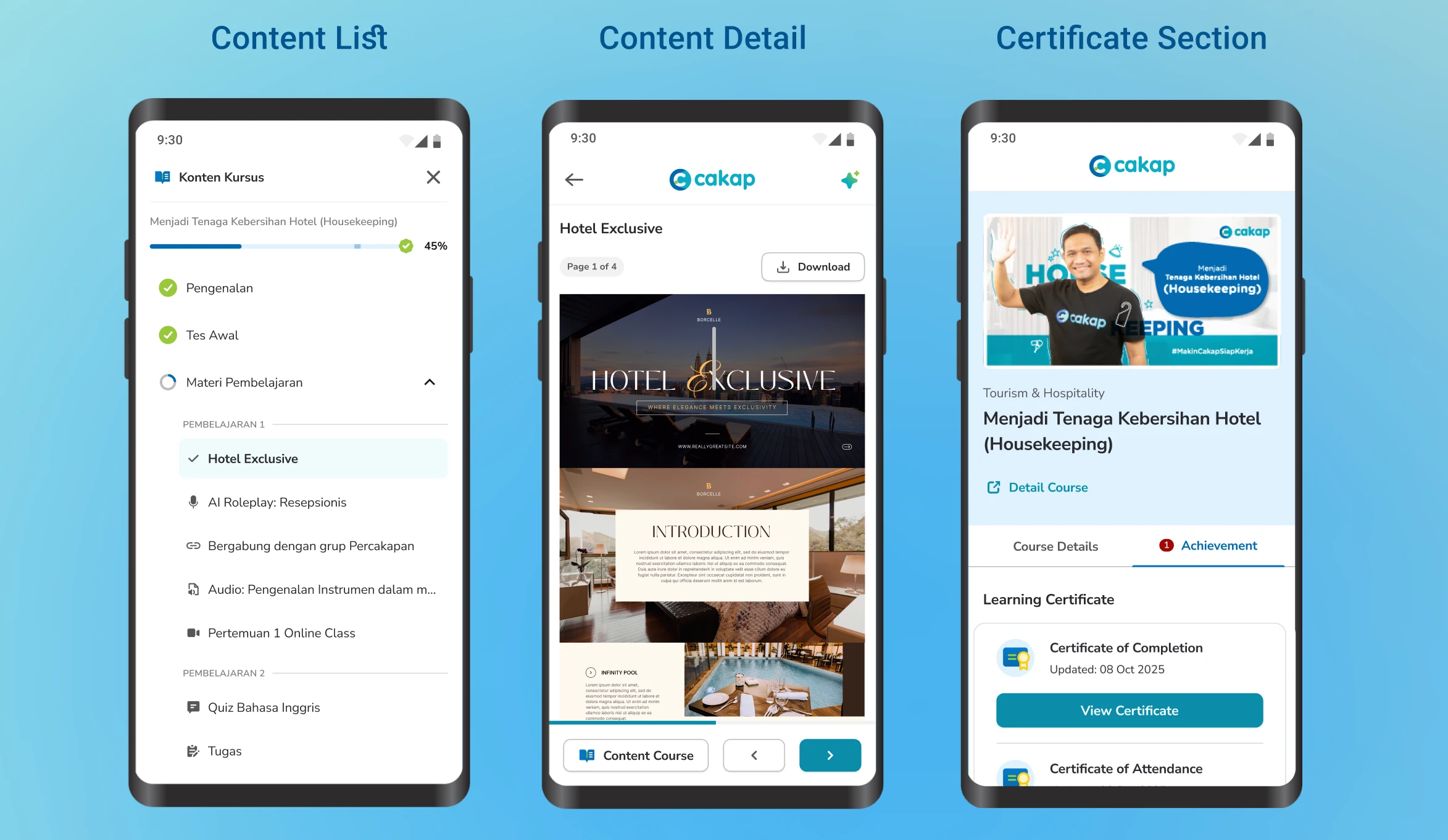
The primary way to access materials was through a pop-up triggered from the course page. On mobile, this created a layered interaction tap to open, read, close, tap again that fragmented the reading flow and made every lesson feel like a task to navigate rather than content to absorb.
Progress was invisible during learning.
Completion state only appeared in the course overview, never in the material view itself. Learners had no real-time feedback on where they were or how close they were to finishing. For at-risk learners, that absence of progress signal removes one of the most reliable behavioral motivators for continuing.
The platform and content were structurally merged. The LMS dashboard mixed global navigation with course-specific controls, creating cognitive overhead every time a learner tried to do something simple, like moving to the next material.
Quantitatively: 64% of users accessed the platform exclusively on mobile. The existing interface had not been designed with that majority in mind.
Research
Before sketching, I benchmarked three LMS platforms Coursebox, TalentLMS, and Career Masterclass specifically looking at how they handled mobile content delivery, navigation hierarchy, and layout extensibility.
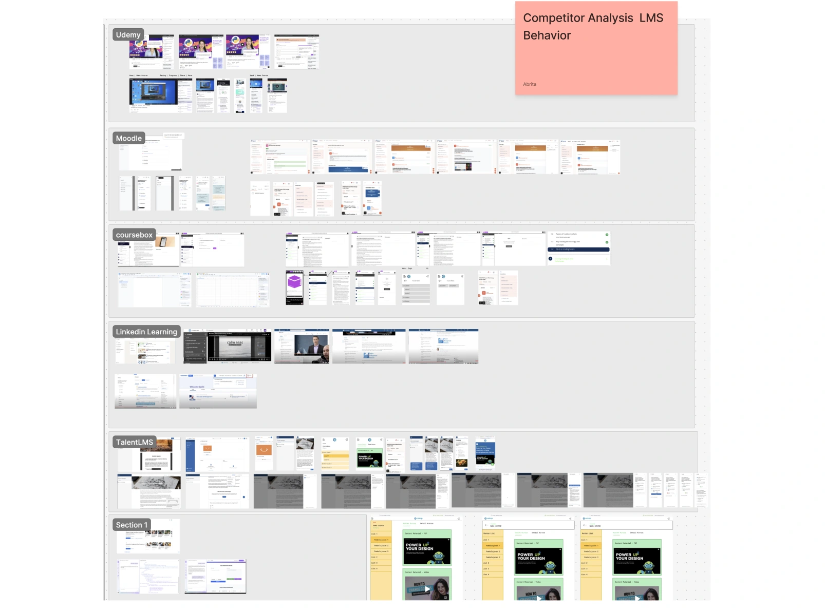
Three patterns were consistent across all three:
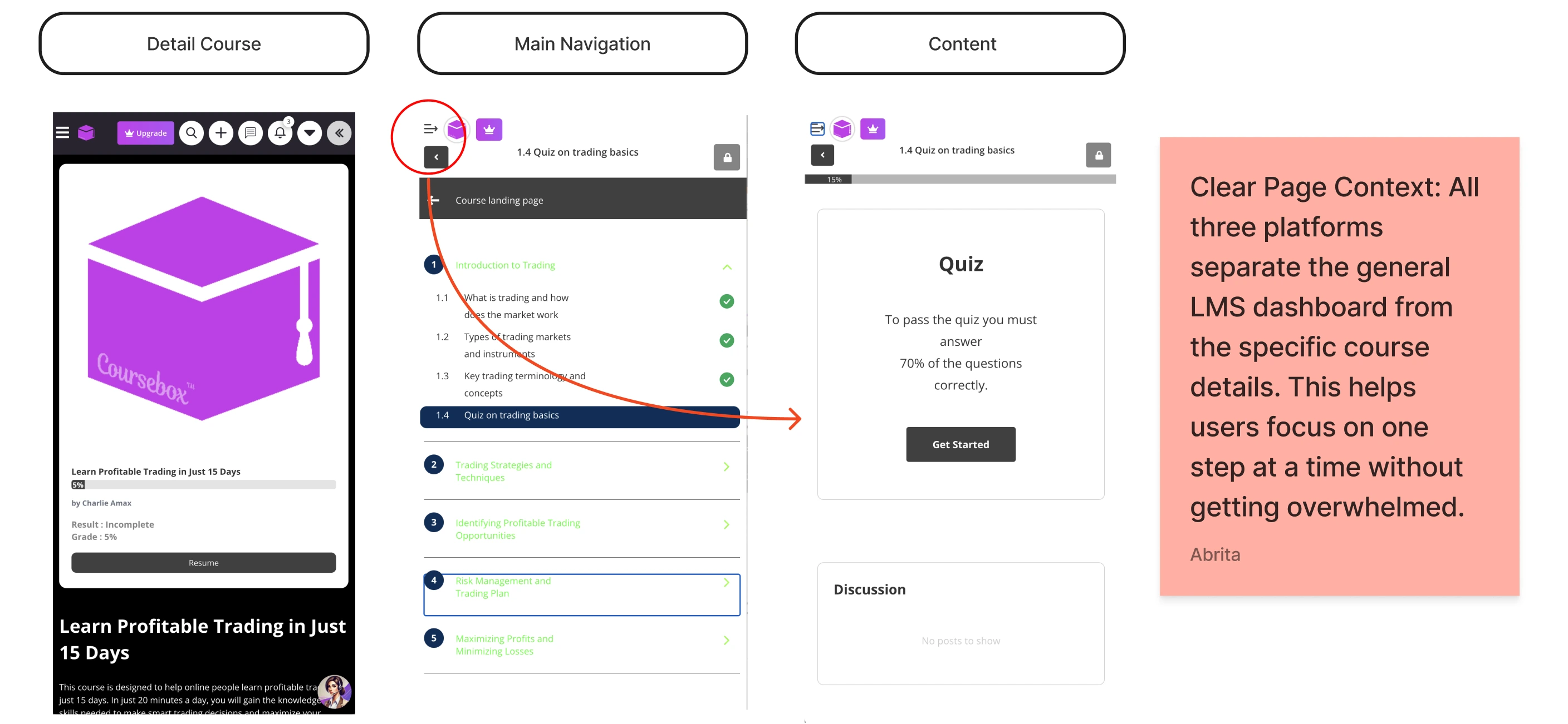
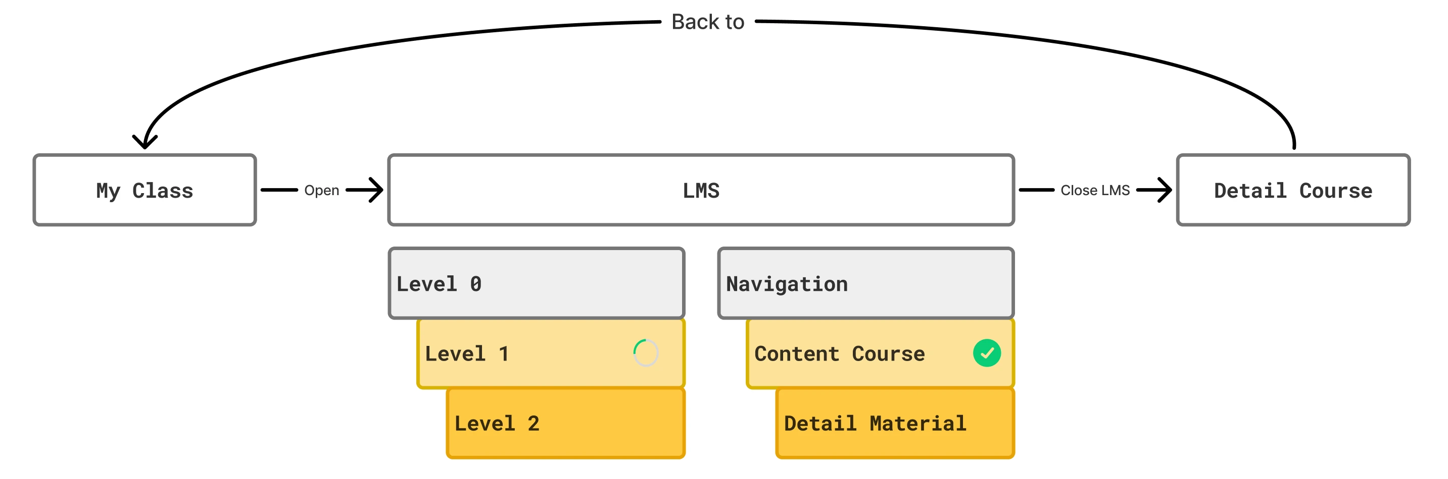
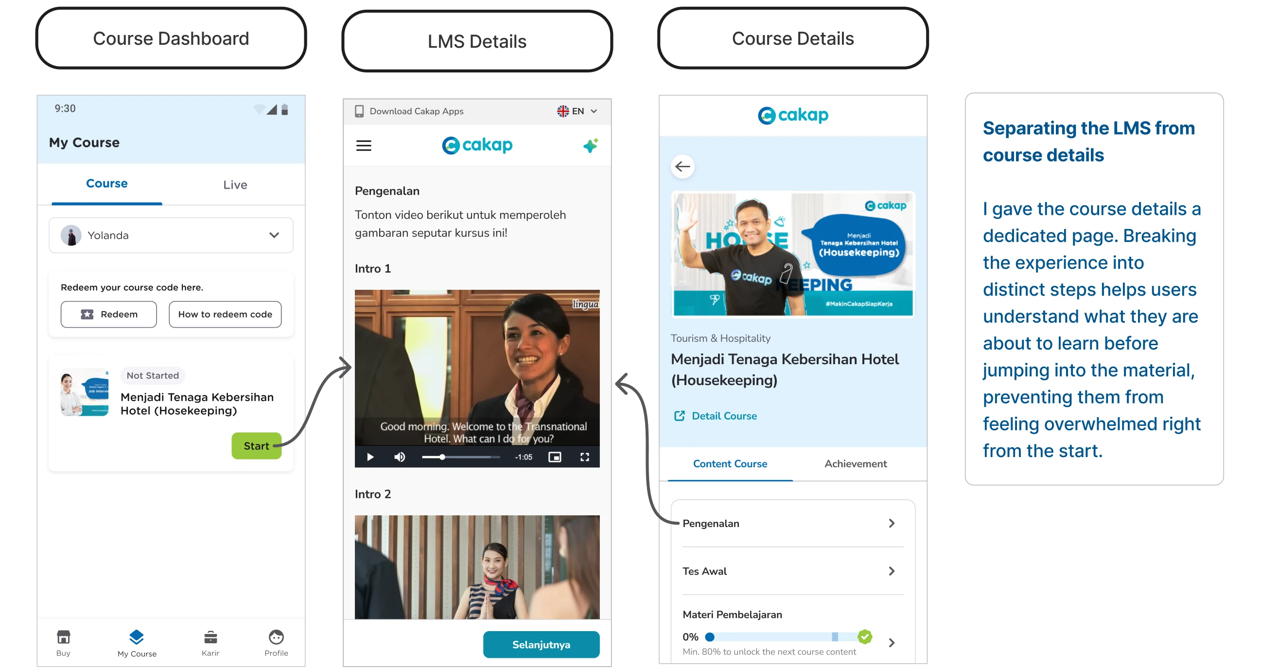
Dashboard and course detail are always separate pages.
None of them collapsed the course overview and the learning view into the same screen. The separation reduces cognitive load at each stage learners know exactly which mode they're in.
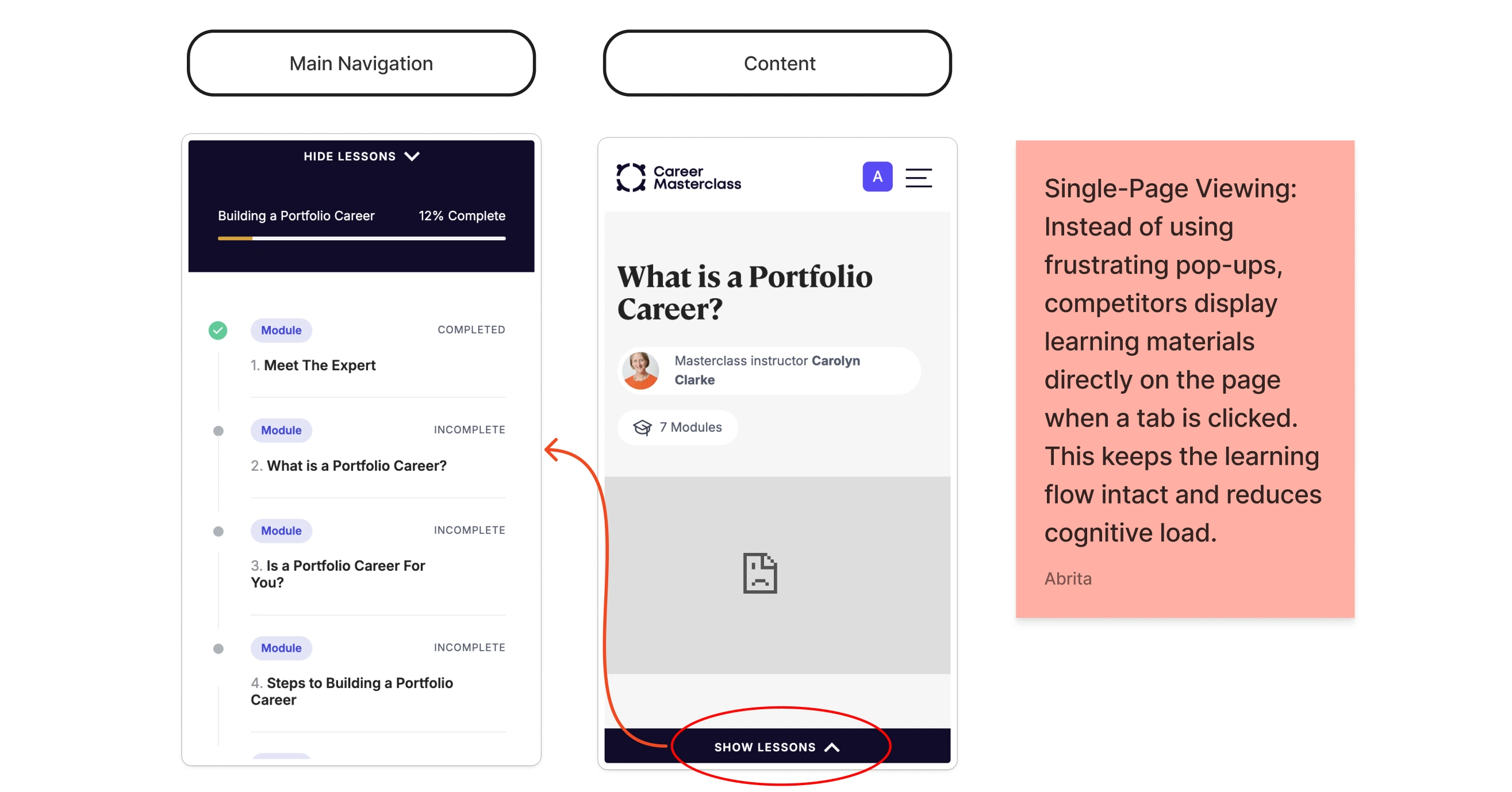
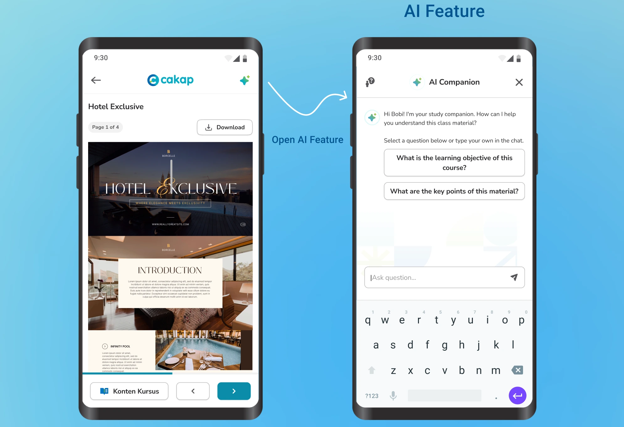
Content loads inline, not in modals.
All three displayed learning materials directly on the page rather than triggering overlays or pop-ups. The reading context stays intact; the learner never loses their place.
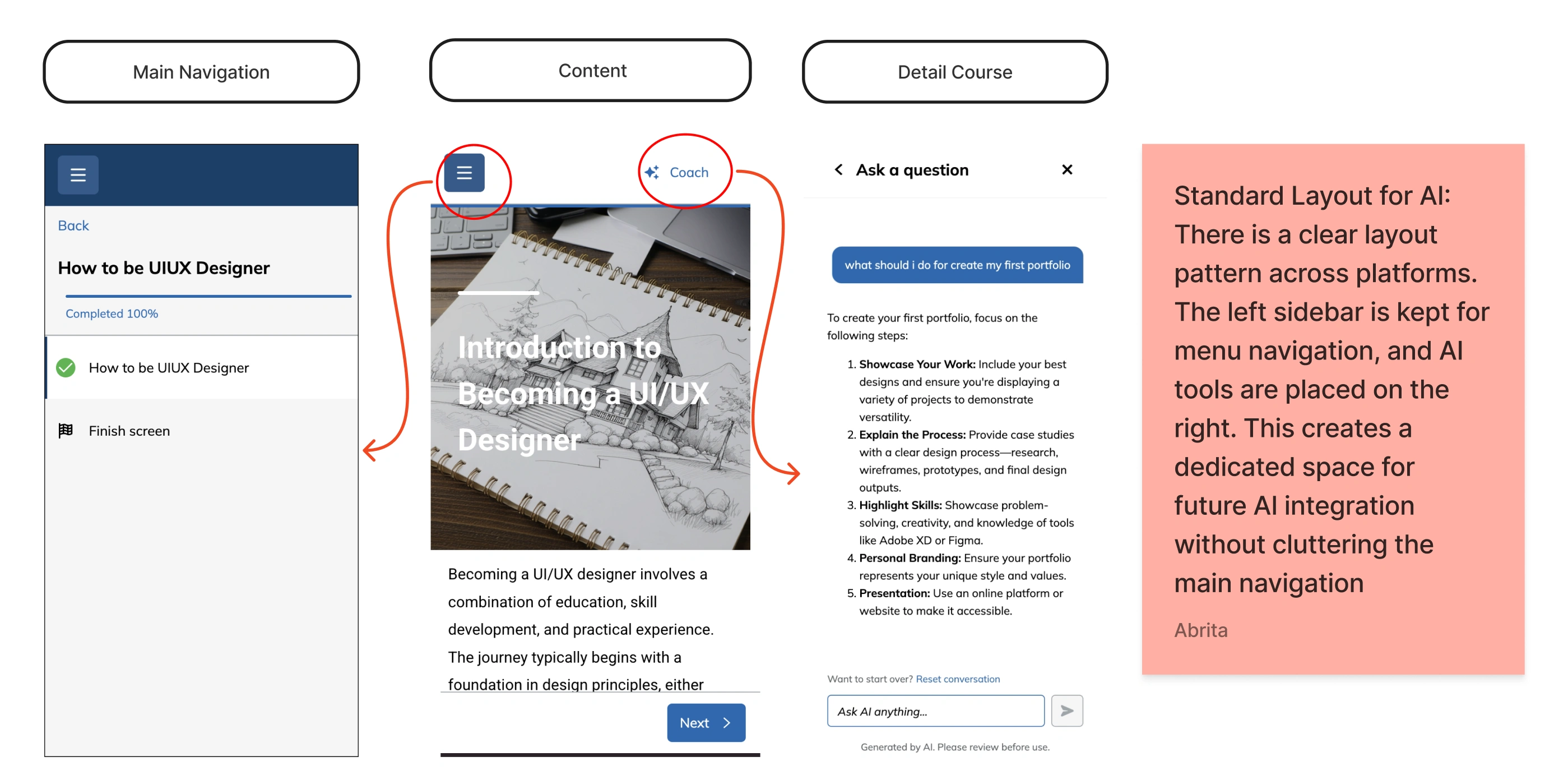
AI tools occupy a consistent spatial position.
Across platforms that had integrated AI assistants, the pattern was stable: left sidebar for course navigation, right panel for AI tools. This wasn't an aesthetic choice it's a layout convention that users can learn once and apply everywhere.
These weren't just surface observations. They pointed to a shared mental model that Cakap's LMS was actively contradicting.
Design Direction
I explored three structural concepts for the mobile learning interface, each addressing the core problem differently.
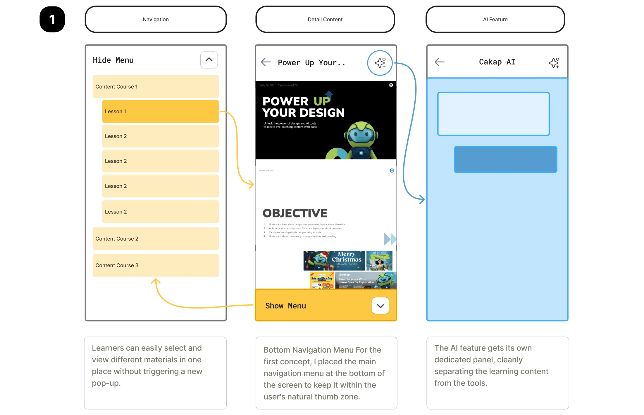
Concept 1 Bottom Navigation Menu
Primary course navigation moved to the bottom of the screen within natural thumb reach. Materials load inline. AI features get a separate panel. This solved the pop-up problem but didn't establish a clear action hierarchy between "move through content" and "manage course."
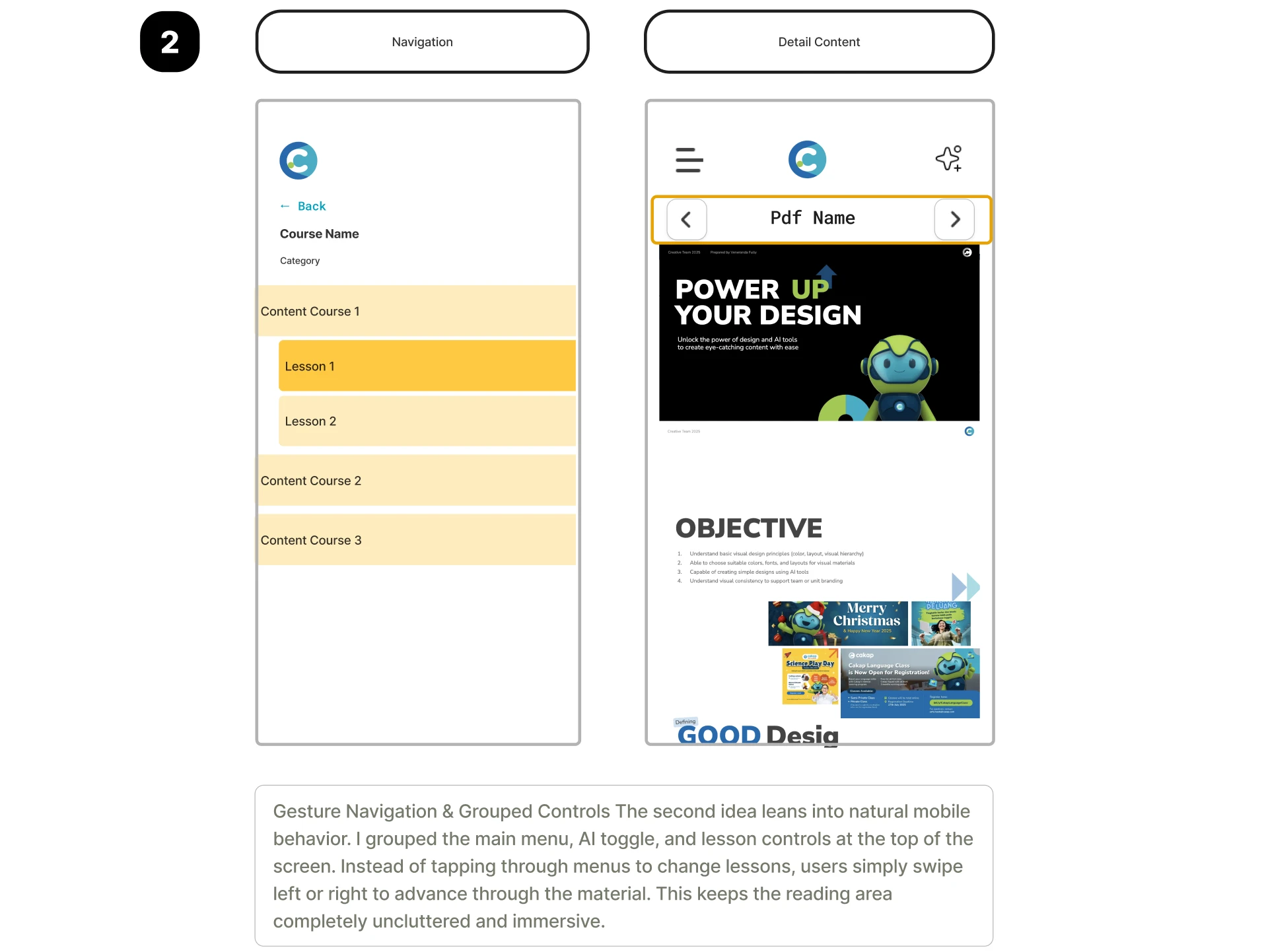
Concept 2 Gesture Navigation
Grouped controls at the top, with left/right swipe to advance through materials. Maximum reading area, minimal chrome. The problem: swipe gestures carry no visible affordance. For Cakap's learner base which skews toward users who are not heavy mobile-app consumers invisible gestures create discoverability failure. A learner who doesn't know to swipe will simply stop. The immersive reading area isn't worth the navigation dead-end.
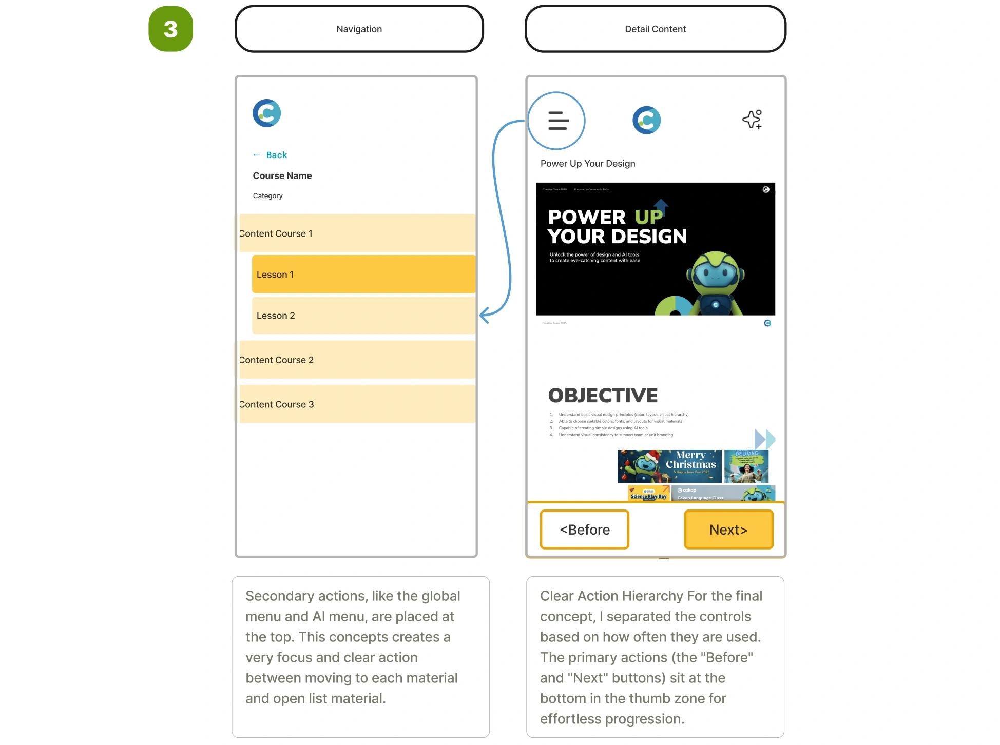
Concept 3 Explicit Action Hierarchy
Controls are split by frequency of use. Primary actions (Previous / Next) sit at the bottom in the thumb zone — the interaction a learner performs most often requires the least physical effort. Secondary actions (course menu, AI toggle) move to the top. This creates a predictable, self-evident interface: the next step is always the button closest to your thumb, and it's always visible.
I went with Concept 3
The core reasoning the highest-risk moment in a learning session is the transition between materials. If that action has any friction requires a stretch, an extra tap, or a moment of confusion learners drop off. Concept 3 eliminates that friction entirely while keeping the interface readable for users at all levels of mobile fluency.
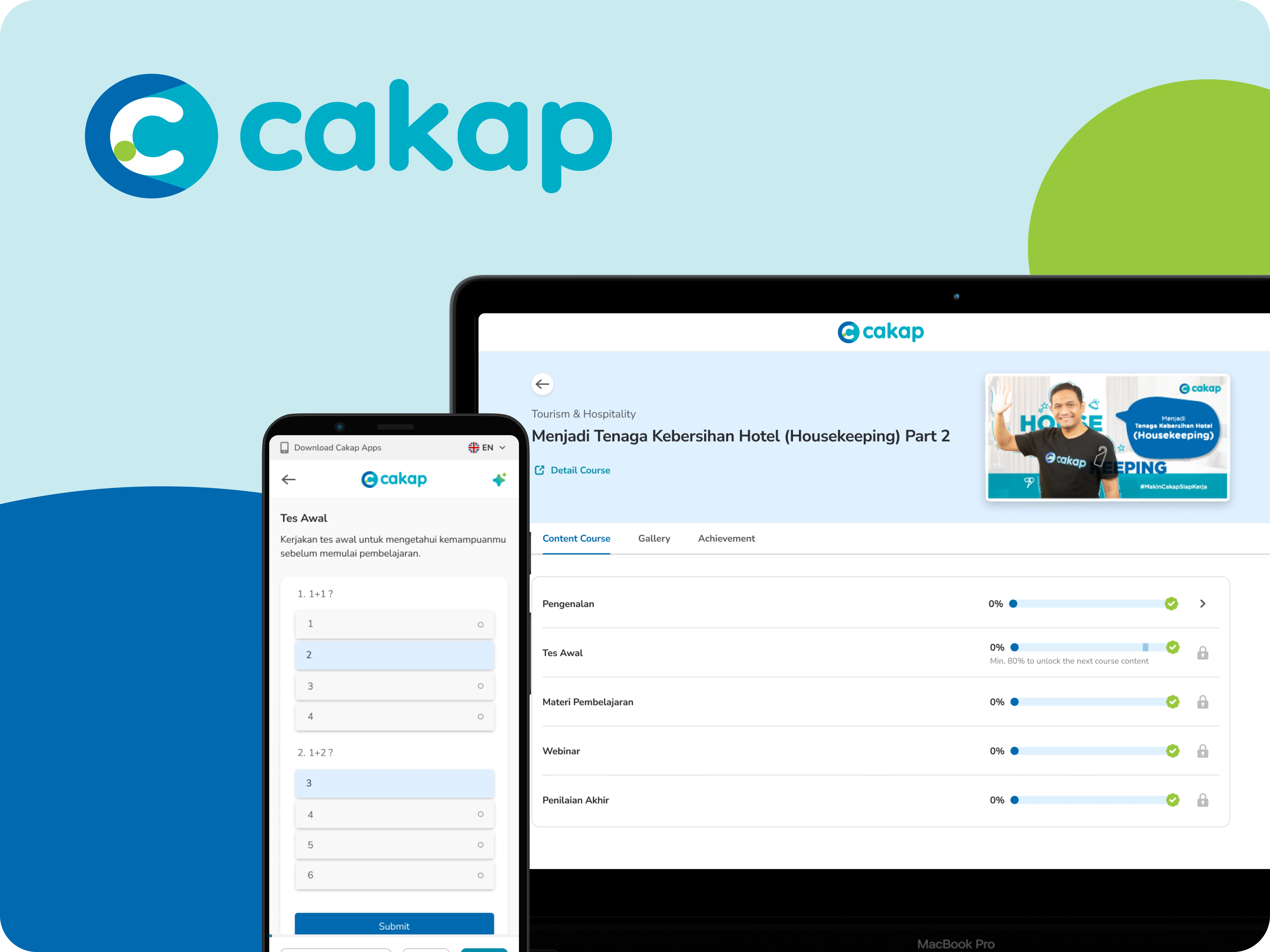
Detail Course and Learning Management System
LMS details
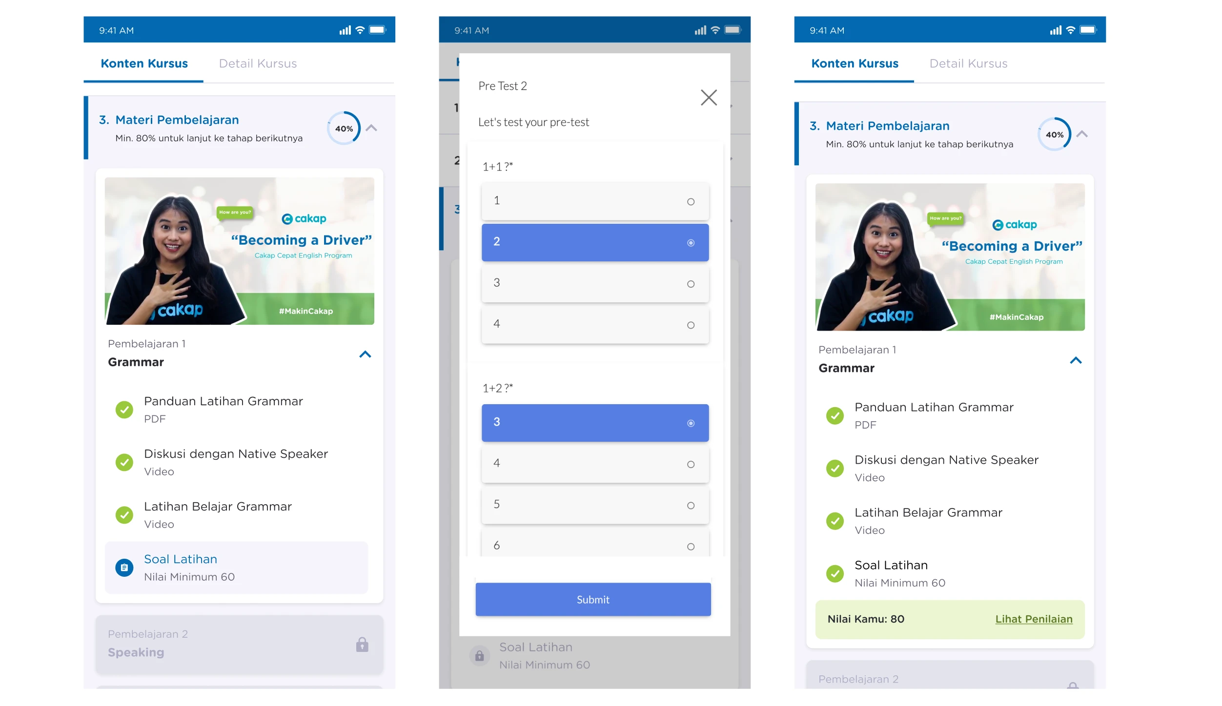
Usability Testing & Iteration
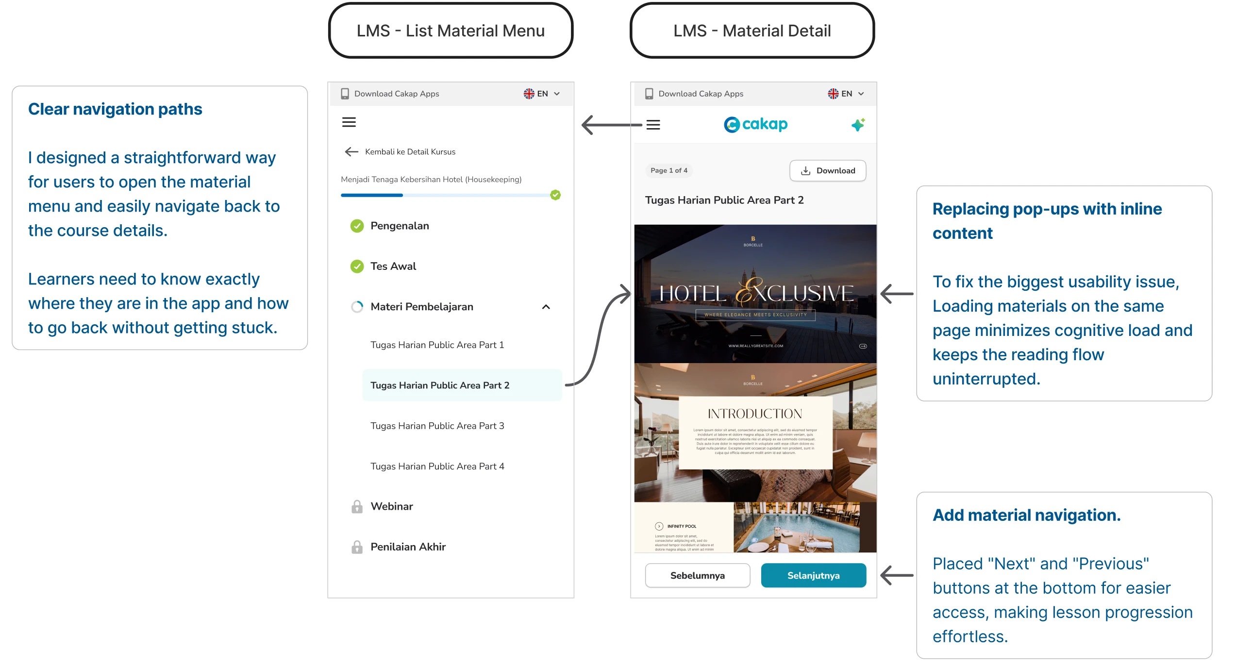
Early testing with five participants surfaced an immediate problem with the initial Concept 3 implementation: all five users missed the syllabus list entirely. It was accessible through the top menu, but nobody looked there. They used the bottom navigation arrows to move forward but had no sense of overall course structure where they were, how much was left.
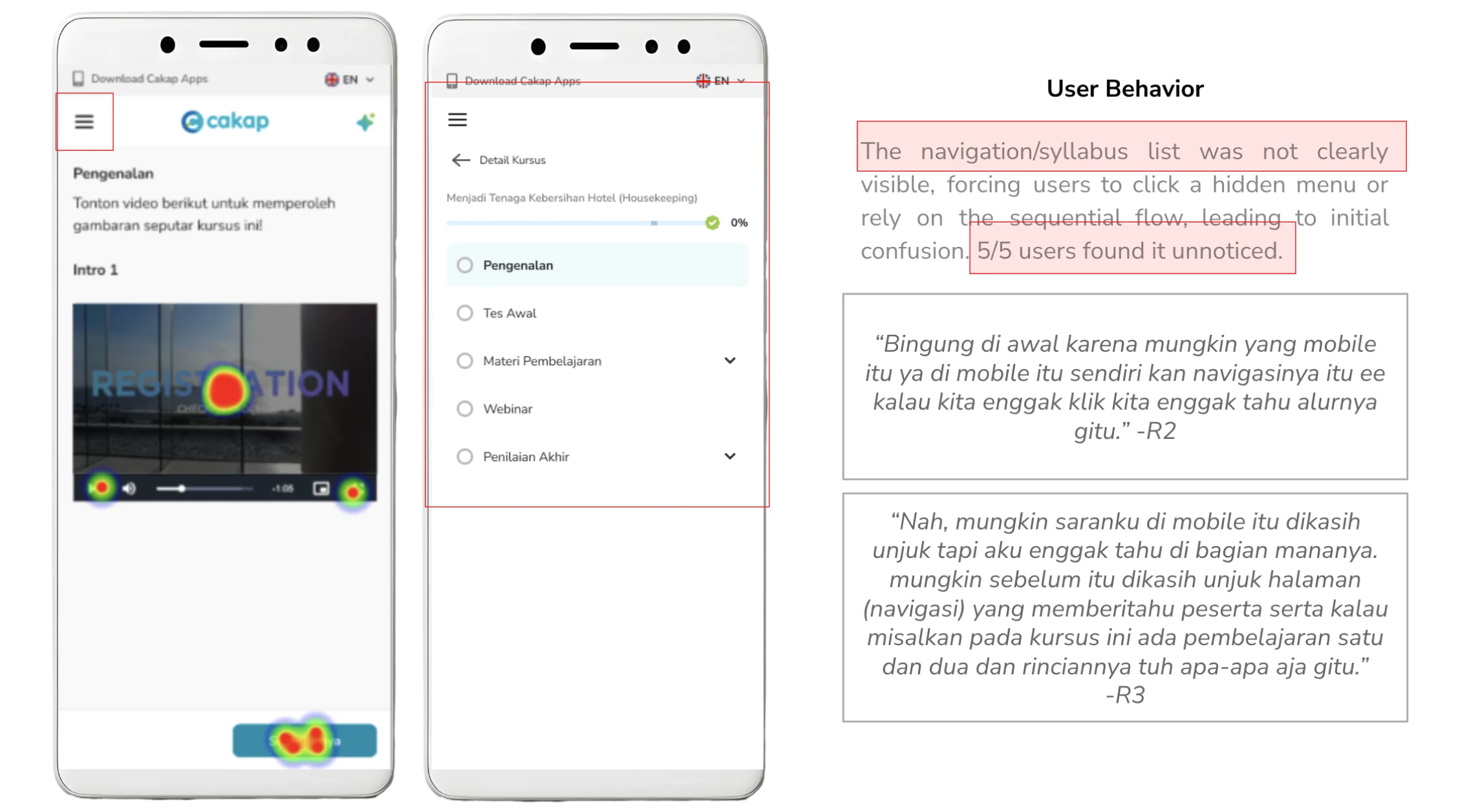
This was a meaningful finding. The bottom navigation had trained users to look down for controls, making anything above the fold functionally invisible during a learning session.
The fix
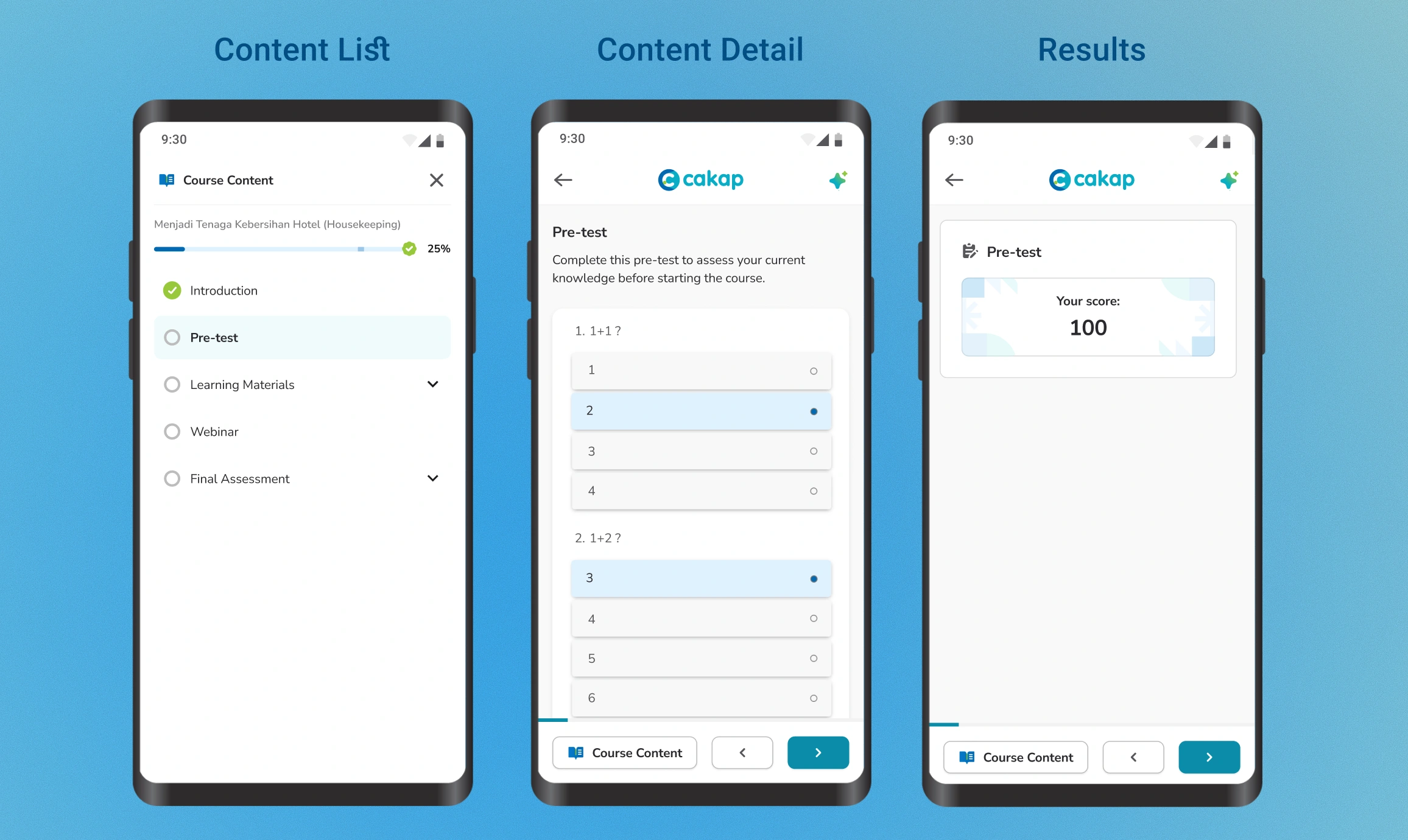
I moved the syllabus access to the bottom bar, creating a three-element layout Course Content button on the left, Previous and Next arrows on the right. This made the syllabus reachable without breaking thumb-zone ergonomics, and kept the reading area clean.
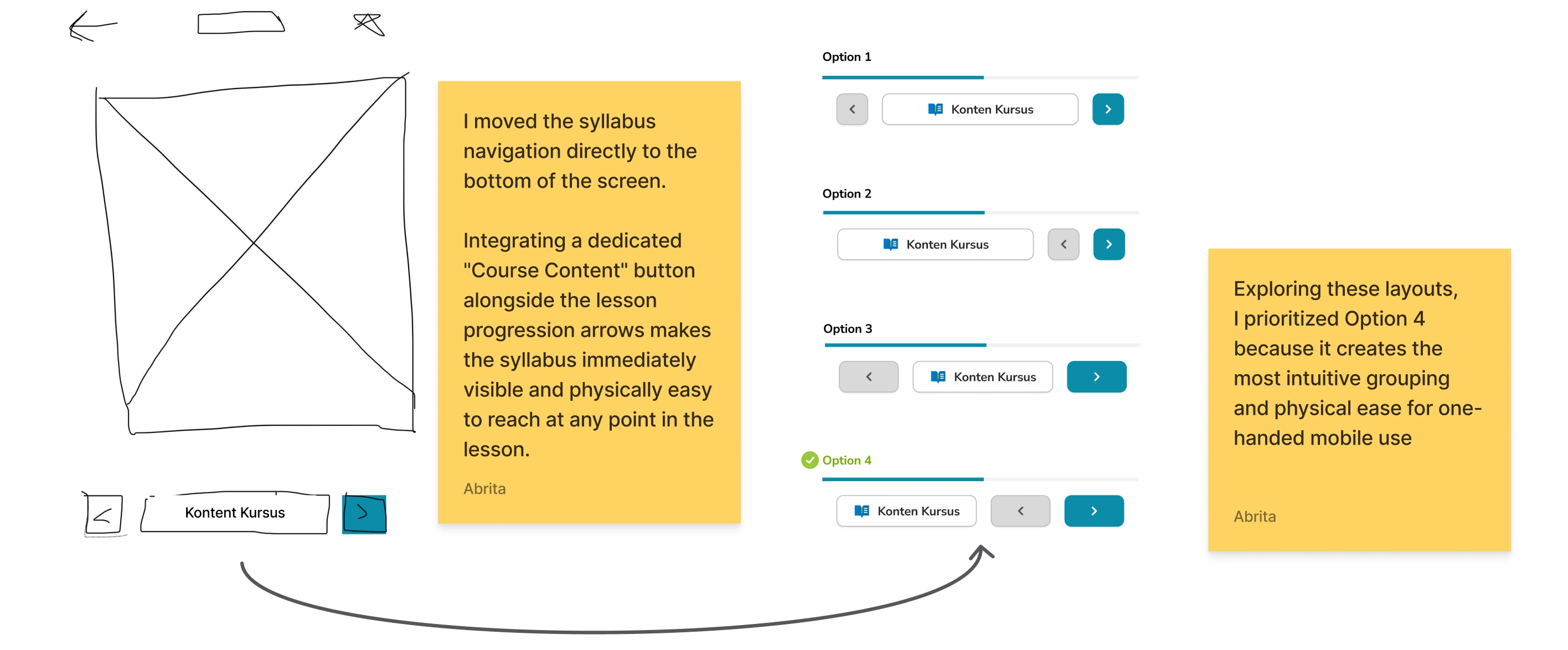
I tested four bottom bar arrangements before landing on this one. The deciding factor was one-handed reachability on a standard-sized phone screen, particularly the left-thumb access to the Course Content button for right-handed users holding the phone naturally.
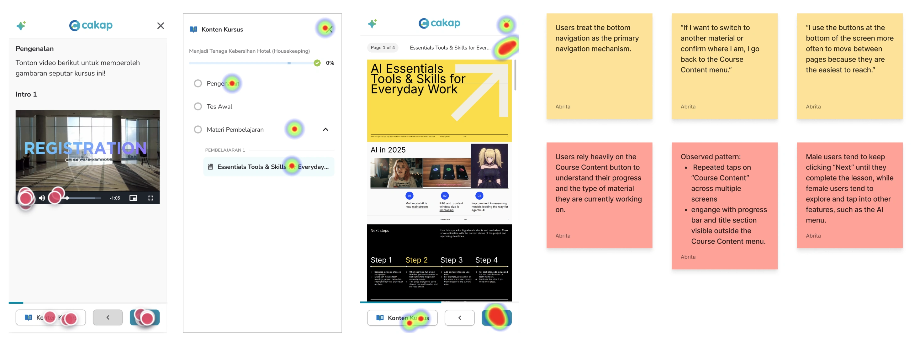
A second iteration came from watching how often users opened the Course Content panel during testing. They checked it repeatedly not to navigate, but to see their progress. That told me the progress bar and current lesson title needed to be permanently visible on the main learning screen, not hidden inside a panel. Persistent progress feedback is not a nice-to-have for learners who are prone to abandonment. It's the primary motivational signal keeping them in the session.
Outcome
The redesign shipped and was measured over the following month.
We set out to increase Material Progress Rate from 37.04% to 41.67%. After launch, the redesign achieved +48.67% (April 2026), exceeding the original success metric.
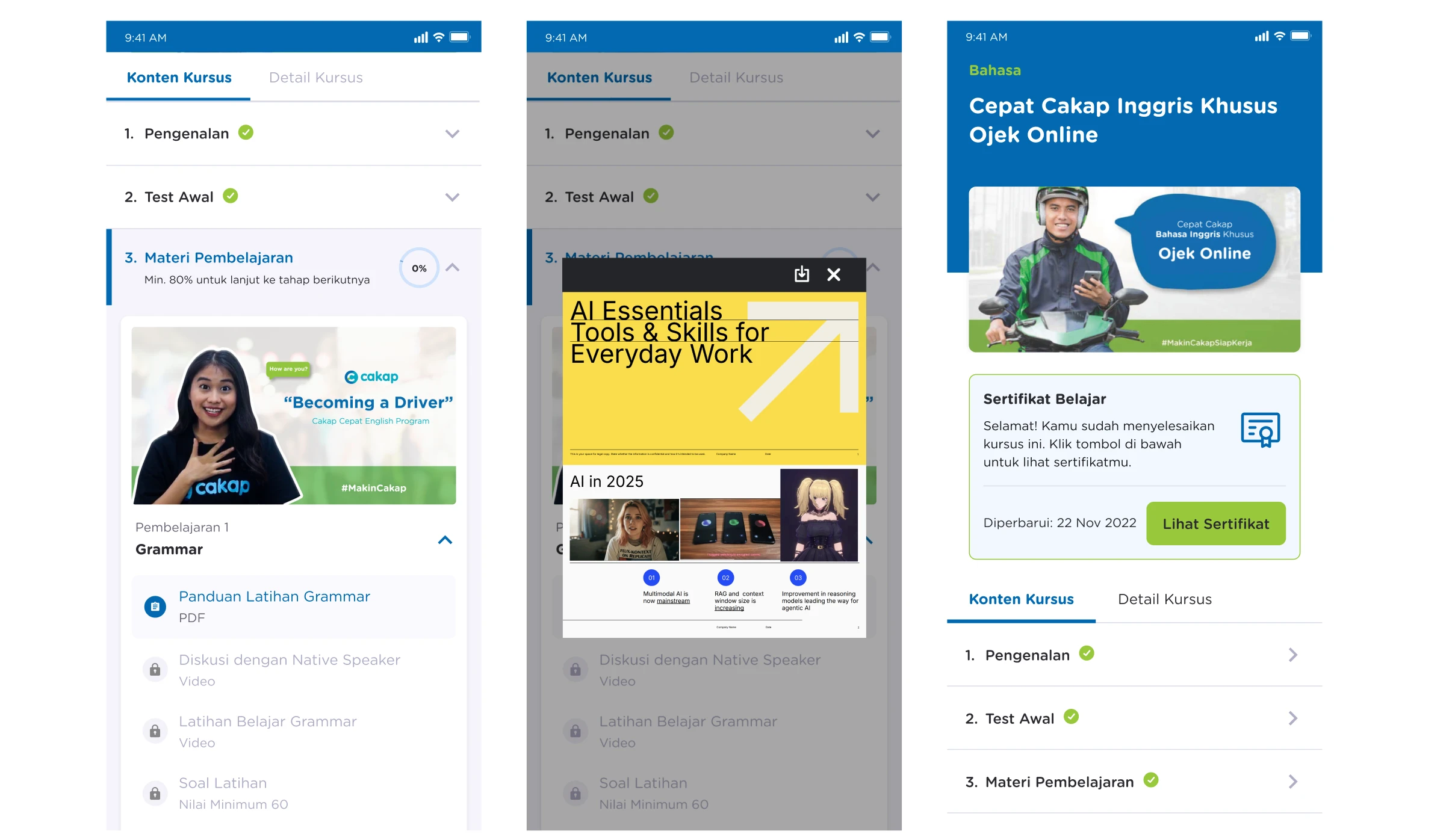
Beyond the completion metric, the structural changes delivered two business outcomes. The platform migration consolidating fragmented learning experiences into a single LMS was completed as part of this project, reducing maintenance overhead. And the new layout architecture created dedicated space for AI tool integration in the right panel, unblocking the next phase of the product roadmap without requiring another structural redesign.
Design Results
BEFORE
AFTER
BEFORE
AFTER
BEFORE
AFTER
What I Learned
Mobile design is physical, not just visual. A layout that looks balanced in Figma can fail completely in a hand. The entire navigation shift in this project came from taking thumb reach seriously as a constraint, not an afterthought.
Progress visibility is a retention mechanism. Hiding the progress bar behind a menu was an architectural mistake that testing made obvious immediately. For learners who are close to dropping off, seeing that they're 60% through a lesson is often the reason they finish it. That signal needs to be permanent and effortless to see.
Invisible interactions are unusable interactions. Concept 2's gesture navigation was more elegant on paper. But elegance that requires the user to already know how it works isn't good design it's a gatekeeping mechanism. Explicit controls, especially for a diverse and not uniformly tech-savvy user base, will always outperform clever interaction patterns with no affordance.
Like this project
Posted May 6, 2026
Redesigned Cakap's mobile-first LMS, increasing weekly material progress 48.67% by replacing pop-ups with inline content and thumb-zone controls.
Likes
0
Views
29