HelpfulSales Rebranding and Website Development in Framer
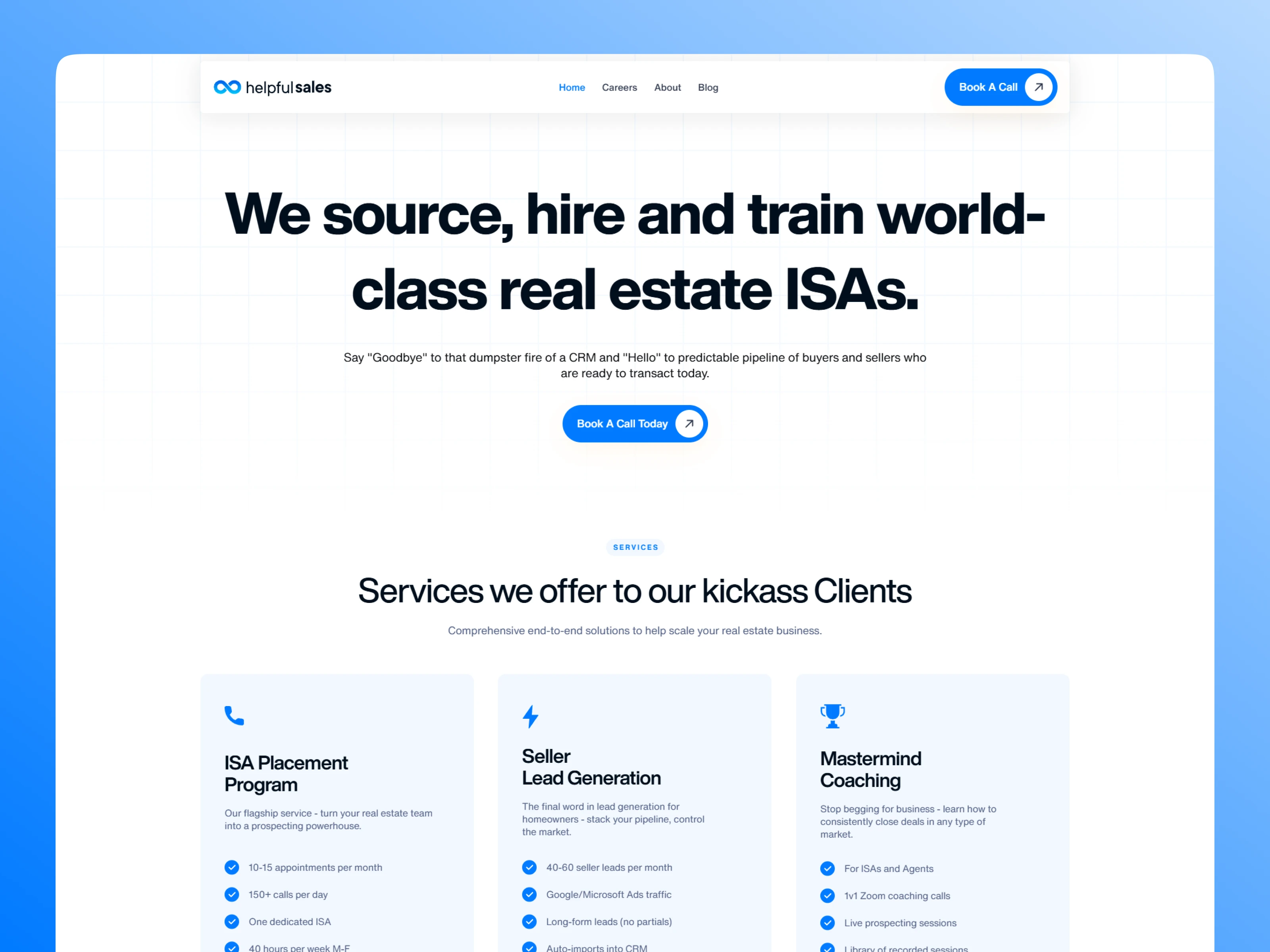
Overview
Client: Andy Cole
Company: Helpfulsales (formerly known as 0260labs)
Project Duration: 3 Weeks
Role: UX/UI Designer, Brand/Logo Designer, and Framer Developer
Tools: Figma & Framer
🔥 Figma Preview: https://bit.ly/4msHvTw
🔥 Check out the live site here: www.helpfulsales.com
🧭 The Backstory
Andy Cole is no stranger to the grind of sales. After spending years cold-calling in the real estate world, he built something smarter, an ISA placement service that helps real estate teams consistently get appointments without burning out.
His company, originally known as 0260 Labs, had already helped hundreds of clients. But its online presence? It didn’t match the quality of the service. The brand felt generic, the messaging was unclear, and the old website wasn’t converting as well as it should.
That’s when Andy decided to rebrand as HelpfulSales, a name that better reflected his company’s mission. He reached out to me to help bring that new identity to life through a website that was not only beautiful and modern but also actually helped grow the business.
❗ The Core Problems We Had to Solve
Andy wasn’t just looking for a “prettier website.” He had real, specific goals:
Rebrand the company with a bold, professional identity
Explain the services clearly to skeptical, time-starved real estate agents
Highlight real proof and results, like the 20,000+ appointments his team had already set
Increase conversions by turning curious visitors into booked strategy calls
Attract talent with a Careers page that shows off the company’s values
Lay a scalable foundation that could grow with his content, offers, and future app
We weren’t just designing pages; we were creating a full experience that made people trust Andy within seconds of landing on the site.
👋 Where I Came In
Andy brought me in to own the project from start to finish:
I handled the research to understand the target audience
Designed the full site in Figma
Built the live website using Framer
Created a responsive system that looked great on every screen
Integrated third-party tools like Calendly, YouTube, and CMS
Wrote and structured content to feel clear, confident, and easy to digest
Everything you see on HelpfulSales.com today was designed, built, and helped shape by me.
🔎 Research & Discovery
Before jumping into visuals, I needed to understand who we were speaking to and what they cared about most.
We had long calls where Andy explained:
The types of clients he works with (real estate team leaders juggling leads, overwhelmed with CRM chaos)
The transformation his service provides (going from no follow-ups to 150+ outbound calls a day)
His current hiring needs (finding and training great ISAs for real estate clients)
The biggest friction: clients don’t have time to dig around — they need to get the gist fast
From this, we mapped out the site structure in a way that mirrors a real conversation:
“Here’s what we do → Here’s how we do it → Here’s what others say → Book a call → Still on the fence? Here’s more proof.”
This became the blueprint for the user experience.
🎨 Design Strategy: Visual Clarity Meets Bold Confidence
In Figma, I built a fresh, clean UI system that reflected the new HelpfulSales brand:
Color palette: Bold blues and strong contrasts for trust and energy
Typography: Modern sans-serif fonts with clear hierarchy
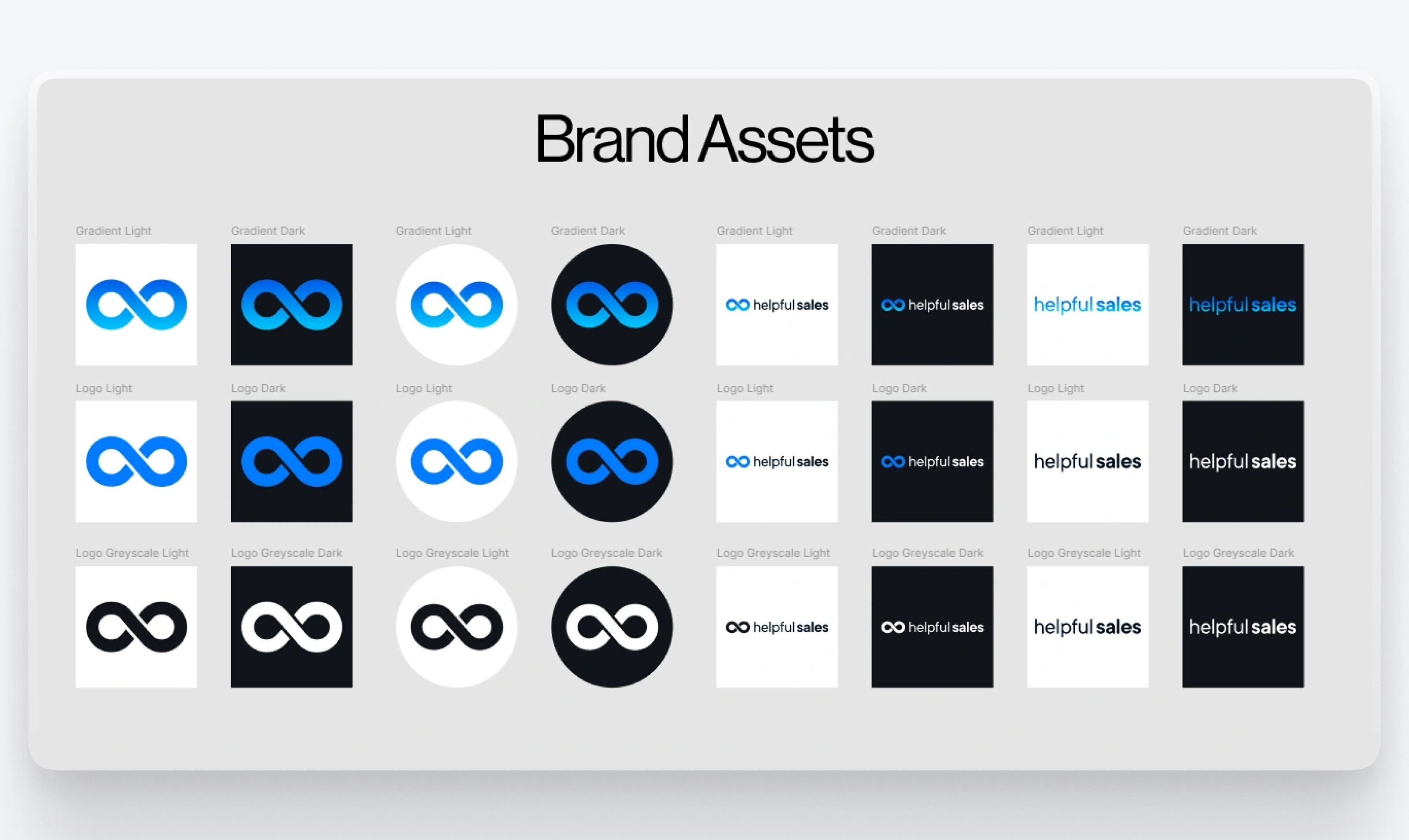
Logo: Simple, memorable, tied to the brand’s theme of “infinite helpfulness”
White space: Lots of breathing room for clarity
Voice & tone: Straight-talking, confident, and sometimes funny, just like Andy himself
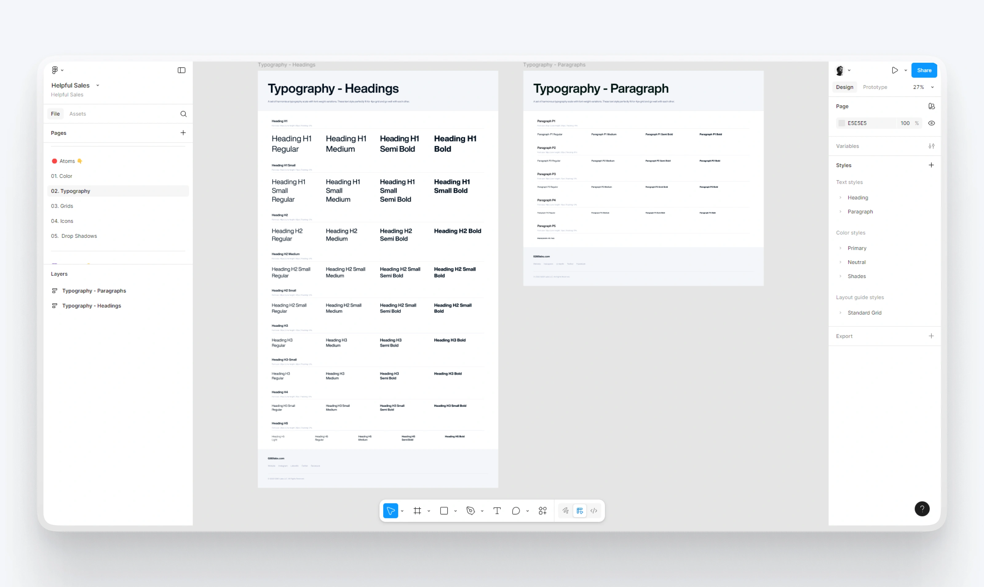
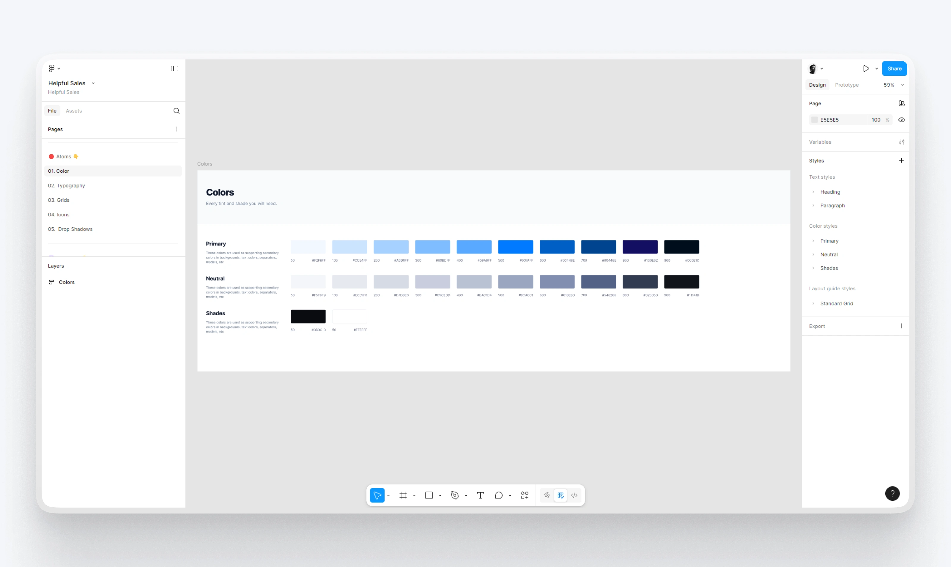
Every page was designed to reduce friction and increase clarity. I designed:
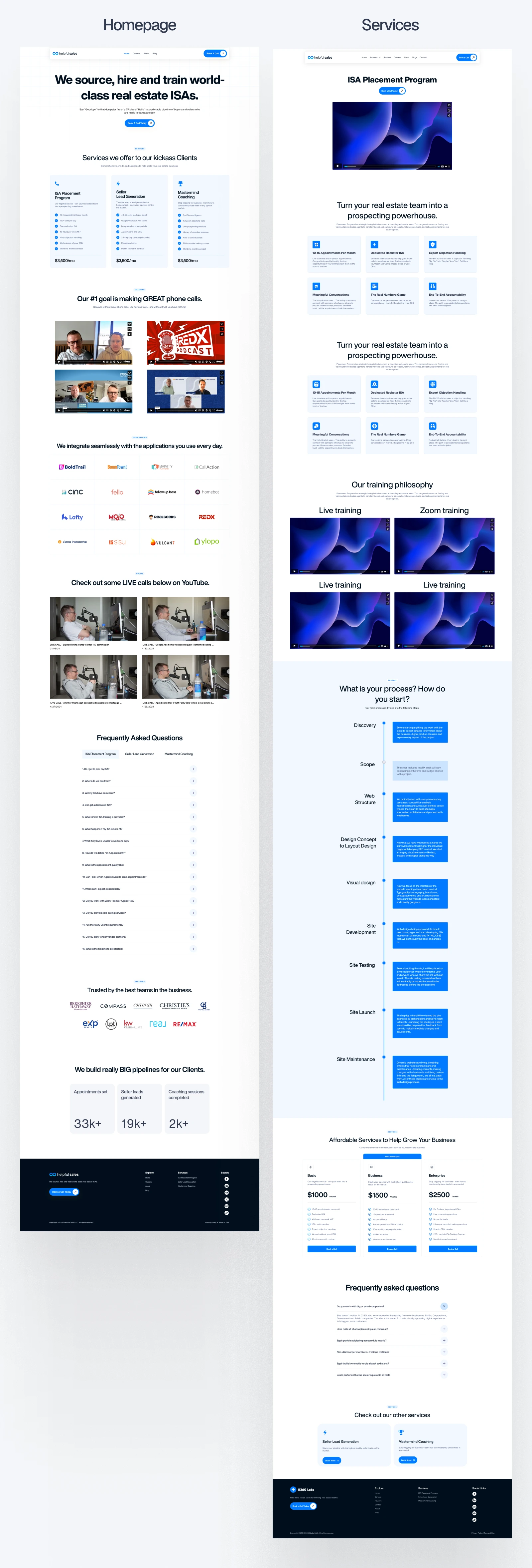
A striking homepage with Andy’s voice front and center
Program-specific sections that explained services in under 30 seconds
Real stats highlighted in bold (e.g., “290+ clients served”)
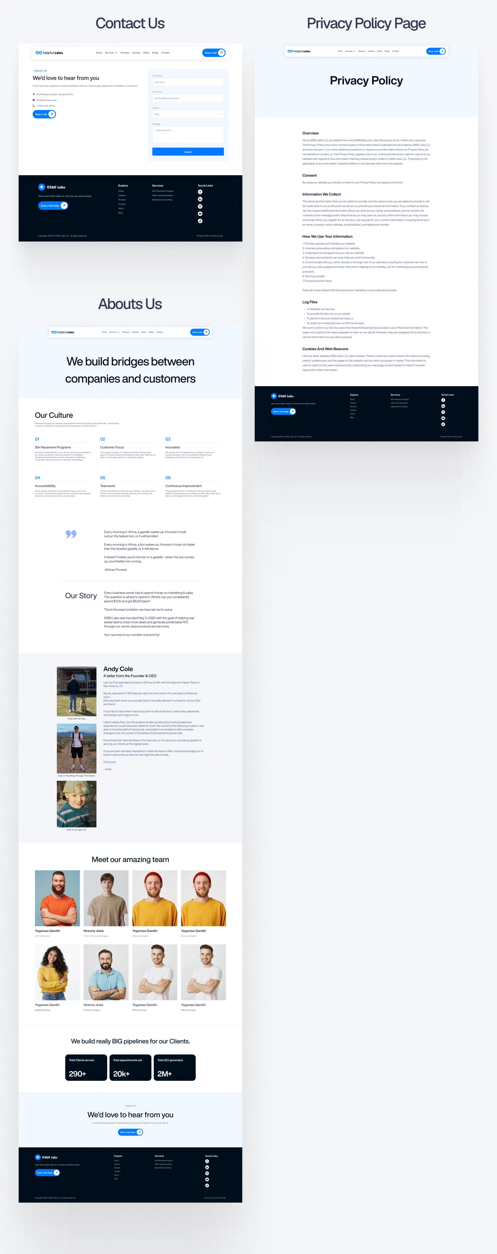
A testimonials grid plus embedded live call recordings — raw proof, no filters
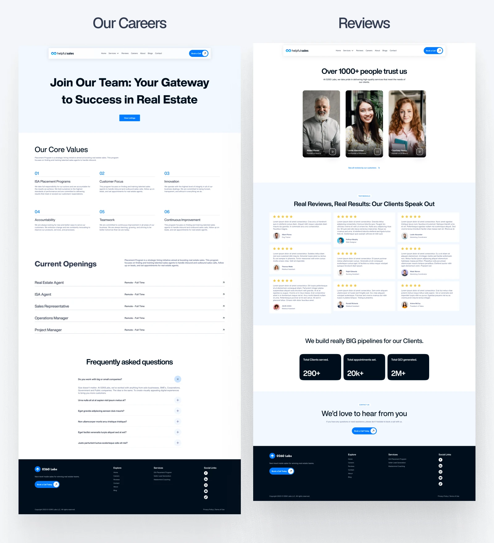
A hiring page showcasing team values and open roles
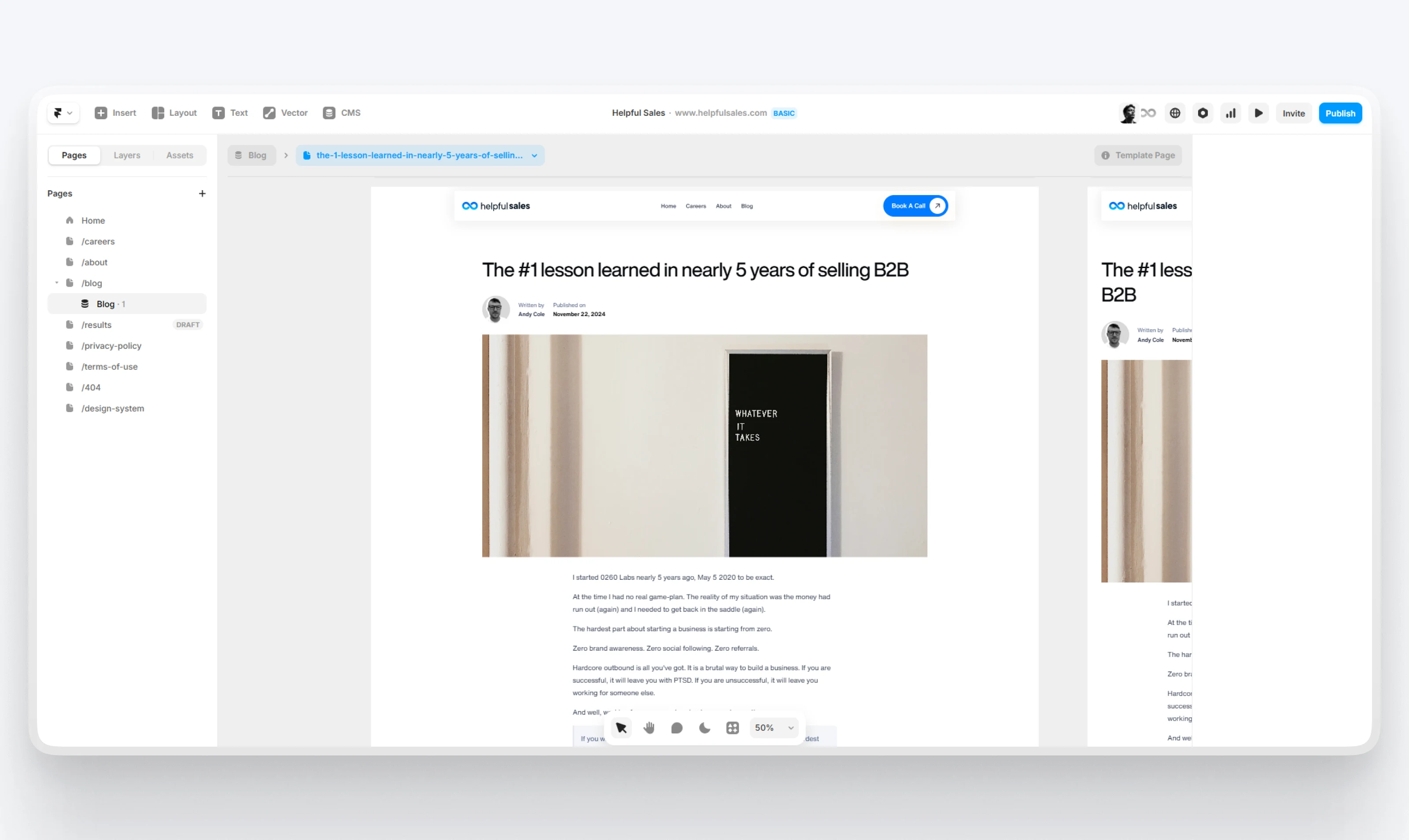
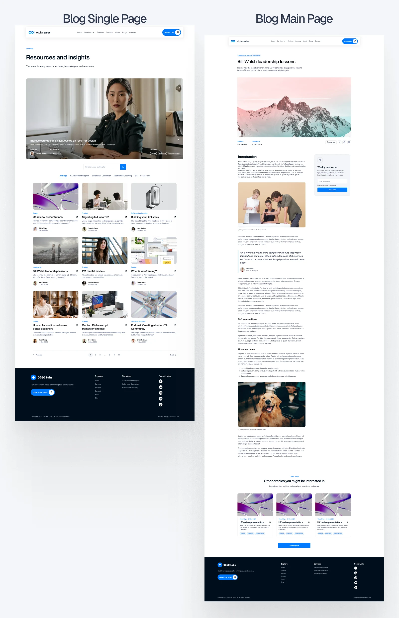
A blog system so HelpfulSales could start ranking for helpful content over time
Everything was responsive, consistent, and scalable.
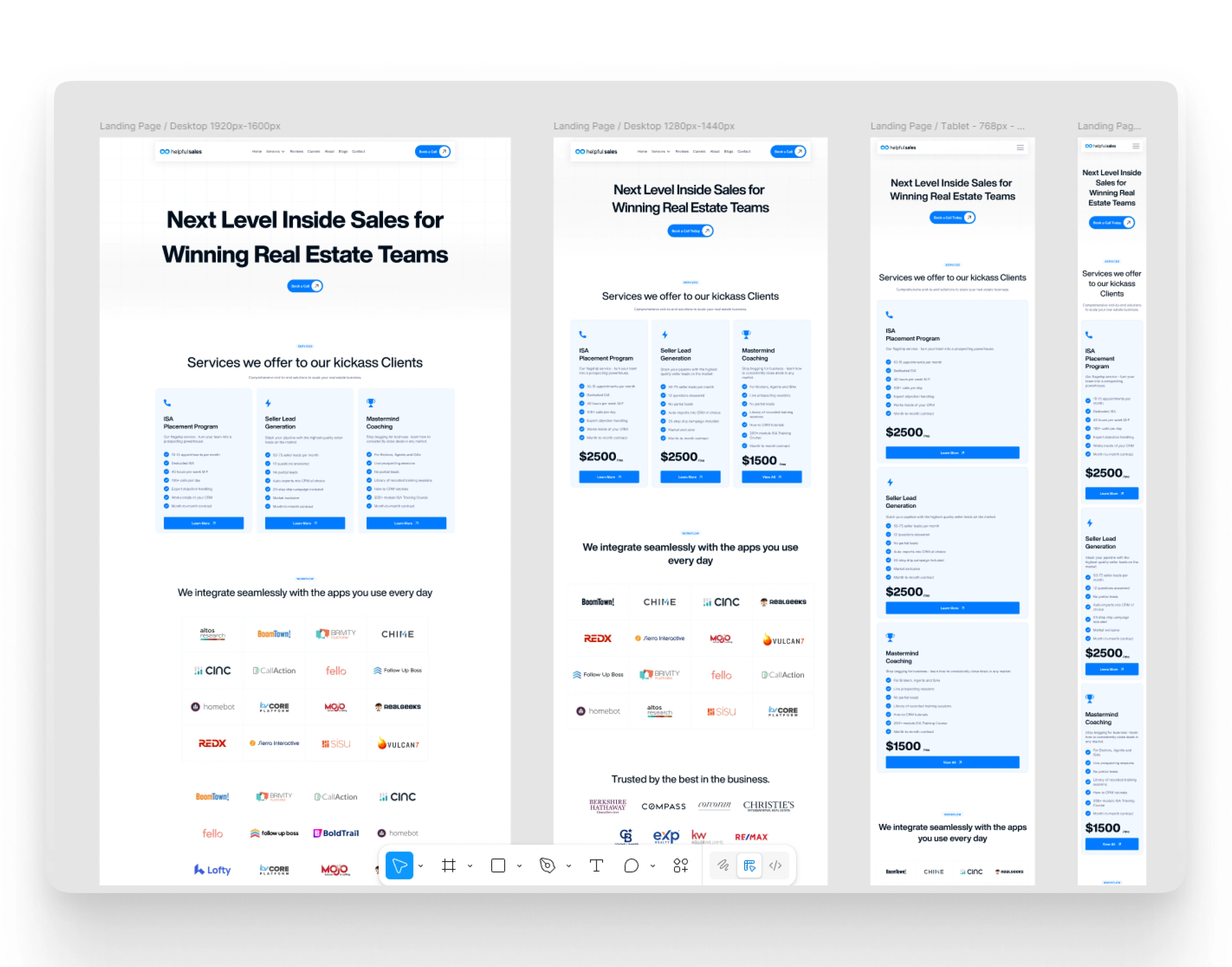
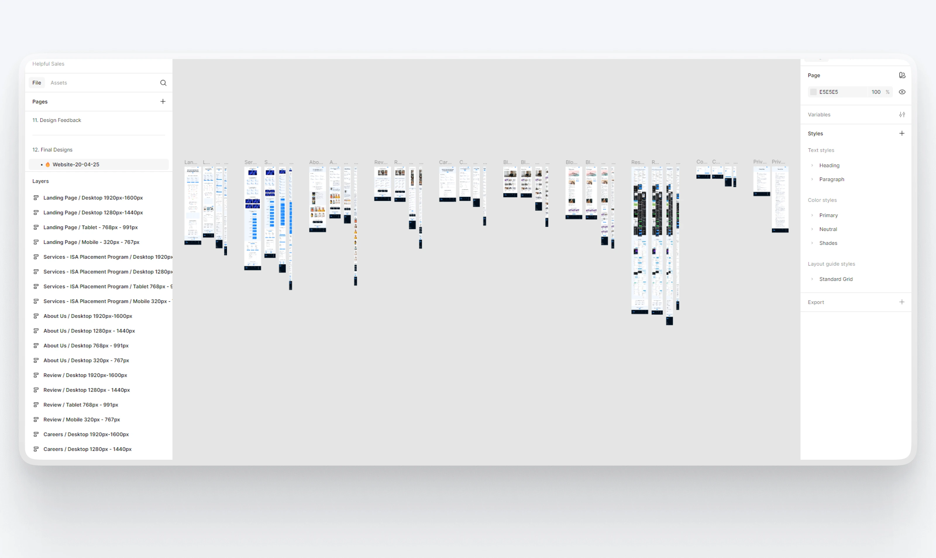
Homepage with responsive variation designs in Figma
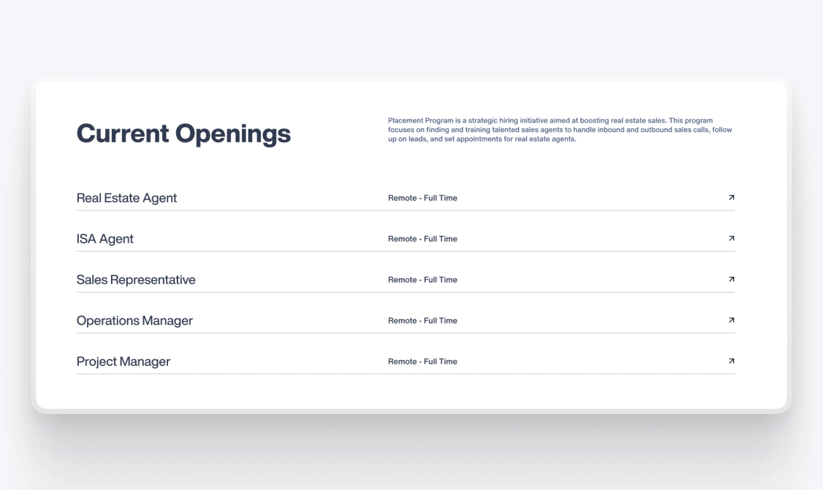
Job Openings
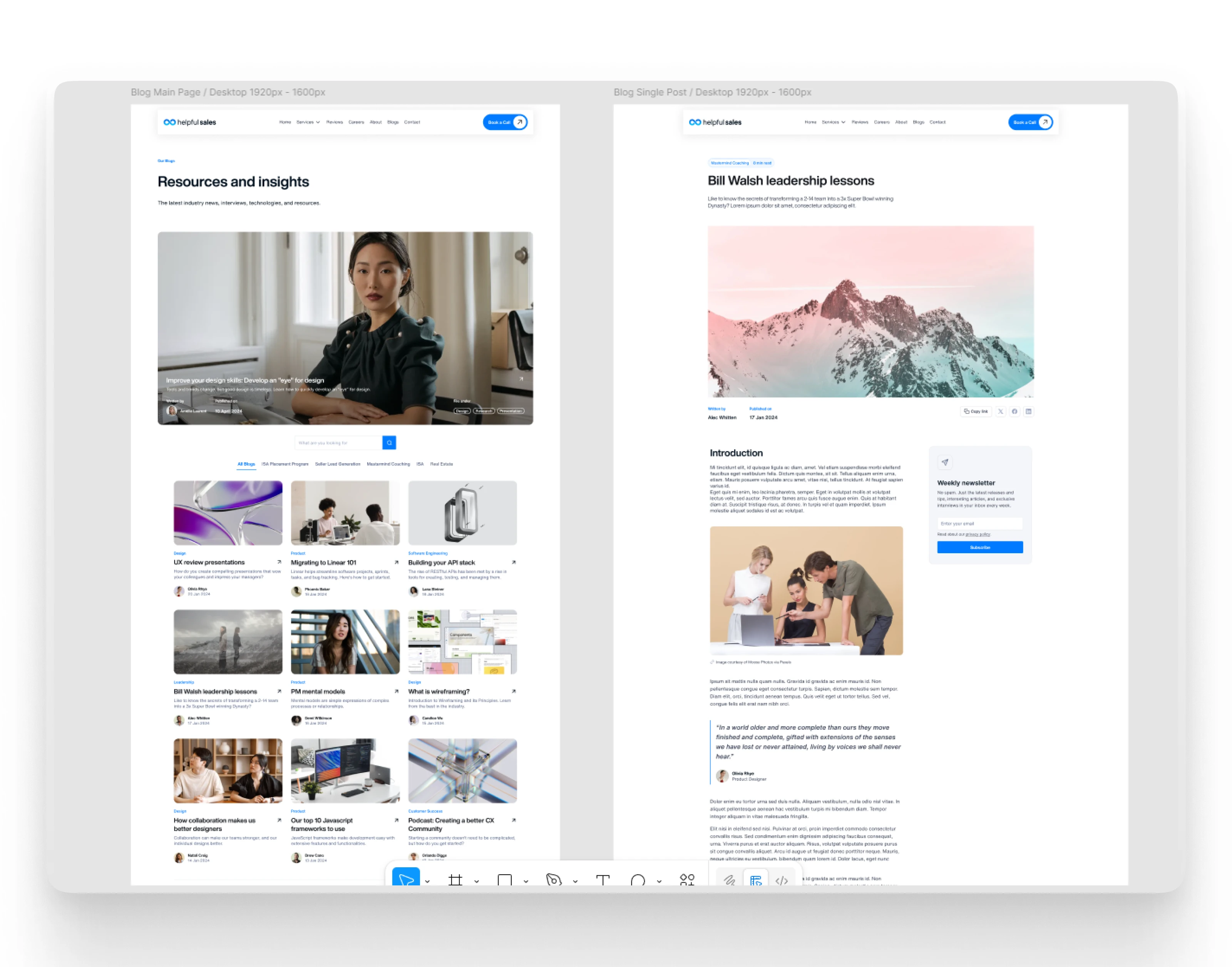
Blog Single Page & Blog Main Page
🔨Development in Framer
Once the design was approved, I built the full website in Framer to match the pixel-perfect look and feel of the Figma mockups.
Key development features included:
Responsive design for desktop, tablet, and mobile
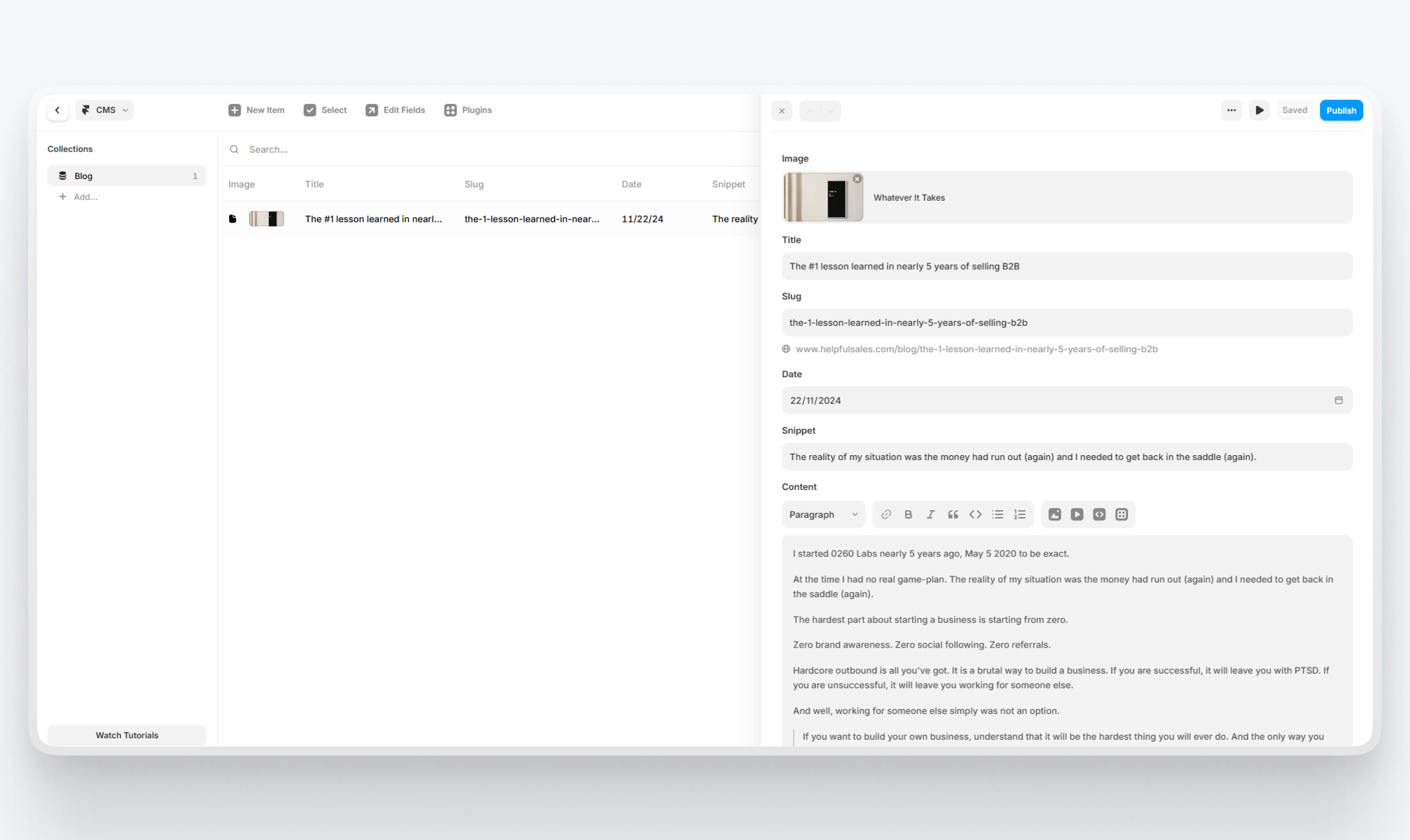
CMS blog integration so the client could publish resources without needing dev help
Framer animations and transitions for smooth, scroll-based interactions
Calendly integration to book discovery calls
YouTube embed modules to showcase real sales calls
Sticky CTAs to drive conversions from anywhere on the page
Custom visual components like icon sets, testimonial layouts, pricing sections, and program diagrams
I also migrated everything from the previous 0260labs.com setup, making sure SEO redirects were handled and analytics were properly connected.
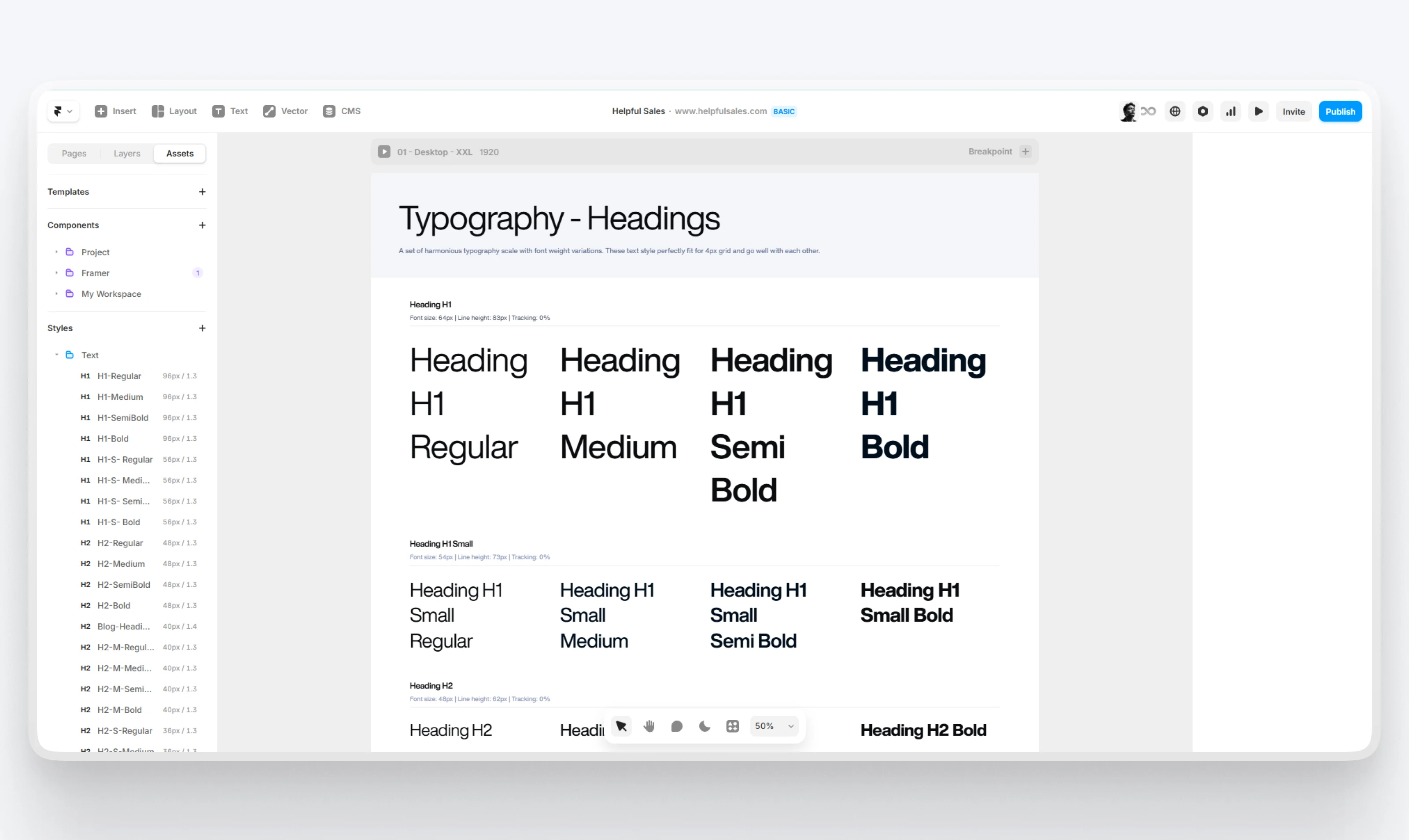
Design System in Framer
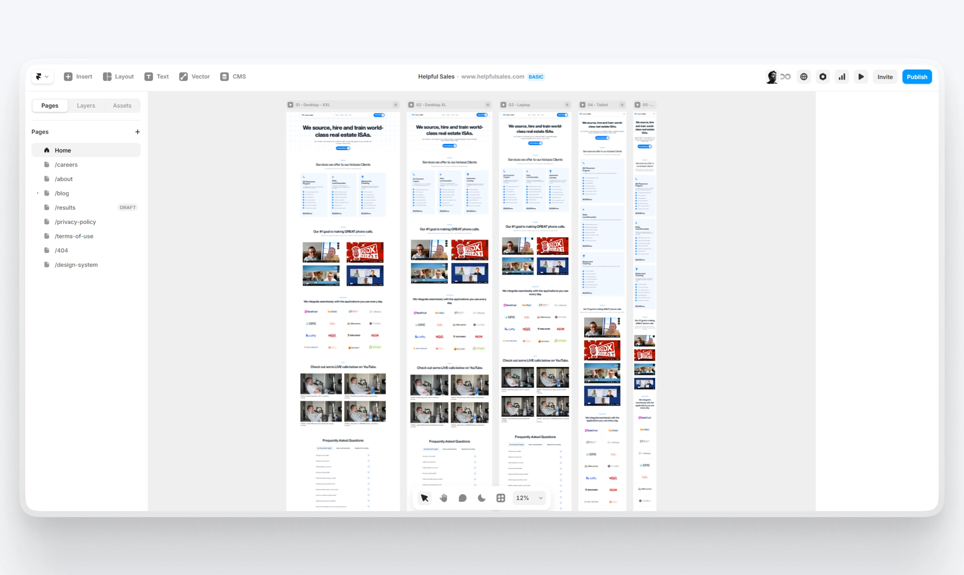
Framer Development
⚠️ Real-World Challenges
Here are a few obstacles we had to navigate:
1. Brand Shift Mid-Project
Andy officially changed the company name during the project. That meant updating visuals, domain strategy, copy, and structure, fast.
How I handled it: I designed with flexibility from day one, so the transition to HelpfulSales was smooth, not chaotic.
2. Too Much Content
Andy has a lot to offer. Explaining it all without overwhelming the visitor was tough.
How I handled it: I broke up content with tabs, accordions, and stat boxes. Used scroll cues and visual hierarchy to keep it all digestible.
3. Tight Deadline
Andy wanted the new site live ASAP. We had to ship quickly without cutting corners.
How I handled it: I worked in daily iterations, shared previews fast, and kept feedback loops short. The full project went from kickoff to launch in just a few weeks.
✅Outcome
Here’s what changed after the new site went live:
✅ A new identity for HelpfulSales, one that finally reflects the quality of their work
✅ Clearer service explanations, less confusion, more interest
✅ More leads booking discovery calls through Calendly
✅ A site that converts, not just looks pretty
✅ A platform Andy can scale with, including a growing blog and hiring funnel
🔥 Figma Preview: https://bit.ly/4msHvTw
🔥 Check out the live site here: www.helpfulsales.com
🔥 Figma Preview: https://bit.ly/4msHvTw
🔥 Check out the live site here: www.helpfulsales.com
Like this project
Posted Jul 6, 2025
Designed in Figma and developed in Framer, the website rebranded from 0260labs to HelpfulSales, an appointment-setting platform for real estate teams in Texas.

