Prodigy Fintech/SaaS Webflow Website
Al Razi Siam
🔍 Project Overview
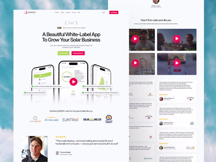
Name: Prodigy
Industry: Fintech / SaaS
Scope: UI/UX Design + Webflow Development
Platforms: Figma & Webflow
Duration: 2 weeks
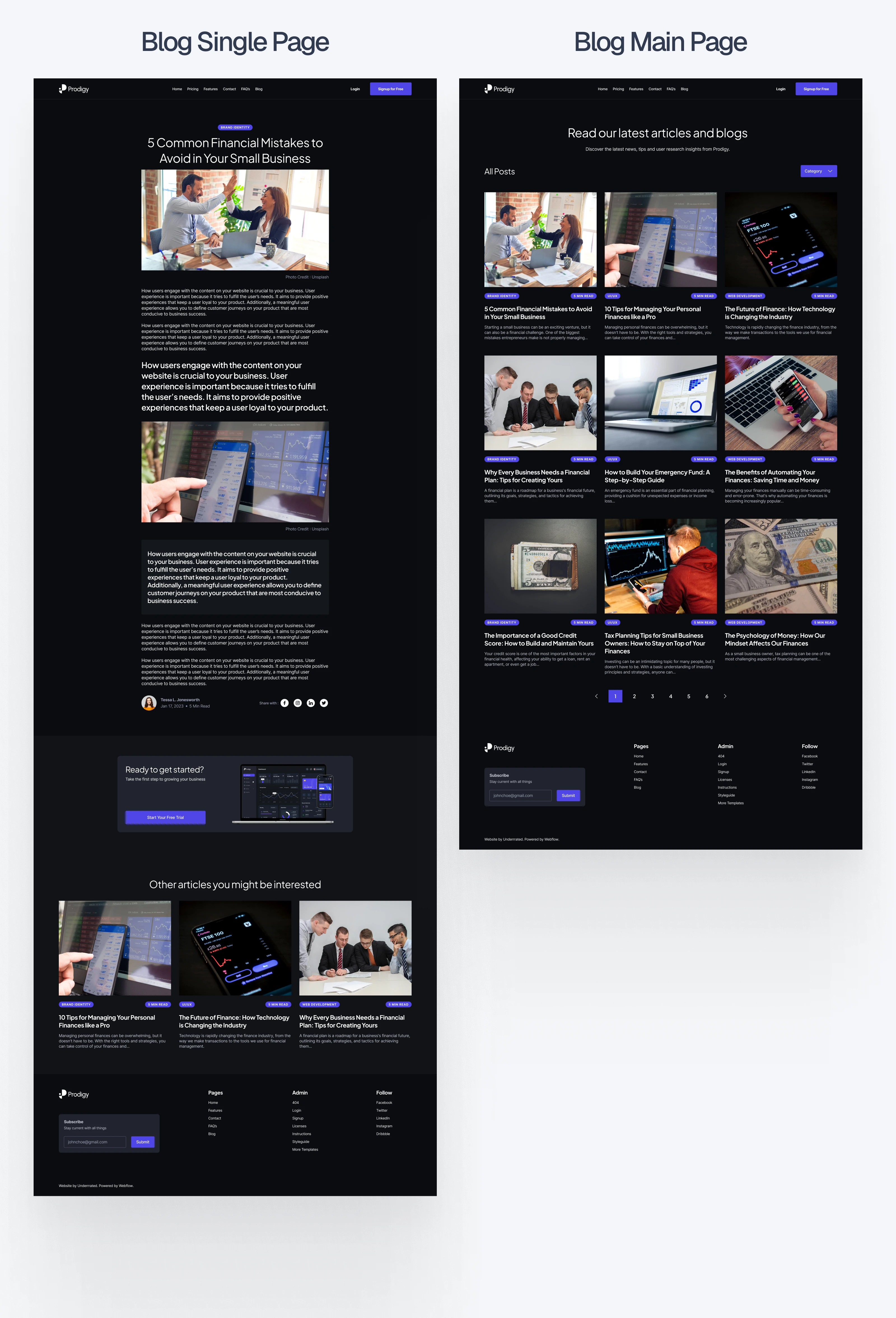
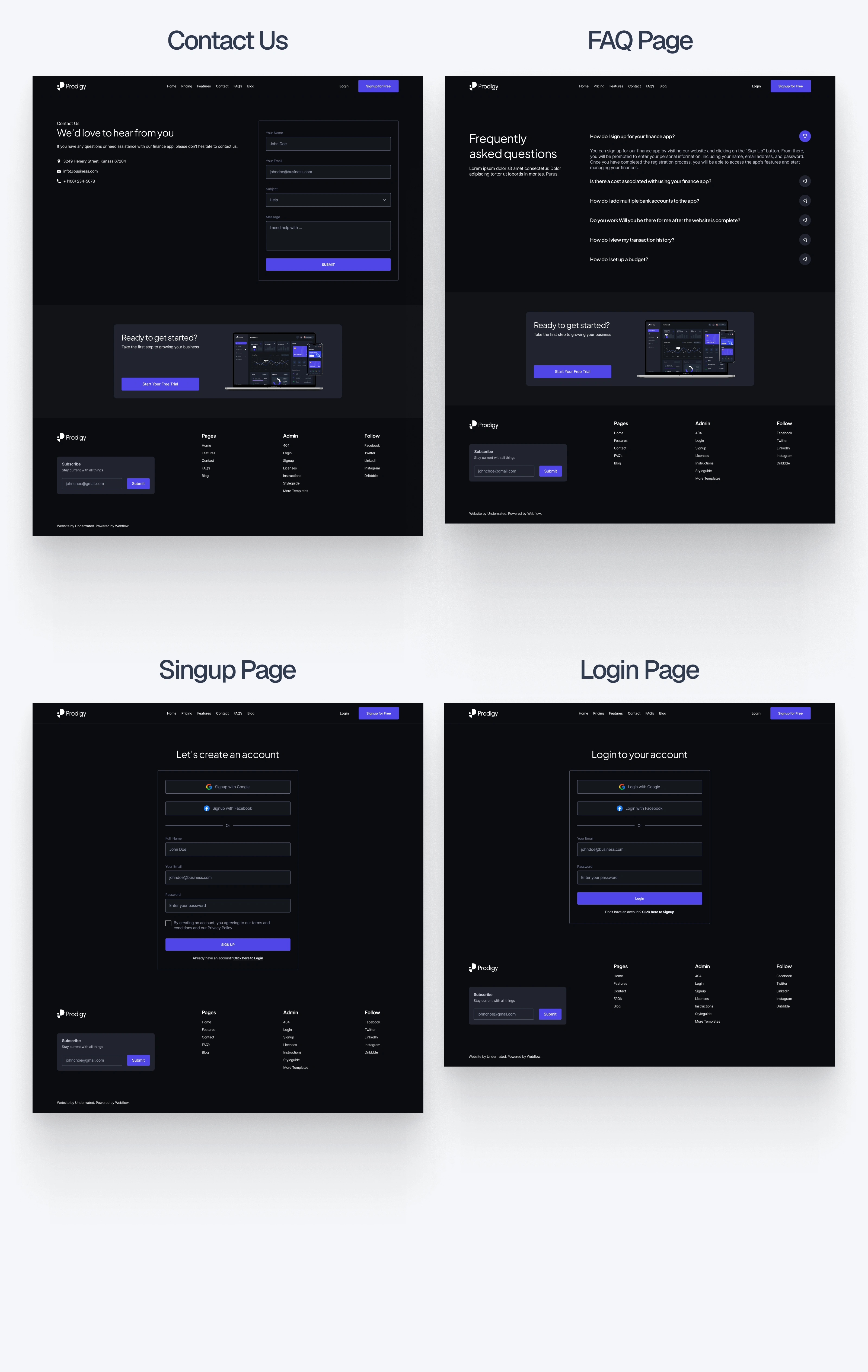
Pages Designed: 16 total (8 light + 8 dark versions)
🔥Live site: Click Here
🔥Figma Preview: Click Here
🔥Checkout the Webflow Template : Click Here
🎯 Project Goals
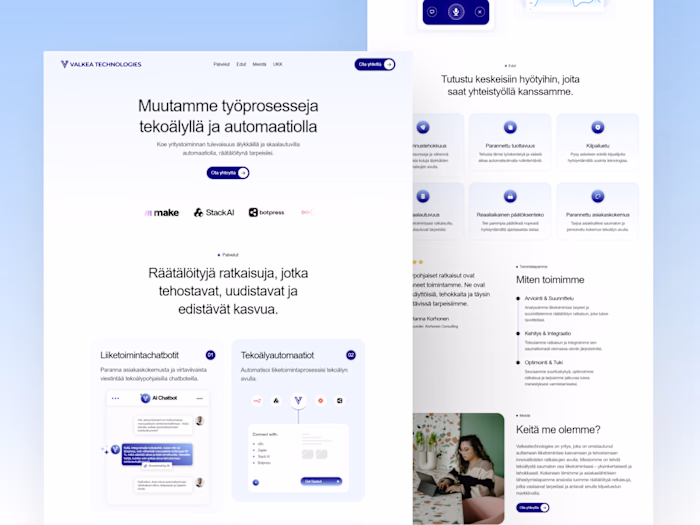
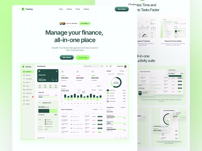
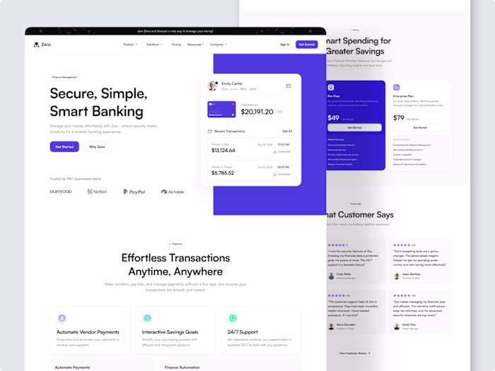
Design a clean, fast, and scalable template tailored for SaaS & fintech websites
Build a full-featured design system that supports both light and dark themes
Make every page responsive and accessible
Ensure structure fits startup needs (product showcase, pricing, blog, FAQ, signup)
Keep everything easy to update and customize inside Webflow
✏️ Design Process in Figma
1. Strategy & Research
I started by researching top-performing SaaS and fintech websites to find out what works. I paid close attention to:
Layout clarity
Trust signals (logos, testimonials, etc.)
How companies explain product value in simple ways
This helped define the content structure and tone for the site, clean, calm, and confident.
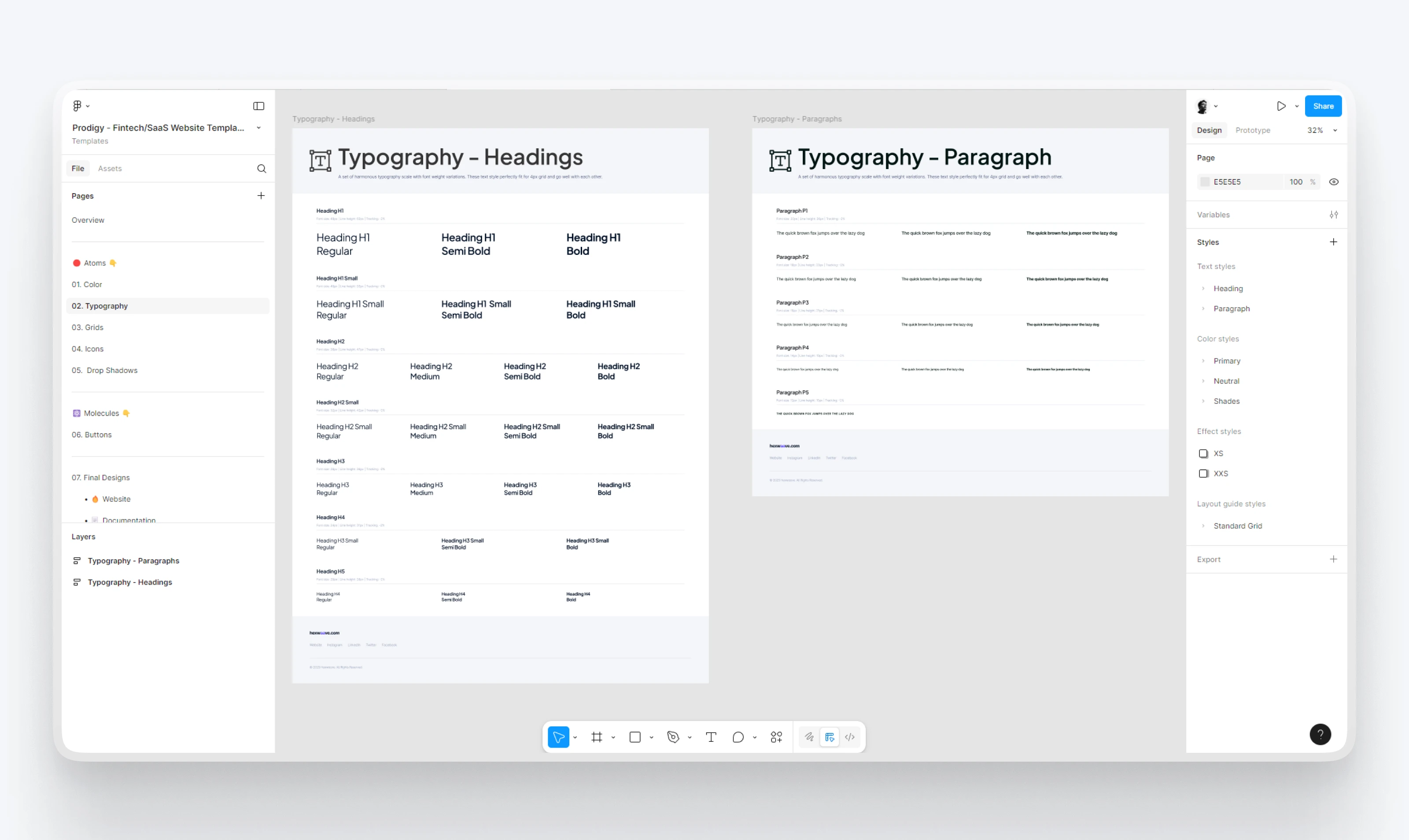
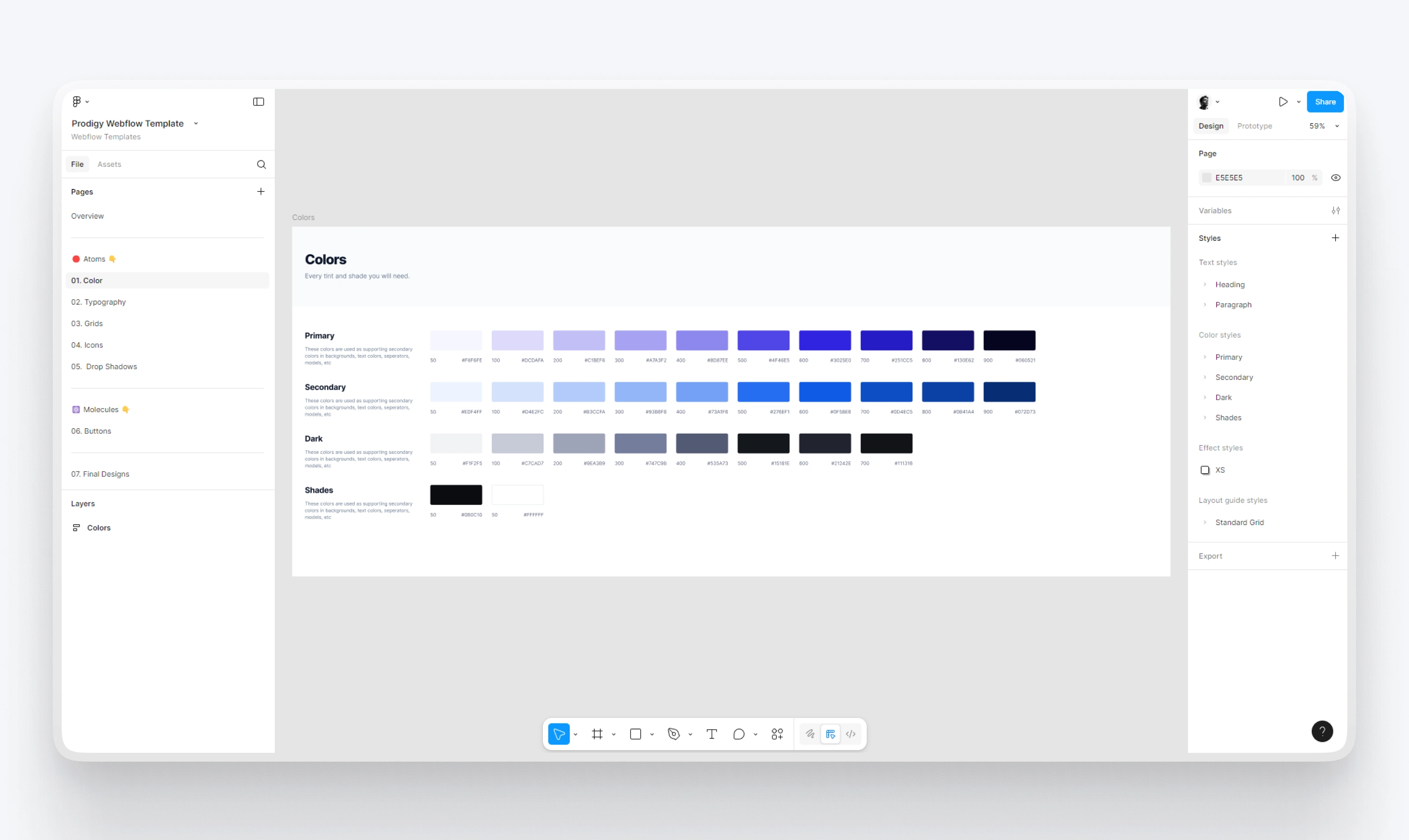
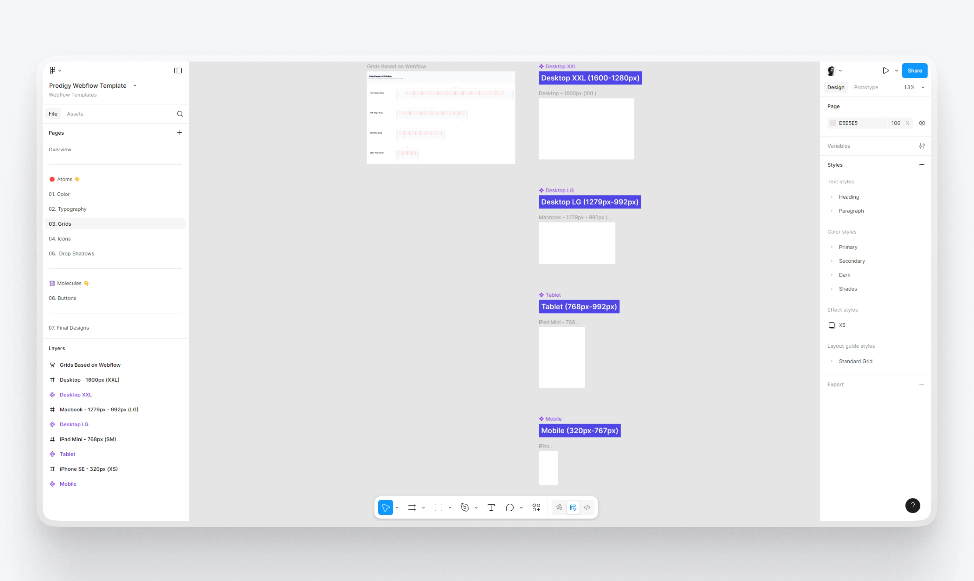
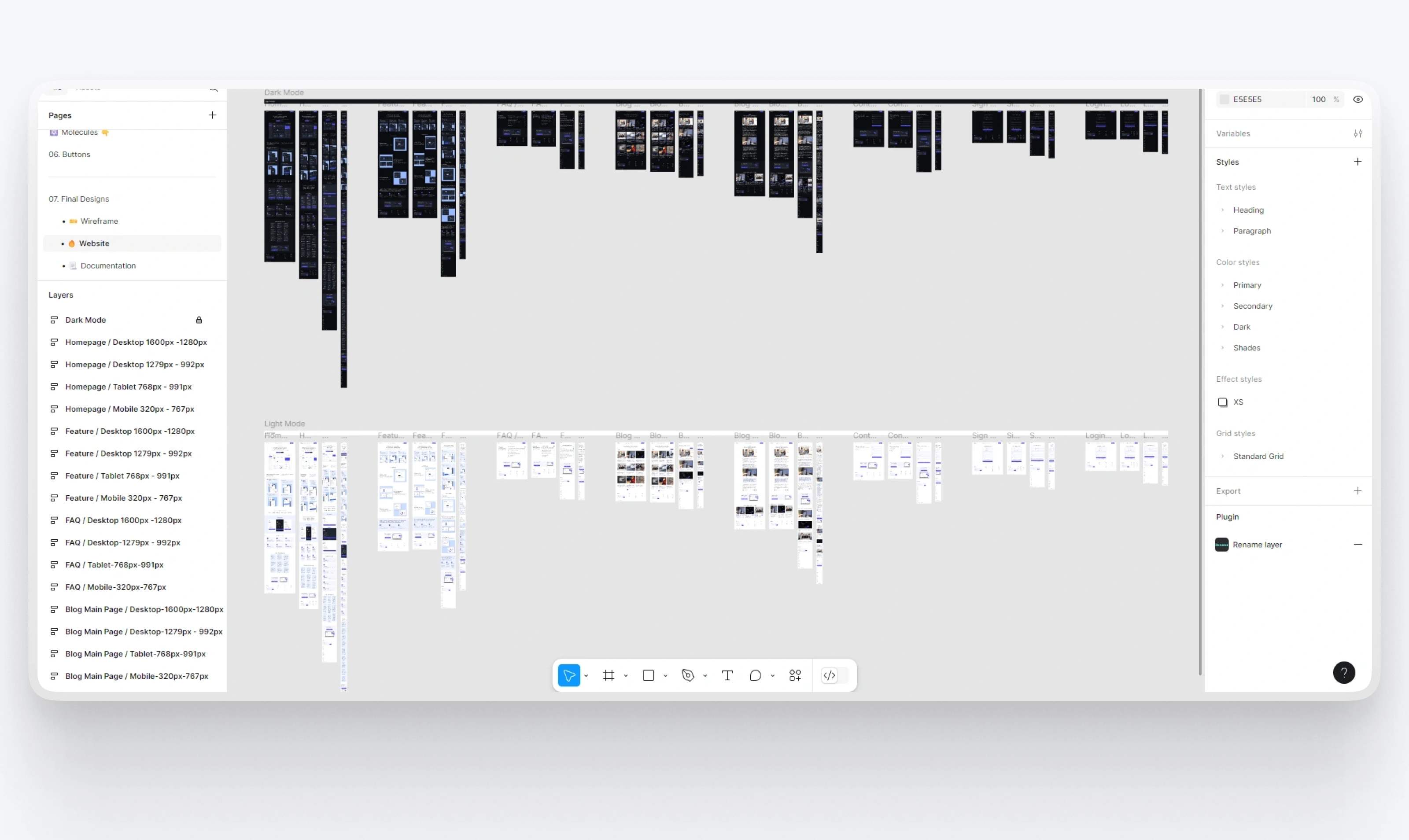
2. Design System Foundation
I built a complete internal design system to ensure consistency and speed during design and development.
Included in the system:
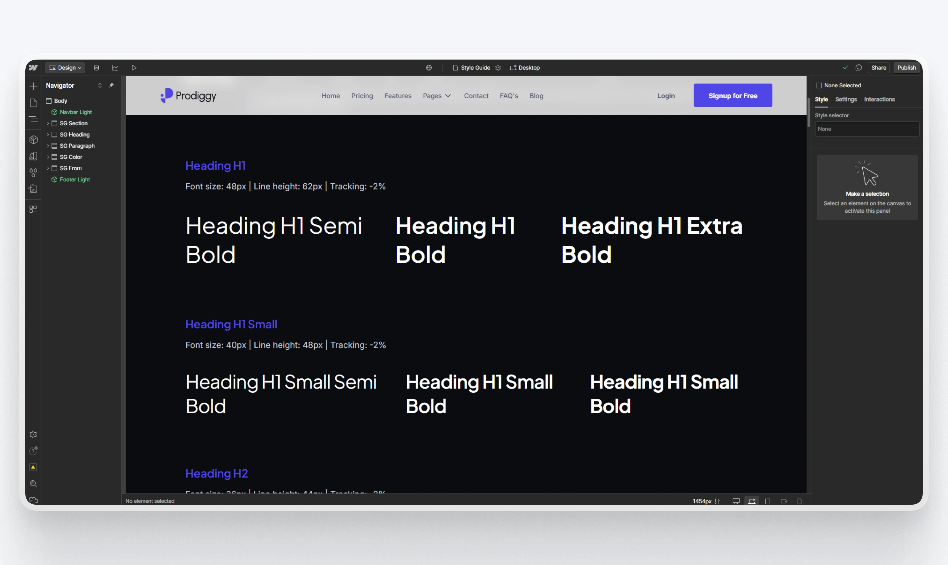
Typography: Headings, body, captions, all with proper hierarchy
Color styles: Full palette with theme pairs (light/dark)
Grids & spacing: Standardized layout margins and paddings
Reusable components: Buttons, forms, icons, cards, sections
Documentation: Everything in Figma is organized and labeled for quick onboarding
This system made it easy to create dozens of screens while keeping the brand feel intact.
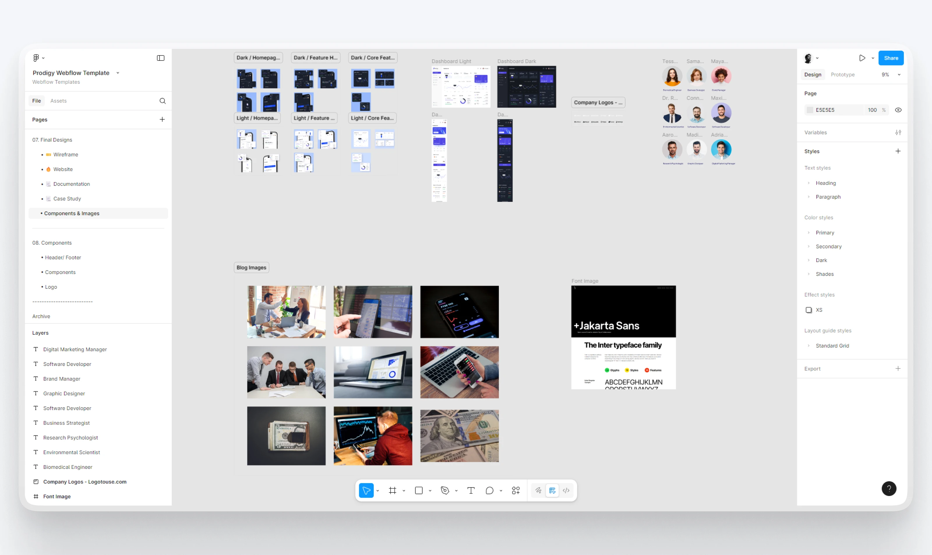
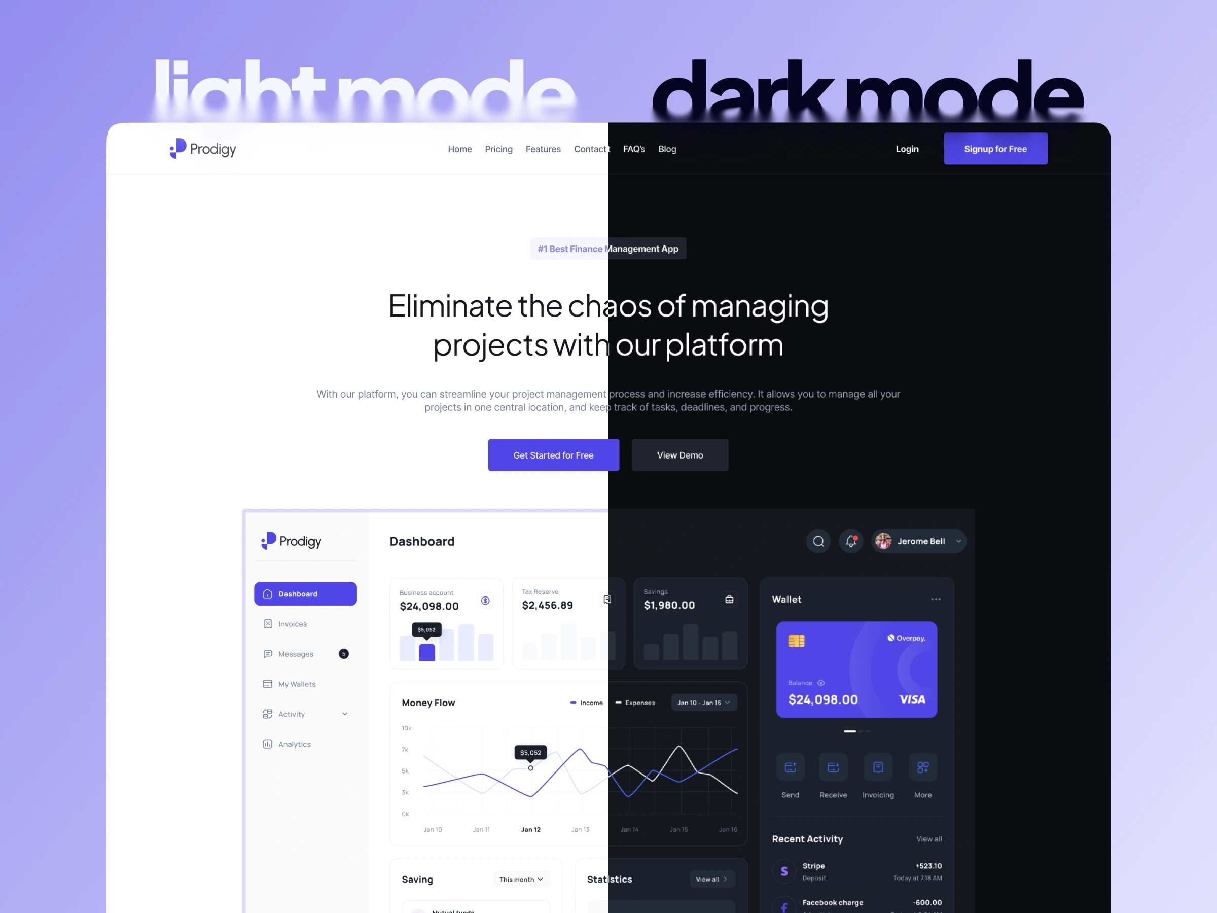
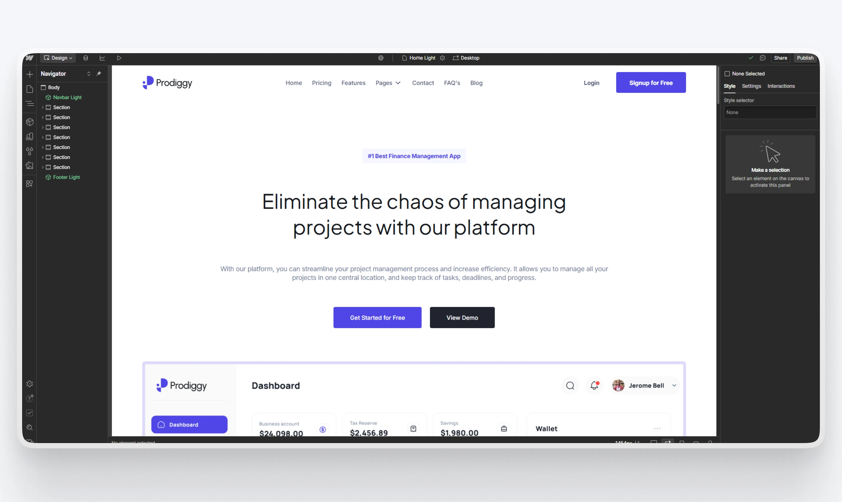
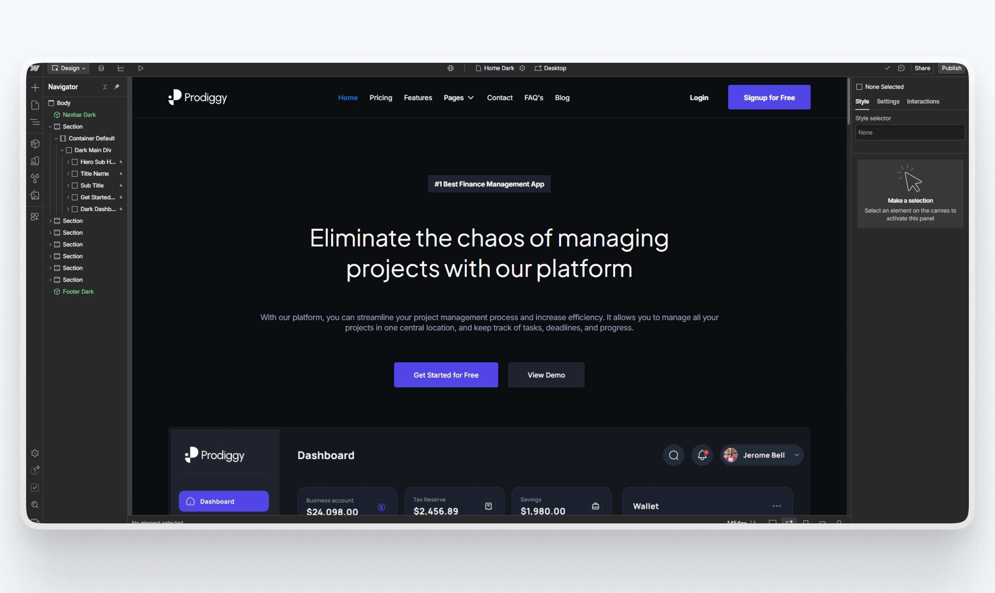
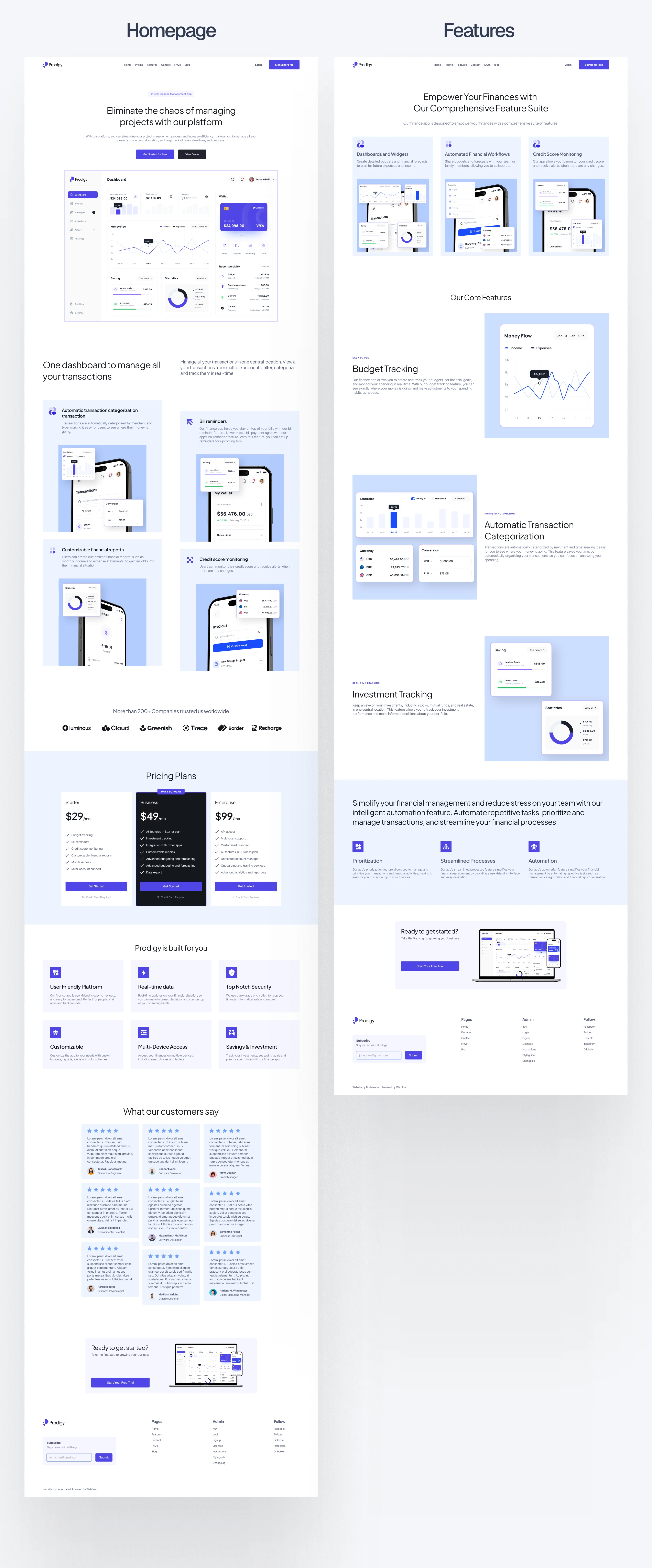
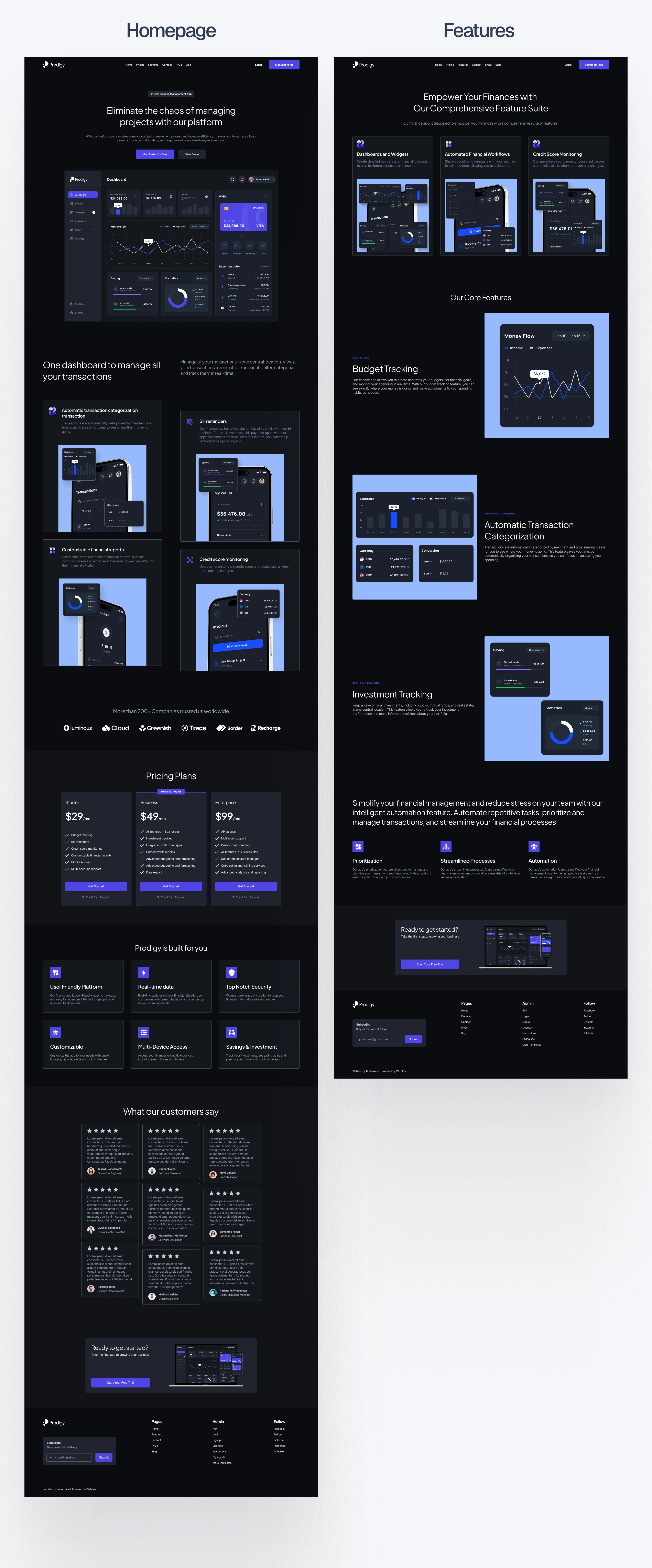
3. Light & Dark Mode Design
Both themes were designed natively, not just inverted. I created:
Thoughtful color adjustments to maintain readability
Brand consistency across both modes
Theme-aware UI elements and icons
Light mode offers clarity and cleanliness, while dark mode gives it a modern, premium edge, perfect for tech audiences.
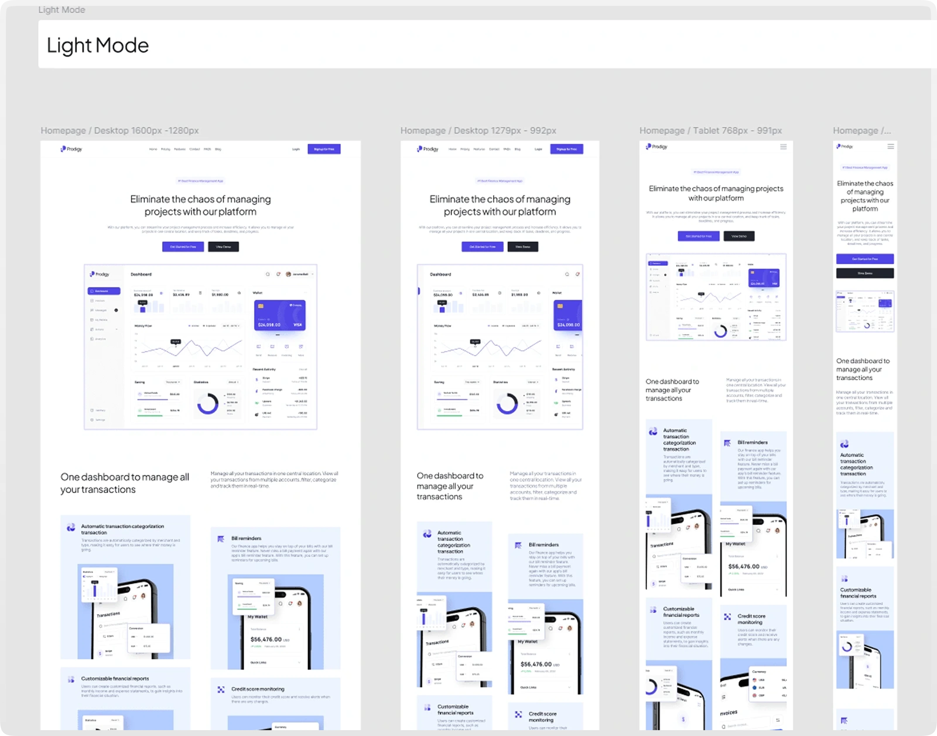
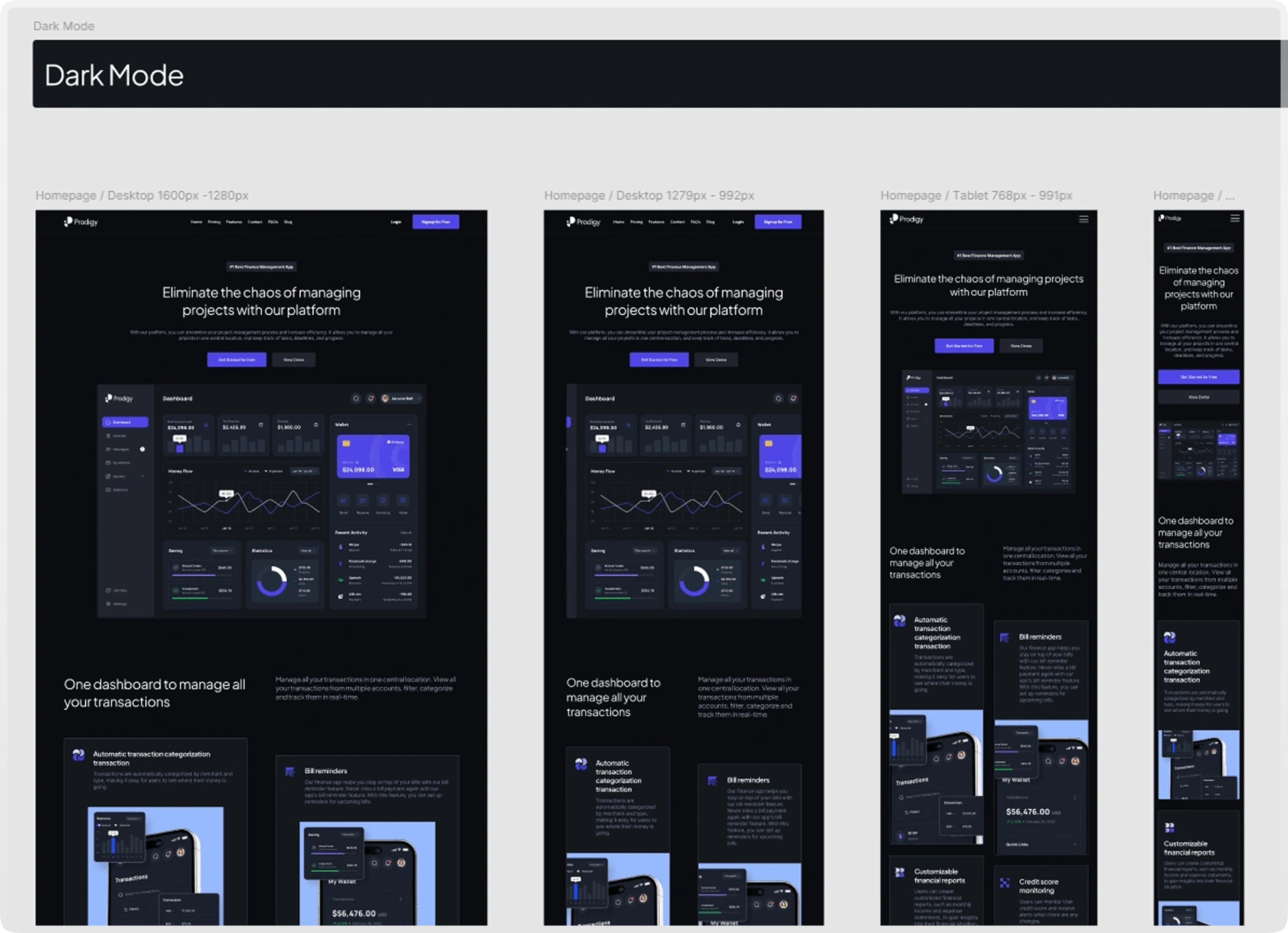
4. Responsive Layouts
I designed all pages across four breakpoints:
Desktop (1600px and 1280px)
Tablet (768px–991px)
Mobile (320px–767px)
Each screen was adjusted manually to ensure smooth responsiveness and visual harmony across devices.
🔧 Development in Webflow
1. Style Guide Setup
Before anything else, I replicated the Figma design system inside Webflow:
Global typography and color swatches
Utility classes for spacing and layout
Consistent padding, margin, and structure across all sections
This ensured a smoother workflow and a highly maintainable build.
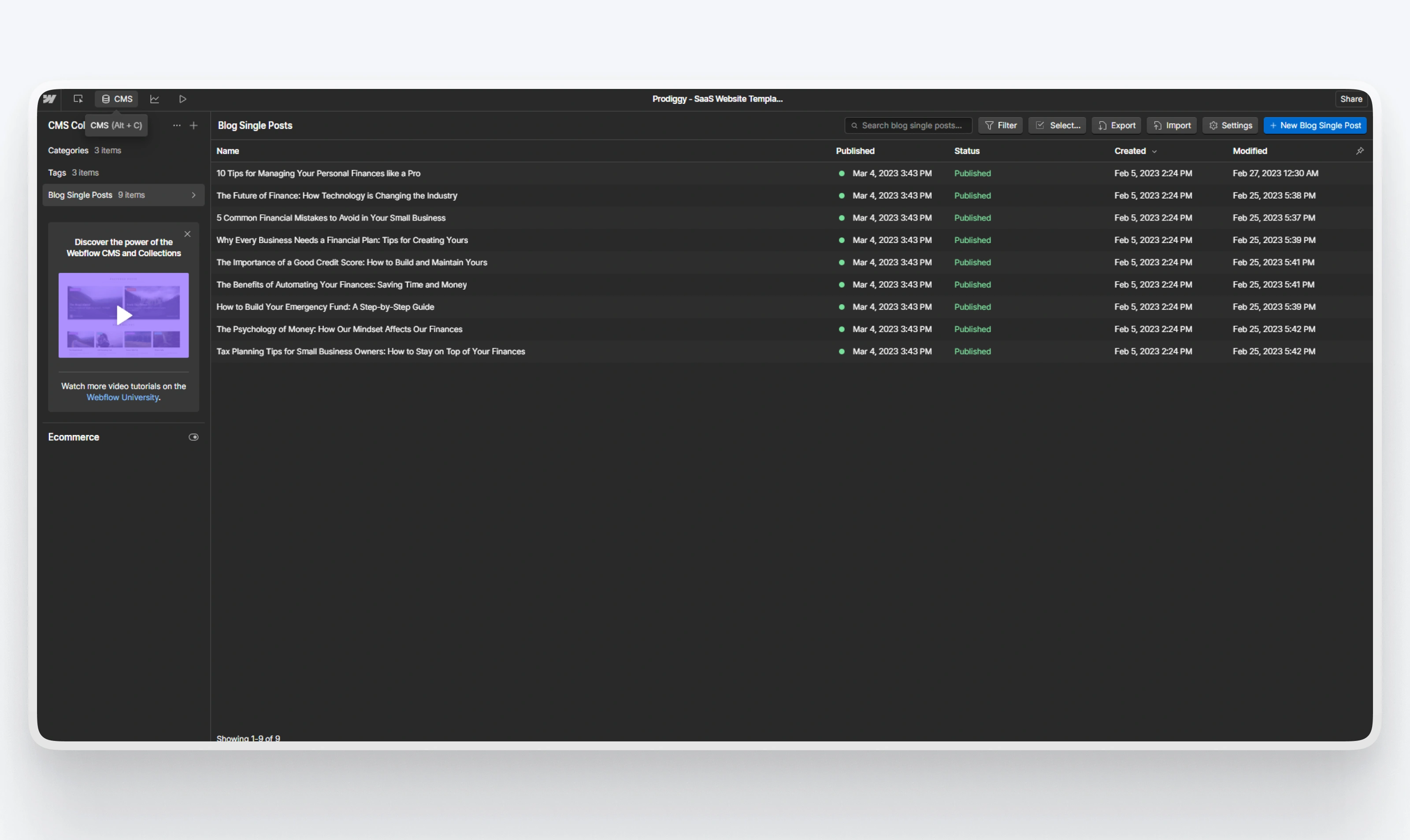
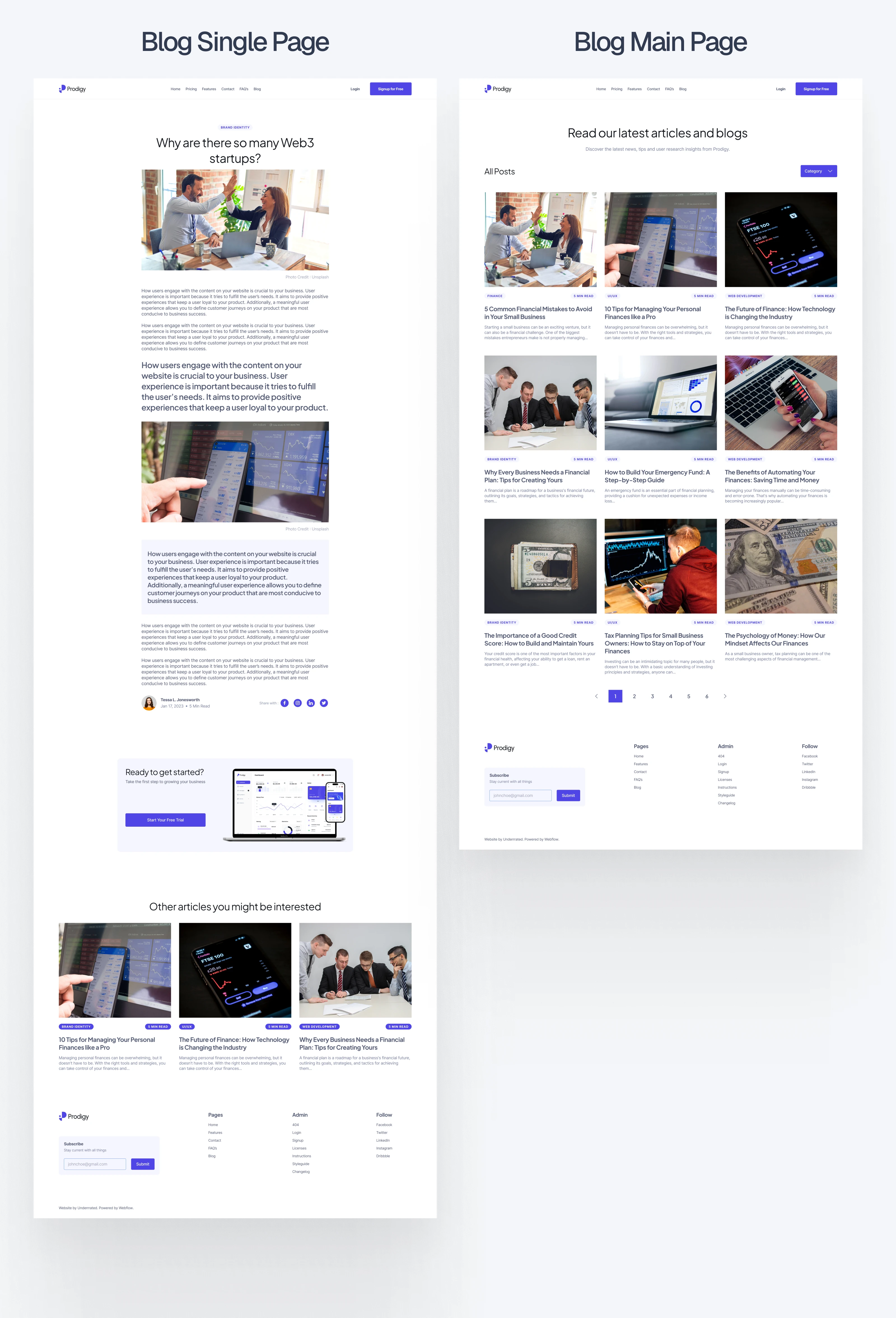
2. CMS Integration
Webflow CMS was used for:
Blog
FAQs
Testimonials
This allows startups or marketers to update content easily, no code needed.
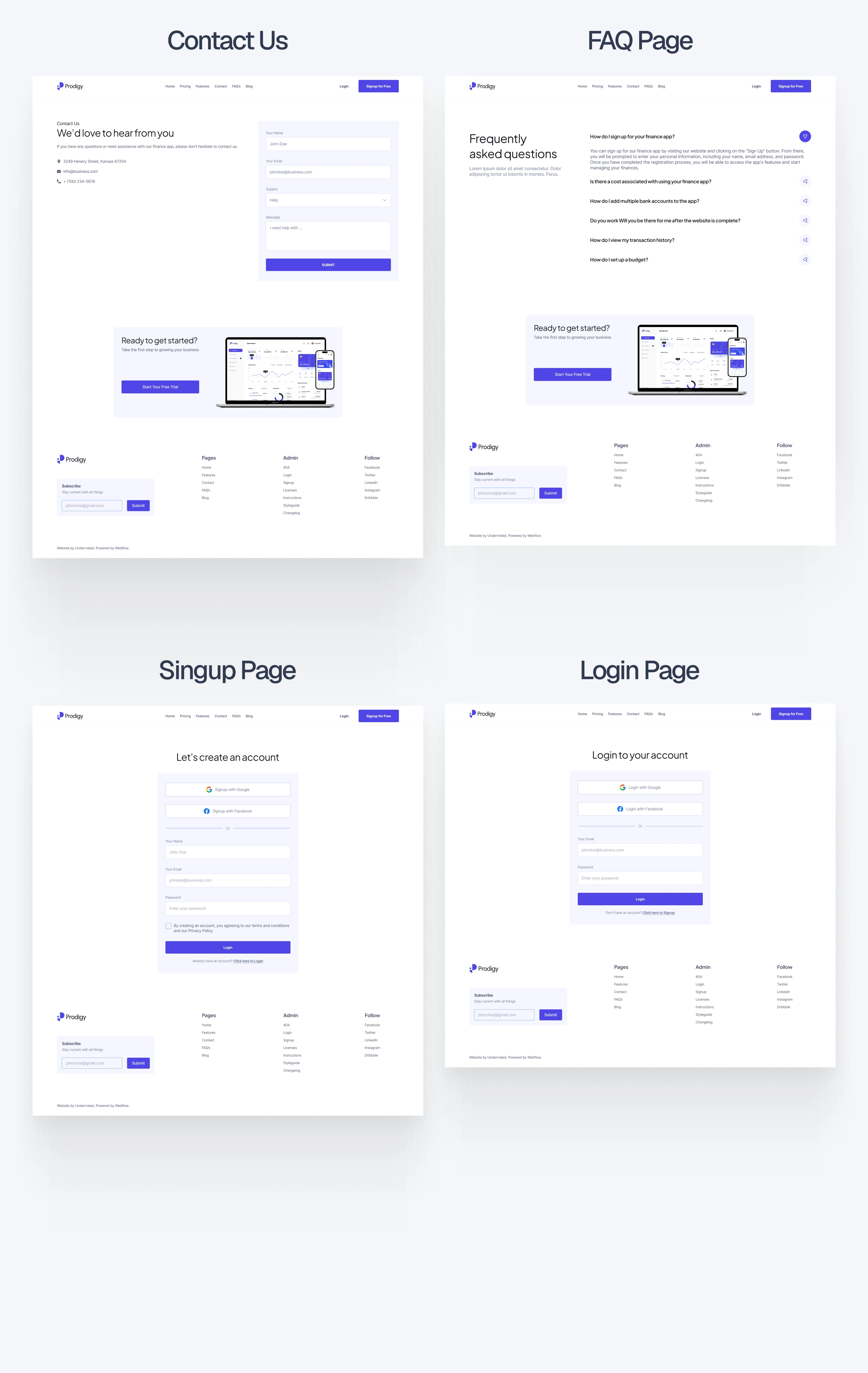
3. Component-Based Structure
I turned all recurring elements into symbols:
Navigation bar
Footer
Pricing cards
CTA blocks
Testimonial sliders
This way, editing one component updates it across the entire site. It makes life easier for anyone using this as a base.
4. Subtle Interactions & Animations
To add a premium feel, I added micro-interactions and smooth transitions:
On-scroll fades and reveals
Hover effects on buttons and cards
Smooth transitions between sections
Animations are intentionally light and fast, no bloat, just good UX.
5. Theme Variants
Each main page (Home, Features, Pricing, Blog, etc.) has:
A light version
A dark version
I used duplicated pages rather than toggle switches, so it’s easy for non-developers to manage and edit theme versions separately.
📱 Mobile-First Experience
This wasn’t just about making it work on mobile; it had to feel native.
Each page is carefully optimized for smaller screens with:
Touch-friendly buttons
Readable text sizes
Stacked layouts
Clean spacing
Whether someone visits on a desktop, iPad, or a phone, the site performs smoothly.
📦 Deliverables
Figma file
Fully documented design system
16 screens (light + dark mode)
Wireframes + final UI
Webflow build
Responsive template with 16 pages
CMS integration for blog, FAQs, testimonials
Interactions and animations
Component library for reuse
✅ Final Outcome
Prodigy is a fully-polished, conversion-focused Webflow template that helps SaaS and fintech brands launch faster with confidence.
16-page template that’s clean, responsive, and branded
Designed with care and strategy, not just visuals
Customizable, scalable, and future-ready
Perfect for startups, product teams, or agencies building SaaS platforms
🔥Live site: Click Here
🔥Figma Preview: Click Here
🔥Checkout the Webflow Template : Click Here

Like this project
Posted Jul 6, 2025
Designed and developed a responsive, scalable Webflow template for SaaS and fintech brands. It is well-documented and highly organized inside Figma and Webflow.