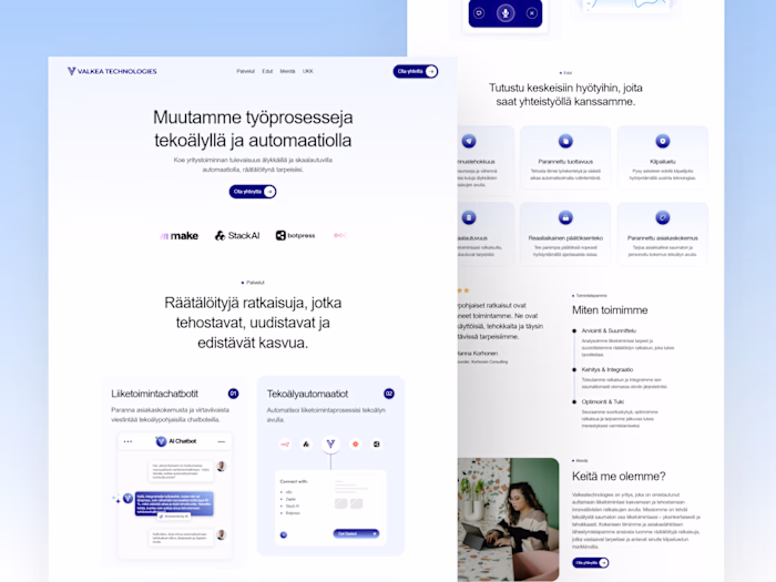
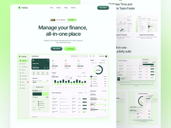
Sunvoy Landing Page Revamp
Al Razi Siam
Client: Jascha Brinkmann, Co-Founder & President
Industry: Solar Business SaaS
Role: UI/UX Designer
Deliverables: Full UX Audit, SEO-Optimized Landing Page Redesign, Visual Revamp
Problem Statement
Sunvoy’s original landing page had several friction points that were negatively impacting user engagement and conversions:
UX Problems:
Poor Information Hierarchy: Key features and benefits were buried or scattered across the page, making it hard for users to understand the value proposition quickly.
Lack of Visual Flow: The design lacked a smooth narrative or visual cues that guided users toward taking action.
Overwhelming Text Blocks: Large chunks of text discouraged scrolling and interaction.
Outdated UI Elements: The UI visuals lacked a modern, trustworthy SaaS aesthetic that resonates with solar tech businesses.
Current Landing Page
SEO Issues:
Missing H1 Tags: The page didn’t clearly communicate its primary offer to search engines or users.
No Structured Headings: The absence of a consistent H1 > H2 > H3 structure hurts crawlability for search engines.
Low Keyword Optimization: Keywords relevant to “white-label solar app”, “solar CRM”, and “solar sales software” were not utilized properly.
Lack of Microcopy & Alt Attributes: There were minimal alt tags for images, CTAs lacked descriptive labels, and the page had low semantic richness.
My Design Process
1. UX Audit
Conducted a heuristic analysis and session replay review to detect user drop-off points.
Identified the three most critical flows: product discovery, feature validation, and conversion.
Highlighted trust issues due to lack of testimonials or recognizable brand logos early on.
2. Strategy & Wireframing
Reconstructed the content hierarchy based on user reading behavior and value-first positioning.
Created wireframes that emphasized:
Immediate clarity in the hero section.
Chunked information for benefits and features.
Proof of performance via stats, social proof, and video testimonials.
3. SEO Optimization
Rewrote headings with high-intent keywords (e.g. "White-label app for solar companies", "Grow solar sales faster").
Structured HTML semantics with H1, H2, H3 for better indexing.
Implemented keyword-rich alt tags and CTA microcopy like “Book a Demo”, “See How It Works”.
4. High-Fidelity Design
Created a clean, trustworthy aesthetic tailored for B2B SaaS.
Used a pink-accented palette that matched Sunvoy's brand but contrasted key CTAs.
Introduced illustrations, testimonial cards, and embedded video for higher engagement.
Final Outcome After Revamp
✅ Clarity & Conversion
Hero section now clearly communicates the offer with 3 mockups and a defined CTA.
Visitors can now understand the value proposition in less than 5 seconds.
✅ SEO Improvement
Optimized structure, semantic tagging, and headings improved crawlability and keyword visibility.
Bounce rate reduced due to improved scannability and visual flow.
✅ Trust & Proof
Social proof and logos placed above the fold.
Seamless walkthrough of onboarding process and user testimonials added throughout.
✅ Business Impact (Post-launch)
Increased sign-ups and demo bookings by simplifying the user journey.
Faster decision-making from visitors due to improved content hierarchy.
Tools Used
Figma for wireframes and high-fidelity UI
Loom & Hotjar for user journey analysis
Google Search Console for SEO audit
Developer-ready handoff Figma file (Framer).
Full View
Figma Preview
On Figma, I've provided 2 design variations; we decided to go with version 2.
Before and After
Sunvoy Lanidng Page Redesign

Like this project
Posted Jun 3, 2025
Redesigned Sunvoy's landing page to improve UX, SEO, and conversions.