The Linkage Club Brand Identity
Krutik Raut
The Linkage Club Brand Identity
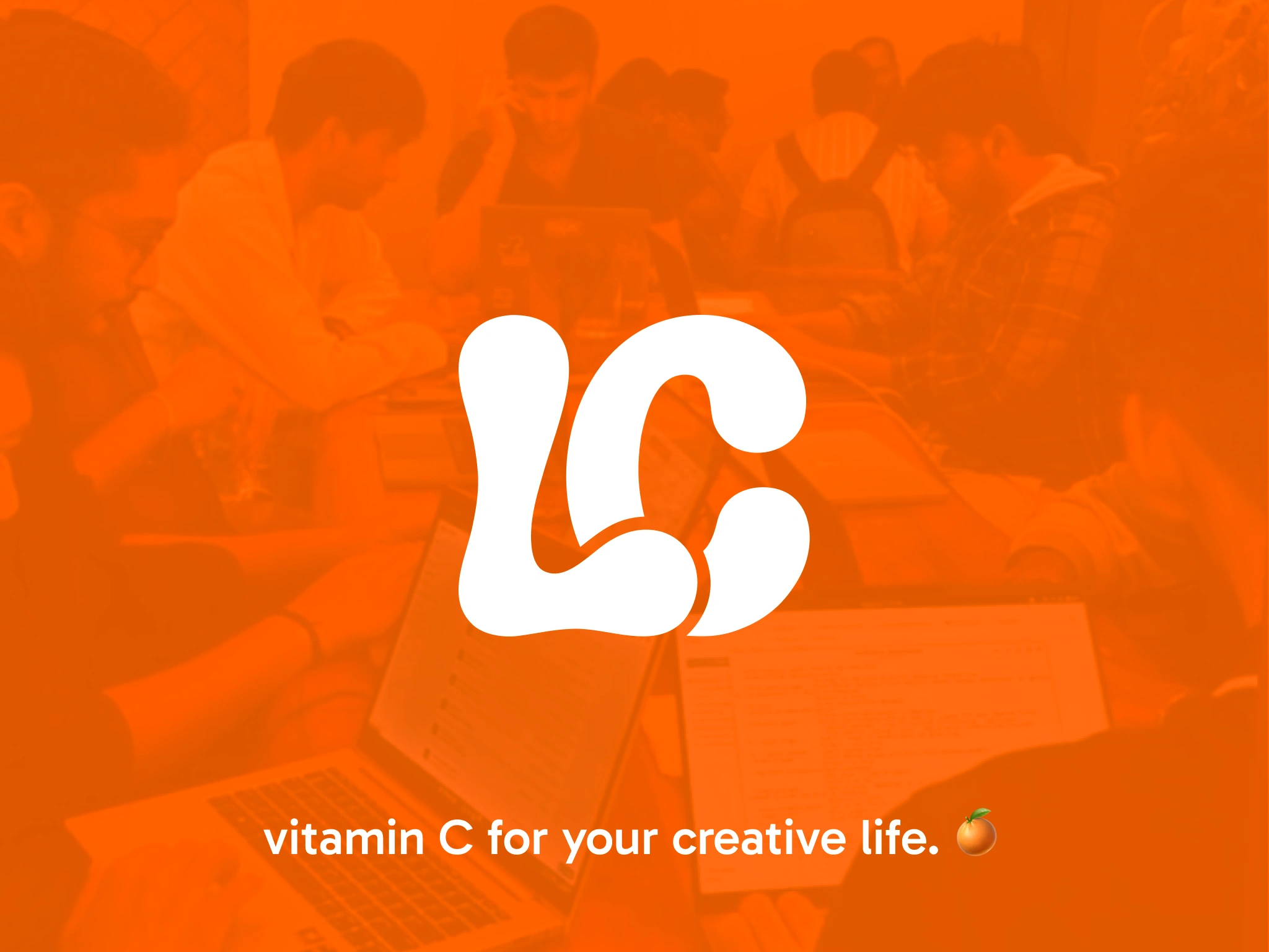
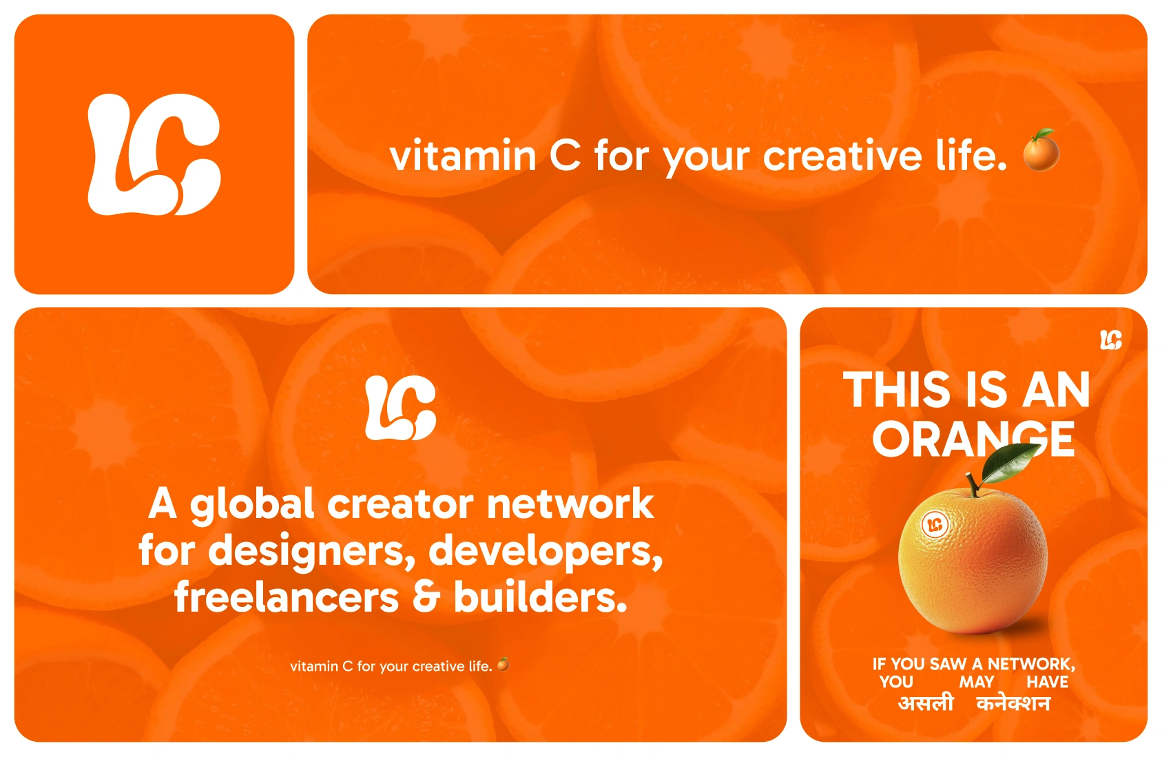
Brand identity for The Linkage Club a global creator community for designers,
developers, freelancers and builders.
The brief was simple build a brand
that feels alive. Not corporate. Not safe.
The orange fruit became the soul of it.
Fresh, real, no preservatives. A symbol
that says everything about what the
community stands for.
What we built →
→ Logo mark — organic bubbly LC monogram
→ Color system — blaze orange, cream, leaf green
→ Typography — Rubik 900 + JetBrains Mono
→ Brand moto — Fresh connections. No preservatives.
→ Naming system — The Squeeze, The Grove,
First Batch, The Weekly Squeeze
→ Voice & tone guidelines
→ Social media templates
→ Brand book
Every decision runs through one filter
does this feel like a fresh orange?
By Infinity Linkage 🍊
thelinkage.club
Like this project
Posted Jun 22, 2026
Developed a vibrant brand identity for The Linkage Club - a global creator community for designers, developers, video editors, freelancers, and builders.