House of Progress - Brand Identity
Krutik Raut
House of Progress is Vadodara's first community platform for builders, founders, creators, and thinkers — people making real progress, without the PR noise.
The logo had to feel like a movement, not just a brand.
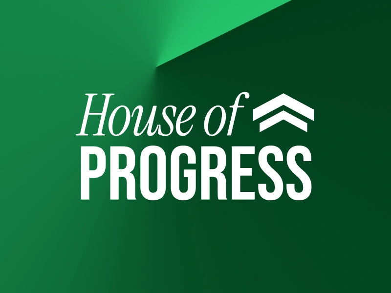
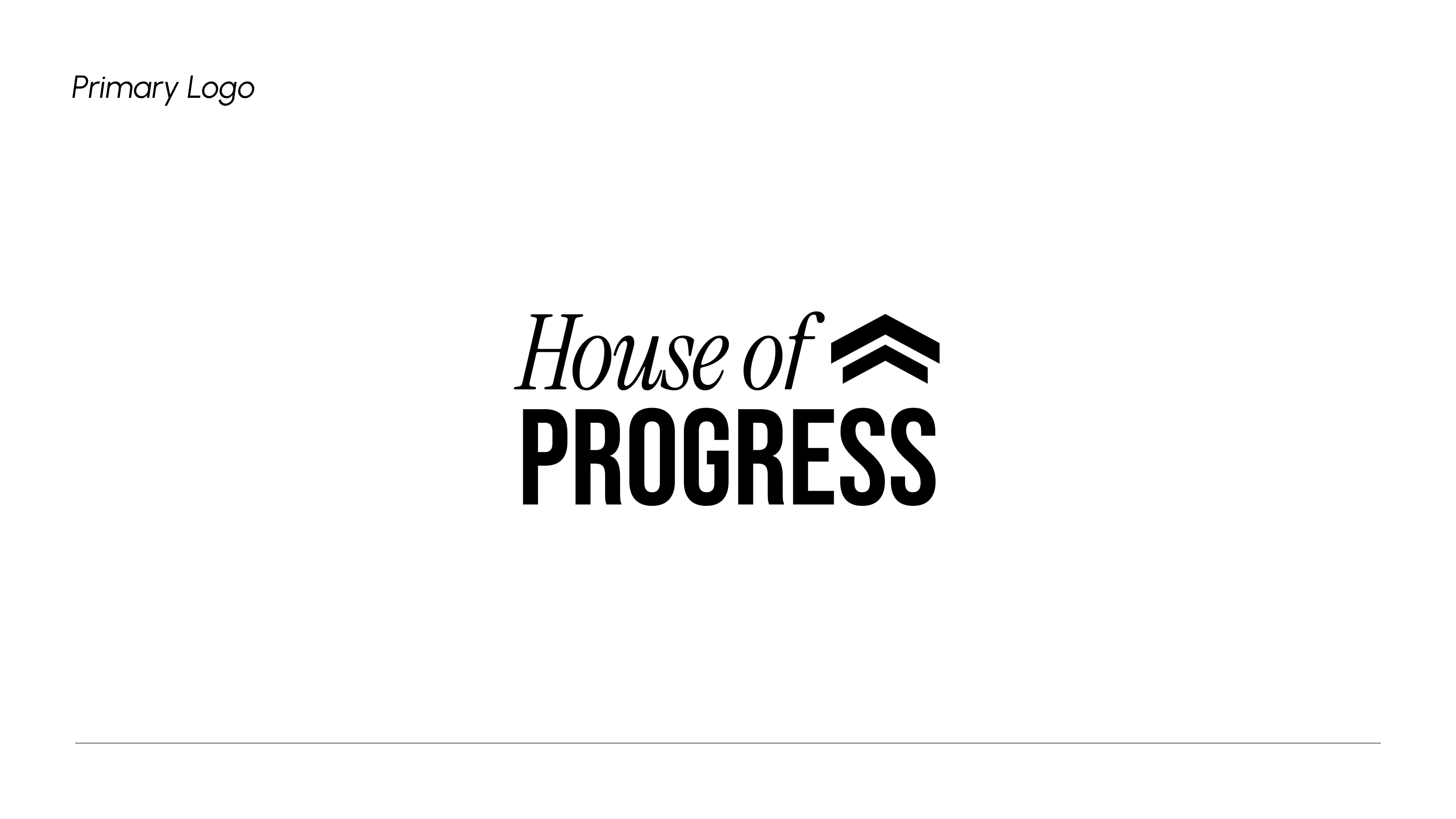
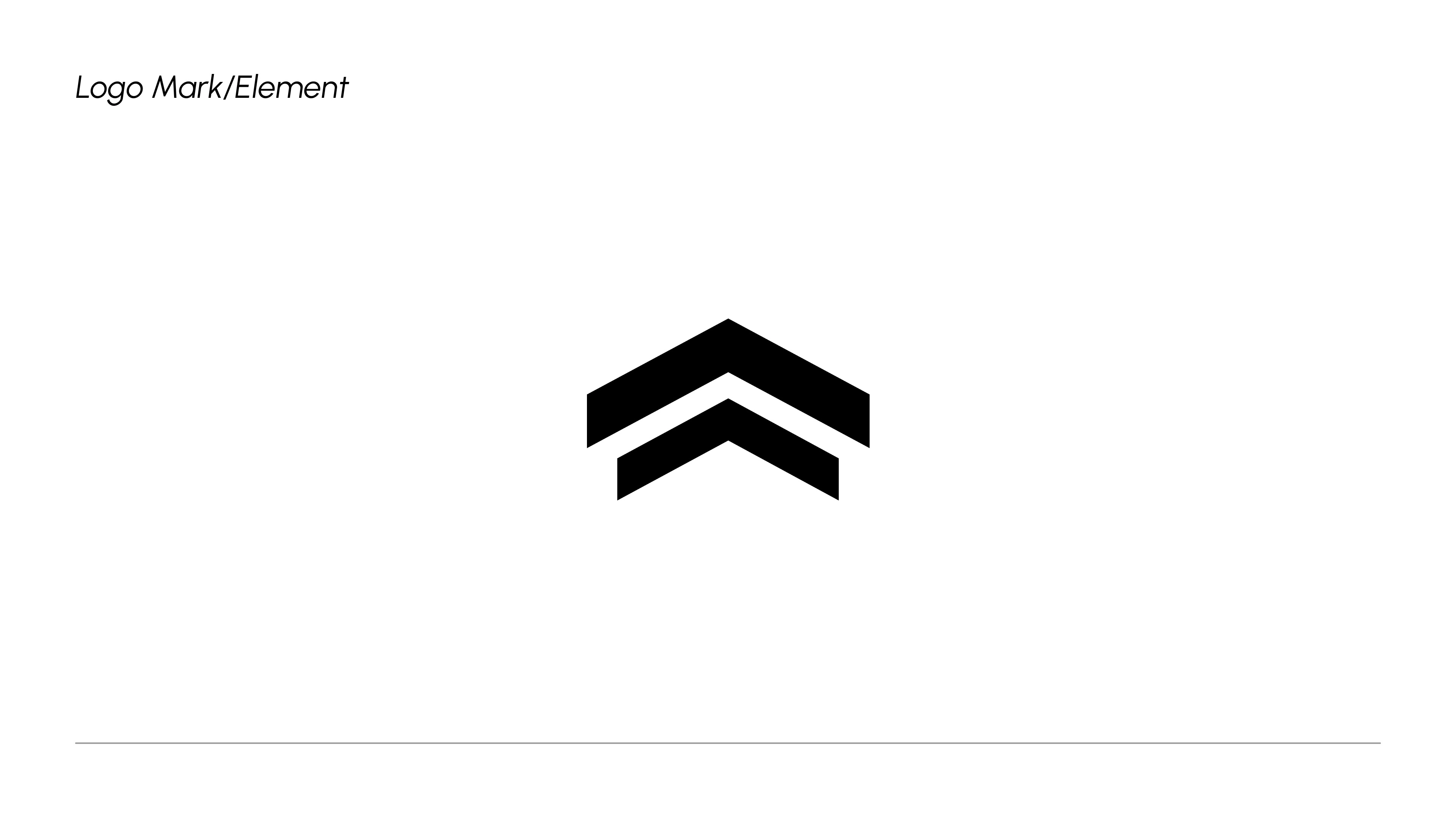
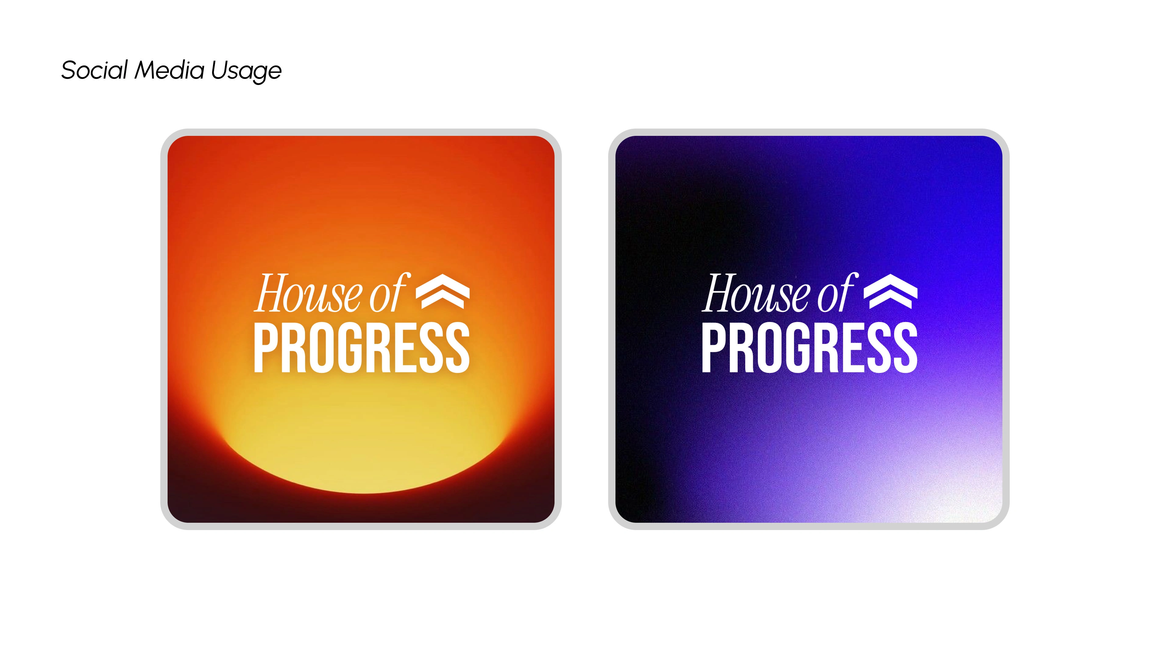
The wordmark pairs an elegant italic script for "House of" with a bold, heavy-set PROGRESS — contrasting energy levels that mirror the community itself: thoughtful AND driven. The double chevron icon next to the wordmark is the heart of the concept — two upward arrows stacked like a rank badge, symbolising continuous growth, momentum, and levelling up. It's the visual shorthand for everything HOP stands for.
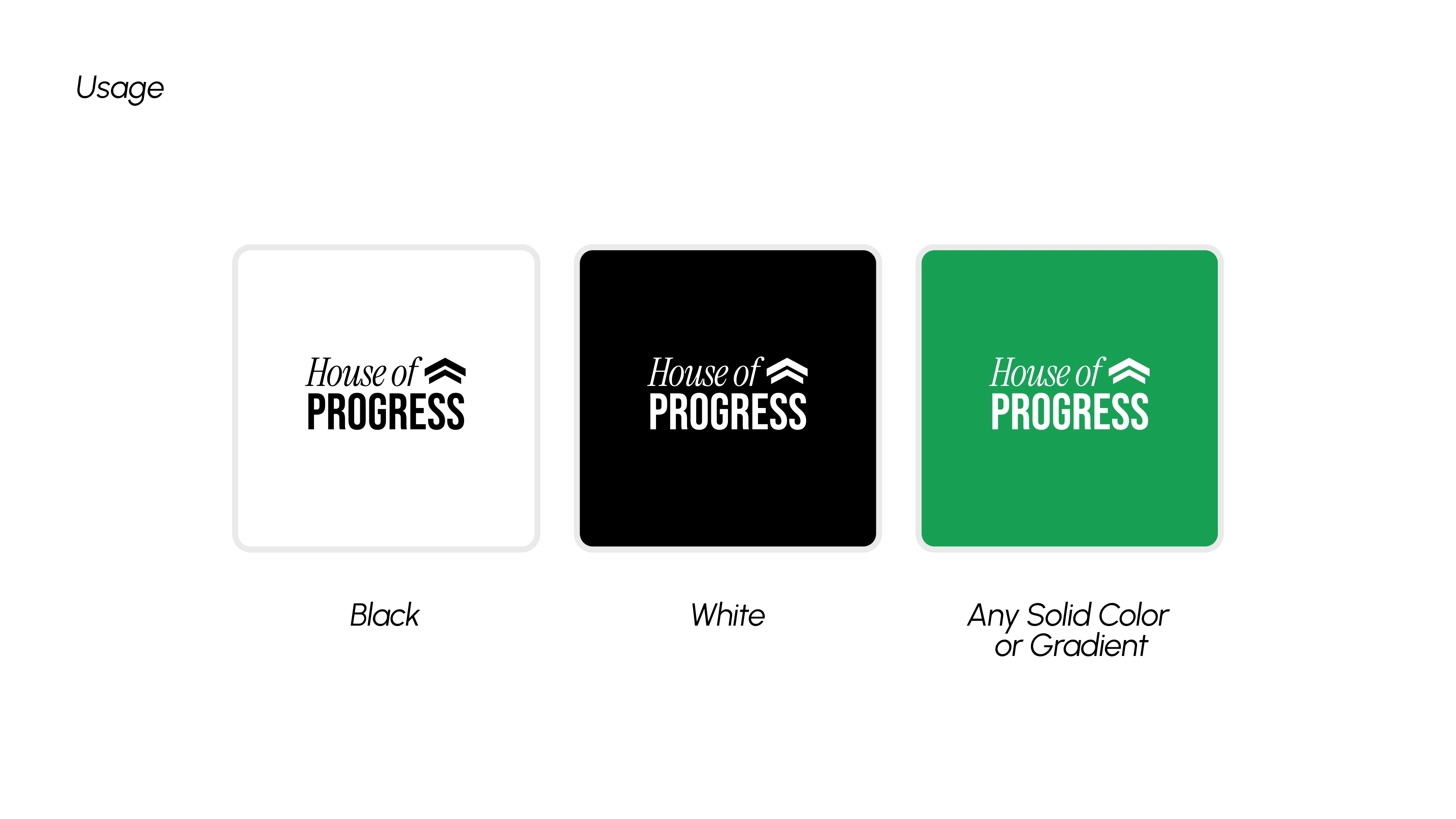
The signature green isn't just energetic — it signals go. Move. Build. It's the colour of permission.
Like this project
Posted Mar 27, 2026
Two arrows. One direction. Up. ↑↑ Designed the identity for House of Progress where founders, creators & thinkers come to build real things. hop.org.in
Likes
2
Views
11
Clients
Alendei Platforms Pvt Ltd