Logo design for restaurant named "Swagat Nivas"
Krutik Raut
Project Description
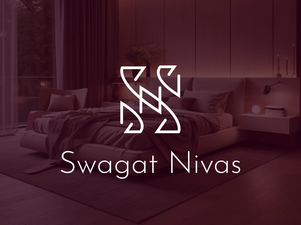
Swagat Nivas is a hospitality brand identity concept built around the warmth of welcome. The name — meaning "Welcome Home" in Sanskrit — guided every design decision, from the interlocking S+N monogram to the earthy, inviting palette.
Deliverables: Primary logo · Secondary mark · Monogram · Color palette · Multi-background variations
A secondary "Namaste" wordmark with a hands-in-prayer icon adds a cultural layer, reinforcing the brand's roots in Indian hospitality.
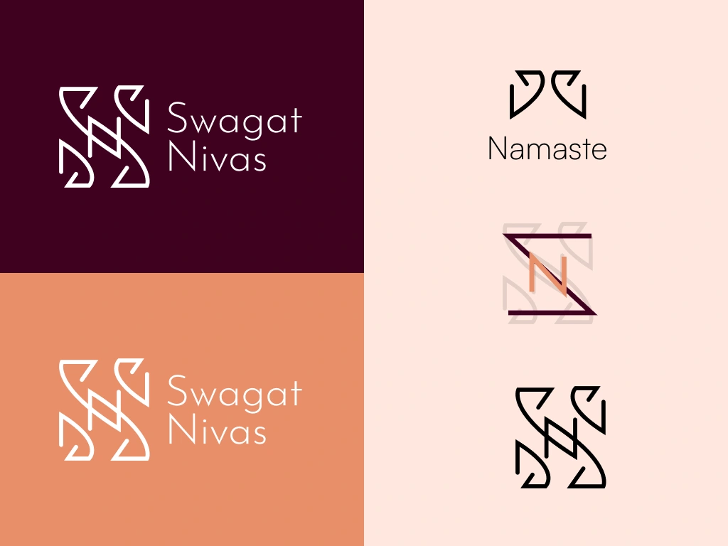
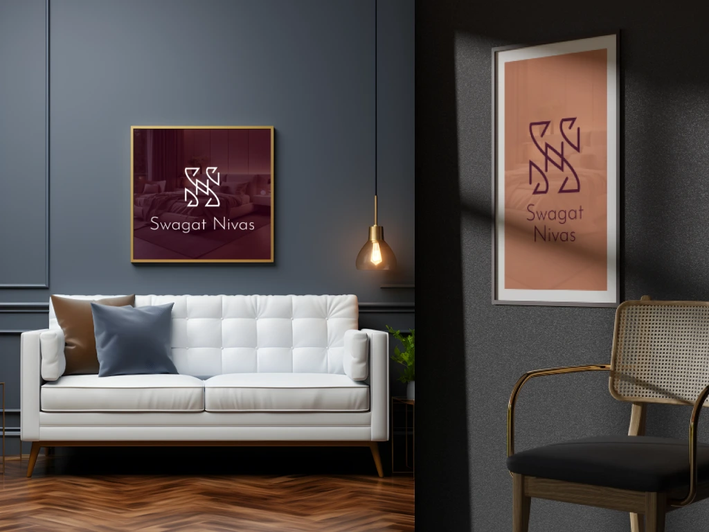
The primary mark fuses the letters S and N into a geometric, arrow-like symbol that subtly evokes movement, direction, and arrival — perfect for a guesthouse or boutique hotel. The logomark was explored across multiple colorways: a deep burgundy for sophistication, warm terracotta for approachability, and a minimal dark-on-light version for versatility.
Like this project
Posted Mar 27, 2026
Swagat Nivas - where every guest feels at home. Brand identity concept for a boutique Indian hospitality experience. Warm tones & cultural souls.
Likes
1
Views
9
Clients
Parul University