RideAway Logo Design for Urban Mobility
Krutik Raut
Overview
RideAway is a modern bike rental app built for urban commuters, weekend explorers, and travelers who want quick, flexible mobility on the go.
The logo was designed to capture the feeling of speed, movement, and freedom while staying minimal enough to work across app icons, bike decals, helmets, digital ads, and brand merchandise.
Challenge
The bike rental space is visually crowded. Most brands rely on predictable symbols like bicycles, wheels, location pins, or road icons, making them look similar and forgettable.
RideAway needed a visual identity that could stand apart.
The mark had to:
Suggest motion without showing a literal bike
Work clearly as a compact app icon
Feel modern, fast, and urban
Stay scalable across physical and digital touchpoints
Build strong recognition through a simple, memorable form
Concept
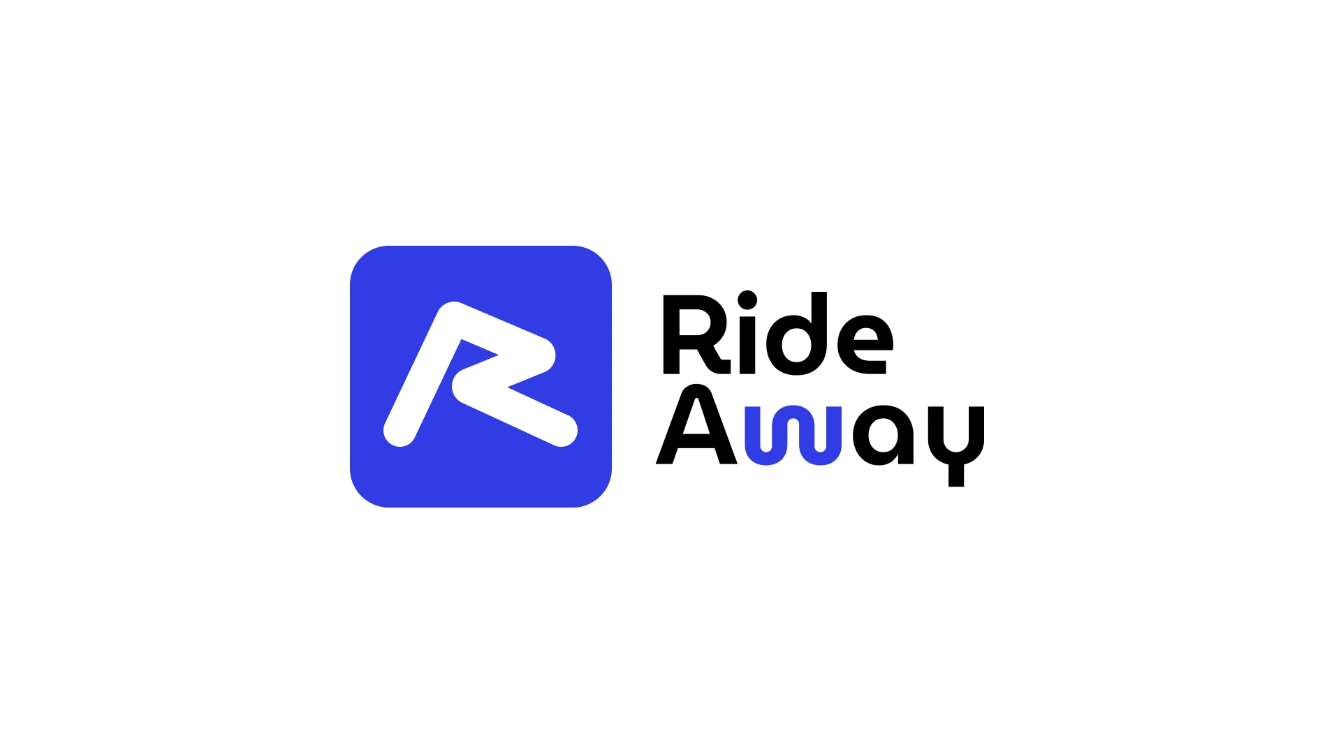
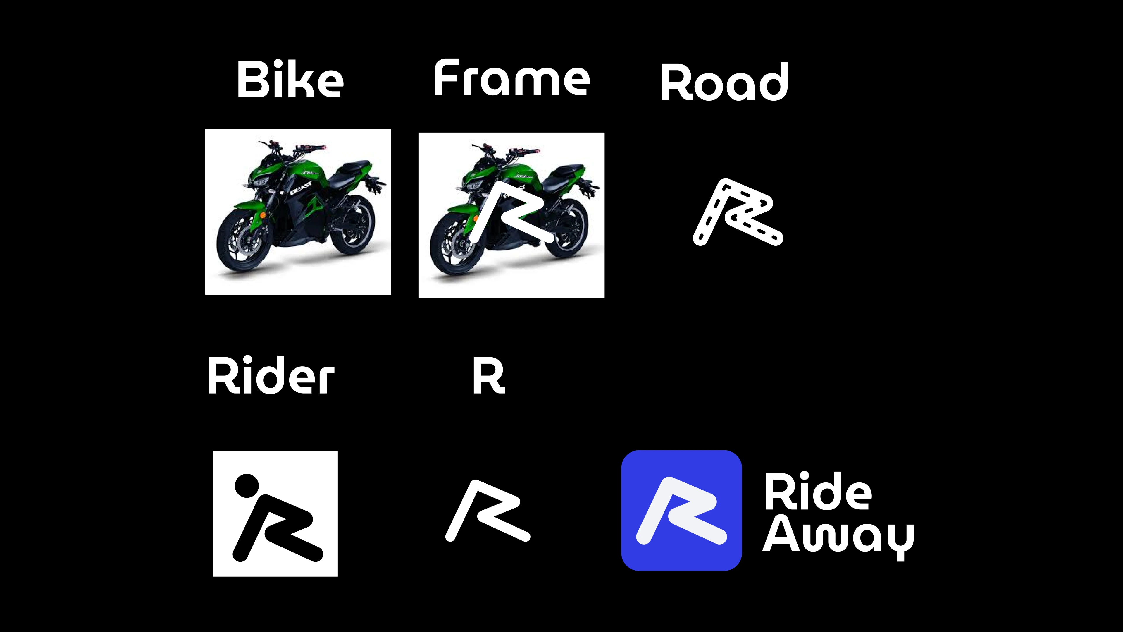
The logo is built around a custom abstract “R” mark that blends the brand initial with the feeling of forward motion.
Its form is inspired by four core ideas:
Bike frame geometry — sharp, angular structure that reflects the mechanics of a bicycle
Road direction — a forward-leaning shape that suggests movement and progress
Rider motion — the dynamic posture of a cyclist leaning into speed
Brand recall — a distinctive “R” that makes the identity instantly recognizable
Rather than using an obvious bike symbol, the mark turns mobility into a bold visual language. The result is a clean, energetic, and scalable logo that feels fast at first glance and memorable over time.
Design Direction
The final symbol combines structure and motion in one minimal form. Its sharp cuts, forward angle, and compact silhouette make it ideal for a mobile-first brand.
As an app icon, it feels bold and instantly identifiable. On bikes and merchandise, it becomes a strong brand stamp. Across digital platforms, it gives RideAway a modern, confident, and high-speed personality.
Outcome
The RideAway logo creates a unique identity for a mobility brand that wants to feel fast, reliable, and future-ready.
It avoids clichés, strengthens brand recall, and gives the app a visual mark that can grow from a simple rental platform into a recognizable urban mobility brand.
Design Direction
Visual Style
Minimal
Bold
Geometric
Tech-focused
Mobile-first
Rounded edges soften the sharp geometry, making the brand feel approachable and modern.
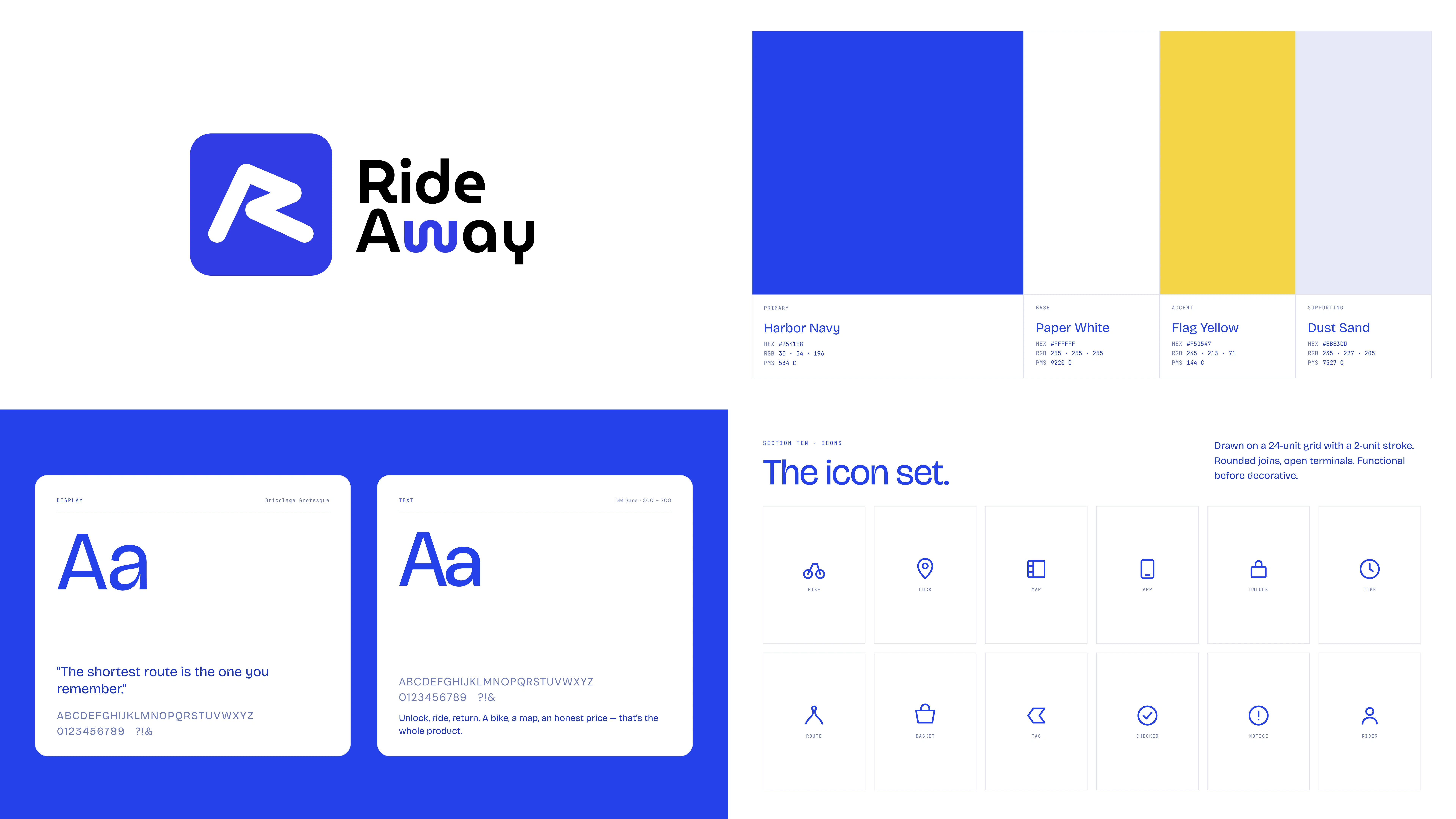
Typography
A rounded geometric sans-serif typeface was used to complement the symbol.
The custom “w” in Away adds fluidity and reinforces the feeling of movement.
Color Strategy
The electric blue represents:
Technology
Trust
Urban mobility
Energy
The high contrast black-and-white pairing ensures strong visibility across light and dark interfaces.
Scalability
The logo was designed to work across:
App icons
Bikes & helmets
QR unlock systems
Websites
Social media
Signage
Its simple silhouette keeps it recognizable even at small sizes.
Outcome
The final identity creates a clean and memorable mobility brand that feels modern, scalable, and instantly recognizable while subtly communicating speed, direction, and riding culture.
Like this project
Posted May 11, 2026
Designed a unique logo for RideAway, focusing on movement and modernity.
Likes
0
Views
2