Logo design for Pratham Brand Vision
Krutik Raut

Pratham Brand Vision is a brand identity built on a single, powerful idea being first.
"Pratham" means first in Sanskrit, and that meaning is baked directly into the mark. The numeral 1 doubles as the vertical stem of the letter P, making the name and the concept inseparable at a glance. It's not just a logo...it's a statement.
All you need. All in one. That tagline shaped every decision.
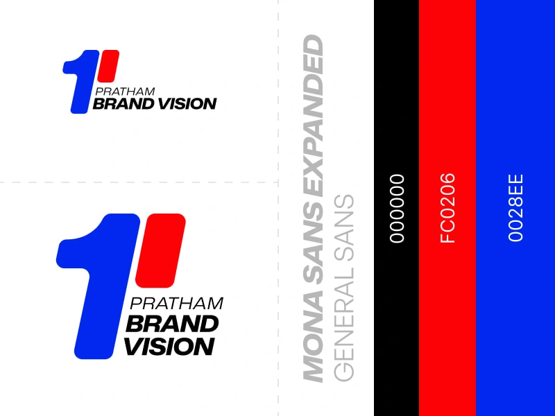
The palette is unapologetically bold jet black for authority, electric red for energy, and royal blue for trust. One mark. Three colors. Everything covered.
Typography pairs Mona Sans Expanded for the wordmark - wide, strong, and commanding - with General Sans for supporting text, keeping things clean and readable.
This is a brand that doesn't just talk about vision. It looks like it has everything figured out from day one.
Like this project
Posted Mar 27, 2026
First in name. First in vision. Pratham : Sanskrit for first. A logo that says everything before you even read it. All you need, all in one.
Likes
2
Views
6